It’s time to continue our fascinating journey into the multi-dimensional topic of font design! In the UniversiTTy series, we cover the essential steps of the font development process, so we recommend you read the previous articles of the series before diving into this one.
The following article is dedicated to the first stage of designing basic Latin characters: glyph construction and determining the graphic features, proportions, and consistency. Antonina Zhulkova, Design Lead at TypeType, will tell you all about these processes. Antonina has been working in font design for more than 5 years now. She’s the concept author and lead designer of projects like TT Neoris, TT Ricordi Allegria, TT Globs, and Ivi Sans Display. Also, she took part in the creation of TT Fellows, TT Fors, TT Interphases Pro, TT Commons, Red Collar, and many other typefaces.
Where do you start designing the basic Latin characters?
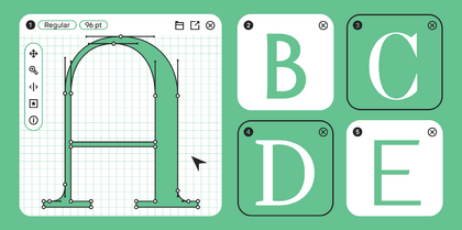
After you have finished all preparations, defined the task and the key characteristics of the font, and made sketches, it’s time to move forward to building glyphs in a font editor.
The main idea of this article section is that font is a uniform, complex system, not individual letters. That’s why every graphic decision should affect all characters in the set. On the one hand, this concept may seem confining and uninteresting. On the other hand, the font’s consistency helps from the graphic point of view by interconnecting and uniting glyphs. Understanding the basic principles of font construction facilitates the entire design process. It’s worth repeating that a clear and coherent construction logic is the driving force behind glyph design and decision-making.
The first step of designing a font in an editor is creating base lowercase and uppercase Latin characters. They will help specify the weights and proportions that will be used as the foundation for crafting the rest of the characters. These letterforms should be designed based on the completed sketches.
To illustrate the font, I offer two examples, a serif and sans serif, so you can compare two basic styles and identify similarities and differences between the development processes of such typefaces.
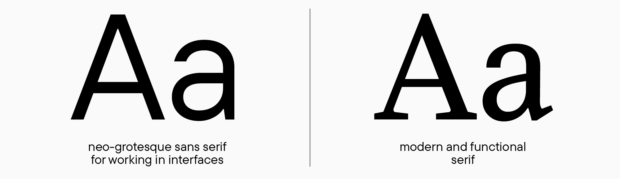
We will craft a font based on our familiar tasks from previous «lessons»: to create a modern, functional serif and a Neo-Grotesque for interfaces. Some cases will include examples from other fonts so you can see the entirety of the processes being described. I should mention that at this stage, we’ll only be discussing roman font styles in this article. An adventure in the world of italics awaits you in one of the following chapters.

The beginning of work: First glyphs
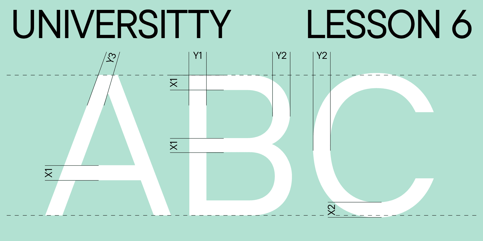
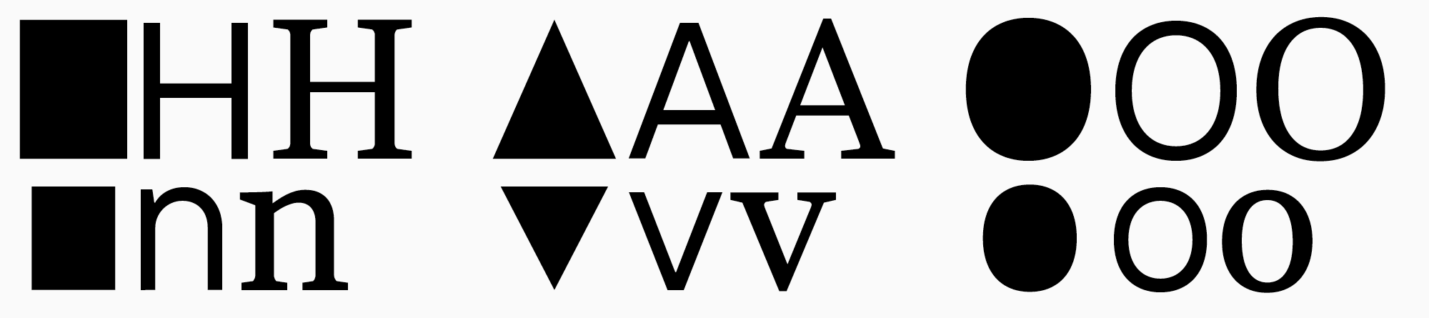
Characters from the basic Latin alphabet can be subdivided into three groups: straight or rectangular (for example, H or n), rounded (O, o), and triangular (A or v). These characters mark the beginning of our work and lay the foundation for the rest of the glyphs.
My story about glyph design will begin with the uppercase letters. There are two reasons for this. First, uppercase letters appeared earlier historically than lowercase ones. Second, these glyphs’ construction logic is a little easier to understand. Suppose you only sketched lowercase letters at this stage. In that case, you can go back to drawing and add the letters Н, О, and А to them to determine proportions and weights and analyze how lowercase letterforms in your font correspond with the uppercase ones. You can begin by drawing glyphs in any lettercase to work on your graphic concept. However, in my opinion, starting my explanations with the uppercase characters is better methodologically.
If you plan to draw the entire font family with multiple weights, the first font style you design should be regular, the one you made «master» at the sketching stage. This rule works for relatively neutral fonts, where readability and logical glyph construction are crucial. Besides, various graphic characteristics are easier to understand in a regular font style. On the contrary, designing display fonts is only limited by your imagination; the choice of «master» doesn’t affect the process too much. Learn more about planning your font family in our «UniversiTTy: Lesson 4» article.
Glyph weight examples and optical compensations
Before we pass over to drawing itself, we have to discuss the theory of varying character weights in fonts. Numeric parameters of weights play an essential role in font design. First, they will serve as the foundation for constructing the rest of the characters in the font family. Second, they help identify any font, determine the stylistic classification it belongs to, and whether it matches the task.
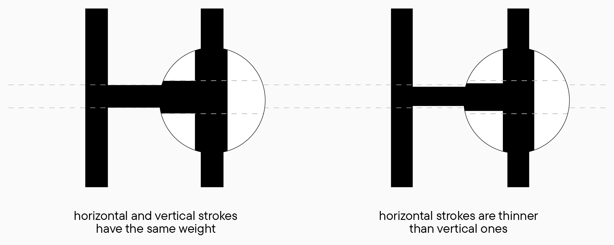
Due to the nuances of our vision, geometrically precise shapes of identical sizes don’t appear identical to us when placed together. Knowing this is crucial for a font designer. When drawing letters, this aspect of perception needs to be taken into account to make typesetting look even and stable on the line. The best way to see this is through the example of geometric shapes.
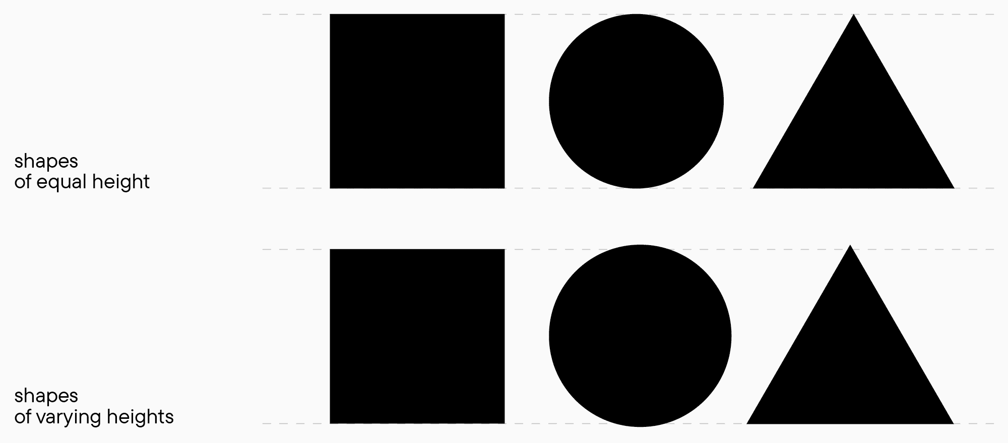
In the top image, a circle looks smaller than a rectangle, and a triangle seems even smaller than the circle. In fact, all the shapes have equal heights. In the second image, the shapes are balanced considering visual perception, so they look equal in height. However, the circle and the triangle’s vertex actually extend beyond the baselines. You can do the same experiment (in a font editor or on a piece of paper) with different types of shapes with various characteristics to better see the contrast in perception.
The example with shapes is often difficult to associate with «real» designs, but such abstract comparisons are essential for understanding the basics. Our visual perception also affects weight estimation: horizontal strokes always seem thicker to us than vertical ones, even when both have equal weights. In the same way, an upright stoke seems thicker than the same stroke but curved, like in the letter O. So, if you’re crafting a font with no visible contrast, for example, a neutral sans serif where all strokes must be visually the same, you should make horizontal strokes thinner than vertical ones.
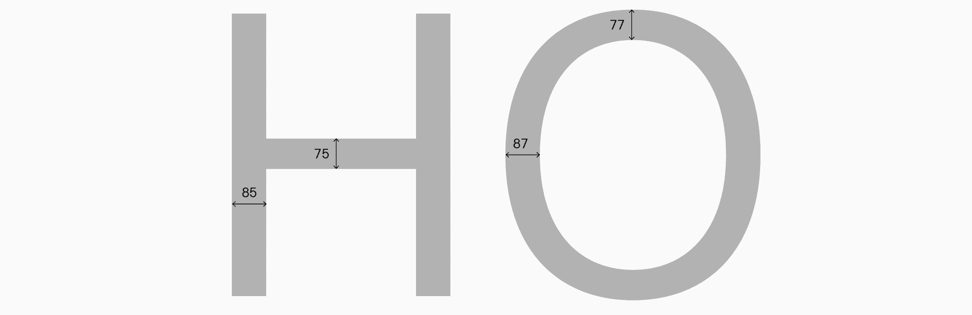
To construct your font’s characters, you have to determine the four core parameters for each lettercase: stem weights (for straight and rounded characters) and horizontal stroke weights (also in both kinds of glyphs). Diagonal glyph weights stand apart, but we’ll cover those in a moment. It’s important to remember that the bigger the font style’s weight, the more prominent the difference between horizontal and vertical strokes. Another thing is that the perception of weights depends on the size of the whole letter: the larger the glyph and the more air it has, the lighter it seems to our eye. That’s why the lowercase character parameters should be compared with ones of the uppercase letters and corrected by testing.
The process of choosing weights for serifs and sans serifs is essentially the same. The only difference is the amount of contrast between vertical and horizontal strokes, plus a more visible weight distinction between straight and rounded characters. However, the approach is the same for both styles of typefaces, and all additional graphic elements (crossbars in double-story characters, serifs, etc.) follow these principles of weight distribution.
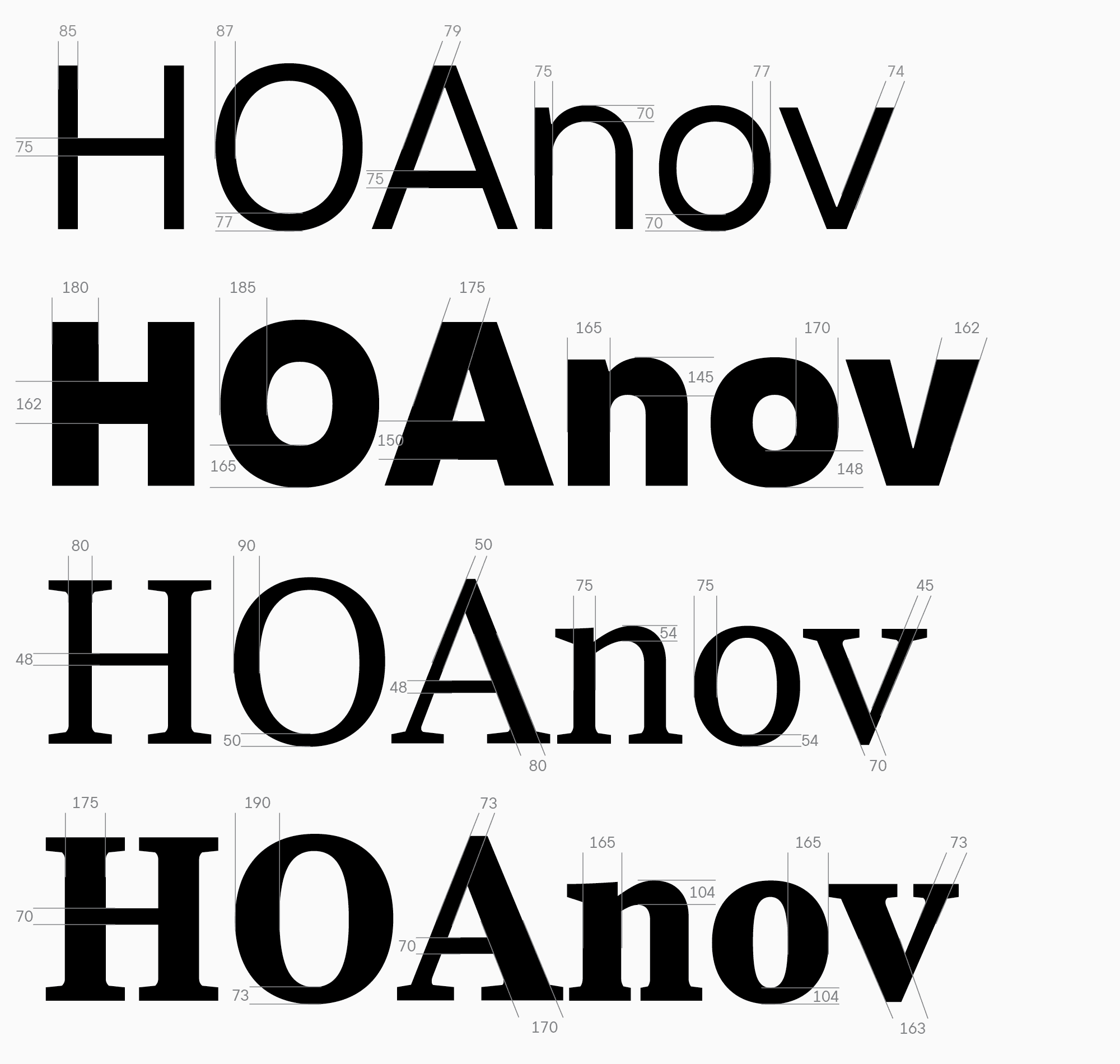
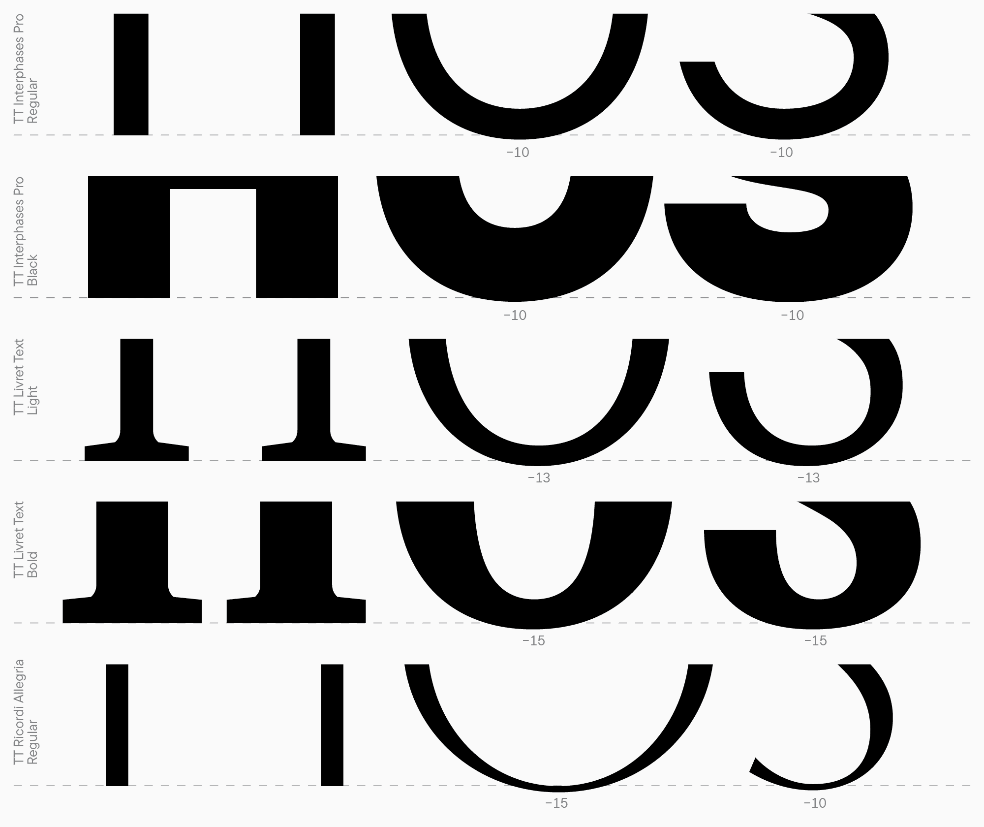
Taking a neutral sans serif for interfaces and a text serif as an example, we can see what values can be used.
Let me add a small comment about the arc weight in the letter n. This element’s weight often doesn’t match the horizontal stroke weights in lowercase characters, and the purpose of this element differs from the one of the crossbar in the letter H. So, it often has to be visually compensated to keep the balance of black in the character. When designing Cyrillic characters, I recommend using the letter н to determine the core weights of horizontal strokes or crossbars in letters a, e, z, or t.
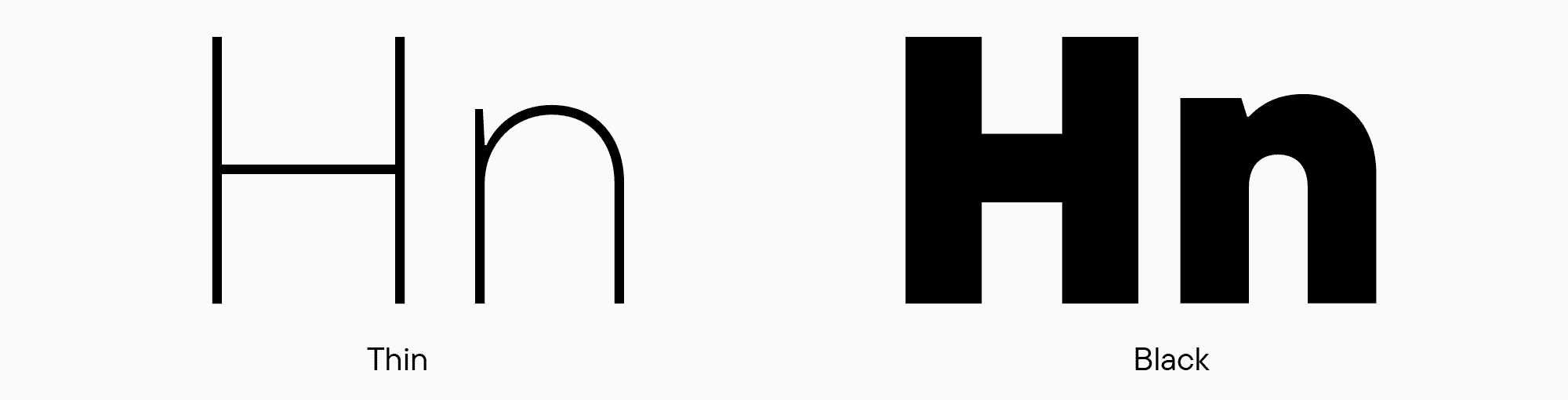
Now, I will briefly describe another couple of options you can face while determining your characters’ weights. First, a sans serif because it tends to have no visible contrast. However, even within the same font family, the contrast between weights will differ: the thinner the style, the lower the contrast between strokes can be. For instance, in the Thin font style, Now, I will briefly describe another couple of options you can face while determining your characters’ weights. First, a sans serif because it tends to have no visible contrast. However, even within the same font family, the contrast between weights will differ: the thinner the style, the lower the contrast between strokes can be. For instance, in the Thin font style, vertical and horizontal strokes can have equal weights, but as the amount of black increases, this difference, on the contrary, will grow.
Weights in sans serifs can also differ depending on the style. In Humanist sans serifs, the distinction between weights is usually more prominent, and in geometric sans serifs, it becomes almost invisible. At the same time, the vertical stroke values for rounded characters differ slightly or don’t differ at all. In this regard, serifs are more versatile and demanding to the weight parameters because they affect the font’s style and the forms of glyphs. To establish your system of glyph design, you have to decide if you’re creating a contrast serif, a more old-style one, or a serif with reversed contrast. I’ll cover the issue of contrast in serifs a little later.
Now, let’s focus on rounded and triangular characters. Rounded glyphs demand so-called overhangs to make the letters visually match in height. The level of overhanging, or the height of rounded characters, is the height of the letter H + a particular value from the top and bottom (this concerns rounded elements on both sides). There are no established rules to calculate this value—everything depends on a specific font and where it’s used. Usually, we use the following formula: the bigger the amount of black in the characters and the larger the point size, the higher this value must be. In most cases, the size is from 10 to 15 points. Also, the level of overhanging isn’t always the same: in some cases, when a font features wide, rounded characters, narrow glyphs with overhangs, like S, seem overly protruding from the line, so the overhangs have to be reduced. These details are more visible after printing, so remember to test your font in a variety of ways.
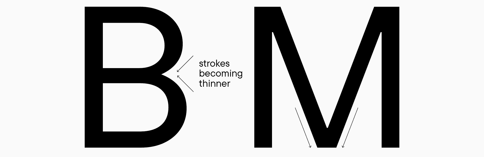
When designing triangular glyphs, the appropriate weight parameters are often unclear because triangular characters tend to look significantly darker or lighter than other forms. Based on my experience, I can recommend making diagonal strokes a little thinner than the main stem size of the letter H and testing each letter between the others. A critical factor to consider when drawing horizontal strokes is that almost all triangular characters with such strokes have points where diagonal strokes intersect, and these points always seem thicker (it also concerns the letters B, M, N, R, etc.). That’s why they must be balanced by reducing the weight of the intersecting strokes.
In the upcoming article, we will continue discussing optical compensations, find out how to determine the heights of uppercase and lowercase characters, and learn more about the essence of contrast.