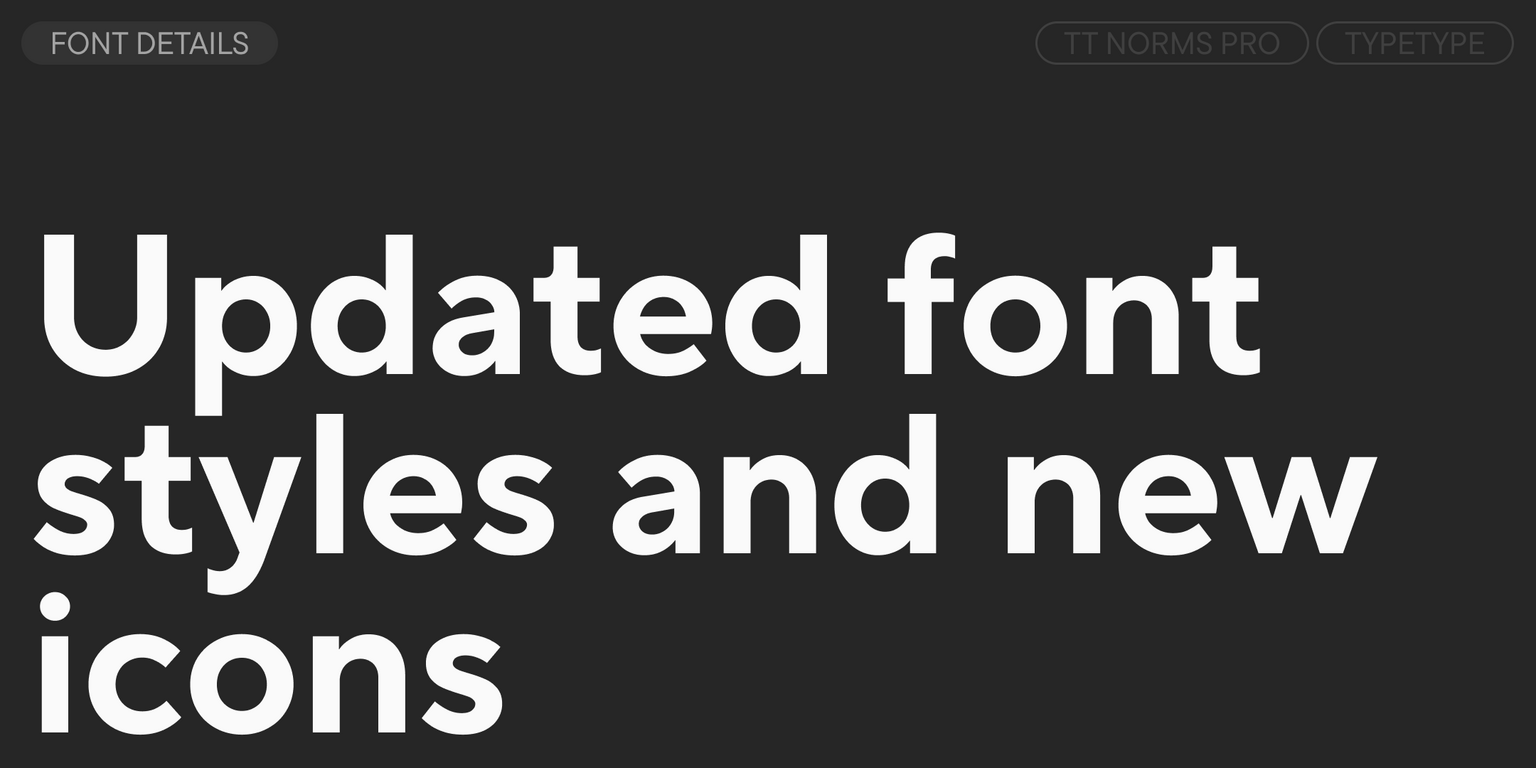


Meet the enhanced TT Norms® Pro version 4.100!
We have redrawn the bold font styles and added a set of icons.
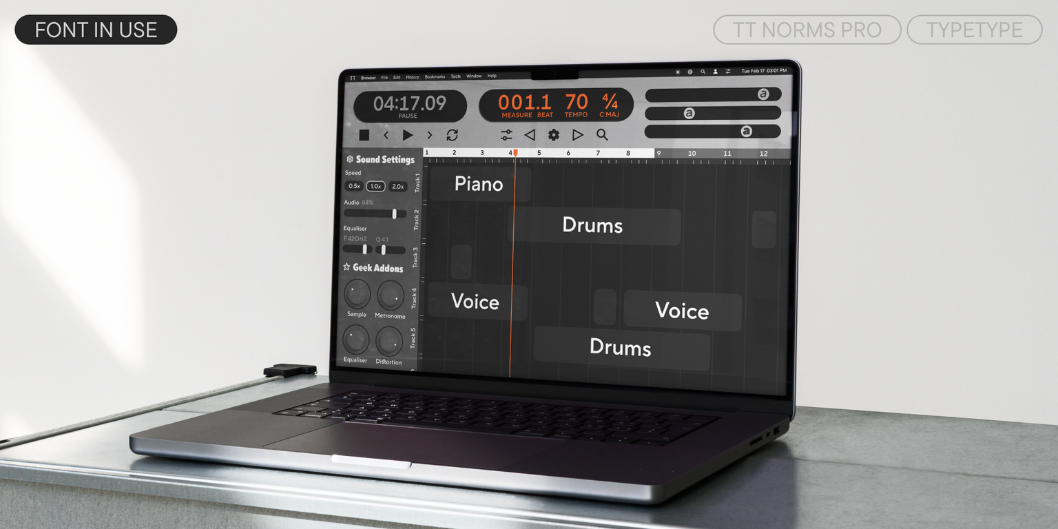
TT Norms® Pro is a functional geometric sans serif for aesthetic solutions and a TypeType studio bestseller. It has enjoyed tremendous success since its release—and it’s no surprise! It is a stylish, concise, and versatile font that will become a go-to solution for any task.
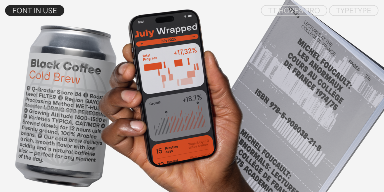
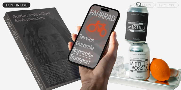
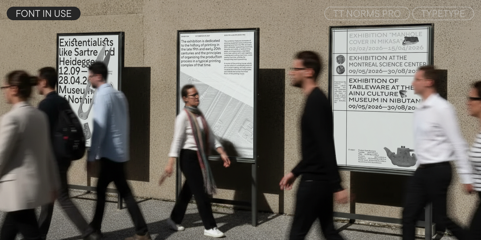
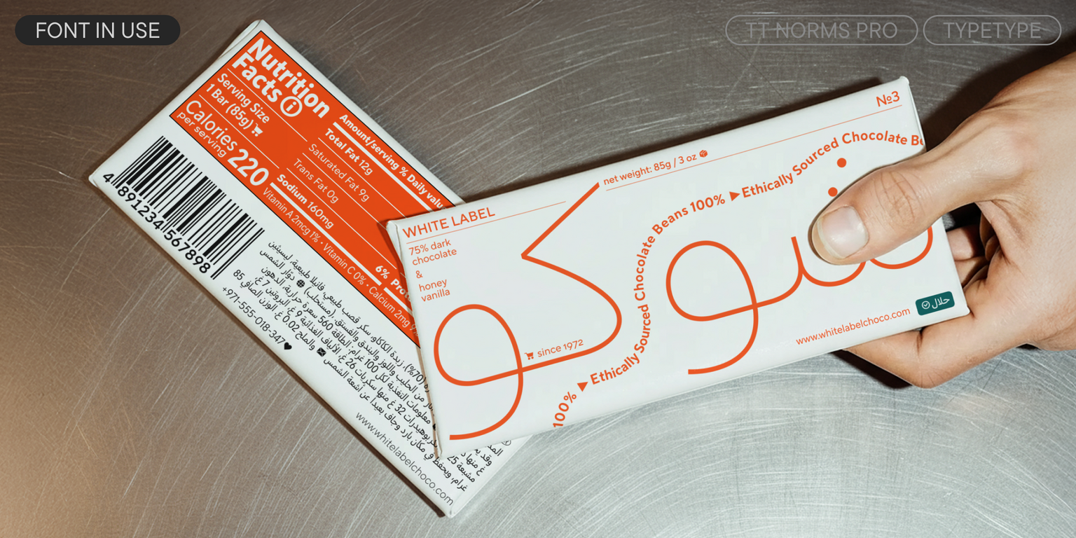
On the one hand, TT Norms® Pro is aesthetic and functional, allowing it to be used as an accent. On the other hand, it is neutral enough to be the perfect “workhorse” that performs flawlessly in running text. This font is suitable for any sector: a streaming service or a banking system, a clothing brand or the automotive industry. It is equally convenient for use on the web or in print.
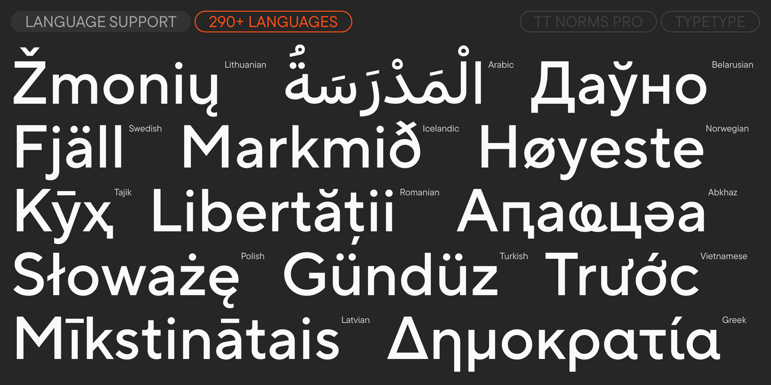
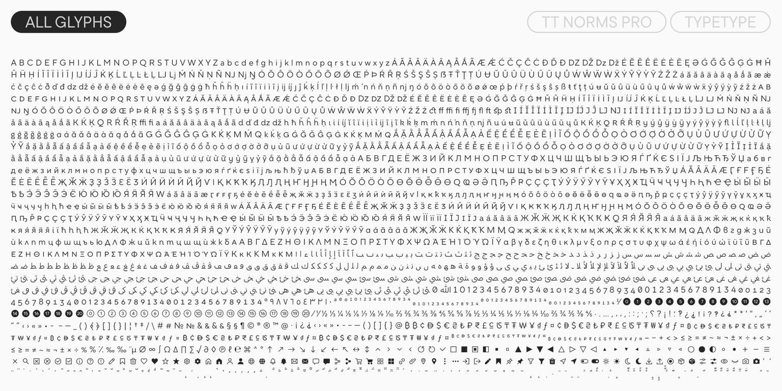
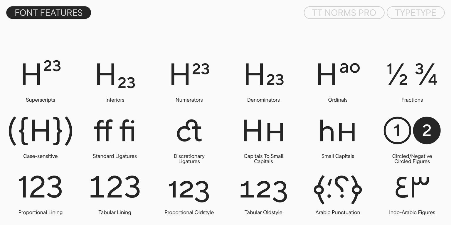
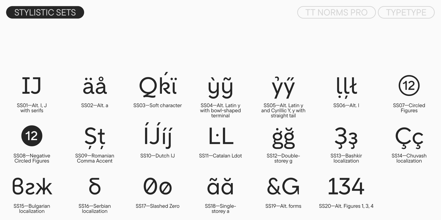
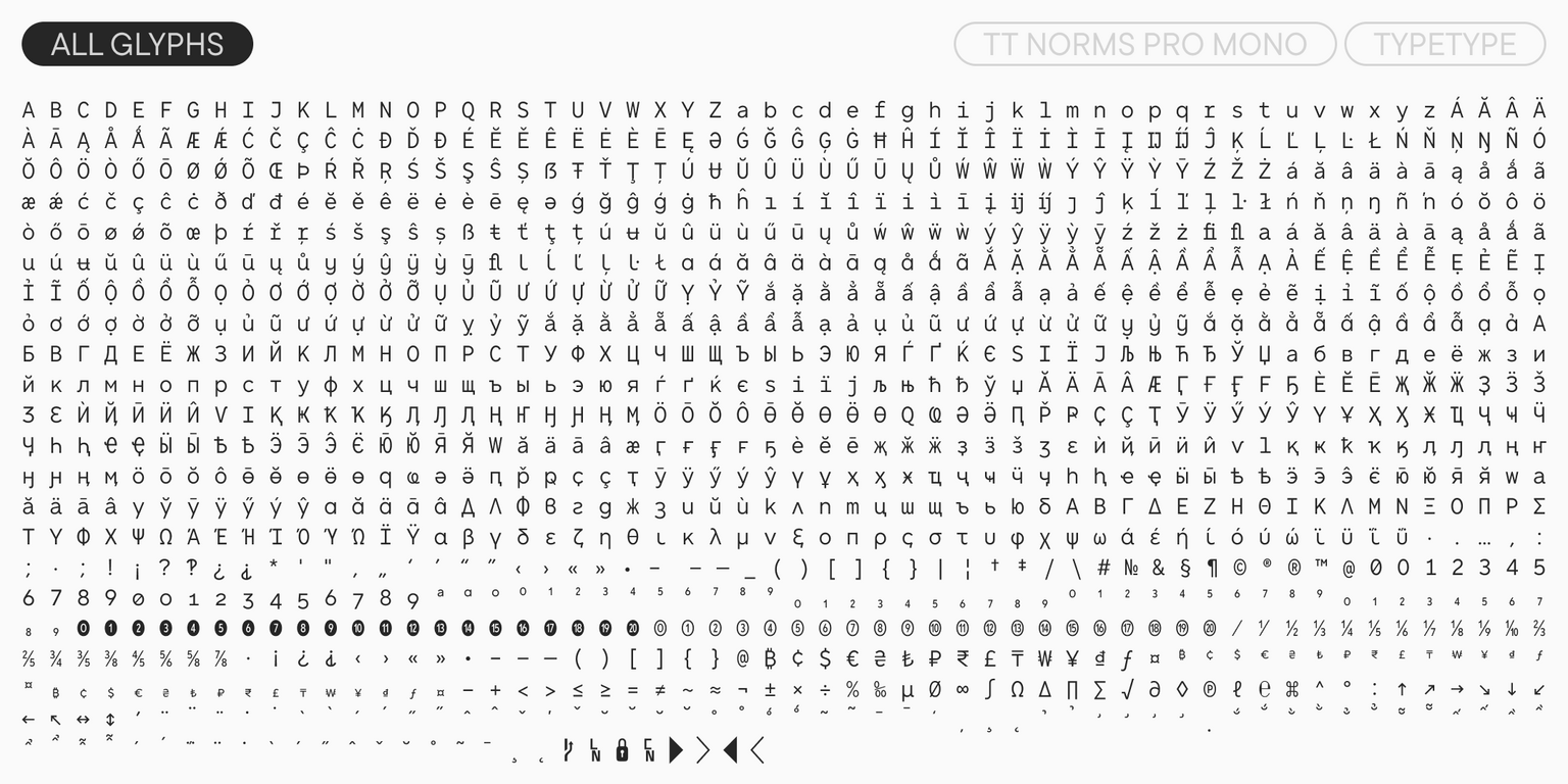
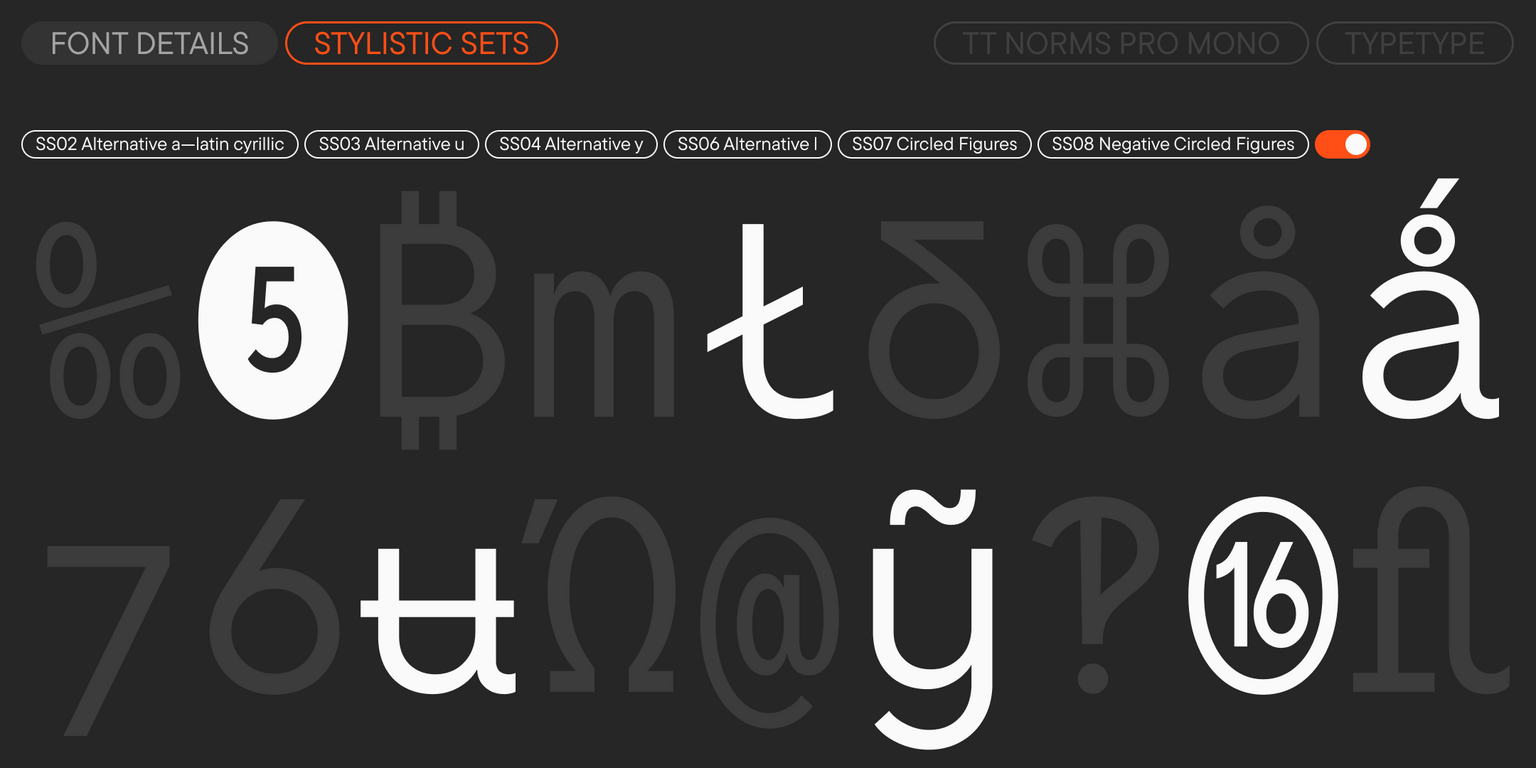
Currently, the TT Norms® Pro typeface includes the most complete set of fonts—both in terms of the number of font styles and the character set. Moreover, it is the font with the most extensive language support in the TypeType collection. It also includes numerous OpenType features and several stylistic sets that can lend the design a friendlier look.
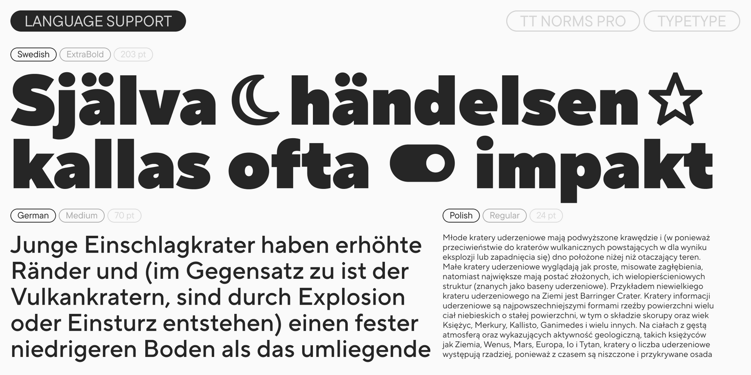
Additionally, the typeface includes a font based on the Arabic alphabet. Despite its geometric base, its design has a noticeable humanist character and harmonizes with calligraphic notes typical of the Naskh style (an Arabic script with clear rounded lines) in which it is drawn. The Arabic version of TT Norms® Pro looks calm in the thin masters, while in the bold ones, it becomes more dynamic and striking. One of the key features of the typeface in the Arabic expansion is the huge number of ligatures, thanks to which letter connections look smooth and natural.
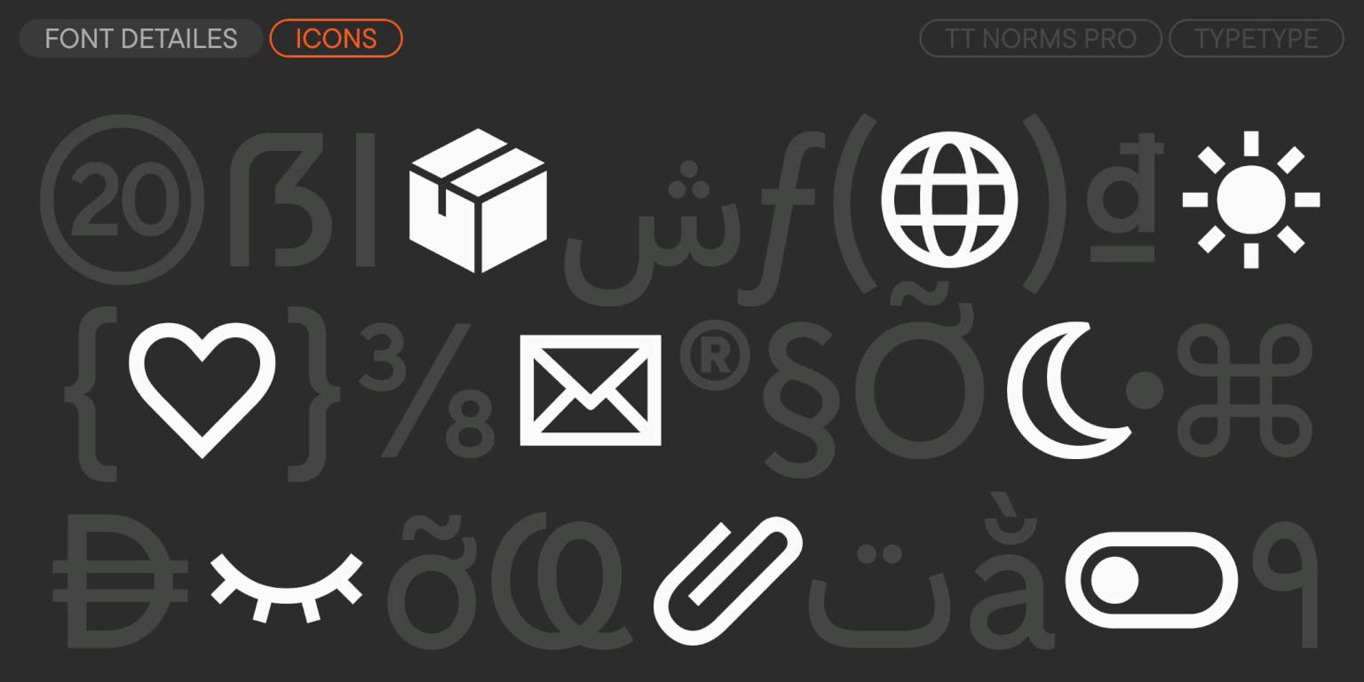
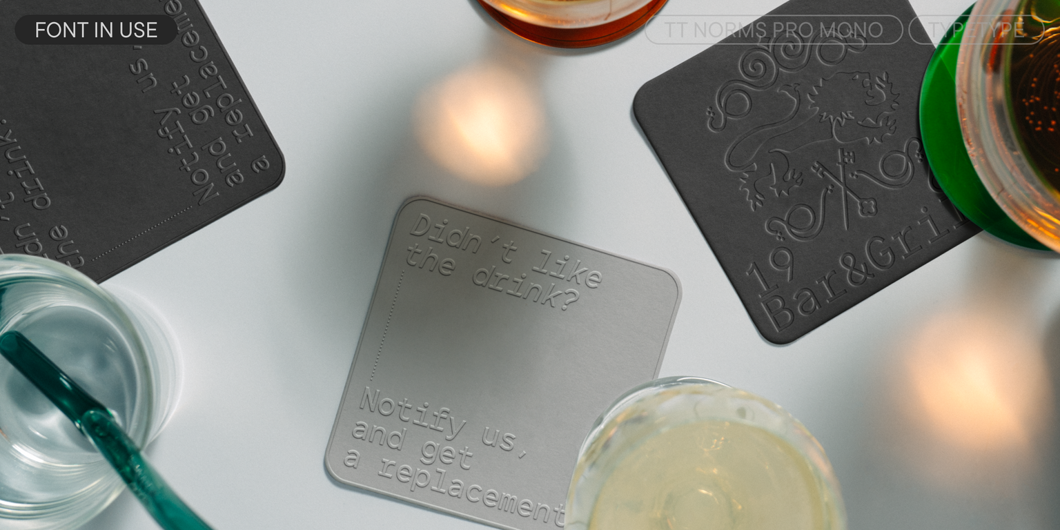
In version 4.100, we completely redrew the ExtraBold, Black, and ExtraBlack font styles across all widths. Specifically, we changed the character terminals, the rhythm, and the ratio of horizontal and vertical strokes. Now the bold styles look much more serious and neutral, making them more versatile. Furthermore, we created completely new hinting and kerning for them. We also added a functional set of popular interface icons across all styles. They are perfect for use in interfaces and print, as they flawlessly match the letters in size and stroke thickness.
The large range of widths allows the font to be used both for large, wide headlines on posters and for setting narrow text on packaging. A complex and carefully calibrated system of letter proportions, spacing, and diacritic placement contributes to good legibility even in small point sizes. And the large selection of styles allows you to solve a wide range of tasks.
TT Norms® Pro 4.100 includes:
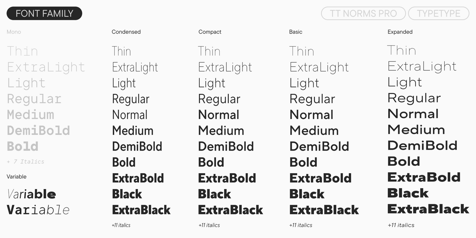
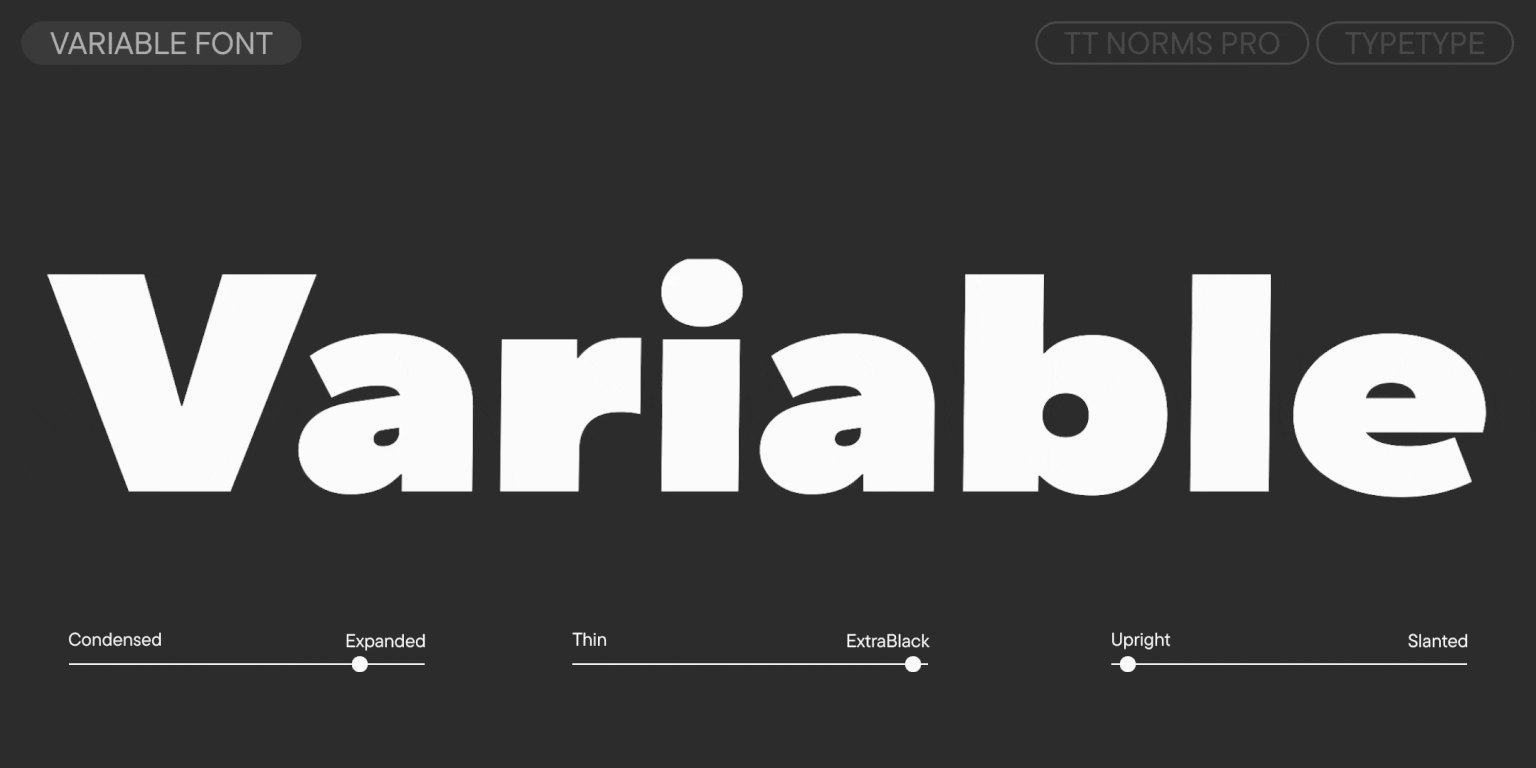
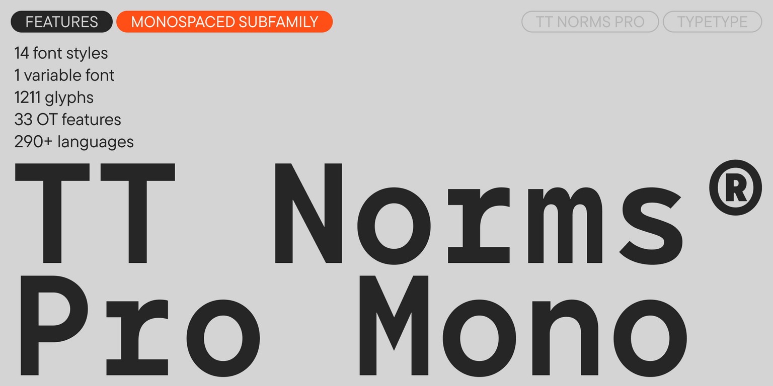
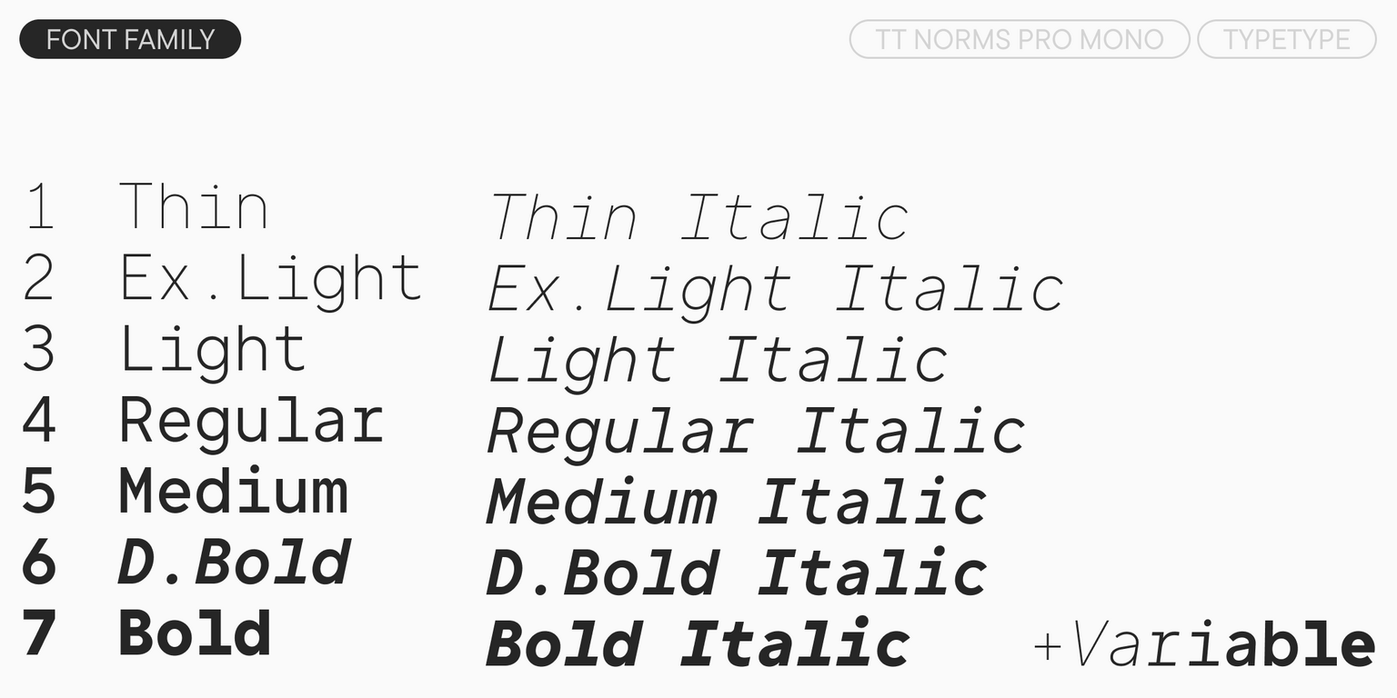
- 104 styles: 44 uprights, 44 italics, and 2 variable fonts (TT Norms® Pro Variable, which varies along three axes, and TT Norms® Pro Mono Variable, which varies by weight and slant)
- 2,564 glyphs per style, including an extended set of punctuation, symbols, and currencies (including the dirham)
- 4 widths: TT Norms® Pro with classic proportions, TT Norms® Pro Compact with more compact proportions, TT Norms® Pro Condensed with narrow proportions, and TT Norms® Pro Expanded with wider proportions, as well as the monospaced font TT Norms® Pro Mono
- 46 OpenType features, including a large number of ligatures, fractions, numerators, and denominators
- 20 stylistic sets
- Support for over 290 languages, including 9 based on the Arabic alphabet
- Flawless kerning and manual TrueType hinting
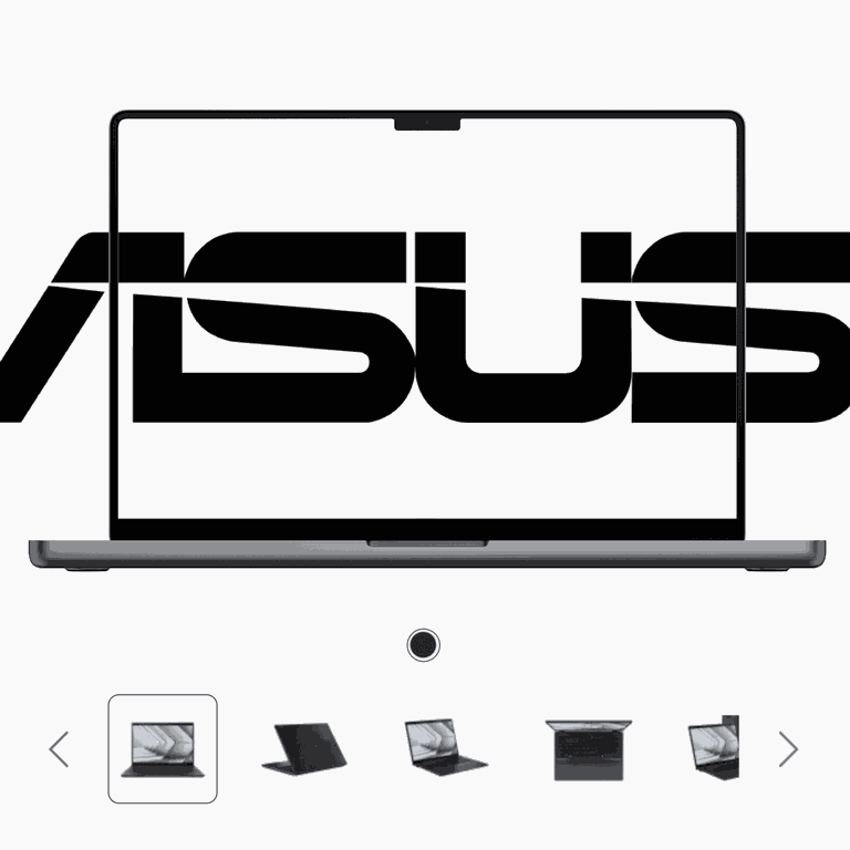
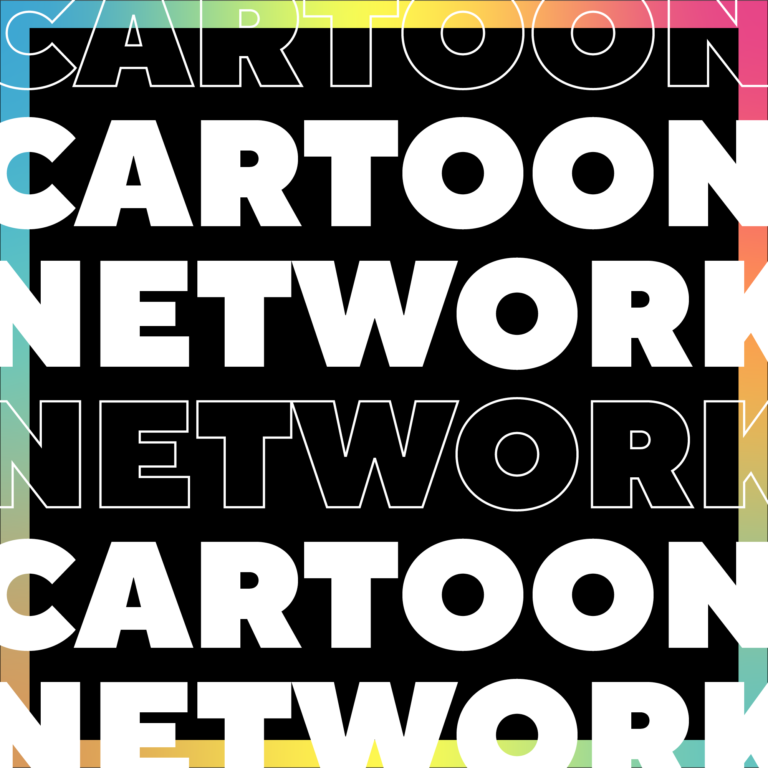
TT Norms® Pro has already become the signature font for brands such as ASUS, AliExpress, CBSN, DreamWorks, Doordash, Intercom, and many others. Upon request, TT Norms® Pro can be customized—we will adapt the font to your project. You can learn more about customization in the relevant section.
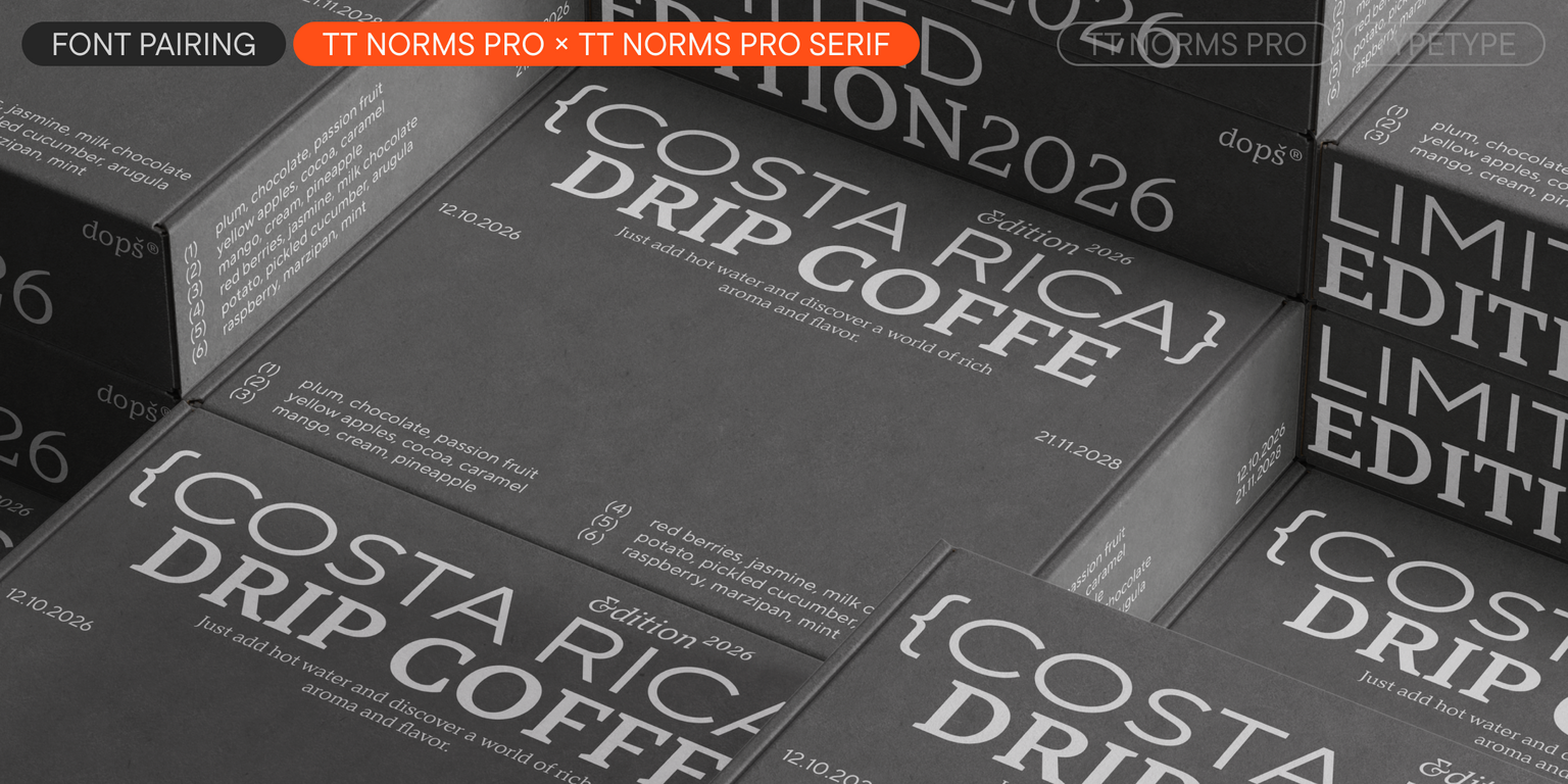
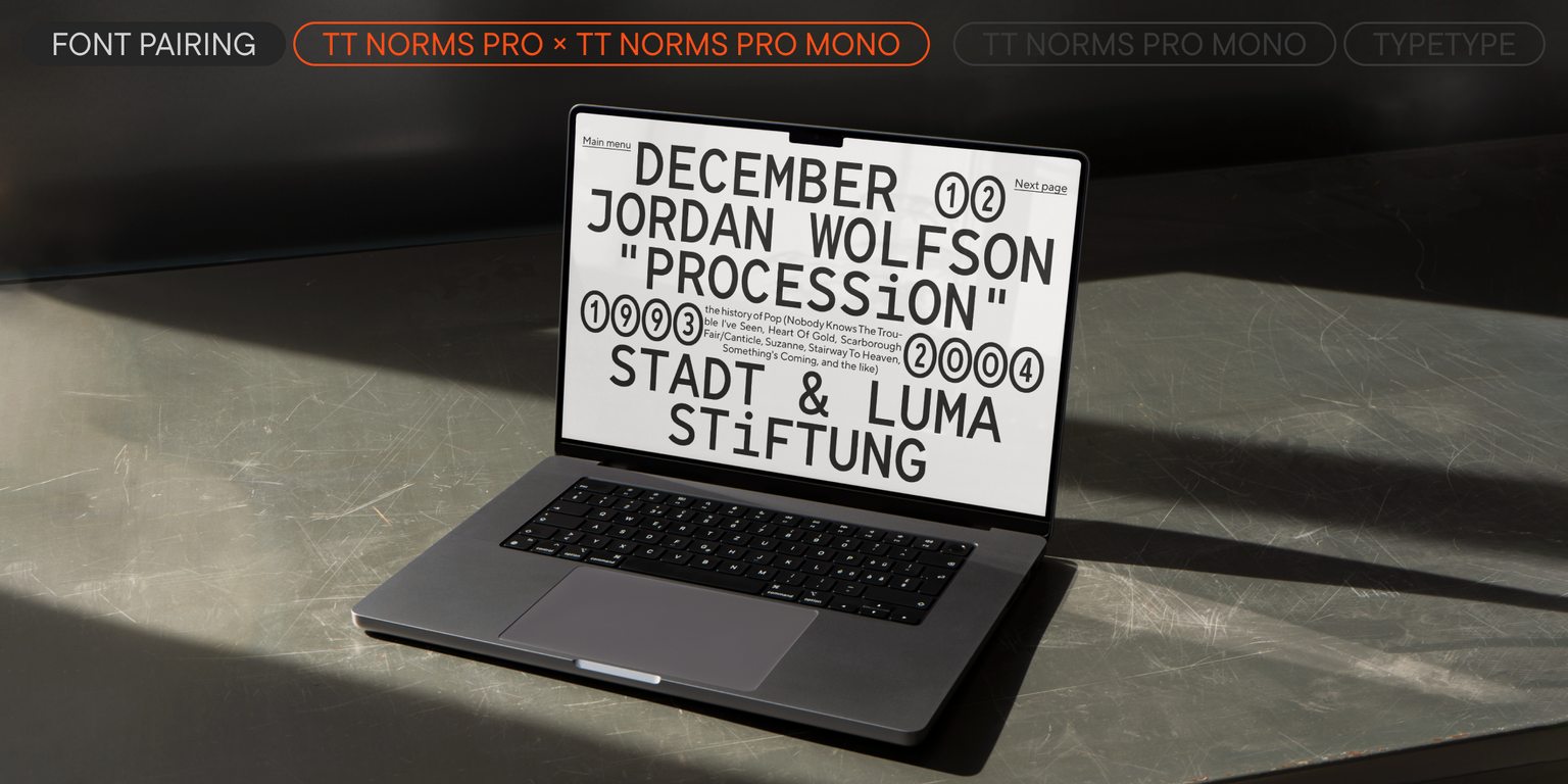
In addition to the TT Norms® Pro family, we created the serif TT Norms® Pro Serif. The fonts combine perfectly with each other, creating a great font pair.