In this article we will tell you about variable fonts and what an interesting and useful, yet underrated instrument they are. We will also mention their disadvantages and nuances of working with them.
The article will cover the following issues:
- Creation history
- Technical peculiarities
- Advantages and disadvantages
- Use peculiarities
- Creative use examples
Creation history
To start with, let’s talk about the history of variable fonts technology development.
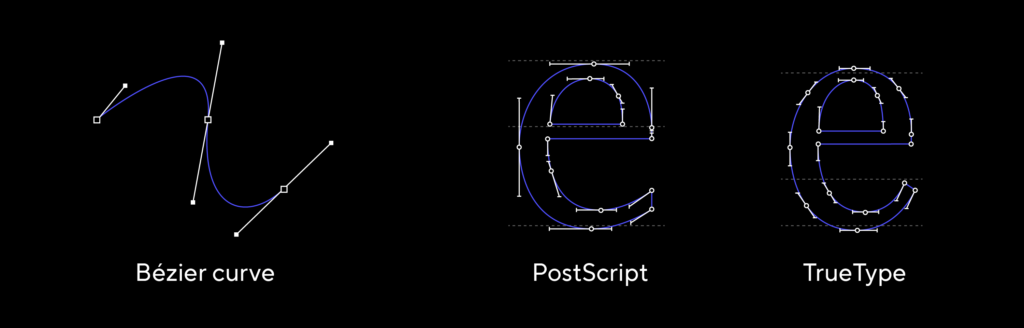
In late 1980s, Adobe presented the PostScript format and Apple presented the TrueType format for font file development. They both used Bezier curves to construct characters. We use these formats in their updated forms to this day when working with font files.
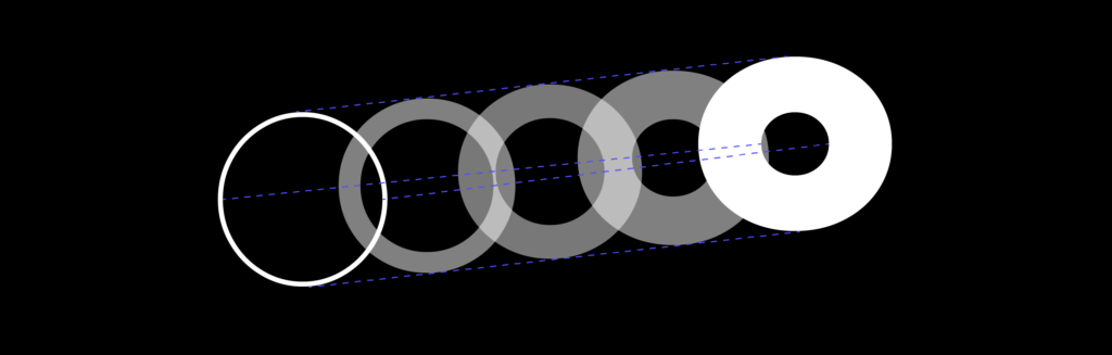
In 1991, Adobe presented the Multiple Master technology as an extension of the PostScript format. It allowed storing several contour variants for one glyph in the same font file. These variants were the end points on a scale, between which you could find intermediary values, for example, in order to change the weight or width.
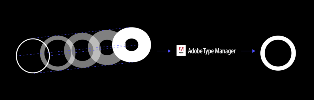
To use such a font, a static face had to be generated first using a special program (Adobe Type Manager). It then had to be uploaded to the system for use in a graphic editor. Due to the difficulty of use this format has never become popular and font designers continued to create static faces.
In 1997, Adobe and Microsoft together presented the OpenType technology. It was based on the TrueType format but allowed for a much larger number of characters to be implemented (65000, previously the limit was 256). TrueType also allowed for OT features, without which we can not imagine a modern font anymore. Here we are talking about small capitals support, tabular characters, superiors, stylistic sets, contextual alternates and so on. The OpenType format remains most popular to this day.
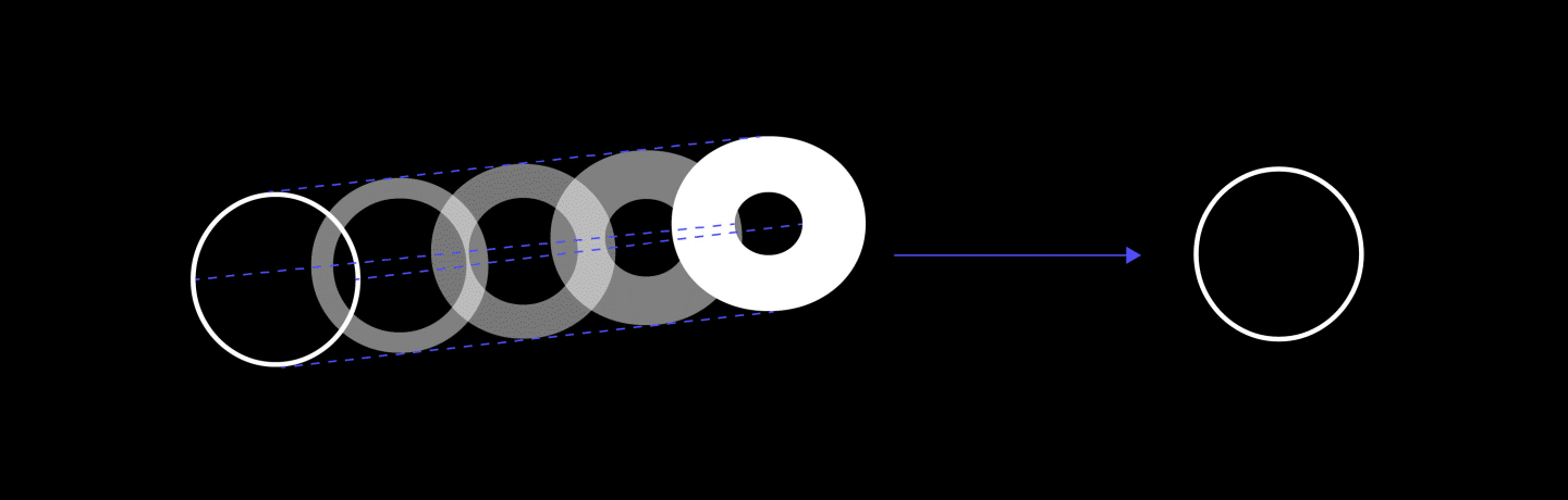
Finally, in 2016, Adobe, Apple, Google, and Microsoft have announced the new version of the OpenType format — OpenType Font Variables. Since then, font designers can write the information on several faces of a font family in the same file. The key point of this format is similar to Multiple Master but has one crucial difference: now static faces don’t have to be generated in advance. Parameters can be set directly in the graphic editor.

Technical peculiarities
Let us have a closer look at how this format is different from the classic OpenType.
When a designer buys a font family, say, a sans serif of 9 weights, he or she obtains 9 separate font files. These faces have been previously prepared by a font designer and the weights were calculated such that the widths are arranged gradually from the lightest to the boldest.

A variable font, on the other hand, consists of only one file and the range of faces is limited only by the thinnest and the boldest ones. And the designer can choose any one among them that he or she likes.
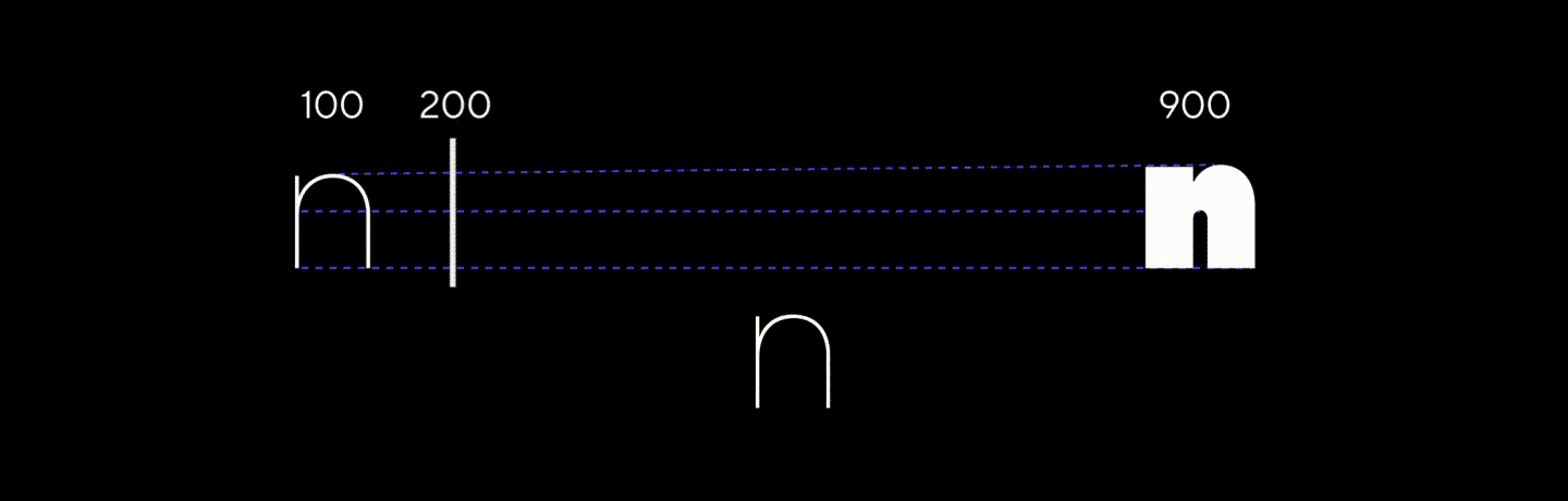
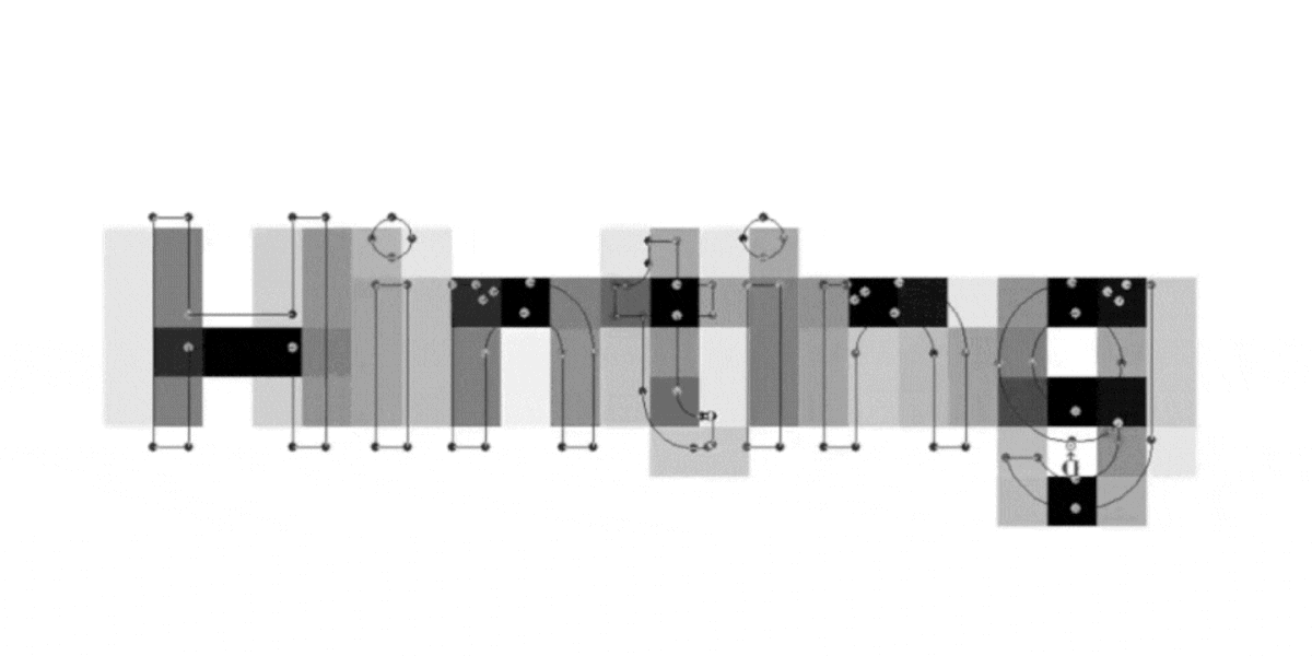
If you look into a font, you’ll see that each character has anchor points, based on which it is constructed. If the number of these points is the same in the lightest and boldest faces, the program can connect them and calculate the midpoint positions. Font development is, of course, not as simple and straightforward, and we often have to specify more than two masters, but this does not affect user experience.
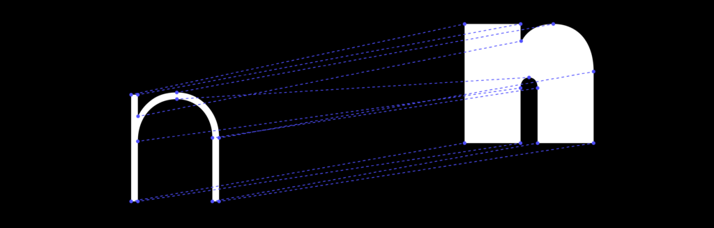
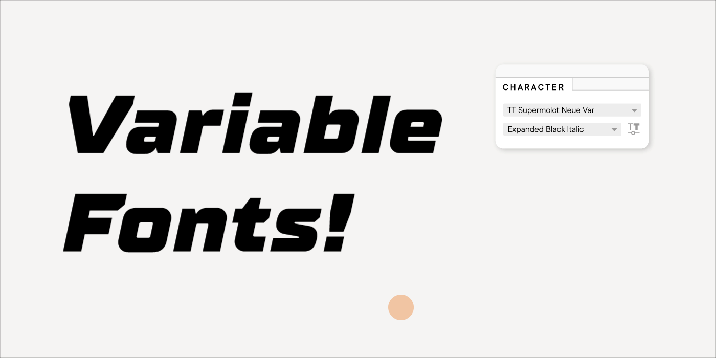
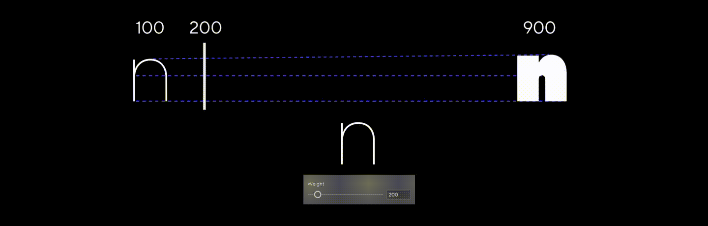
The range between two end faces is called an axis. In graphic editors like Adobe it looks like a slider that can be adjusted to choose the needed value.
Variation axes options
The first variant is the weight axis that has already been described. In most font families, there are several faces of different weights and theoretically they all can be variable.

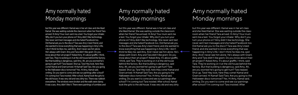
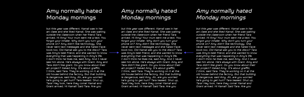
Let’s imagine that you have bought a regular font family and plan to use it to set a book or a website with a large array of text. You know what the optimal weight of the main text should be so that it is comfortable to read. But you have a problem: the regular face in the family looks too light, and the next one, say, the medium, looks too bold. A weight between regular and medium would be perfect, but it does not exist. But if you were using a variable font, you could move the slider in the editor or specify a custom value in CSS to create it.
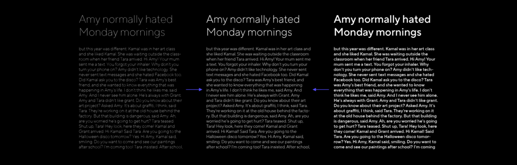
The next rather frequent axis is the width of the font. In static families, you have several width options, for example, Normal, Condensed or Extended. In the variable font you can manually select the needed width between the narrowest and the broadest faces.

This setting may come in handy if you are setting the text in narrow columns which have to fit in as much text as possible. Normal width is too broad for this purpose, and the narrow is inconvenient for reading large texts. A variable font would have allowed you to make the face a little narrower without compromising its readability.
The third axis is slant. It is applicable when the characters in the slanted face are constructed the same way as in the upright. Most often, this variant can be found in sans serifs.

You can choose the incline angle yourself, thus regulating how much this face will stand out in the text. This option is useful if you need to set a large text array in an inclined face without causing the reader any discomfort.
Finally, an axis that is less widely spread but is also embedded into the OTF Var format, the optical size axis.

You might have seen Display and Text subfamilies in variable fonts. The first usually stands out due to its higher contrast, more detail and narrower spacing. Display faces are used in titles, posters, and other cases where large text size is needed.

The Text subfamily, on the contrary, has lower contrast and fewer details. Overall, it is better readable in smaller sizes and large texts.
In a variable font, you can generate an intermediary variant which will still be well readable in small sizes but more refined than a simple text face. This variant would be ideal in smaller titles, for example.
We have now covered the axes that were implemented by the format developers. Specific names have been developed for them:
- wght — weight
- wdth — width
- slnt — slant
- ital — italics
- opsz — optical size
But font designers can also invent and implement their own axes.
You can find completed examples where the following parameters change: serif length, height of lowercase and uppercase characters, height of ascenders and descenders, contrast, etc.

A font can of course be changed decoratively. Only the author’s imagination is the limit here.
Imagine now that one axis can provide you with a thousand options for font faces. If you have two axes, there are now a million options. Now, when you have custom axes, the font options become endless.
To sum up, almost any typographic task can be solved with the use of variable fonts.
Advantages and disadvantages of variable fonts
Now let us discuss some of the problems we encounter when using variable fonts and interesting use cases of variable fonts.
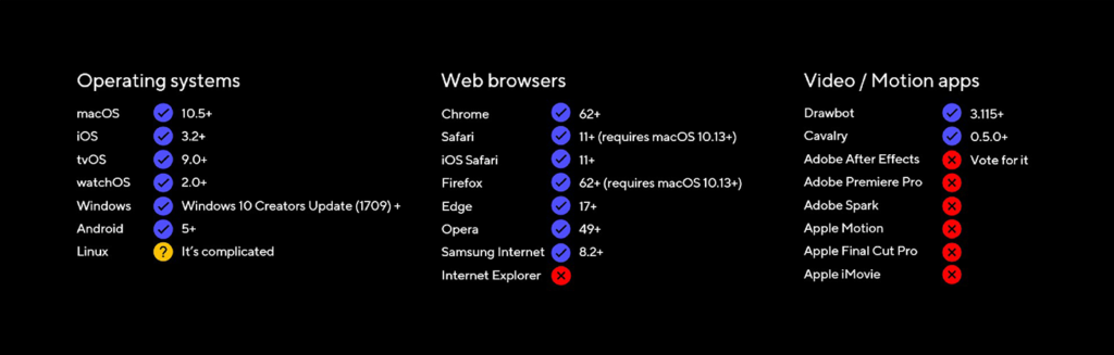
It should also be noted that the variable font technology has existed for many years now. However, while the technology of font editors advanced greatly and variable fonts have become so much easier to create, they are still not very popular or widely used. This means that either there is not yet an area where they can be used or that the product itself does not correspond to the market demand, or that the instruments do not allow using them. At the moment, not all graphic editors and browsers support variable fonts — for example, not all browsers support design apps.
The greatest disadvantage of variable fonts is the low quality. Most variable fonts are of mediocre quality, and consequently, they may act up at the worst moment when in use.

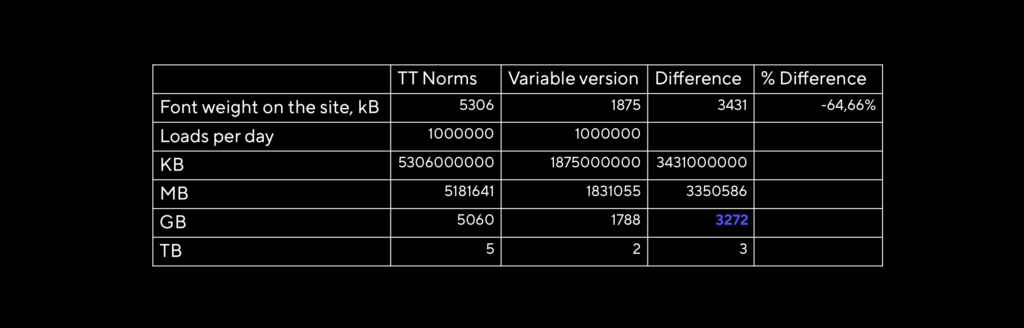
Another example. If you have a website that is loaded 1000000 times per day and uses the full Norms PRO family, it takes up 5306 Kbytes on the webpage. If you use the variable version of the family, it only takes 1875 Kbytes. Have a close look at the table below. We see that with this huge number of loads per day, there can be a total difference of 3272 Gb that has to be loaded from the server. Obviously, it does not matter much for each individual loading instance, but when summed up, it matters.
It also has to be noted that most variable fonts are not hinted. It is a difficult process that has to be learned. Because of this, variable fonts may not always display properly in small sizes.
How to use variable fonts
Now let us talk about using variable fonts in work.
Let us first look at Adobe Illustrator. For instance, you have already typed a text and would like to choose an already installed variable font for it. Such fonts have a «var» sign next to them in the list. By the way, Adobe has its own variable fonts installed in the latest software versions, so you can start experimenting with them.
Once you have chosen a variable font, an additional button Variable Font appears in the Character panel. All variable axes present in the font hide behind it, and you can change the parameters with the sliders. You can see the results immediately. Other settings in this panel remain unchanged.
You can also choose one of the faces from the list and use that family as static.
The process in Sketch is absolutely the same, but it has no special marks next to variable fonts.
Variable fonts can be implemented in the web with help of CSS. We will not cover this in detail, but we can have a look at how variable fonts are integrated in the web.
Here you can see that changing the properties of variable fonts is available using CSS Transitions.
This demo shows support for CSS Animation.
And also an example of how it is possible to animate each letter separately.
You can read more about using variable fonts on the web in Richard Rutter’s articles on Medium:
Get started with variable fonts — a quick but rich introduction.
How to use variable fonts in the real world — description of problems you may encounter and how to solve them.
Creative use examples
Let’s have a look at creative examples — how you can use variable fonts with a bit of imagination.
Example of stretching the font depending on the size of the container.
Example of interesting attempts to use variable fonts in AR.
Example of how a font can change depending on the looking distance.
Example of adapting font saturation depending on reading conditions, lightning in this case.
You can make a step further and create moving images from the font, as axis-praxis suggest. You can even make them colorful by overlaying several letters, as you may see in Toshi Omagari’s experiments. But this is, of course, beyond the initial purposes of font use.
Useful sources
We would like to suggest several resources where you can try working with variable fonts.
First, this is axis-praxis.org that has a large collection of variable fonts. You can also upload font you have there.
Second, there is also v-fonts.com where you can try different fonts in their simplified form.
Finally, there’s the great website that we actively use in our work to test variable fonts, dinamodarkroom.com by Dinamo. There you can test not only variable axes, but opentype features as well, and upload static fonts with defined parameters.
Instead of a conclusion
Variable fonts have the chance to become an integral part of the font world. In the last years, there was a lot of talk about them, but they have not become widespread yet. At present, they are instruments to solve an array of specific tasks. We also have to note that there appear increasingly more variable fonts. They will take over the world! It’s only a question of time!