


About font family
Introducing the legendary TT Drugs version 2.100!
We’ve given the font a beauty injection: added a new subfamily, enhanced the variable font, and refined its technical aspects.
TT Drugs is a typeface that doesn’t feature serifs but stands out for its high contrast. Its narrow terminals lend an elegant and sophisticated appearance. Interestingly, the upper parts of stems in letters like ‘n’, ‘m’, ‘p’, ‘q’, ‘r’ and the lower elements of strokes in ‘a’ and ‘u’ are slightly curved. These details make the font unique and add refinement while maintaining its serious character.
The typeface’s name reflects the story of its creation: the font family was initially intended to be used for the pharmaceutical industry. However, in practical use, the font revealed its multiple dimensions and seamlessly blended with differently themed projects. After the update, the typeface has become even more versatile, so now only its provocative title reminds us of the pharmaceutical past of TT Drugs.
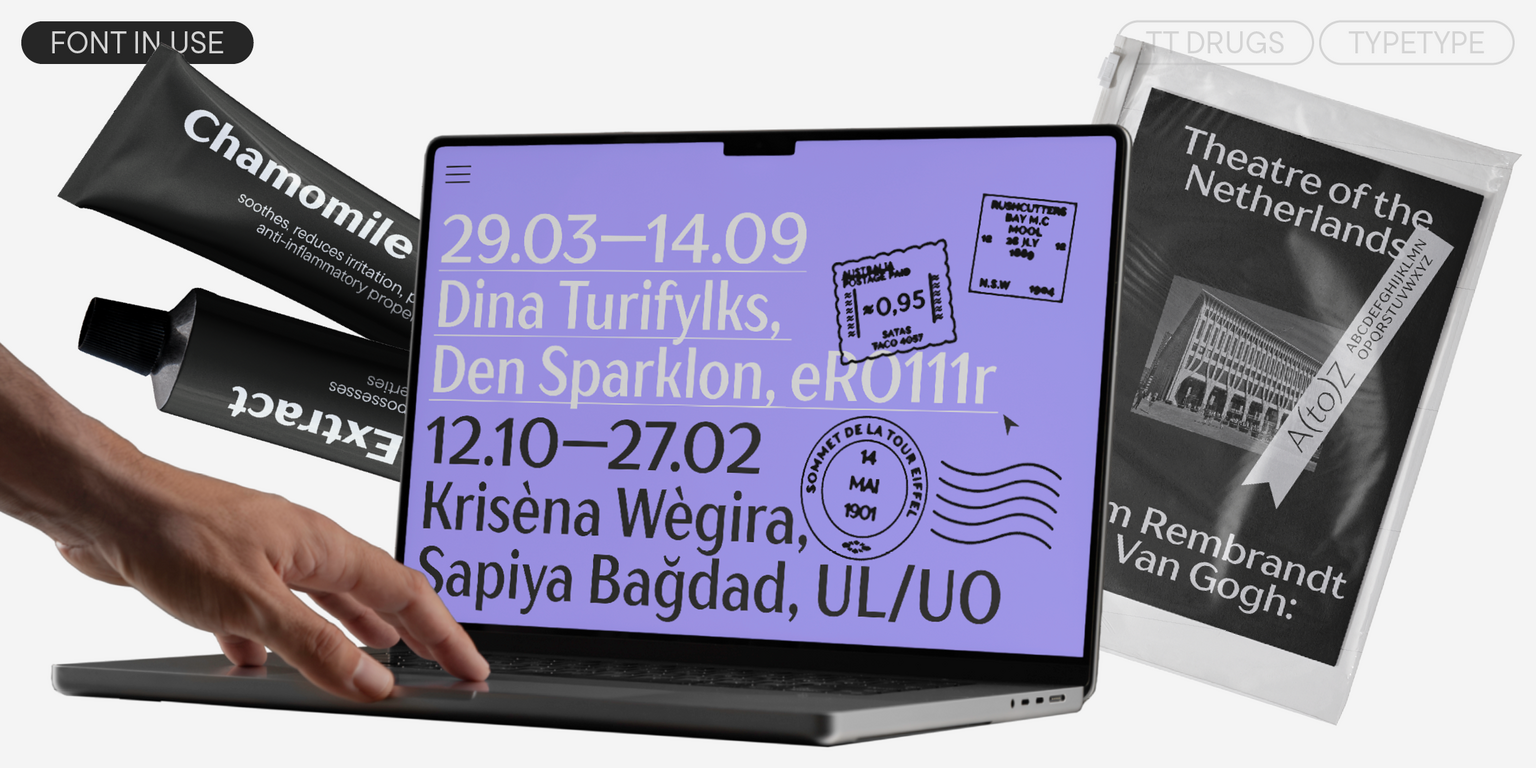
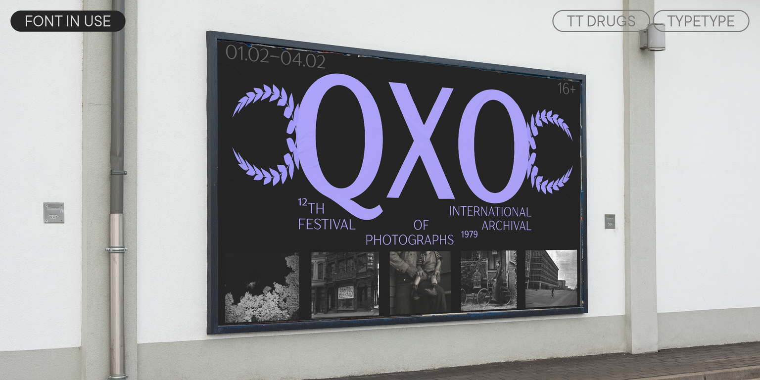
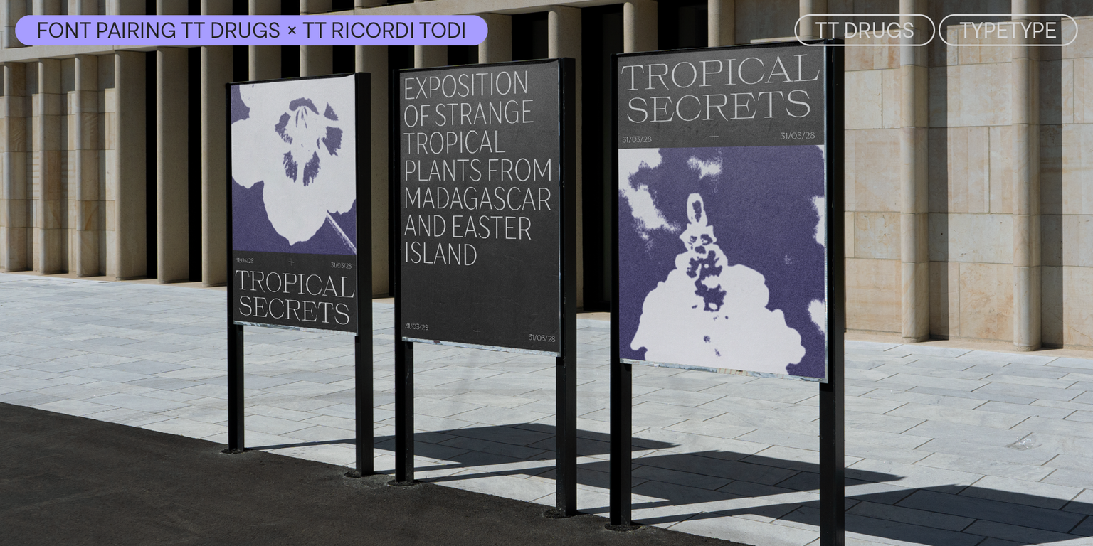
The updated font can easily become part of a skincare brand’s visual identity, adorn a design magazine cover, appear on a healthy food restaurant signage, or feature in a classical concert poster.
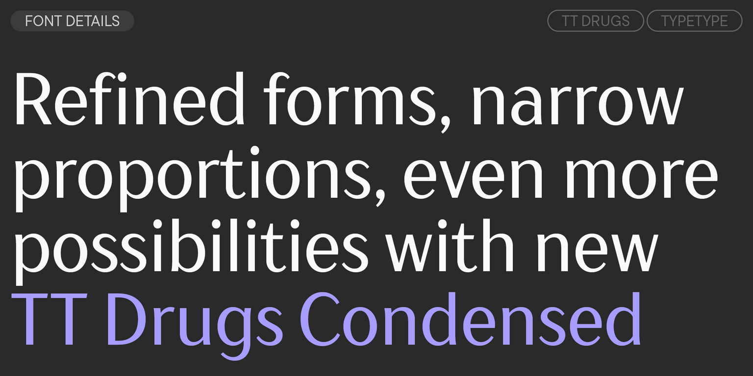
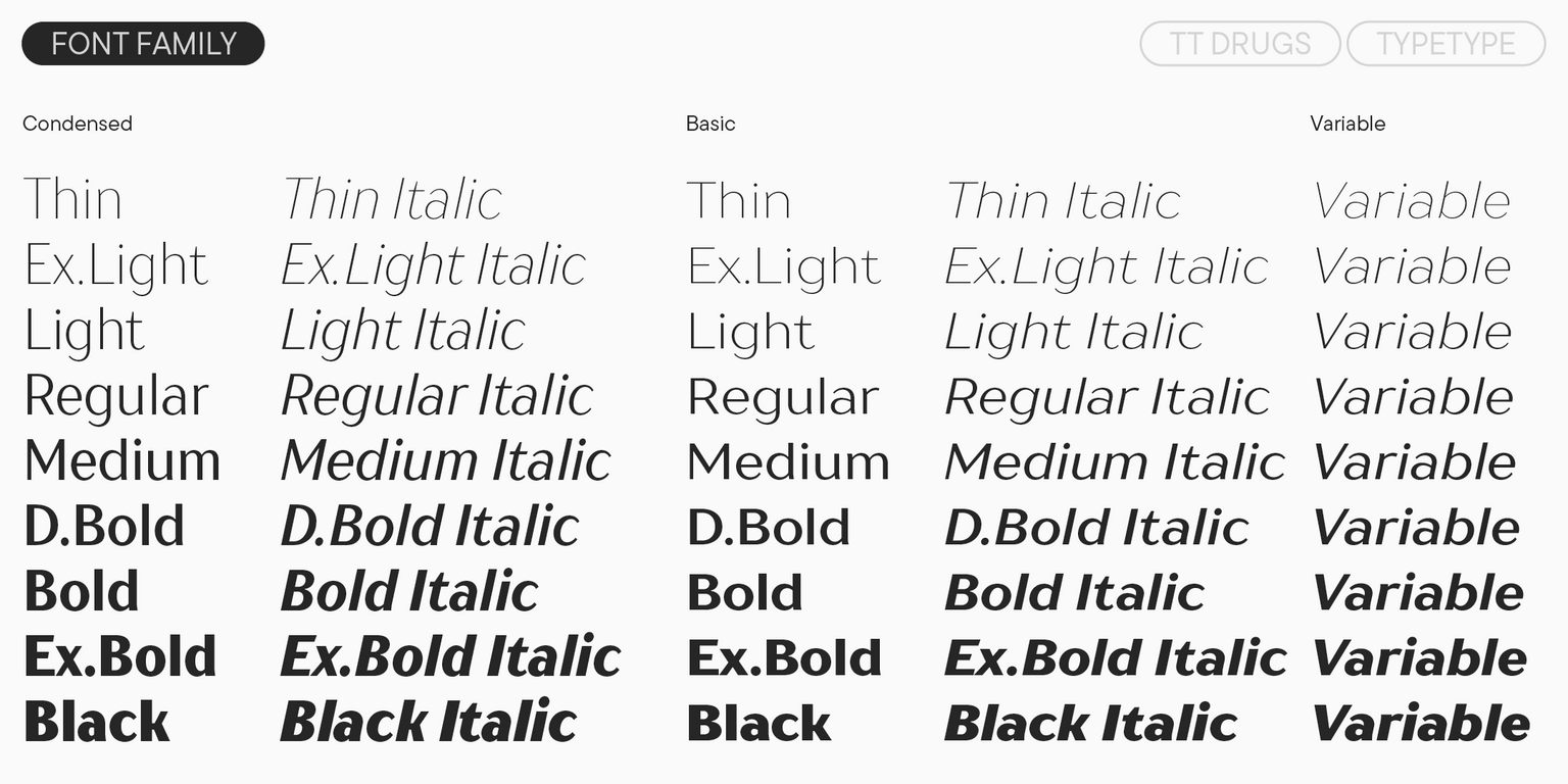
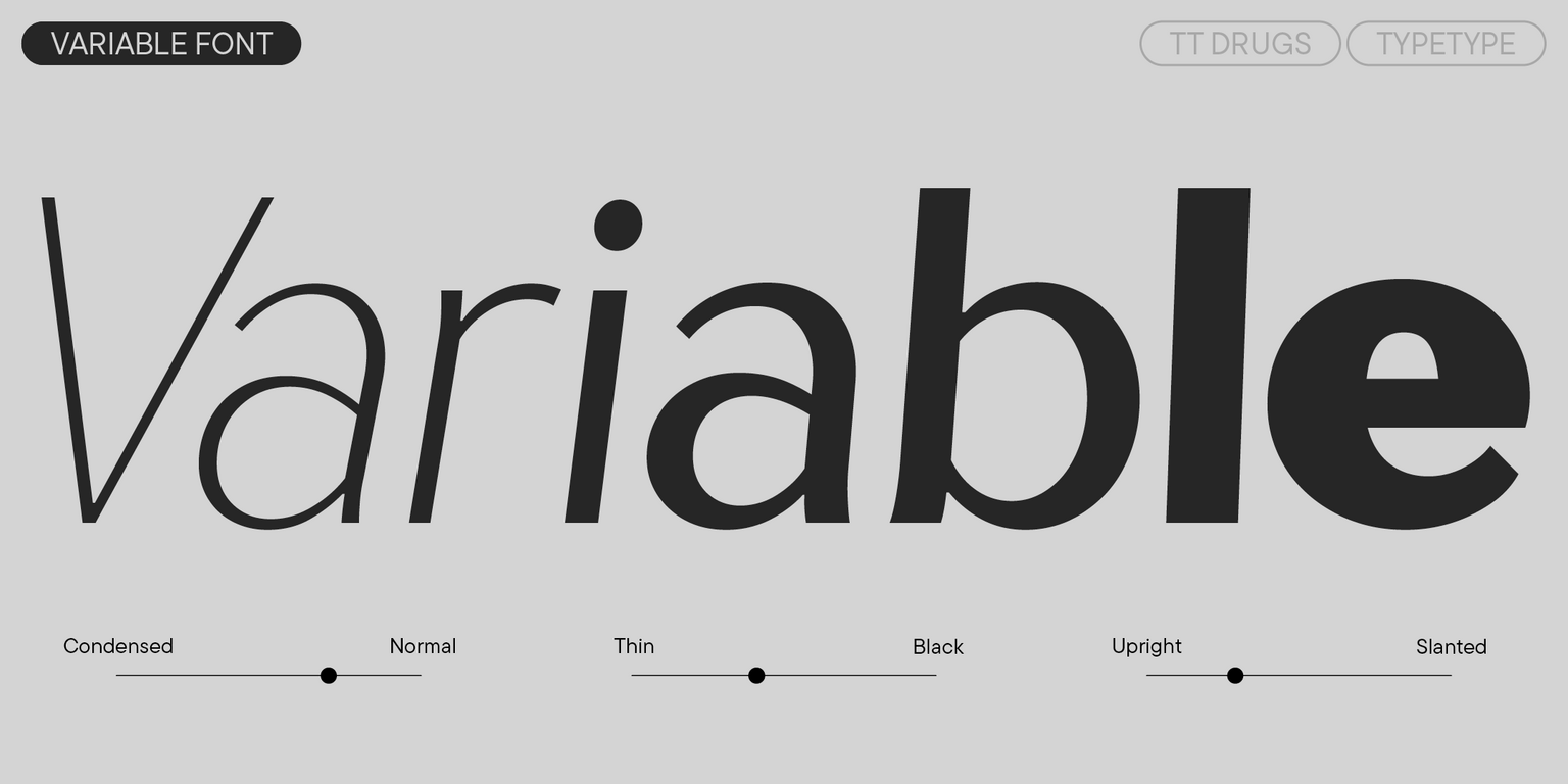
We completely redesigned TT Drugs: recalculated its weight, made the graphics more resonant, clean, and modern. We critically reimagined Cyrillic forms and eliminated ambiguous solutions. Version 2.100 introduces a Condensed subfamily with 18 font styles—9 upright and 9 italic. We’ve also added a Width axis to the variable font, enabling changes across three axes. Additionally, we’ve updated kerning and hinting.
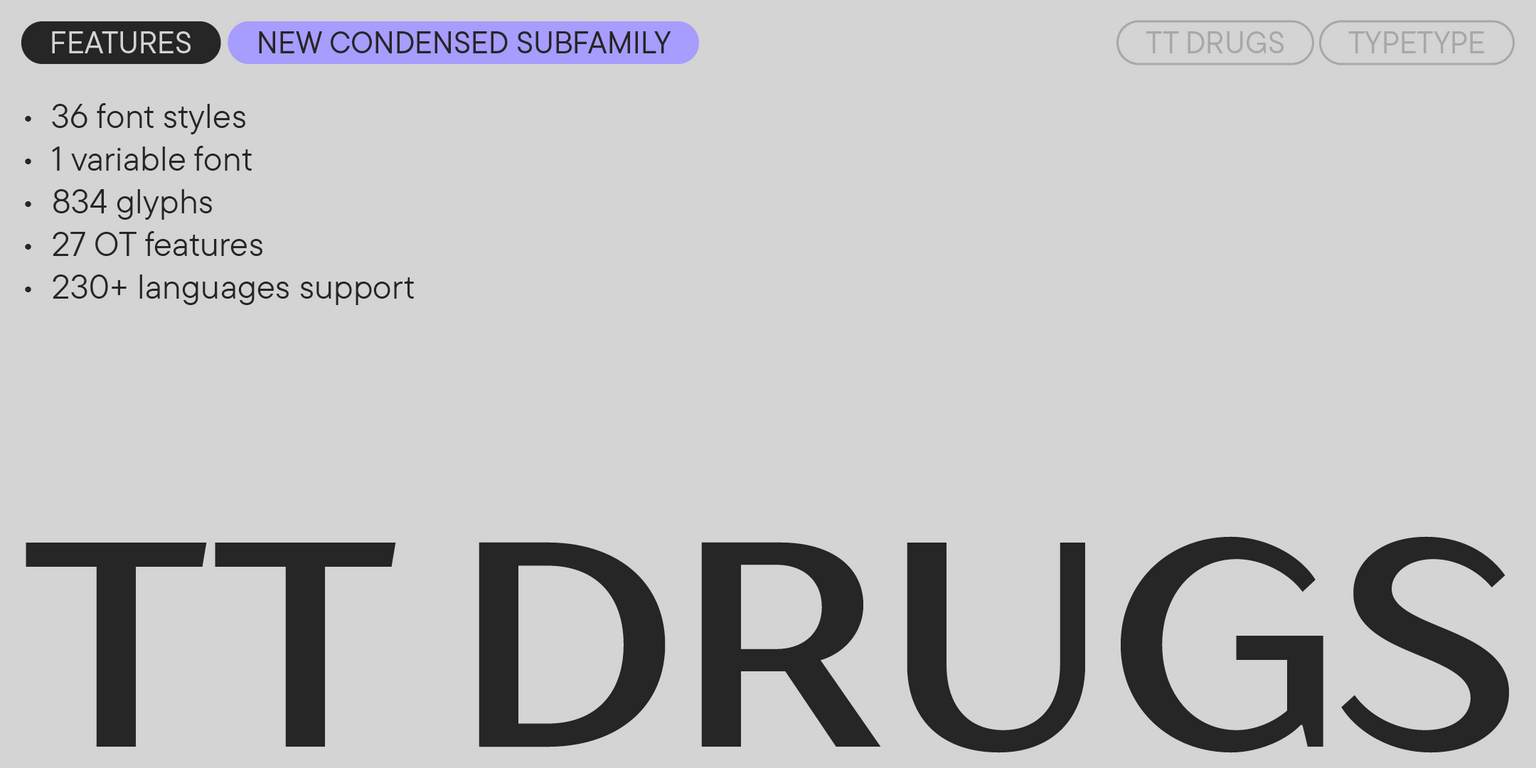
The updated TT Drugs includes:
- 37 styles: 18 upright, 18 italic, and 1 variable font
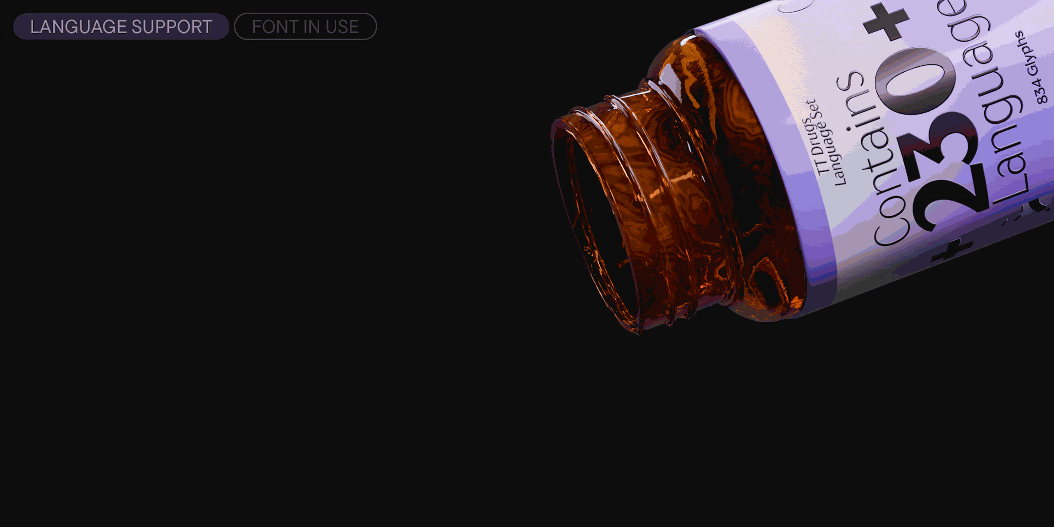
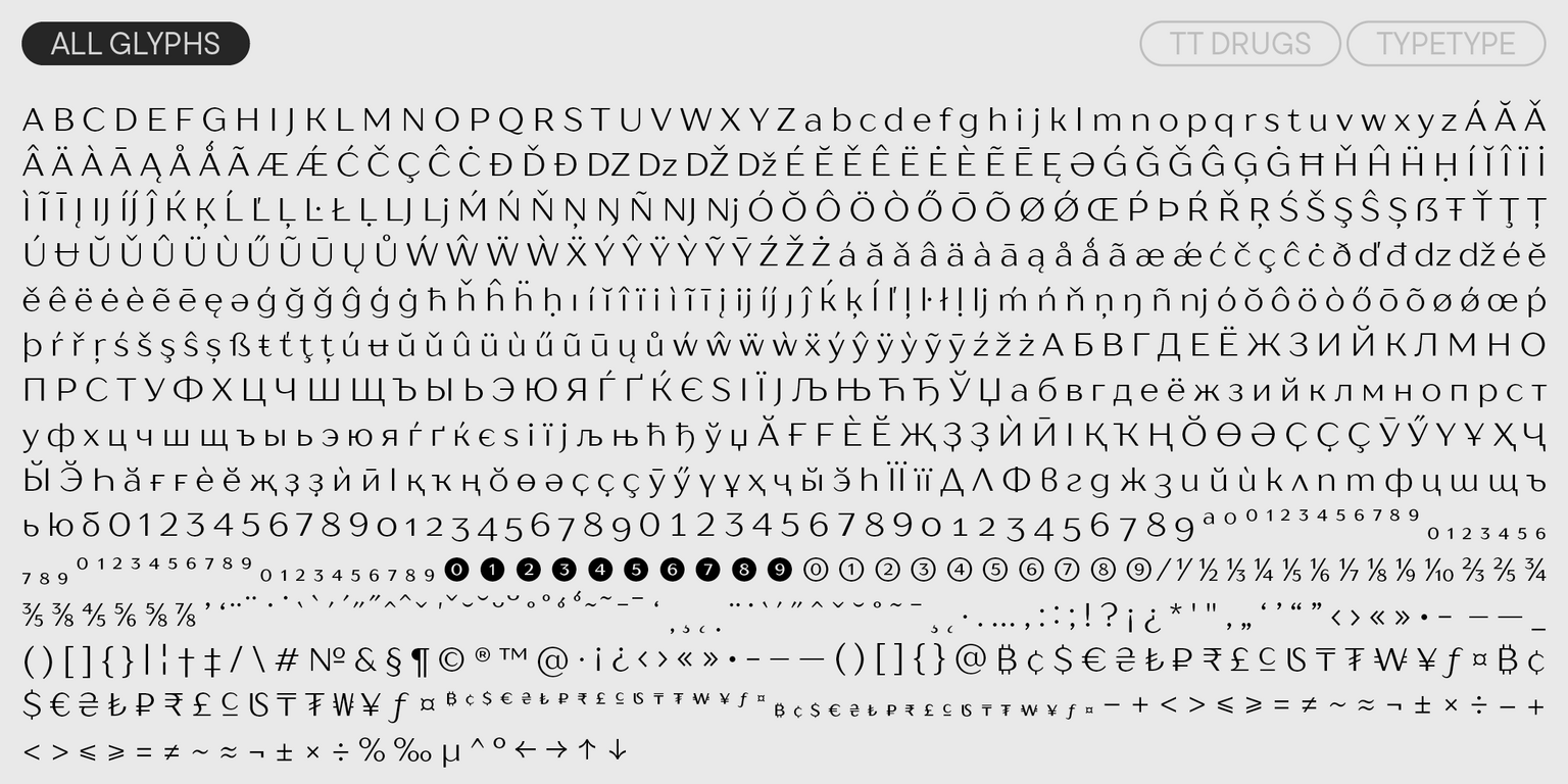
- 834 characters per style
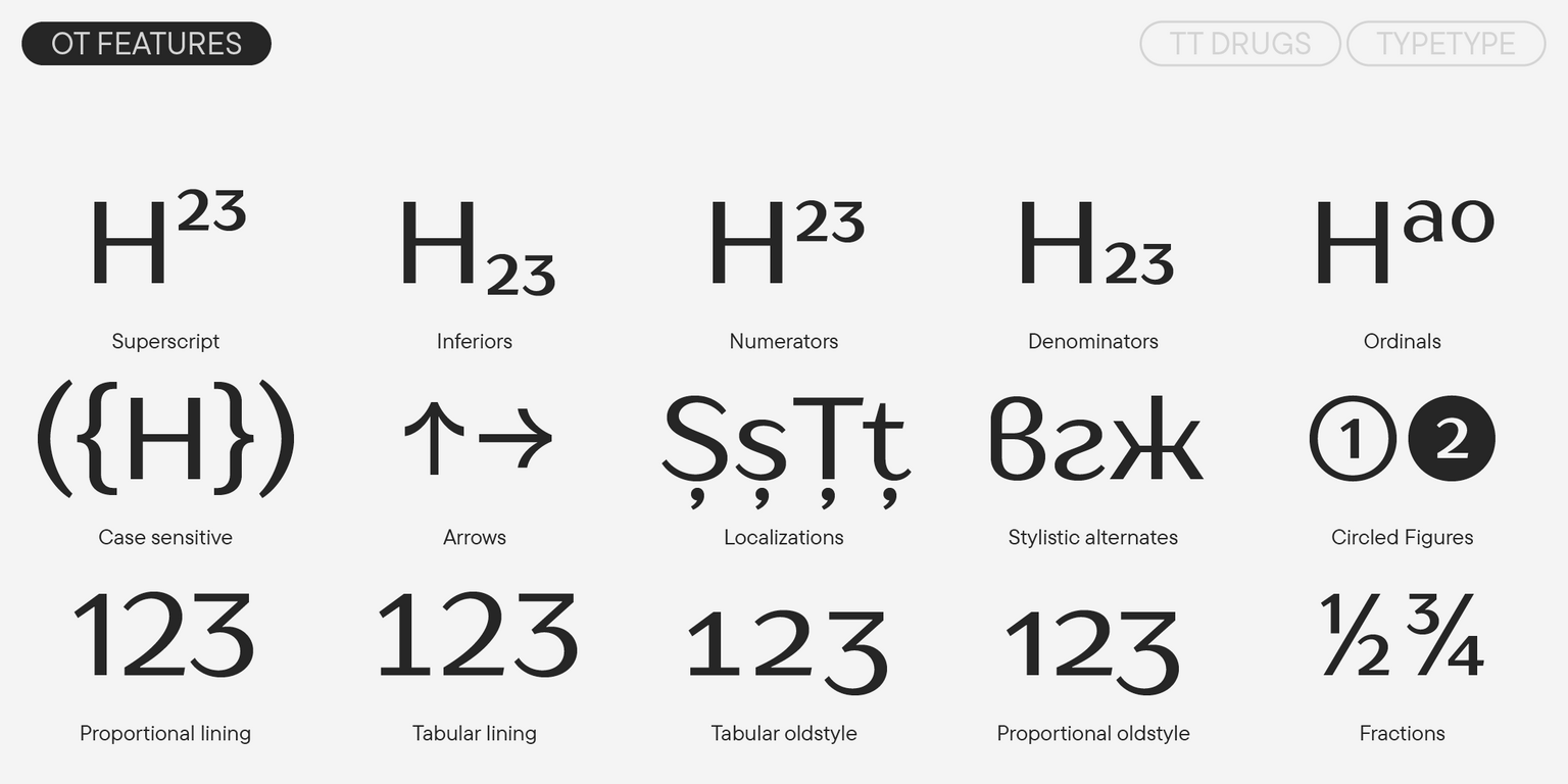
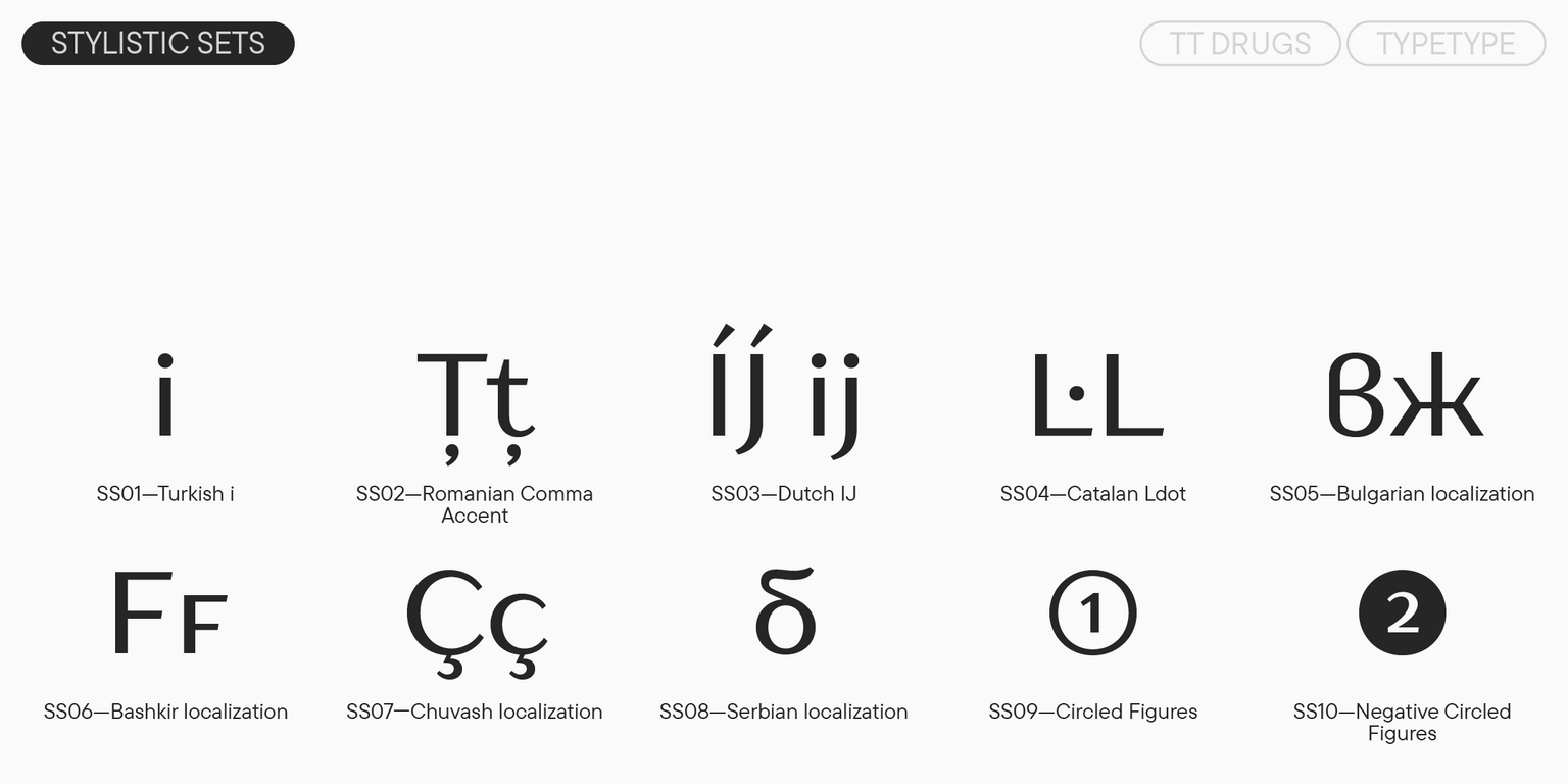
- 27 OpenType features
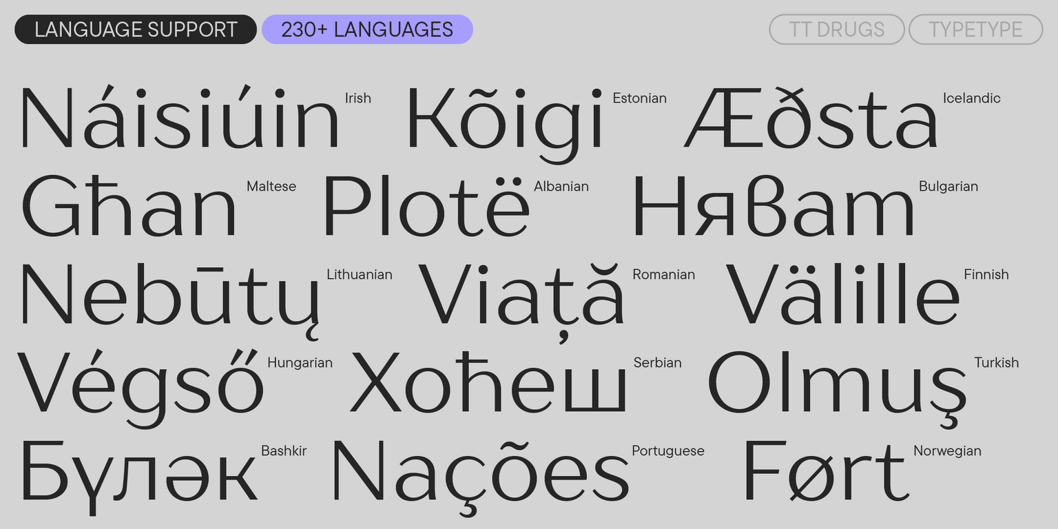
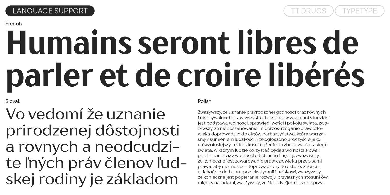
- Support for over 230 languages
TT Drugs: a magic pill for your projects (caution: font may cause addiction!)