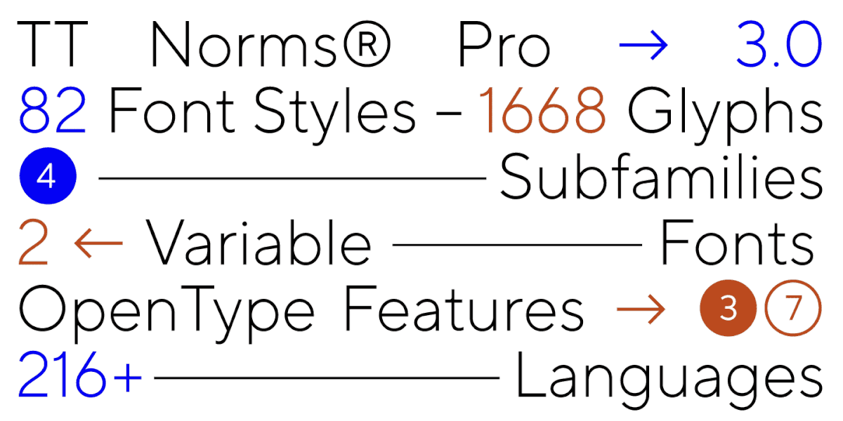
It is often believed that by analyzing a person’s handwriting, you can make judgments about their character. However, why judge someone when it is possible to create a typeface out of the handwriting of a person who made a significant contribution to science? In this article, we delve into a project of this kind.
When expanding character sets of fonts, novice type designers often face difficulties in drawing the eszett character. In this article, we will take a journey through the history of this character, learn about its origin and role in modern typography.
The font is part of the brand, responsible for the emotional context of the information communicated. Is it possible to complement these associations and expand the audience by changing the corporate font?
Creating your first font is most difficult because the designer does not yet know all the details of development, does not have enough visual intuition and experience. When developing a font for the first time, you have to learn a lot in the process, transferring theoretical knowledge about type design to practice, which is always difficult.
TT Hoves is the youngest font in the collection of universal geometric sans serifs. It forms a functional trio with TT Norms® and TT Commons™, yet has its own recognizable character. The TT Hoves font has managed to win the sympathy of designers from all over the world. The font family has been among the studio’s bestsellers since its release on marketplaces, and yet it’s time to update the typeface!
What do you pay attention to when you visit a well-known brand’s website? Most likely your answer is design. And this is really the first thing that catches your eye, which is why international companies work out their corporate identity so thoroughly and carefully, spending a lot of resources on it and going through rebranding from time to time.
It sometimes happens that on paper, a new font seems to be a relatively simple and quick task, but as a result of the work, it turns into one of the largest projects of recent years. Today’s story is about just such a font.
The TT Commons™ Pro font family needs no introduction as it has been TypeType’s best-seller for many years now. These are not just words — since 2018, the font family has been a bestseller for 93% of the time it has been on the sites. TT Commons has a fascinating history, because it was created in 2016, and back then it was not supposed to be released as a commercial font at all.
TT Norms® Pro is one of the most sought-after typefaces in the TypeType collection. More than three reissues in 7 years, first lines in MyFonts ratings, dozens of customizations and reviews. It’s hard to put into words what a valuable experience this font has been for everyone at the foundry, but we will try to tell its full story, with all its dead ends and mistakes, with the first victories and a massive redrawing process.
In January 2022, a new TypeType font TT Fellows was released on sales platforms. Almost immediately, it attracted the attention of designers from all over the world, which is not surprising, because this versatile, concise, and functional typeface is suitable for most modern projects.