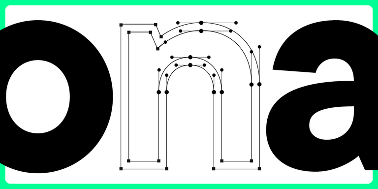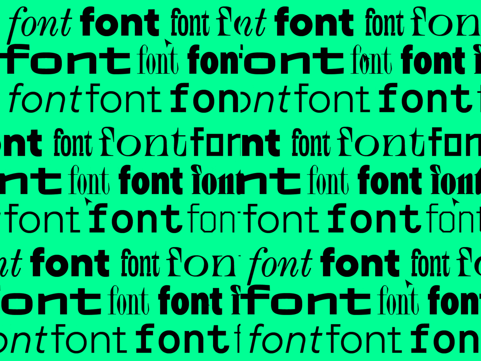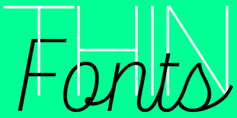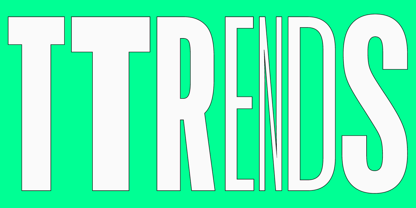
We live in a time when trends shift nearly every day, and typography design trends are no exception. We all encounter typography daily: on the web, in supermarkets, and on shop windows and signs. Outdated design, at the very least, induces boredom; at worst, it fosters distrust in the product or service. However, trendy design looks captivating and attractive.
So, how do you create a fresh, contemporary design in 2024? In this article, we will focus on the latest typography trends that can help you tackle this task.
3D and interactive features
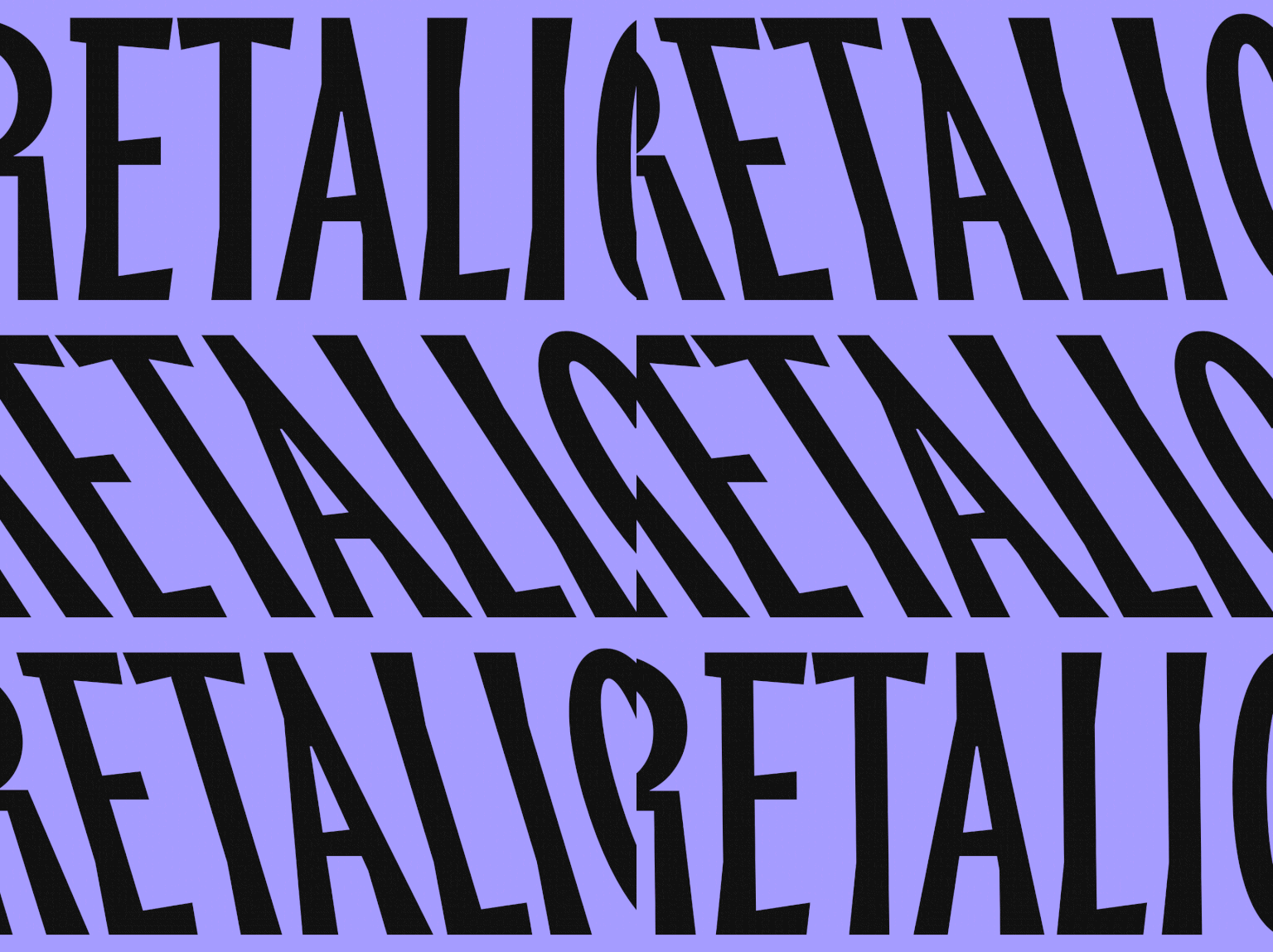
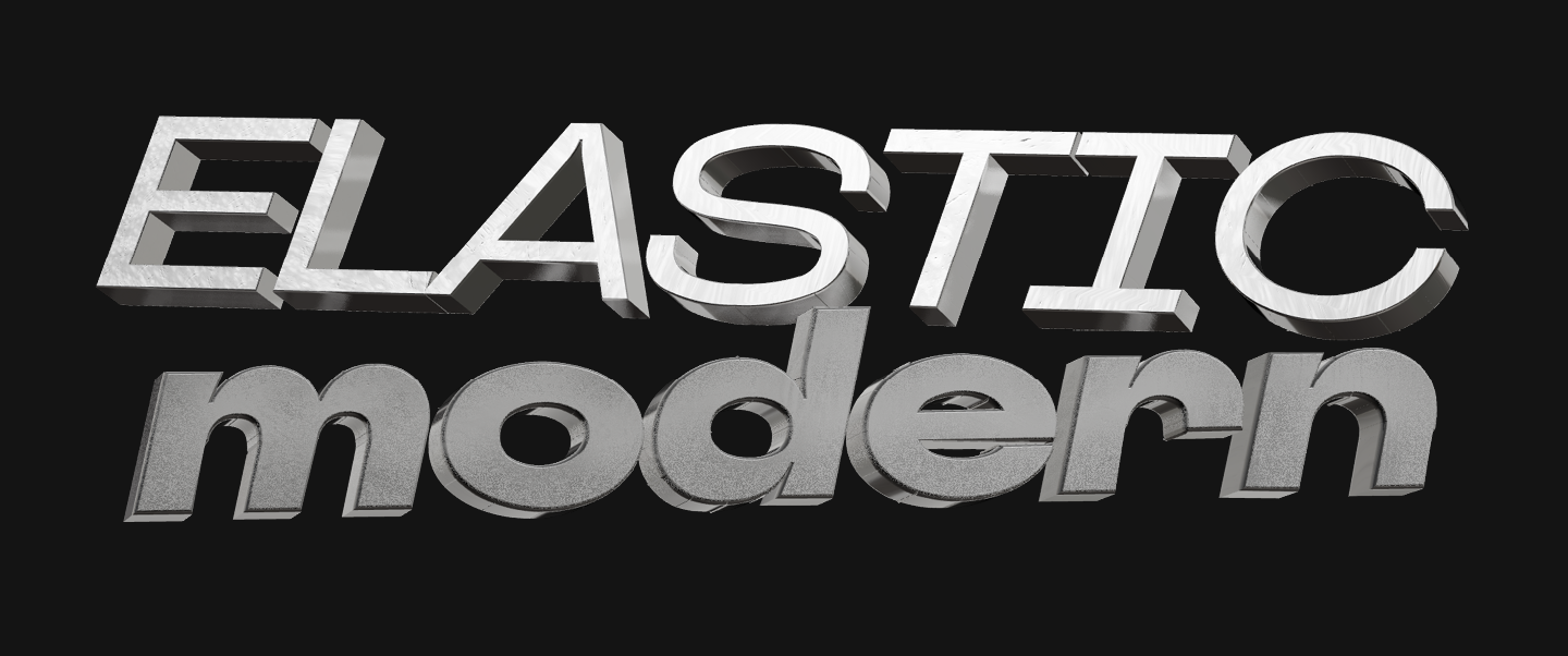
This isn’t a new trend; however, in 2024, it’s still actively developing. Three-dimensional or animated (or both at the same time) letters that visually seem to reach beyond the layout or screen make us want to stretch out our hands and touch them. The higher the quality of a 3D font, the more realistic it looks. Such elements infuse typography with a bold and playful personality, making the design look expressive and distinctive.
Where to apply
This trend suitable where it’s crucial to underscore a sense of modernity and informality, attract attention, and rise above the ordinary. For example, in the branding of youthful fashion brands, on music festival banners, and on the covers of contemporary art magazines and books.
Customized signature fonts
The trend for authenticity and uniqueness is undoubtedly still with us in 2024. Customized fonts give brands an opportunity to express themselves, stand out among others, and create a genuinely memorable design.
Unlike using a ready-made font, customization unveils multiple opportunities for self-expression: upon the client’s request, extra characters can be added to the font, a logo can be implemented, letterforms can be modified to match the brand’s visual identity and become its integral part.
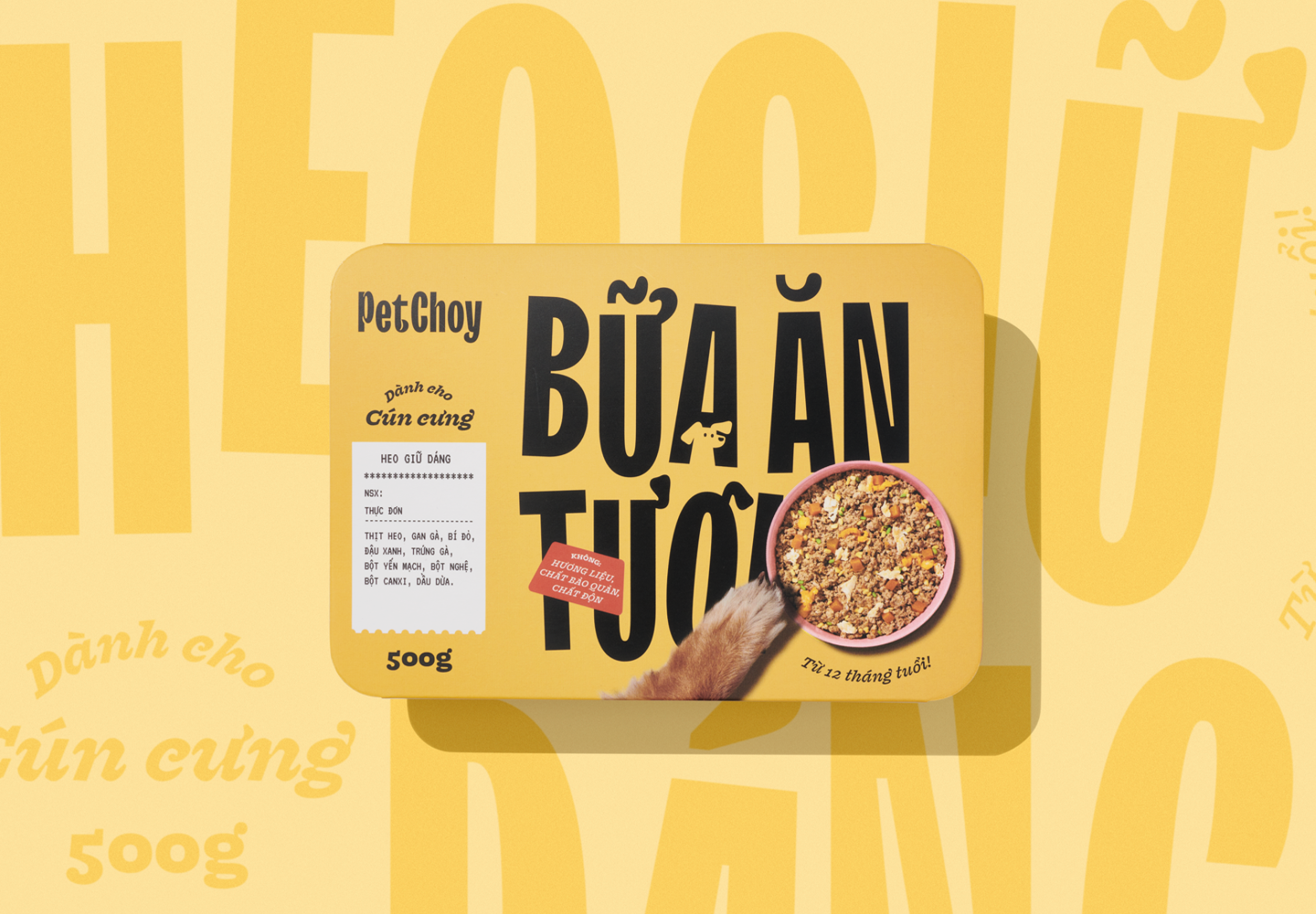
An excellent example of this is the customization of TT Trailers for the rebranding of the Vietnamese company PetChoy, known for producing pet food. We adapted the font to match the brand’s needs by integrating the Vietnamese language support. Moreover, we modified the designs of several characters, adding diacritics shaped like tails and ears as well as cat and dog silhouettes.
Where to apply
Customized fonts are appropriate when you create an integral brand identity and will use the typeface for different tasks and on multiple platforms and carriers (website, packaging, advertising, etc.) For smaller-scale projects, it is better to choose ready-made fonts. Learn more about how to choose the perfect options in our article.
Fonts created with the help of AI
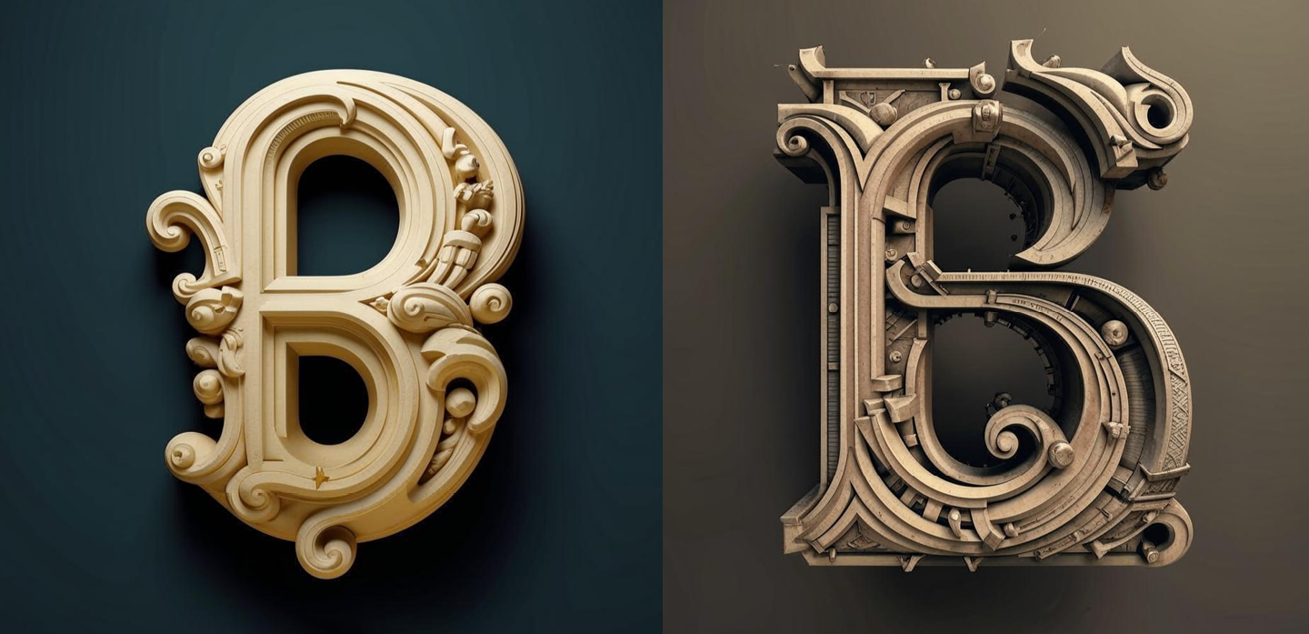
Using artificial intelligence (AI) is quite a new trend that has made its way into many spheres and provoked numerous debates. There is no need to avoid it: AI cannot replace humans and develop a comprehensive typeface, at least for now. However, it can definitely help a font designer break free from their own preconceptions and design something new and unexpected.
Where to apply
Fonts created using artificial intelligence are appropriate for projects that require unconventional solutions. This tool will help you reach a new level of working with fonts, find unusual combinations and textures, or make fonts interactive.
Back to serifs
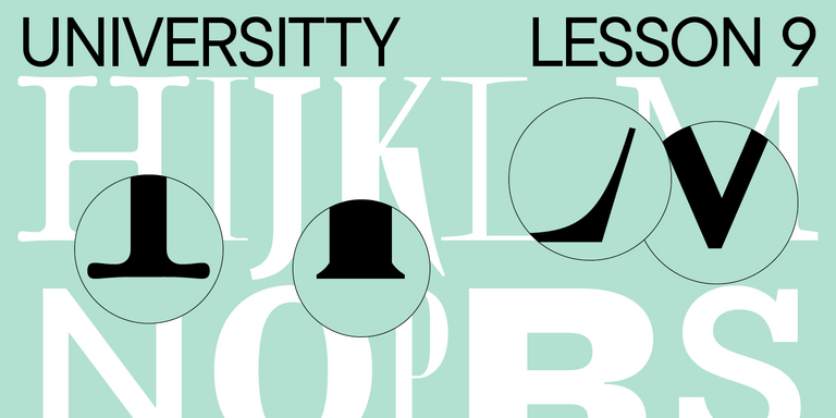
During a certain period, serif fonts lost their popularity as they were seen as old-fashioned, rigid, and dull. But those days are over now—in 2024, the trend for serifs has come back to life. This is not a surprise because modern serif typefaces differ dramatically from the ones we see in last century’s printed publications. Today, serifs are ultra-modern and unusual fonts with captivating and remarkable details.
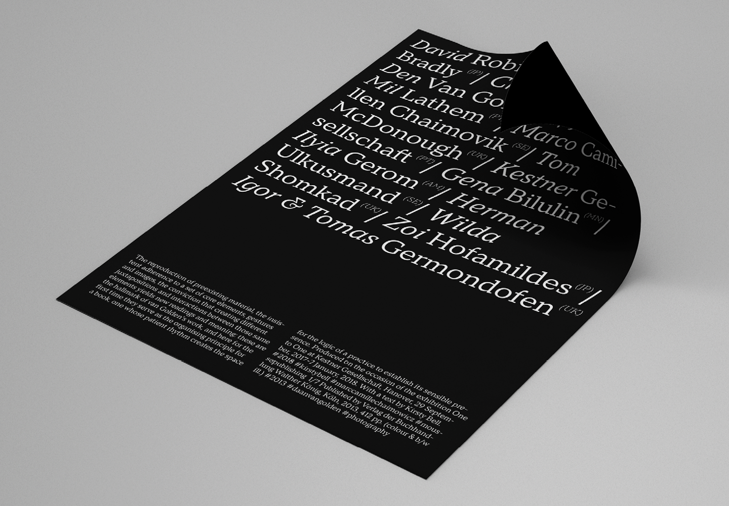
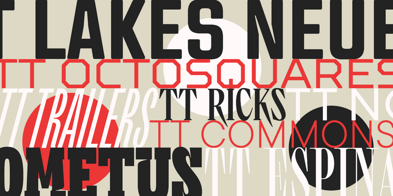
Take a look for yourself at the diversity of modern serif fonts. They can be dynamic, unique, and alien, like TT Alientz Serif, or magical, charming, and elegant, like TT Espina. Even when a font is rather restrained, serifs can look relevant, like, for example, in TT Tricks and TT Norms® Pro Serif.
Where to apply
More active fonts with serifs can perfectly match any modern project’s visual identity, infusing it with a necessary mood and becoming a remarkable accent, ideal for your design idea. Versatile serifs are suited for almost any project and can be used for both highlighting something and typing running text.
High-contrast sans serifs
High-contrast sans serifs are a compromise between serif and sans serif typefaces. They have subtle or almost invisible serifs, and unlike standard sans serifs, they have contrast. These details allow the fonts to maintain the simplicity of slab serifs and impart elegance by intertwining history and modernity.
An excellent example of this kind of font is TT Ricordi Greto. It features a barely noticeable hint of serifs, reflecting the typeface’s origins: it was created as part of an experimental project and based on text on a floor plaque dating to the year 1423. However, this font looks very relevant and stylish nowadays.

Where to apply
High-contrast sans serif shine best in large point sizes, where they unravel all their hidden potential. They will look captivating on magazine covers, packaging, and posters.
Neo-Gothic
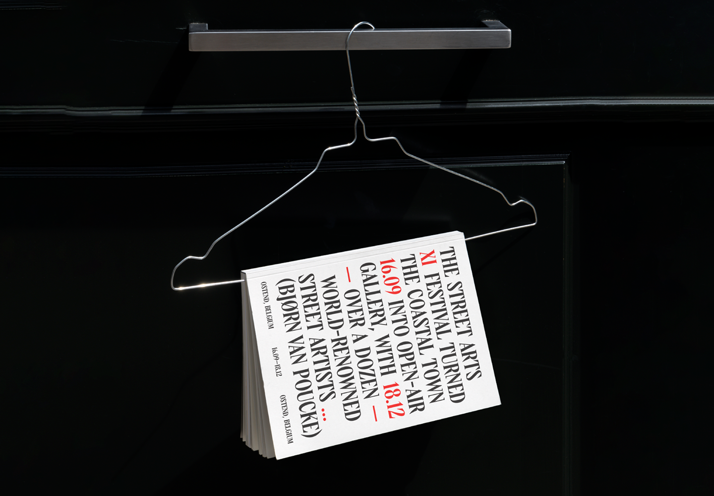
Typefaces inspired by blackletter fonts, references to lettering, contrast, sharp edges, and ornate elements—Neo-Gothic fonts can easily be considered one of the most peculiar global type trends of this year. Familiar methods and elements in such typefaces are rethought and integrated harmoniously into contemporary visual code.
One of the remarkable examples of a trendy typeface with Gothic elements is TT Ricks. This is a bold and angry Antiqua with sharp serifs inspired by the De Vinne typeface, designed in 1892 by Gustav F. Schroeder. The Gothic traits are especially noticeable in the bold font style. Another interesting example is an experimental sans serif TT Carvist. Robust and geometric, it looks as if it’s carved in stone. The Latin character set of this typeface has a Gothic mood, whereas the Cyrillic set’s look is closer to the ancient decorative lettering.
Where to apply
Regardless of historical references, modern fonts with Gothic accents look super relevant. They will infuse your design with an audacious, edgy, and ultra-modern vibe that looks great on event posters, branding, and book and magazine covers.
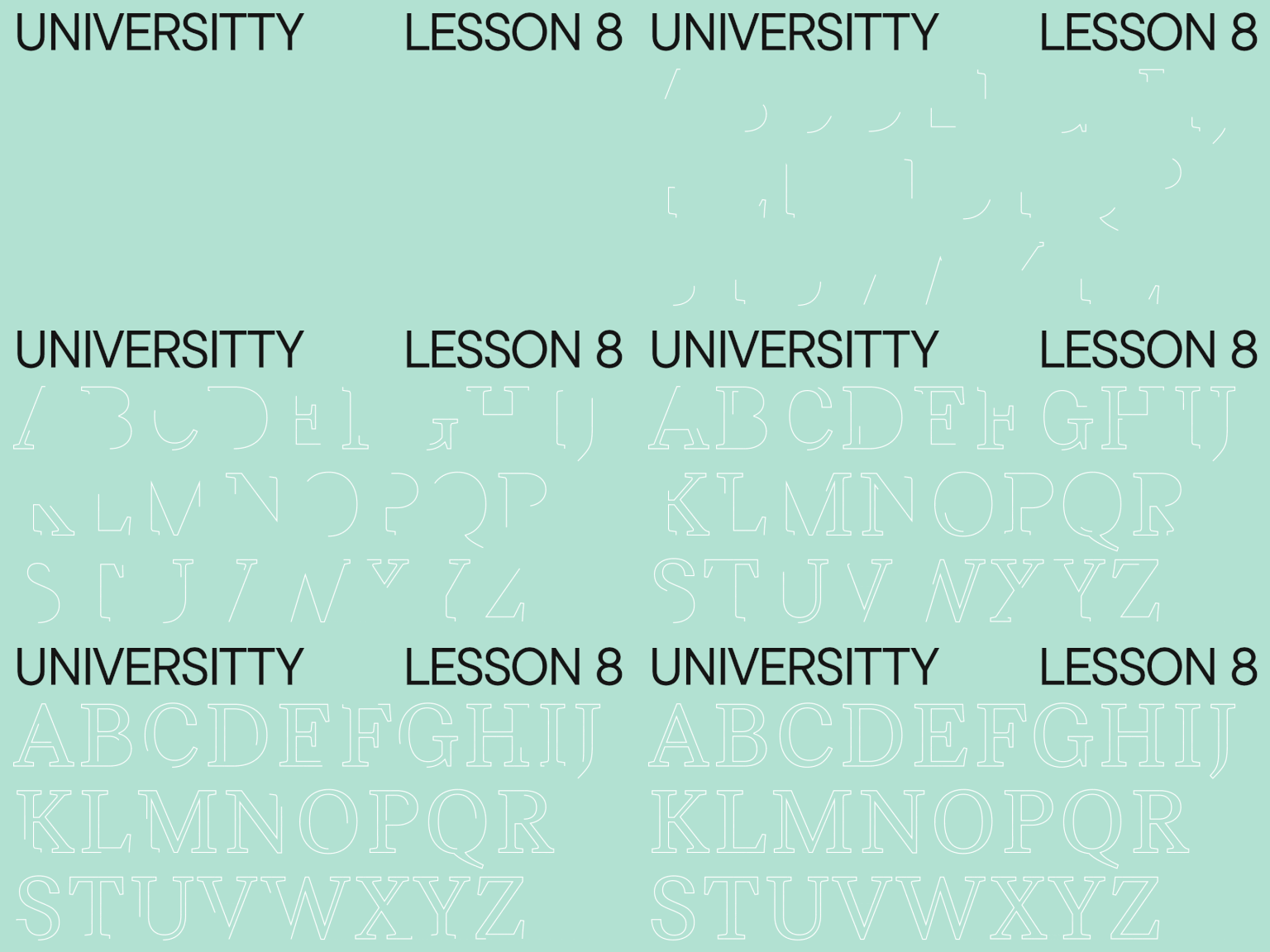
Outline fonts
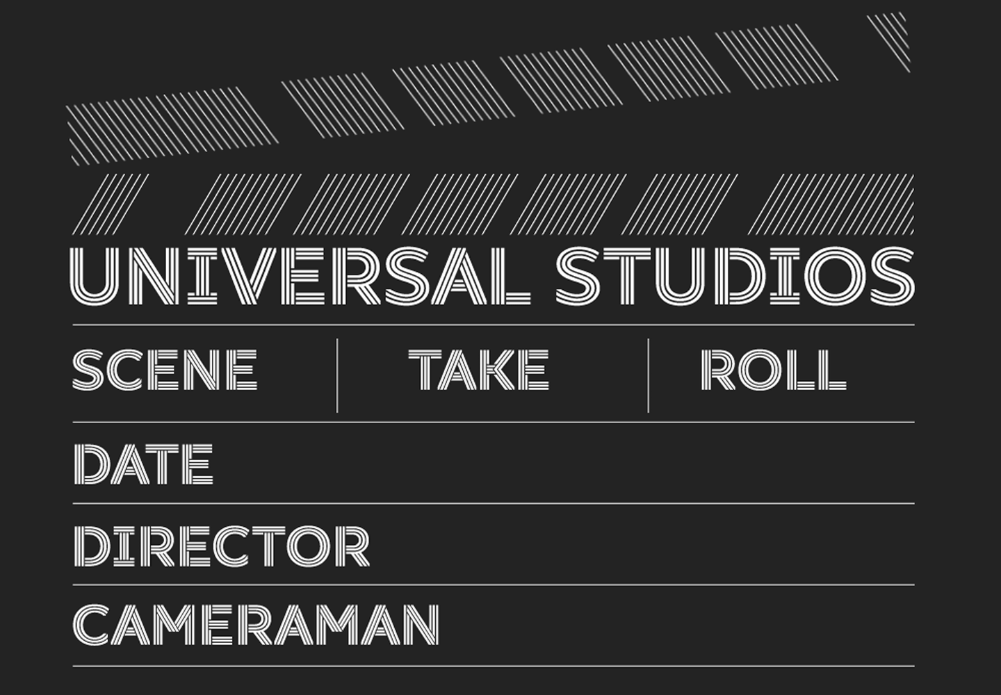
Outline fonts have long been used in design; however, in 2024, this trend has reached a new level. Thanks to cutting-edge technology, it’s now possible to create a truly unique design with these fonts, especially when this trend is combined with others and with 3D and interactive elements added to the mockup.
You can find the best outline fonts by TypeType and other font studios in our article.
Where to apply
This trend will help you make your design more unusual and attract attention. Outline fonts look stunning on signage and really shine when used for accent text on websites, applications, and more.
Multilingual fonts
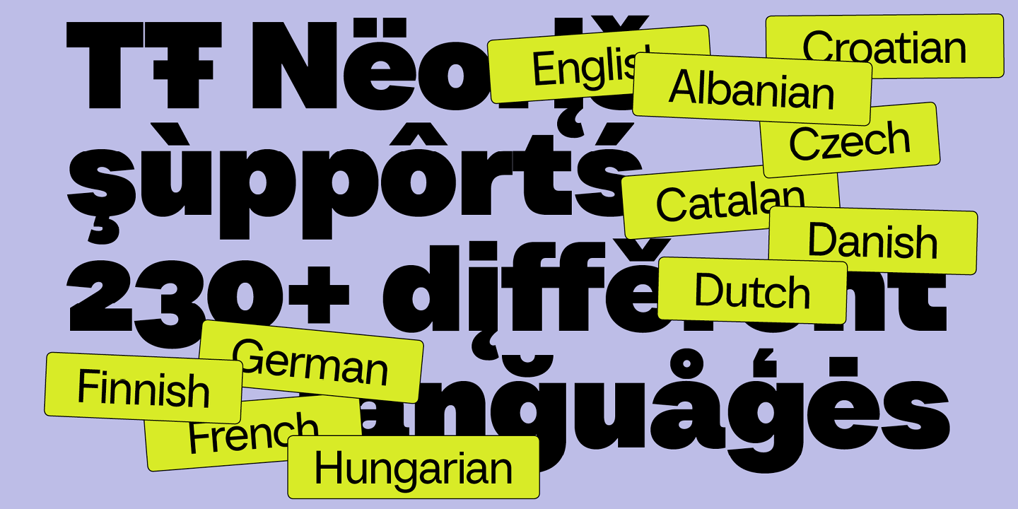
The trend towards localism has been influencing various fields for years. It has also affected font design, where multiple studios gradually increase the number of languages supported by their fonts. There are numerous languages in the world based on an equally wide variety of writing systems, so it’s a truly valuable opportunity for people from different cultures to take full advantage of beautiful and high-quality fonts.
At TypeType, we’ve been actively working on expanding the number of Cyrillic-based languages in our typefaces since 2022. A wonderful example of a project where we implemented this principle is TT Neoris. The largest typefaces in our collection support 280+ languages, including the extended Cyrillic and Latin alphabets. Among such fonts are our bestsellers TT Norms® Pro and TT Commons™️ Pro.
Where to apply
Opt for typefaces with extensive language support when you plan to localize your website, app, brand, or any other project for different countries.
Large font families
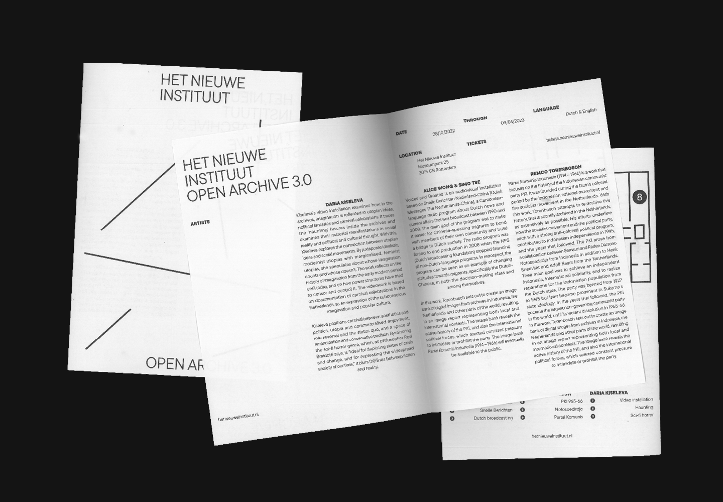
Integrating many different font styles into one typeface is undoubtedly one of the most essential font trends. This feature allows designers to add visual diversity to the project, choose the most suitable font variant for each particular occasion, mix and match font styles, and use one typeface for several projects.
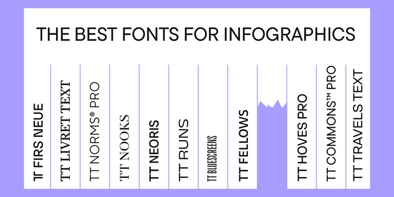
The largest font families in the TypeType collection are TT Norms® Pro (104 font styles), TT Commons™️ Pro (104 font styles), TT Lakes Neue (91 font styles), and TT Hoves Pro (83 font styles).
Where to apply
It’s worth considering large font families when you need new fonts on a regular basis to solve different tasks or when you need multiple fonts for one project. For occasional one-time projects, we recommend choosing small typefaces or individual font styles.
Variable fonts
The last yet still significant trend in our list is variable fonts. This tool allows designers to modify the font to suit their needs and tastes, crafting an original design with unique features.
Many TypeType typefaces contain variable fonts. Learn more about what they are and how to use them in our article.

Where to apply
Variable fonts are perfectly suited for unconventional tasks and when the font needs to be adapted for a specific layout format, such as in website or packaging design.
Conclusion
Which trends from out list did you find most interesting? Don’t forget to save this article for your future design ideas!

