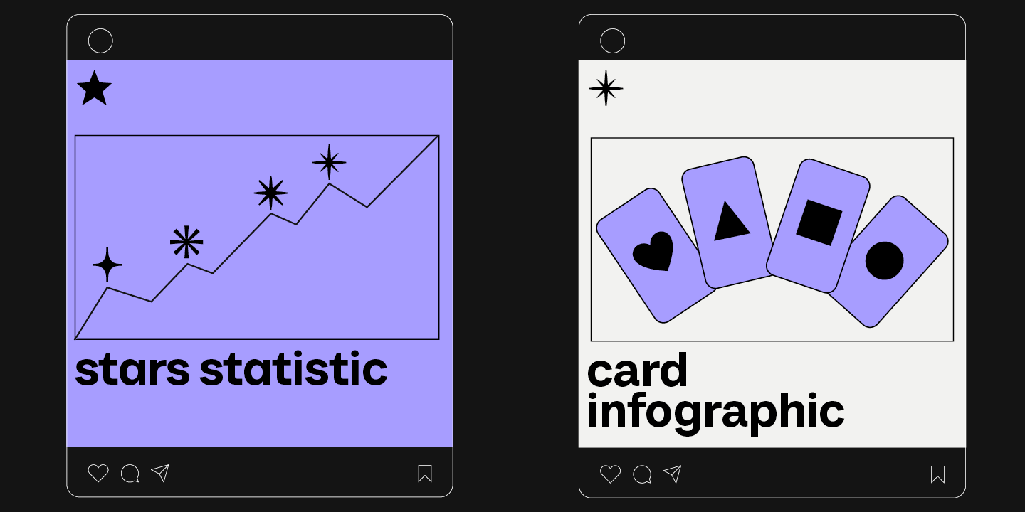
Infographics is a versatile and convenient tool that finds application everywhere: business, advertising, science, journalism, and more. This is a powerful way to communicate information in a simple, visual manner.
Why is it so essential to choose the right font for your infographic, and how to do this? How do you pair fonts with each other? What fonts work best for marketplace infographics? Read on to find out!
Why is it important to choose the right fonts for infographics?
Infographics consist of a wide range of elements that, combined together, can help deliver information concisely and create an emotional impact on the audience. The font is one of the most essential among these elements. Why so? Let us explain.
The text serves as glue, keeping all visual objects together in the infographic and turning individual images into a cohesive story. That’s why fonts should not only deliver textual information but also support the overall visual style and convey the necessary mood.
Typography and design work together in infographics. An illegible, excessively extravagant, or visually outdated font can ruin the overall impression of your visualization.

Tips for choosing good fonts for infographics
Let’s explore several rules you can rely on to choose the best font for infographics.
Choose signature fonts
If you are creating infographics for a brand that already has signature fonts, you should use them. This will make your work easier and strengthen brand recognition while preserving its visual identity in every aspect.
Keep the style consistent
Before choosing an infographic typeface, we first recommend you determine your project’s overall style and mood. Each font has a character that should correspond to the goals you are trying to achieve. For instance, sophisticated and elegant fonts are perfectly suited for a premium jewelry brand’s infographics, and clean and strict-looking sans serifs work best for tech companies.
Always keep readability in mind
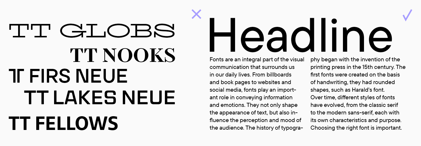
When it comes to infographics, it’s crucial for the text to be legible. The text should be easy and comfortable to read—this way, you will achieve maximum effectiveness in conveying information. Easy-to-read fonts feature clean lines and simple forms, not overloaded with extra decorations. They do not distract readers and stay clear even in the tiniest point sizes. Read our article to learn more about choosing easy-to-read fonts and explore their key characteristics.
Try fonts out
Even if you have found a font that seems perfect all around, don’t rush into settling on it yet. You should first test it in your mockups. Two visually similar fonts may look completely different in your infographic. We recommend checking several options in terms of how coherent they are with the rest of the design elements and your color palette. Besides, you can download free trial versions of any typeface or test fonts online on this page.
Don’t use more than two fonts
Within one infographic or any other project, it’s preferable to use no more than two fonts. Too many fonts will overload the design, and when it comes to infographics, they disperse attention and stand in the way of the primary goal, which is to communicate information in a concise way.
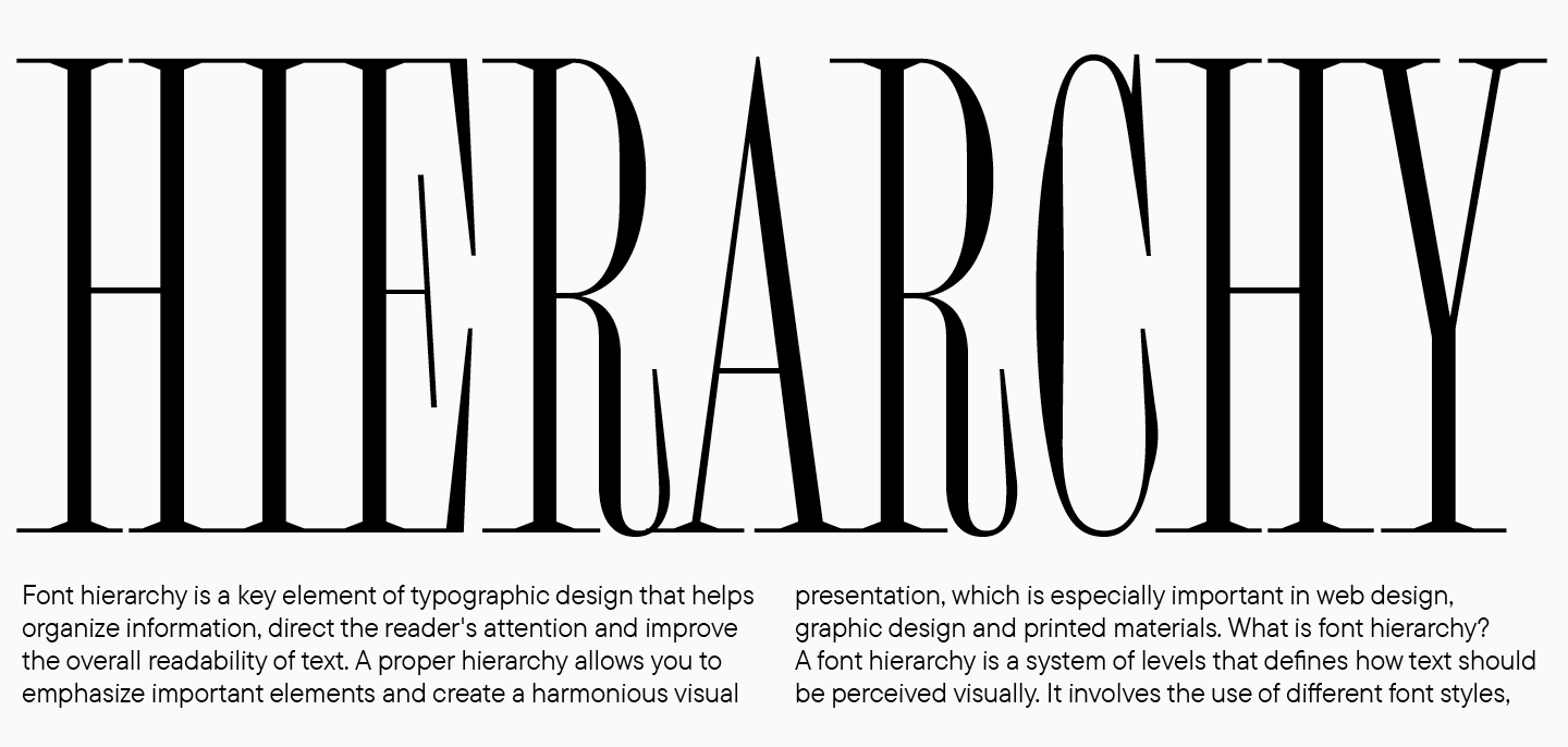
Build a hierarchy
If you use more than one font or font style, it’s essential to determine the function of each of them. Start by choosing the primary font—the one that you will use for setting the main text. Then, find a suitable display pair to set headings and other expressive texts.
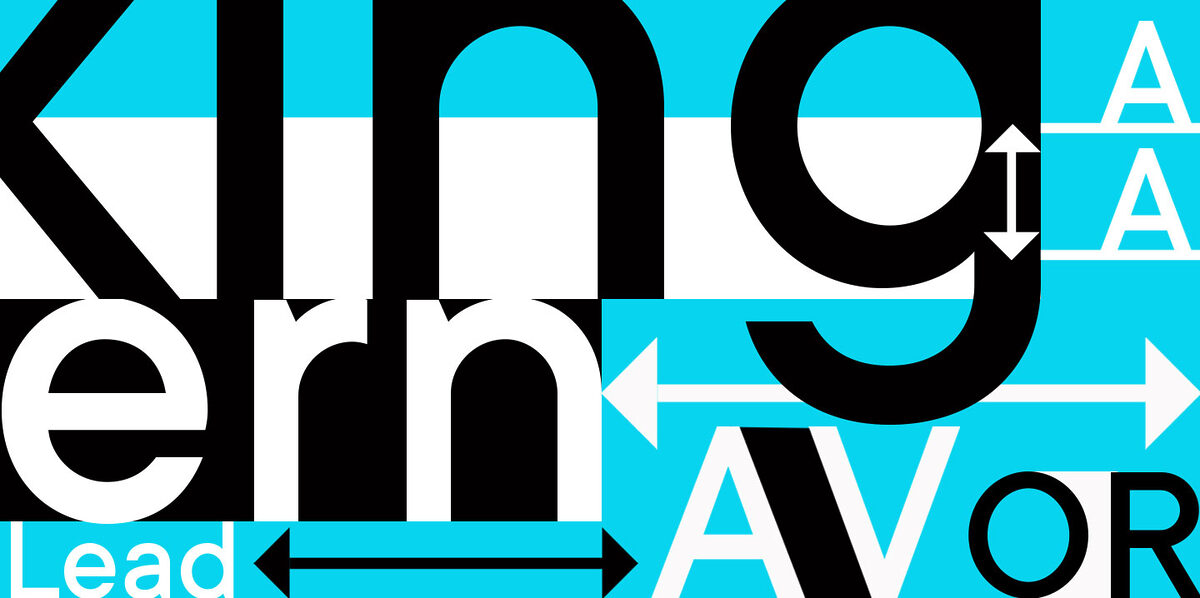
Combine fonts correctly
It’s important to have both similarities and differences in your font pair. That’s why a guaranteed approach is to mix and match different font styles within one font family. In this case, you can be sure that they will go together nicely and align stylistically. Different typefaces can also look harmonious; however, in this case, you must follow certain pairing rules. Learn more about combining fonts here.
The easiest option is to choose a ready-made font pair—two fonts created as part of the same concept. Below, we have compiled examples of such pairs from our font library.
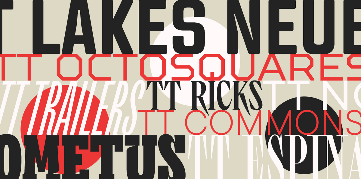
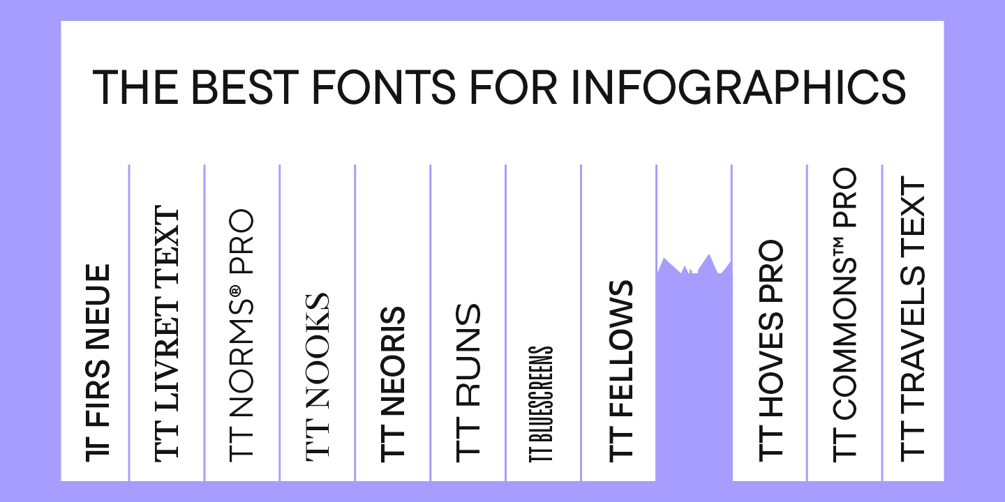
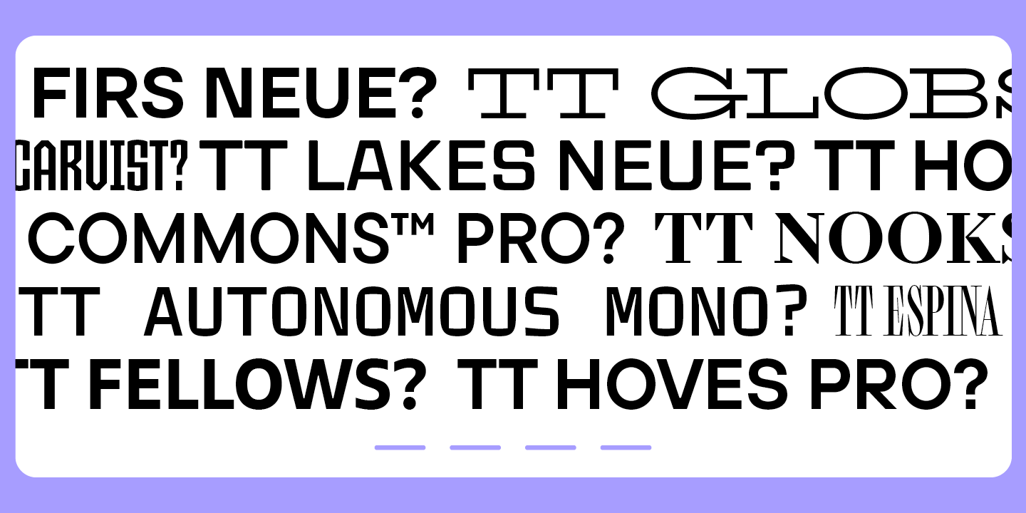
Top fonts for infographics worth checking out
We have chosen rather versatile font families and pairs for infographics, all featuring different vibes and styles. Among them, you may find the best infographic font to go perfectly with almost any theme.
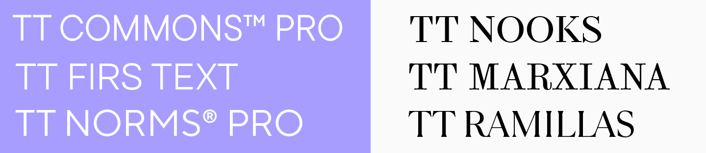
TT Norms Pro + TT Norms Pro Serif

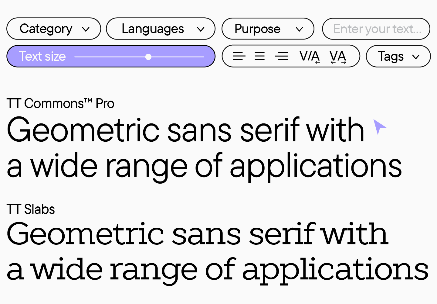
TT Norms Pro is a basic geometric sans serif, the most popular choice in our collection. This is not a surprise: the font is clean-looking, stylish, readable, functional, and totally versatile. TT Norms Pro is a genuine classic suitable for any infographic, from clothing or cosmetic brands to tech or IT companies.
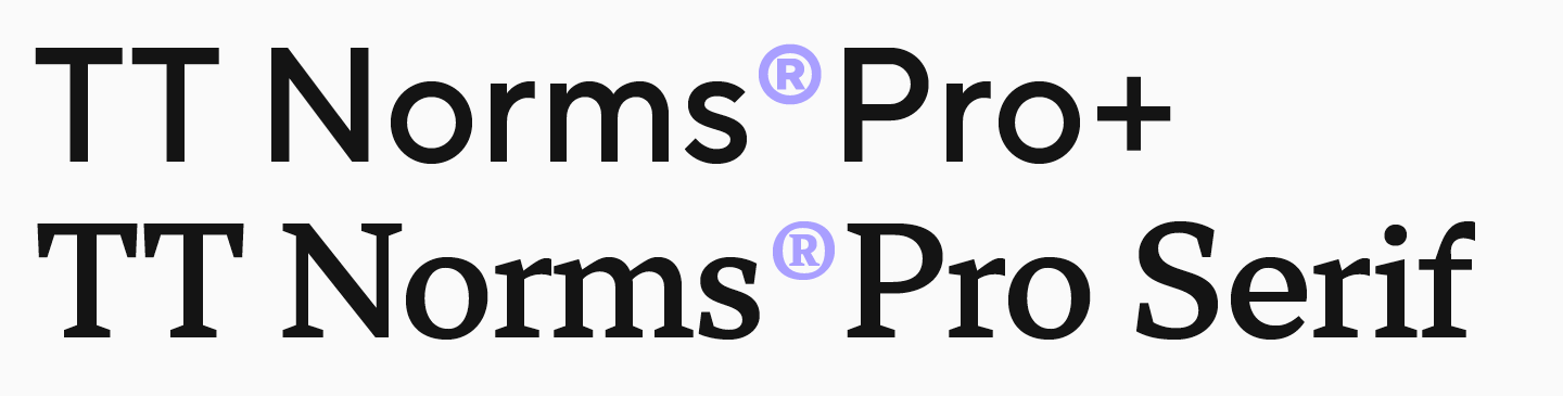
TT Norms Pro can be combined with many other fonts, but we designed a perfect pair for it: TT Norms Pro Serif. This text serif is elegant yet relatively neutral. If you wish to infuse your infographics with a sophisticated feel while maintaining their modern design, this font pair is your ideal option.
TT Norms Pro и TT Norms Pro Serif can be used separately or together, and each one will perform great in both body text and headings. To learn more about this and our other font pairs, check out our article.
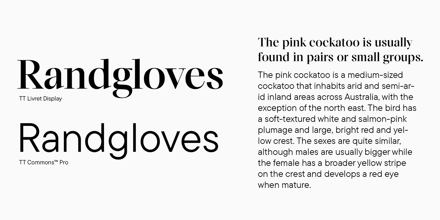
TT Livret
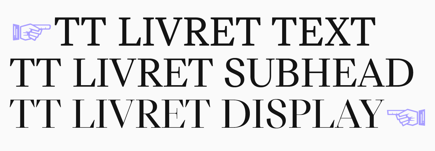
The TT Livret typeface is an excellent choice for those who want to use different font styles from the same font family. This graceful, modern, and highly functional serif consists of three subfamilies: Text, Subhead, and Display. Text works perfectly for running text, Display shines best in headings, and Subhead is somewhere in between—it can be used for both text setting and accent placement.
This beautiful typeface is a great fit for infographics designed to convey an elegant, sophisticated, and premium feel.
TT Firs Neue + TT Firs Text

Our Scandinavian sans serif, TT Firs Neue, is a stylish font with a Nordic mood. This font looks interesting but not in a way that will overcomplicate your infographic. Plus, it can easily adapt to a variety of themes, from art to technology.
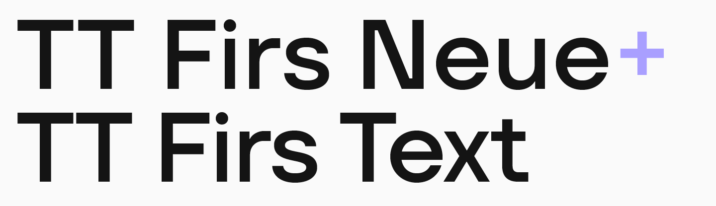
For the main text, we designed a perfectly suitable sans serif TT Firs Text as a pair for TT Firs Neue. We preserved the beauty of Scandinavian minimalism in it; however, the design doesn’t distract from reading, and the font remains perfectly legible even in small point sizes.
TT Travels Next +TT Travels Text

If you are looking for an ultramodern and unusual font for infographics, we recommend considering TT Travels Next. This font is a stylish, experimental sans serif with wide proportions. The font has a strong visual appeal and is easy to read, which helps the headings set in it attract attention and effectively communicate the idea of the text.

An ideal pair for this font is TT Travels Text , a geometric sans serif with the core features of TT Travels Next but much more versatile and neutral. It also boasts exceptional readability.
Conclusion
We hope this article will help you find the best font for your infographics. Don’t be afraid to try something new, and remember to always research your colleagues’ work to find inspiration and develop watchfulness.
FAQ
What fonts are best for infographics?
The best fonts for infographics are readable, stylistically consistent, and suitable for the project’s mood. TypeType recommends versatile families and pairs such as TT Norms Pro + TT Norms Pro Serif, TT Livret, TT Firs Neue + TT Firs Text, and TT Travels Next + TT Travels Text.
Why is font choice important in infographics?
Font choice is important because text connects all visual elements and turns separate images into a coherent story. A font should deliver information clearly, support the visual style, and create the right emotional impression.
How do you ensure readability in infographic design?
Readability is ensured by choosing fonts with clean lines, simple forms, and no excessive decoration. The text should remain easy to read even in small sizes and should not distract from the information.
What font sizes work best for infographics?
The main principle is that every text element must remain legible in its context. Headings should be clearly distinguishable, while body text and labels should stay readable even at the smallest planned size.
Should you use multiple fonts in one infographic?
You can use more than one font, but it is better not to use more than two. Too many fonts overload the design, scatter attention, and make it harder to communicate information concisely.
What are the best font combinations for infographics?
Strong combinations include ready-made font pairs or styles from the same family. Examples from the article include TT Norms Pro with TT Norms Pro Serif, TT Firs Neue with TT Firs Text, and TT Travels Next with TT Travels Text.
How does typography affect data visualization?
Typography shapes how easily viewers understand data. Clear hierarchy, readable labels, and consistent font choices help organize information, while illegible or overly decorative typography can damage the whole visualization.
What are common mistakes in infographic typography?
Common mistakes include choosing an illegible or outdated font, using a font that does not match the project style, adding too many fonts, ignoring hierarchy, and failing to test the typeface inside the actual infographic layout.
Are serif or sans serif fonts better for infographics?
Both serif and sans serif fonts can work in infographics if they are readable and appropriate for the topic. Clean sans serifs are good for strict or tech-related projects, while elegant serifs can suit premium, sophisticated, or editorial infographics.
How do you optimize infographic fonts for mobile devices?
To optimize infographic fonts for mobile devices, use highly legible fonts, test the layout at small sizes, avoid excessive decoration, build a clear hierarchy, and limit the number of fonts so the design remains clean and easy to scan.