TT Hoves Pro is a versatile sans-serif with a recognizable geometry
Texas Chainsaw Massacre Fonts
- All fonts 74
- Sans Serif 48
- Serif 27
- Slab Serif 6
- Display 40
- Script 10
- Variable 46
- Font sale 16
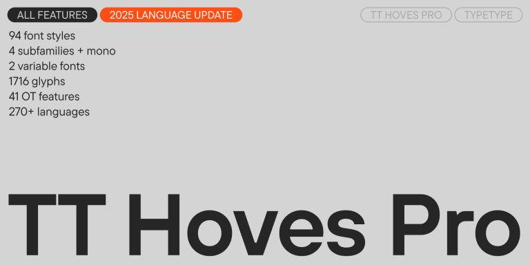
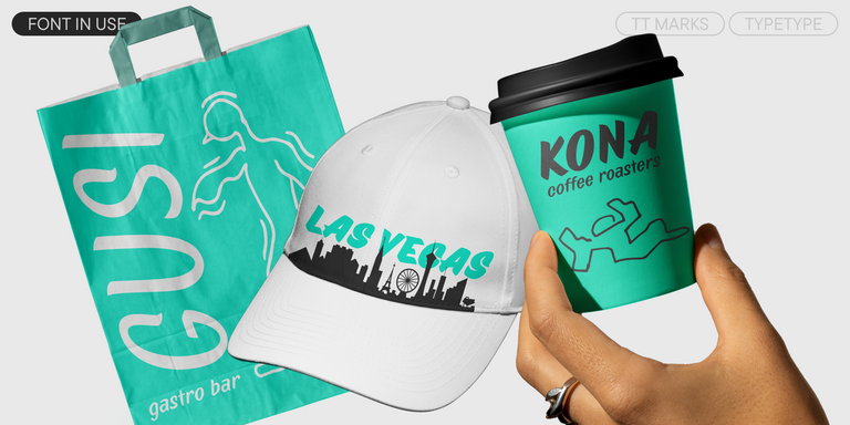
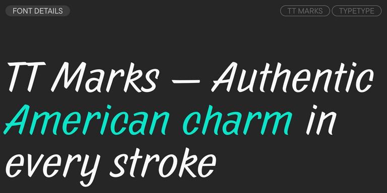
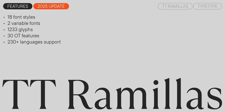
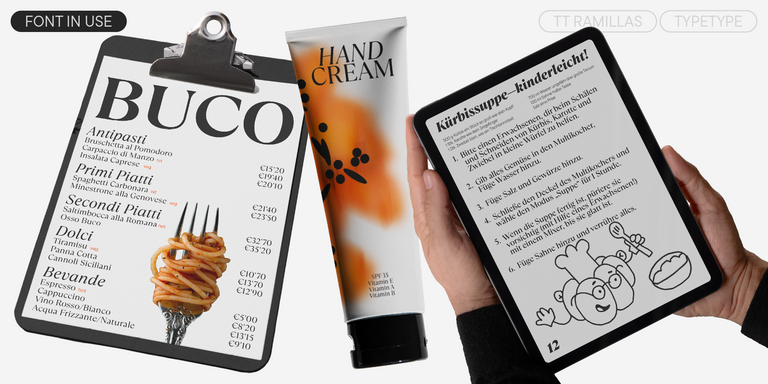
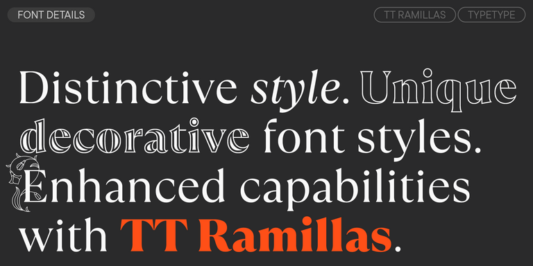
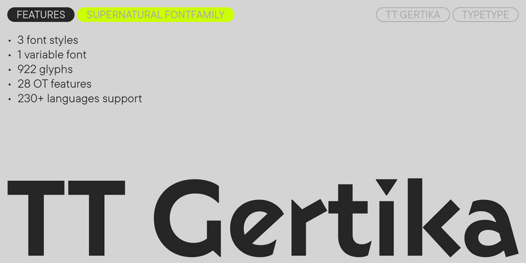
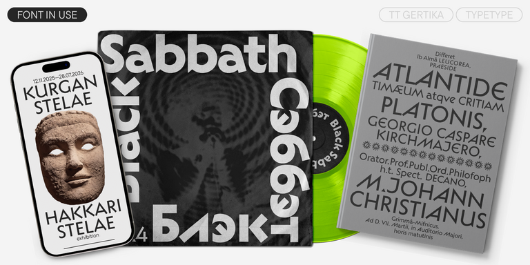
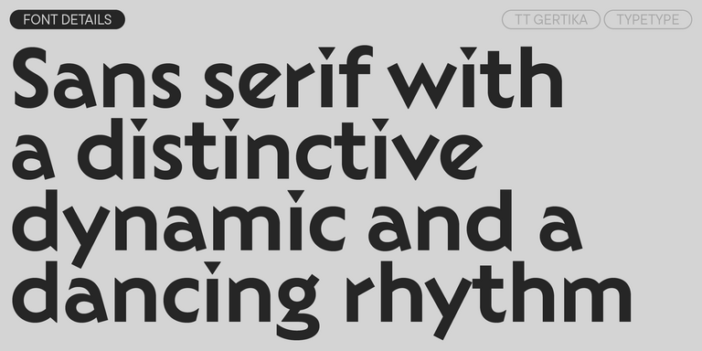
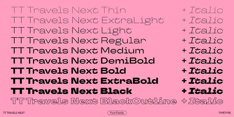
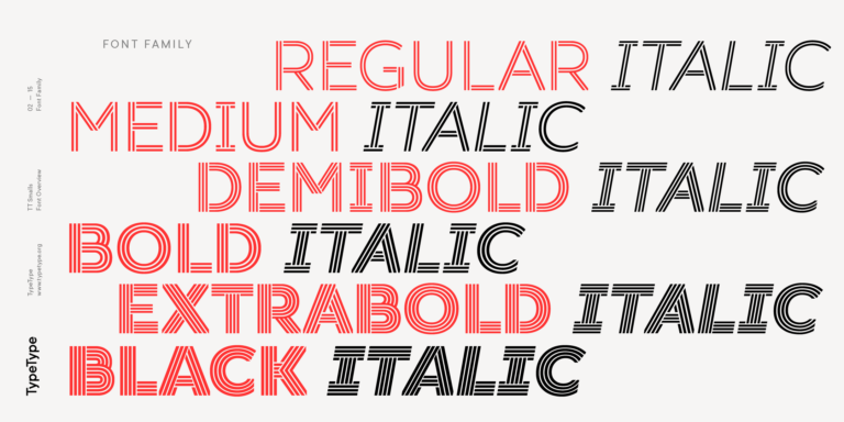
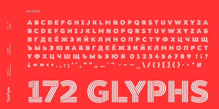
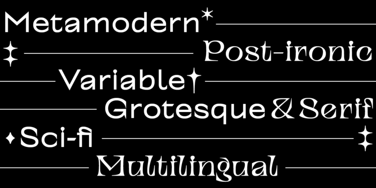
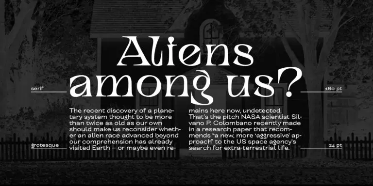
If you’re searching for the Texas Chainsaw Massacre Fonts to complement your design, TypeType studio is the one to provide a wide range of typefaces suitable for commercial purposes. The specific styles and the complete font families can be found on our page online: you may choose from a variety of well-made and technically verified fonts, use them for free, and leave a request to buy a suitable license type. TypeType gives an opportunity to download the trial versions of all Texas Chainsaw Massacre Fonts for you to use in your projects, as well as to get advice from design or client care teams. Feel free to contact us by our form on the website.
- The quick brown fox jumps over a lazy dog.
- Pack my box with five dozen liquor jugs.
- Sphinx of black quartz, judge my vow
- 0123456789 !?.,:;—–()[]{}<> “quotes” ‘apostrophe’ @#%&*_+=/\| № $ € £ ₽ +−×÷=≠≤≥ … % © ® ™
- Aa Bb Cc Dd Ee Ff Gg Hh Ii Jj Kk Ll Mm Nn Oo Pp Qq Rr Ss Tt Uu Vv Ww Xx Yy Zz
We continue to expand the line of the studio's main bestseller TT Norms® Pro!
TT Severs is a geometric sans serif with emphasized elements of internal brackets. The main visual feature of TT Severs is the unusual form of internal ovals.
TT Jenevers is a modern serif with a Dutch flavor. The font family features the characteristic details peculiar to Dutch serifs—these are the asymmetrical shape of serifs and an irregular slant of ovals.
TT FRANTZ IS AN EXPERIMENTAL VARIABLE FONT, DISTINGUISHED BY ITS SLIMNESS AND LIGHTNESS. THE VARIATION IN THE FONT AFFECTS THE CHANGE IN THE HEIGHT OF THE MEAN LINE—BY MOVING THE AXIS ADJUSTMENT SLIDER YOU CAN EASILY RAISE OR LOWER THE MEAN LINE OF THE FONT.
TT Quaris is an exquisite, modern high-contrast sans whose design balances between soft and sharp. The glyph shapes in the font are fluid and tend towards roundness, yet there are also sharp elements.
TT Ricordi Allegria is a sleek and intelligent contemporary Florentine grotesque.
TT Bakers is a fluid serif with a gentle and lively character. This font is like freshly baked goods: it’s warm and soft, especially in its bolder weights.
TT Modernoir is a display sans serif with dynamic proportions. Fluid lines and delicate Art Nouveau forms in this typeface blend seamlessly with the rhythmic flow and improvisational freedom of jazz.
TT Marks delivers a script with dynamic rhythm, heartfelt character, and nostalgic appeal inspired by the classic art of American sign painting. This craft, where skilled artists hand-painted storefront signage with brushes and careful technique, is experiencing a well-deserved renaissance in today’s design world.
TT Ramillas is a fully reconsidered high contrast transitional serif, which is perfectly adapted to modern realities and requirements.
TT Gertika is a geometric sans serif with a dynamic character and a dancing rhythm. This font’s idea originates from the lettering featured on an American poster from the late 1930s.
TT Biersal is a display sans serif with a free-spirited, playful, and adventurous nature. The concept of this font was sparked by a German poster from the early 1930s.
TT Travels Next is a very trendy and modern wide display sans serif for use in different sets, be they print or web.
TT Octosquares is a fresh, revised, expanded, and significantly improved version of our first commercial font TT Squares & its narrow version.
TT Ricks is a flamboyant elzevir-type serif, for which the words “cute” or “calm” are not a fitting definition.
TT Wellingtons is an attempt to combine the style of English humanist sans serifs of the early 20th century with the requirements for modern geometric grotesques.
TT Rounds Neue soft, friendly, rounded sans serif fontfamily
TT Smalls is now a decorative font that makes it easy to attract attention.
TT Alientz is a variable typeface that allows the user to make a visual journey from an extraterrestrial grotesque to a very prickly display serif.
The TT Tsars font family is a collection of serif display fonts that are stylized to resemble the fonts of the beginning, the middle, and the end of the XVIII century.
TT Nooks is an experimental project comprised of a high-contrast egocentric serif and an upright humanist italic.
TT Backwards Sans is a narrow grotesque, which takes us back to the book design of late 70s and early 80s with its ductile characters.
When designing TT Mussels, we paid great attention to the possibility of imposing large arrays of text, and we can state that TT Mussels is a rare type of technological text fonts.
