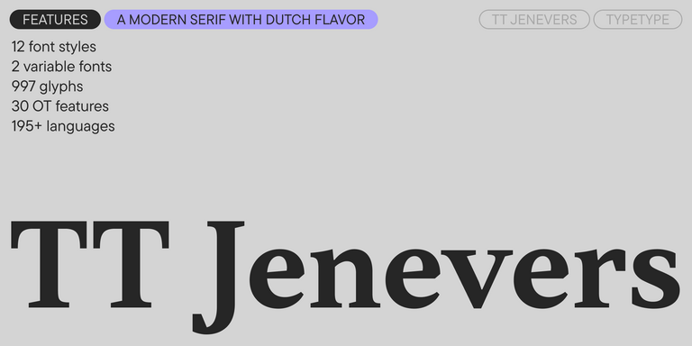
TT Hoves Pro
Regular
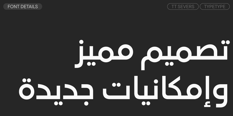
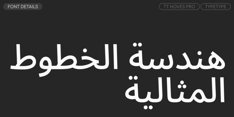
96 أنماط خط
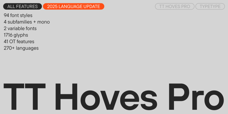
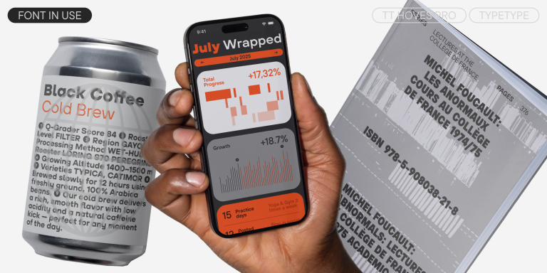
TT Hoves Pro is a versatile sans-serif with a recognizable geometry