Explore TypeType's Amish Fonts Collection
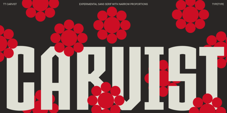
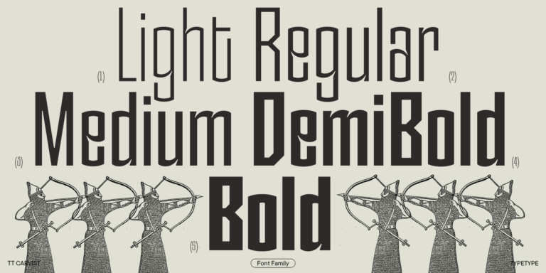
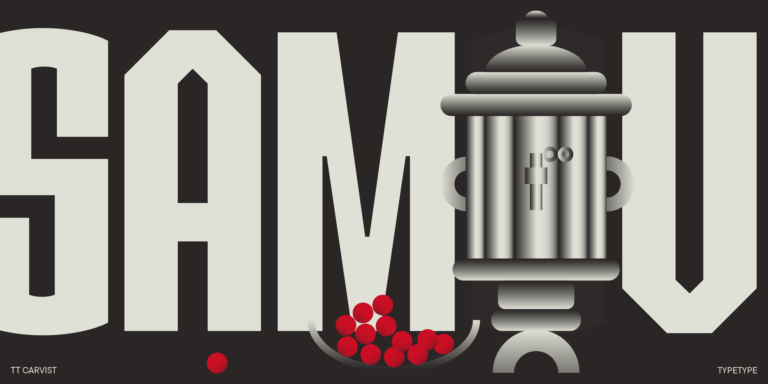
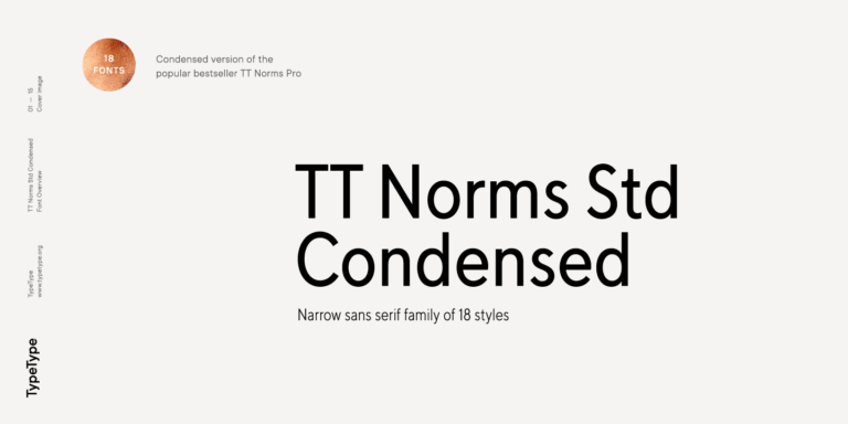
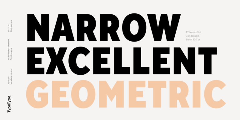
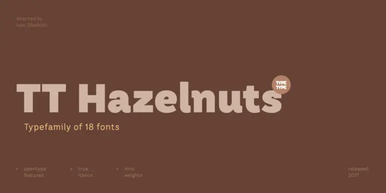
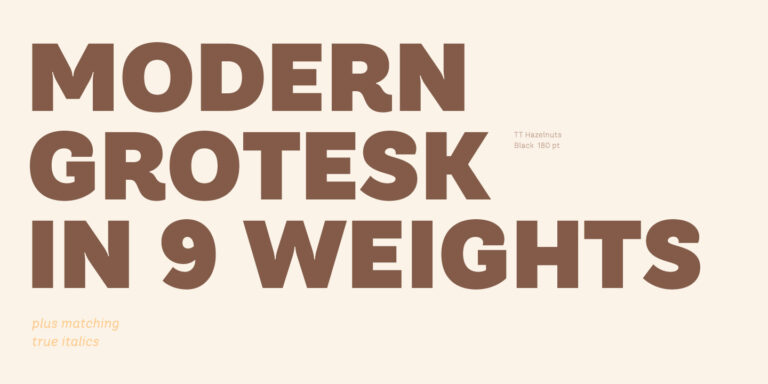
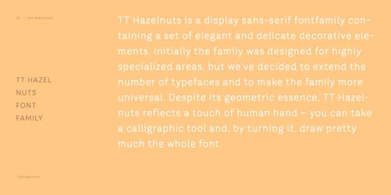
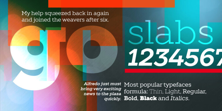
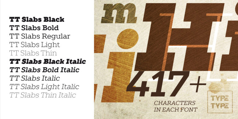
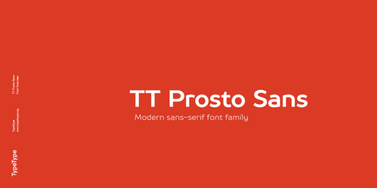
The selection includes TT Carvist, TT Norms® Std Condensed, TT Hazelnuts, TT Slabs, and TT Prosto Sans. Start with their individual pages to review specimens and check the details relevant to your brief. A family name alone does not establish its appearance, character coverage, or suitability for a particular medium. Compare candidates using the same sample text so that differences in letterforms, spacing, and overall texture are easier to judge. TypeType offers trial versions and access to its design or client care team, giving you a route to further evaluation before choosing a commercial license.
What Makes Amish Fonts Distinct
Here, Amish is a catalog tag grouping several TypeType families, not a standardized typographic classification. It should also be distinguished from an individual typeface with a similar name found elsewhere. The label does not establish a common construction, historical lineage, or connection to Amish communities. Instead, let each specimen show you what distinguishes the design: examine proportions, stroke relationships, letter shapes, and the rhythm of a line of text. These observations provide a useful basis for comparison without assuming that every option shares a rustic appearance, decorative treatment, or cultural meaning.
Where Amish Fonts Are Used
Potential briefs include brand identities, packaging, signage, and editorial layouts. Treat these as applications to evaluate, rather than documented uses of the listed families. Each setting places different demands on typography: a package may need a clear product name alongside compact supporting information, while a sign must communicate at the intended viewing distance. For identity work, assess whether the lettering supports the brand’s tone and feels appropriate to its audience. In an editorial layout, compare headings, captions, and longer passages at their expected sizes. Use realistic wording, including numerals and punctuation, rather than relying on a short specimen alone. Where a project refers to a particular community or tradition, establish that context through research and the wider design brief; the catalog tag cannot supply cultural authenticity. Suitability should emerge from the relationship between the chosen family, the message, and the finished composition.
How to Choose an Amish Fonts Font for Your Project
Begin with a shortlist from this collection and define what each candidate must accomplish. Record the intended media, text sizes, required characters, and hierarchy before comparing specimens. Check individual product pages for available variants and other relevant specifications rather than assuming capabilities from the names. Next, test your intended wording in realistic layouts using trial versions only within their permitted scope. Include difficult combinations, long names, numbers, and any language-specific characters your project needs. Keep the layout consistent while comparing candidates, then adjust spacing and scale to assess each option fairly. Separate visual approval from licensing approval: access to a trial does not by itself authorize commercial deployment. Confirm that the selected license covers your planned use before release. If a technical requirement or permission remains unclear, contact TypeType’s design or client care team through the website for guidance on the next step.