Customization is an instrument solving a large array of design tasks and helping corporate brand establishment.
It often happens that existing fonts do not correspond to the needs of a certain project. But font is not a static instrument that functions only the way it was created. To convey the company’s individual style, the font can and should be adapted and customized to one’s needs that may range from simple changes like diminishing the character composition to complex design changes in all glyphs.
In this article we will try to cover all types of font customization and tasks that can be solved with it.
Technical customization
1. Changing font parameters to match a reference font
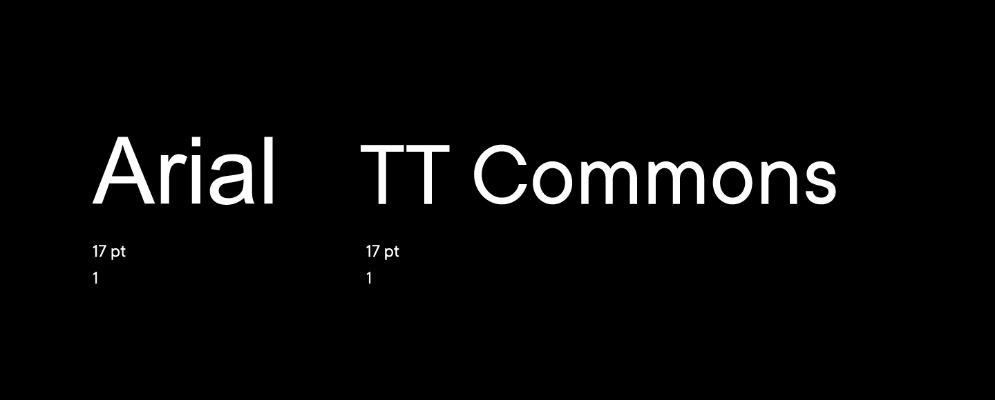
Let us start with a fairly common example, the proportional alteration of font size. For example, you use a system font on your website, but at some point, you decided to change it and buy a font that matches the specifics of your work better. But there is a problem: you change the system font to the new one and the layout goes completely wrong such that you need to make a new one.
There may be different reasons for this happening, and one of them is that the physical sizes of the two fonts are significantly different.
In such a case, a custom-made font can be created, in which we can match the font size or other metrics to the required measurements of the reference font to make the transfer from one to another as simple as possible.
2. Switching off or customizing OpenType features
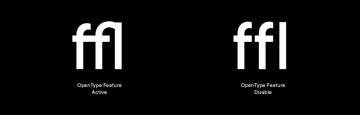
Contemporary fonts are universal products and their files always have more characters and features that an average designer needs.
By default, OpenType features like ligatures created for characters that merge in a set in order to make it more uniform are included in fonts. In our experience, clients often do not need them, and if that is the case we can turn them off in the font code and transfer the file to you.
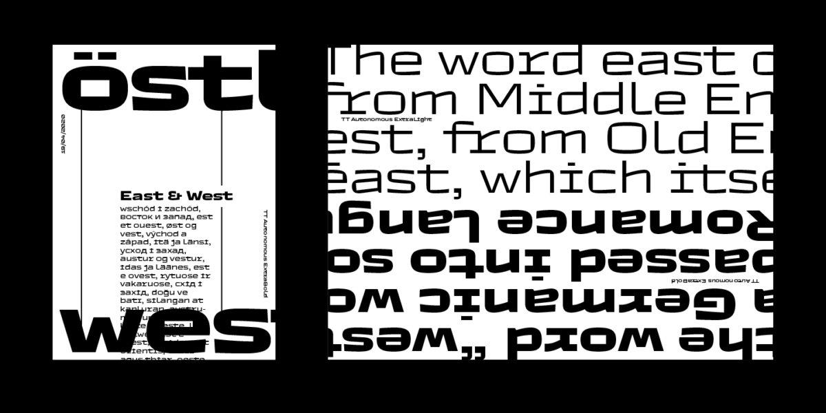
3. Changing spacing in the font
Spacing is the distance between the letters. Depending on the task we can make the set more condensed or, on the contrary, more dispersed. We were surprised when we realized that not all designers know about this type of customization and spend a lot of time correcting for this manually. We would like to change that!
Let us have a look at an interesting example. For one of our IT clients, we did some research and developed a system to change font density depending on the size of the font. As a result, we created 8 fonts with different spacing such that in larger size the font is denser and in smaller size it is sparser. This way, our client’s work is easier: there is no longer the need to code spacing manually.

4. Downsizing the character composition of the font
Let us keep on discussing the sizes and proceed to the physical parameters of font files, which is especially important in contemporary web design.
One of the ways to control the size of the font file is diminishing the font character composition. Let’s say you need the font files to be of a small size and that you know what languages, figures and punctuation marks you need. In this case, it is possible to create a custom version of the font with a reduced number of characters leaving in only those that are really needed for work. This significantly decreases the size of the font file.
Speaking of the size of the font file, let us also think of variability. If you plan to use on your website more than three upright faces from the same font family, a variable font file can be developed and used for these.
But that’s not all. If downsizing the number of characters has not helped, we can also proceed to advanced customization: for instance, we can gradually omit hinting, kerning and find a couple of kB hidden in font info until we reach the needed size.
5. Customizing the mean line, interline spacing
Graphic editors used by designers have different interfaces that vary not only in terms of content, but also in terms of how elements are aligned within the blocks. Because of this, fonts may be displayed incorrectly, and a designer might have to manually adjust the parameters, which takes a lot of time that could otherwise be dedicated to solving more important problems.
A great example of this could be an abstract object, «Button», in which a designer places the text line. For it to be centrally aligned in different interfaces, it is necessary to manually set up the ascender and descender parameters in the font.

A similar problem often arises with interline spacing. Customization allows for setting up any space that you need between any two lines next to each other in order to not do it manually every time.
We customize our fonts for all popular designer software. What’s more, based on our clients’ feedback, we constantly adapt them to software settings such that these problems do not arise in the future.

Graphic customization
1. Adding a logotype to the font
It often happens that the clients needs the logo of the company to be added into the font, for instance, in order to use the glyph on the site and not to mess around with a separate image.

We can also alter the font such that it looks better together with the logo — for instance, the logo might have round full stops and the font has square ones. This is fairly easy to correct.
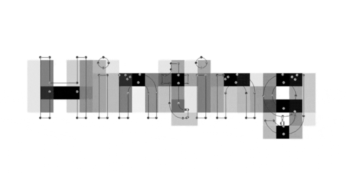
2. Changing the shapes of characters or separate elements
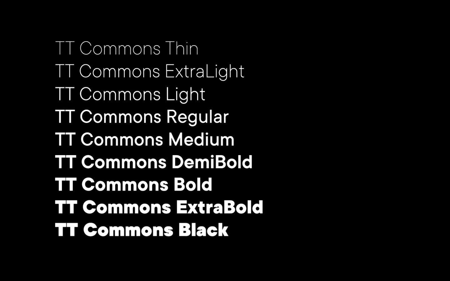
Depending on your branding materials we can change the shape of one, several, or even all font characters.We were once contacted by a company that wanted to use our TT Commons™ font as its corporate font. They had especially liked the rounding of the letter t, and so they had asked us to add similar rounding into letters a and d. We analyzed their logotype and corporate style to offer a harmonized solution for the rest of the letters. As a results, we created a customized version of TT Commons™ that solves the client’s task.
3. Individualizing the font visuals by changing the characters in a stylistic set
If you would like to make the font more personalized but do not have enough time and resources, an easy way out is to work with the characters already present in the font. For instance, you could set the letters hidden in stylistic sets to be a part of the main set.

If you type large text arrays, you would probably like to mostly use minuscule figures instead of majuscule ones. In this case, you could set old style figures as default figures. Or, if you often set tables, you could set as default tabular figures and currency signs.
4. Creating an intermediate face
Changing the stroke weight in a font is another frequent designer request. If you haven’t found an ideal weight in a font family — for instance, Regular looks too thin and Medium is too massive — an intermediate weight can be created and precisely customized for a specific task.
For one of our clients we have changed the width of TT Norms’s Medium face. The axis position was at 500 but the client wanted it to be 475. It seems to be a very minute change but a designer knows very well what would look better!
5. Adding an alphabet or a language
One of our clients produces goods for different countries and the packaging has to feature the language of the distribution country. They have chosen a suitable font but before purchase realized it didn’t have Vietnamese. We have then created Vietnamese for this client specifically with the needed character composition, punctuation list and features.

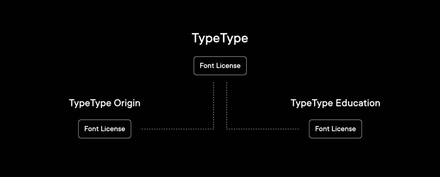
Custom licensing
In addition to visual and technical aspects, a custom font might be an alternative to traditional licensing.
1. For companies that have subsidiaries or affiliates
We can specify in the license a possibility to expand the right to use the font within the whole holding, beyond a specific entity.
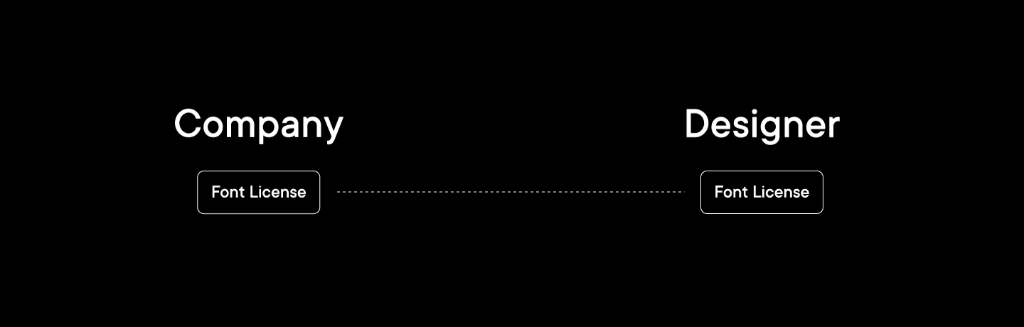
2. For companies that outsource design
If a company purchases a license but employs no designers, in the individual license we specify that it can transfer the font file to its contractors fro the period of working on the projects.
We are flexible in our approach to changing standard licenses depending on the requirements of your legal department and are ready to personalize a font by changing its name for your brand.
But, with the purchase of a license, we most often offer customization for free!
Instead of a conclusion
Sometimes customization may be very advanced — such that a new font emerges as a result. But that is a different story.
Customizing a font to one’s task is possible and even advised! Customization instruments enable solving almost any issues. In this article we have tried to shed light on some tasks that customization tackles, but that’s only the top of an iceberg. Let us be honest — we are always keen on working with interesting cases and finding optimal solutions.

If you have any questions on customization or a task that needs to be solved, just contact us wherever is most convenient for you. We will make sure to respond and solve your font problem.