In our font studio’s 10-year journey, we’ve designed 1.500.000+ glyphs. Try out TypeType fonts online!

We Have a Digital Font Catalog! Looking through our typefaces has become even more convenient. PDF Catalog of TypeType Fonts

Use font subscription! The full font library of 75+ fonts will always be at hand. See more

Type foundryBlogCustomized version of TT Hoves for True Digital agency

Customized version of TT Hoves for True Digital agency

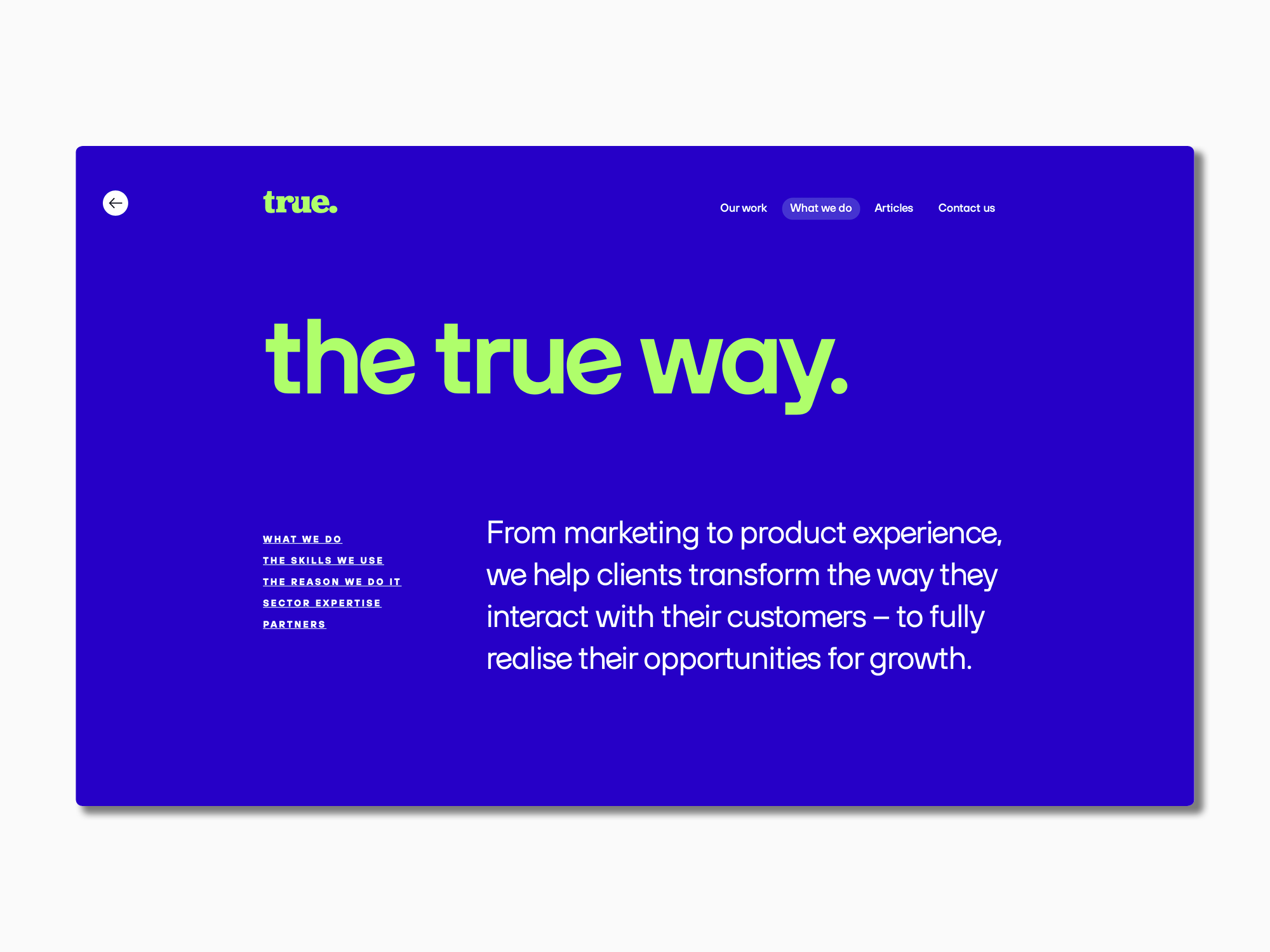
TypeType received a font customization request from True Digital Ltd, a marketing agency from Great Britain. The company emphasizes a sincere and involved approach to brand promotion. They wanted to underline their concept by adapting a font to their corporate style.

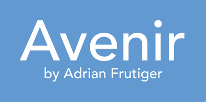
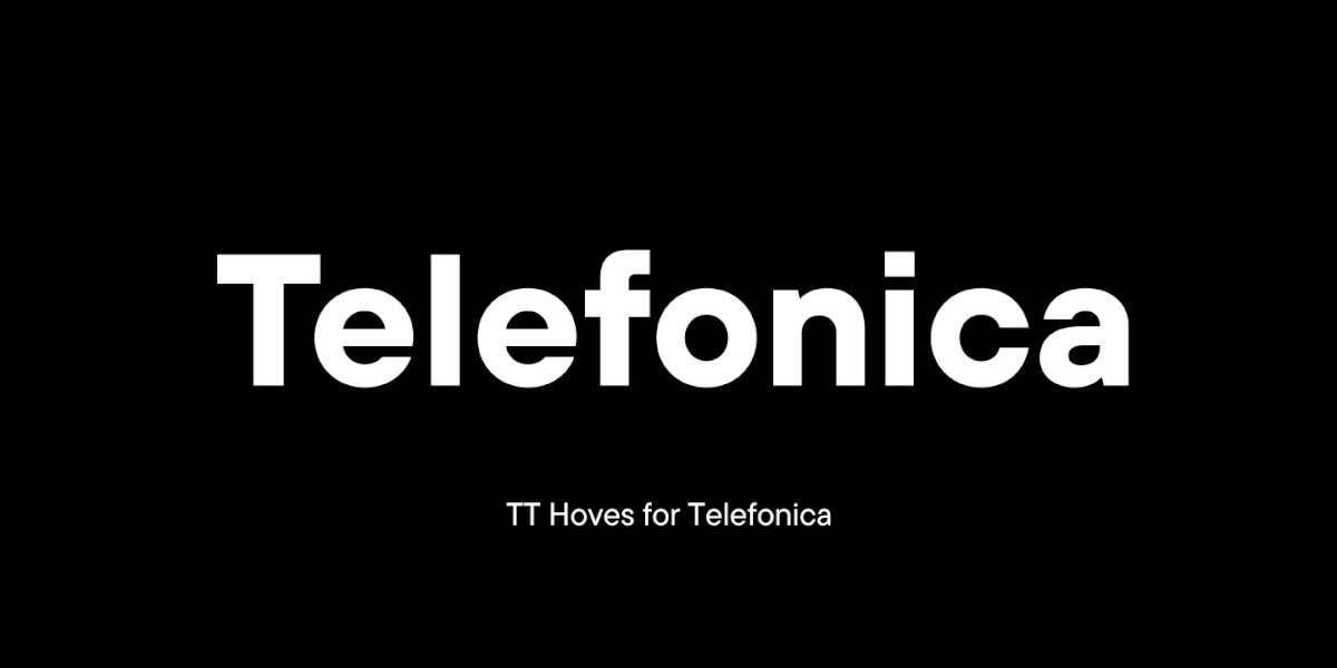
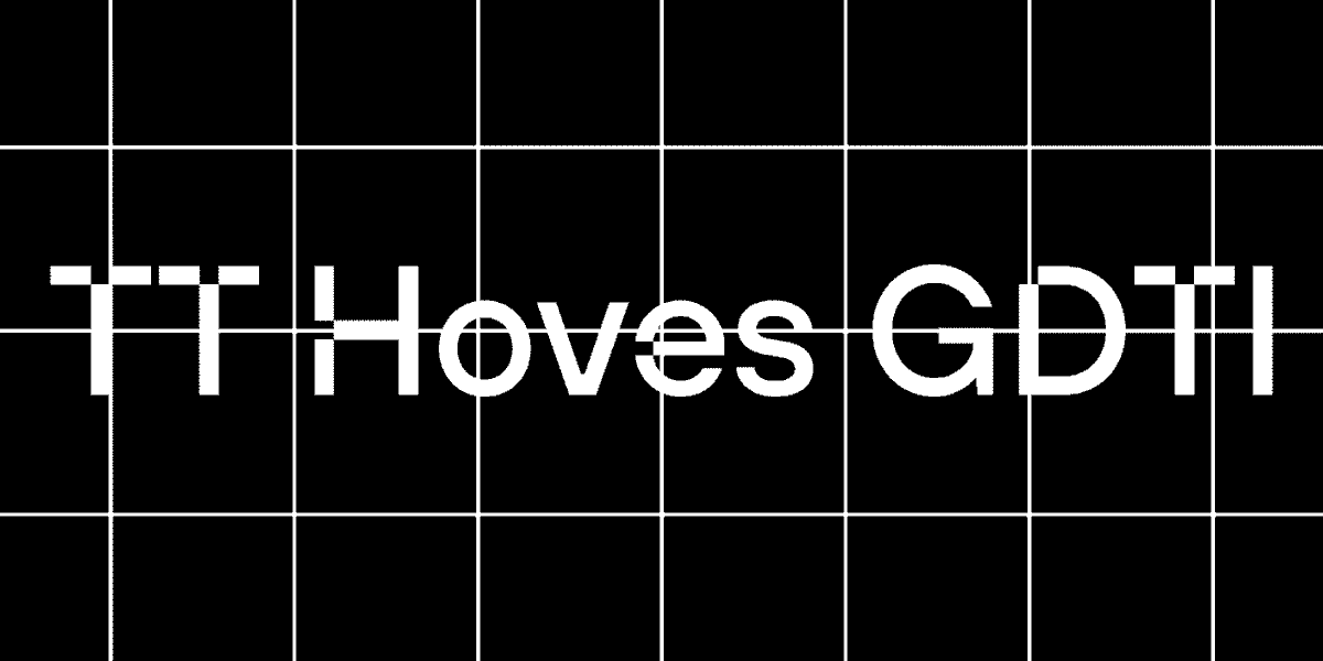
TT Hoves served as the basic font.
There were several large-scale tasks.

• Changing the style of the letter e, making it slightly tilted to the left.
• Replacing the square dots in characters and letters «! ? . ,; : … · j i » with round ones.
• Making the one-part shape of the letter default, and moving the two-part one into a stylistic set.

As a result, the adapted font got a new name—TT Hoves True. The customized version reflects the True Digital Ltd brand values: a modern and vibrant, but not an overwhelming look.

Step by step, the TypeType designers and technical specialists have generated the following changes.
• New look of the letter e. In the new style, the letter looks playful, but does not stand out from the overall composition. The ideal tilt angle was chosen and the adapted was implemented in 20 TT Hoves styles: 10 upright and 10 italics.

Customized version of TT Hoves for True Digital agency
New look of the letter e

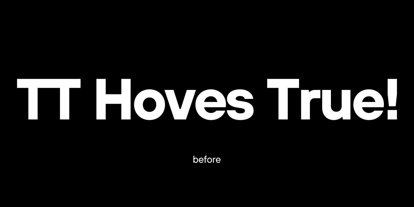
• In the same faces, square dots were replaced with round dots in letters and symbols. The seriousness of perception has softened, and the symbols in the new font are more conducive to dialogue.

Customized version of TT Hoves for True Digital agency
Changing shape of dots

• The letter a complements the new font’s penchant for minimalism. The two-part shape has been replaced with a one-part one. Now the letter a matches the other rounded letters perfectly.
The one-part shape of the letter a became part of the main set, and the two-part shape was put into a new stylistic set.

Customized version of TT Hoves for True Digital agency
Changing stylistic set

• At the final stage, new hinting was made for the customized characters, and the name of the adapted font was changed to TT Hoves True.

The result is an easier-to-read typeface that fits the agency’s concept perfectly with its fluid faces and a charming e.

Customized version of TT Hoves for True Digital agency

Latest publications

25+ Best Gaming Fonts for Your Projects in 2024

25+ Best Gaming Fonts for Your Projects in 2024

Choose the best gaming fonts from our extensive typeface collection to level up your video game design projects. Finding a good font for your game is essential because cool fonts infuse your game with individuality. However, fonts unsuitable for games can seriously compromise the gaming experience.

See more
Icons & Illustrations in Fonts: What are they, and what’s their purpose?

Icons & Illustrations in Fonts: What are they, and what’s their purpose?

In addition to the base set of letters, marks, and symbols, most typefaces also have other graphic elements.What does their appearance depend on? How and why are they designed? What variations do they come in? In this article, we will focus on these questions and showcase the most captivating icons and illustrations from TypeType typefaces.

See more
20+ Best Thin Fonts in 2024: Slim and Light Fonts for Your Elegant Design

20+ Best Thin Fonts in 2024: Slim and Light Fonts for Your Elegant Design

Looking for the best thin font for your new design project? Explore and take advantage of our skinny, light, and thin typeface collection. Each of these fonts available on the market will make your designs stand out. These thin-line fonts perfectly match various printed media and digital projects.

See more

See more

Creating a customized version of TT Trailers with pet-friendly diacritics

Creating a customized version of TT Trailers with pet-friendly diacritics

How often have you come across hidden kitties and puppies right in the letters? If never, do hurry to read this case.

See more
TypeType conquers the USA!

TypeType conquers the USA!

We don’t know what the modern American dream is. We are opening our first office in the USA because forty percent of sales and a large number of interesting projects come to TypeType from America. The first step towards customers is at the same time another point of growth for the font foundry.

See more
Creating a font for Mail.ru Group logo setting

Creating a font for Mail.ru Group logo setting

Today we will share a fascinating story of creating a font family to set logos for one of the largest brands. We promise you won’t be bored: in this story, you will have the chance to have a look at all stages of the work and will learn more about font creation.

See more