The TT Commons™ Pro font family needs no introduction as it has been TypeType’s best-seller for many years now. These are not just words—since 2018, the font family has been a bestseller for 93% of the time it has been on the sites.
TT Commons™ has a fascinating history, because it was created in 2016, and back then it was not supposed to be released as a commercial font at all. Despite this, the TT Commons™ family in its classic version has had 2 versions, and in 2021 it experienced a global revision receiving its new name TT Commons™ Pro.
In honor of the release of the new TT Commons™ Pro Mono subfamily, we decided to let designers behind the scenes of font making and share the story of how initially a corporate typeface created for TypeType’s internal use became one of the studio’s main driving forces.
First sketches and development
At the end of 2016, Pavel Emelyanov, the author of TT Commons™, came up with the idea to create a corporate font for the TypeType studio. Upon creation, we wanted to see an interesting and memorable family that at the same time would be concise and minimalistic. After all, our corporate identity had a neutral character, and the font had to become part of this style. We planned to design our logo and the new website, client agreements and internal documentation using the developed typeface.
We wanted the font to be expressive, but at the same time neutral and simple. With this in mind, the first sketches—options for the logo and some letters—were created.

Then we expanded the character composition, working on just one face, the middle one between Medium and DemiBold. In about two weeks, the studio’s specialists finalized the font, and it was put to use.

The font was named TT Commons™, as in common. As planned, we designed the entire corporate identity using the new typeface. We created an aesthetic font that graphic designers liked visually, and colleagues working with documents liked it for its simplicity and ease of use.

A distinctive feature of the font was that the size of TT Commons™ was 11% smaller than standard fonts. Typically, the height of capitals is 700 font units, and the size of capitals in TT Commons™ is 630. This feature came out naturally, and for internal use, such parameters did not hinder the work with the font at all, and we did not plan to release TT Commons™ on the sites.

Creating a commercial typeface
Immediately after the release of TT Commons™ as a corporate font, we began to receive a lot of questions about the new typeface. Users saw the font they liked, they could also see the name TT Commons™ hidden in the page code. There was a dissonance: there was an aesthetic font that people would like to purchase, but the font itself did not exist neither on the font sites nor on the corporate site.
As the size of the audience interested in TT Commons™ grew, we realized that we needed to start developing a complete font family for commercial use. We expanded the character composition, added support for languages, and increased the number of font styles. We didn’t change the parameters of the font, nor its visual character.
The Black face was ready by the summer of 2017, later the Thin typeface was drawn, and then we proceeded to intermediate fonts. In the fall, all straight faces were ready: Thin, ExtraLight, Light, Regular, Medium, DemiBold, Bold, ExtraBold, Black. While the technical department was hinting these weights, the type designers were working on creating italics.

In early 2018, the font was released to marketplaces. The first commercial version of TT Commons™ had 18 styles and 771 glyphs. The release took place in March 2018, and almost immediately the font became the studio’s bestseller.
The technical progress of the TypeType studio, as well as the professional growth of the graphics department, directly influenced the development of TT Commons™. We wanted to make this font family better, apply new internal technologies, and expand the character composition. This is how additional versions 2, 2.1, 2.110 appeared.
We improved the font technically, changed encoding, and added new glyphs. In the 2.0 version, there were still 18 faces, but the character composition consisted of 1230 glyphs. The 2.1 version was supplemented with new faces, and their total was now 24. The character composition also changed: instead of 1230 glyphs, there were now 1434.
We were constantly improving the font, and each version was a natural step in the evolution of the project. Despite significant changes, the font retained all of its features that designers all over the world liked so much.

The last version of the classic TT Commons™ was released in 2019, but after the release, we began to prepare a new, global and significant upgrade for the project. The best-selling typeface was on the verge of a new birth and an almost complete redrawing.
Audience contributions to TT Commons™ and customizations
In our studio, there is an unspoken rule: always listen to the opinion of the audience. It is the comments of users about our fonts that allow us to develop our projects, improve them and make them more beautiful. Of course, it is not only that: our team is always striving to become more professional and better. And yet, without feedback, it is more difficult to understand whether we are going in the right direction or not.
In the TT Commons™ story, user comments are the reason why the font is now available for purchase for your project. However, audience feedback continued to influence the development of TT Commons throughout its development.
Since the release of the font on the platforms, we have received many comments and questions about it. These were mainly TT Commons™ customization projects that later influenced the creation of TT Commons™ Pro.
Customization is a usual service for TypeType, in which we modify a font for a specific project, partially changing it from a technical, visual or other side. For example, the most common requests are adding a logo to the font’s character composition, reducing the number of languages to lighten the weight of the font, and renaming the font for the client.
All of the above customizations also happened with TT Commons™, but some of the requests were unique to the font.
You might recall that TT Commons™ was created with custom sizes reduced by 11%? The initial feature of the font was not very convenient for many customers, so the most common request for customization of TT Commons™ was to increase the font sizes to the standard ones found in most popular typefaces.
For example, such Customization was requested by Vidmob, MATTR, Ripple.

In the next chapter, we will explain how such requests influenced the creation of TT Commons™ Pro, and for now we will move on to another common type of customization made for TT Commons™. With these requests, we were more often approached by designers working in interface programs. The font has such a thing as a mean line, that is, a conditional line along which the font will be aligned, for example, in buttons. For words to look harmonious, they should be centered, but many designers had difficulty working with TT Commons™, because the mean line was slightly shifted. We changed the level of the mean line for many projects, and subsequently became more attentive to this parameter in all of our fonts. By the way, designers working in interface programs will feel comfortable with TT Commons™ Pro.

There were, of course, more global customizations. For instance, we are talking about graphic changes in glyphs that companies requested so that the font would match the corporate identity of the project or the client’s requests.
We did the largest customization for Ripple, and in the course of work, we made the following changes.
- Made a straight cut of the stem in the letter a, which initially was at an angle.
- Removed the spur in uppercase G.
- Made the aperture in the letter e more open.
- Swapped the S for a broader one.
- Redrew % and figures 69.

The final font received a new name and became part of the project.
Of course, some customizations are of a singular nature and are associated with the customer’s vision for their project. However, in the case of TT Commons™, some of the customizations were recurrent, and we could not ignore the wishes of the majority.
It was impossible to create a new 3.0 version of TT Commons™, because a global reinterpretation of the font was required. And so we started working on it.
Developing TT Commons™ Pro and TT Commons™ Pro Mono
By the time we started working on TT Commons™ Pro, we had grown a lot as a font design studio. We already had our own systems for working on certain tasks, for example, a proprietary approach to kerning and manual hinting. Our programmer has developed useful software for working with fonts, and the graphics department has grown significantly in professional terms.
Completely redesigning a project that had already become prominent, while maintaining its uniqueness, was both an exciting and very responsible task.
This is especially the case considering that we did not want to delay the release of the new version for many years. Because of this, several specialists were involved in parallel work on TT Commons™ Pro. It was a challenge, because each designer had their own vision and logic of work, which inevitably contributed to the result. When different specialists work on the same task, it is necessary not only to coordinate their actions and achieve a harmonious result, but also to maintain everyone’s enthusiasm and creative vision. In our opinion, we were successful in this task, applying this experience of the parallel work of several specialists in other large-scale projects.
This was just one small part of the titanic work that we carried out on TT Commons™ Pro.
Firstly, in the new font, we wanted to increase the sizes to the ones the users were used to, because this was a frequent request from the audience. Before we took action, we did research to determine the optimal values for the new font so that TT Commons™ Pro would still be recognizable, readable, and neutral in character. The height of uppercase characters in the Pro version has become 700 points, in lowercase—500.

As we did our research, another feature came to light: the regular face of TT Commons™ looked bolder than the regular faces of other fonts. Therefore, in TT Commons™ Pro, we worked with regular weights, which forced us to rethink the weights of the entire family. At first glance, the difference between the versions is not so obvious, but upon closer examination, it is noticeable.

By the way, we carried out several research projects when working with TT Commons™ Pro. One of them was blind testing, thanks to which we were able to solve one of the important tasks in working on the font family.
We are talking about the shape of ovals, which in the classic version of TT Commons™ were diamond-shaped. We wanted to change them to more round ones, but at the same time, we were afraid that this might deprive the legendary typeface of its characteristic graphical character.
We did not dare to make such an important decision on our own within the TT Commons™ Pro working group. Therefore, we created several variants of ovals and placed them in texts set in the font. In one version, the ovals remained diamond-shaped, in others they acquired more rounded outlines of varying degrees of puffiness. We assembled a focus group of our colleagues who were not involved in the work on TT Commons™ Pro and showed them texts in which versions were marked with conventional symbols.

At the beginning, the colleagues did not notice what exactly had changed, which was a plus. So we realized that the font does not lose its character when changing the shape of the ovals. However, later all our focus group members described what exactly had changed in the font, and the majority voted for the most radical version with the most round ovals. In TT Commons™ Pro, you can see the new shape of the ovals where the diamond shape is gone.

When working on TT Commons™ Pro, we carefully checked all the points and contours, corrected the shelves, stem thicknesses, diagonals, while carefully making sure that the authenticity of the classic TT Commons™ was preserved.

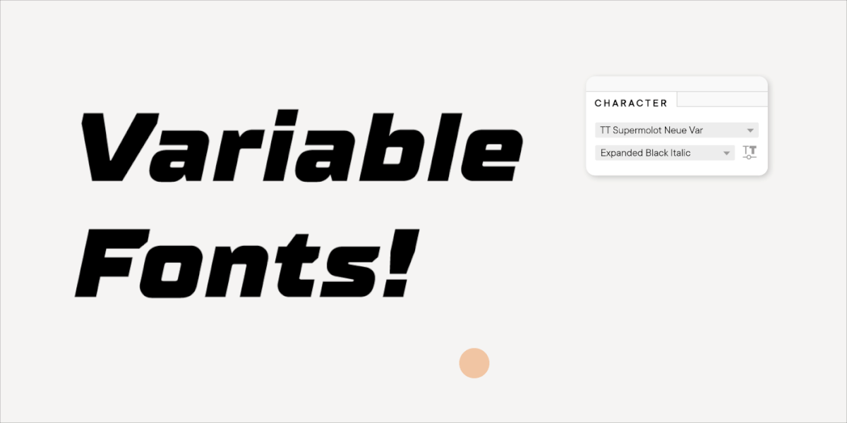
In the process of work, we literally redrew the font anew, harmoniously moving the bestseller to a new framework. At the same time, we expanded the character composition, and added new languages and styles. Moreover, we created 2 new subfamilies: TT Commons™ Pro Condensed and TT Commons™ Pro Expanded. They represent a narrower and wider version of the new TT Commons™ Pro and became an integral part of the variable font we’d worked on.

Variable fonts are the studio’s new classics, and we now create them for almost all new typefaces. From a technical point of view, we have been moving towards this for a long time, especially since the demand for variable fonts among our audience is really high. That is not surprising—with the help of such a font, a designer doesn’t have to choose from existing styles, but can create their own with parameters that are ideally suited to the project.

The final version of TT Commons™ Pro was released on platforms in the spring of 2021. The typeface has 62 faces, including the variable one, and the character composition has been expanded to a record high,1546 glyphs. The font is manually hinted, perfectly kerned, and functional features that any designer will feel comfortable working with have been added.
We tried to maximize the scope of the font. That is why, immediately after the release of TT Commons™ Pro, we began to develop a new monospace subfamily.
We had the idea to supplement bestsellers with mono-fonts a long time ago. Initially used in programming, monospace typefaces have been gaining popularity in design in recent years. Of course, many people will be pleased to use the familiar TT Commons™ as a monospace font, because this subfamily has retained the main visual features of the main family, despite the new forms.
The quirky monospace font TT Commons™ Pro Mono, where the usual glyphs are placed in a 600 point em square, can be a real asset for designers. After all, in addition to 14 faces, the font also has a variable version, and all the usual and functional OpenType features are preserved.

For the studio, TT Commons™ Pro and TT Commons™ Pro Mono are valuable projects that embody our professional growth, the creative vision of type designers, and the needs of the audience.

Bonus for aesthetes: TT Commons™ in projects
We shared with you the story of one of the studio’s top bestsellers, but the fact is that designers love with their eyes. So enough with the words, because TT Commons™ and TT Commons™ Pro can impress without them!
As a conclusion, we share examples of how TT Commons™ and TT Commons™ Pro are used in real projects: get inspired to create your masterpieces.


P.S. Those of you who want to learn more about the development of TT Commons™ Pro, we invite you to watch our lecture on YouTube.
Worked on the font:
Pavel Emelyanov
Antonina Zhulkova
Marina Khodak
Ivan Gladkikh
+ TypeType Team
FAQ

What is TT Commons™ and how did it become a bestseller?
TT Commons™ is a minimalist and neutral sans serif originally created for TypeType’s internal identity. It became a bestseller after users noticed it on the studio’s website, asked where they could buy it, and pushed the team to turn the internal font into a full commercial family. The first commercial version was released in 2018 and almost immediately became one of the studio’s bestsellers.
Why was TT Commons™ originally created as a corporate typeface?
TT Commons™ was created to become part of TypeType’s own visual identity. The studio needed a concise, simple, neutral, but still memorable font for its logo, website, agreements, and internal documents.
How did TT Commons™ evolve from an internal font into a commercial product?
After TT Commons™ appeared in TypeType’s corporate identity, users began asking about the font and found its name in the website code. Since the typeface was not available for purchase, the studio decided to develop it into a complete commercial family with more styles, broader language support, and an expanded character set.
What changes were made in different versions of TT Commons™?
The first commercial TT Commons™ had 18 styles and 771 glyphs. Later versions improved the technical quality, changed the encoding, expanded the character set, and added new styles: version 2.0 had 1230 glyphs, while version 2.1 grew to 24 styles and 1434 glyphs.
How did user feedback and customization requests influence TT Commons™ development?
User feedback directly shaped TT Commons™. Common customization requests included increasing the font’s size to standard proportions, adjusting the mean line for interface work, and making graphic changes for brand identity projects. These repeated requests became one of the reasons for creating TT Commons™ Pro.
What are the key differences between TT Commons™ and TT Commons™ Pro?
TT Commons™ Pro is a global reinterpretation of the original family. It has standard font proportions, reworked weights, improved technical quality, more glyphs, more styles, manual hinting, better kerning, functional OpenType features, and a variable font.
Why was a full redesign needed for TT Commons™ Pro instead of a simple update?
A simple version 3.0 was not enough because the recurring customization requests required deeper changes. The font needed a global reinterpretation: standard sizing, adjusted metrics, rethought weights, improved interface usability, and a more mature technical system.
What technical improvements were introduced in TT Commons™ Pro?
TT Commons™ Pro introduced manual hinting, refined kerning, expanded OpenType functionality, a variable font, standard uppercase and lowercase heights, and an expanded character set of 1546 glyphs. The final Pro version includes 62 faces, including the variable one.
What is TT Commons™ Pro Mono and how does it differ from the main family?
TT Commons™ Pro Mono is a monospace subfamily based on TT Commons™ Pro. It keeps the main visual character of the original family but places glyphs into a fixed 600-point em square. It includes 14 styles, a variable version, and preserved OpenType functionality.
What makes TT Commons™ a versatile font for branding and design projects?
TT Commons™ is versatile because it combines neutrality, simplicity, readability, and a recognizable but restrained visual character. It can work in corporate identity, interfaces, documents, websites, and branding systems without overpowering the design.