Technical work on a new typeface by third-party designers always arouses professional curiosity. Especially when it comes to working with fonts for brands with a world-famous history.
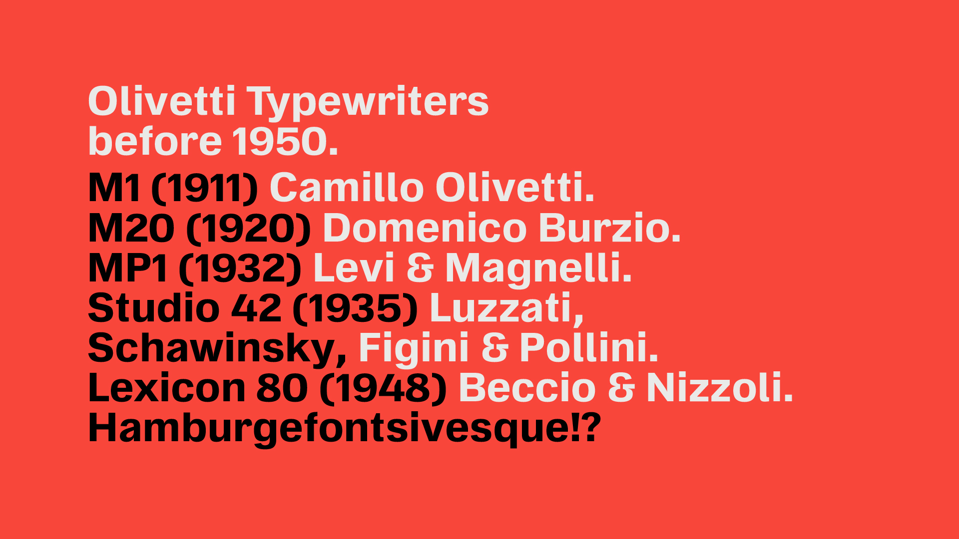
Olivetti is an Italian company whose name inspired admiration and respect in the 20th century, especially among journalists and writers. Olivetti produced some of the most popular typewriters, and the Lettera 22 is on display at the Museum of Modern Art in New York and has been the subject of numerous other international exhibitions.
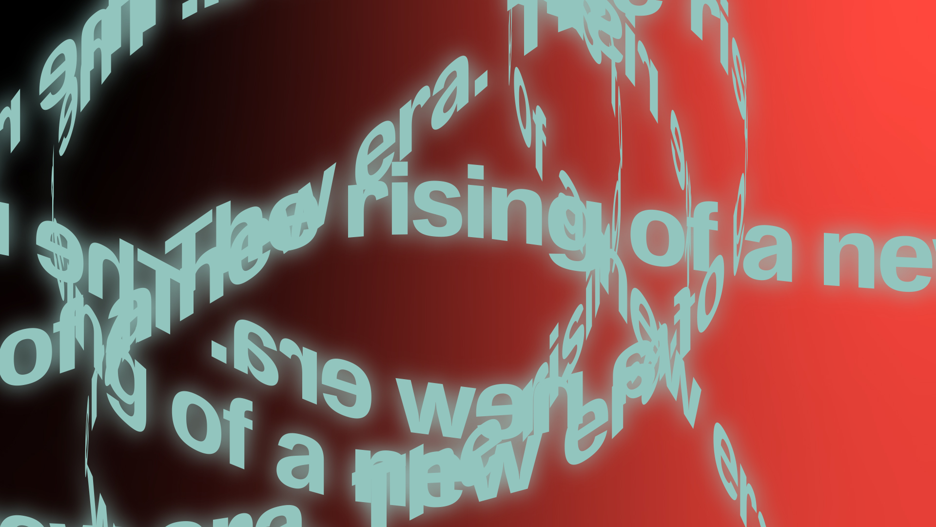
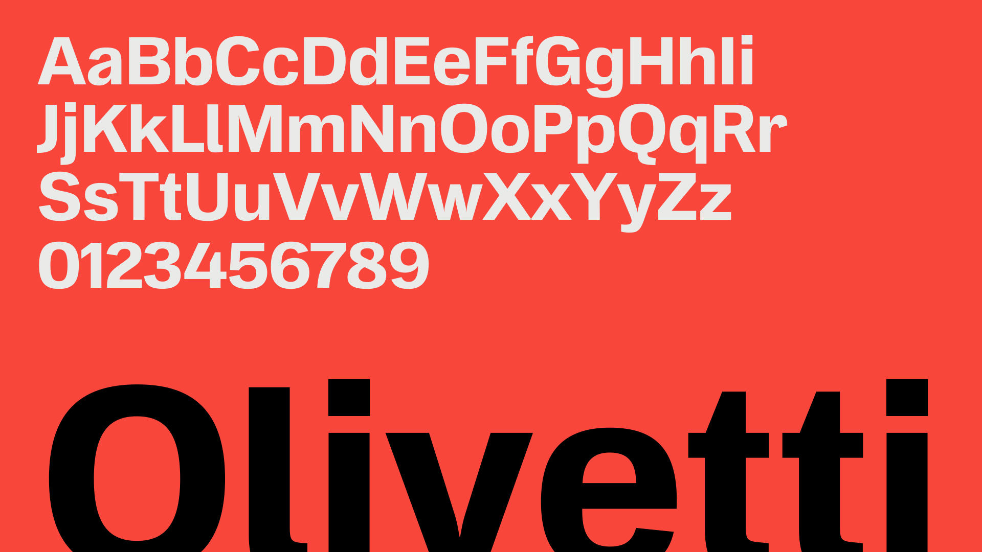
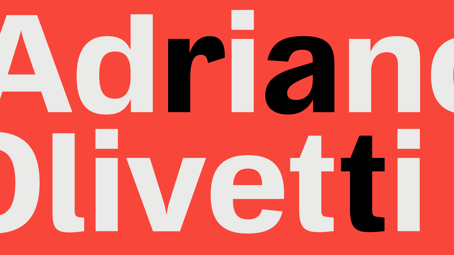
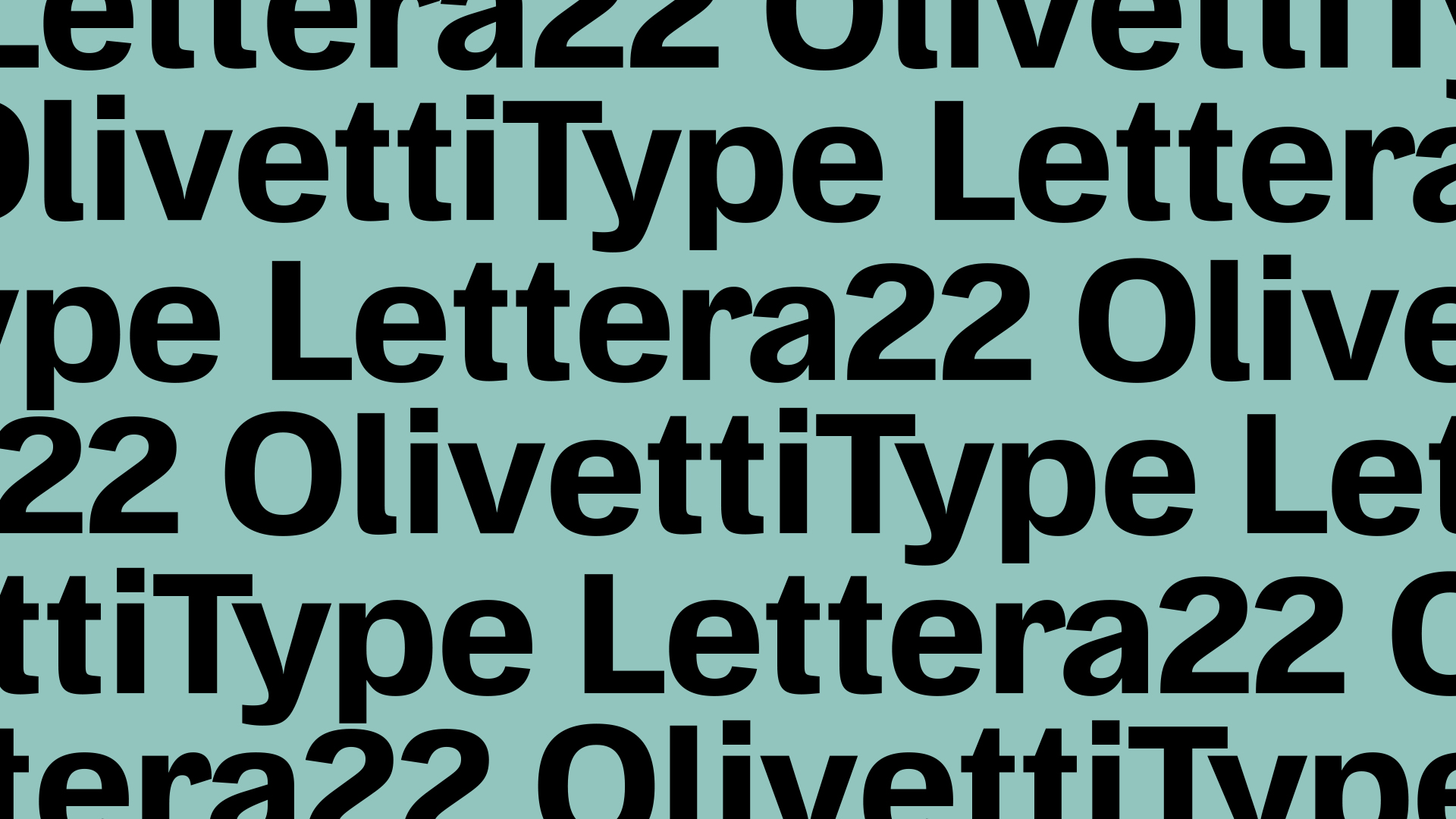
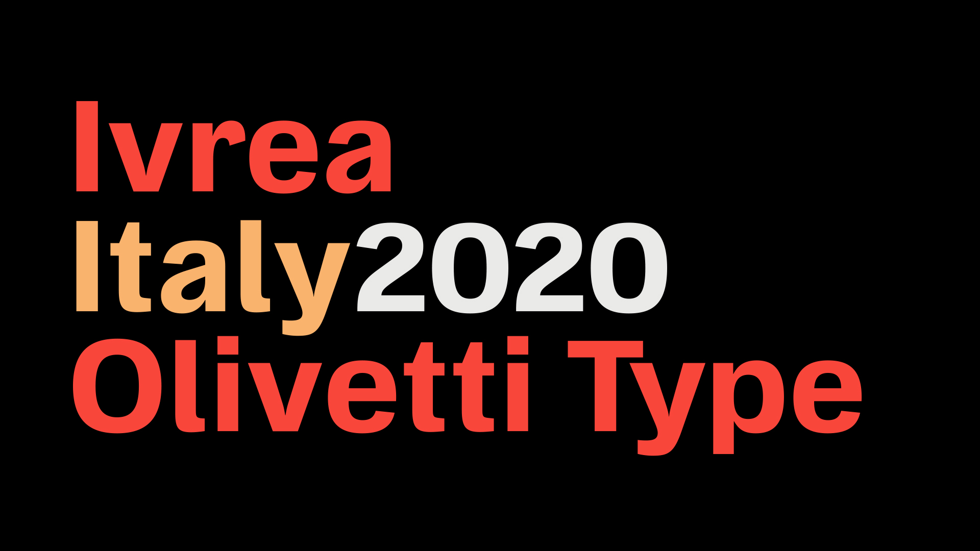
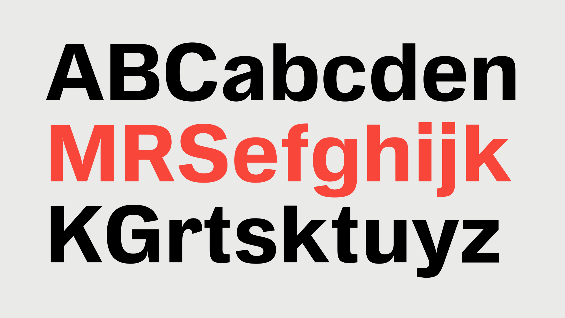
For the 70th anniversary of Lettera 22, Olivetti decided to create a modern typeface OT L22 inspired by the history of the famous typewriter. To create it, they reached out to the design agency Capelli Identity Design.
For font projects, Capelli engages designer Antonio Pace, with whom we often collaborate. We were invited to participate as technical specialists and we immersed ourselves in the history of Olivetti. It was not news to us that this is the largest manufacturer of typewriters, but we were surprised to learn that Olivetti even supplied its products to the USSR. Initially, our partners considered the possibility of creating a whole font family, but later settled on one style.
So we began working on it. During the negotiation stage it became clear that we have to carry out the whole technical part of mastering except the visual.
TypeType splits font mastering into 4 large blocks:
• visual, that is polishing the design of separate elements or entire characters, checking if glyphs conform to the typographic rules, making edits;
• technical, which involves setting up technical font parameters, checking the contours and diacritics, creating features;
• kerning, that is, forced compensation of the space between letters for specific pairs;
• hinting, which is the process of creation of visual markings for the font to display perfectly in any size.
Fullest mastering is when a client approaches us with a drawn font that we first send to visual and then technical audit. After that, specialists from two departments work on improving the font making the needed changes. In the OT L22 project, there was no need for visual mastering. Having received the final font file, we started working on kerning and spacing, setting up Font Info, checking font directions, and hinting.
Antonio Pace, a font designer and our partner, is someone who prefers working as a creator and going all out on each project creatively. Our task is to complete the font file technically, checking the diacritics and contours, specifying the features and supplementing the font with the functions that make it a working instrument. Our shared goal in joint projects is to create a font family that is aesthetically pleasing and simple and intuitive in use.
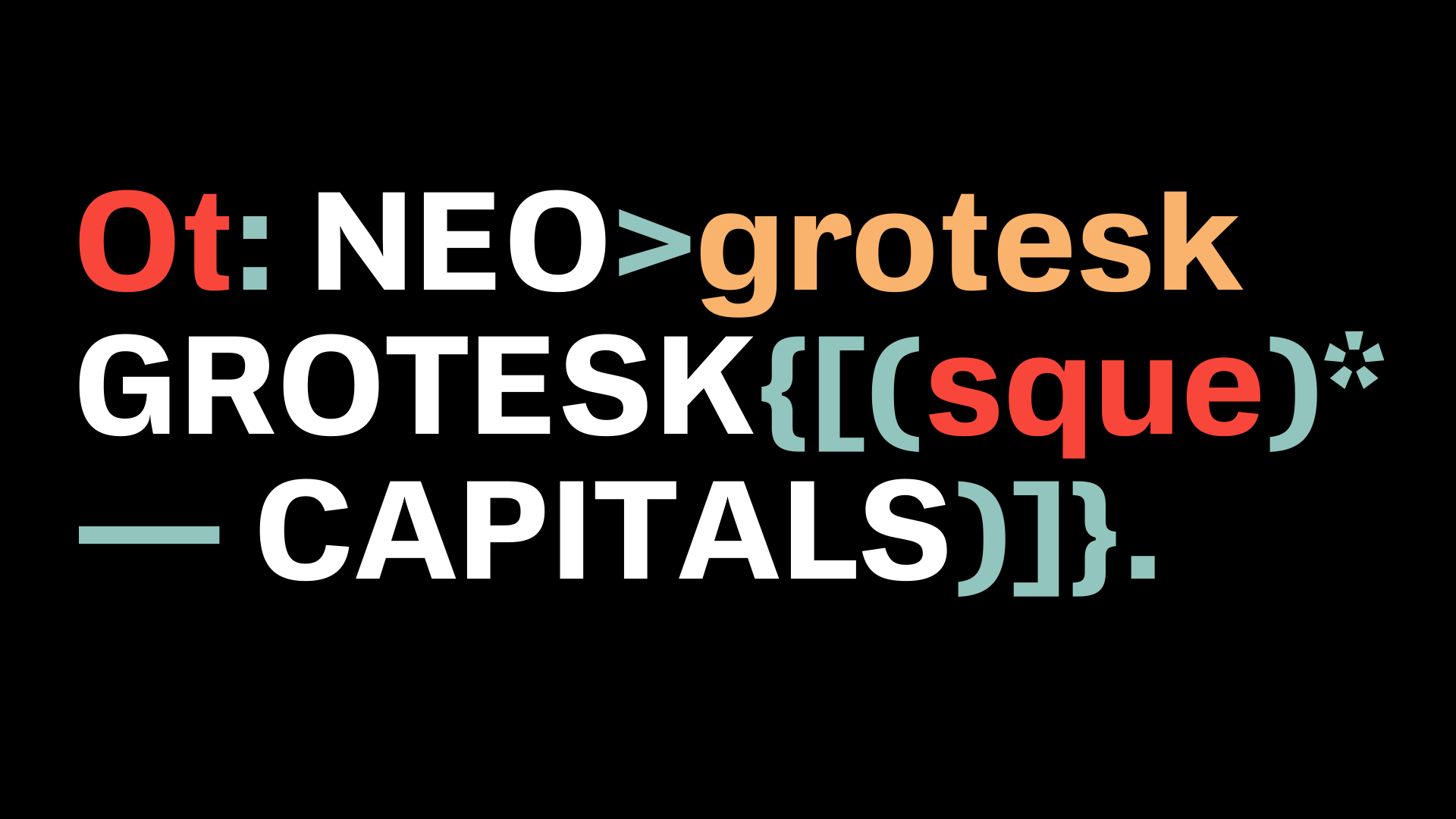
OT L22 is a typescript font, so the working system was similar to that used by TypeType in working with fonts of its own production. At the very beginning, we checked the outlines for correct construction, then determined the correct directions for their rotation so that the font is displayed correctly. Then we checked diacritics and the presence of anchors. Next, the font was diagnosed using a program specially developed by the studio — a language script — to make sure that all the necessary glyphs are present in the font.
After checking and the first adjustments, you can transfer the font to kerning – forced compensation for the distances between pairs, thanks to which the font becomes visually harmonious. Our studio has a well-established technique for performing kerning, which the technical department has been perfecting over the years.
After we transferred the kerning into the main font file, the specialists proceeded to the final setup specifying the main features. Before transferring the font to hinting, our team checked the file through a validator to eliminate possible errors. The validator is another TypeType’s development created for the final validation of a file. At the end of the technical work on OT L22, we did hinting, that is, we created a visual layout of the font to improve readability in absolutely any screen size and resolution.
The full cycle of technical work took the TypeType team two weeks. The longest part of cooperation on OT L22 was the discussion of the project and negotiations, because it was at this stage that a full range of tasks was planned on our part, for which the time was set in advance.
Technical work with typescripts is one of the most common and at the same time favorite tasks for us. The team has perfected working on each stage so that it is now possible to pay more attention to the peculiarities of the font on which we work. We released the final OT L22 file easily — knowing for sure that now this font can be used with pleasure.
Involved in working on the font
Creative Direction: Emanuele Cappelli
Type Design: Antonio Pace, Lorenzo Properzi
Visual Design: Andrea Fiori
Project Manager: Massimiliano Napoli
Communication & External Relations: Fabio ZaninoFont
Mastering: TypeType Team