
A font is a work of art.
Many designers think so, but we will talk not about the industry as a whole but about a specific font which is of interest for art lovers. It has all that is necessary: a beautiful creation story, aesthetics, and line flow. The Italian font designer Antonio Pace created the font for the Cappelli Identity Design studio, and TypeType transformed their creation into a functional work instrument.
2020, Lido Island, 77th annual Venice International Film Festival.
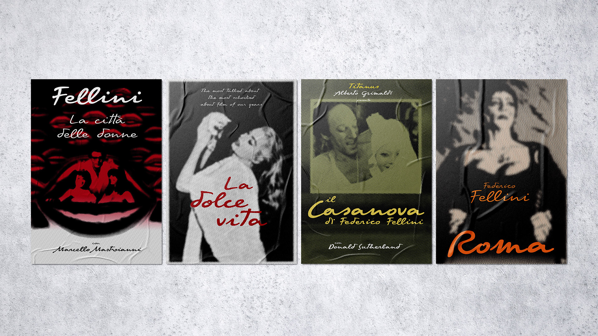
The Italian pavilion is dedicated to the cinema maestro Federico Fellini, a director whose contribution to the industry is invaluable. He is recognized as a classic and innovator of his time; more than one generation of masters grew up on Fellini’s works. Despite the fact that his films were made in the 20th century, their ratings are still high.
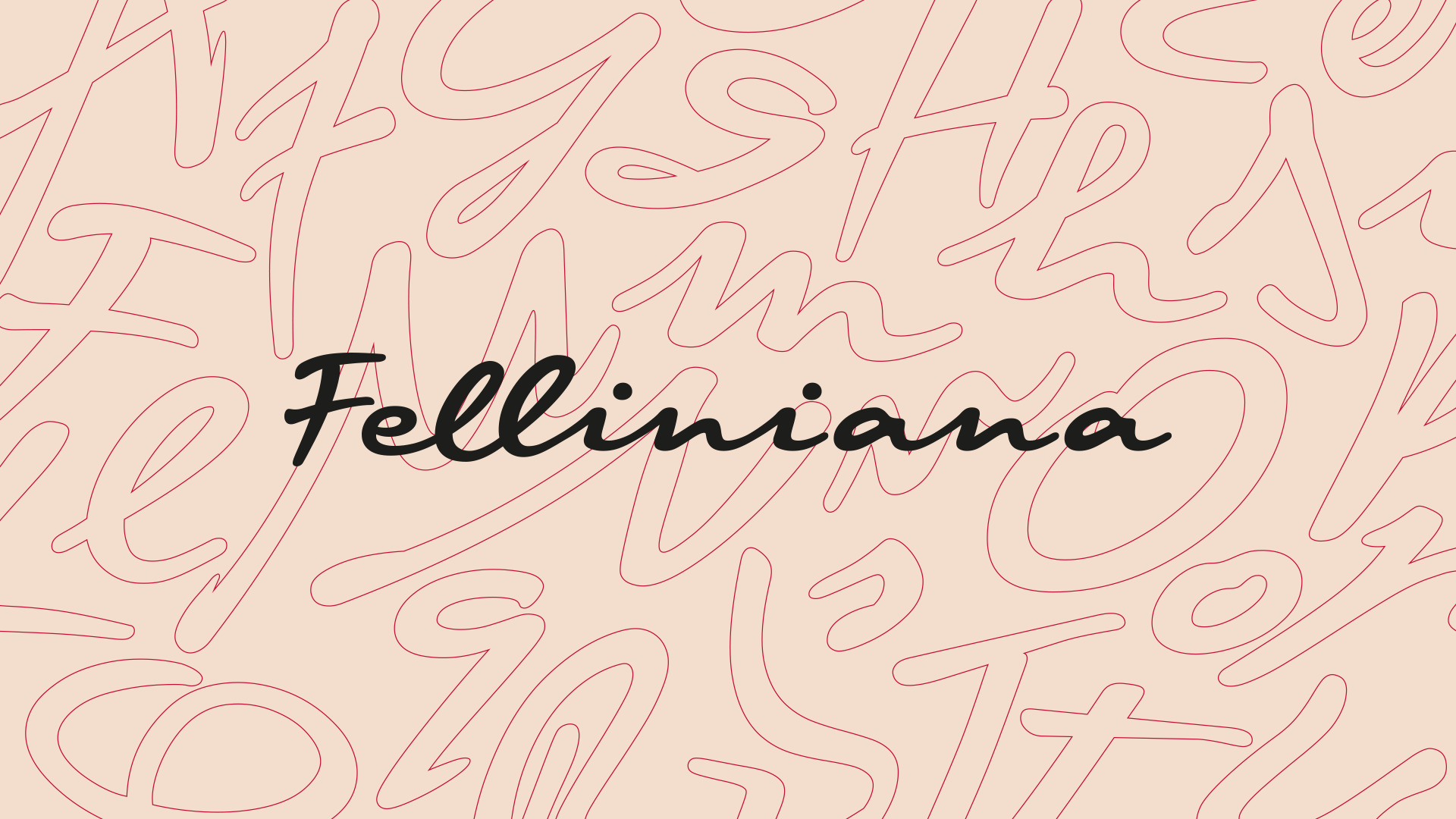
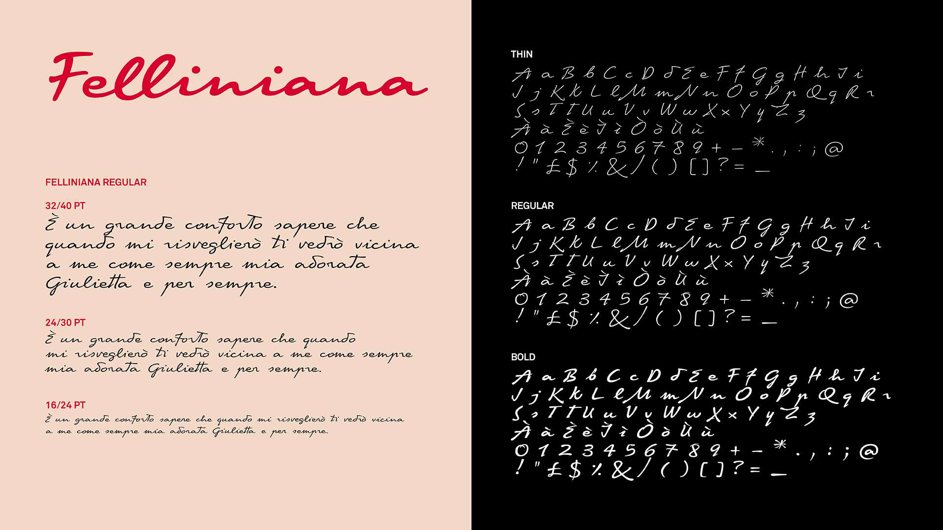
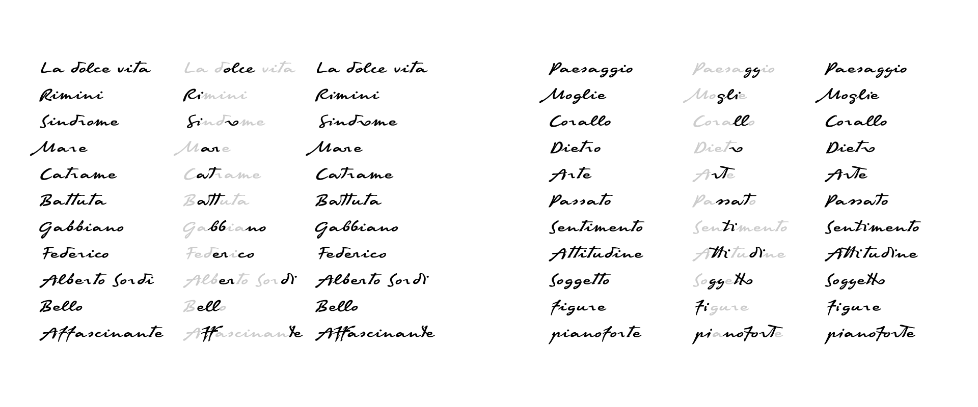
Do not be surprised by the information about the Venice Festival, because the Feliniana font was created especially for it, and visitors could see it in the design of the Italian Pavilion. Its theme was not accidental — in 2020, Federico Fellini would have celebrated his 100 year anniversary. Felliniana is a cursive typeface inspired by Fellini’s handwriting. The director’s letters were taken as a starting point, carefully gathered as reference material for the future font.
Already at this stage, Antonio reached out to us as technical partners. They had a system from which they assembled a font based on handwriting. The concept and scope of tasks of the future font family were clear in the materials provided. Digitization, transfer of glyphs to a font editor, and preparation of the font were planned by our partners, and the task of TypeType was to turn their work into a functional font.
The budget was limited, so the volume of tasks was also planned to be small. Despite this, mastering for Felliniana was a valuable experience for us, because we took part in a world-famous project.
At the negotiation stage, we discussed each option, outlining a plan for future work. The handwritten work of art in font format was received by TypeType studio in October, and already in December we handed over a working font family.
Mastering a font for the Venice Film Festival certainly seemed like a very promising idea. However, we were also interested in taking on for technical work a handwritten font with such a fascinating backstory.
Most of the projects at the TypeType studio are related to typewriter fonts. Of course, our experience is not limited to them but the bulk of handwritten typefaces were released under our experimental brand Piñata. Creating them, we got acquainted with the peculiarities of the technical work on such fonts, realizing the huge difference in approaches.
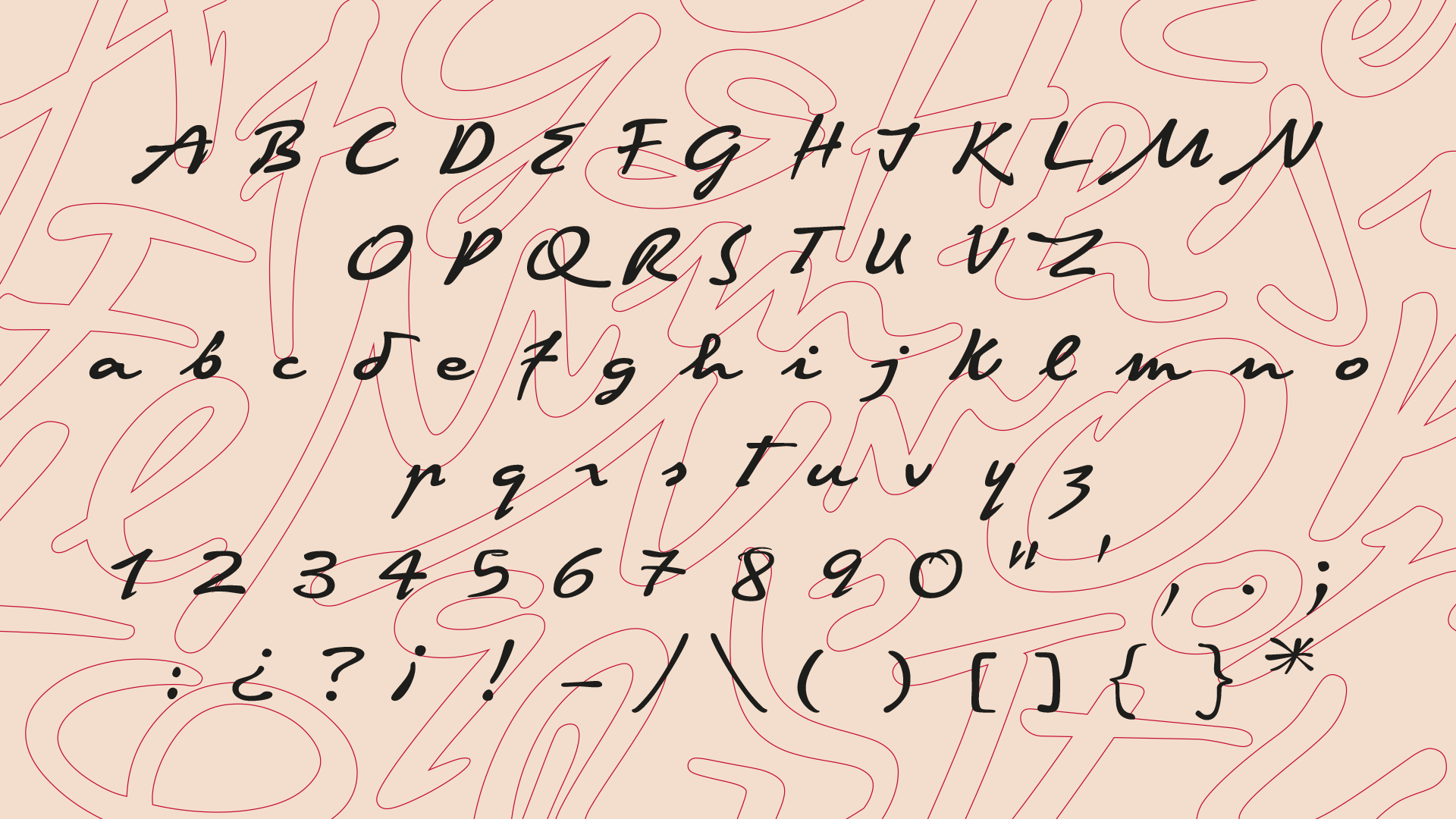
Handwritten font is always a lively, very dynamic material for a technical specialist. It doesn’t matter if they gave us scanned letters or a digitized version assembled in the editor, when working with such a typeface it is impossible and even harmful to apply all the rules that are mandatory for typewritten ones. This applies to spacing, kerning, and the shape of glyphs. Many aspects may remain not quite correct from the typographic point of view, but absolutely right from the handwritten one. For example, the shape of characters: the same person never writes a letter exactly the same, and it is important to reflect this in the font, otherwise the creators risk losing the liveliness of the handwriting in the final typeface. There may be many such peculiarities.
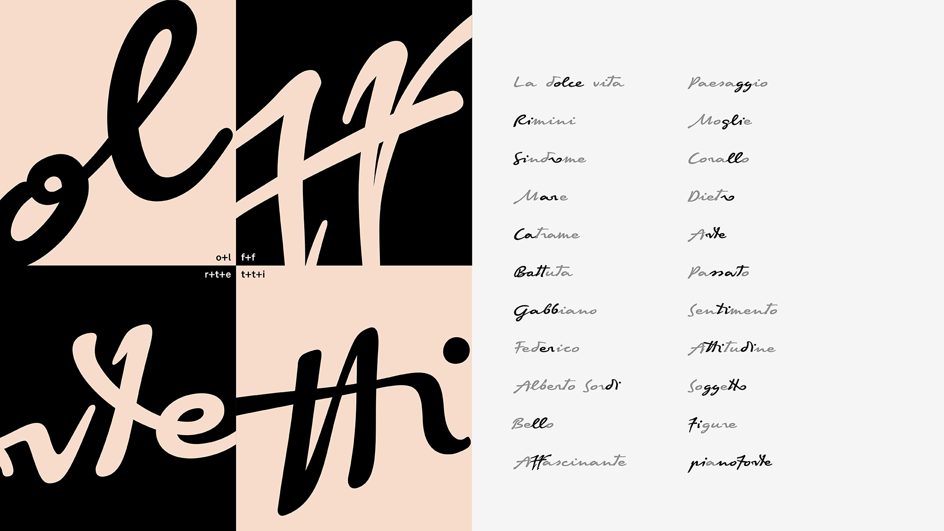
Federico Fellini, by the way, rarely connected uppercase and lowercase letters, so it is often possible to see a free space between them. This is noticeable in his letters, taken as reference for Felliniana, and it was important to convey this feature. Fellini’s handwriting is also distinguished by smooth lines and pronounced expression. Antonio Pace, working for Capelli, was able to convey the spirit of the handwriting in the created font. TypeType had to technically refine the font and deliver a working tool.
Due to the tight deadlines and minimal budget, it was decided to abandon the visual edits. In addition, the digitized imitation of handwriting completely suited the authors. The TypeType technical team conducted an audit of the font source in order to correct errors in contour direction in subsequent work, determine the presence or absence of anchors in some glyphs, and partially review spacing. We had to get additional approvals for some of the edits, for example, the drawing of some glyphs–some were sent for minor revisions.
In the corrected file, we added OpenType features and set up Font Info. We only specified features for ligatures that were borrowed from Fellini’s handwritten texts. In total, the font had two rendered styles, thin and bold, and one interpolated, that is, created automatically in the software. We dealt with the intermediate face at the technical stage, and also checked the correctness of the construction of the upper and lower diacritics in all three styles.
Of course, the directions of the contours were checked. In cursive, this is especially important, since glyphs often overlap, which means that they must have the same direction so that white spots do not appear at the intersection.
In just 10 working days, we have turned Felliniana into a functional instrument. This handwritten script was later used to decorate the texts of quotes and thoughts by Federico Fellini for the Italian Pavilion at the 77th Venice International Film Festival.
Mastering for the Felliniana font has become not only a stylish line in the portfolio of the TypeType studio. Thanks to this project, we gained experience in mastering a handwritten font created by international experts. Let’s be honest, working with the technical side of such a font from third-party authors is like bringing manuscripts to life, turning them into a tool.
Working on the Felliniana typeface with colleagues from Italy was exciting and enjoyable, especially since we were able to approach great things together, creating a typeface for the Venice Film Festival.
Involved in working on the font
Creative Director: Emanuele Cappelli
Type Design: Antonio Pace, Lorenzo Properzi
Lettering: Giovanni Dal Ben
Font Mastering: TypeType Team