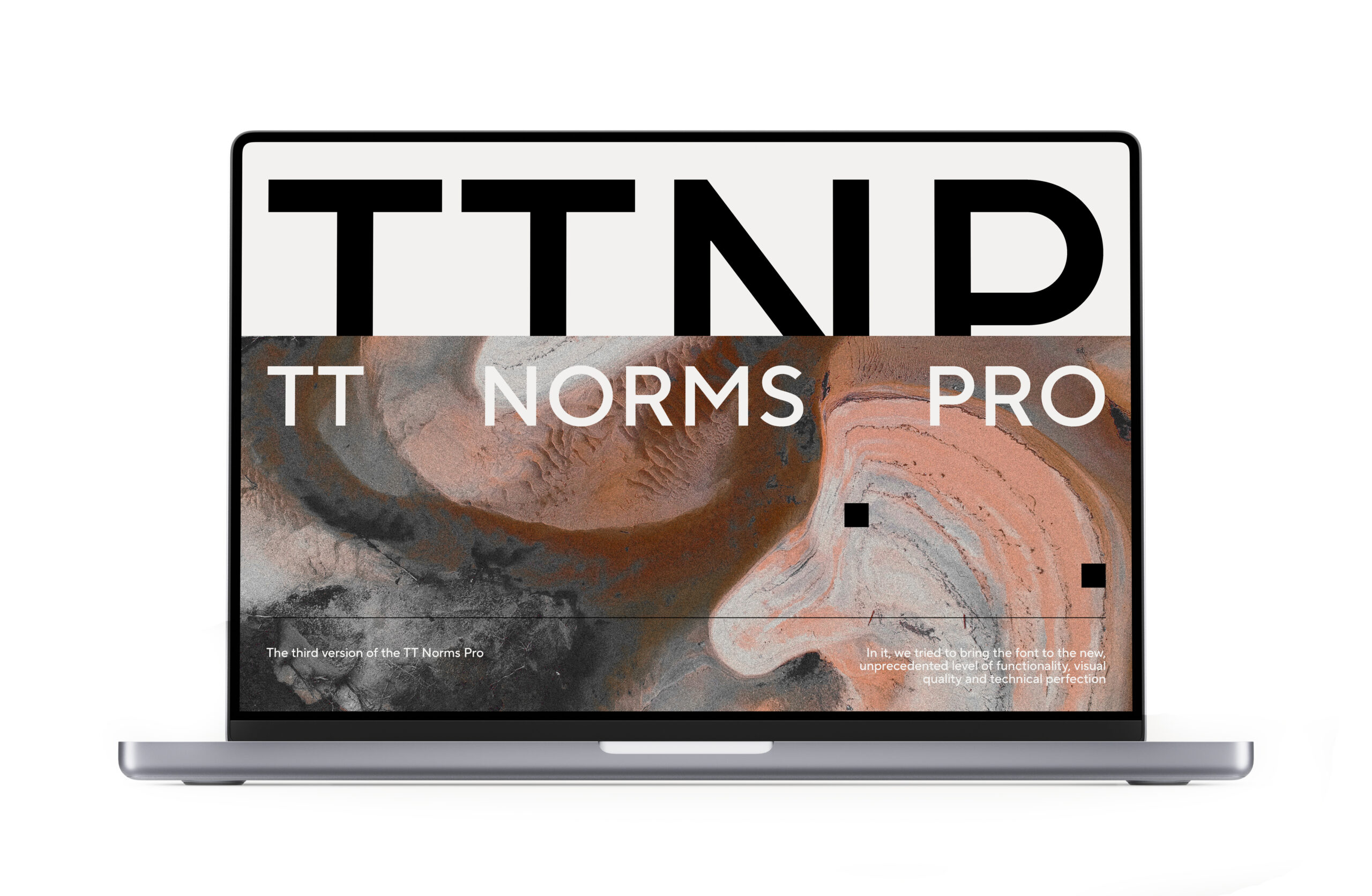
TT Norms® Pro is one of the most sought-after typefaces in the TypeType collection. More than three reissues in 7 years, first lines in MyFonts ratings, dozens of customizations and reviews.
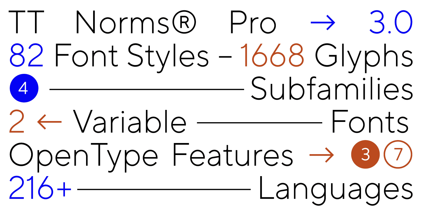
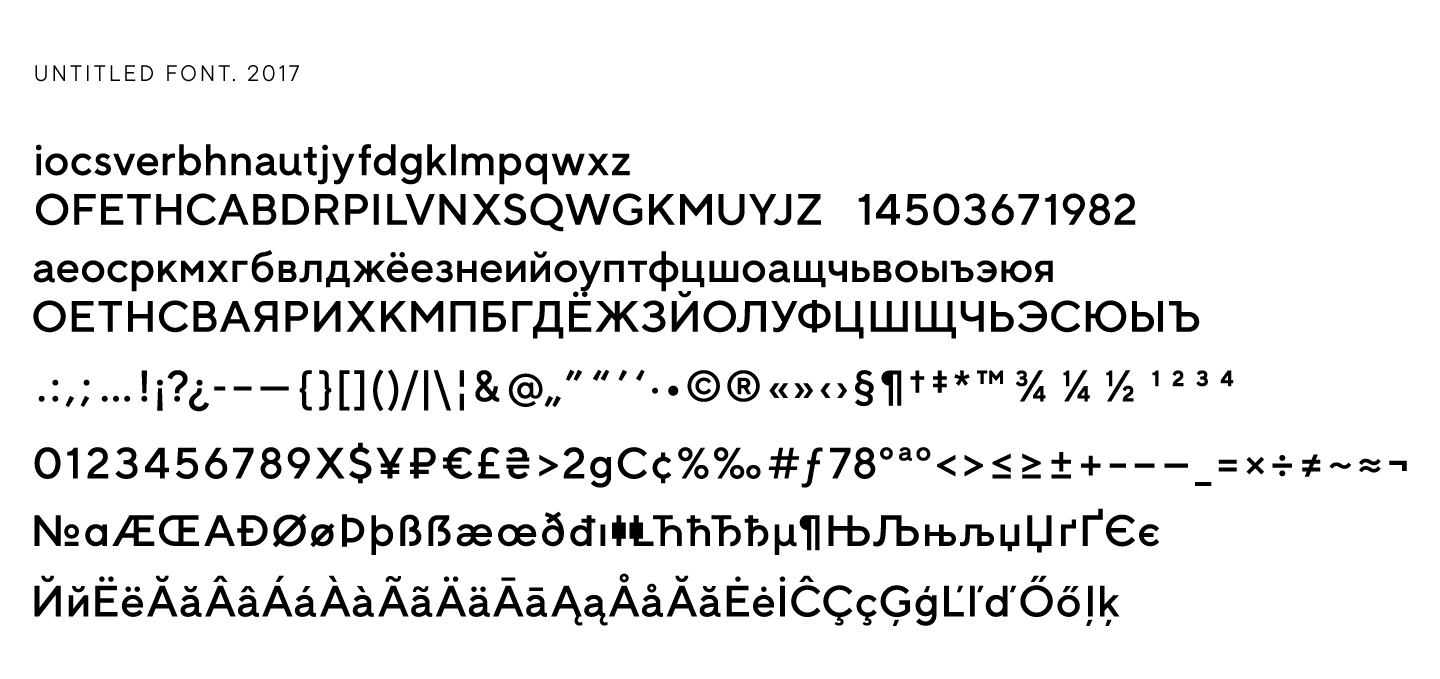
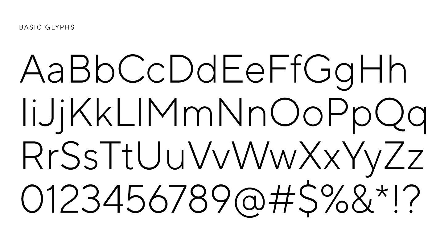
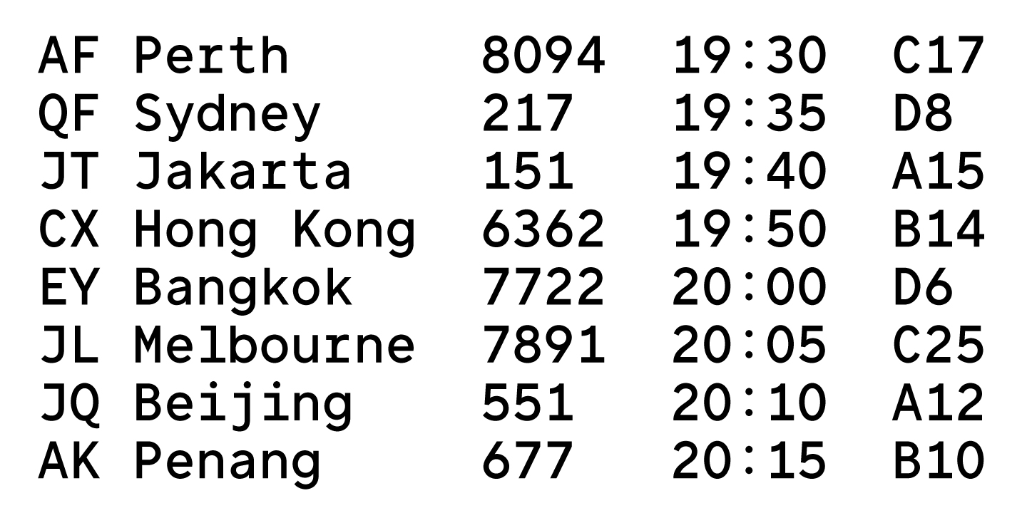
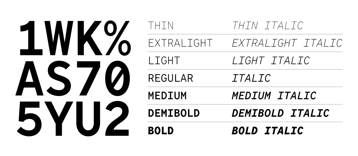
TT Norms® Pro, released in 2022, has 1668 characters in its font composition, 66 faces and 1 variable font changing along three axes. The TT Norms® Pro Mono subfamily contains 1181 characters, 14 faces and 1 variable font.
It’s hard to put into words what a valuable experience this font has been for everyone at the foundry, but we will try to tell its full story, with all its dead ends and mistakes, with the first victories and a massive redrawing process.
It all started with an idea
Back in 2015, TypeType could only dream of creating the most popular typeface in the world. However, it was then that we got the idea to create a new typeface, fundamentally different from everything that had been done before.
It would have been nice to say that we already knew then that we were creating a legend, but everything was much more prosaic. One of the studio’s type designers realized that when choosing a typeface for a new project, problems constantly arose: they liked the typeface visually, but did not like the character composition or the Cyrillic version. In addition, at that time the choice of geometric sans serifs was modest, although such fonts were gaining popularity in the world and becoming a trend.
This was the prerequisite for creating their own product with a carefully crafted Cyrillic alphabet, an extensive character composition, and a universal character. We wanted to get a font that would suit different projects, look stylish and modern—a geometric sans serif with classic character proportions, neutral, but indispensable for designers.
This is how the first sketches appeared.
TT Norms®—first version
2015–2017. From sketches to the top of MyFonts ranking
In 2015, the studio had a completely different approach to type design, but quite many ambitions and plans. We put all our efforts into creating a geometric sans serif with a universal character, because we wanted to expand the scope of its application as much as possible.
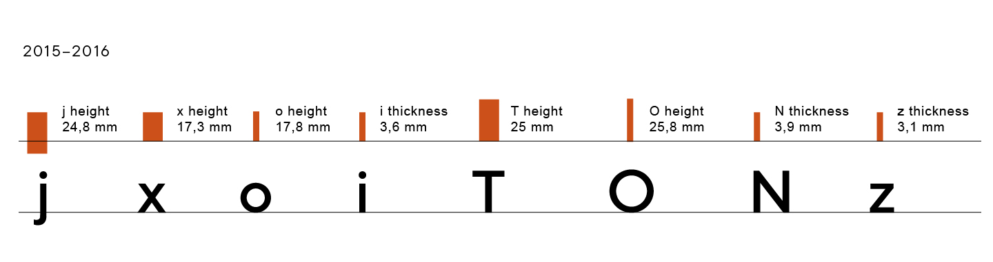
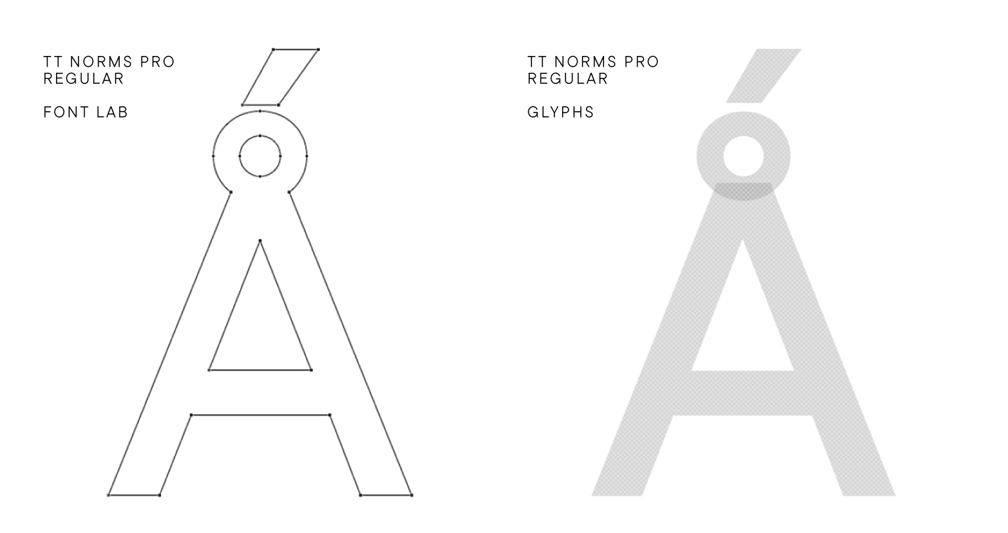
The idea was taken into work right away, and from the first sketches, the active development of the font, for which at that time we did not have a name, began. The file with developments was called «Untitled font». At the end of 2015—beginning of 2016, several letters were drawn in Adobe Illustrator, and on March 7, 2016, the first face appeared. Each glyph was drawn in a graphics editor, and the plan was to create 7 upright faces: Thin, Light, Regular, DemiBold, Bold, Black, Extra Black.
Simultaneously with the first developments, we began to think about the name of the future font. There were three versions proposed.
- The first was called Norms. It is formed from the word «norm», alluding to example, sample, or standard.
- The second name was Brevs. Translated from Norwegian this word means letters.
- The third contender was Completes, derived from the English «complete», that is, perfect or finished.
It is not difficult to guess that the very first option was the winner. The name TT Norms® still seems to be the most fitting option for us, as concise and memorable as the font itself.
The work continued.
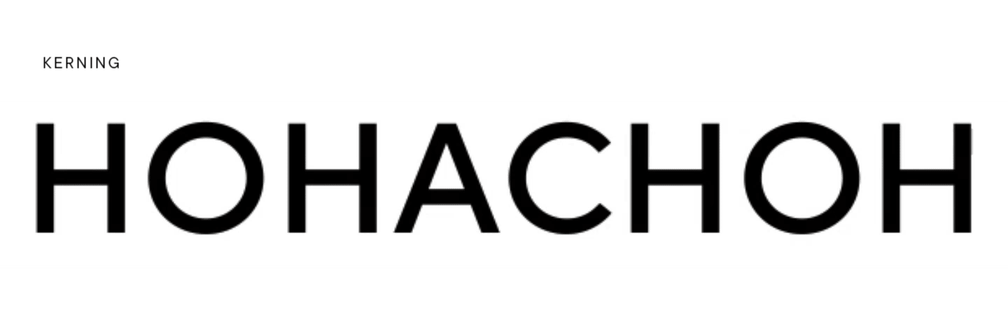
On March 13, 2016, the font was fully assembled. The correct approches were set, kerning was done, features for working with alternative characters were specified. We wanted to bring the typeface to its final state as quickly as possible in order to pay more attention to honing and refining it while seeing the finished result.
The first edits are still in the team’s archive folder. We share some of them.
- In different sizes, the edges of the number 8 and the Latin lowercase letter f were displayed wrinkled or cut off.
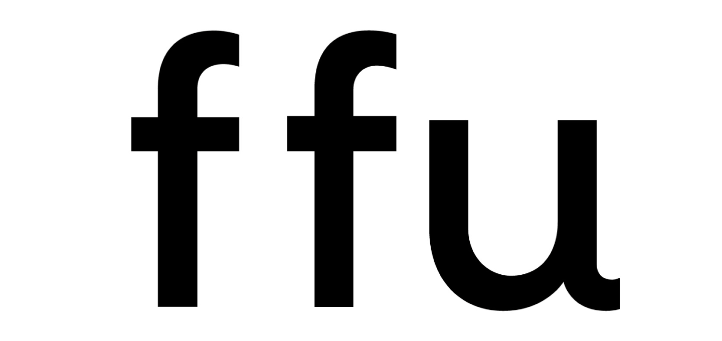
- The shapes of the rounded elements of the Latin lowercase letters r, f have changed compared to the original versions. The r got a more rounded shape, while the f got a sharper tip.
- In some pairs, the letters flew apart, which was a kerning mistake. This problem could be encountered when working with a certain size and scale.
- The gap in the pair of lowercase and uppercase letters was significantly larger than the indentation within the word, which was also a kerning flaw.
There were indeed some flaws in the first iterations, but it didn’t matter at all, because even then the first impression of the font exceeded all the team’s expectations. TT Norms® looked really harmonious: both the shape of the letters and the diacritics were very attractive. The enthusiasm to continue the work was very high.
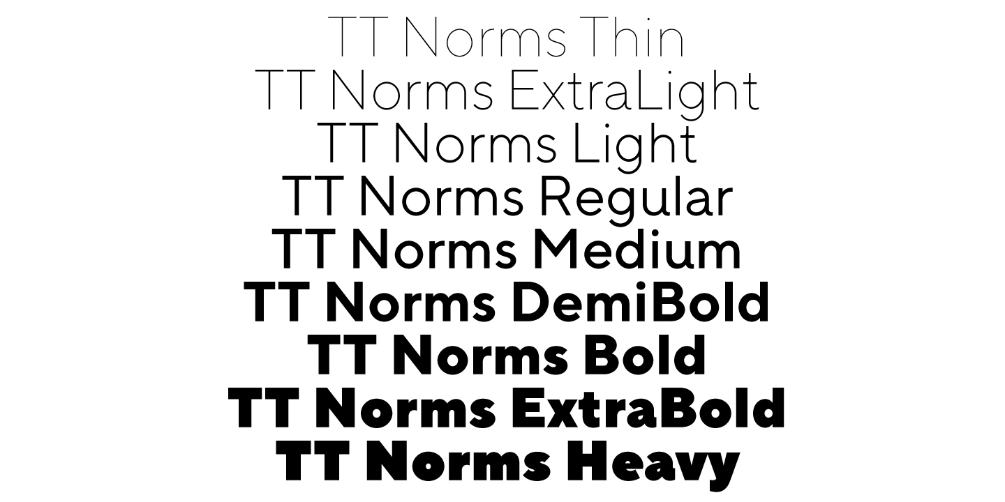
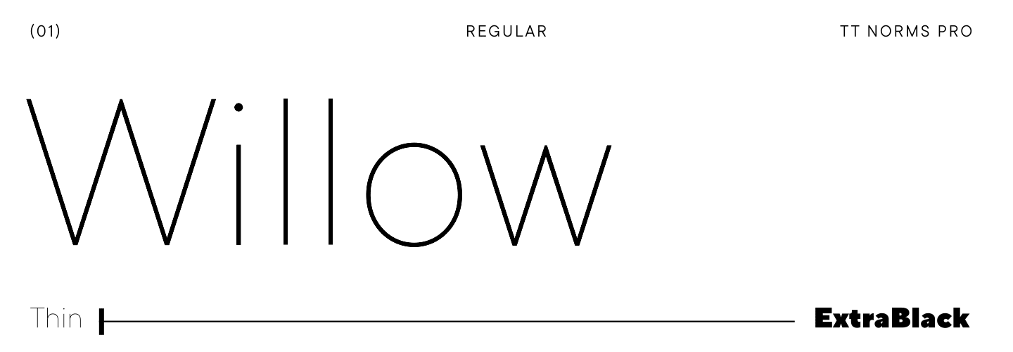
By the end of March, the plans were to draw 7 upright faces, namely Thin, Light, Regular, Medium, DemiBold, Bold and ExtraBlack. It seemed to us that this particular set would cover all the needs of designers. By the way, in the final version, we still added 2 more faces.
At that time, we worked in the FontLab 5 program, and all the styles were drawn by hand. After making changes, the project was brought into the CRM system. It’s worth noting that we didn’t work on TT Norms® on a daily basis, because other projects were going on in parallel, so sometimes the font was lying around and waiting for its time to come.
By the time the idea was formed, the font was taken into development and partially rendered, we had to take a break and wait until the team’s resources were freed up to continue working.
In November 2016, we took the finished developments as a basis as a medium font and added Heavy and Thin, that is, the thickest and thinnest fonts. In the process, we found some small flaws so we made changes in parallel. For example, in lowercase Latin letters a, y.
By January 2017, seven upright faces were ready, and ExtraLight was added to the originally planned ones. In the first version of the font, DemiBold was dropped, as the difference in vertical stroke weights between it and Medium was negligible. But the boldest—Heavy—has been added to the palette of faces.
During additional testing, further needed edits were identified, some of them are shown below.
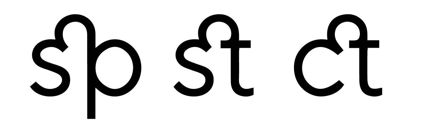
- The inter-letter spacing of some ligatures looked heterogeneous, so the task was to make everything look harmonically.
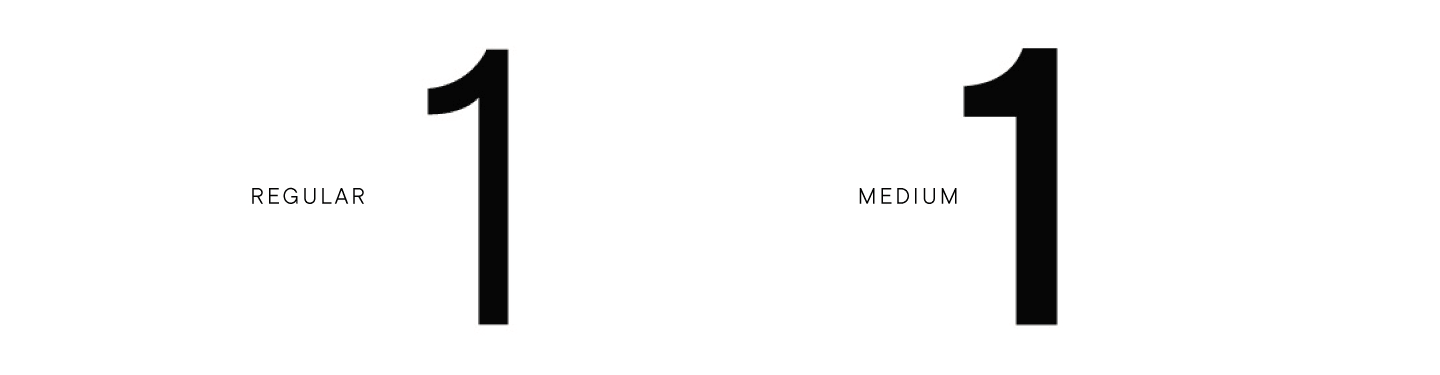
- Some characters changed shape in different styles, for example, in the thinner Regular, the number 1 looked different than in Medium.
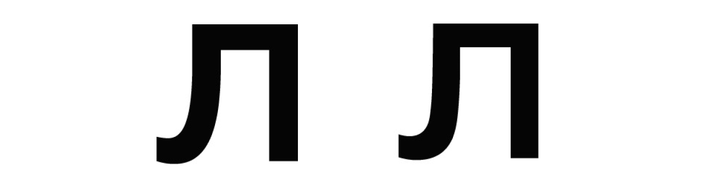
- Some forms of glyphs have changed compared to the original, for example, in Cyrillic л, the smoothness of the turn has decreased.
We constantly examined the font for flaws and made changes, trying to consider all the details finalizing the font.
In the same period, real italics appeared, that is, with a change in the shape of characters. It was an experiment that we later abandoned.
On May 30, 2017, the first version of TT Norms® was completed. We have released the project on the platforms.
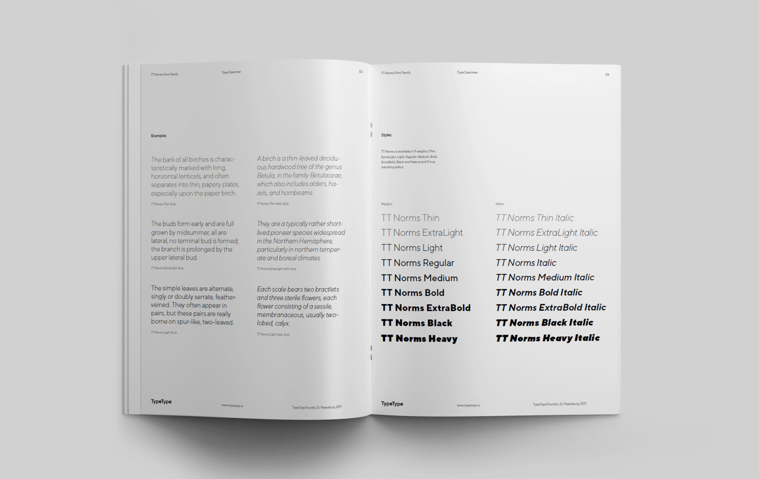
There were 18 faces in the 2017 version of TT Norms®: 9 upright (Thin, ExtraLight, Light, Regular, Medium, Bold, ExtraBold, Black, Heavy) and 9 italics duplicating them. The character composition of the first version of the font was 530 characters in each style. Later, the number of glyphs will increase by more than three times!
Together with the TT Norms® font family, a specimen came out with all the necessary information and graphic materials on the font.
Our efforts were not in vain: almost immediately after the launch of sales, the released font became a bestseller on MyFonts. Of course, this served as a powerful motivation to continue working on the TT Norms® update, improving it from a visual and technical points of view.
TT Norms®—continuation
2017–2018. From version 1.2 to TT Norms® Pro
After the release of the first version and the success on the platforms, we started thinking about expanding the font family. We wanted to give designers the most versatile tool in their arsenal.
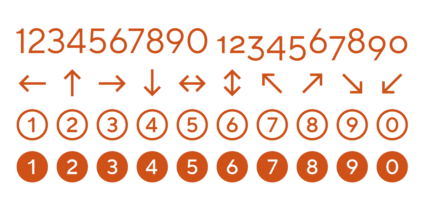
Version 1.2 was implemented almost immediately after the release of the first. We have increased the character composition to 610 glyphs in each style by adding extended Latin characters, old-style and tabular figures, arrows, and figures in circles with and without fill. For both versions, automatic hinting was done using ttfautohint.
In 2017, we also met the team of the oldest font studio from the capital. More experienced colleagues at that time made an audit of TT Norms® and helped us to pay attention to some technical shortcomings, which we immediately began to correct. It was then that the realization came that without establishing the technical department and the development of software, it would be difficult to develop the font, so we began preparing software products that would help control the quality of the fonts produced.
The technical department was formed and expanded. In 2018, the team mastered manual hinting and created their own set of utilities for quality control of font families.
It’s easy to imagine that the whole of 2018 was devoted to changes in TT Norms®. We actually redrew the font during this period, starting with a global study to understand what glyphs can be added to the font. The team also recalculated the parameters of stems for better compatibility between the faces, changed the interpolation in the fonts and, since each style and each glyph was changed manually, redrew almost the entire font.
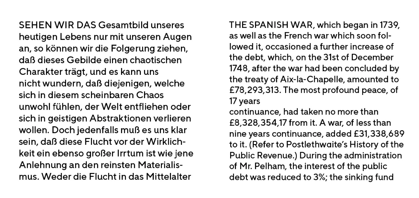
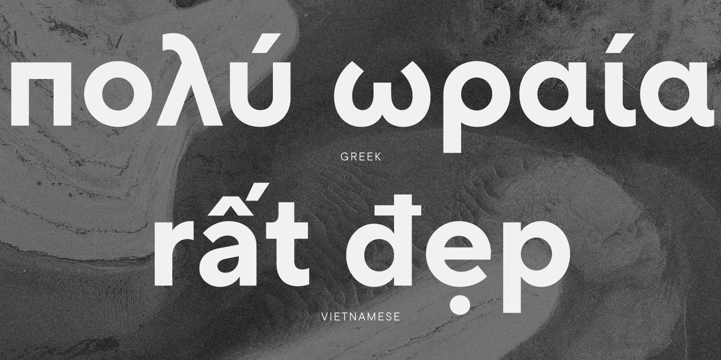
Real italics were replaced by italics completely repeating the original drawing of upright character obliquely. The character composition expanded to 1392 characters: Greek and Vietnamese languages appeared, the palette of Latin and Cyrillic languages expanded. We have added new currency signs, including their variations: numerators, denominators, tabulators and old style forms. We supplemented the font with service characters, thought over OpenType features, which, as we understood, were used by all professionals in type design. Hinting was done manually, which increased the value of TT Norms® when working in a web environment.
Of course, with these changes, we released not just an update, but a new version of the font, which received the prefix «pro» and changed its name to TT Norms® Pro. At that time, it was the largest and most voluminous project of all that we ever did. The font went on sale in January 2019 and again captivated users, becoming popular all over the world.
We began to receive feedback from users, including feedback on shortcomings or bugs noticed during use. For us, messages from a real audience are always a valuable contribution to the development of a font, because it is an opportunity to quickly fix all the flaws.
We constantly rechecked the character composition until we realized that the TT Norms® Pro version needed major changes. Thus began work on version 2.140.
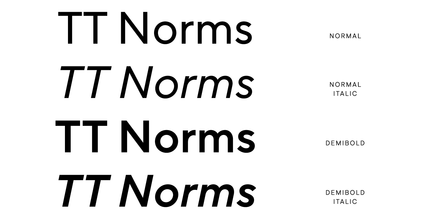
So, based on feedback from users, we have added 4 new weights that were mentioned in requests most often: Normal, Normal Italic, DemiBold, DemiBold Italic.
The character composition has gone through yet another expansion, this time reaching 1,590 glyphs, an incredible number for TypeType. At that time, TT Norms® Pro in version 2.140 was the most extensive in terms of character composition.
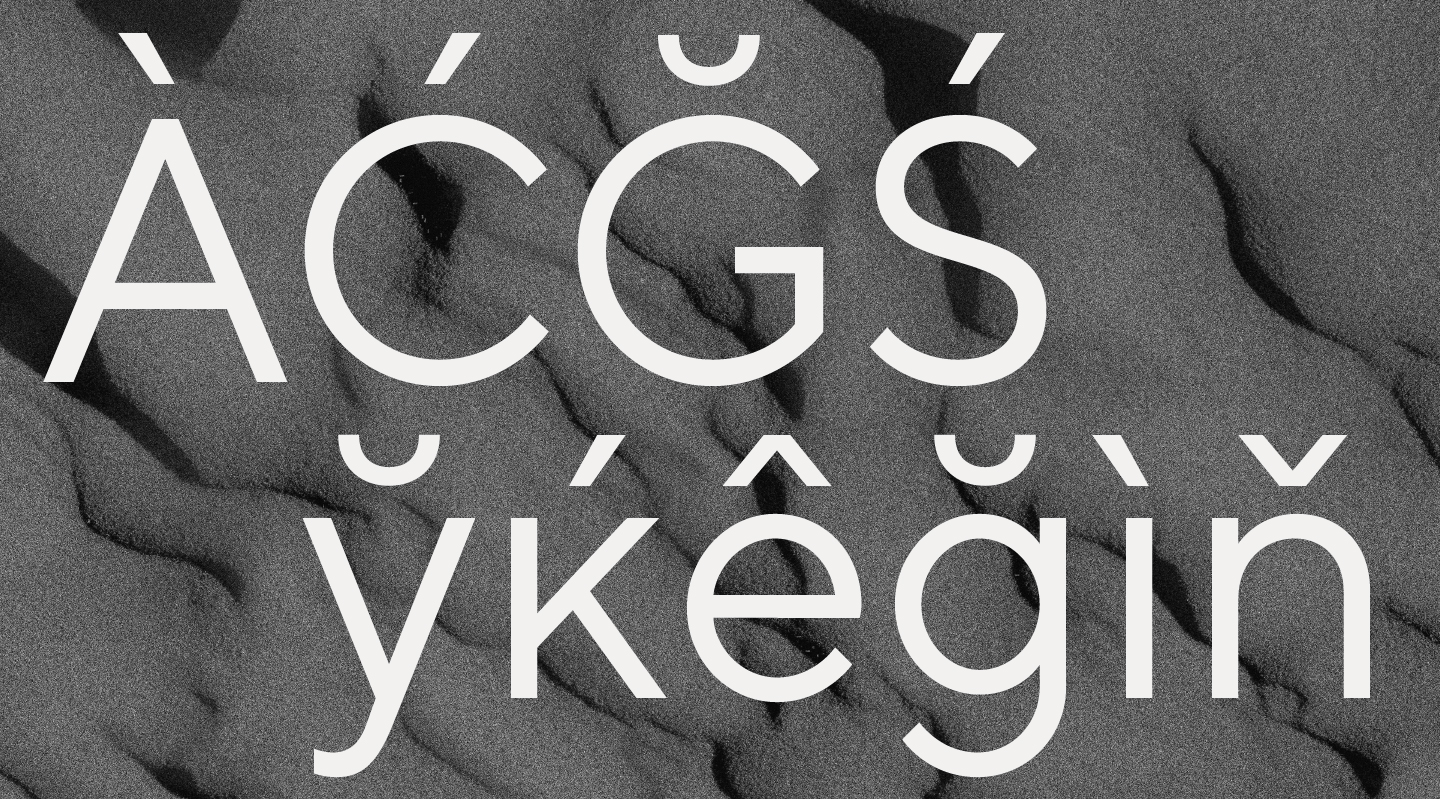
We thoroughly studied the market, conducted research and rethought the features for the font family. This time we have included localizations for Serbian, Chuvash, Bashkir, Bulgarian, Moldavian (Romanian), Catalan and Dutch. In the language composition of the updated TT Norms® Pro, even the languages of the small peoples of Russia were present.
In TT Norms® Pro 2.140 we made the first variable font at TypeType. It was a compromise version for those who insistently asked for a similar font, because it resulted in 2 variable fonts: one for uprights, and the other for oblique faces. Separate variable fonts for straight and italics appeared due to technical difficulties: the number of dots between styles did not match, which made it difficult to correctly switch variations. Each weight, as we already mentioned, was a hand-drawn master, so reaching such a compromise was a victory, because the variable fonts worked really well at the end.
The technical department checked the font for bugs and shortcomings, which were fixed in parallel. Edits were made constantly, because we wanted to make this font the best.
The technical department also collected feedback from users, making improvements to the operation of TT Norms® Pro. For example, in the course of work, we found that some of the legs of the letters were unstable, that is, they moved up and down. In type design, there are 2 types of curves: OpenType and TrueType, and the technical department had to convert some parts of the curves to TrueType in order for the variable font to be correctly generated.
It is worth noting that this version is the most popular and in demand. It was released in 2020, and if you have used or at least heard of TT Norms® Pro, then with a high probability it was version 2.140. At the time of release, it was the most time-consuming and complete font.
We haven’t stopped improving TT Norms® Pro even after the updates. For example, one of the clients noticed that in version 2.140 the Polish diacritics were not drawn correctly, so we completely redrew it in all styles. A rather time-consuming process, but inevitable when you want to your font to be the best.
TT Norms®—dead end
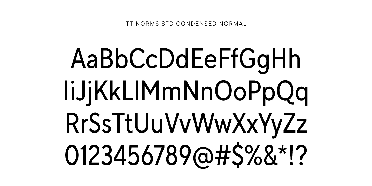
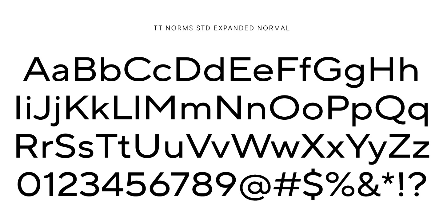
2018–2020. Simplified TT Norms® Std, Condensed and Expanded
The story that we will tell in this chapter chronologically intersects with the previous one. By 2018, the entire TypeType team fell in love with TT Norms®, so we were constantly thinking about new ways to improve the font. In addition to working on TT Norms® Pro, there was an alternate history of the font’s development.
By 2018, the TT Norms® typeface has already become a complex typeface with a huge character composition, an abundance of languages and styles. As we mentioned, this is the only font in the TypeType collection that supports extremely rare languages, which began to affect the price of the font.
We came up with the idea to make a simplified version of the classic TT Norms®, reducing the character composition to a basic alphabet, numbers and punctuation. This product could become more accessible to a wide range of consumers, including those who do not use a large number of features and characters in their work.
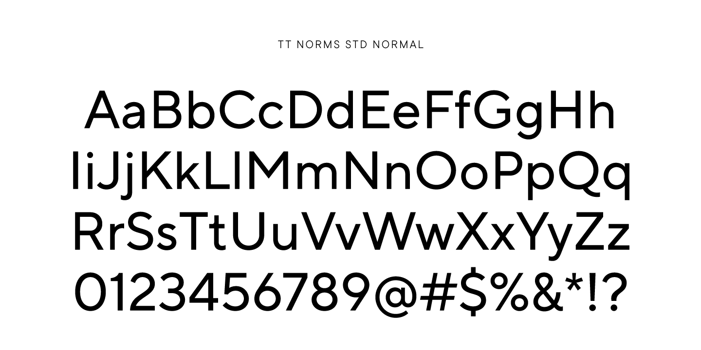
Lighter versions were to be called TT Norms® Std and included the classic TT Norms® Std, the narrower TT Norms® Condensed and the wider TT Norms® Expanded. In the simplified version, the character composition was only 378 glyphs for each style.
For those of you who love spoilers, we only released TT Norms® Condensed as a result, although almost everything was drawn.
We started the work on TT Norms® Condensed, which began with extensive research. The art director of the studio studied all the sans serifs of large studios, in the family of which, in addition to the classic ones, there were narrow versions. In the course of the research, we were able to understand what values are considered optimal for narrowing, so that at the same time visual harmony and character of the font family would be preserved, and with which values the font pattern would be severely deformed.
The study also looked at the number of weights for narrow versions to understand at what maximum weight the font would still look aesthetically pleasing.
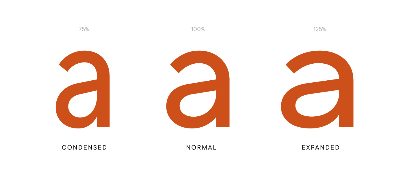
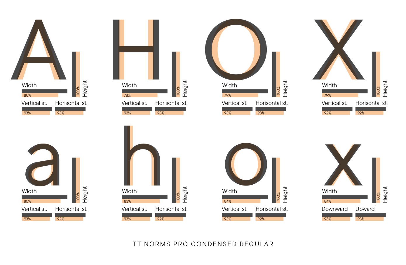
However, as a result, we relied more on our own opinion and observation than on examples of other typefaces. As a result, the team was able to determine the values for the thickness, height and narrowness of the signs. We decided to make uppercase characters narrower by 78-80% and lowercase characters by 75%.
We began to look for the optimal value using the example of the medium, the thinnest and the boldest styles, because the same changes will affect the font drawing in different ways. It was also decided to abandon the boldest typeface because it was no longer possible to achieve visual harmony when narrowing the letters in this thickness. By the way, other type foundries often make a similar decision.
All the results of the research and analysis were agreed, however, TT Norms® Condensed did not go into work immediately due to the load and the presence of higher priority tasks.
Glyph rendering started with three weights, namely Thin, Regular, and Black. Later, designers joined in to work on the rest of the styles, including italics. Due to the manual rendering of glyphs in all styles, the work was energy-intensive.
We were still working in FontLab 5, where it was not possible to create reference masters and generate intermediate styles based on them. Later we switched to Glyphs and this transition influenced the development of TT Norms®, but we will talk about this a bit later.
With the Norms® Std versions, plans changed as we worked: we had thoughts of releasing it as a standalone product or finishing it in the future for other purposes.
The main work on TT Norms® Condensed took place in 2019, and the font was released in April 2020.
The technical department checked and tested the finished font files for errors, checked the level of ascenders and descenders, the contours of tabular figures, looked at how dots are located in uppercase and lowercase characters, and manually equalized approches. It also did kerning and its transfer into the main font file.
We cut down the font composition to the standard encoding. Before doing so, the team did some research to figure out which set to keep. It was important that the user still be able to use the main European languages. Finally, manual hinting was done.
Next in line was the TT Norms® Expanded. The wide version of the font was organized in the same way as the narrow version. In the beginning, a study was conducted to determine the necessary parameters for expanding the font. Accordingly, families containing the wide version were selected for analysis. After several iterations, we came to the optimal values: 110% and 120%, depending on the style. In this version, they decided not to discard the boldest style, because it looked harmonious.
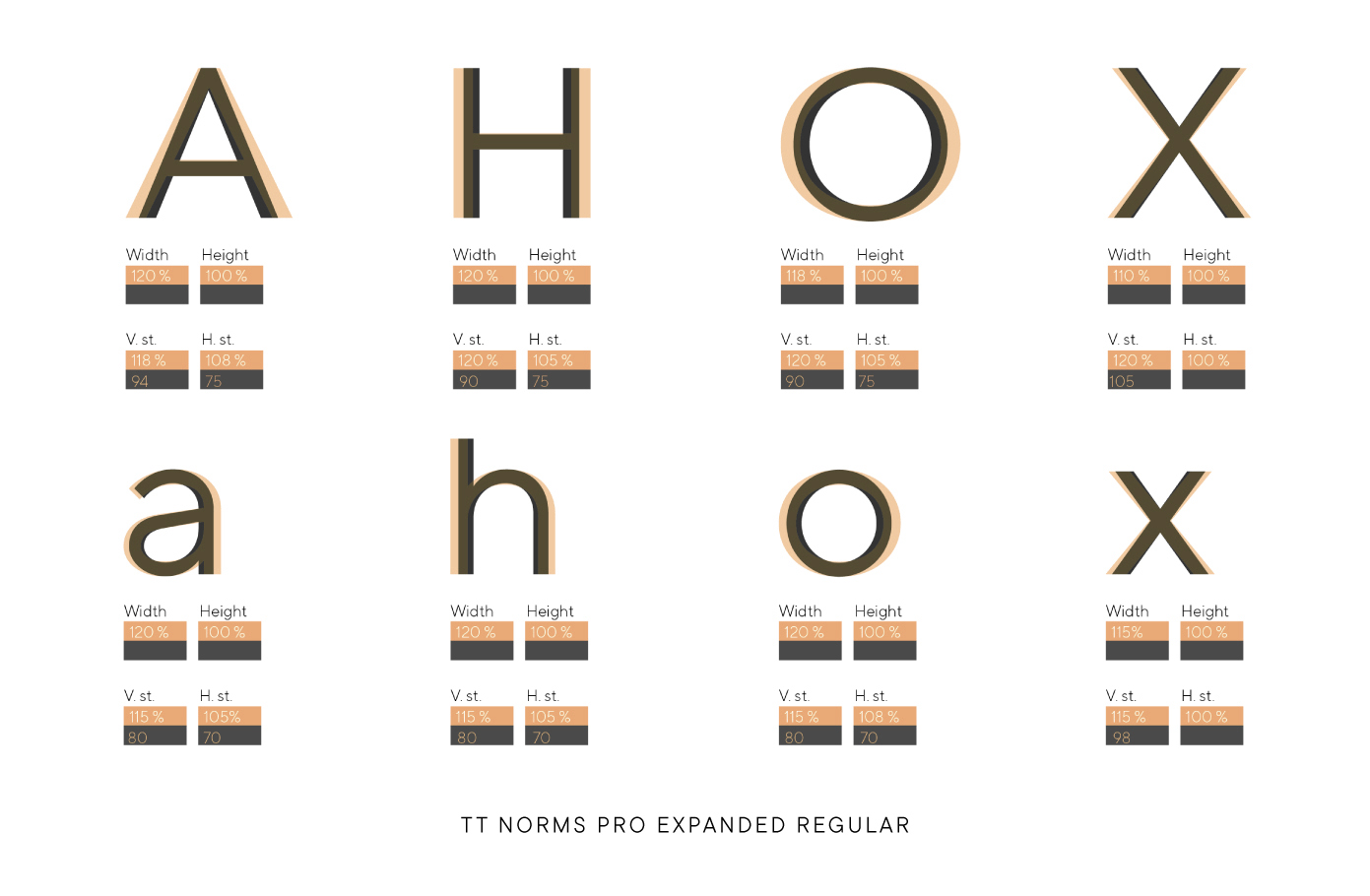
The final values turned out to be around 125%, because it was in this width that the glyphs looked quite attractive. When developing TT Norms® Expanded, we already had in mind that in the future we would make a real variable version of the font.
By the way, it was during this period that our studio began the transition from FontLab to Glyphs, but the extended version of TT Norms® was created using the usual technology. At some point, it became clear that TT Norms® Expanded would not be released for sale, because plans had changed towards a new version 3.0 with an expanded character composition.
Therefore, we focused on working with Expanded for its further use in a variable font, but porting difficulties and a reduced character composition led to the fact that later the wide version for TT Norms® was redrawn.
It turned out that the development line of the Expanded version came to a standstill, and with it the entire Std line. Priorities have shifted, TT Norms® Condensed has not lived up to expectations in terms of demand, and our team has already begun working on a completely new version of TT Norms® Pro.
Work on Expanded was put on halt, and the resources of designers were transferred to priority tasks. However, this stage is an experience that is rarely overwhelmingly positive. There was no need to get upset, because ahead of us was the most voluminous task that we had ever set in working with TT Norms®.
TT Norms® Pro—return of the legend
2021–2022. Full scale variable font, uniwidth subfamily and completely dedrawn character composition
TT Norms® is in many ways a unique font for the studio. Although we liked it from the very beginning, we always continued to look for new opportunities to improve and change it. Seven years have passed since the launch of the first version, and during this time the TypeType studio has changed as much as TT Norms®. Our staff and competencies of employees grew, and we divided into technical and graphic departments, improving each of them.
Therefore, when we first planned version 3.0, everyone understood how difficult, grandiose and labor-intensive it would be. As discussed in the previous chapter, testing a product with a reduced character composition has reached a dead end. Instead, we decided to expand TT Norms® Pro to the maximum, add a narrow and wide version to the font file, and create italics for all styles, and then collect all this in a font that is variable along all axes.
In other words, we abandoned the abridged versions in favor of a very rich one, containing all the previous developments. We had to take the rendered characters as a basis and add the missing ones, that is, to make one very large family of TT Norms® Pro in version 3.0.
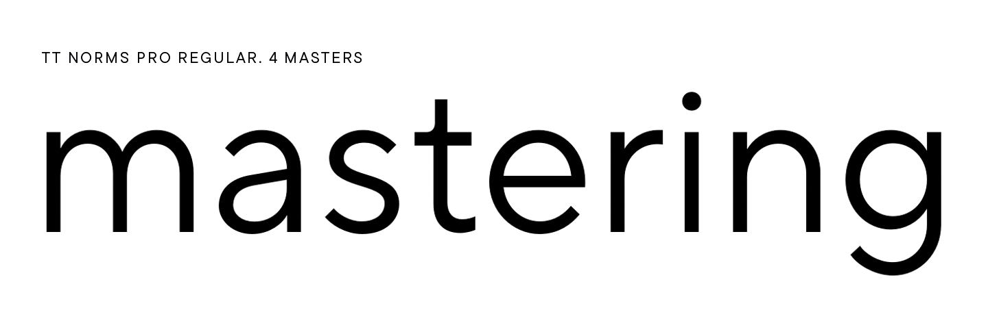
The new character composition was 1668 characters for each style. Since we started working in the new software, we had to manually draw not all styles, but only reference masters. However, there were still a lot of them—32 masters. Working in one font file was a must to create the perfect variable face for the user.
First, let’s explain what we mean when we talk about a face «variable on all axes.» This means that the font will shrink and expand at the same time, change the slope or thickness.
First of all, we had to transfer TT Norms® to the new font software, that is, to Glyphs. Given the huge character composition, this was already a lot of work. When transferring files, the technical department had to reconfigure and check features, outlines, Font Info settings, and kerning.
Absolutely everything was transferred, including the narrow and wide Std versions, and all the while it was necessary to make sure that all styles were interpolated with each other. All dots in each letter of one style had to match those in a similar letter in another style in terms of the number, direction of the contours, and the logic of construction. However, fonts were drawn in different years, moreover, by many designers, so one letter could be interpolated differently even within the same font.
Probably, from the outside, the difference might be not as noticeable, but for us it was a fundamental moment. Interpolation should be smooth, signs should not jump in height or width, cuts should have the same construction logic. To correct each such issue, colossal work was required.
Work on version 3.0 took about 4,000 man-hours, a time in which we could potentially redraw the font from scratch. Indeed, over the years of development, so many people with their own views and methods have worked on TT Norms® that it is rather difficult to combine this into one concept. With that, even the same person in 7 years changes a lot as a specialist.
Another problem with merging files was that the Condensed version had one less face. This was no problem when it came out as a standalone product, but now there was a need to have all thicknesses in all widths. Accordingly, now the boldest ExtraBlack, which we had previously abandoned for visual reasons, had to be redrawn and made attractive.
Moreover, there were more basic masters in version 3.0 than we expected. There are usually 4 masters in a standard sans serif: an intermediate one (Regular or Medium), two extreme ones (the thinnest and the boldest) and a transition between the regular and the boldest (DemiBold or Bold). The latter is necessary to remove the optical compensation that arises because of the bold style.
In TT Norms® Pro version 3.0, 4 masters were also originally planned, but in the process we realized that there was an excess of contrast in the regular font, which was not present in version 2.140 or previous ones. It looked aesthetically pleasing but didn’t fit the character of the TT Norms®. The font should not change fundamentally, for instance in such issues as the presence or absence of contrast, so we had to solve this problem.
We decided to add a 5th master to correct the situation. This in itself did not take much time, however, after the introduction of an additional style, we had to edit each corrected or new glyph 5 times, and then do the same with italics.
The volume of work was large, so it was carried out by several specialists at once. From the type design perspective, working on one file at a time is a difficult task in organization of the workflow process, but it went well.
In version 3.0, we had to re-check the contours, interpolation, and set all components and anchors according to the new system. In addition to the wide face in the narrow version of the font, more than 1000 characters had to be added—not only in Condensed, but also in Expanded.
By the way, due to the fact that the boldest style in Condensed had to be redrawn, this version has 6 reference masters for upright faces, since ExtraBlack had to be thought through very carefully.
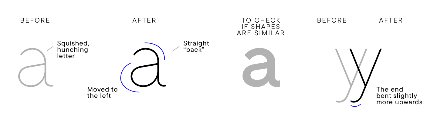
Some of the edits and even global redraws were caused by the personal wishes of the team. When a specialist looks at their old typeface, there is certainly a desire to correct or change something. This is because the specialists increase their quality levels over time—and this within an entire studio of specialists has grown into a painstaking, detailed and thorough reworking of TT Norms® Pro. To be honest, as a result, we have corrected or somehow changed almost every glyph, while reverently preserving the character of the original TT Norms® Pro.
Some things have been redrawn from scratch, such as the Vietnamese diacritics. The Vietnamese language is rarely used in our fonts, so we were not perfect experts in drawing the Vietnamese alphabet. We had to do a lot of research about the language and its origins, about what it should look like. As a result, we now have manuals on this topic and an understanding of how to correct the Vietnamese language in TT Norms® Pro. It turned out that all glyphs are based on the signs of the Latin or extended Latin composition that we have already drawn, and the main feature of the Vietnamese language is complex diacritics.
Another example is Greek. When we carefully looked at it in version 2.140, we wanted to redraw it. We conducted a study and outlined the changes to be implemented: correct the thickness and polish the forms. Not as globally as with Vietnamese, but still it was necessary to change each character 16 times in the basic upright faces, and then the same number in italics. In general, the work was voluminous. By the way, TT Norms® Pro font is the only one in our collection that has the Greek language.
As for the Italics, we planned to transfer the existing styles to the new font file without changing almost anything, since their shape suited us completely. However, due to the fact that most of the glyphs were changed, italics had to be redrawn too. Given the scale of the box office, it required quite an effort.
The technical department, when working with version 3.0, first reviewed the 16 basic upright masters, setting up the Font Info, glyph sorting, and making initial edits. In parallel, kerning was done, which was partially taken from 2.140. After transferring the kerning, we finished the edits. After mastering the upright styles, it was the time to work on italics, which had 16 basic masters. There were 32 masters in total.
Edits were made throughout all the work, after which the specialists split the font file into 3 parts and divided the work in order to check the files in parallel. One source included Condensed along with italics, the second included Expanded with italics, and the third included the normal form of the font along with italics. The contours were checked, and it was also important to make sure that the heights of glyphs did not jump. We had to run the files through the scripts and TypeType plugins used to check the final fonts.
Next, the features were checked, the font was adjusted to generate static styles and a variable font. It was difficult to upload a file with such a huge number of masters to MyFonts, so we had to experimentally remove the masters and make sure that the resulting boldness corresponded to static styles. There were 24 masters left: Black, Light and Extra Bold were removed from Condensed along with their italics, and from the remaining two (Expanded and Normal)—only Light and Extra Bold along with their italics.
The contour check was completed in the summer, after which 3 files were merged into 1. We prepared Character Sets, later finalized the kerning, and added final edits for vertical metrics and Font info. Small changes were made up until the last moment.
With version 3.0 complete, we moved on to the final part, a monospace font from the TT Norms® family. Many expected to see it, and we ourselves have long wanted to add a new subfamily to the most popular font from the TypeType collection.
TT Norms® Pro Mono is a standalone monospace font based on the drawing of TT Norms®. The character composition is smaller than in the classic version, and all the em squares are 600 points. All characters are inscribed in this area.
The studio has a special plug-in in its arsenal that automatically makes a blank based on the given glyph deformation values. At some stages, this plugin was used, and otherwise we would target the visual character and drawing of TT Norms® glyphs.
We thought of TT Norms® Pro Mono primarily as a practical coding font, but we didn’t limit ourselves to that use case. After all, monospace fonts are now becoming a trend in branding, art exhibitions and other areas.
The set of features is almost identical to the composition of the classic TT Norms®, but we have removed the tabular figures and currencies, because the entire font can be called tabular due to the squares of the same width.
In total we made 7 upright styles and 7 italics. The basic masters were Thin, Medium and Bold. There are no overly bold styles in this font. TT Norms® Pro Mono complements version 3.0 and comes with it, although it is a separate subfamily.
The TT Norms® Pro Mono font was drawn in a month.
The technical department did a full audit checking glyphs and contours, Font info settings, variation, and monospacing. There were minor edits on the contours that were made in the process of work.
Hinting was partly carried over from the base version of TT Norms® because we have a tool to transpose hinting into other weights or fonts. The rest of the hinting was edited manually.
This is the first experience of releasing a monospaced version of a popular font from the collection. TT Norms® Pro version 3.0 and TT Norms® Pro Mono is a project that has taken a lot of time, effort and skill. However, we believe we were able to release the best version of this font ever!
With every major rework, we feel like TT Norms® couldn’t get any better. However, months pass, and we again come up with something new, and fix and develop this typeface. It’s nice to know that along with TT Norms®, the TypeType studio itself has changed, becoming stronger, smarter and more experienced.
Involved in working on the font
TT Norms® 1.0 and 1.2
Ivan Gladkikh—project director, technical director
Pavel Emelyanov—art director of the project, designer
Oleksa Volochay—designer
Nadyr Rakhimov—designer
Dmitry Greshnev—designer
TT Norms® Std
Yulia Gonina—art director
Ivan Gladkikh—technical director
Yuri Nakonechny—head of technical department
Nadezhda Polomoshnova—designer
Marina Khodak—senior designer
Anna Tikhonova—senior designer
TT Norms® Pro 3.0 и TT Norms® Pro Mono
Yulia Gonina—art director
Ivan Gladkikh—technical director
Yuri Nakonechny—head of technical department
Marina Khodak—senior designer
Anna Tikhonova—senior designer
Evgeny Tansturin—designer
Antonina Zhulkova—designer
Kirill Maslov—designer
Nadyr Rakhimov—designer
Mikhail Nekrasov—designer