In 2023, we breathed new life into the beloved Scandinavian sans serif TT Firs Neue by dramatically refining and renewing the typeface to comply with cutting-edge standards. Soon after, we introduced the text font pair for this typeface — an elegant TT Firs Text.
This article is dedicated to how it all began, why we decided to update TT Firs Neue, what we added and modified, and how TT Firs Text was born.
How TT Firs planted roots
The story of TT Firs began back in 2014 when TypeType was just starting out. The idea for the font’s design was born in Helsinki: Ivan Gladkih, the studio’s co-founder, went on a family trip there for a weekend.
«We went to the Fazer café, which was initially just a café named after its founder. Later, they began producing the famous chocolate under this brand. This dessert shop is located in the city center of Helsinki and was founded in 1891. It looks like a simple canteen, but they serve amazing signature desserts, so the place is always crowded. The café blends seamlessly with the surrounding area. There, I saw an old sign with the Fazer name. When I looked closer, I thought it was something very eye-catching, unique, and interesting. And this is how the idea of designing a Scandinavian-themed font came to my mind. I was inspired by the letter ’A’ on the sign with a massive horizontal stroke at the top and began sketching the future Firs.»
Ivan Gladkih, CTO, co-founder of TypeType
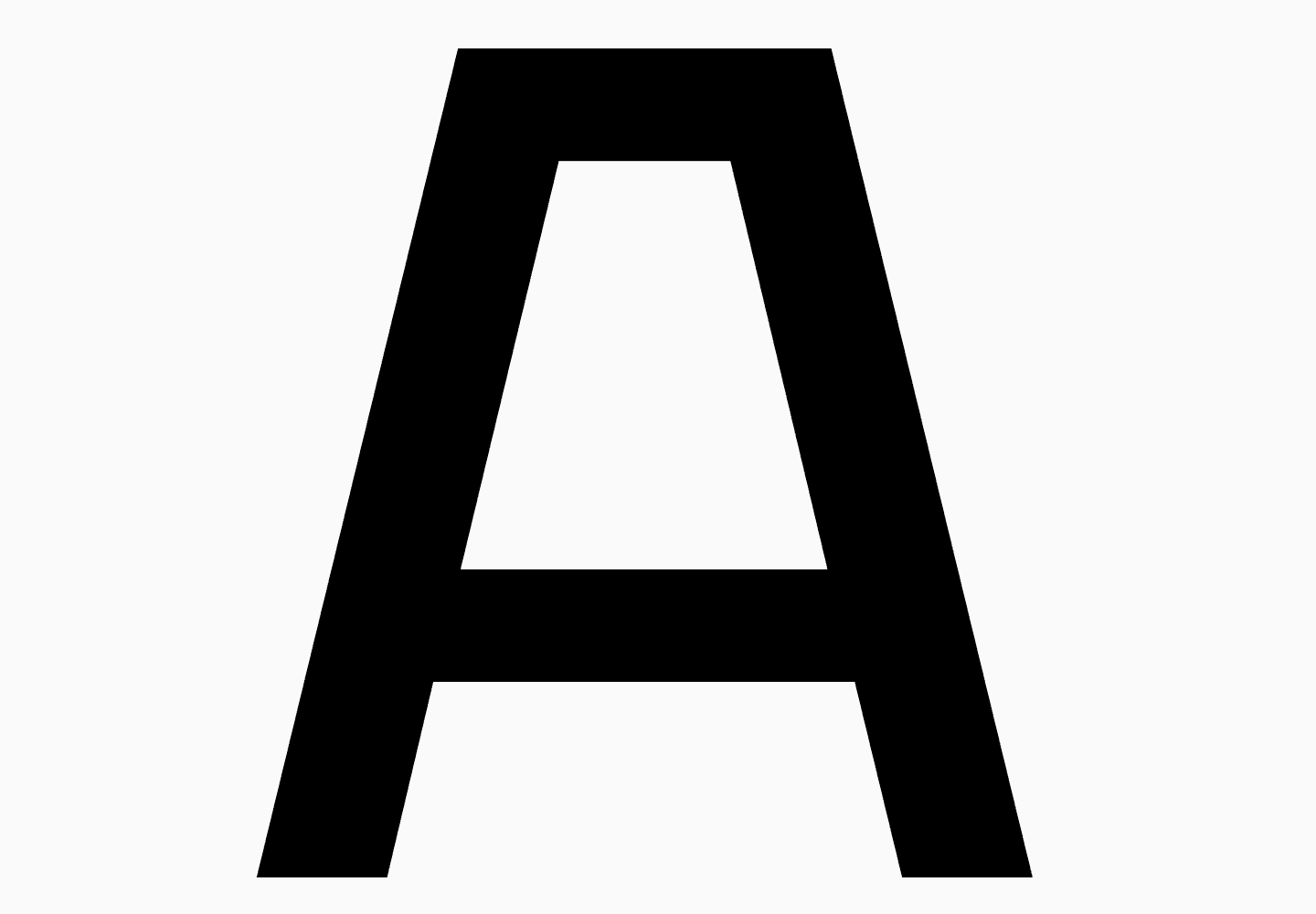
«At that time, we drew everything intuitively, without any research. We made a mood board with Scandinavian design references and Scandinavian-themed fonts. While designing this sans serif, my primary concern was what people would want to use it for and how it would blend with designs. Implementing the Cyrillic alphabet was a particular challenge because there are no similar fonts featuring Cyrillic glyphs. If we used the horizontal element of the letter ’A’ in the Cyrillic letters ’Д’ and ’Л,’ which is a reference to the 1960s of the Soviet period, it would be logical to design other pseudo-soviet letters—and that’s how branchy ’К’ and ’Ж’ were designed. Overall, I relied entirely on my personal sense of things.»
Ivan Gladkih, CTO, co-founder of TypeType
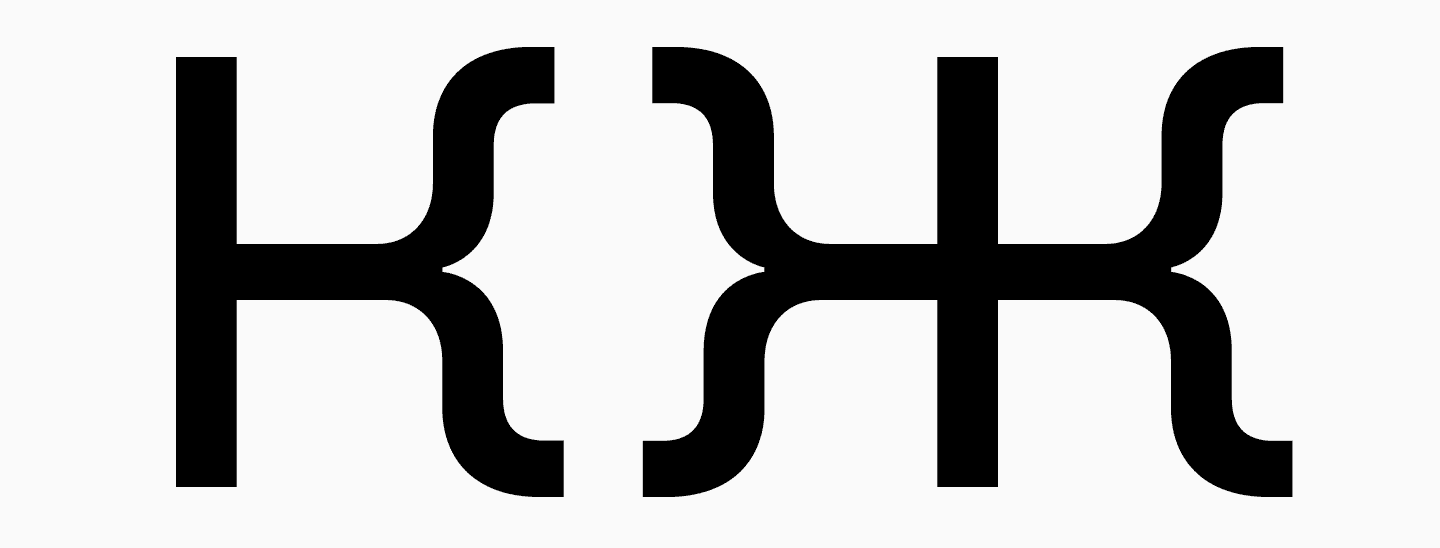
So, in 2015, the first version of our Scandinavian sans serif came to life. The typeface consisted of 9 roman and 9 italic font styles, and the character set was minimal. The bold font style was rather solid but had nuances related to the distribution of contrast and weights. We will tell you more about that later. Nonetheless, the font turned out to be genuinely unique and definitely infused with a Scandinavian atmosphere.
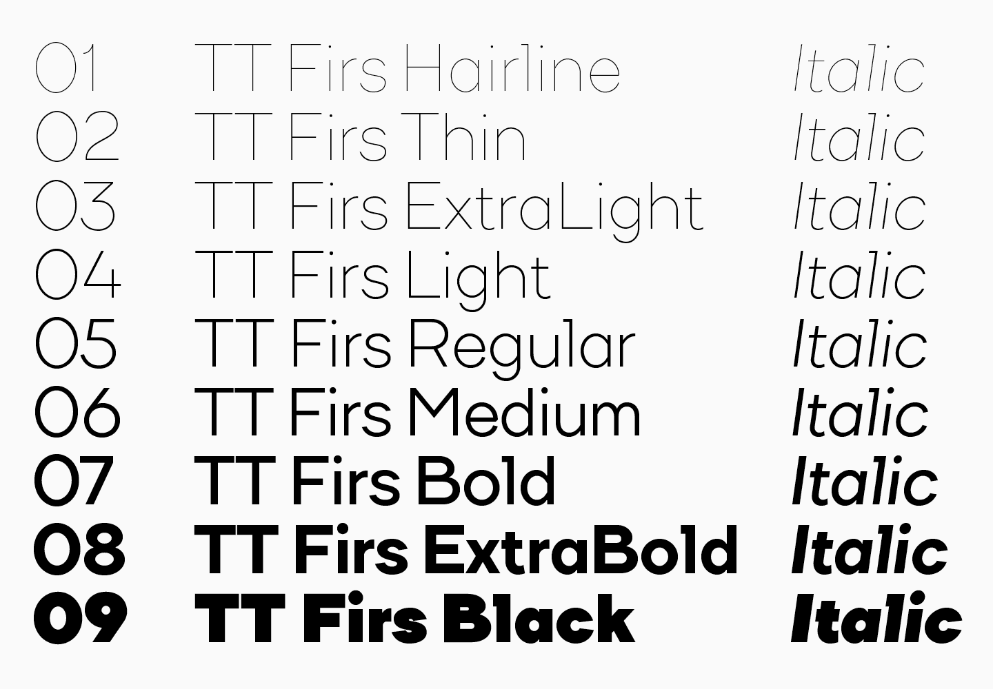
«We had a tradition at that time to name all fonts so that their names ended in ‘s.’ While I was thinking about how to name a Scandinavian sans serif, I realized that one of the distinctive features of Scandinavia is fir trees. This is how the font adopted the name TT Firs, which caught on and still exists in the third font’s edition.»
Ivan Gladkih, CTO, co-founder of TypeType
After the release of TT Firs, it lived a life of its own — we watched it from aside and saw many examples of people using it in their designs. Although it didn’t feature hinting or any OpenType features, it was unique, captivating, and loved by users. That’s why we considered updating and enhancing the typeface.
How TT Firs «branched out» and grew to become TT Firs Neue
We truly loved TT Firs. However, the more fonts we released, the better we understood that this Scandinavian sans serif is not keeping up with the quality of our font library. So, in 2017, we decided that it was time to get started on its revamp.
First changes
At that time, we collaborated with Filipp Nurullin, a guest typeface art director at TypeType. He was the one to do the first revision of TT Firs and conduct the first research.
Filipp attempted to reimagine the font with artistic vision to make it more modern and effective for various projects. So, sharp angular cuts appeared in the font, for example, in the letter «g,» which has a rounded part combined with a sharp angle. There is also a squared angle in the letter «f.» On one hand, this element doesn’t seem logical. On the other, it offers a unique way to highlight lowercase characters that previously looked more neutral.
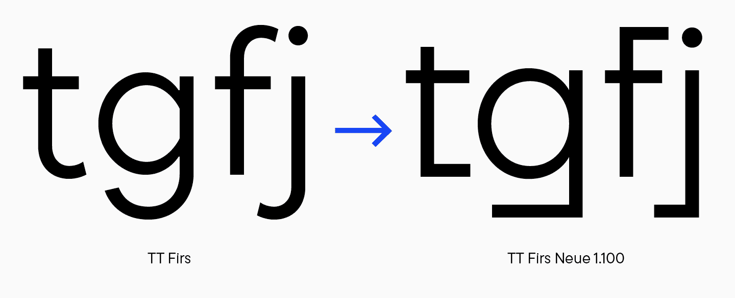
Also, Filipp reworked the legs of «A» and arms of «K» and «Ж» to make them look tougher, more intense and give them a European feel. Branchy letters from the previous version remained to serve as alternates. This way, we got a basic set of glyphs used in TT Firs by default and represented this font and an alternate set (spoiler: we’ll keep following this logic with alternates while working on future iterations).

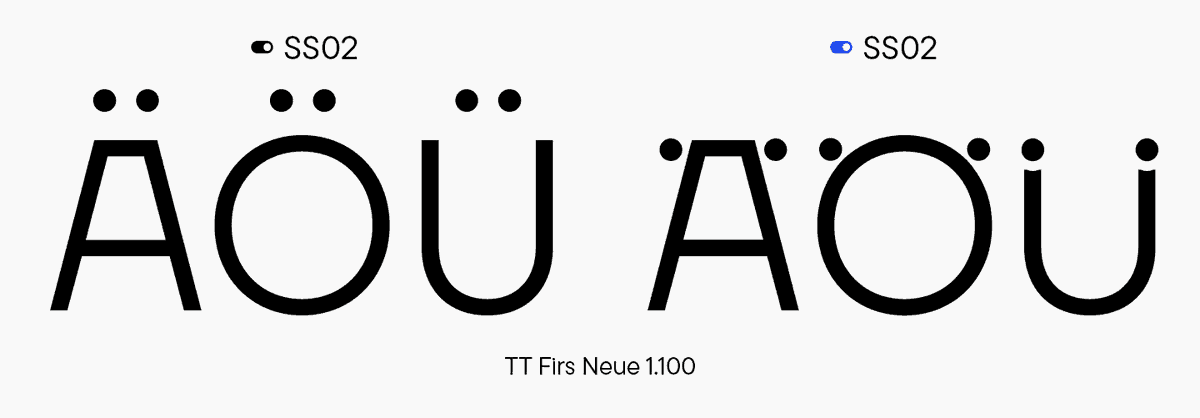
During the work, it became clear that one of the unique features of Scandinavian typography is diacritical marks positioned inside letters. For instance, a characteristic letter «U,» where the umlaut is often placed inside, like berries in a shot glass.

So, diacritical marks are either integrated into letters, pressed up against them, or placed on their side. We made this peculiarity one of our font’s key features and emphasized its Scandinavian spirit by designing a set with such diacritics (a similar but enhanced set remained in the latest version of TT Firs Neue).
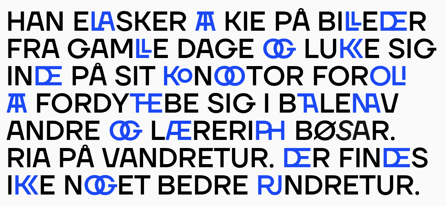
This update also contained numerous display ligatures. They were unexpected, unique, and added expressiveness and visual mass to the font.

«I think it’s really cool that just by using these ligatures, designers can spice up the visual style of a letter, word, text, or logo without implementing any additional graphic elements. It may sound surprising, but I have never seen such ligatures in use. Although I would love to, because they are truly awesome and „survived“ until the current font version (only in a modified form — Ed. note).»
Ivan Gladkih, CTO, co-founder of TypeType
This is how the reimagined version of TT Firs came to be. We released it in 2018 under the name TT Firs Neue (1.100). At that time, the typeface included more than 900 glyphs (in contrast to the first version, which had about 400 glyphs). TT Firs Neue, version 2.000, will feature more than 1700 glyphs—but let’s address everything in turn.
Interestingly, TT Firs Neue’s perception has been changing a lot. The more projects used it, the more neutral it seemed because it had become ubiquitous: we saw it in YouTube videos, branding, logos, and more.
«The font has become visually neutral, however odd it may seem. All its expressive and super recognizable forms, such as triangular „Д“ and „Л,“ and „t,“ „f,“ „g,“ and „j“ with squared angles, became ordinary as if they were always supposed to look like this. This came as a surprise to me. As the saying goes, font works in mysterious ways. At first, our typeface seemed something extraordinary, and after a while, you think it’s just a font, and there’s nothing special about its look.»
Ivan Gladkih, CTO, co-founder of TypeType
A new beginning: Designing TT Firs Neue 2.000
As time went on, the studio evolved and mastered new tools. Our fonts grew together with us. After transitioning to Glyphs, we got our hands on variation axes. This tool helps us create variable fonts as well as maintain logic within a typeface.
That’s why, in 2022, we thought up a new makeover for TT Firs Neue, which had been loved by both us and our users. The font was excellent already, but we decided that we had to make it even better! We meticulously revised the tiniest details and polished them to perfection. As a result, we didn’t just update the font—we practically rebuilt the typeface from scratch.
Part 1: Looking for imperfections
To begin with, our Lead Designer, Antonina Zhulkova, revised the existing TT Firs Neue and suggested potential improvements. Let’s go through them together.
Note that we will often refer to the word «weird» (or its synonyms) throughout the text. What do we mean when talking about the weirdness of a font or individual characters? We see it as a little flag: «Something stands out from the overall picture.» First, we quickly «scan» the font, getting a sense of it. TT Firs Neue is harsh, Nordic, static, attractive, recognizable. It’s easy to remember mainly because of the horizontal joints between diagonals. The letter «A» Ivan mentioned earlier could serve as a logo for this font. Another detail forming the font’s style is squared terminals in some characters. These are the integral parts of the typeface’s character. The rest of the expressive elements are evaluated with a critical eye in terms of their purpose. We mark things as «weird» or «unexpected» and analyze whether this graphic contradicts the core concept of the font or emphasizes it. If something complements the font’s character, enhancing and supporting it, we might keep it. If a detail has no influence on the font’s character or goes against it, this detail doesn’t belong here.
Visual compensators
It’s essential to understand that the first version of TT Firs was designed in FontLab 5, and the previous update was created in Glyphs. So, we had to work with the file that was moved from FontLab 5 to Glyphs in a slightly incorrect format.

This posed some challenges. For example, the previous font version contained ink traps in the bold styles. This added an extra flair to the font and addressed the issue of glyphs clumping in small point sizes. After moving to Glyphs, lighter font styles also acquired ink traps, but they only served as workarounds. During the revision, we came to two conclusions. On the one hand, these compensations had a functional purpose: to make variability work. On the other hand, they made bold characters look more expressive, and the overall graphics seemed inconsistent.
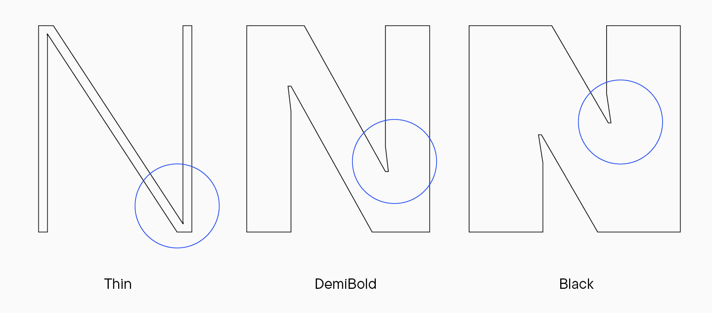
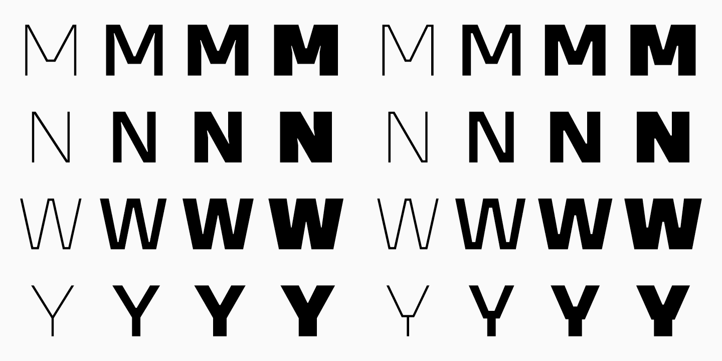
For instance, the letter «N» in the Thin font style usually looks calm, and in the Black font style, the compensators appear to transform its character slightly. However, if in «N,» they are not excessively noticeable and have a technical function of not letting bold stems clamp with diagonals, in the letter «M,» they become thinner and much more aggressive. And in the ampersand, they change their shapes again.
Thus, ink traps were not featured in all font styles and looked different even within one font style, creating visual noise.
Different overhangs in rounded characters
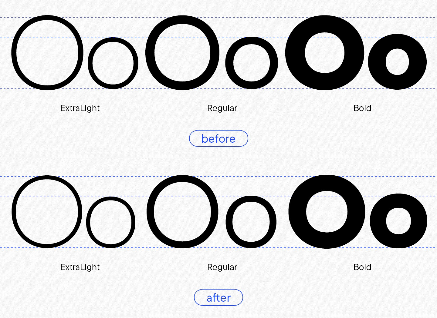
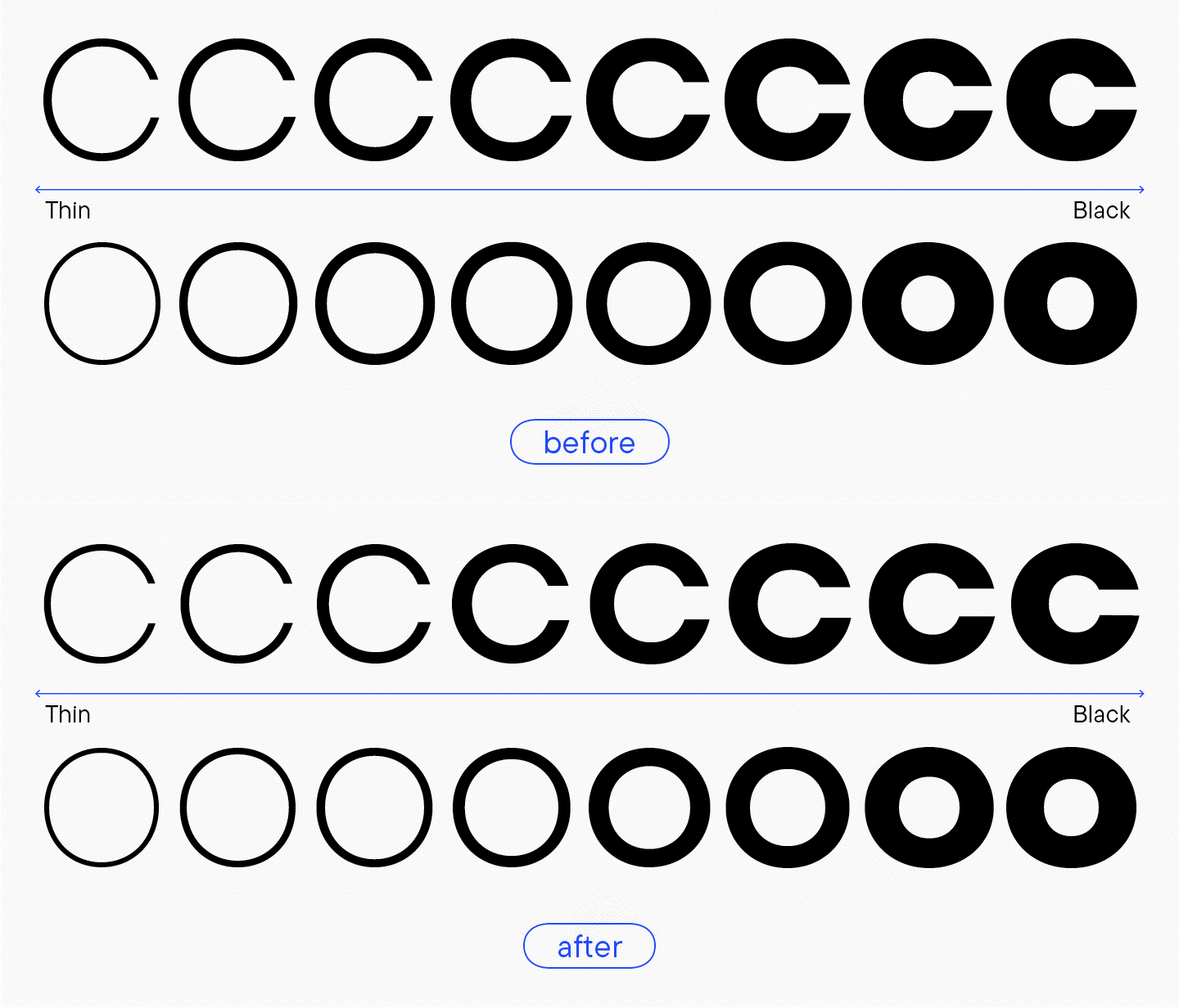
The logic of rounded characters was flawed. For example, the uppercase «O» in the Thin font style looked circular but slightly stretched vertically. In the regular font style, it reached maximum roundness and expanded horizontally in Bold and Black. Lowercase characters made this effect even more prominent.

Different terminal character
«Interestingly, this was one of the features that helped me distinguish the old TT Firs Neue version from the new one if I spotted the font out on the street somewhere. These old terminals attract attention; I called them ’scorpion’s tails.’»
Marina Khodak, TypeType Lead Designer
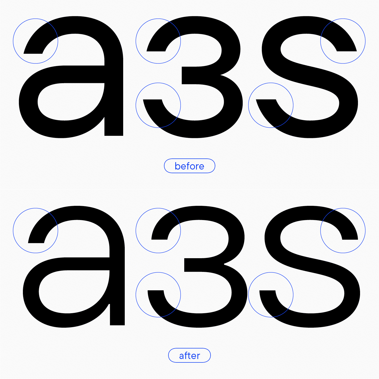
For instance, the letter «a» had a smooth and symmetrical terminal, where the left bracket part looked almost the same as the right one. Yes, it was a little more sloped on the left, but overall it looked similar. The letter «з» has a filled oval on the right, while the left terminal flattens out, and the angle sharpens dramatically—like the scorpion’s tail before a strike.
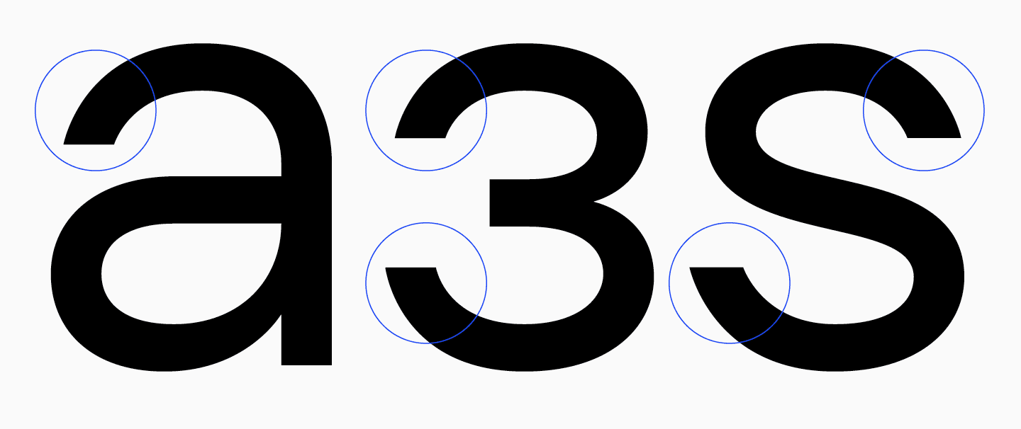
This is as noticeable in the uppercase «S» and «З» as in the rounded characters («C,» «G»). The upper top part of the letters seems to lose its weight and roundness.
In general, both options have the right to be, but we needed to understand which one was better for our font: rounded, full terminals or sharp «tails.»
«Given that the font looks quite tough and serious, it was logical to make terminals resemble the ones in the letter ’a’: symmetrical but without the loss of weight.»
Marina Khodak, TypeType Lead Designer
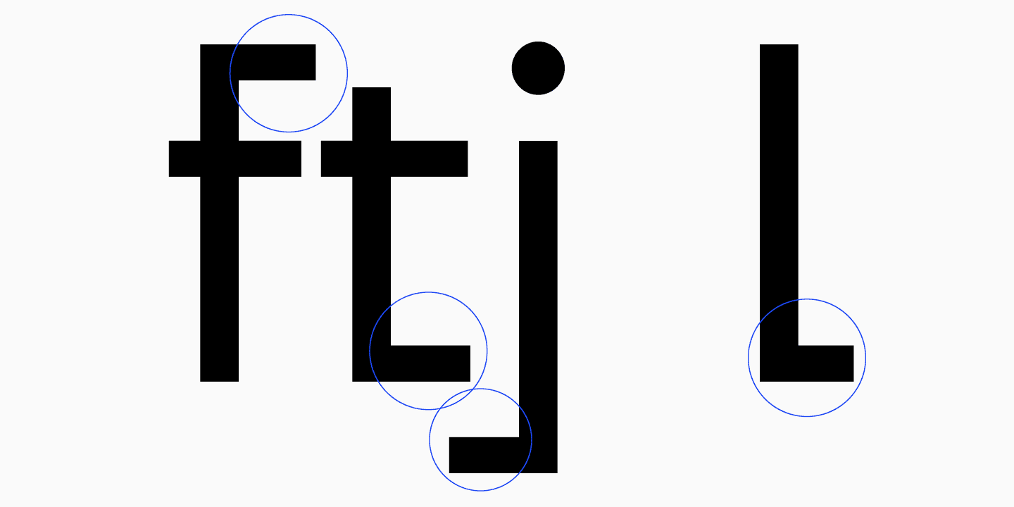
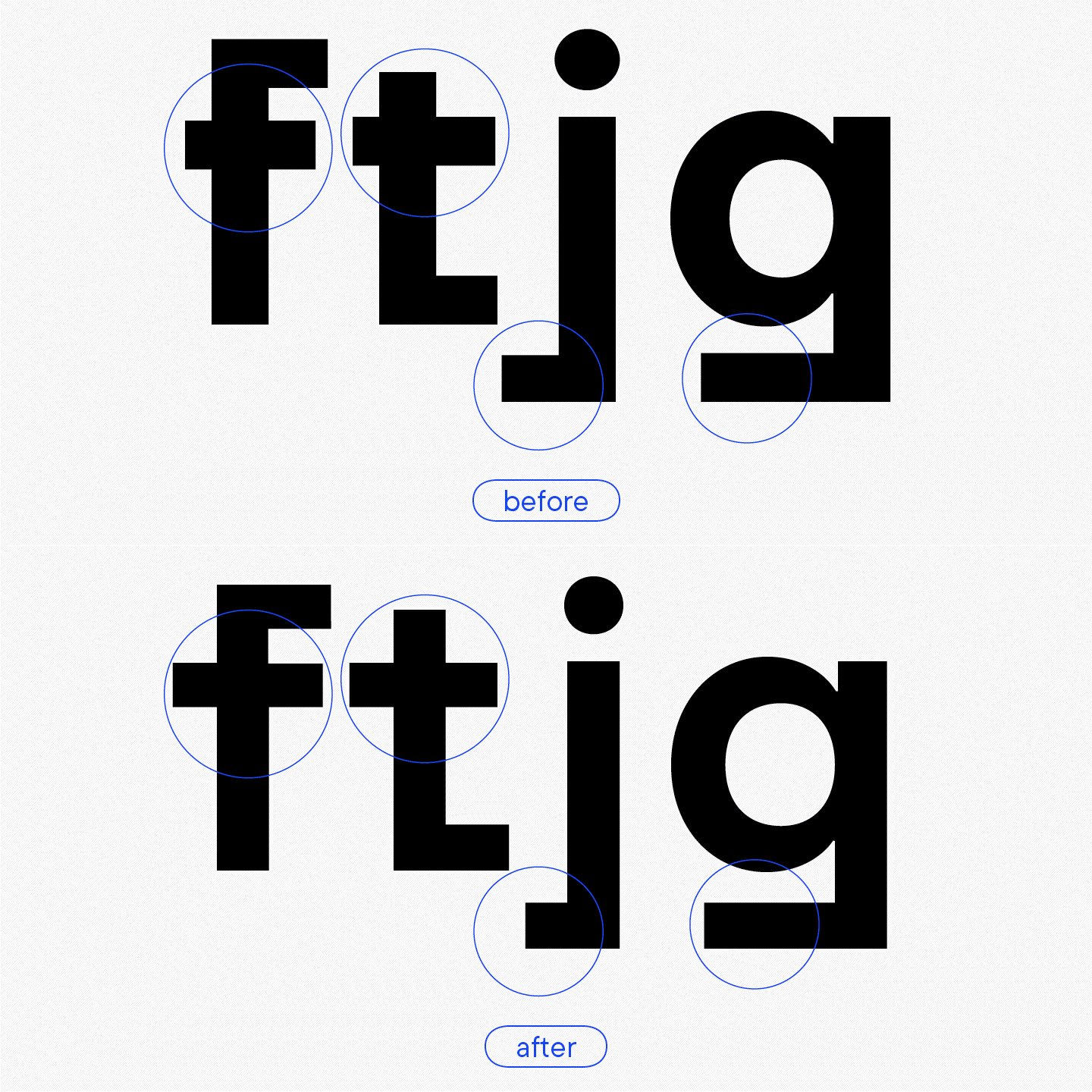
Another problem was that, in addition to the personalities, terminals had varying widths. This is clearly visible in the letters «t,» «j,» «l,» and «f.» For instance, the terminal of «j» is significantly wider than that of the letter «l,» and this looks odd, especially taking into consideration that the terminal’s shape is quite expressive and eye-catching.
Inconsistent choice of forms
In older versions of our fonts, there is a noticeable trend to make the black font style more unusual. Now, we don’t do that anymore. First, letterforms should be consistent in all font styles to make variability work properly (the number of points in font styles must be equal). Second, we consider such design choices a break in the font family’s logic. That’s why some forms of the old TT Firs didn’t pass our new self-censorship.
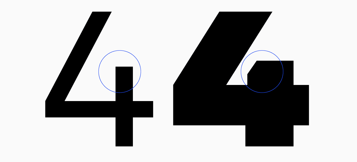
For example, the number 4 in the Black style had a sloped stem angle, allowing for more negative space inside. At that moment, we probably thought it was the most optimal decision. But it wasn’t the best. We needed to find another one that wouldn’t make us break the glyph’s form.
Interletter spaces (aproshes)
Spacing required refinement.

Triangular characters
Inconsistent form logic, varying master widths, not enough slant in «A,» «Л,» and «Д.»
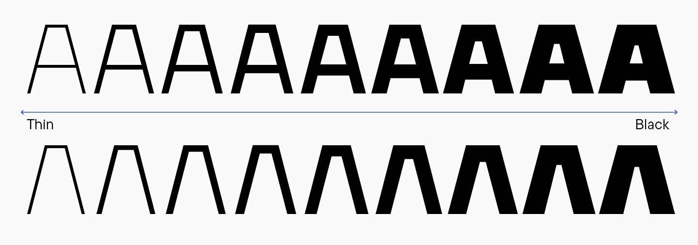
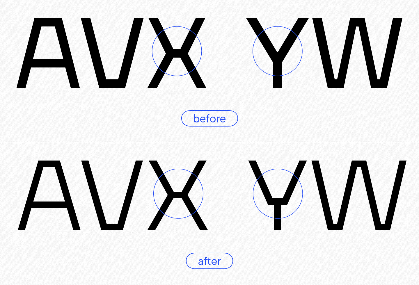
This is a very important nuance because these junctions, horizontal bars, are a style-forming element of the font. In TT Firs, they were the most strongly expressed in comparison to the other typefaces in our collection.
For instance, this junction is very noticeable in «A» and «V.» Note that that it looks the same in these two letters and the letter «X.» However, in «Y» and «W» it’s not featured, making them just ordinary letters without any expressive elements. Thus, the logic of glyph design is broken within the Black font style.

The same issue can be seen in the lowercase triangular characters (Cyrillic and Latin): «v,» «w,» «x,» «y,» «л,» «д,» «м,» and «и.»
Let’s now look at the whole family. Apart from ink traps in the bold masters, there is a lack of clarity in junctions. The letter «M» in the Bold font style has a horizontal at the bottom but not at the tops. In the Thin font style, it’s also only featured at the bottom. Moreover, the width of this detail varies in different font styles: in Thin, it’s much wider than in Bold or Black.
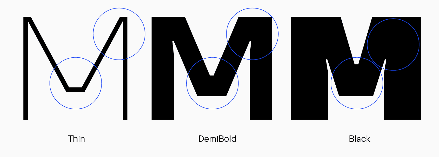
The letter «N» doesn’t include such elements at all. Besides, ink traps are present in the bold master but not in the thin one.
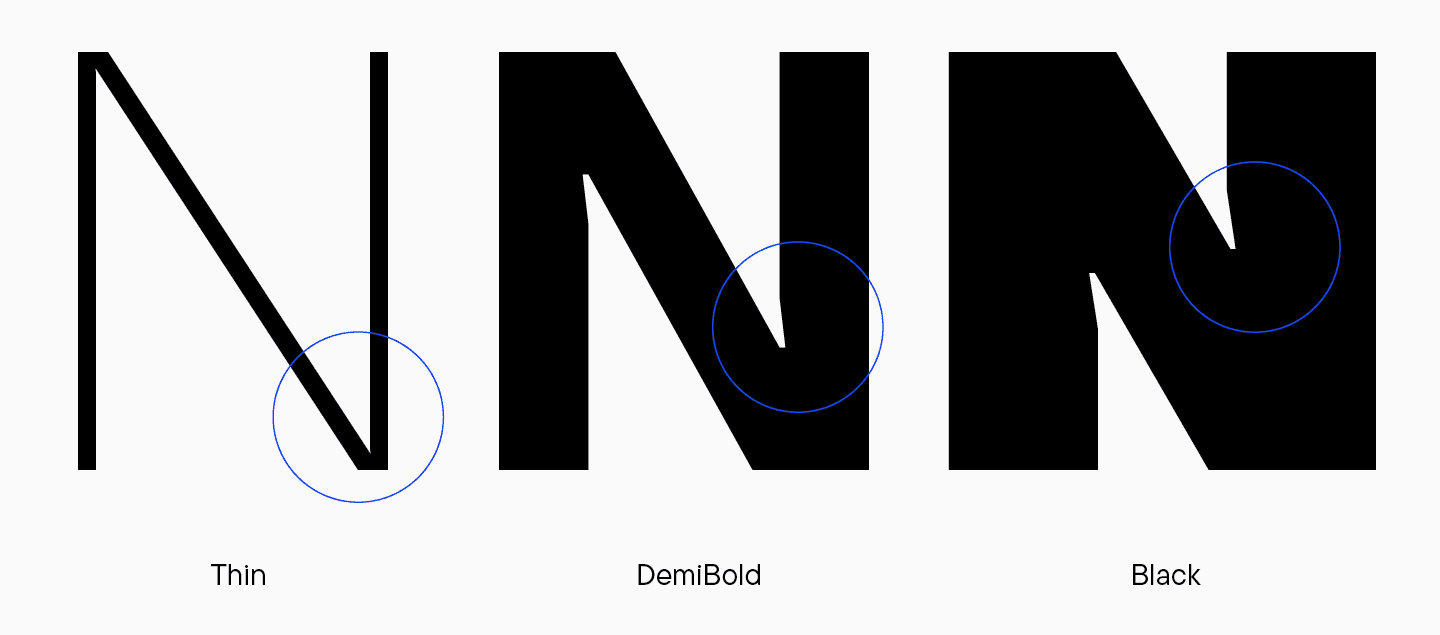
Take a look at the letter «W.» Like «M,» it should have featured a junction in the upper part of the diagonal intersection and sharp angles in the bottom part. However, for «W» in the Thin style, all the intersections go through this junction and are not included in the bold master, and ink traps are not featured either.
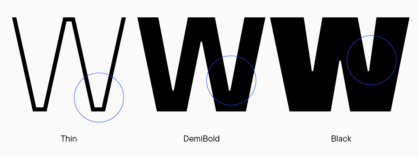
It looks like the logic was flawed both within individual font styles and between different font styles.
«For the update, we could consider the following approaches: shift towards expressiveness or turn away from it. For example, we could add ink traps everywhere. Within the team, we decided that, in that case, this graphic choice wouldn’t refresh the project in any way, and opting out of it would make the font look more modern. Besides, there is no point in adding ink traps to light font styles as they are not clearly visible there. Another issue was whether to add junctions everywhere or get rid of all of them. If we had not integrated them, we would have had a more neutral design. Such a decision didn’t suit TT Firs Neue but was implemented into TT Firs Text (we will tell about it later — Ed. note)»
Marina Khodak, TypeType Lead Designer
So, we decided to keep horizontal elements. However, there was a question of how they should look: like in the «M» or in the «W.» These letters have the most noticeable difference between the construction of junctions.
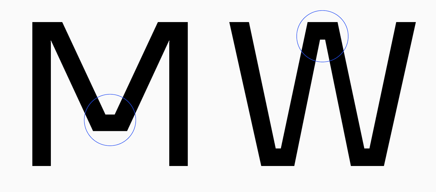
In her interview, Antonina suggested creating a more standardized version: add junctions like in the letter «W» everywhere and make them medium in width. She made a sketch that inspired the further development of the font family.
Round characters
«When I began working on the font, I completely redesigned round characters. Looking at the old version of the font, at all the font styles featured there, we can see that the proportions of rectangular characters vary. For instance, in the Thin font style, the letter „H“ is very narrow, and the correlation between „H“ and „O“ in this font style is not the same as in Regular, Bold, and Black. Essentially, the letter „H“ in Thin was not just extremely narrow; it also appeared much narrower than the letter „O.“ The „O“ looked more round, and the „H“ was very elongated vertically. At the same time, the Bold font style didn’t feature this difference. So, it looked as if „H“ expanded with increasing weight, changing its proportions.»
Marina Khodak, TypeType Lead Designer
The same thing happened to lowercase characters. By comparing the letter «o» and the single-storey «a,» we can see that these letters have very similar proportions in the Thin font style: the «a» is a little narrower than the «o» but still looks more rounded. However, in the Regular font style, the «a» becomes more vertical, while the «o» expands horizontally. With increasing weight, this tendency, much like in uppercase letters, becomes more pronounced. The letter «a» and similar characters become narrower, acquiring a vertically oriented form, and the letter «o,» in contrast, becomes wider.

Besides, in the Thin font style, the left sides of the «o» and the single-storey «a» are similar to each other, but as the font weight increases, the similarity disappears. Also, the junctions of the round characters seem lighter in the Bold font style.
Marina eventually modified the letter proportions to solve this problem. We’ll show and tell you more about the outcome below.
Characters with bowls
The next aspect on the review list was the broken logic of the correlation and distribution of the oval forms between font styles. Moreover, the bowl heights seem too large, especially in the Thin style. The letter «Я» is smaller and narrower than the letters «Р,» «В,» and «Ь.»

«For example, by comparing the letter „P“ in the Thin and Regular masters, we can see the difference in correlation. In Regular, the waist is higher than in Thin, which makes the letter resemble a small flag on a stick. As if the oval is not an essential part of the letter but simply another additional element.»
Marina Khodak, TypeType Lead Designer
S, З, J
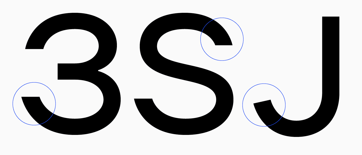
The character of these letters significantly stands out from the other glyphs in the set, which is especially noticeable in lowercase letters.
The upper left part of the bowl in «З» is a little short. «S» features excessive fluidity, «J» has an overly vibrant terminal—the only letter in the font where the terminal cut is angled. In all other characters, terminals are cut horizontally. TT Firs is a static, harsh sans serif, and if such fonts have a dynamic look, this should be justified.
Ligatures
There were also concerns about the set of ligatures. For instance, the lowercase set includes «fi» and doesn’t include «ffi.» Certain uppercase ligatures are missing their reverse versions — there is «AV» but no «VA,» and «TA» but no «AT.» This is not a mistake but raises questions about what is really happening there.

The logic between masters in the ligatures is also flawed. In the «AR» letter combination, «A» is narrower than «R» in the Thin font style, and in the Black font style, this proportion shifts, and «A» becomes significantly wider, taking up almost as much space as «R.» The same goes for «RJ.»
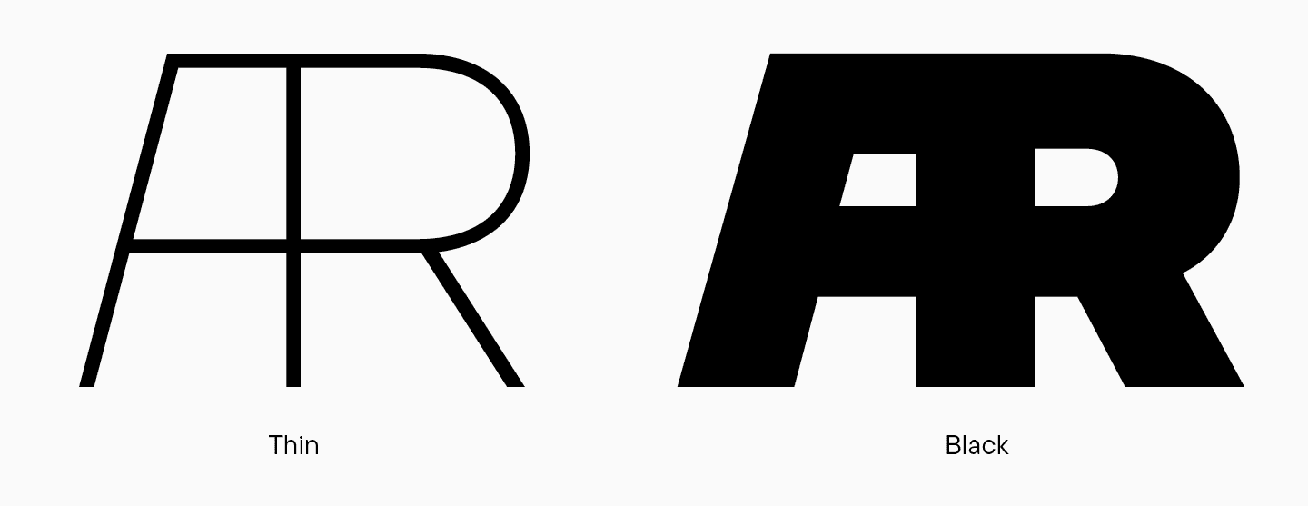
«LA» features a weird connection, which is inconsistent in different masters.
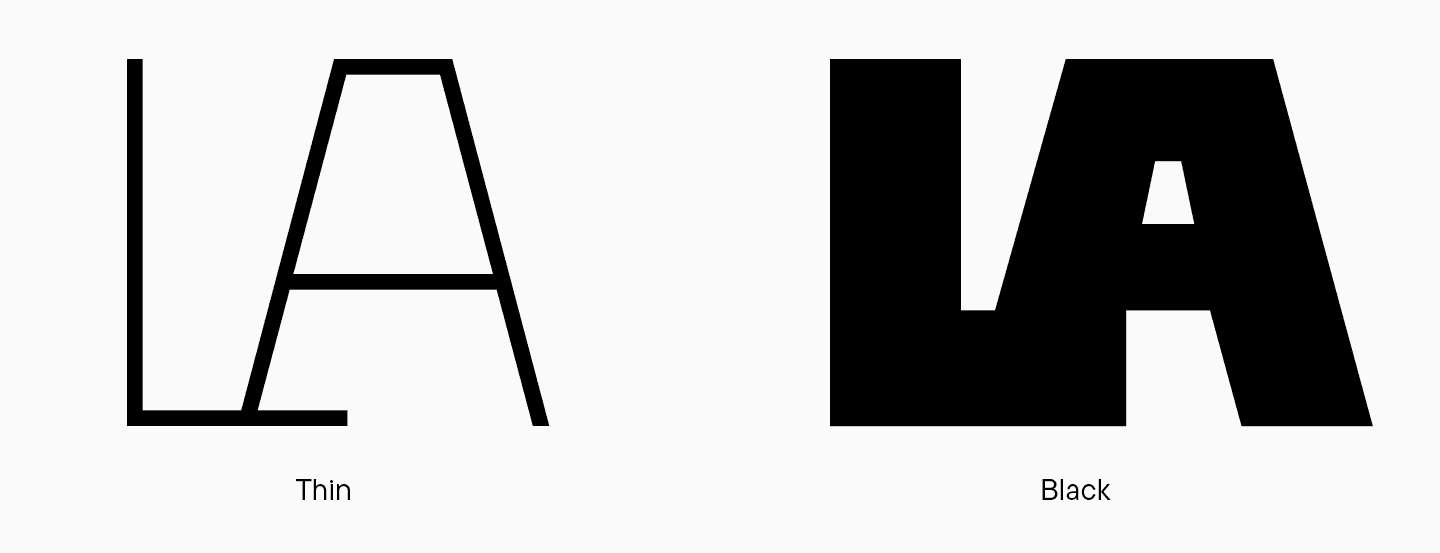
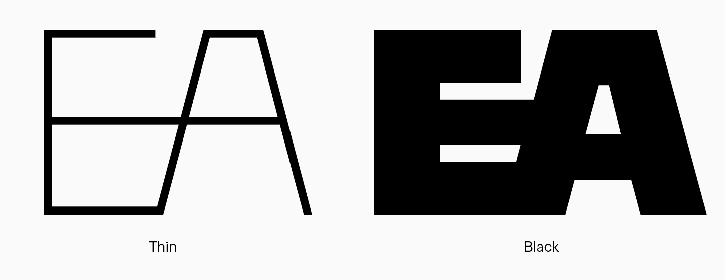
Another odd design choice is the common horizontal stroke in «EA.» It is interesting on its own but isn’t completely thought through, so in the Black font style, everything clumps together, and the ligature looks more like the Cyrillic «БА» because the bottom part of «E» forms an oval shape.
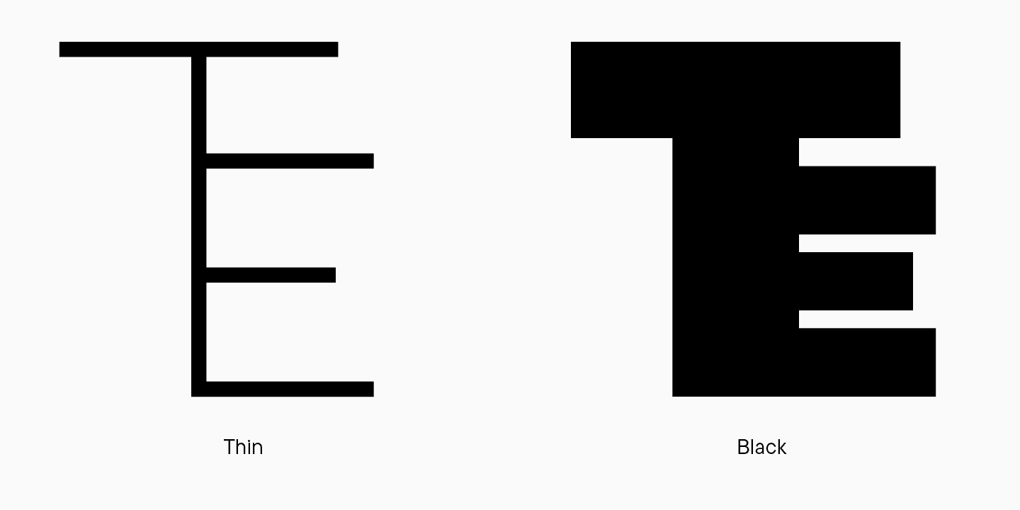
«TE» also looks strange and resembles a hair comb. When a letter becomes reminiscent of something else, it becomes an icon or an illustration. It seems the graphics may have been overemphasized during its design.
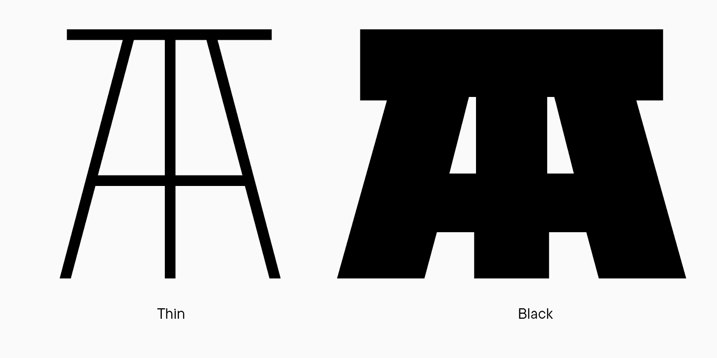
Finally, here is the «АТ» ligature, which is unfortunately completely illegible because of its overcomplicated form.
The Regular font style was too bold
After the first TT Firs update, the Regular font style looked too bold because of the font’s transition from FontLab 5 into Glyphs. We make the conclusion about the excessive weight according to the similar distribution of weights in font styles of numerous typefaces. Users have expectations about how (in theory) a Regular or Bold font style should look, and font designers have the knowledge of values.
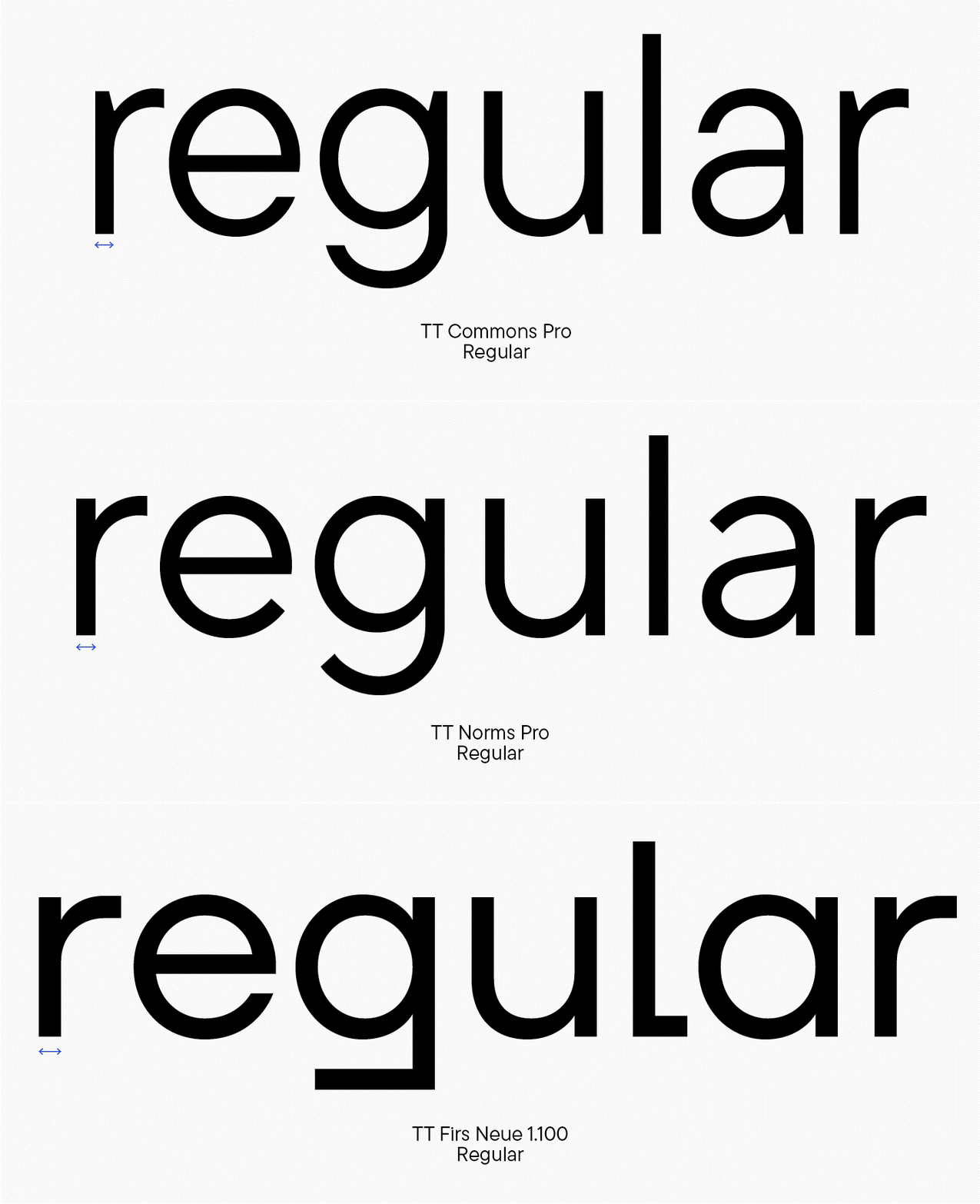
Antonina Zhulkova offered the following solution: to take all the values from the old TT Firs Neue and make the Regular font style a little lighter. At that moment, this solution was optimistic because we thought it would be a quick update where we would only be making minor adjustments to the font. However, after we decided on the total font makeover, Marina Khodak came up with another solution, which we will tell you about later.
Illogical stylistic set
Earlier, we mentioned that, apart from numerous peculiar ligatures, the first TT Firs had a set with built-in diacritics. The problem was that the diacritical marks were made only for several characters, and the design was inconsistent. In some glyphs, the diacritic was positioned closely to the letter; in others, it either had a squished form or was integrated into the character. Some characters didn’t have diacritical marks at all. We needed to establish a uniform logic for everything.
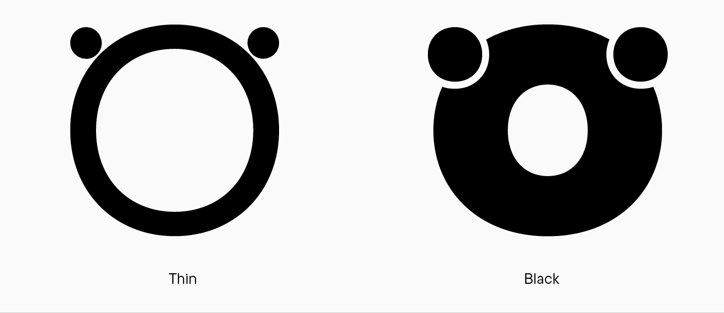
Diacritics also varied between font styles. For example, in the recognizable «O» with «ears,» a dieresis was implemented only in the Black font style. In Thin, the dots are placed next to the character, and in Regular, they appear stuck to the character. The same happens to the letter «A» and some other characters. This looks odd and requires searching for a unified logic.
Addition to the character set
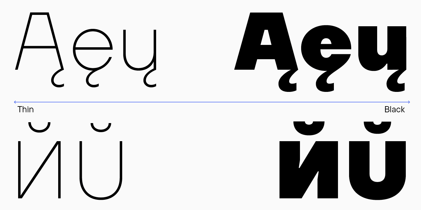
The language set of the extended Cyrillic alphabet for all letter cases (lowercase, uppercase, small capitals) didn’t correspond to our current standards.

There were no circled numerals, fractions, or small-cap numbers.

Other review points
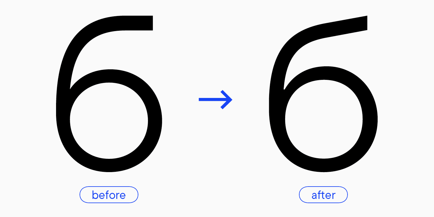
Some characters’ graphics needed revision. For instance, the logic of stylistic sets was broken; there was a set for the Cyrillic alphabet with fancy legs of «К» and «Ж,» but their relative letter «Я» didn’t have such a leg. The middle stroke of «E» was too short. The oval of the double-storey «g» was too overpowering and looked unbalanced. Antonina suggested creating a more visible difference between ovals and try moving the bar between them. The shape of the branch in «б» made the letter too similar to the number 6.

The junctions at intersections; for example, in the letter «n.» They served for optical compensation. In the Thin font style, the width of this element was only 1 point. It should be either more prominent or non-existent.

The upper part of the stem in “n,” to the right of the arch, had the same weight as the rest. Antonina suggested making this “thorn” narrower. It is a common practice to make it a little thinner than the main stem. This way, it doesn’t look too sturdy and large.

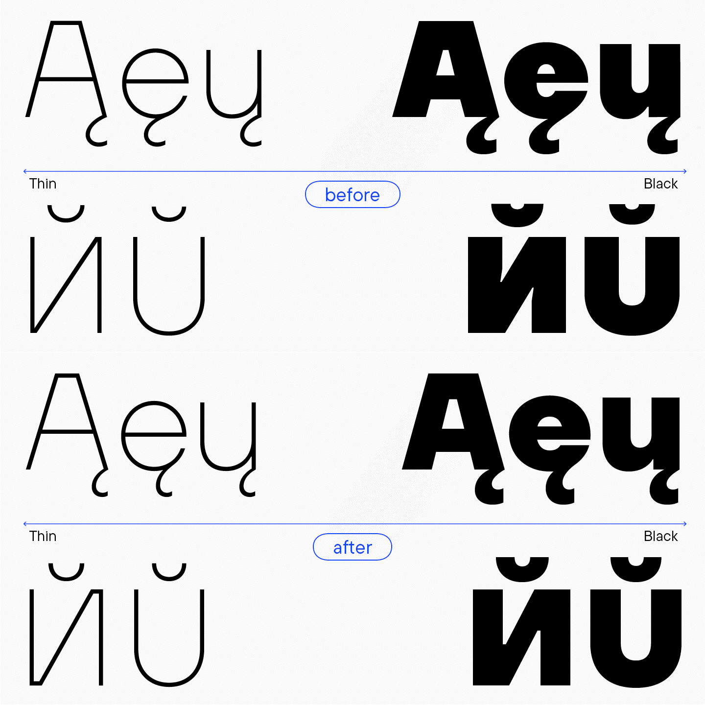
Inconsistent diacritics. The Cyrillic and Latin breve were identical in some styles and different in others. The flame was too calligraphic and didn’t fit the font’s character.
Also, the updated graphics required the best brand-new spacing and hinting.
Part 2: Font refinements
At this stage, Marina Khodak became the project’s Lead Designer. Building upon Antonina’s research and finding her own solutions, Marina initiated a complete TT Firs Neue overhaul. For the 2.000 version, the font was practically rebuilt from scratch.
Let’s cover the most interesting changes.
Balanced Regular font style
Regular is the main font style of the typeface. The task was to make it safe and easy for users to replace the old TT Firs Regular they initially used with TT Firs Neue without making everything look bolder. That’s why it was very essential to maintain similarities between the basic font styles in the majority of the typefaces.
«When it became clear that we were doing a more in-depth rework on the font, we re-calculated all font styles. As a result, the weight of the Regular style in TT Firs Neue 2.000 was 70 points — it was how it should be. Besides, we added a Normal font style to the font with a stem weight of 90 points. We often add this font style to sans serifs because of high demand. In the old TT Firs Neue, the Regular style weighed 90 points, and the new one — 70. We kept the value of 90 points for the users who liked this specific weight in the previous version of the font.»
Marina Khodak, TypeType Lead Designer

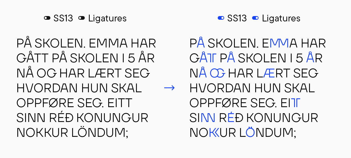
Designed universal logic for the set with compressed diacritics
To align the diacritical marks that stuck to letters to the overall logic, Marina analyzed the frequency of characters in Scandinavian languages.
«Our font featured a set with these compressed diacritics, and I wanted to understand why these marks were added and applied to only some specific characters. I had a version that they were only added to the letters featured in Scandinavian languages: Swedish, Norwegian, Icelandic, and Danish. The Finnish language doesn’t belong to Scandinavian group, but it is also called that due to its geographic association. I also considered English as the most widely spoken language, and Cyrillic-based languages as those we are native to. My theory did not hold up. It turned out that the set doesn’t include all of the most frequently used letters of these languages. We simply crafted compressed diacritics for all uppercase letters. This design choice became the font’s unique trait, so now almost any text that features diacritical marks can be stylized.»
Marina Khodak, TypeType Lead Designer

Apart from the ss13 set with tightly positioned diacritics, we added the ss14 set, where diacritical marks are integrated into the letters.
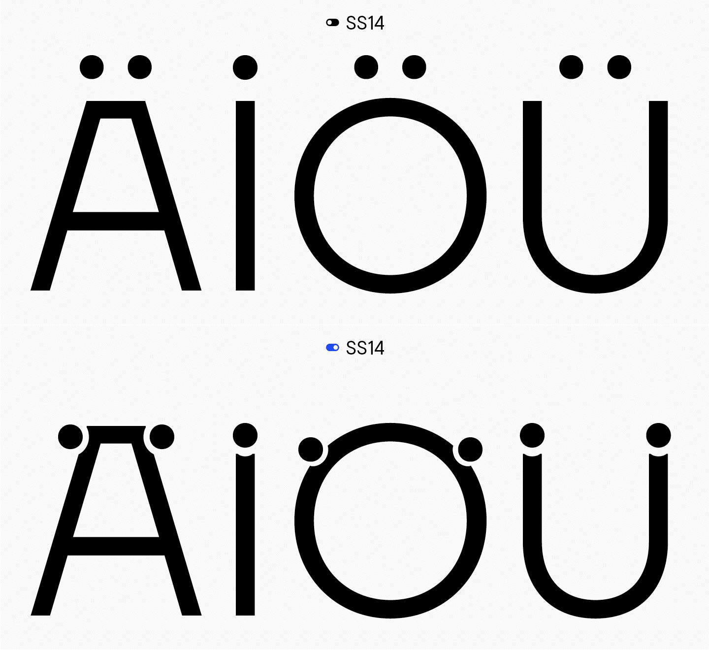
«TT Firs Neue 2.000 has a carefully thought-out logic for its stylistic sets. However, many designers don’t use them because they either don’t know they exist or simply find this tool inconvenient. So, we always recommend exploring the specimen and going through the font’s functionality before installing it. Within it lies a wealth of features that, when utilized, will reveal the typeface from a new perspective and add fresh dimensions to its appearance.»
Ivan Gladkih, CTO, co-founder of TypeType
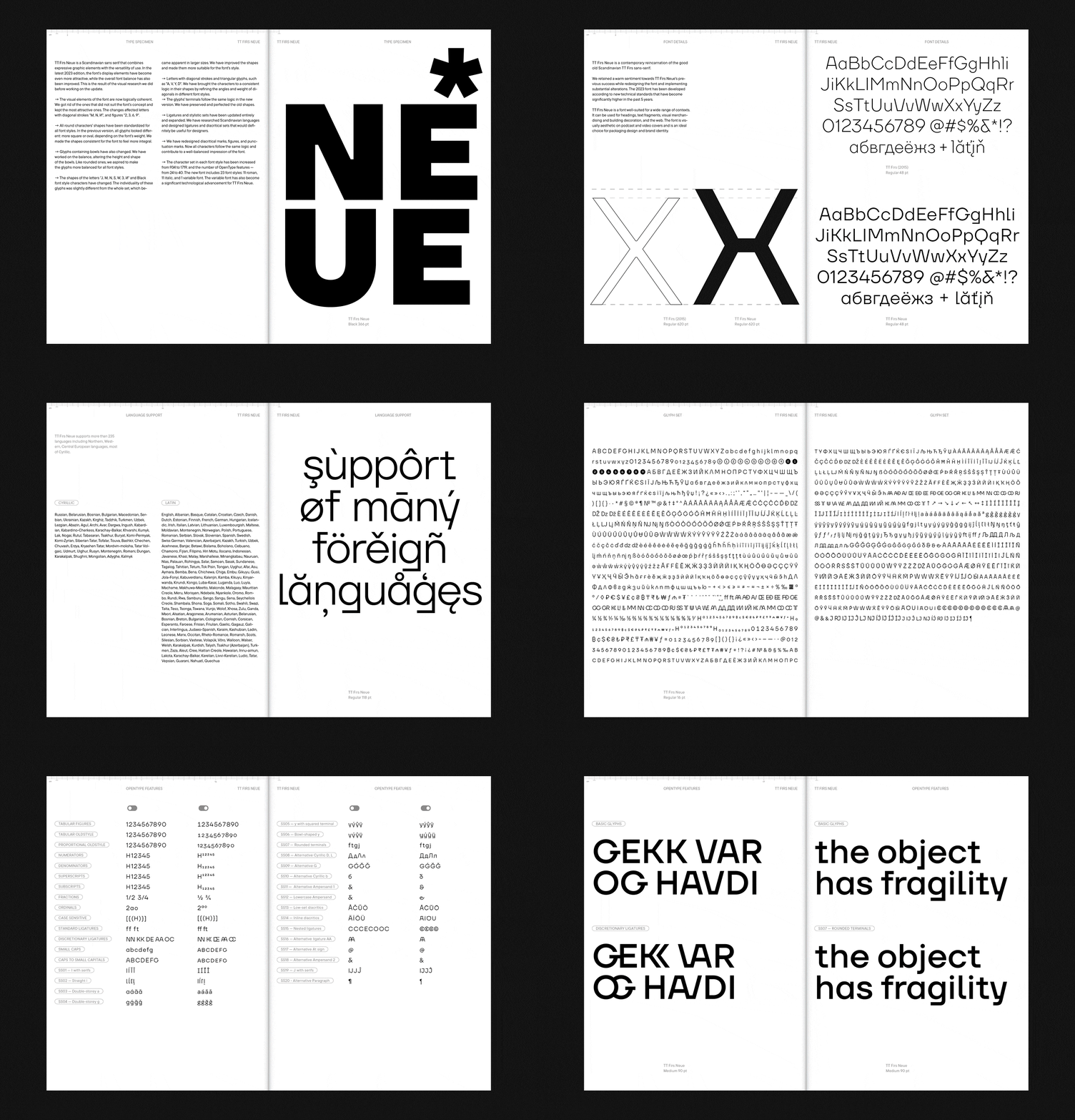
If you want to learn more about finding and using stylistic sets and other features, check out our article.
Refined ligatures
The old version had incomplete sets of ligatures. Marina’s starting point was that our font belongs to Scandinavian sans serifs. That’s why she chose this direction for the research.
«I considered the most frequently used letter combinations from Scandinavian languages. We could just design ligatures out of them, but they didn’t always look harmonious when combined. So, we chose two logical approaches: the first was frequency, and the second was aesthetically pleasing and interesting letter combinations. According to this analysis and logic, we created pairs that were included in the font.»
Marina Khodak, TypeType Lead Designer
Here are some interesting examples of the ligatures we made:
- Unconventional «DE.»
- In «Eл and «Fл design continuity with a common horizontal stroke of the old font remains consistent.
- A form of the letter «G,» commonly found in Scandinavian typography, made a strong appearance in the previous font version. We added it to ligatures, rhyming the horizontal accent with «Eл and «FÐ.»
- Ligatures with «doubled» letters also came from the Finnish language.
- «WE» looks quite captivating.

Uppercase letters in the old font had many specific ligatures—they underwent significant changes, but the logic remained the same. TT Firs Neue, version 2.000, offers two kinds of ligatures: simple and the ones from the ss15 set — letter inside a letter.

Uppercase letters in the old font had many specific ligatures—they underwent significant changes, but the logic remained the same. TT Firs Neue, version 2.000, offers two kinds of ligatures: simple and the ones from the ss15 set – letter inside a letter.
Amplified Cyrillic-based language support
The updated font includes expanded language support, especially for Cyrillic-based languages.
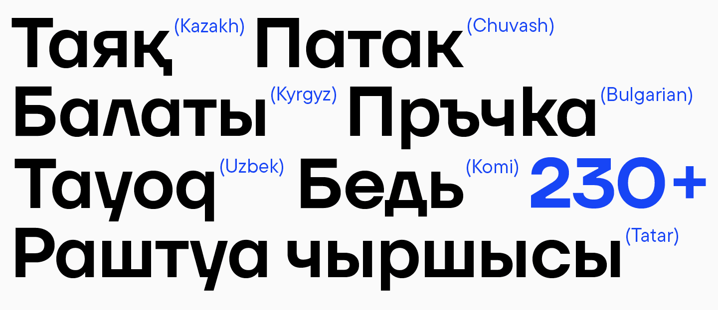
«A couple of years ago, we realized that the world of Cyrillic-based alphabets is very broad. That’s why, in 2022, we started incorporating extended Cyrillic character sets — not only for the main Cyrillic-based languages but also for the languages of smaller ethnic groups used by more than 1 million speakers, such as Tatar, Kazakh, Kyrgyz, and more. And TT Firs Neue isn’t an exception to this new approach.»
Ivan Gladkih, CTO, co-founder of TypeType
Added more captivating italics
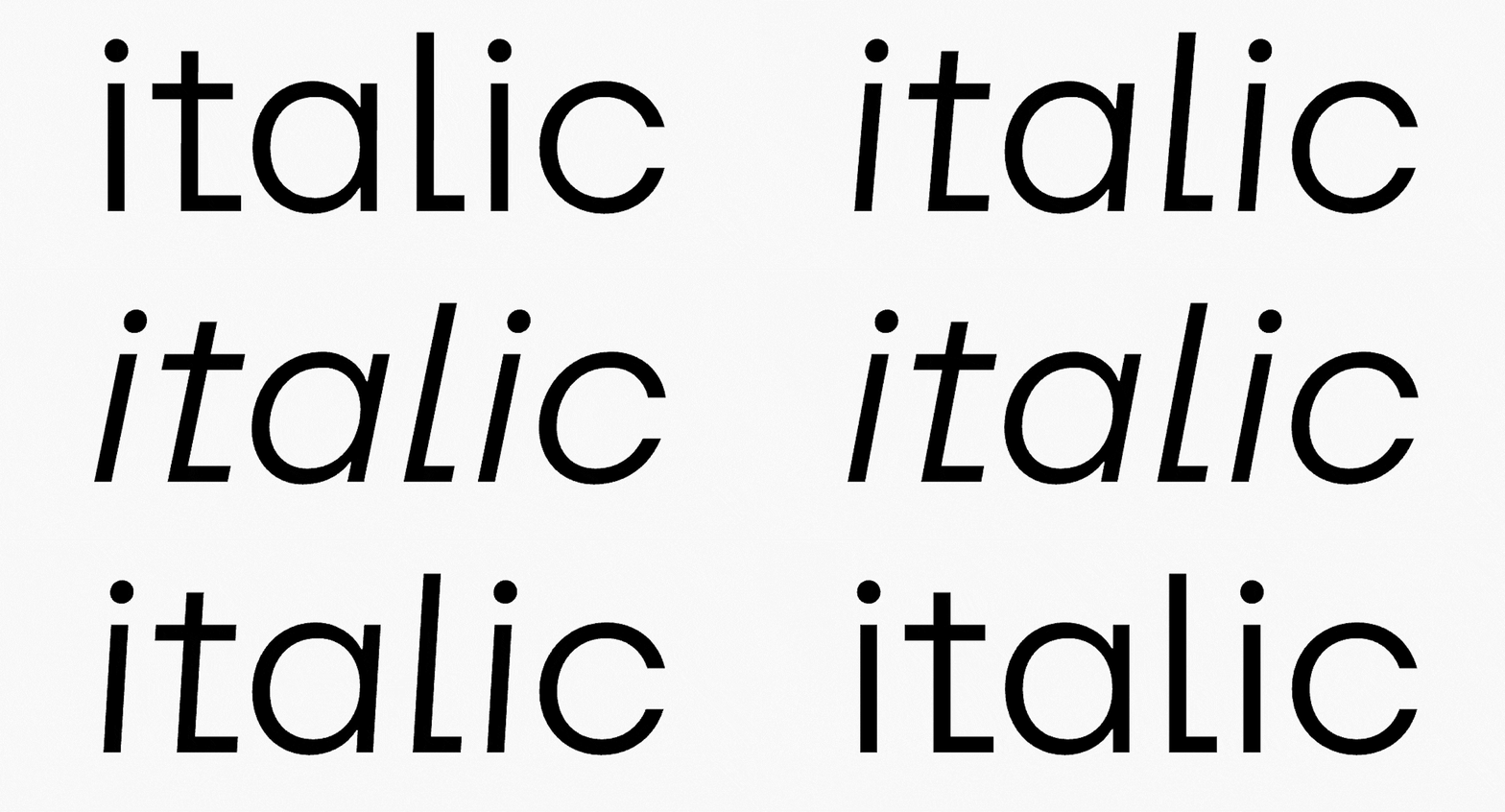
TT Firs Neue became the first sans serif for which we put extra effort into the detailed development of italic font styles. Usually, the most basic Slant with artifact compensation is designed as a pair for sans serifs. The font’s proportions stay the same. However, in this case, we chose another approach.
«We put a lot of time, effort, and heart into refining the updated typeface. We wanted to do more — something really special.»
Marina Khodak, TypeType Lead Designer
So, while working on the sketches of italics, we decided to make them more dynamic by increasing the slant angle from 10° to 12° and modifying the proportions of the round characters. Without this important change, large, rounded forms didn’t let the eye «glide» on the slanted line. Now, the more dynamic design of the italic styles better fulfills its main purpose of highlighting key ideas in the text when paired with a static, upright font. Besides, this italic style turned out to be just beautiful.
Other transformations
After the update, the typesetting has become more stable, tough, solid, and uniform. We redesigned junctions, widths, oval ratios, contrast, spacing, and proportions, solving all the problems we covered in the previous section.
For instance:
- We completely redrew round characters and balanced their proportions in all masters, resulting in more uniform shapes.
- Junctions in the triangular characters became visually consistent.
- We removed the sharp terminals, the so-called «scorpion’s tails.»
- The terminals of the letters «t,» «f,» «j,» «g,» and similar have been smoothed out, becoming more uniform in weight and length. This is especially noticeable if you try comparing two «g» versions.
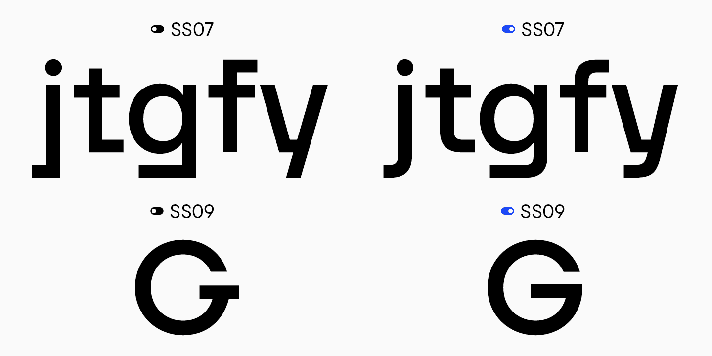
- The ss7 stylistic set with rounded terminals was added. This set was later incorporated into the main character set of TT Firs Text, as well as ss9, where the letter «G» didn’t have this attractive horizontal element.
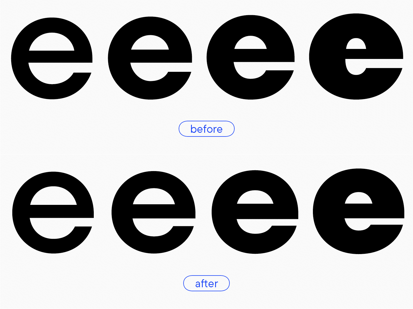
- Excessive contrast in the letter «e» was removed in the bold font style.
- «C» and «O» acquired more balanced proportions between masters.
- The branch in «б» was redesigned.
- We balanced out diacritical marks in weight and form, clearly visible in the Cyrillic breve.
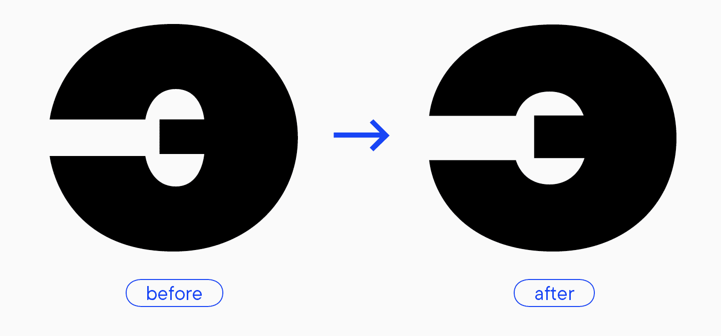
- The letter «Э,» which used to feature weird proportions and high contrast, now has everything in order.
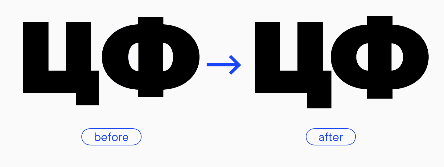
- The tail of the letter «Ц» and the terminals of «Ф» became more confident and clear.
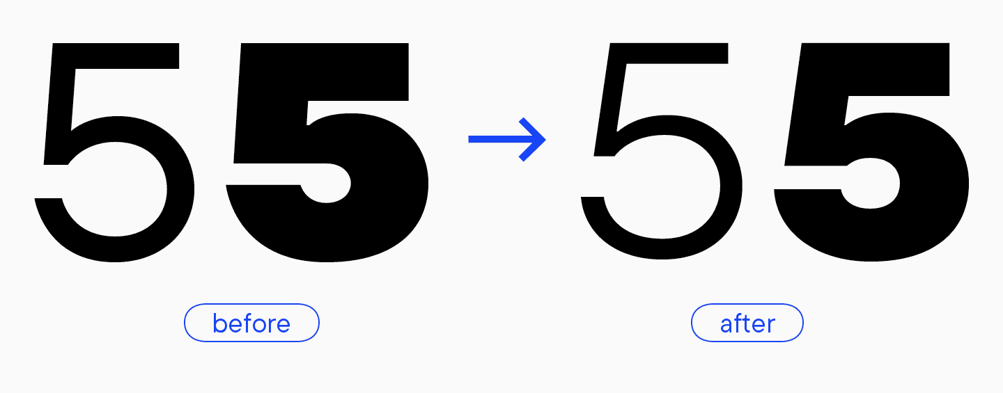
- We modified the form of the number 5, eliminating its “weirdness.” The more classic version of the number worked better for this design.
- Ampersand’s shape was modified as well and became more expressive.
«It’s funny that the shape turned out very similar to the one from the first TT Firs version, even though I didn’t have it as a reference. Obviously, it is guided by the font’s style and naturally belongs here.»
Marina Khodak, TypeType Lead Designer
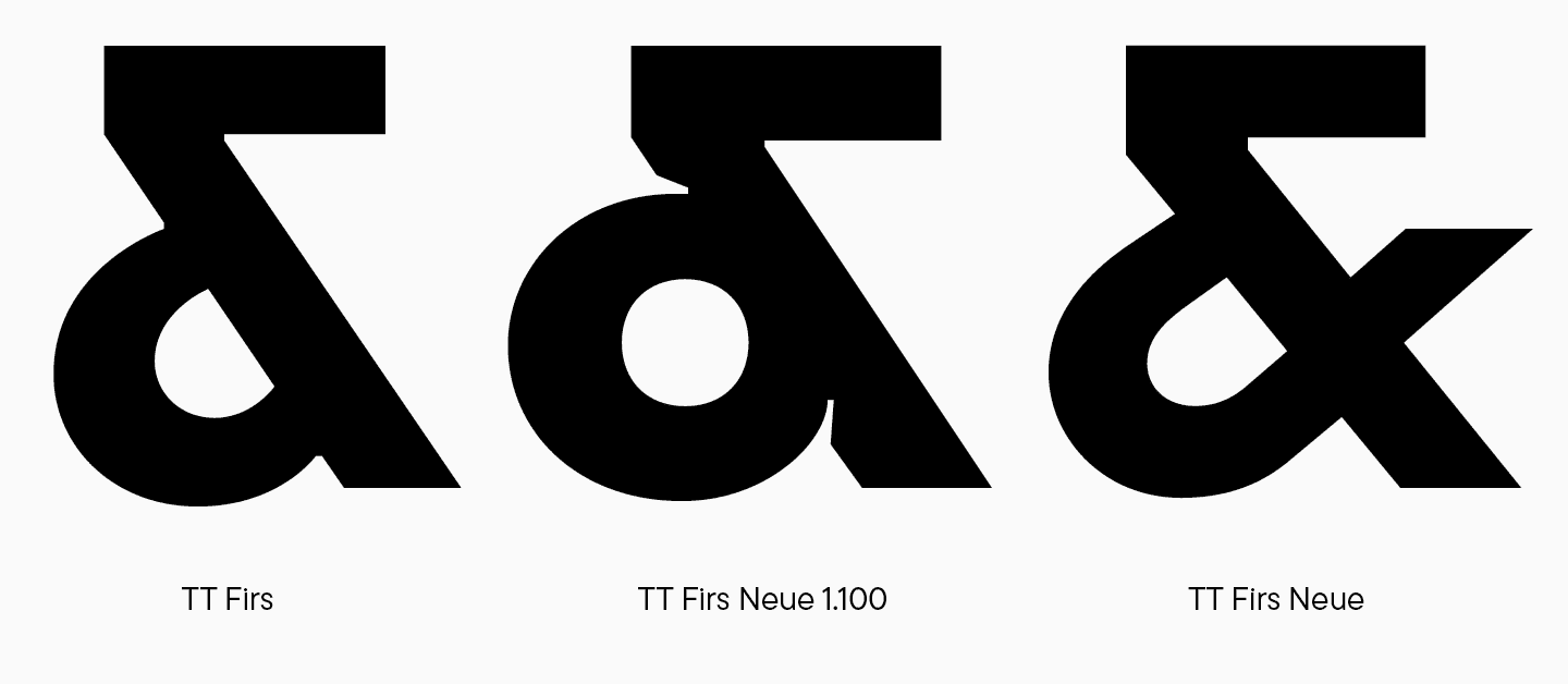
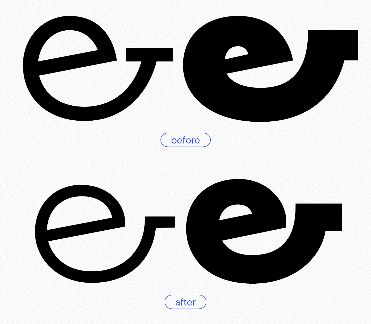
- The lowercase ampersand version remained but without the horizontal element, making the overall form look more balanced. Also, the issues with interpolation and using the variable font have been resolved.
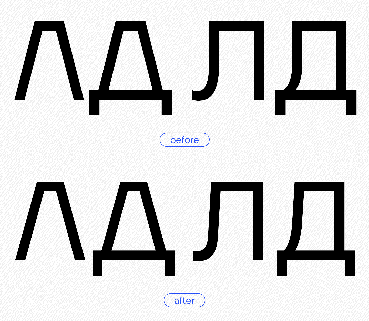
- In the primary character set of TT Firs Neue, the letters «Л» and «Д» have a trapezoidal shape, supporting the look of the letter «A.» We designed primary text forms for the alternate set. Their character was softer and more naïve than that of the entire font. In TT Firs Neue 2.000, we kept these alternate glyphs to amplify the typeface’s functionality and redesigned them in the necessary style. Later, these characters will be the ones to form the primary set of TT Firs Text, which we will cover in more detail below.
The outcome of the TT Firs Neue 2.000 design
As a result of all our hard work and dedication, we got a perfectly balanced Scandinavian sans serif with expressive graphic elements and high versatility in use.
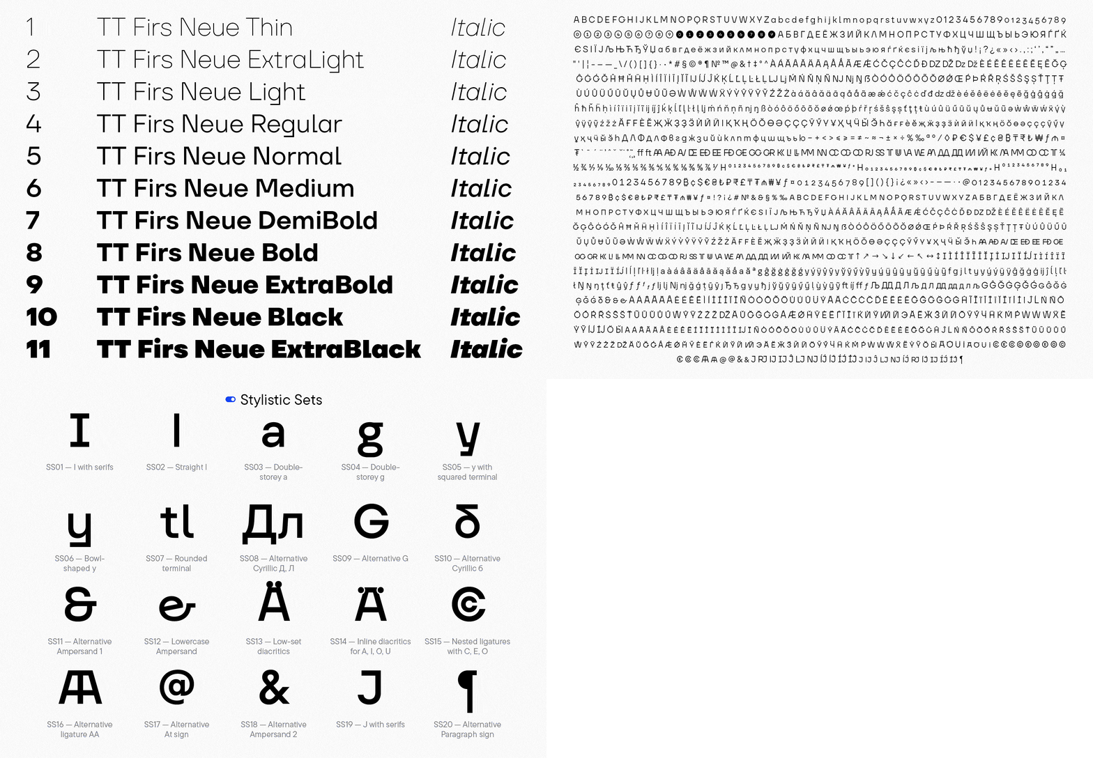
TT Firs Neue 2.000 includes:
- 23 font styles: 11 roman, 11 italic, and one variable font with two variation axes: weight and slant;
- 1719 characters in each font style;
- 40 OpenType features;
- 235+ languages support.
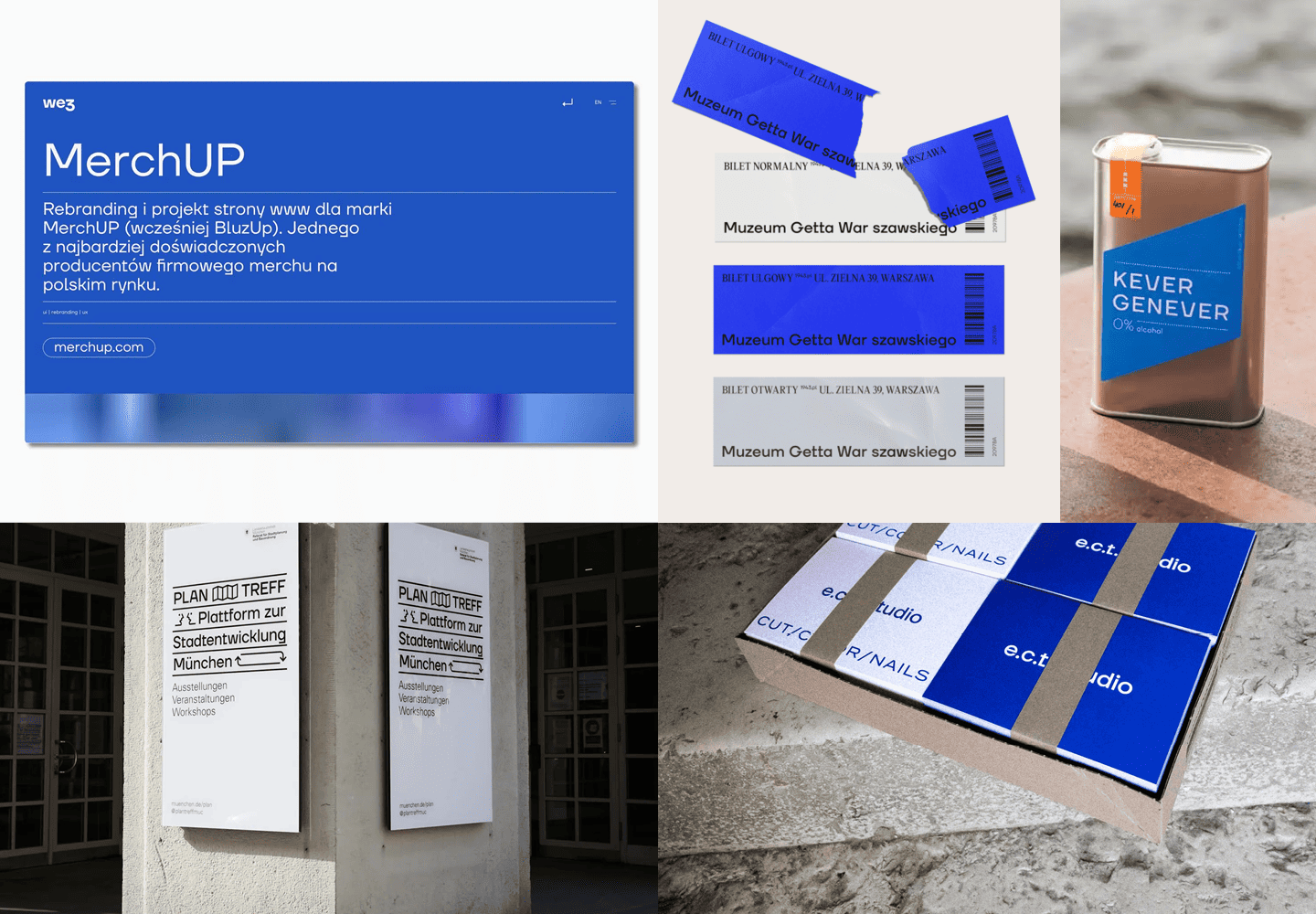
«Surprisingly, the second edition of TT Firs is particularly popular in European branding. It is well-loved by various museums, architectural agencies, and cafés — everything that falls into the category of Scandinavian vibe. This means that our vision came to life as expected.»
Ivan Gladkih, CTO, co-founder of TypeType
From a lone fir to an entire forest: Designing a text font pair
As we used TT Firs Neue, we noticed that it was quite expressive and started thinking about designing a font pair for it — TT Firs Text.
Usually, font pairs are made of fonts from different groups, like serif and sans serif, that contrast with each other. We chose a slightly different path by keeping the TT Firs Neue proportions and designing a text pair for it. Basically, we did this to keep the font looking nearly the same while ensuring that all the characters are suited for text setting.
We outlined the task as follows: to design a simple text font based on TT Firs Neue 2.000, remove expressiveness and extra details, and minimize the character set to the essentials.
We based our work on research done earlier for the TT Neoris font and revised certain glyph forms to reflect higher-frequency ones—those more commonly used by designers.
Here are some of the details we altered:
- Junctions in the triangular characters were removed, making the forms less expressive;

- Some forms got a more classic look (for example, «G» or «Q»);
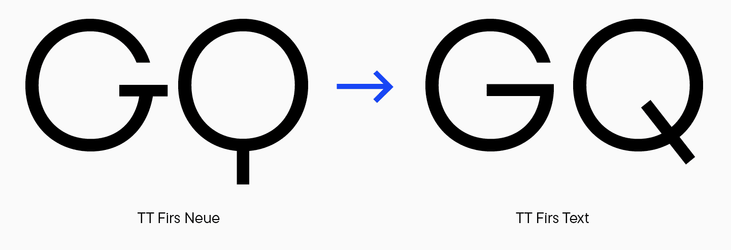
- Squared terminals were replaced by rounded ones in «f,» «g,» «j,» «l,» and «t»;

- The proportions of characters with junctions were visually compensated;

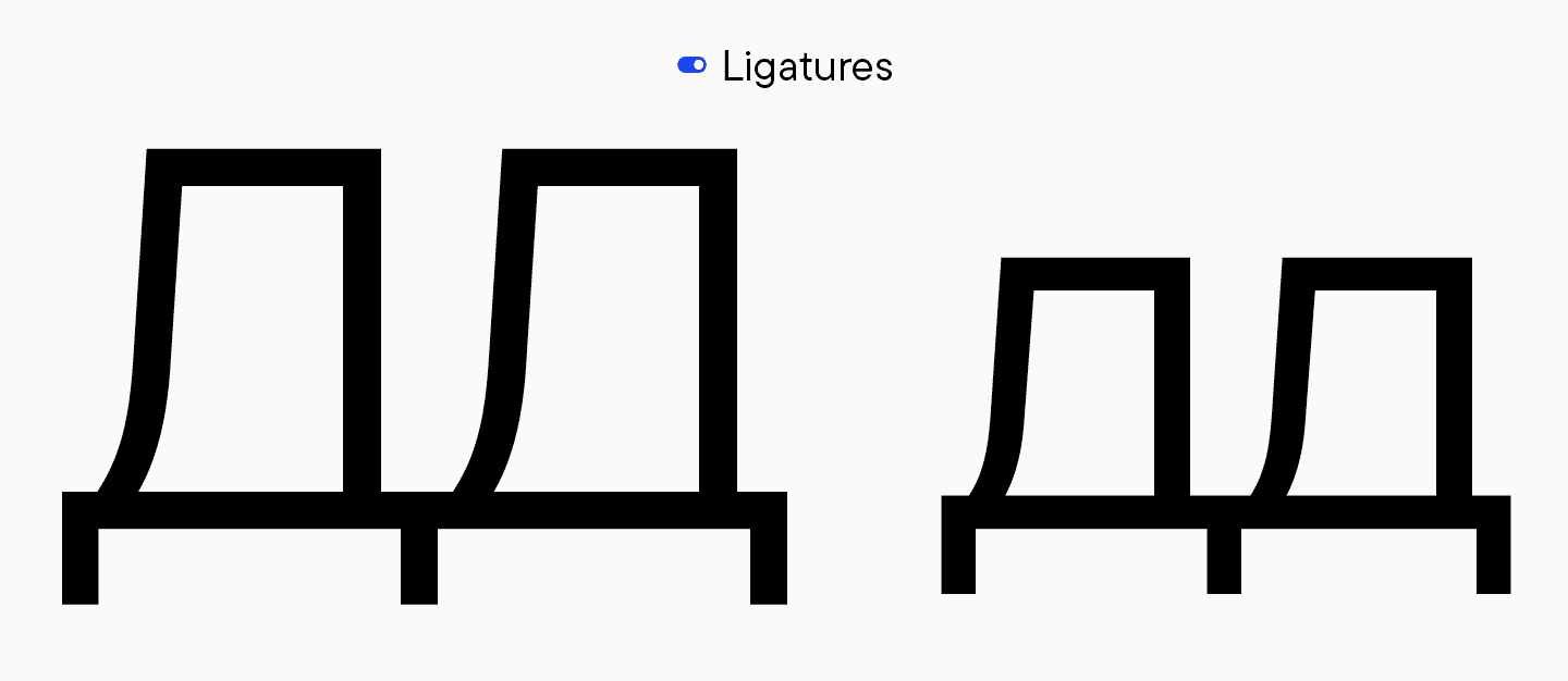
- Almost all ligatures were removed, and the ones that remained serve for technical purposes rather than aesthetic;
- Italic font styles underwent the same transformations.
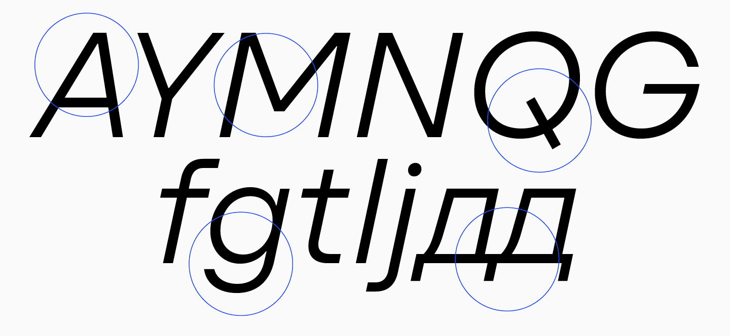
«As a result, we got a sans serif with more traditional text forms of characters. The font turned out to be rather neutral but still recognizable. It has a particular style and vibe of TT First Neue.»
Toma Streltsova, Lead Font Designer
The outcome of the TT Firs Text design
TT Firs Text is an elegant geometric sans serif with a Nordic character that blends uniqueness and neutrality.
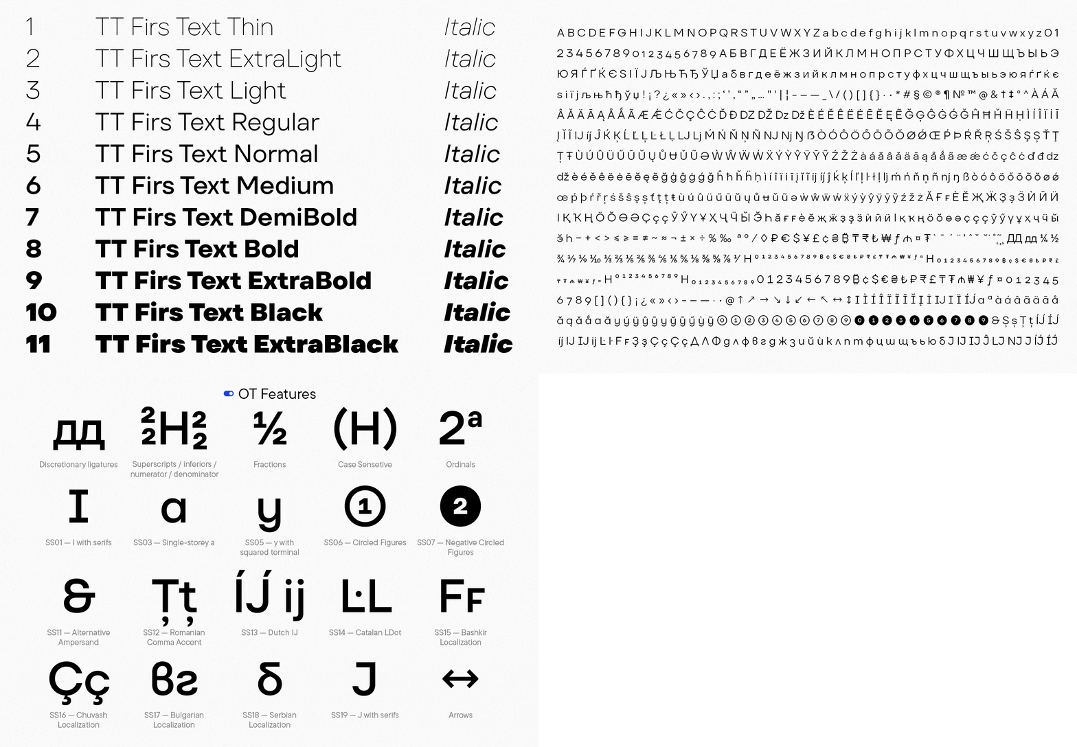
TT Firs Text includes:
- 23 fonts styles: 11 roman, 11 italic, and one variable font with weight and slant variation axes;
- 898 characters in each font style;
- 31 OpenType features;
- 235+ languages support.
«We achieved a strong sans serif with a subtle Scandinavian aftertaste, which perfectly matches TT Firs Neue 2.000. It’s clear to us that TT Firs Text is a „workhorse“ for a wide variety of tasks. We can see this in action as the typeface has already become popular with our users.»
Ivan Gladkih, CTO, co-founder of TypeType


