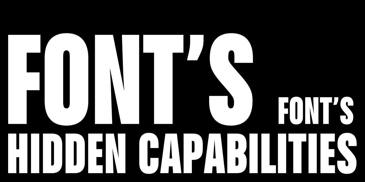
Fonts feature numerous hidden capabilities. However, many designers either don’t know they exist or don’t understand how to use them. In fact, nobody hides anything, and all the tools are very easy to find. The main thing is to know what exactly you are looking for.
In this article, we will explore the topic of Open Type functions (also known as OpenType features): what they are, what they can do, and how to use them.
What Are OpenType Features?
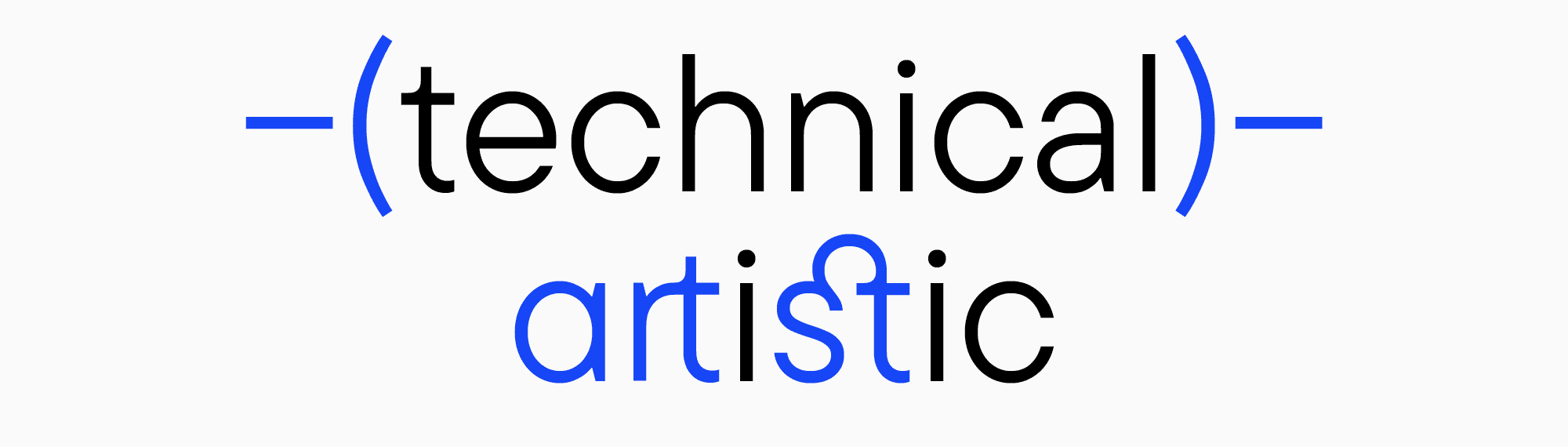
OpenType features are these exact “hidden capabilities”—a set of tools integrated into a font. They have several objectives that can be subdivided into technical and artistic.
OpenType itself is a font file format developed by Microsoft and Adobe. It combines the best of TrueType and PostScript technologies while introducing advanced features for typography. The OpenType specification defines how fonts are structured, stored, and accessed, enabling compatibility across operating systems and devices. This specification also allows for extensive support of character sets, complex scripts, and typographic refinements.
The technical OpenType attributes tools are meant to improve the layout. Font developers most often want their font to work smoothly and be user-friendly. That’s why they do everything to give designers seamless control over the entire typeface’s functionality.
The artistic features are stylistic sets and alternates, which allow designers to fine-tune the font to fit the project and modify it to convey a particular message or character.
Convenience is a distinctive feature of fonts with embedded OpenType features. Compared to the TrueType format, OpenType fonts offer significantly more capabilities, which we’ll explore in detail.

How Do OpenType Features Work, and What Are Their Types?
Let’s explore the existing OpenType features and how to utilize each function effectively.
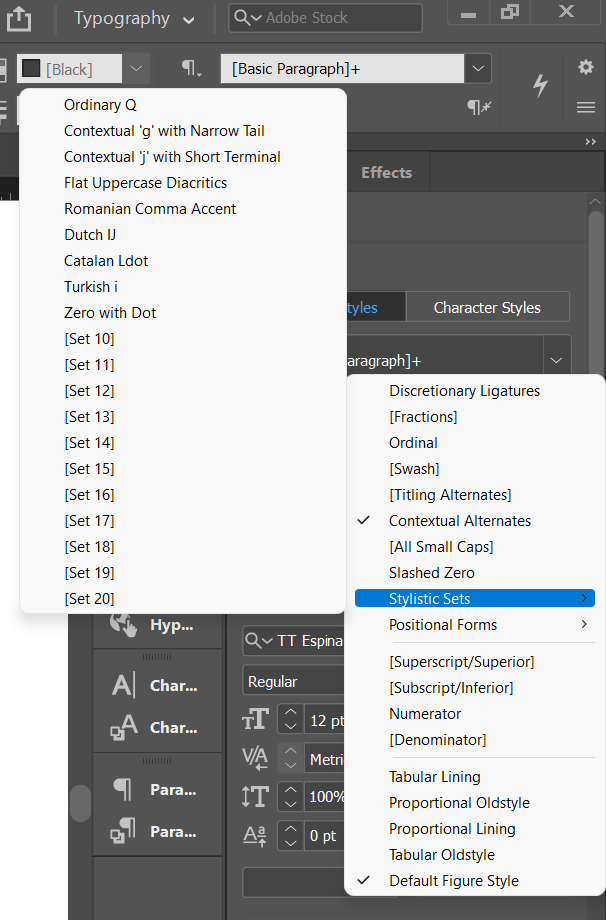
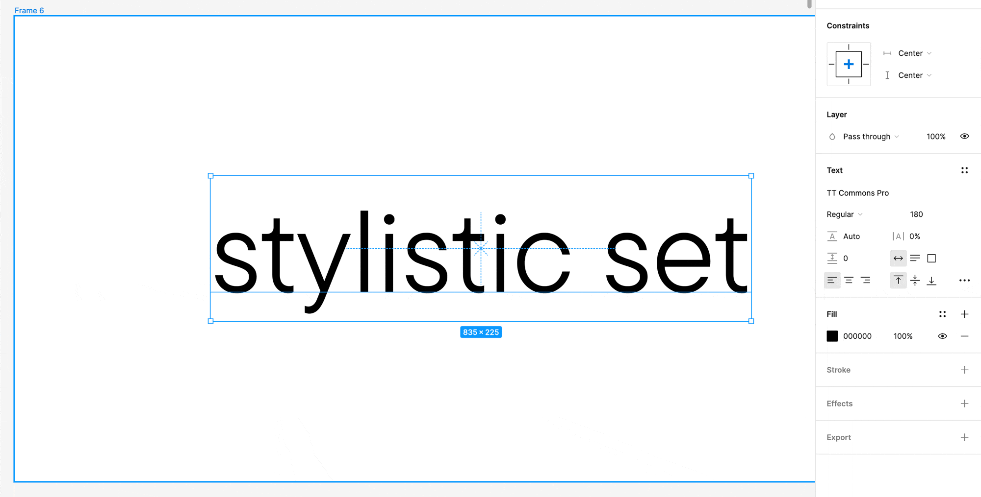
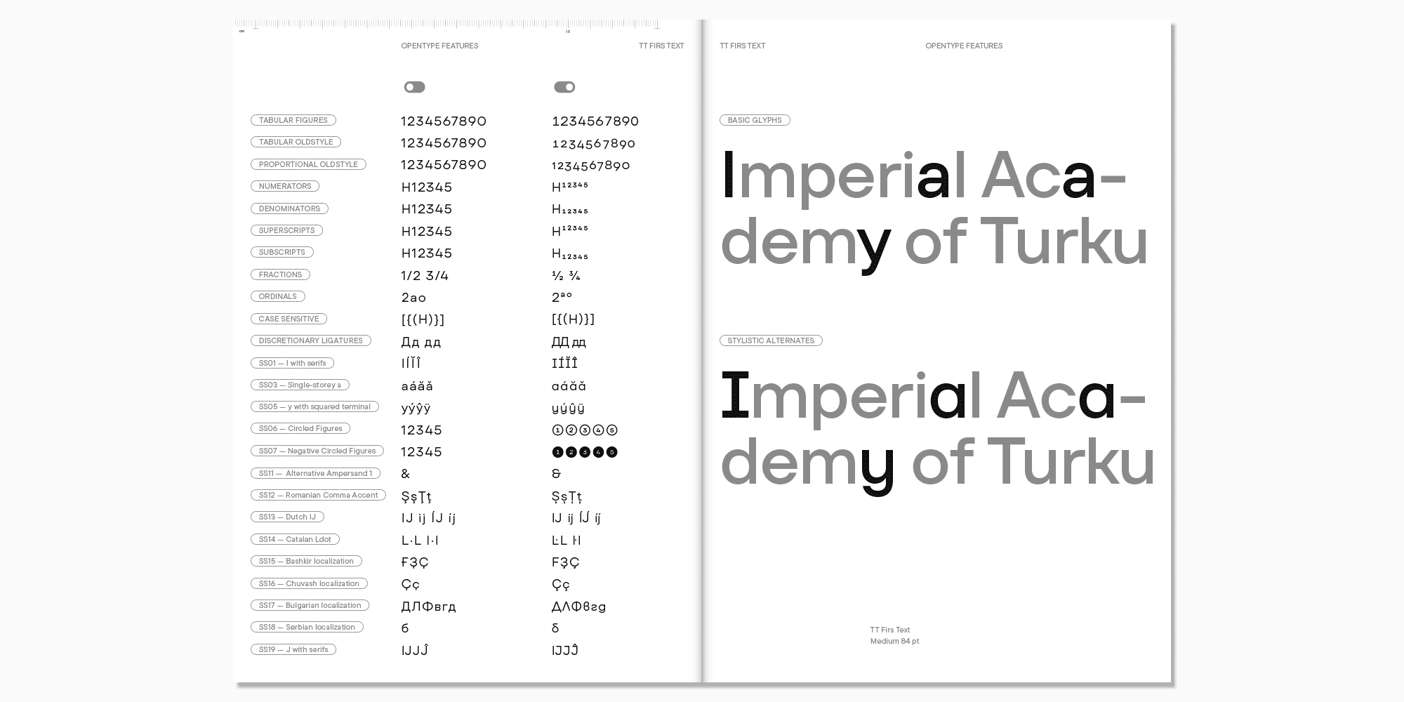
Stylistic sets
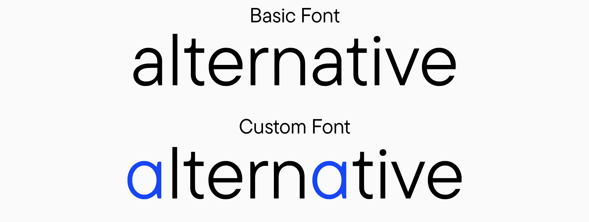
One typeface often contains multiple variations of the same letters. For example, single and double-story “a” are two alternate forms of one character. There can be a lot of them—the number is only limited by the font designer’s imagination. Many of these alternates have purely graphic, artistic functions, but some have practical applications. For instance, the lowercase letter “l” (“L”) with a tail is often needed for the navigational purpose of not confusing it with the uppercase “I” (“i”) because they look very similar.
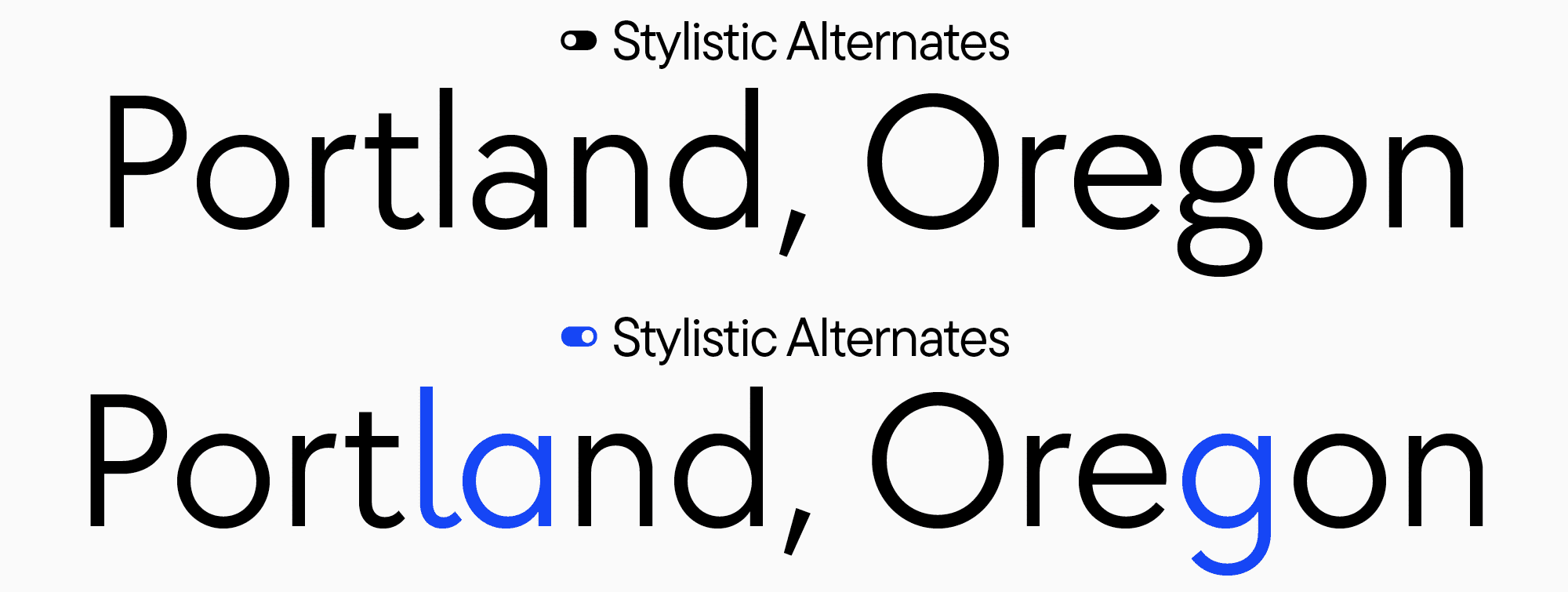
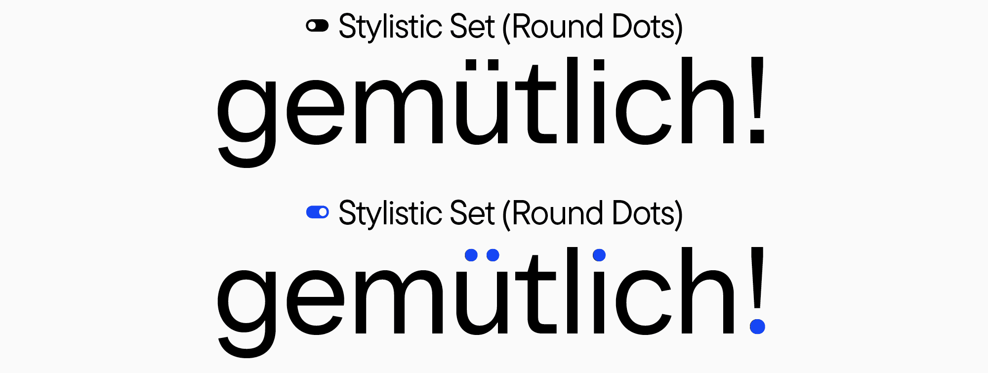
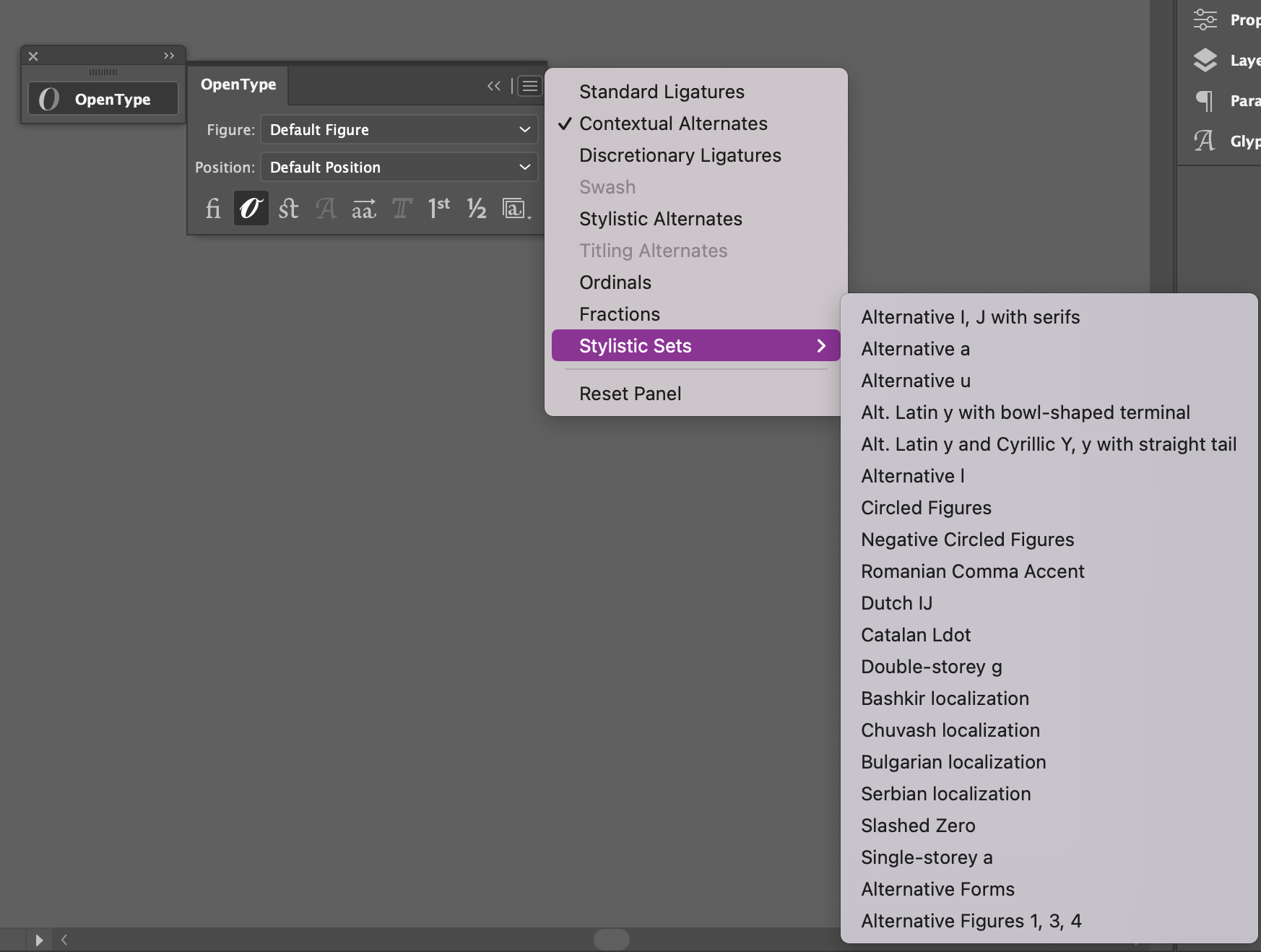
Some alternate forms often have similar key traits, which unite them into groups called stylistic sets. Stylistic sets are collections of characters with a common alternate form. You can use stylistic sets to transform the font’s personality; for example, you can turn a neutral sans serif into something soft, fun, and even playful—all that just by changing the forms of particular characters. However, the possibilities of stylistic sets go beyond just individual letters: if we want to change the forms of periods, all the numerous characters that have dots in their construction will be transformed.
They are most often gathered into a whole set to avoid replacing each letter separately, which would be very time-consuming in the case of a large text file or a book. Simply turn on the set, and all the characters in the entire text block will be modified. This is a very convenient feature.
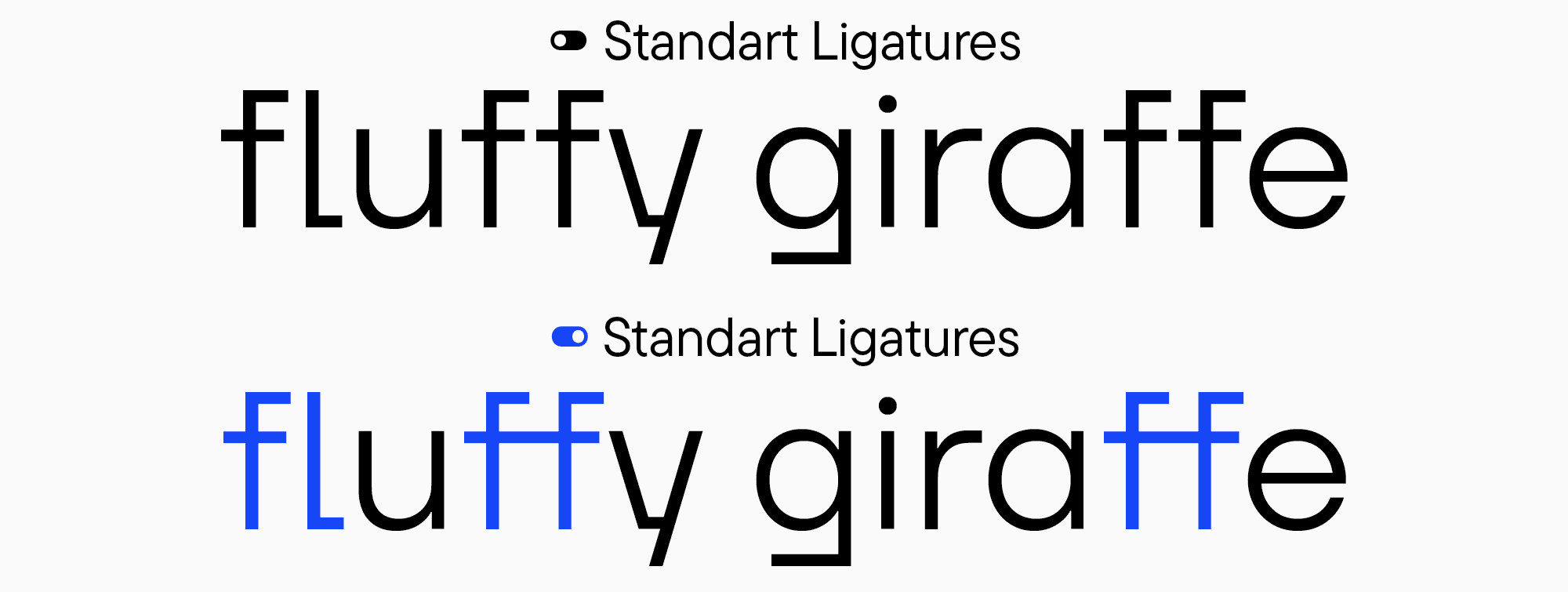
Ligatures
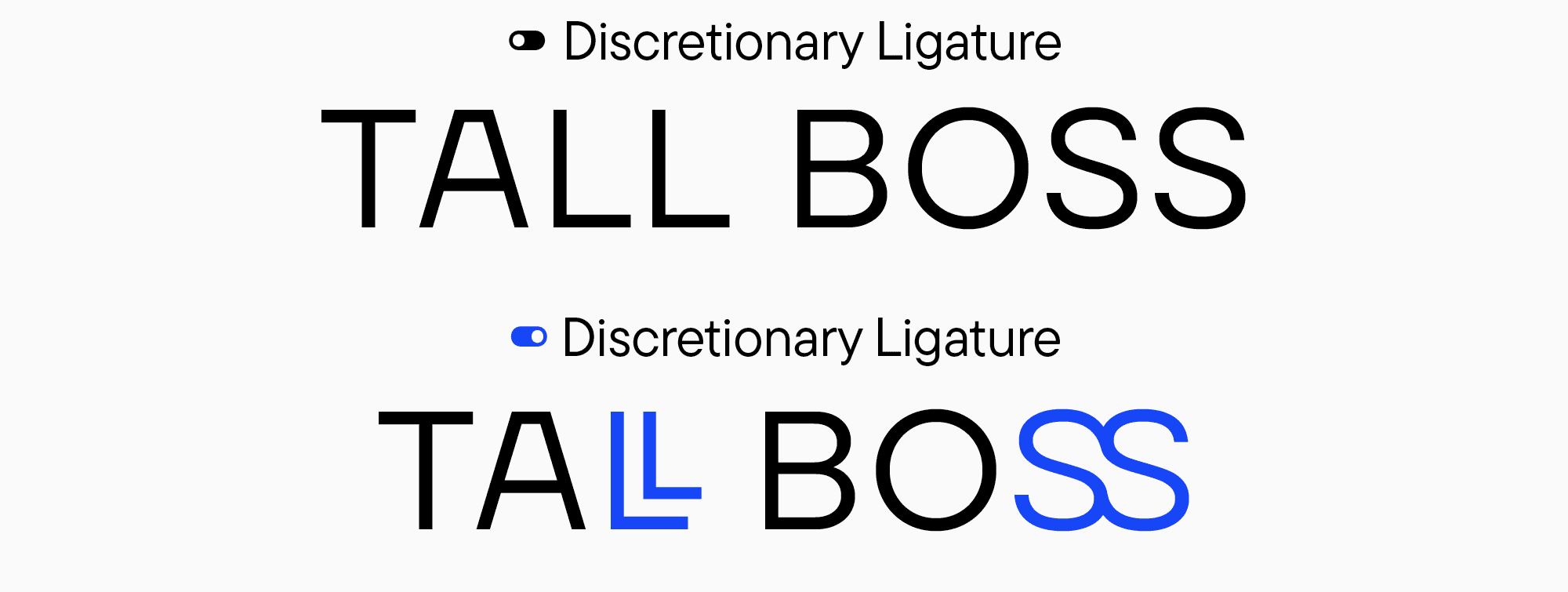
Ligatures are characters constructed by visually linking several glyphs. They can be standard or discretionary. Standard ligatures, such as fi, fl, ff, ffi, ffl, and ft, are featured in almost every font. They fulfill practical functions.
Discretionary ligatures are primarily decorative and can involve any combination of letters, depending on the author’s imagination and the project’s specificity. Any characters a designer wants to combine, seeing a practical and aesthetic meaning in this, turn into discretionary ligatures. Among them, you can discover highly unusual solutions that can become one of the most distinctive features of your design project.
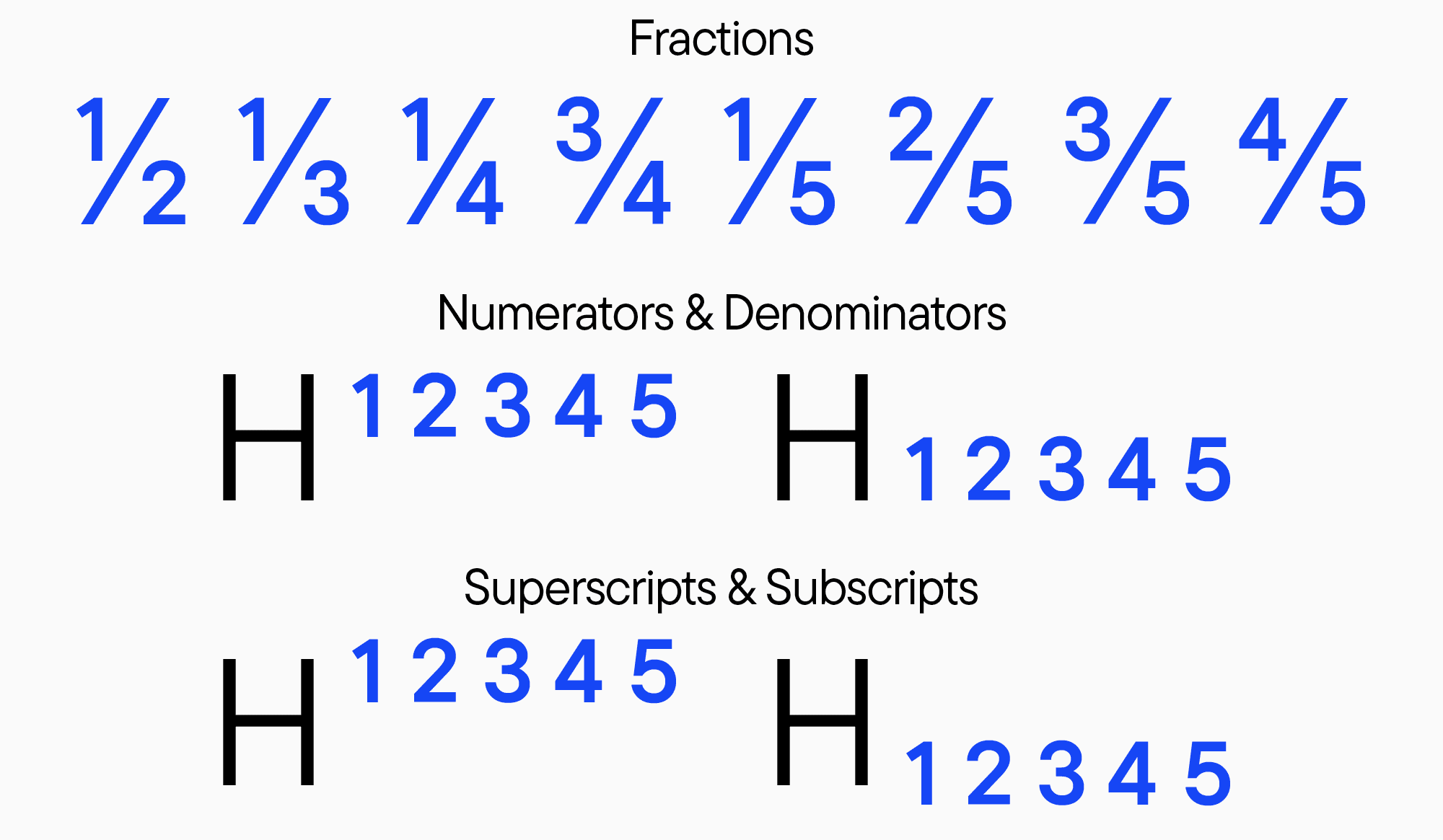
Figures
Many fonts feature special characters based on figures, such as fractions. The number of combinations for fractions is almost limitless. There are numerous variants of small figures, like subscripts and superscripts, including numerators and denominators that form part of fractions.
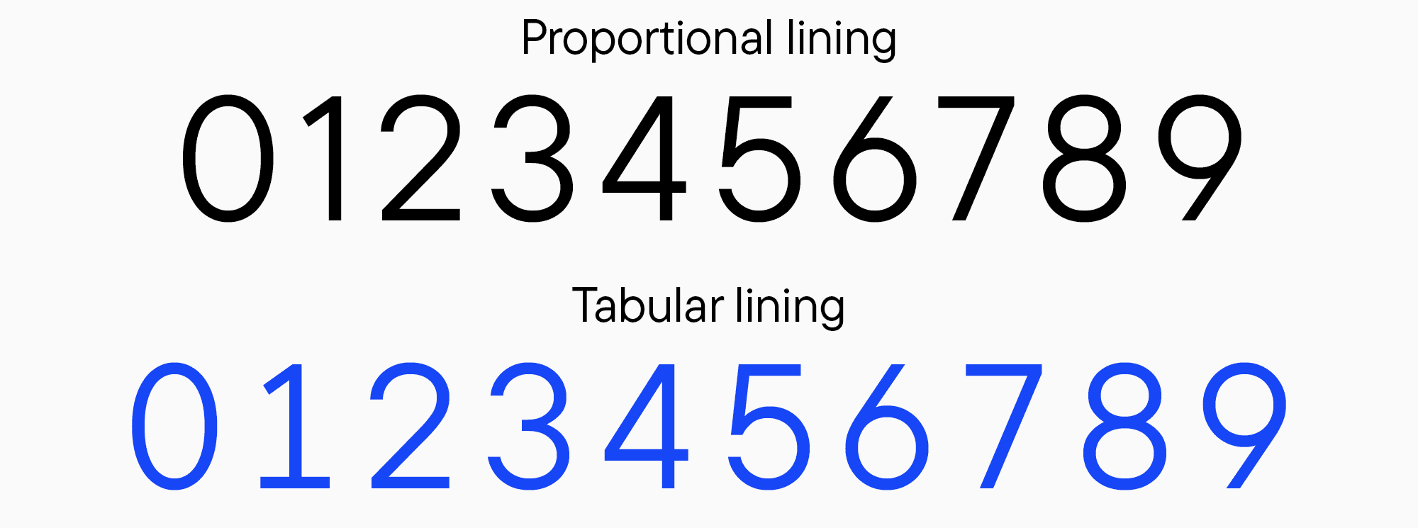
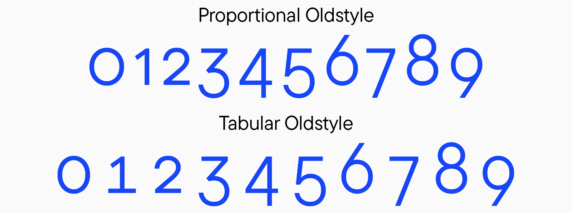
Many fonts also have tabular figures, the ones with identical widths. Roughly speaking, these are “monospaced figures.” They are very convenient to use when it’s essential to have every figure in the succeeding line exactly beneath the figure from the line above, like in tables.
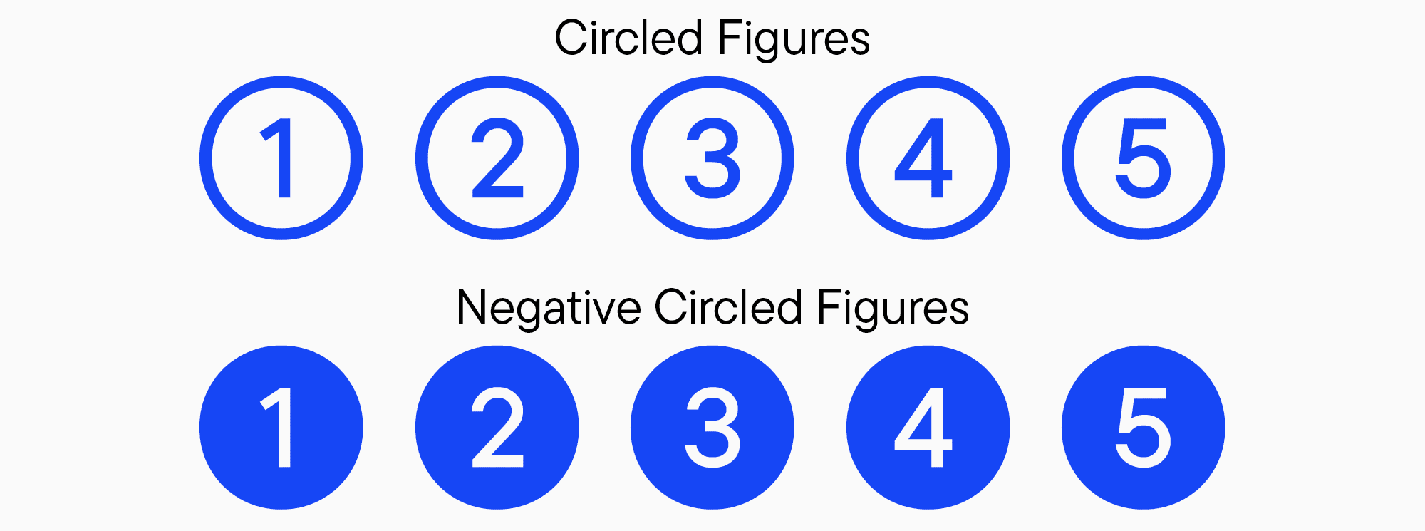
Another fascinating designer tool is circled figures. There are two kinds: black and white circled numbers. These figures are usually included in stylistic sets and serve for decorative purposes.
In addition, there are old-style figures. They differ in form from the modern, familiar ones and can be used to give your project a historical feel. This kind of figures goes well with the old-style currency symbols, another feature integrated into many fonts.
Icons
It is very common for fonts to contain basic icons or unusual symbols. Lately, the number of typefaces featuring such little “images” has been growing rapidly, as they can reflect and unravel the font’s personality. This is a feature of many modern fonts. Moreover, the icons and symbols added to the typeface are the most suitable graphics for the specific font. The main advantage of icon sets is that designers don’t have to draw additional illustrations or any other graphics to match the font—they are already there.
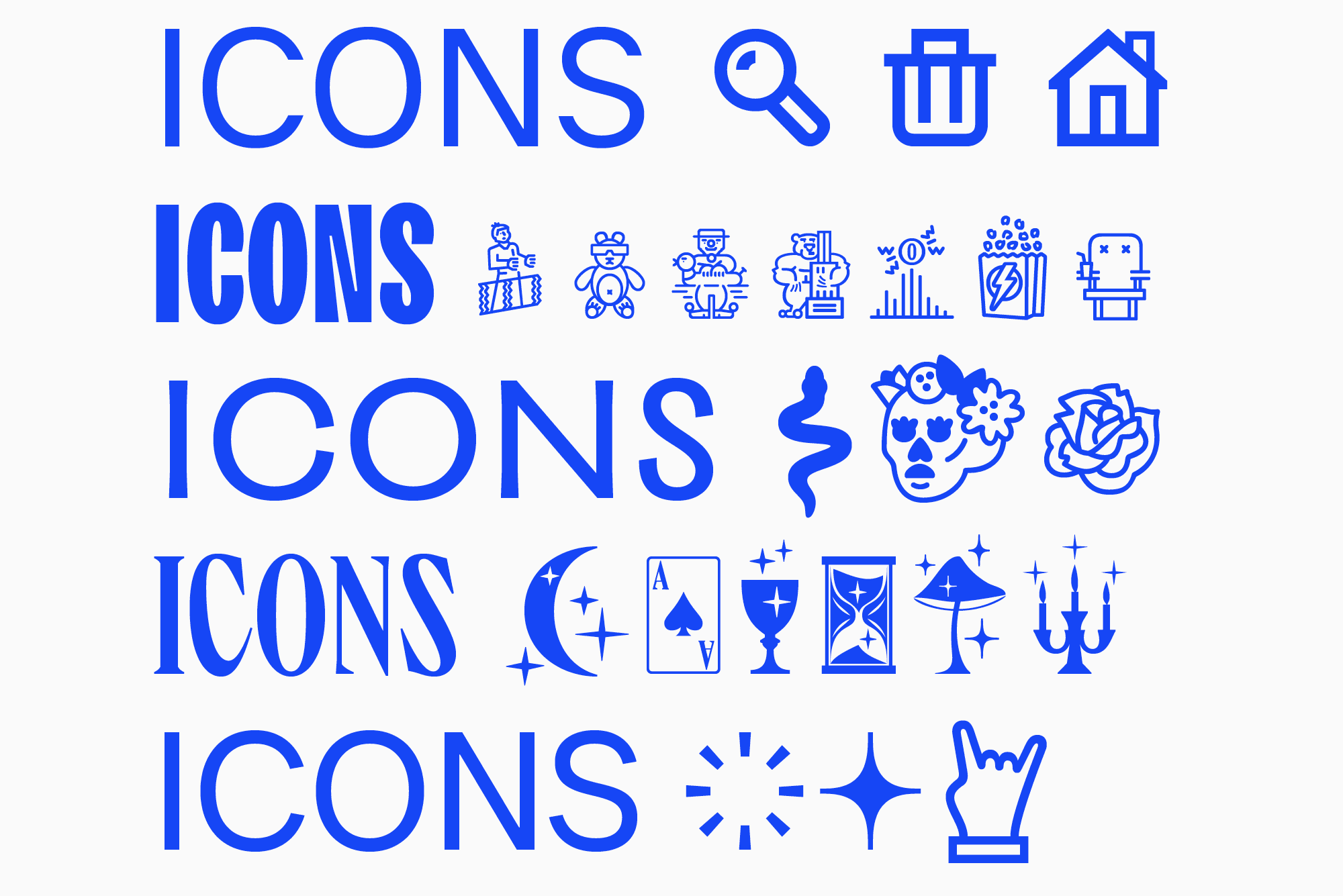
In more adaptable fonts, you are likely to find a neutral and familiar icon pack. However, display typefaces may feature distinctive images and associations of a font designer with a particular project. The icons’ alignment with the typeface’s mood is an important characteristic.
Language localization features
When working with different languages, designers are often unaware of the font functions available for such tasks. Languages are typically switched in the Character tab, like in Adobe InDesign and Photoshop.
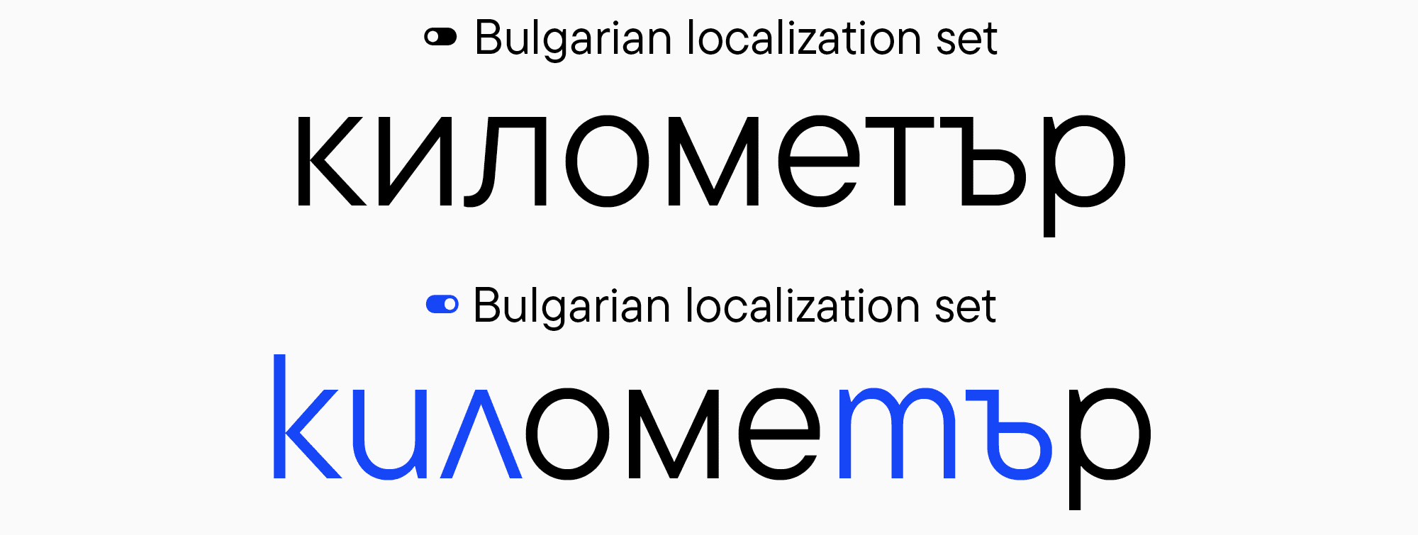
However, not all programs allow to switch languages this way. In such cases, you can use localization sets that can be turned on in Adobe Illustrator through OpenType features and in Figma through stylistic sets. Localization works similarly to replacing alternates through stylistic sets: in the entire highlighted text fragment, the standard letters are substituted with the characters without Unicode from the enabled language. By opening the list of stylistic sets in the OpenType features tab, you can see the localization sets (right after the sets with alternate glyph forms). They will be titled using the name of the language for replacing the standard letters with Unicode.
How to Use OpenType Font Features in Different Programs
Now, it’s time to find out how to turn on the above-mentioned features in different programs.
In Adobe software
Adobe Illustrator
To open the OpenType panel, go to the “Window” tab and select “Text” > OpenType.
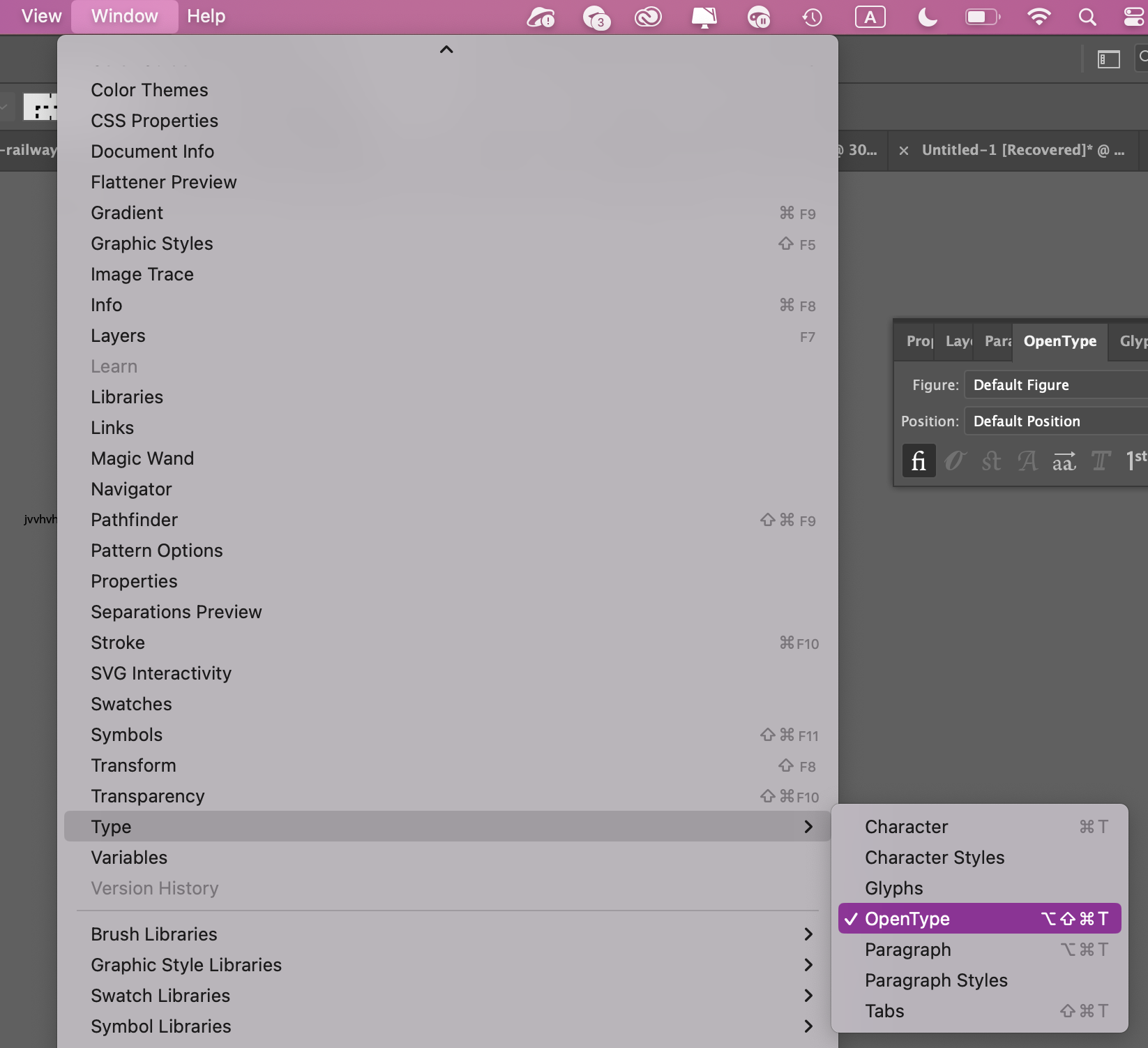
Then, in the window that appears, click on the icon with three horizontal lines (in the top right corner). In the dropdown menu, select “Stylistic Sets”—this will show you a list of stylistic alternatives and localization features.
Adobe InDesign
In the “Properties” tab, select the OpenType button.
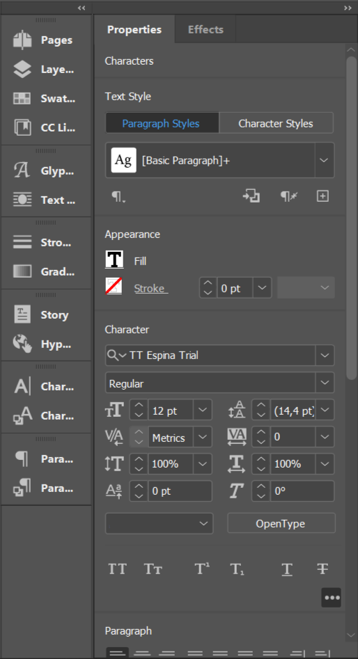
In the window that appears, you’ll see a list of all available features.
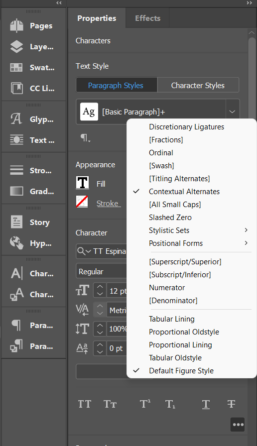
Select the “Stylistic Sets” option to view a list of all stylistic alternatives.
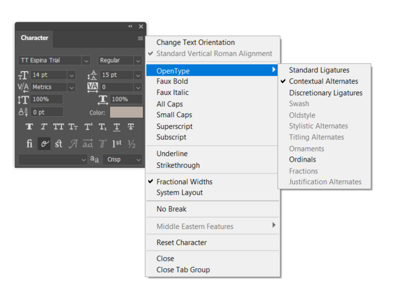
Adobe Photoshop
Select “Character” > OpenType. In the window that appears, you’ll see a list of all features.
Figma
In Figma, stylistic sets can be turned on through the panel Text > Type Settings > Details. Many designers don’t know how many interesting tools this tab contains.
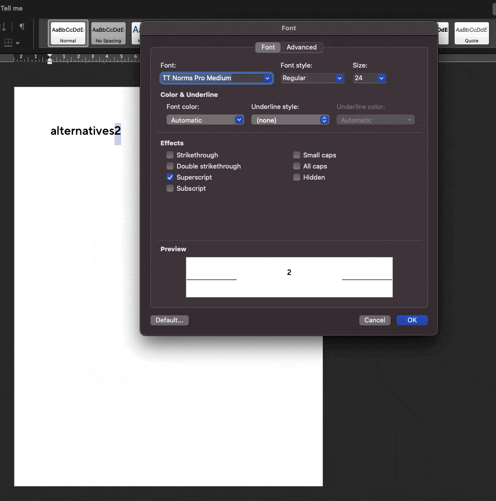
Word
Even Word partially supports these features. In the “Format” tab, choose the “Font” option. Then, click on the “Advanced” settings button to see stylistic sets and figure forms. You will also be able to turn on superscripts and subscripts. In Word, the process of working with OpenType features is more complex and less convenient, given that this isn’t graphics or design software. However, even there, you can use some of the fonts’ hidden powers.
Specimen
To learn what OpenType features are available in the typeface before purchasing it, you can take a look at the font’s specimen. They are usually showcased on the website where you buy the font. The specimen contains all the capabilities of the typeface, examples of the font in different point sizes, its styles, and functionality.
Customization
Every font can be customized to get a unique look. In the examples above, you saw how several stylistic alternates can dramatically transform the font’s character. When you make changes to certain glyphs, the entire font acquires a unique personality.
For instance, you can customize the font so that all basic glyphs that have such a possibility are replaced with their alternate forms, completely transforming the mood of the typesetting. Suppose you like a particular font but want to replace the single-storey “a” with the double-storey one. In that case, you can simply replace the glyphs that use basic (single-storey) “a” with an alternate set with double-storey “a” and maintain the integrity of the entire design system.
Read our article “Font Customization” to learn more about the ways to customize fonts.
Conclusion
As you can see, OpenType features significantly expand the capabilities of working with a typeface and unlock its full potential. We hope this article will help you make the most of the font’s hidden capabilities and give your design unique visual traits!