


Poster design is a vast creative playground for working with typography. How do you choose poster fonts correctly without compromising your idea? What kinds of different fonts for posters exist, and how can you find yours? Learn in this article!
Why do poster fonts matter?
The font is an integral part of any poster design. Event flyers for cultural or sports events, student bulletins, advertising, or campaign posters—text is present in each of them, helping convey various messages.
Moreover, in some poster designs, typography becomes one of the main features, and graphic elements complement the text or are absent altogether. We will dive into this later.
So, it is obvious that choosing poster typefaces correctly is essential to craft a stylish poster that will grab attention and communicate your idea correctly.
Types of poster fonts
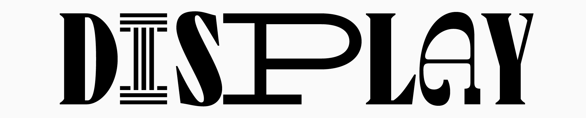
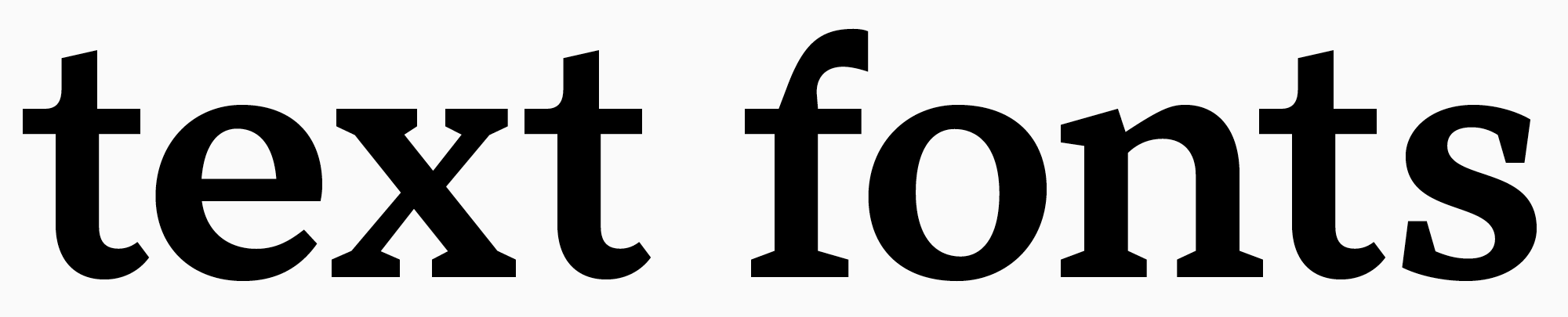
Let’s start by exploring the different fonts available for poster designs. All typefaces can be subdivided into two large groups: display and text.
Expressive fonts serve to place accents: they can be used for headlines or any other large, eye-catching text. These fonts have a pronounced character, more complex graphics, and many curious details. Such typefaces are designed for large and medium point sizes and work perfectly as standalone fonts, even without any graphic elements.
Text fonts come in handy when you need a font that reads well in small point sizes. These are more neutral typefaces with simple graphics that don’t distract from reading and are convenient for visual perception. Text fonts can still be used in large point sizes and accentuated on posters. They work perfectly to create a minimalist poster, achieving elegance and tidiness in the design.
So, almost any font can be part of the poster design. Discover how to choose the one for you!
How to choose a cool font for posters: checklist
Before we dive in, let’s clarify that these tips should be seen as guidelines for selection rather than strict instructions. In poster design, typography often becomes the designer’s main creative tool, allowing them to create something beautiful and unique. That’s why you shouldn’t be afraid to experiment and try different font options. To do that, you can download the trial versions of fonts for free.
Determine the idea of your poster
First, you should decide what goals you are aiming to achieve with your poster: informative or decorative, advertising or promotional. What mood will your poster have? What will its color palette look like? Will it be expressive or minimalist? After answering these questions, choose a font from the stylistic category corresponding to your concept. The best poster font is the one that helps convey your idea.
Find the font’s place and functions in the design
Now, it’s time to think about how exactly you will use font in your design. Will it be an addition to graphics or an eye-catching element alongside the illustration? Or will it become the only element on your poster?
If you use the font in large point sizes together with graphics, pay attention to details: certain glyph elements can be enhanced through graphics or similarities between them. If you use the font independently, try experimenting with point sizes and weights to create an unusual pattern out of your text. If you need a poster text font for small point sizes, move on to the next step.
Readability is important
The main thing about fonts used in small point sizes is that they should be easy to read. To be readable, fonts should possess the following traits: simplicity, clarity, neutral proportions, standardized character widths and stroke weight, no decorative elements. Learn more about choosing the right text font here.
Functionality should match the goals
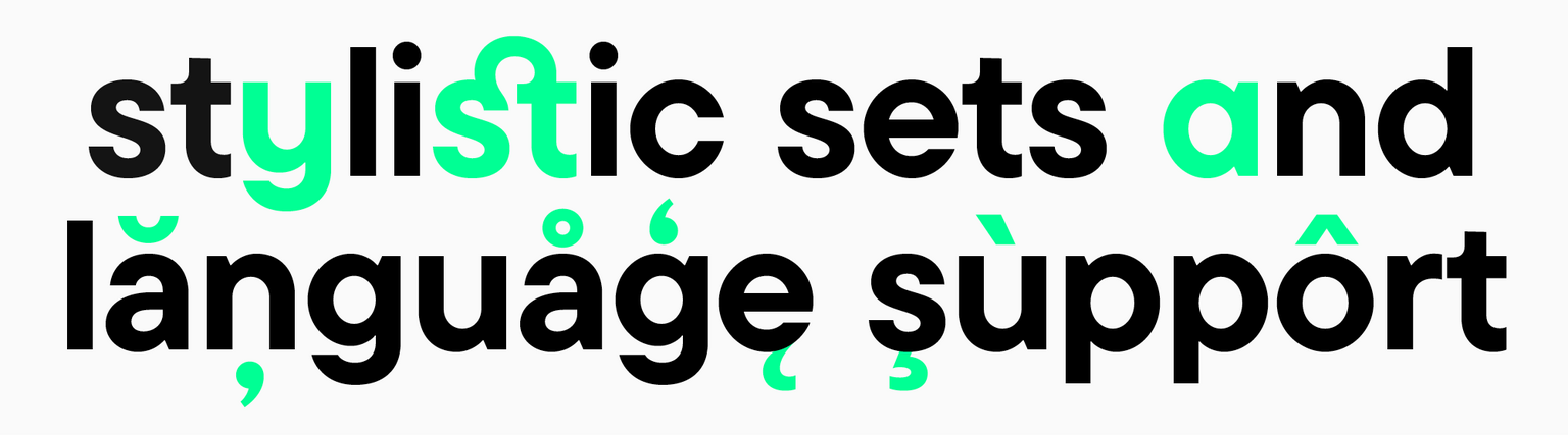
Another essential factor when choosing a cool font for posters is functionality. Before settling on a font, you should decide on the necessary functions. If you want to place multiple text pieces on your poster, and all of them will be in different languages, make sure the chosen typeface supports all these languages. To use different fonts on one poster or make a series of posters in the same style, choose typefaces consisting of many font styles. It would be a good bonus if the typeface included a variable font. This way, you will be able to experiment with typography and make unusual design choices.
Read more about choosing fonts for any project in our article.
Icons and other additional graphics in typefaces
Fonts often have extra graphic elements in addition to the base character set. The simplest symbols, like circled numbers, arrows, and signs, can be found in almost every typeface from the TypeType collection and in many fonts made by other studios.
More complex icons and illustrations are rarer—font designers draw them for specific fonts to reflect their mood and style. For instance, a typeface that evokes associations with something mystical and witchy can include crescent or magic ball icons. A more fun font would have matching icons, too.
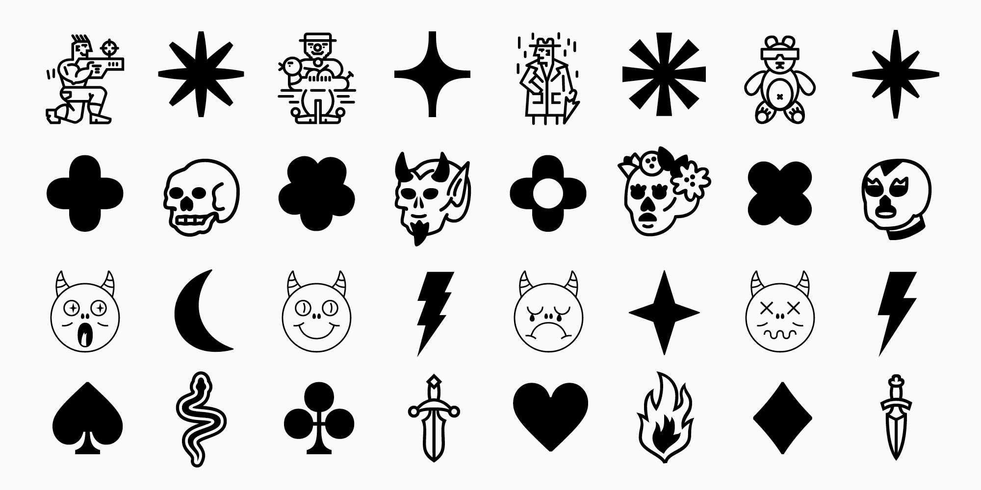
When a typeface includes icon sets, it can make your job a lot easier. In addition to the font, you can use these graphic elements in your poster design, matching your text’s style perfectly. Moreover, if you choose the right font to match the mood of your poster, there is a good chance that icons will match the idea and theme of your project as well. Learn more about icons in fonts in our article.
The selection below includes typefaces featuring icon sets.
Best poster fonts
We chose the best fonts for posters in different styles from the TypeType collection. We also provided examples of real projects utilizing them to illustrate how they work in various poster designs. They all support a wide variety of Latin and Cyrillic-based languages.
You can download a free trial version of any typeface featured in the list to see if it matches your project’s aesthetics.
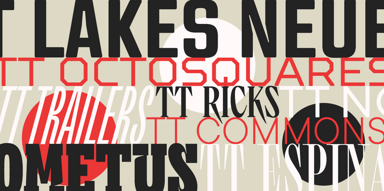
1. TT Trailers—a vibrant font for posters (and more)
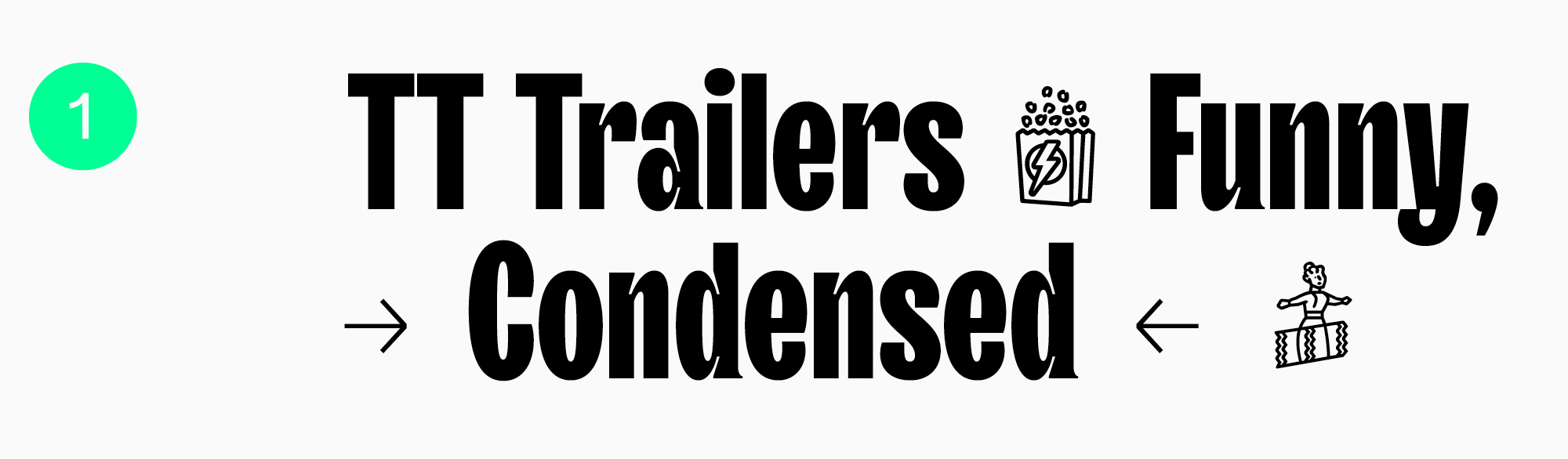
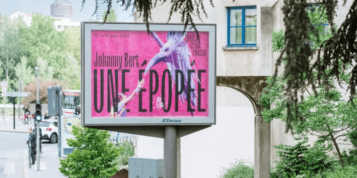
TT Trailers is an expressive display sans serif that stands out for experimental letter forms and extra narrow proportions. This font was developed for the film industry, so it shines on posters like a genuine star. TT Trailers became part of the identity of Theatre de la Croix Rousse. Look how eye-catching, elegant, and modern it looks on the theater’s posters!
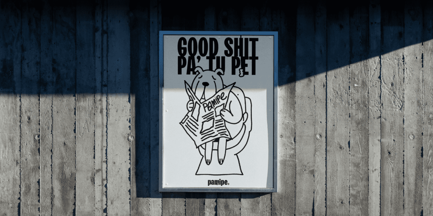
However, the application range of this cool typeface is much broader: it can be used for any type of poster. PAMIPE, a Spanish pet food brand, proves it by making TT Trailers its signature font. Here, it is used in marketing posters and, paired with graphics, looks fun and cool, showing its playful side.
By the way, TT Trailers features a movie-themed icon set. It includes popcorn, seats, a screen, and more cute images you can use on your poster.
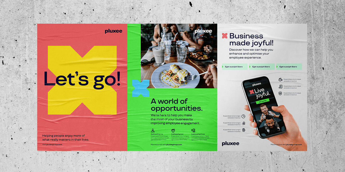
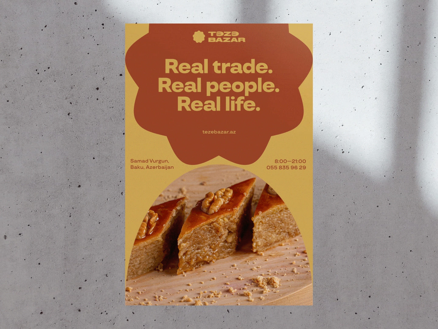
2. Versatile and expressive TT Travels
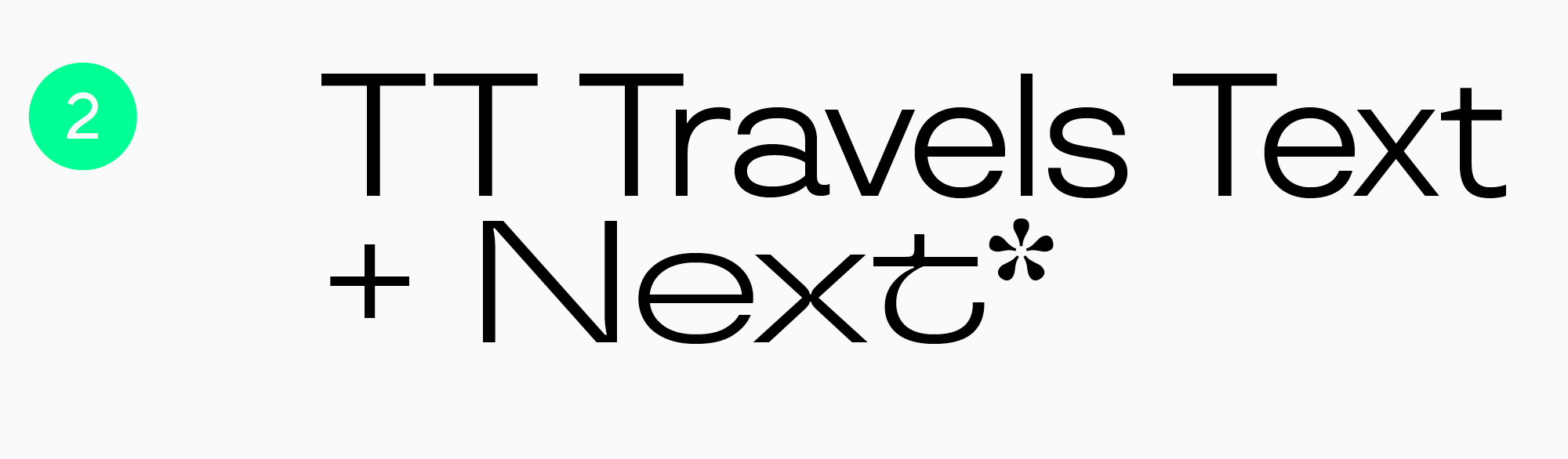
TT Travels is a wide geometric sans serif. Its wide proportions and cool, vibrant details attract attention yet stay quite adaptive, allowing the use of this font in projects with varying themes and tones.
Pluxee, a leading global employee benefits and engagement partner, uses TT Travels on posters. Here, it looks friendly and neutral. Examples include posters with graphics and ones where the font works almost solo.
On posters of Teze Bazar, the oldest market in Baku, Azerbaijan, the font behaves completely differently. Here, it becomes a perfect addition to the graphics and blends seamlessly with the project’s overall style and uniqueness.
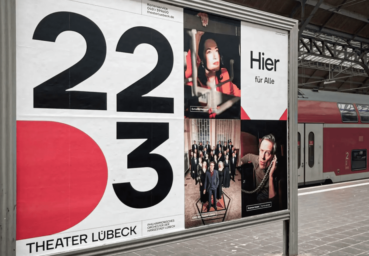
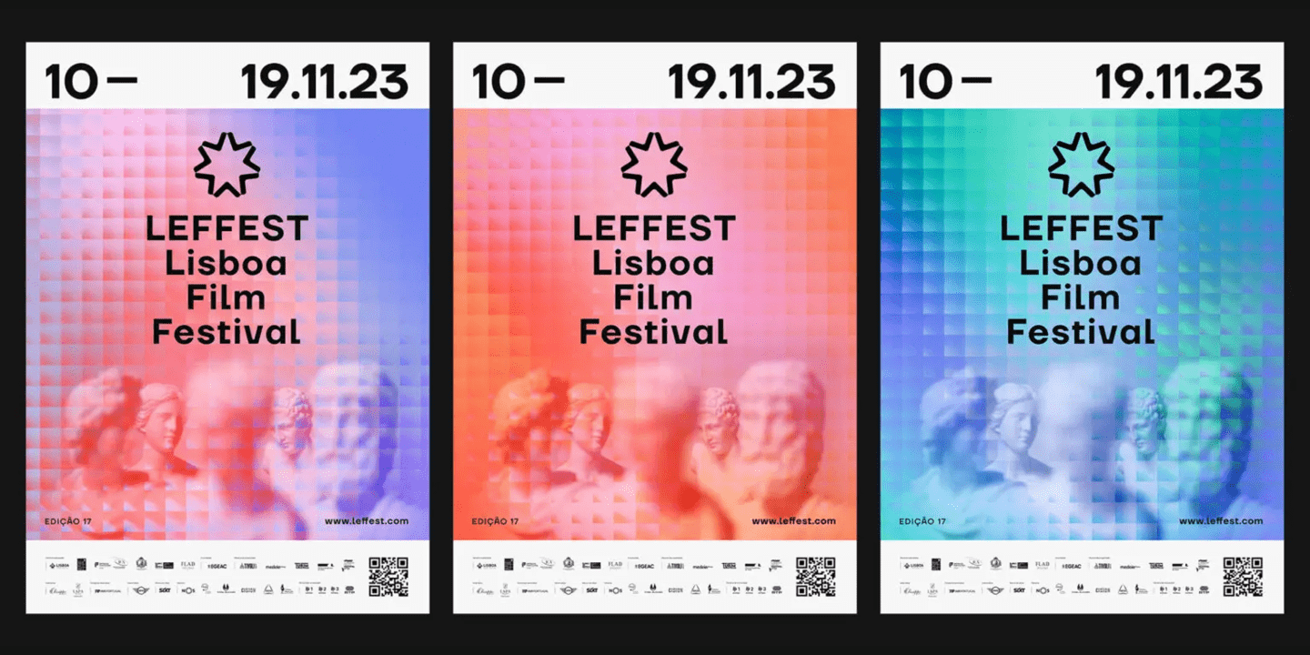
3. Minimalistic and stylish TT Firs Neue
TT Firs Neue is a Scandinavian sans serif that combines minimalism and recognizable character. This blend is easy to notice on the posters of Theater Lübeck, one of the largest theaters in the German state of Schleswig-Holstein. The font here works alone as an attention grabber and a highlight of the organization’s status and modernity.
The same font is used on the posters of The Lisbon & Estoril Film Festival (LEFFEST). Here, the font collaborates with the graphics and looks rather neutral without overcomplicating the image, adding a unique atmosphere to the posters.
4. TT Commons—a perfect base for every project
TT Commons is a versatile geometric sans serif and a good option for a multitude of different projects. Thanks to its neutral character, it can be combined with almost any graphics or used solo if your poster idea requires elegance.
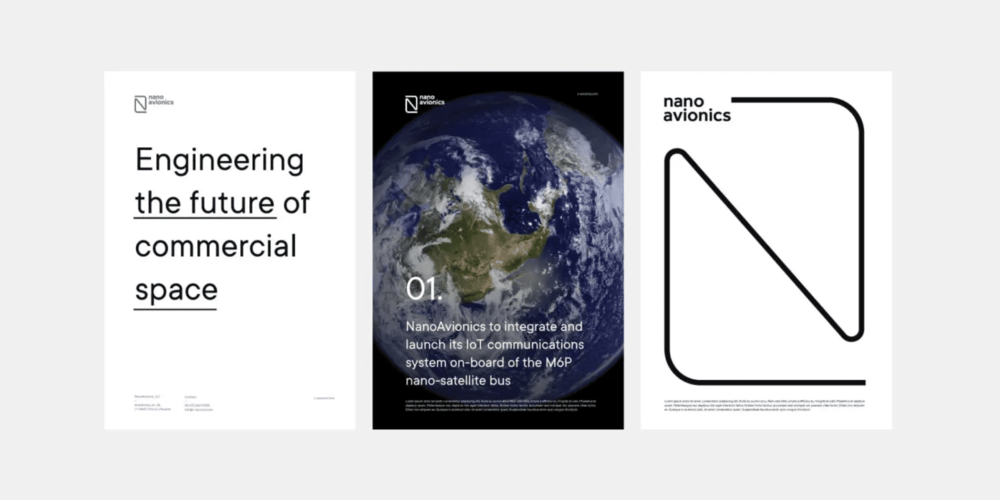
For example, this typeface functions brilliantly on the posters of NanoAvionics, a company manufacturing nanosatellites. TT Commons shines as a standalone font, replacing all graphics, as well as a secondary one, performing the informational function.
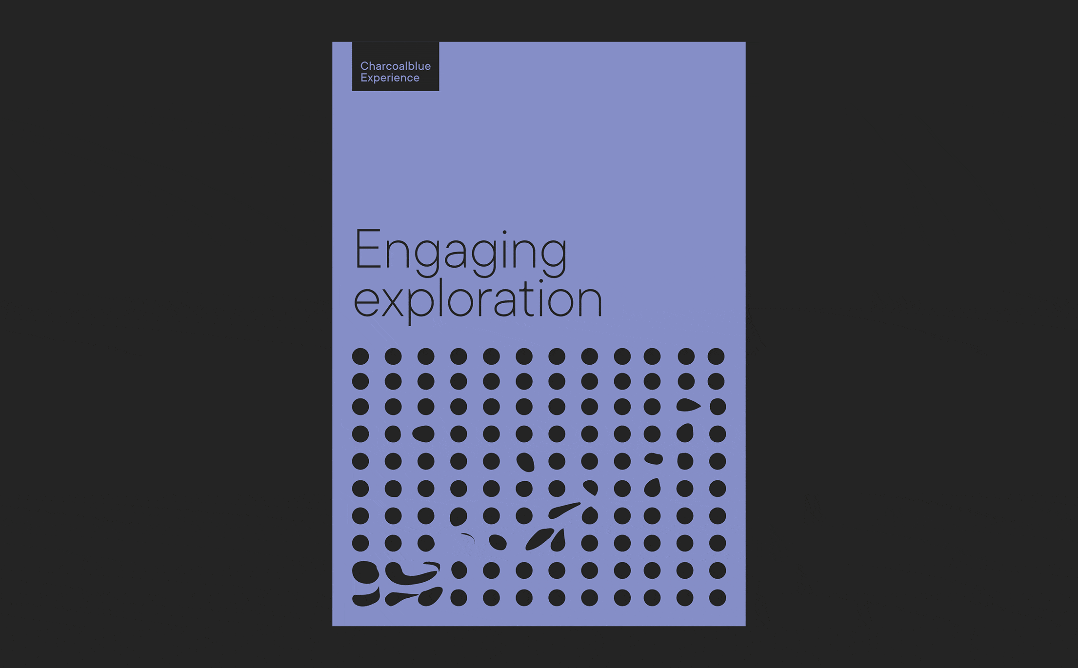
Charcoalblue Experience pairs TT Commons with elegant graphic elements on posters: both highlight and complement each other. The emphasis is placed on the lines here.
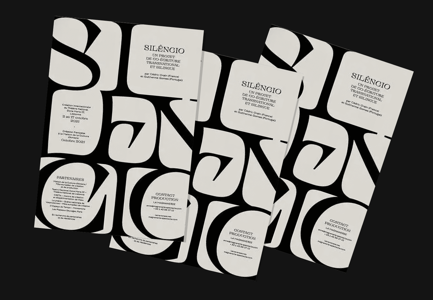
5. Extraterrestrial TT Alientz for unusual posters
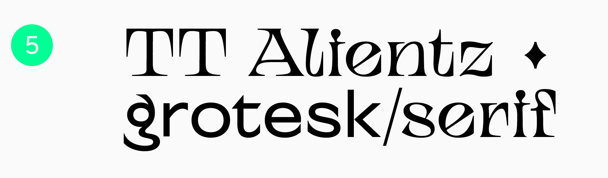
If you want to create a cool and even extravagant poster, try TT Alientz. This typeface is eye-catching and captivating, even with no extra graphics added. Take a look at the poster designed by Svelt Studio for the project Cédric Orain and Guilherme Gomes SILÊNCIO created by La Magnanerie. Here, TT Alientz is used in a variety of point sizes—the designers used this trick to create an unusual effect and substitute graphic elements with just one font.
6. Chameleon font TT Neoris
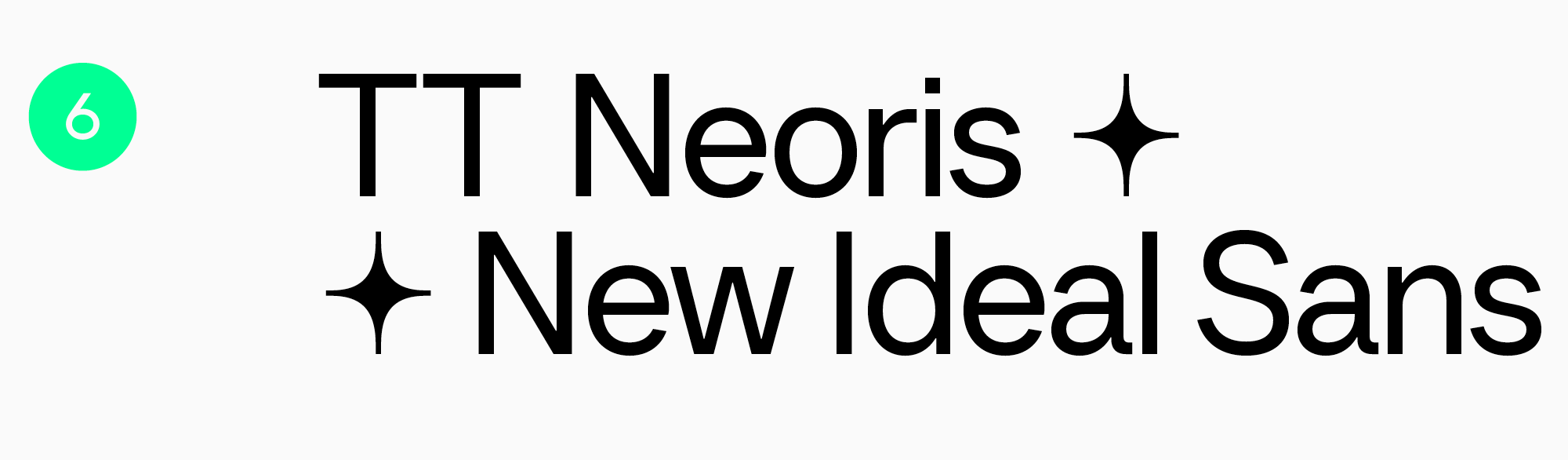
TT Neoris is a typeface that can replace several fonts at once and adapt to completely different projects. Cool, cure, eye-catching, or elegant—this font can help you design various projects with accentuated or neutral text. See for yourself how gorgeous TT Neoris is on posters. The poster also features a versatile set of icons included in the typeface.
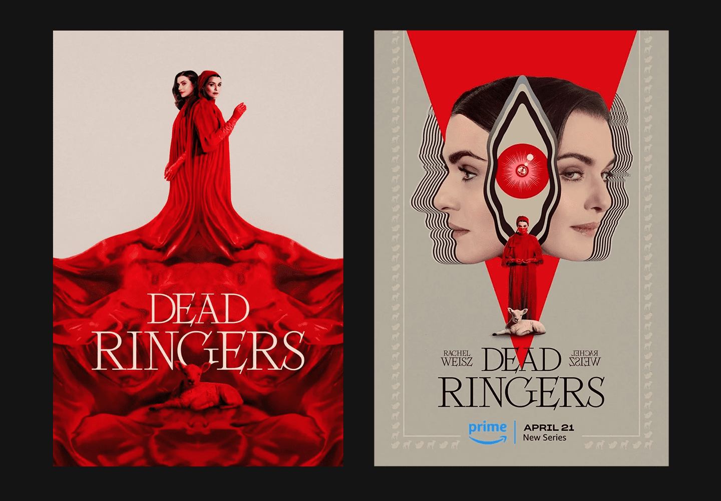
7. TT Ricordi Fulmini—a modern font with a historical background
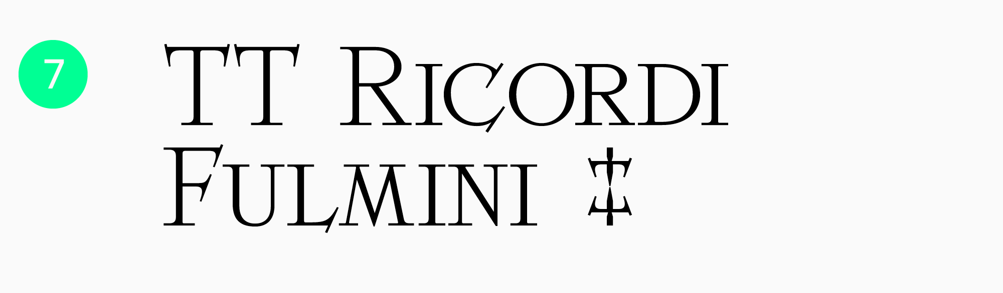
TT Ricordi Fulmini is a modern serif, captivating and even spiky but still gentle and elegant. This eye-catching font shines brightest in large point sizes, so it isn’t suitable for small text. It will bring a certain mood to your idea: mysterious, bold, audacious. No wonder TT Ricordi Fulmini goes so well with the poster design for the miniseries Dead Ringers.
8. “Angry” TT Ricks—for a poster with personality
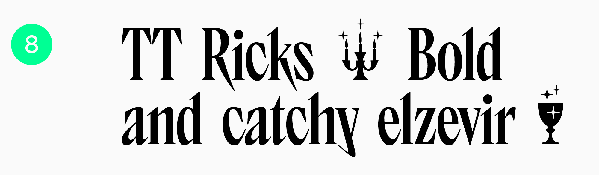
A sharp and edgy TT Ricks is another expressive font that will become a standout element on your poster. This typeface performs at its best in medium to large point sizes. Whether you use it solo or pair it with graphics, it will undoubtedly attract attention. By the way, you can enhance your poster design with stylish icons included in the typeface.
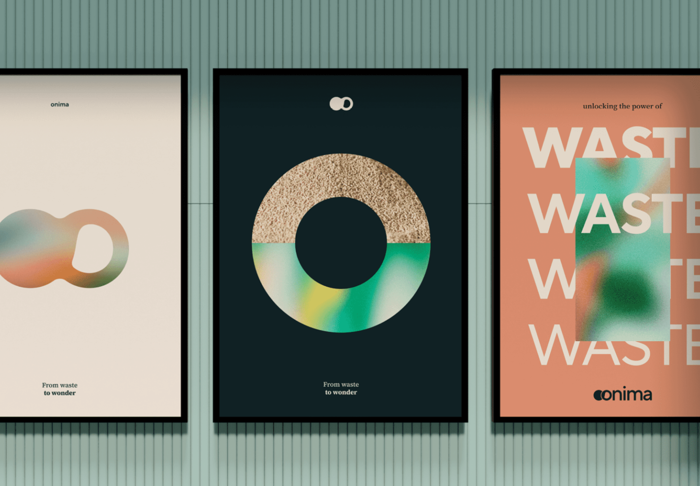
9. TT Norms Pro for every occasion
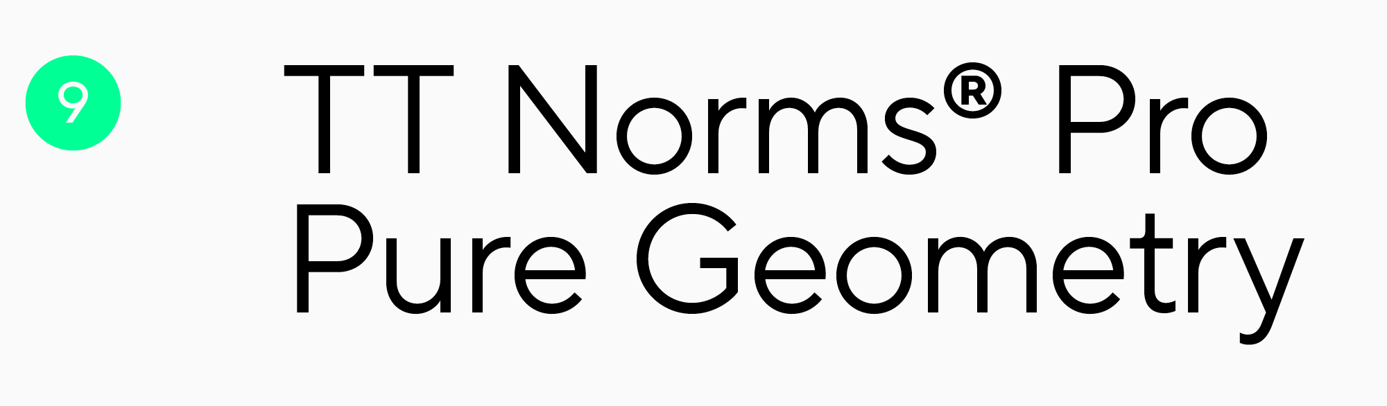
TT Norms Pro is a functional and aesthetic geometric sans serif and another basic font in our collection. It matches totally different design ideas, from advertising flyers to event posters. This font can be used in any point size and made both a focal point of the composition and an addition to other design elements. For instance, here is how TT Norms Pro looks on the posters of the Onima innovation laboratory.
10. TT Espina—a font that charms
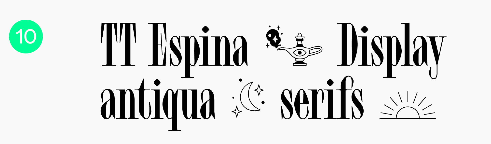
TT Espina is a display Antiqua with expressive serifs. This is a cool font for posters with folklore, magic, esoteric, or similar themes because TT Espina’s captivating graphics will infuse any project with a unique aesthetic. You can also use the font’s icon set to add more graphic elements and make your poster designs feel complete.
Conclusion
We hope our article will help you choose the best fonts for posters and create genuinely unusual and captivating poster designs! Be bold in your experiments, look for more inspiring examples, and develop your own unique style!