The bestseller TT Norms® Pro—a geometric sans serif, trouble-free workhorse
Ticket Master Fonts
Confident letterforms, open proportions and numerals that stay clear on a crowded ticket define the typographic mood many event designers look for. This page gathers Ticket Master Fonts by TypeType: commercial typefaces selected for tickets, passes, posters and booking screens. None is presented as the official typeface of the Ticketmaster brand; each is a licensable option you can test before committing.
- All fonts 78
- Sans Serif 46
- Serif 21
- Slab Serif 6
- Display 44
- Script 9
- Variable 49
- Font sale 12
What Makes Ticket Master Fonts Distinct
The typographic language of ticketing and live events is shaped by practical pressure. A ticket has to communicate a date, a venue, a seat and a price in seconds, often under poor lighting or on a small phone screen. Designers working in this space tend to value clarity over ornament, confident weights that hold up at a distance, and figures that cannot be misread. At the same time, event graphics need presence: a headline on a poster or a banner in an app should feel energetic enough to sell an experience. These are general design considerations for the genre, not properties attributed to any single typeface on this page.
Where Ticket Master Fonts Are Used
Brands aimed at concertgoers, sports fans and festival audiences rely on type across a surprisingly wide set of touchpoints. Printed tickets and wristbands demand compact, legible details. Digital passes and booking apps need characters that render cleanly at small sizes on every screen. Posters, venue signage and promotional campaigns call for display weights that read from across a street or a stadium concourse. The typefaces gathered under this tag on TypeType are selected with these audiences and formats in mind, giving teams options for both headline impact and the dense information that every event product has to carry.
How to Choose From Ticket Master Fonts for Your Project
Start with the smallest element you will set. On a ticket that usually means seat numbers, row codes, times and prices, so check how each typeface handles figures at reduced sizes: similar shapes such as 1 and 7, or 3 and 8, should remain unmistakable. Next, define roles. Many event systems combine a display face for names and headlines with a quieter text face for terms, directions and fine print; decide whether one family can cover both jobs or whether a pairing works better. Test in context rather than in isolation by placing trial versions into real mockups of a printed ticket, a mobile pass and a poster, then compare results on screen and on paper. Finally, confirm practical requirements on each typeface's own page, including the weights you need and language support for international audiences, before requesting a license from TypeType.
Explore TypeType's Ticket Master Fonts Collection
This tag brings together a broad set of TypeType families, including TT Norms® Pro, TT Commons™ Classic, TT Hoves Pro, TT Interphases Pro, TT Supermolot Neue, TT Bluescreens Pro, TT Chocolates and TT Firs Neue, alongside many others listed on this page. They are offered as commercial alternatives for ticketing, entertainment and event branding, not as typefaces used or endorsed by Ticketmaster. Because the selection is wide, it helps to browse with a specific brief in hand: note the formats you are designing for, the amount of data each layout must hold and the tone the event should convey. Open individual family pages to review the available weights and technical details, then request trial versions to test your shortlist in real layouts. Once a choice is made, you can request a suitable license type for commercial use, and TypeType's design and client care teams are available to advise on selection or licensing questions.
- The quick brown fox jumps over a lazy dog.
- Pack my box with five dozen liquor jugs.
- Sphinx of black quartz, judge my vow
- 0123456789 !?.,:;—–()[]{}<> “quotes” ‘apostrophe’ @#%&*_+=/\| № $ € £ ₽ +−×÷=≠≤≥ … % © ® ™
- Aa Bb Cc Dd Ee Ff Gg Hh Ii Jj Kk Ll Mm Nn Oo Pp Qq Rr Ss Tt Uu Vv Ww Xx Yy Zz
TT Hoves Pro is a versatile sans-serif with a recognizable geometry
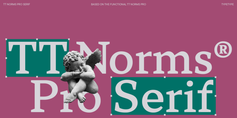
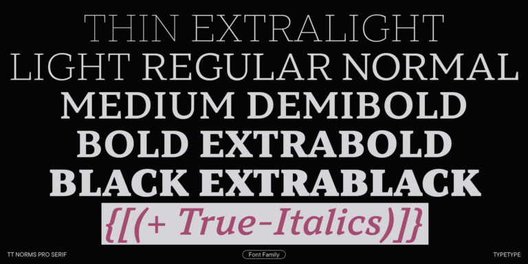
We continue to expand the line of the studio’s main bestseller TT Norms® Pro!
TT Livret is an elegant, modern and functional serif
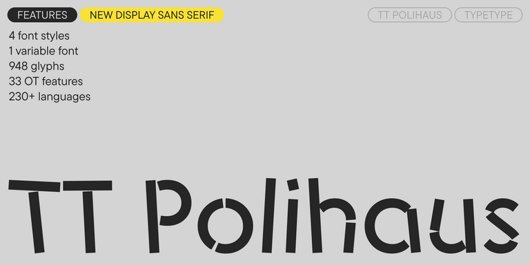
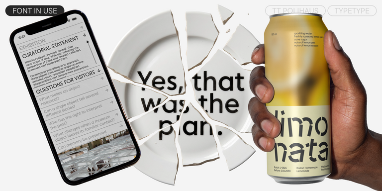
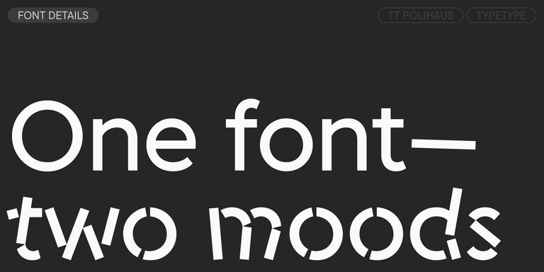
TT Polihaus is an experimental sans serif that, at first glance, looks ordinary, but then breaks apart, transforming into a stencil pattern.
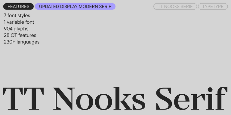
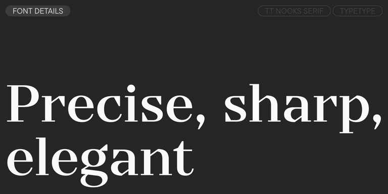
TT Nooks Serif is a display modern serif with a slight touch of egocentricity. It has a sharp and firm, yet elegant and stately character.
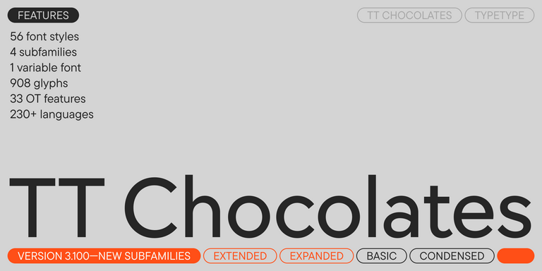
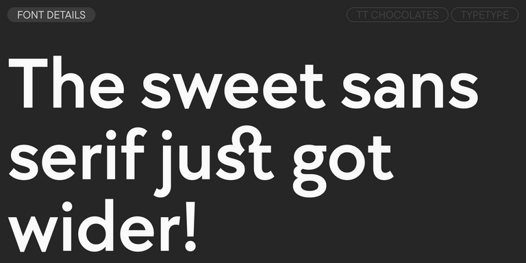
TT Chocolates typeface consists of 14 fonts: 7 weights and 7 obliques. Due to the extended language support and the introduction of useful features.
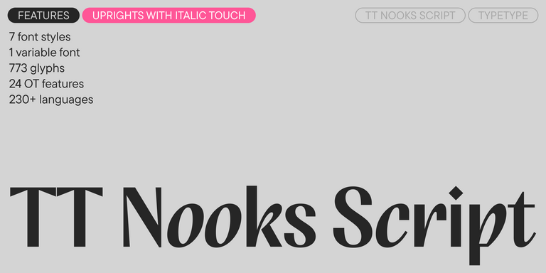
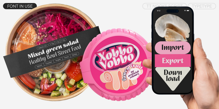
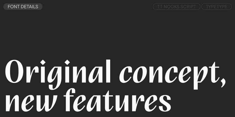
TT Nooks Script features a unique design that has no direct analogs.
TT Neoris is an elegant Neo-Grotesque with unlimited potential and a font that encompasses all modern requirements and user desires.
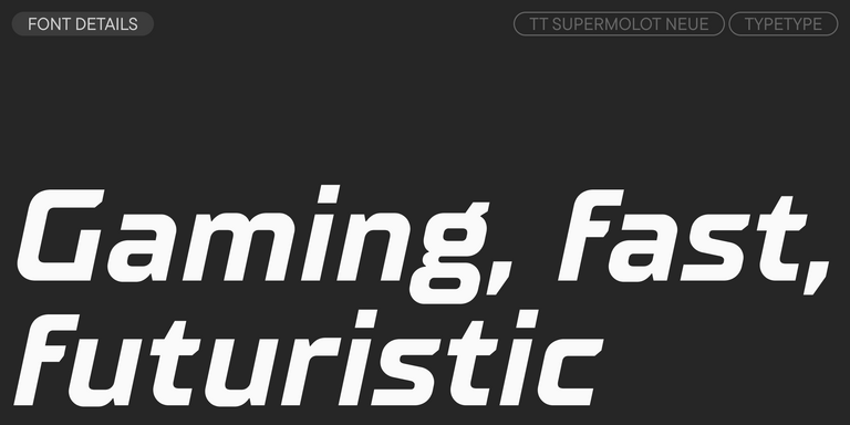
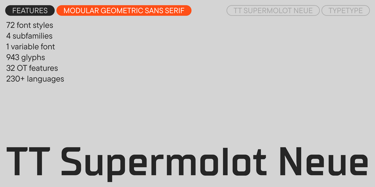
TT Supermolot Neue is a redesigned, extended, and greatly enhanced reincarnation of the popular font family
TT Commons™ Classic is a universal sans serif with a minimal contrast of strokes, a closed aperture, and geometric shapes of characters.
TT Runs is a very stylish and charismatic display sans serif with irregular proportions of some characters.
TT Bluescreens is a upgraded geometric sans serif with narrow proportions
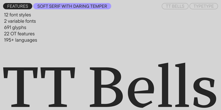
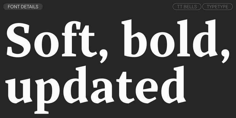
TT Bells combines the elegant softness of Antiqua with a complex and daring temper reflected in straight stroke terminals and arrowheaded serifs. The typeface is based on the broad nib, which creates these hallmark terminals and serifs.
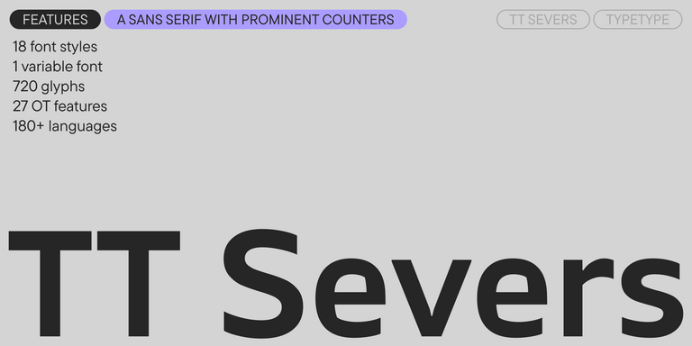
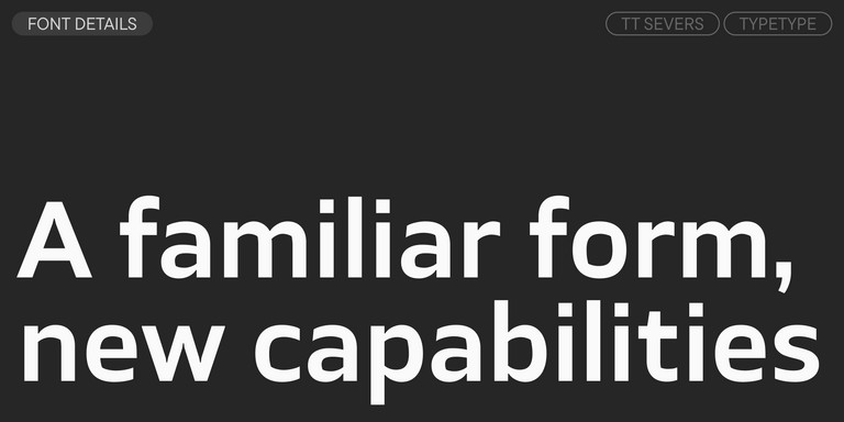
TT Severs is a geometric sans serif with emphasized elements of internal brackets. The main visual feature of TT Severs is the unusual form of internal ovals.
TT Turns is a striking geometric sans serif with expressive elements. This versatile font works exceptionally well for running text, while at large point sizes, it takes on a distinct display character.
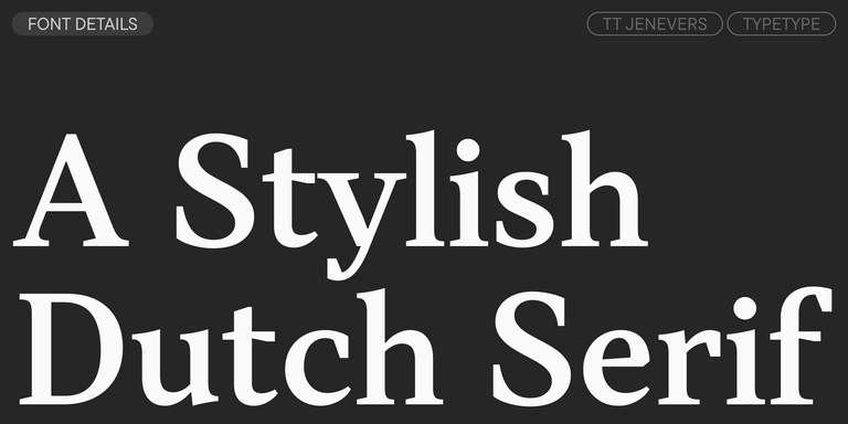
TT Jenevers is a modern serif with a Dutch flavor. The font family features the characteristic details peculiar to Dutch serifs—these are the asymmetrical shape of serifs and an irregular slant of ovals.
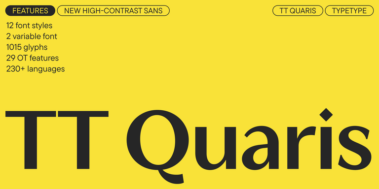
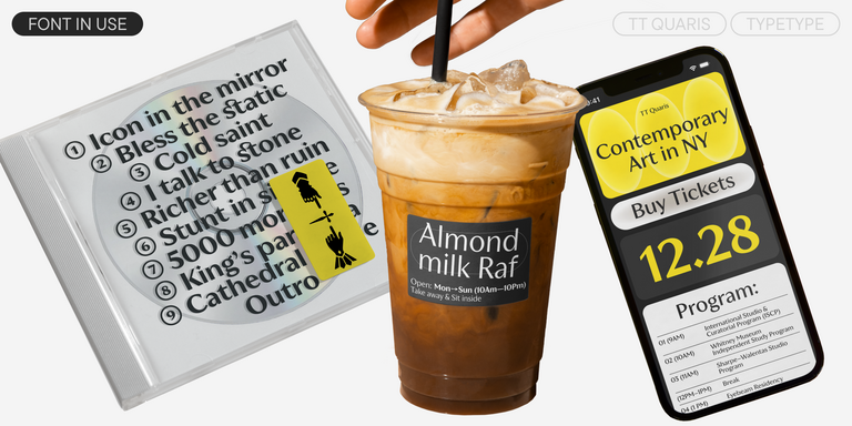
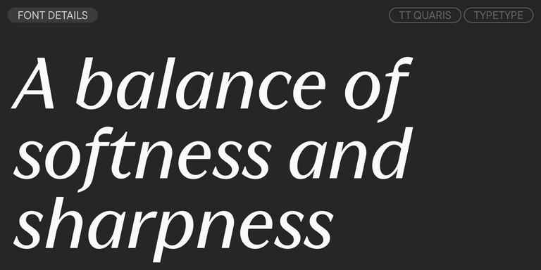
TT Quaris is an exquisite, modern high-contrast sans whose design balances between soft and sharp. The glyph shapes in the font are fluid and tend towards roundness, yet there are also sharp elements.
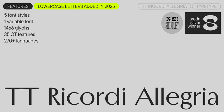
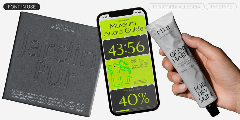
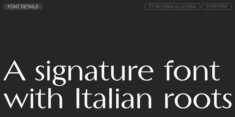
TT Ricordi Allegria is a sleek and intelligent contemporary Florentine grotesque.
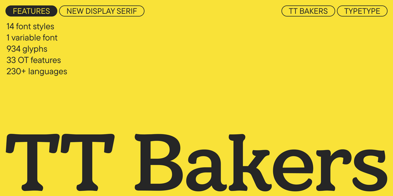
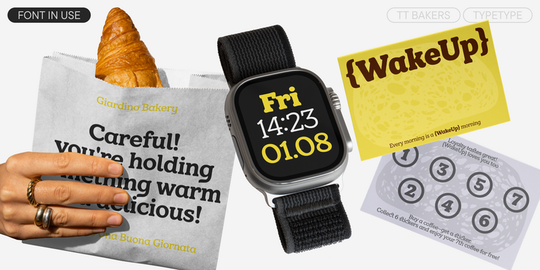
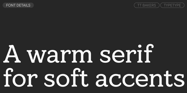
TT Bakers is a fluid serif with a gentle and lively character. This font is like freshly baked goods: it`s warm and soft, especially in its bolder weights.
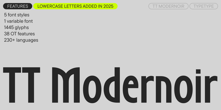
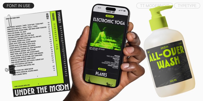
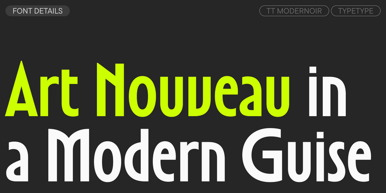
TT Modernoir is a display sans serif with dynamic proportions. Fluid lines and delicate Art Nouveau forms in this typeface blend seamlessly with the rhythmic flow and improvisational freedom of jazz.

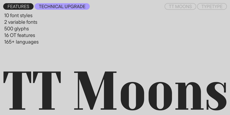
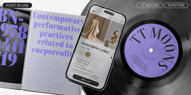
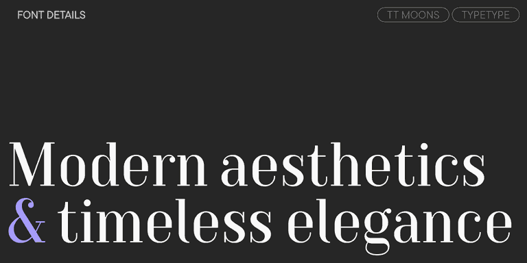
TT Moons is a slim and contrast serif. This font family works especially smart in classic design themes. TT Moons is a typeface of the glyptal modern typeface.
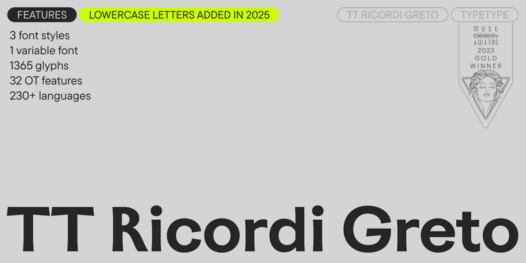
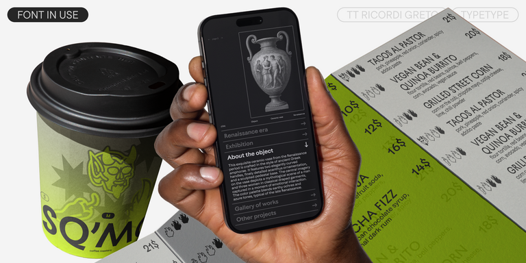
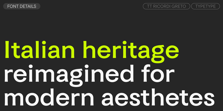
TT Ricordi Greto is an experimental project, inspired by a floor plaque dating from 1423 found in the Basilica di Santa Croce, Florence.
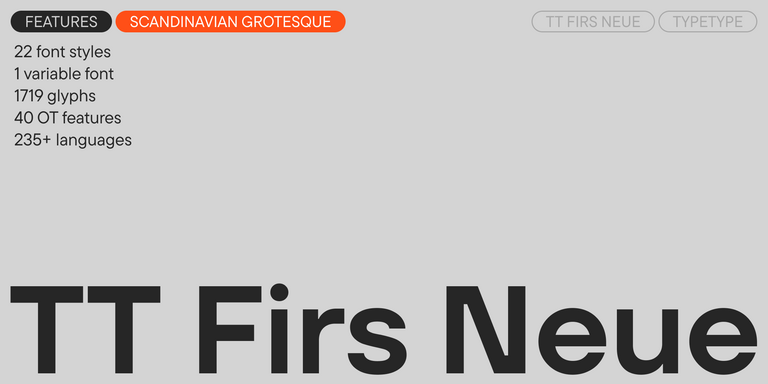
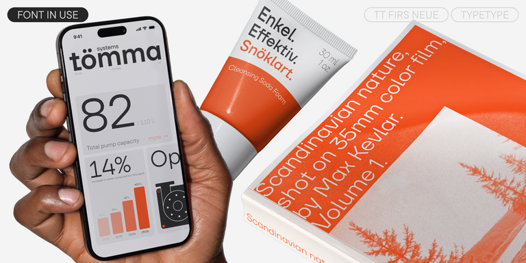
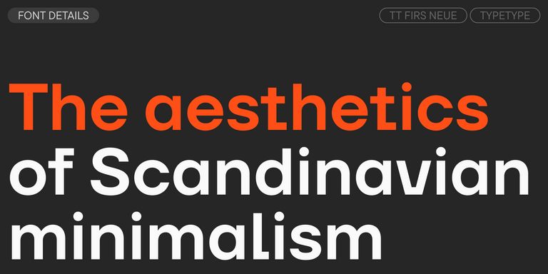
TT Firs Neue is a contemporary reincarnation of the good old TT Firs sans serif.
What Are Ticket Master Fonts?
On TypeType, this is a tag grouping commercial typefaces suited to ticketing and event-oriented design, where clear figures, legible details and strong headlines matter. It is not a list of typefaces officially used by Ticketmaster, and the brand's actual typography is not confirmed here. Each family is a licensable alternative.
Which Industries Use Ticket Master Typefaces Most Often?
They suit live events, concerts, sports, festivals, theaters and other entertainment venues, as well as ticketing and booking platforms. These are contexts where information must be read quickly and promotion needs visual energy. Treat them as suitable areas of application rather than documented customer usage.
Can Ticket Master Typefaces Be Used for Branding?
Yes, with a commercial license they can anchor an event or entertainment identity. Assign one family to headlines and another, or a lighter weight, to supporting text, then apply that hierarchy consistently across tickets, apps and signage. The aim is an original identity, not a replica of Ticketmaster's trademarked branding.
What Should Be Considered When Pairing Ticket Master Typefaces?
Combine a display face for headlines with a highly readable text face for dates, seats and conditions. When pairing Ticket Master Fonts, check that figures, weights and proportions sit comfortably together at both large and small sizes. Test candidate pairs with trial files in realistic ticket and poster mockups.
Can You Buy TypeType Fonts for Commercial Projects?
Yes. Trial versions are available for testing each typeface in drafts and mockups, while commercial use requires a suitable license requested from TypeType. Details depend on the license type you choose, and the design and client care teams can advise on which option best fits your project and its intended use.