The bestseller TT Norms® Pro—a geometric sans serif, trouble-free workhorse
Flare Fonts
The widening of a stroke toward its terminal can influence a letter’s character, but a category label alone does not describe every included design. TypeType’s Flare Fonts brings together candidates to examine individually. Compare their shapes, proportions, and overall tone against your project, then use trial versions to assess how your shortlist works in context.
- All fonts 78
- Sans Serif 46
- Serif 21
- Slab Serif 6
- Display 44
- Script 9
- Variable 49
- Font sale 12
What Makes Flare Fonts Distinct
In general typographic terminology, flare describes a stroke widening toward its end. That concept offers a useful starting point for looking at letterforms, rather than a guarantee about every family on this page. Treat this category as a selection to investigate through individual specimens. Look at how strokes finish, how curves meet straight lines, and how letters establish a rhythm across a word. Compare several characters instead of judging by one distinctive detail. The important distinction is between an anatomical term and the overall impression a typeface creates: both can inform a decision, but neither replaces examining the actual design.
Where These Typefaces Are Used
Brands aimed at audiences that value a distinctive visual identity might evaluate this selection for packaging, campaign headlines, or other prominent messages. These are potential applications, not established specialties of every included family. Begin with what the audience needs to read and the impression the communication should make. A brief headline allows a different assessment than a detailed product description. Consider viewing distance, available space, and the surrounding imagery before choosing a candidate. For editorial projects, compare a title with its supporting text; for packaging, test both the main message and smaller information within the same layout before making a commitment.
How to Choose Flare Fonts for Your Project
Selecting Flare Fonts starts with your own content. Set a brand name, a representative headline, and a longer passage where relevant, keeping the layout consistent as you compare candidates. Look for clear word shapes, comfortable spacing, and a tone that supports the message rather than competing with it. Next, reproduce the conditions in which the typography will appear: approximate size, line length, background, and surrounding elements. A specimen that appeals in isolation may behave differently in a crowded composition. Check each family’s documented capabilities against your requirements instead of assuming language support or particular features from its name. If another typeface will accompany it, test the two together at their intended hierarchy levels. Use trials to resolve visual questions, then review the relevant licensing terms. A shortlist based on actual layouts gives you a clearer basis for choosing than a preference formed from a single sample word.
Explore TypeType's Flare Fonts Collection
The collection includes TT Nooks Serif, TT Chocolates, TT Nooks Script, and TT Commons™ Pro, among other listed families. These names provide starting points for comparison, not a ranking or a claim that they share identical construction. Open the individual entries that interest you and examine the information available for each. Keep brief notes about what works in your project so that your next comparison addresses a specific question rather than repeating the same visual review. TypeType offers trial versions for evaluating candidates and a route to request an appropriate license. Treat these as separate steps: testing helps establish design fit, while the applicable terms determine permitted use. If you need help with selection or licensing, contact the design or client care teams through the website form. Describe your intended application and any unresolved requirements so that the conversation can focus on the decisions still needed.
- The quick brown fox jumps over a lazy dog.
- Pack my box with five dozen liquor jugs.
- Sphinx of black quartz, judge my vow
- 0123456789 !?.,:;—–()[]{}<> “quotes” ‘apostrophe’ @#%&*_+=/\| № $ € £ ₽ +−×÷=≠≤≥ … % © ® ™
- Aa Bb Cc Dd Ee Ff Gg Hh Ii Jj Kk Ll Mm Nn Oo Pp Qq Rr Ss Tt Uu Vv Ww Xx Yy Zz
TT Commons™ Pro is a completely redesigned version of the well-established classic font family TT Commons.
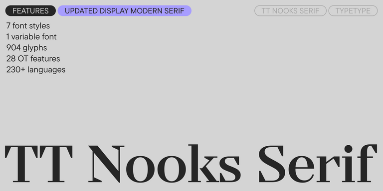
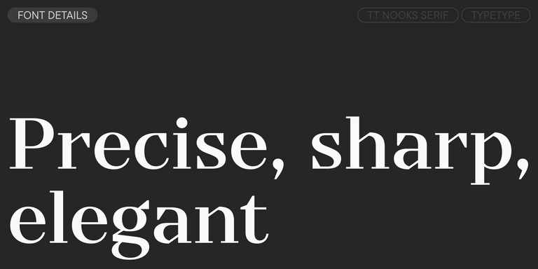
TT Nooks Serif is a display modern serif with a slight touch of egocentricity. It has a sharp and firm, yet elegant and stately character.
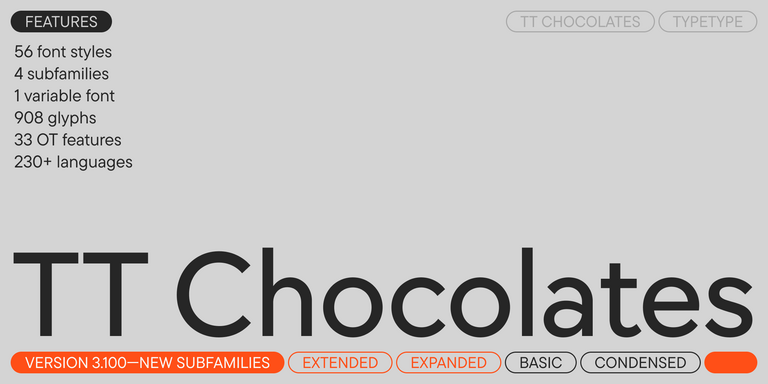
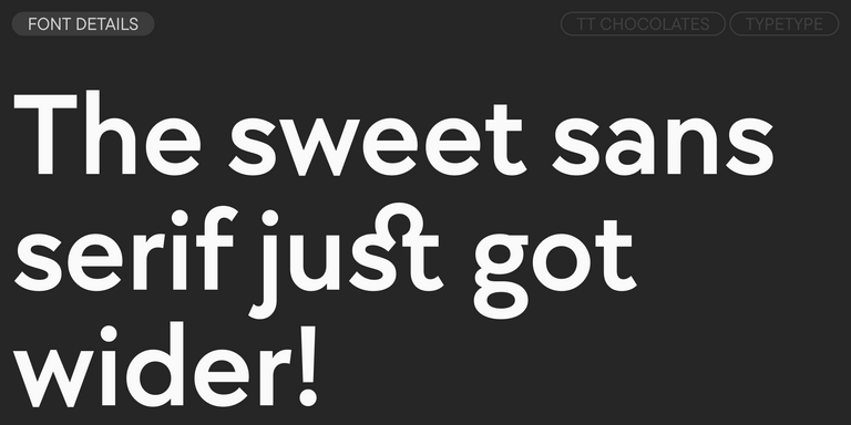
TT Chocolates typeface consists of 14 fonts: 7 weights and 7 obliques. Due to the extended language support and the introduction of useful features.
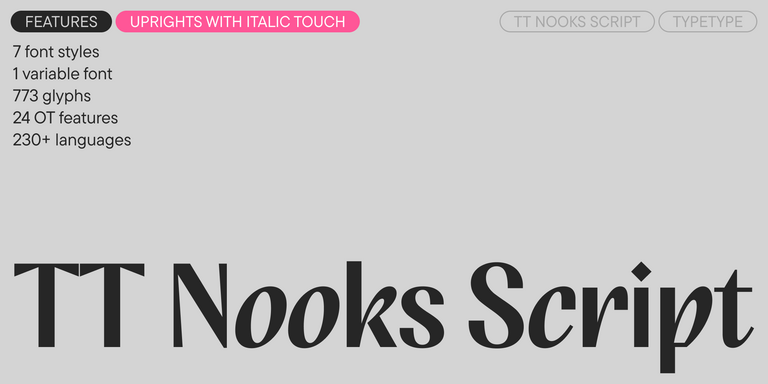
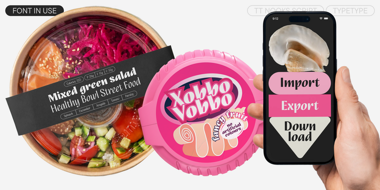
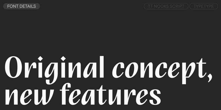
TT Nooks Script features a unique design that has no direct analogs.
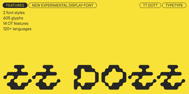
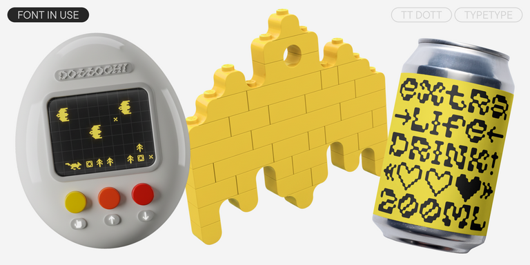
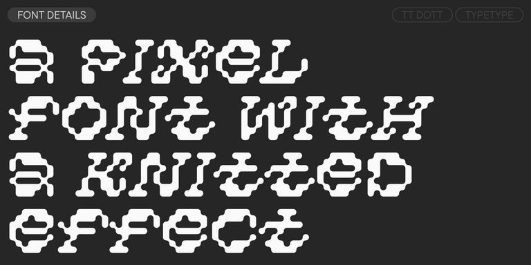
TT Dott is an experimental pixel grotesque where a circle is used as the base for the pixel. It is a fluid and unusual display font, evoking associations with embroidery and techno parties all at once.
TT Neoris is an elegant Neo-Grotesque with unlimited potential and a font that encompasses all modern requirements and user desires.
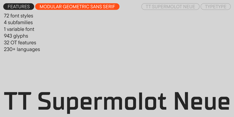
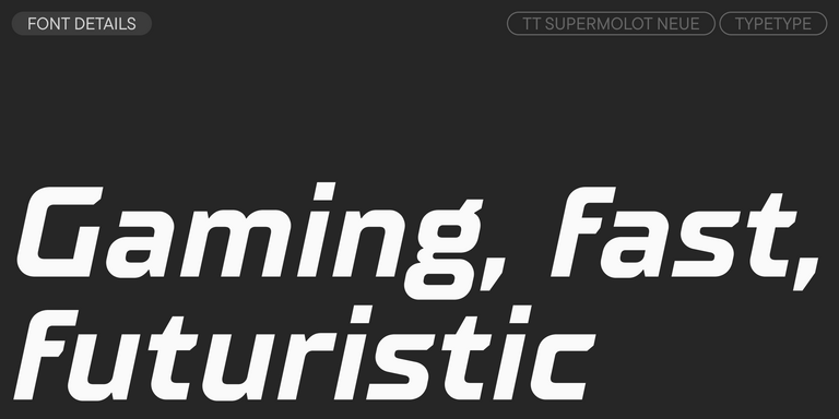
TT Supermolot Neue is a redesigned, extended, and greatly enhanced reincarnation of the popular font family
TT Rationalist is functional and neutral slab serif typeface.
TT Commons™ Classic is a universal sans serif with a minimal contrast of strokes, a closed aperture, and geometric shapes of characters.
TT Runs is a very stylish and charismatic display sans serif with irregular proportions of some characters.
TT Bluescreens is a upgraded geometric sans serif with narrow proportions
TT Turns is a striking geometric sans serif with expressive elements. This versatile font works exceptionally well for running text, while at large point sizes, it takes on a distinct display character.
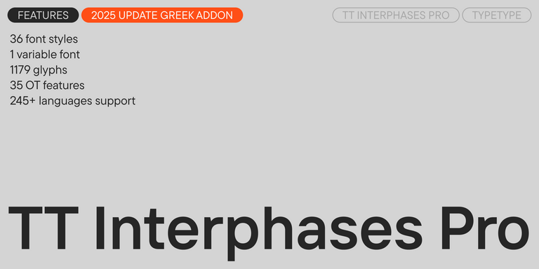
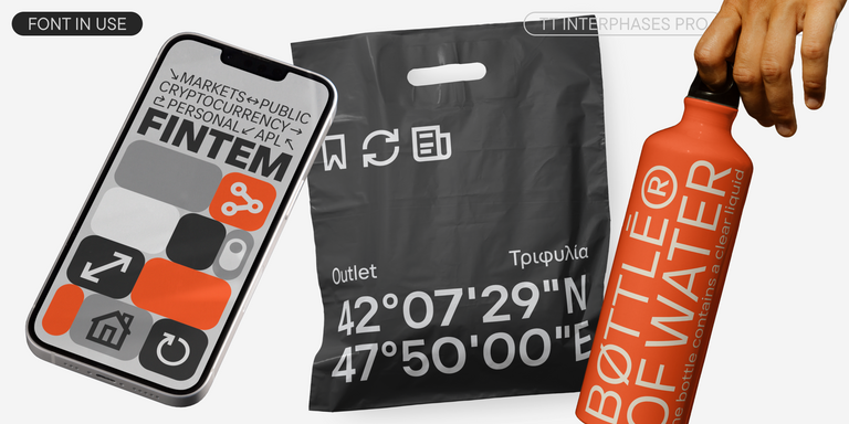
TT Interphases Pro is a neo-grotesque sans serif with equal-width proportions
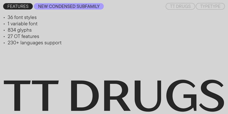
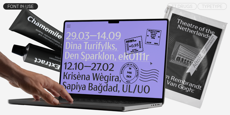
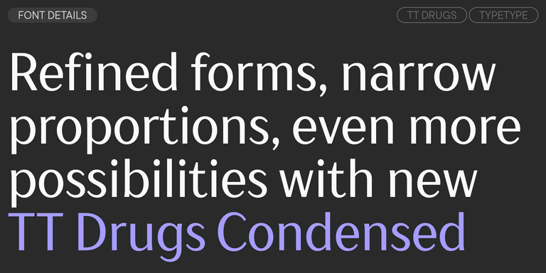
TT Drugs is a typeface that doesn`t feature serifs but stands out for its high contrast.
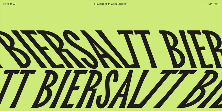
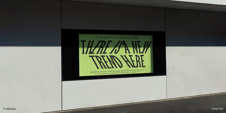
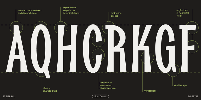
TT Biersal is a display sans serif with a free-spirited, playful, and adventurous nature. The concept of this font was sparked by a German poster from the early 1930s.
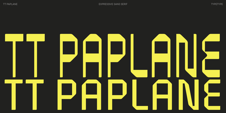
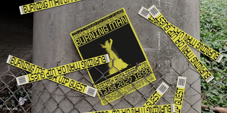
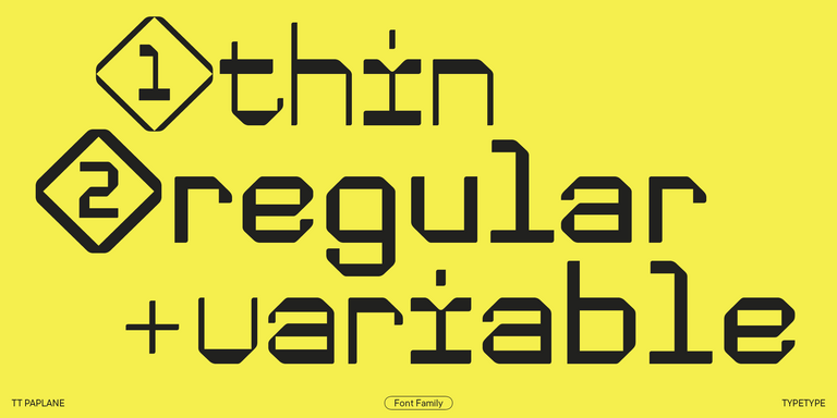
TT Paplane is a squared-looking display sans serif.
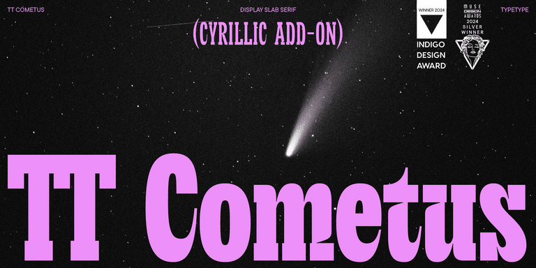
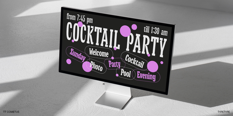
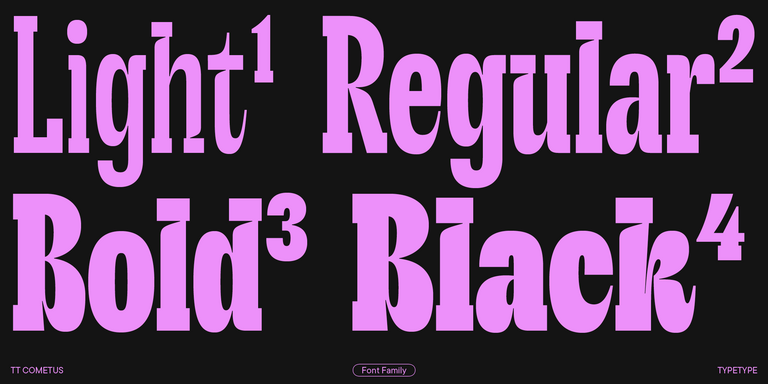
TT Cometus is an expressive typeface that captivates from the first time.
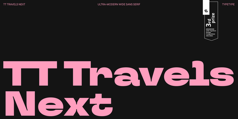
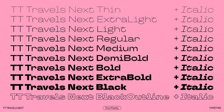
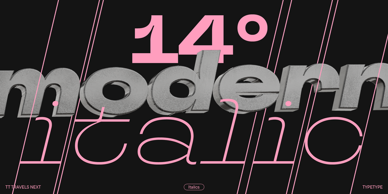
TT Travels Next is a very trendy and modern wide display sans serif for use in different sets, be they print or web.
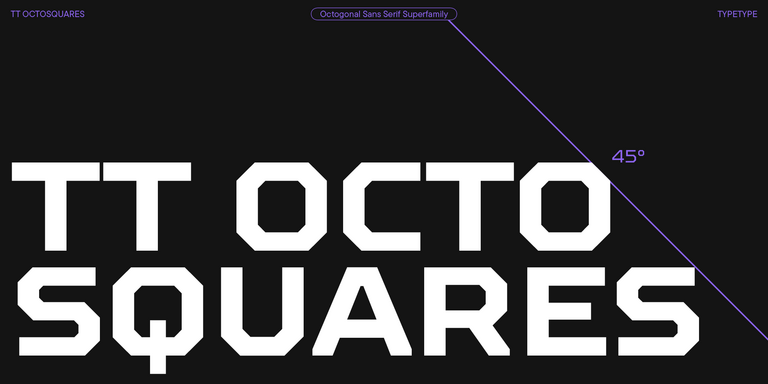
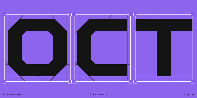
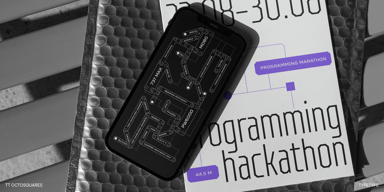
TT Octosquares is a fresh, revised, expanded, and significantly improved version of our first commercial font TT Squares & its narrow version.
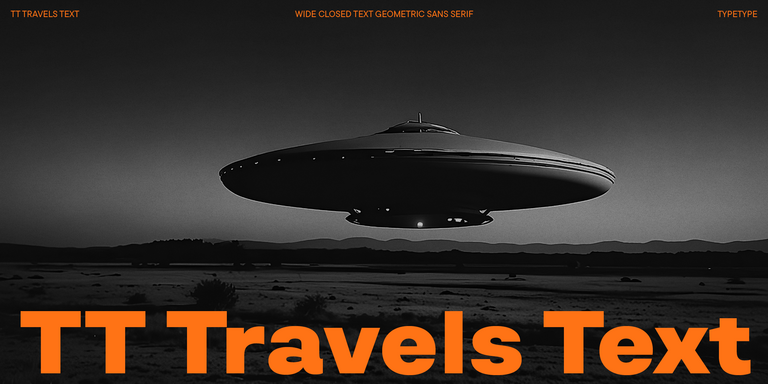
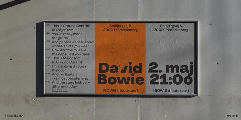
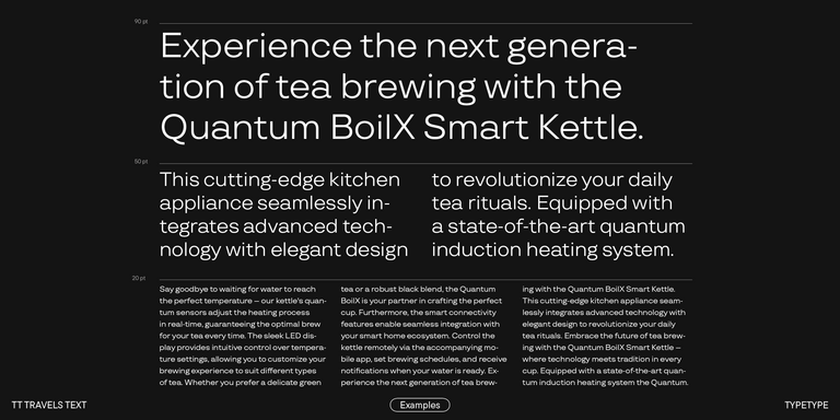
TT Travels Text is a geometric grotesque with wide proportions and specific shapes of circles and fillets, which includes two stylistic sets with completely different natures.
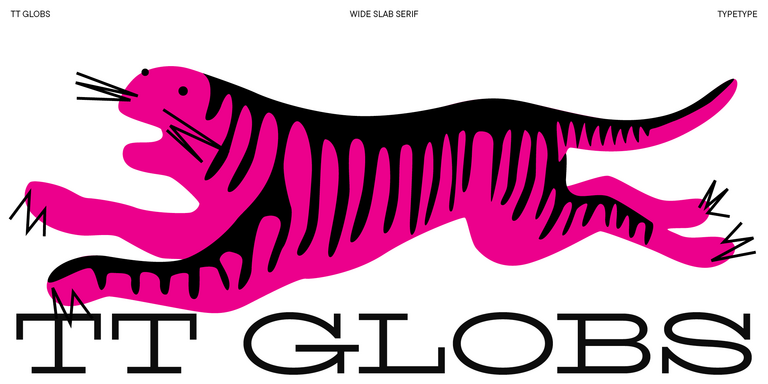
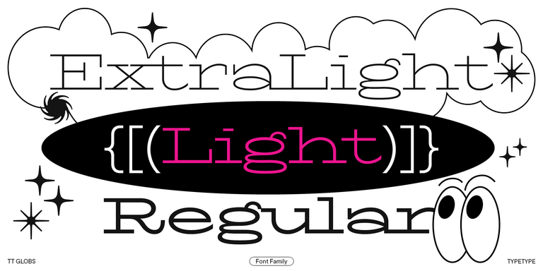
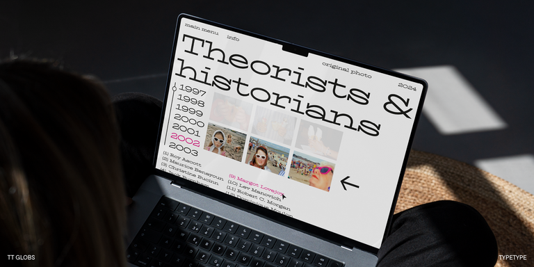
TT Globs is the first font from the TypeType Starter Kit line.
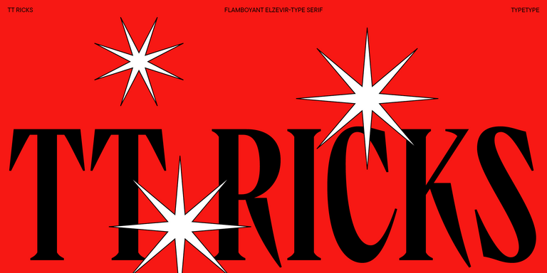
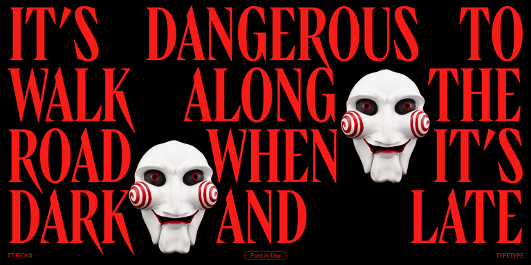
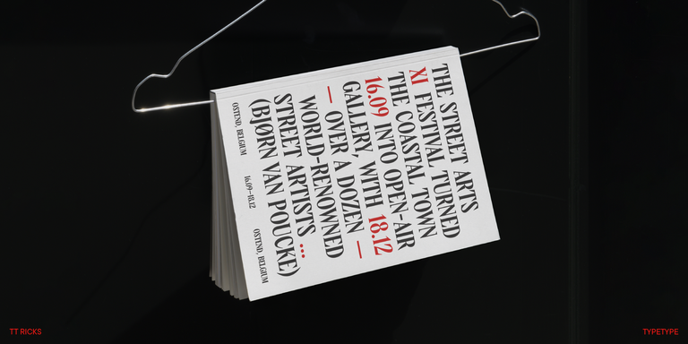
TT Ricks is a flamboyant elzevir-type serif, for which the words “cute” or “calm” are not a fitting definition.
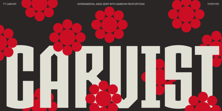
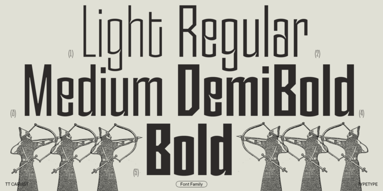
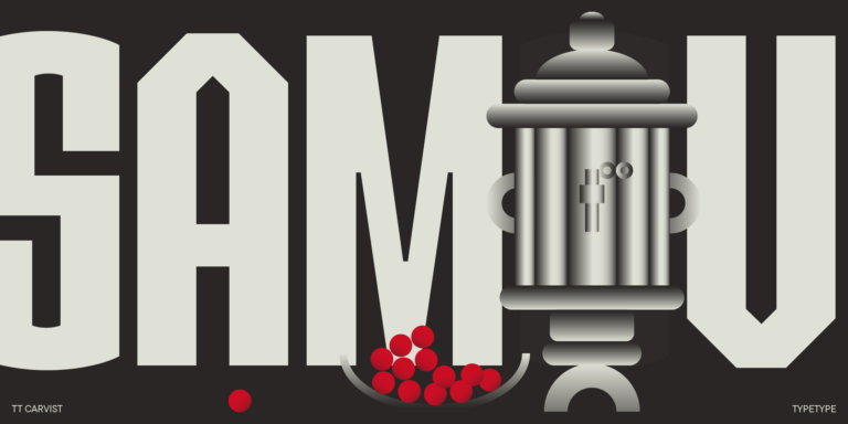
TT Carvist—peculiar, playful, and courageous—this font does an excellent job of grabbing attention!
What Are Flare Fonts?
This is a TypeType category containing a range of typefaces to evaluate individually. In general typography, flare refers to widening strokes toward their terminals. The label should not be treated as proof that every listed family has the same anatomy; examine individual specimens for defining details.
Which Industries Use These Typefaces Most Often?
There is no single industry rule for choosing from this selection. Possible contexts to evaluate include retail packaging, editorial headlines, and brand communications. Let the audience, message, and intended viewing conditions guide the choice rather than assuming a family is suitable because of an industry association.
Can These Typefaces Be Used for Branding?
Yes, they can be considered for a brand identity, subject to design fit and appropriate licensing. Test the actual brand name and representative messages across intended applications. Compare the resulting tone with the brand’s personality, and check that distinctive details remain effective at the sizes you need.
What Should Be Considered When Pairing These Typefaces?
When pairing Flare Fonts, compare proportions, visual weight, and the contrast between heading and supporting text. Assign each typeface a clear role, then inspect readability in a realistic layout. Avoid judging the combination from isolated samples; spacing, line length, and size can change how the relationship works.
Can You Buy TypeType Fonts for Commercial Projects?
TypeType provides trial versions and a way to request a suitable commercial license through its website. Free trial access does not establish permission for unrestricted commercial use. Review the applicable terms, and ask client care through the website form about the scope and restrictions relevant to your project.