top_banner_ttchocolates0826
TT Neoris Pro
21 styles
Type foundryFonts & StylesSans SerifTT Neoris Pro

TT Neoris Pro

TT Neoris Pro is a versatile Neo-Grotesque with extraordinary flexibility. It is a true chameleon typeface that adapts to various design contexts and requirements.
Single style: from $65.99
Full family: from $389 21 styles

Buying Options

To purchase a font, first select the styles you need, then choose your licenses and proceed to checkout. To test the font in your project, download the free trial version.

Select at least one style before choosing licenses

To purchase a font, first select the styles you need, then choose your licenses and proceed to checkout. To test the font in your project, download the free trial version.
Package offer:
per style $18.52
from  $389
21 styles
from  $389
from $65.99
from $65.99
from $65.99
from $65.99
from $65.99
from $65.99
from $65.99
from $65.99
from $65.99
from $65.99
from $65.99
from $65.99
from $65.99
from $65.99
from $65.99
from $65.99
from $65.99
from $65.99
from $65.99
from $65.99
from $329
Package offer:
per style $16.45
from  $329
20 styles
from  $329
from $65.99
from $65.99
from $65.99
from $65.99
from $65.99
from $65.99
from $65.99
from $65.99
from $65.99
from $65.99
from $65.99
from $65.99
from $65.99
from $65.99
from $65.99
from $65.99
from $65.99
from $65.99
from $65.99
from $65.99
from $329
1 style
from $329
from $329
On request
Perpetual
On request
On request
Perpetual
On request
On request
On request
On request
On request
On request
On request
On request
Perpetual
On request
On request
Perpetual
On request
On request
Perpetual
On request
On request
Perpetual
On request
On request
On request
On request
On request
Your order:
Nothing selected yet

Select styles first, then licenses.

Questions about the font or licensing?

Testers

TT Neoris Pro
Size
Features
Turn on all

TT Neoris—neo-grotesque for universal use

TT Neoris Pro
Size
Features
Turn on all

We have developed the TT Neoris font family for two and a half years. The first four months of work were dedicated to studying the font market and resulted in fundamental ideal sans research. What should an all-purpose and convenient font for modern design look like? Which letterforms are the most archetypal for a contemporary font? How large should the character set of a versatile Neo-Grotesque be? During the research process, we answered these questions and many others. With the first sketches, we aimed to find the character of the future font because this is what sets the direction for the entire project. In the early design stages, we tried to achieve the weightiness of the boldest font style, making its letterform completely identical to the regular. After this, months of hard work were invested in the font family, and it was the most challenging and complex project we have ever done.

TT Neoris Pro
Size
Features
Turn on all

Simple, expressive, understandable, versatile

TT Neoris Pro
Size
Features
Turn on all

2900 hours of work on the project

TT Neoris Pro
Size
Features
Turn on all
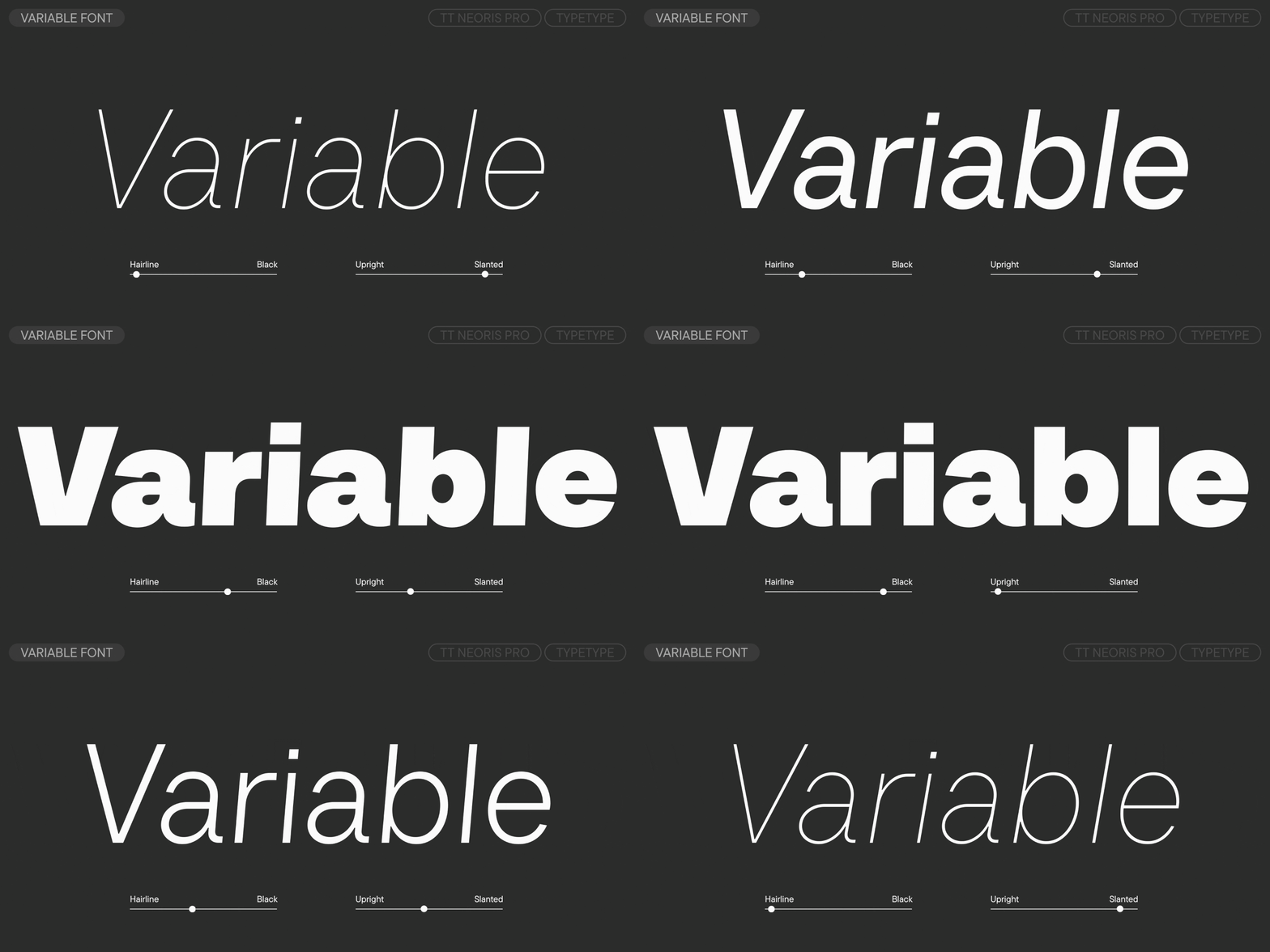
Variable axes
Weight
Slant

Know How in 1996

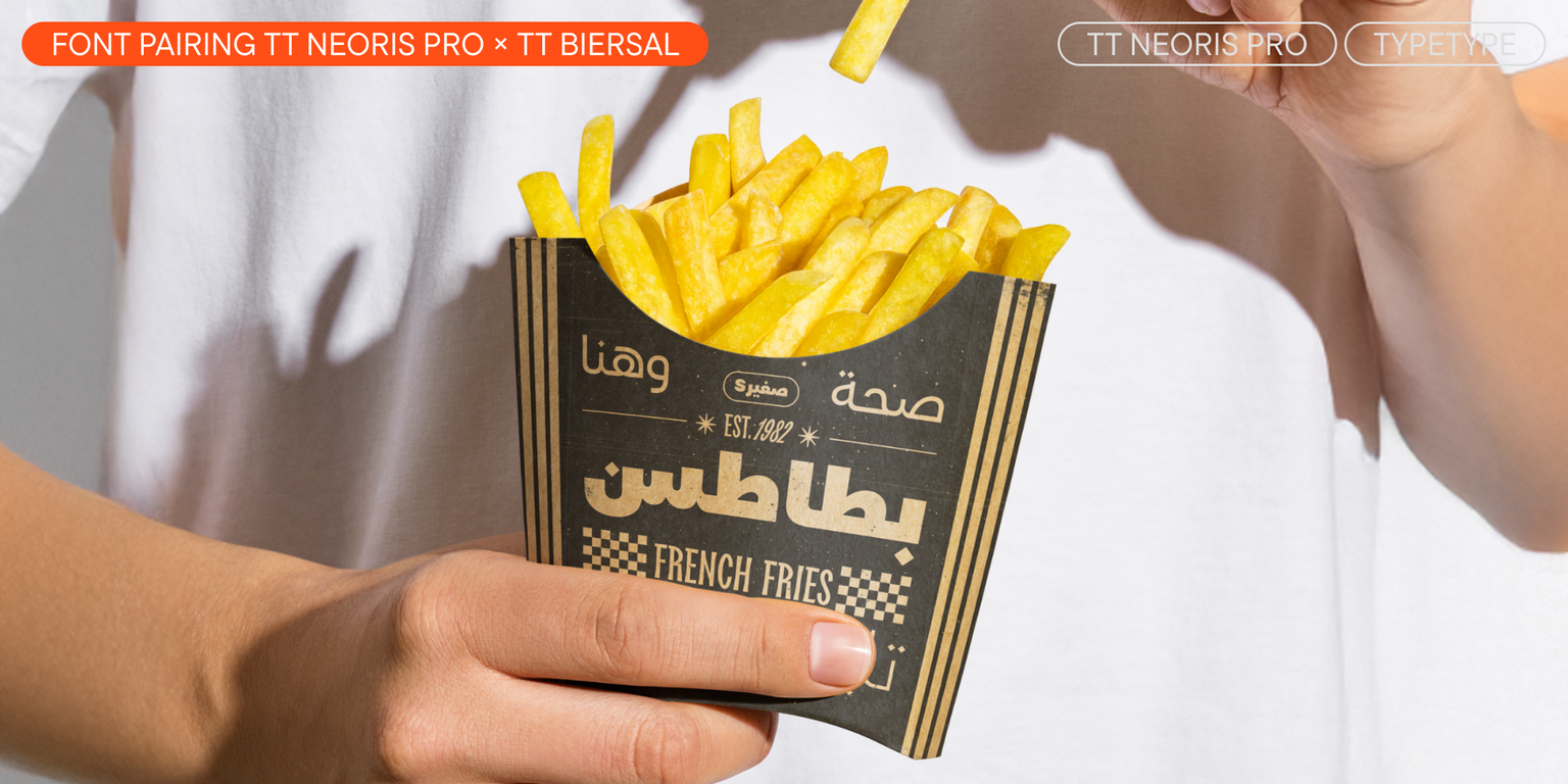
Ideal font pairs with TT Neoris Pro

Choosing Combinations for Brand Personality

Typography contributes strongly to how a brand feels: precise, approachable, premium, energetic, traditional, or unconventional. When choosing complementary fonts, start with the personality the project needs to communicate. One typeface can establish the main character while the second brings balance and functionality. Test the combination across several touchpoints to make sure it supports the wider identity rather than only one individual layout. A strong system should remain recognizable across websites, campaigns, packaging, presentations, and other brand materials without becoming visually repetitive.

Why Readability Matters When Combining Typefaces

Strong font pairings should improve the way information is understood, not simply make a layout more decorative. An expressive headline style can attract attention, while the supporting typeface should remain comfortable in longer text, captions, or interface elements. Check spacing, character differentiation, and performance at smaller sizes so that visual contrast supports hierarchy without creating unnecessary reading friction. This becomes especially important in content-heavy layouts, where users need to move quickly between headlines, details, labels, and longer passages of information.

Testing Combinations with Real Project Content

Generic samples are useful for early exploration, but final decisions should be made with actual content. Test brand names, headlines, paragraphs, numbers, navigation labels, and other elements at realistic sizes. If you start with curated recommendations or a font pairing generator, replace the sample copy early. This helps reveal whether the combination works not only visually, but also in hierarchy, readability, and tone. Real content can also expose spacing issues, awkward word shapes, or differences in rhythm that may not appear in short specimen phrases.

Description

About font family TT Neoris Pro
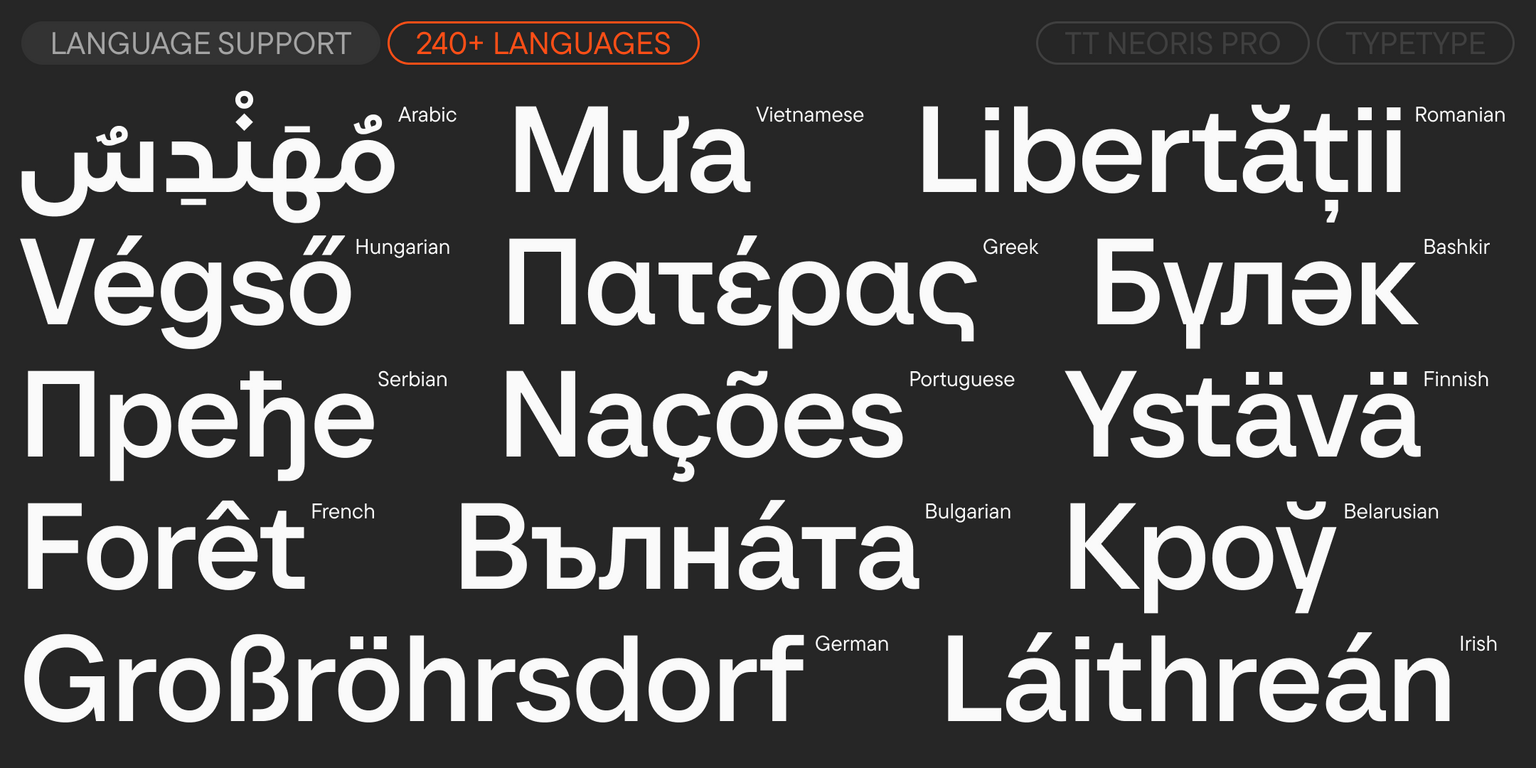
240+ Language support

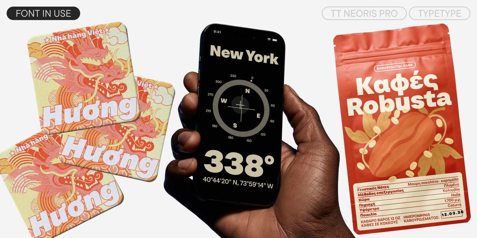
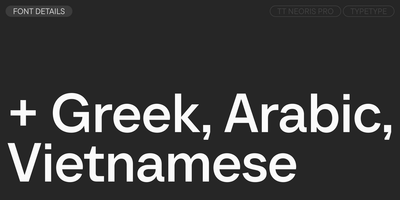
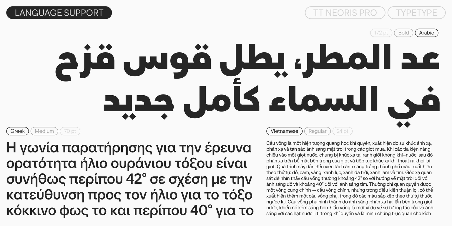
Meet TT Neoris Pro version 2.000—now with support for Greek, Arabic, and Vietnamese!

TT Neoris Pro is a concise neo-grotesque for universal use. We developed this font family over two and a half years. First, we carefully studied the market and conducted extensive research on the topic of the „perfect grotesque.“ Then, drawing on those results, we set a goal: to create a neo-grotesque with a neutral character, basic and easy to use, yet original, contemporary, and fresh.

This is exactly how TT Neoris Pro turned out: simple and expressive, universal and functional. It is also versatile and multi-faceted. Thanks to a large number of options, this single font can replace several at once, changing its mood and character.

We paid special attention to details to bring the font closer to the ideal. We made the proportions of the italic styles slightly narrower than the uprights, and added a stylistic set with true italic forms for Cyrillic—its design honors the tradition of Cyrillic calligraphy. We ensured that the boldest font style has the same serious character as the regular one. We also added support for all Cyrillic-based languages with over a million speakers.

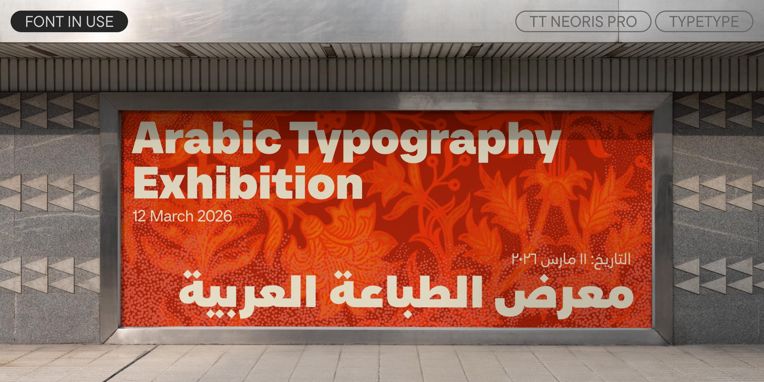
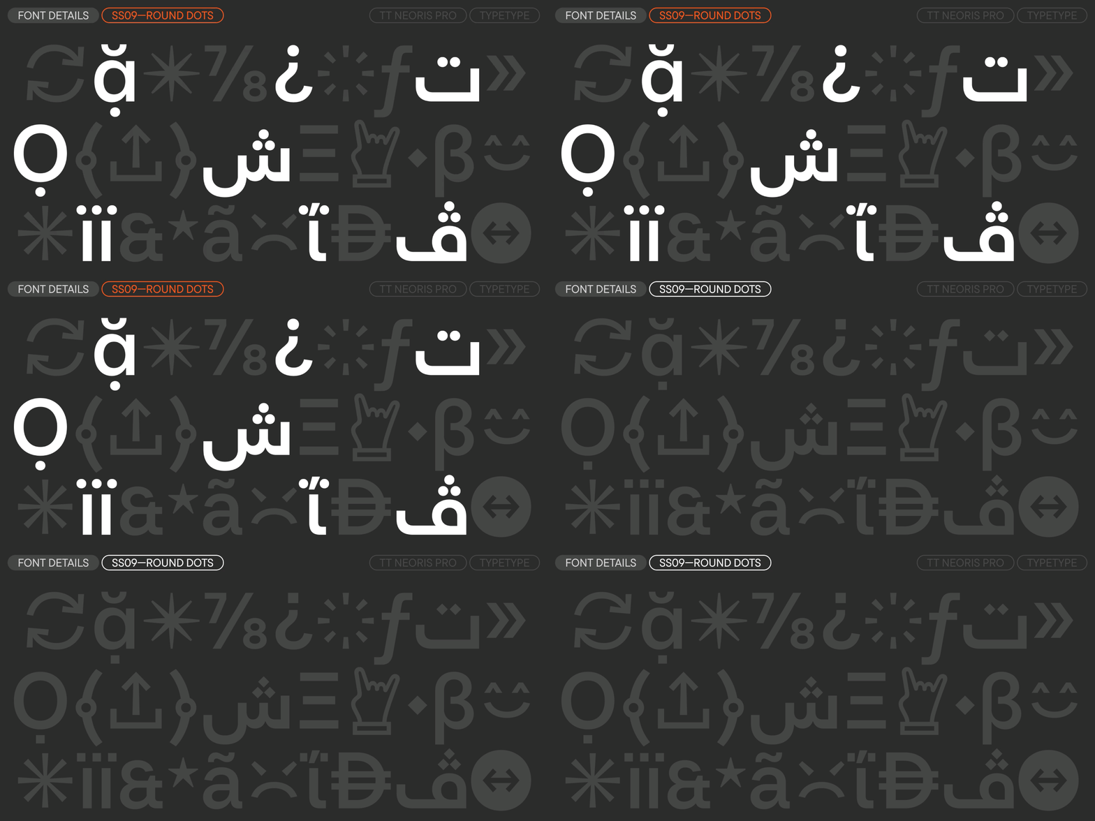
The main update in version 2.000 is the addition of Greek and Vietnamese, as well as a font based on the Arabic alphabet. All forms look emphatically neutral and contemporary. For the Arabic version, we chose a hybrid of the Kufi and Naskh styles—it is a modern take on the Arabic script with rather simple and minimalistic graphics, but with subtle humanist touches noticeable in the terminals and connections. The standout feature is the diamond-shaped dots in all diacritics, which can be swapped for round ones using a stylistic set.

We also added the dirham and dong currency symbols in all cases, and updated the kerning and hinting.

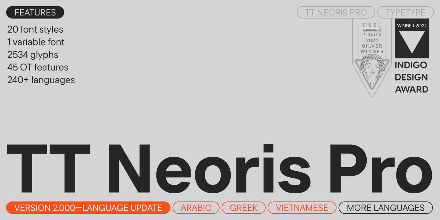
TT Neoris Pro 2.000 includes:

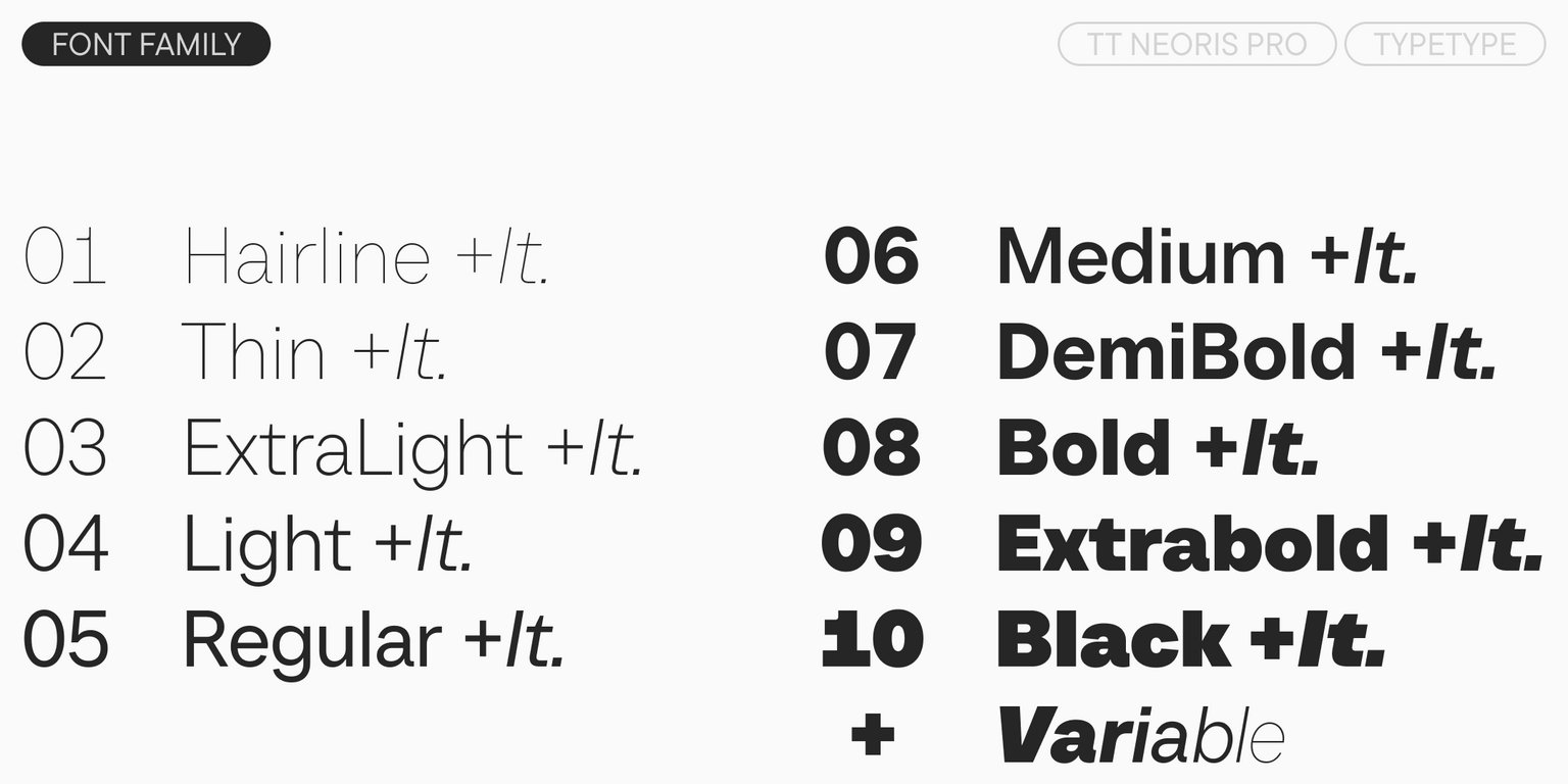
  • 21 styles: 10 uprights, 10 italics, and 1 variable font that changes along the weight and slant axes
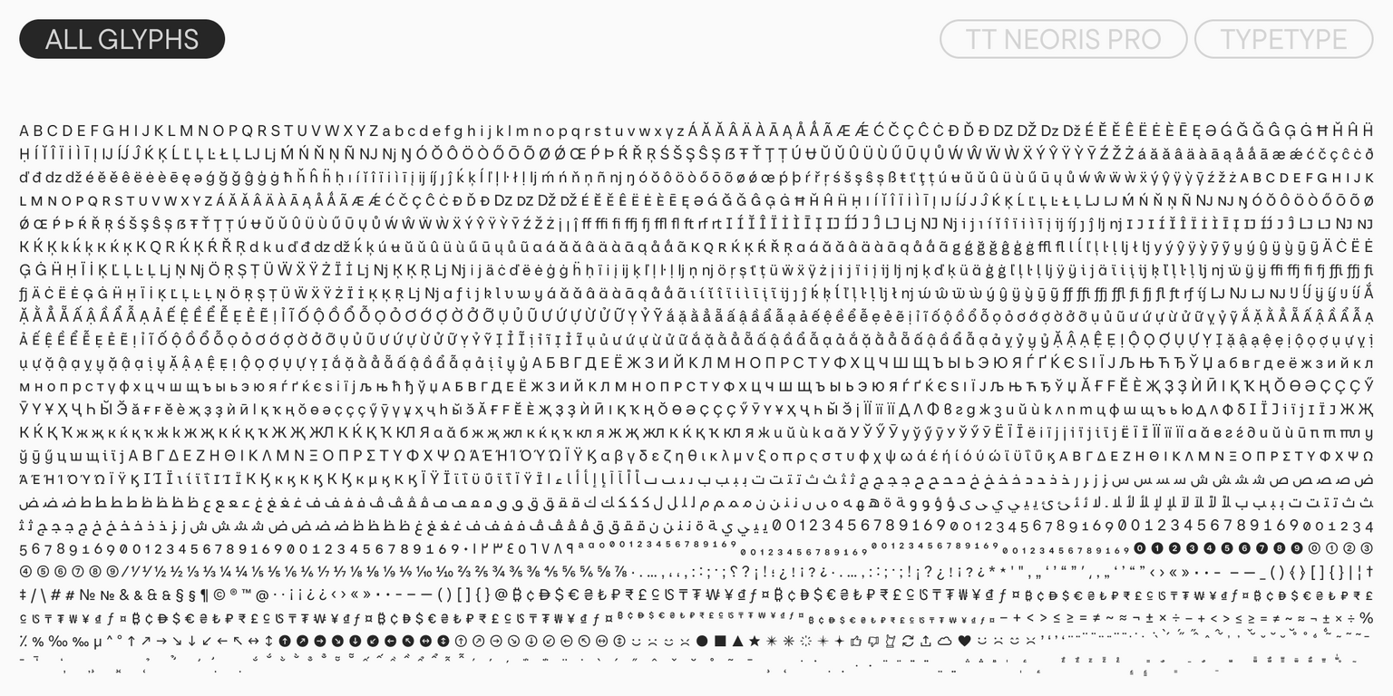
  • 2,534 glyphs per style
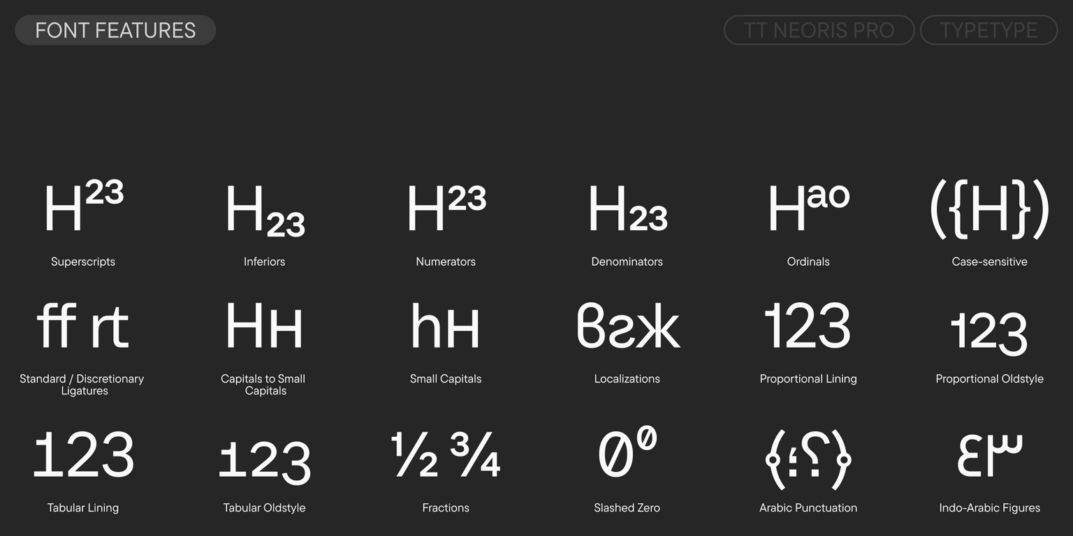
  • 45 OpenType features
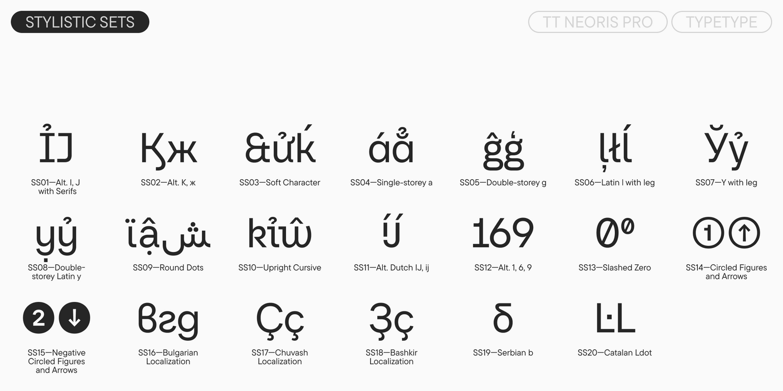
  • 20 stylistic sets
  • Support for over 240 languages

Team

Antonina Zhulkova
Marina Khodak
Ivan Gladkikh
+ TypeType Team

Release and update date

Release: 12 September, 2023

Last update: 28 April, 2026

What's changed in the font:
  • The number of glyphs per style increased from 1,832 to 2,534. Specifically, the dirham and dong currency symbols appeared in all cases.
  • The number of OpenType features increased from 41 to 45.
  • The number of languages increased from over 230 to over 240. Specifically, Greek and Vietnamese were added, as well as a font based on the Arabic alphabet.
  • The technical side of the typeface (kerning and hinting) was updated.

Additionally

Specimen

Download font specimen (pdf)

Poster Images

Graphic presentation at Behance

Custom version

Looking for a custom version of this font?

Character Set

Basic Latin Basic Cyrillic Extended Latin Extended Cyrillic Vietnam Greek Arabic Fractions Proportional Lining Figures and Currencies Indo-Arabic Figures Other Figures Punctuation and Symbols Arabic Punctuation Math Symbols Arrows Icons
A B C D E F G H I J K L M N O P Q R S T U V W X Y Z a b c d e f g h i j k l m n o p q r s t u v w x y z

OpenType features

ss02 | Alt. Latin K, k

K Ḱ Ķ

K Ḱ Ķ

ss03 | Soft character

Q R Ŕ

Q R Ŕ

ss09 | Round dot

‚„‘’

‚„‘’

ss10 | Upright cursiv

Lj Nj

Lj Nj

ss12 | Alternative 1, 6, 9

1 6 9

1 6 9

ss14 | Circled figures and arrow

5 7 3

5 7 3

Show all

Similar fonts

43 font styles
104 font styles
Select licenses
Contact us!