


We carry on with our story about the intricate process of font development. The following topic is a logical continuation of the previous ones, so we recommend reading the articles published earlier if you haven’t done it yet. In the articles “How Not to Get Lost When Working on a Font. The Art of Task Outlining” and “Your Future Font Sketches: Technique, Digitization, Testing” we covered the very first stages of the font design process.
The previous article focused on creative sketching. Here, we will explore its more pragmatic side—sketches of a font family. Julia Gonina, TypeType Art Director and the creator of TT Livret, TT Fellows, TT Autonomous, and TT Ricordi Todi typefaces, will explain why it’s important to define the contents of your future typeface at the initial development stages.
Sketching the family and choosing masters
After settling on the main graphics of the font and moving from paper to vector, it’s time to make sketches for the future font family. Let me explain why it’s essential to address it right away.
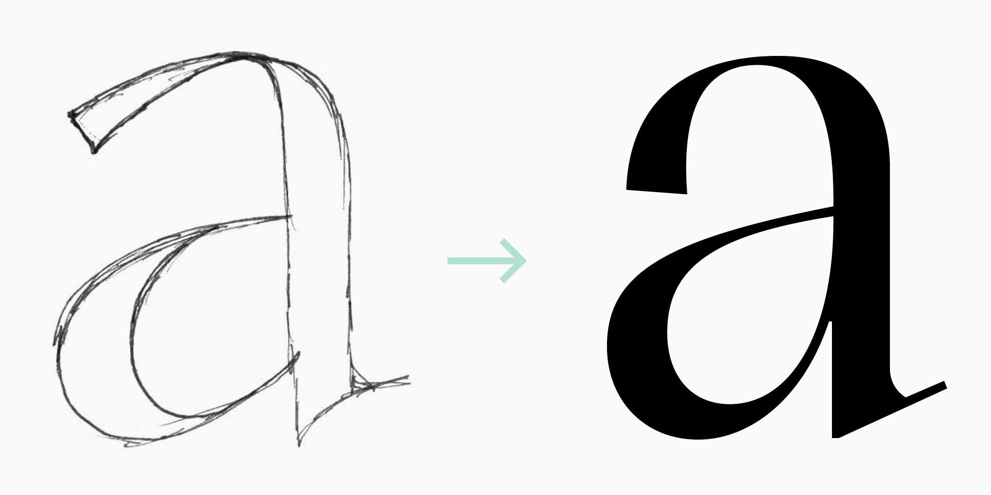
First, you must be sure that all the graphic choices you made for the regular font style can be applied to the rest of the styles, even to the boldest and the thinnest ones (or the widest and the narrowest ones, if you plan to include them). You need to keep in mind that it can set limitations on the graphics.
Second, from a technical point of view, you should choose the masters you will work with. It will help you save more time in the future. If you work in a modern font editor, like Glyphs, Fontlab 6, or a more advanced one, you don’t have to draw all the font styles in the family. It will be enough to design foundations—so-called masters. Let’s focus on it more in the context of the fonts (serif and sans serif) we described in our previous article.
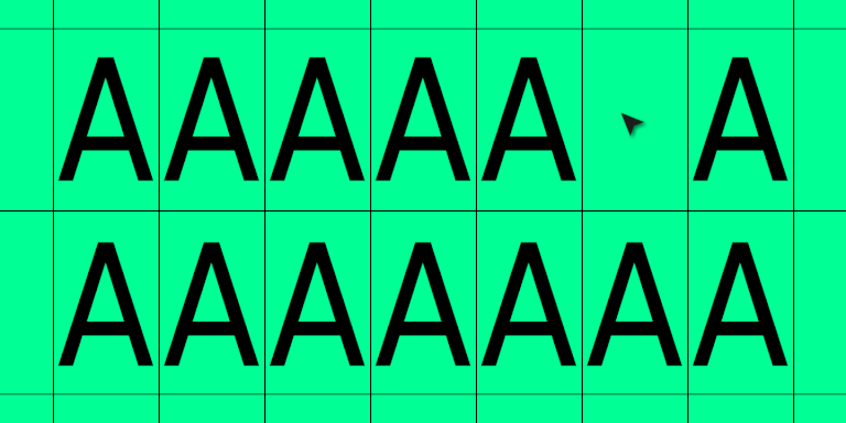
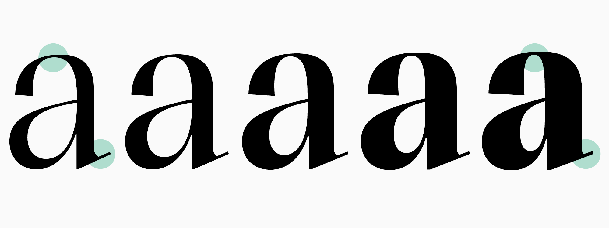
While working on a functional serif’s brief, we relied on the data provided by our research and settled on five weights. Theoretically, it will be enough for us to design only the boldest and the thinnest font styles. If the number of points coincides in each character in both of these font styles, the program will be able to create any intermediate values—interpolate them.
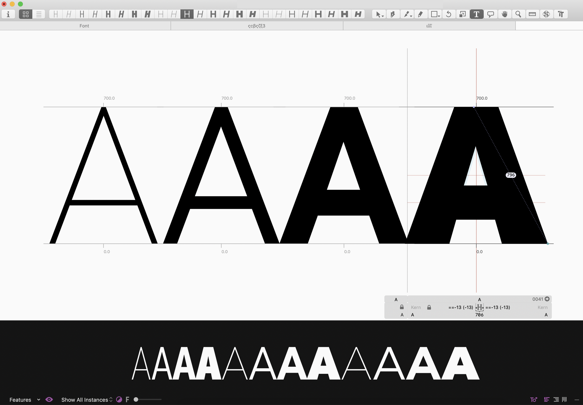
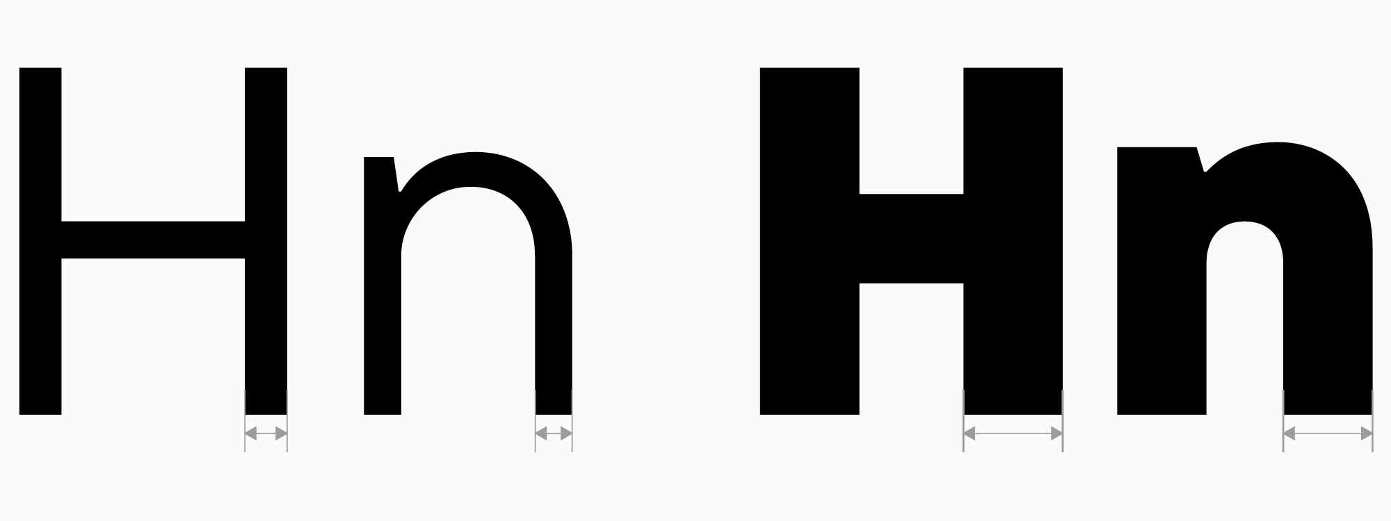
It’s highly convenient and saves tons of time. But how do we determine all styles’ weights? In the case of text fonts, the weight of the Regular font style is crucial because it’s the style people use and see the most. As a result, there is a common image of the weight of a Regular text font style so that it’s convenient for a user to work with. We recommend looking back at the competitors research we did in the previous article and choosing the Regular style’s weight that wouldn’t contrast too much with the rest in the same category (if standing out isn’t your priority, of course). This way, you will be able to determine the weights of the “H” and “n” stems in your Regular font style. You will be able to build upon these values later. After that, you can determine the weights of your Bold font style using the same approach.
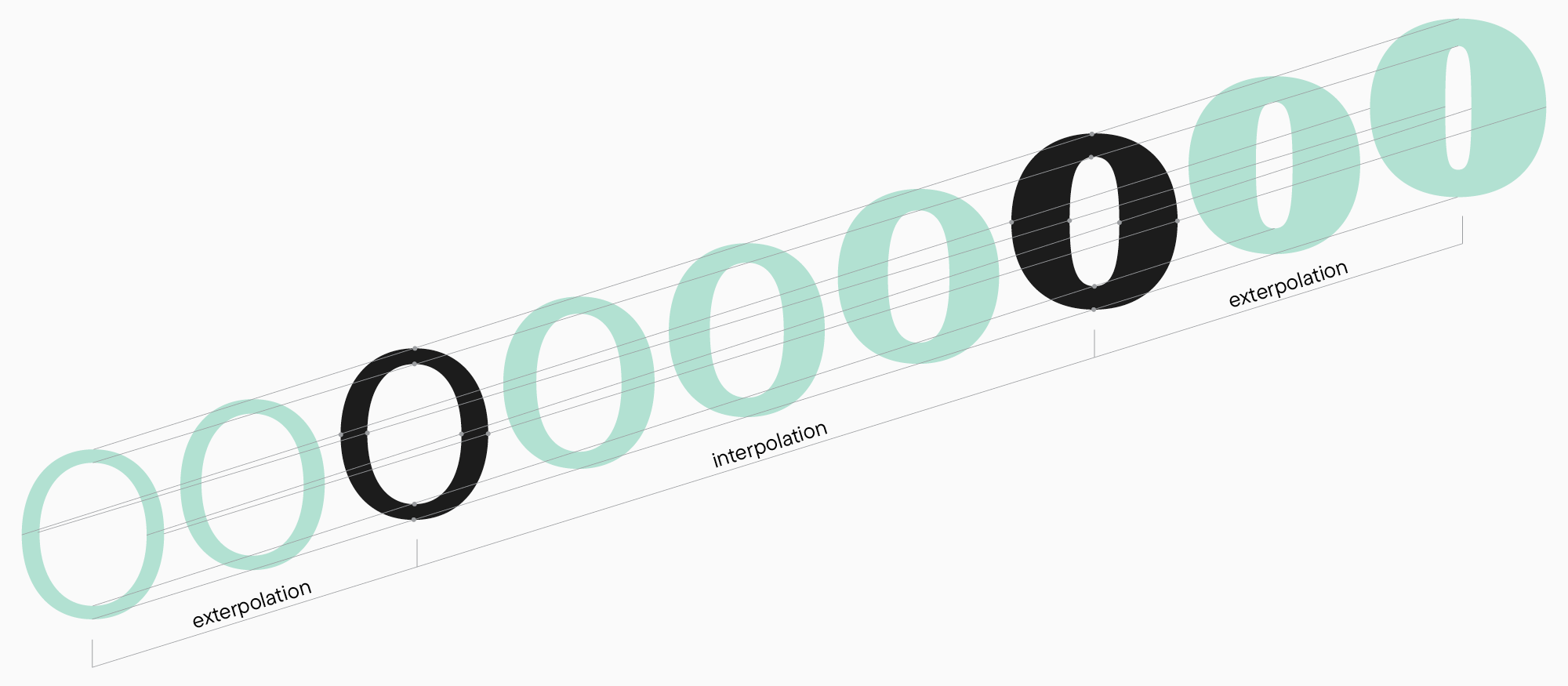
The Bold font style is also used often, so it makes sense to harmonize it with the rest of the fonts with a similar purpose. However, here, it’s possible to deviate from the norm. As a result, at this stage, you need to get two font styles with two weights to use as a foundation for designing the other styles in the family using interpolation and extrapolation (automatically projecting the design characteristics onto the font styles lying beyond the interval between two masters).
When you have more than two font styles, it would be a good practice to spread the other weights evenly. You wouldn’t want to have many similar bold font styles and only a few thin ones that are very different from each other. You will get this exact result if you try spreading weights at regular intervals.
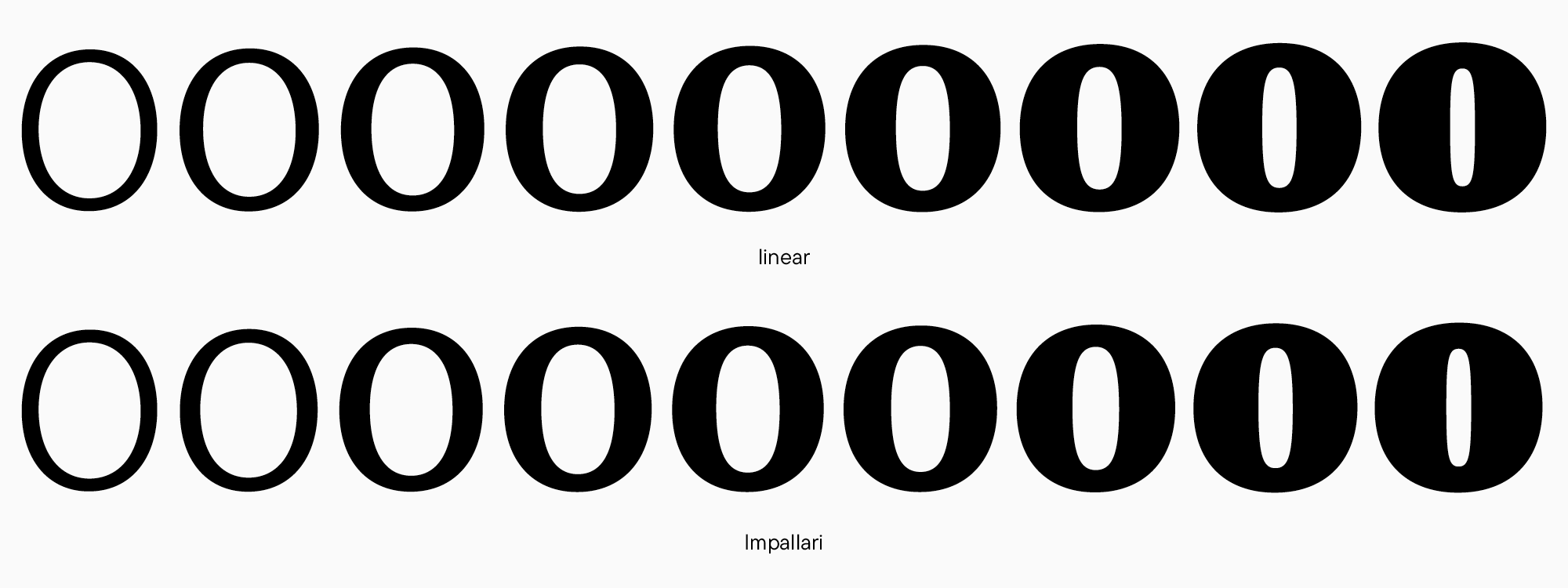
There are special equations for smooth weight distribution. You can use this service to find the values based on specified parameters. At TypeType, we usually use Pablo Impallari’s equation.
In our case, there is a preferred Regular value (it’s common to use the “H” stem’s weight as a specific value) and a Bold value that we aim for. Now, we experiment with values, determine which font styles will be first and last (Light – Bold or Regular – ExtraBold?), and then apply the formula to find the intermediate values.
Consequently, we have the following values for the functional serif: Light (75*), Regular (92), Medium (114), DemiBold (137), Bold (160).
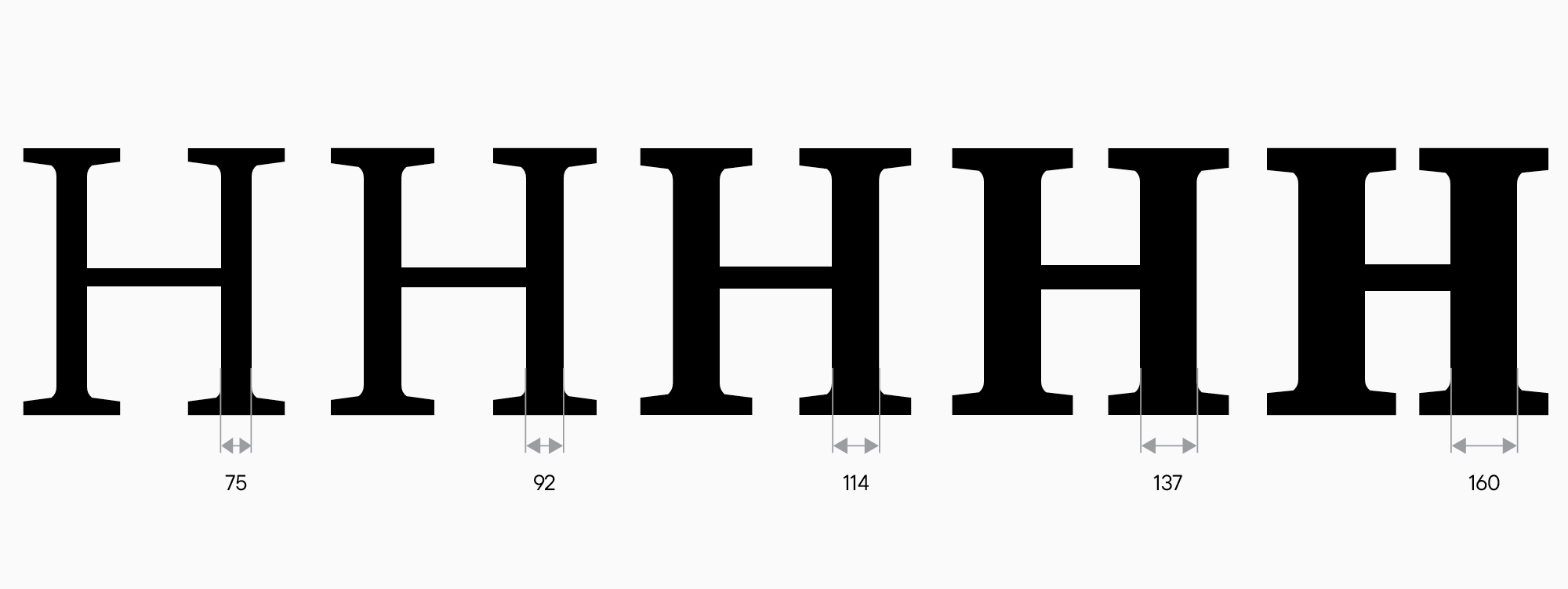
Here, the weight of the “H” stem is used. If you don’t have uppercase characters yet, you can use the weight of the “n” stem.
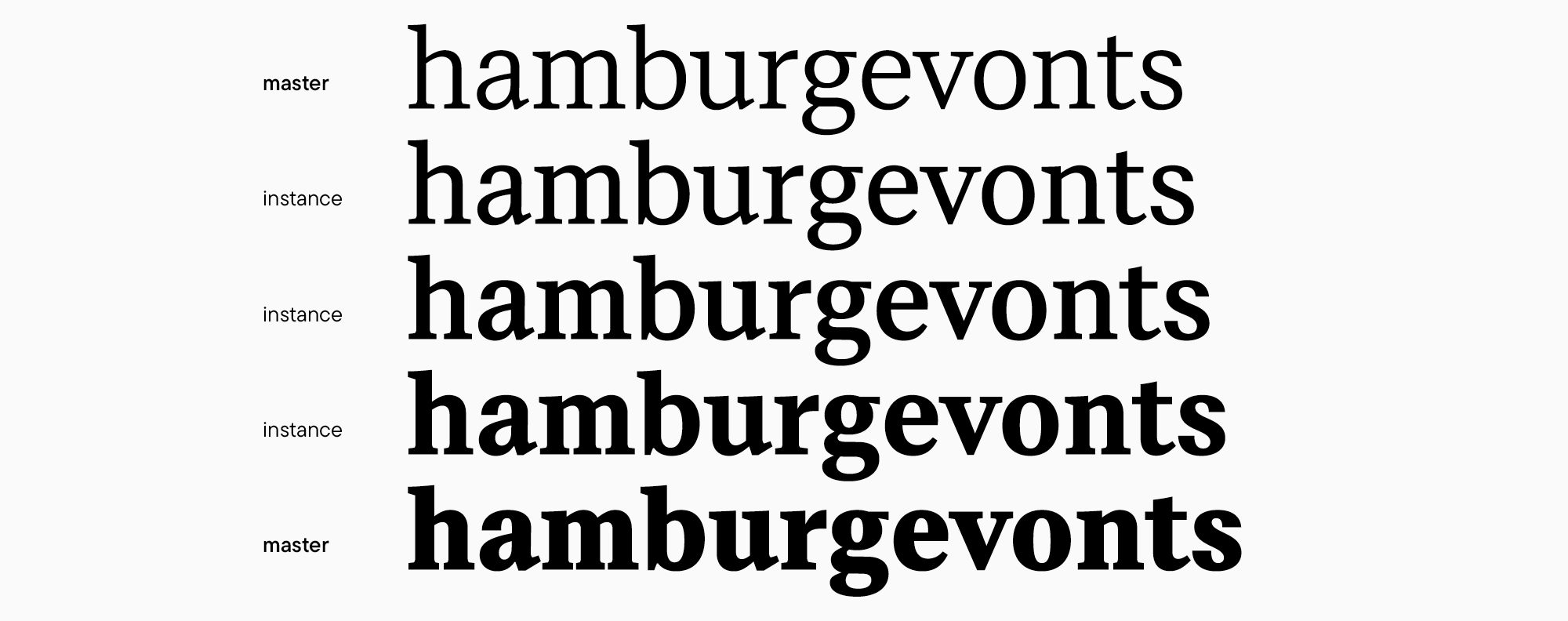
The fewer masters you have, the sooner you’ll see the progress. Although on the other hand, achieving a decent look of the intermediate font styles will take more work. Now, you must decide whether you can work with only the first and last masters (Light and Bold in our case) or you will have to design additional intermediate base font styles.If you haven’t drawn the test word in your first and last font styles, now is the time to do it. At this point, it’s essential to carefully test the intervals (the so-called instances—the automatically generated font styles) and try them in text and larger sizes to make sure that the weights, widths, and the amount of contrast satisfy you in each font style. For example, our serif can perfectly work with just two masters.
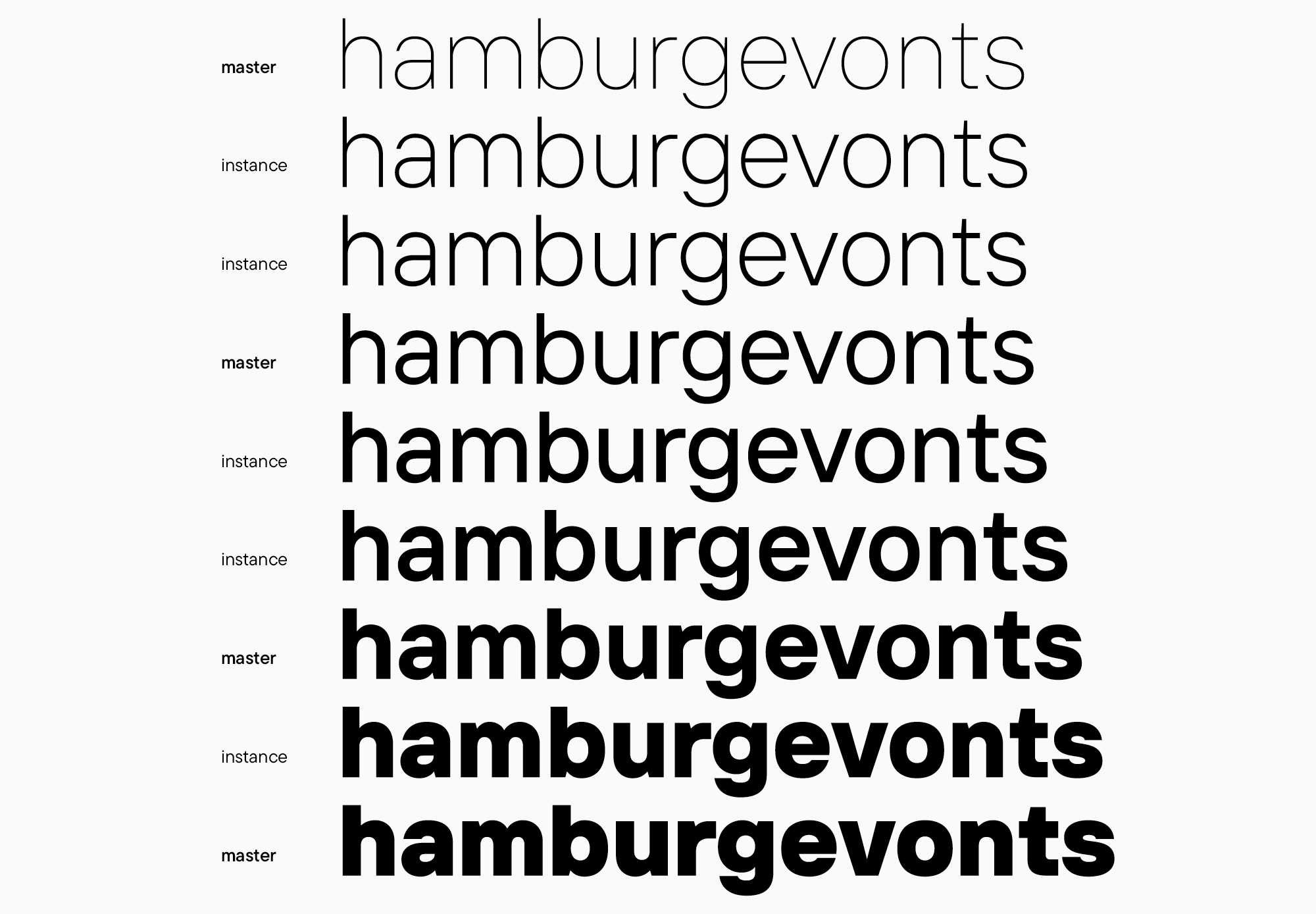
Now, let’s consider our interface sans serif. Our goal is to incorporate nine weights into this font. In this case, we need to complete the same steps in defining the values of all font styles plus their Impallari equation values and designing the first and last masters. What we will get is the following set: Thin (25), ExtraLight (40), Light (55), Regular (85), Medium (105), DemiBold (125), Bold (150), ExtraBold (180), Black (200). Let’s see what will happen if we try designing our large family using only two masters.
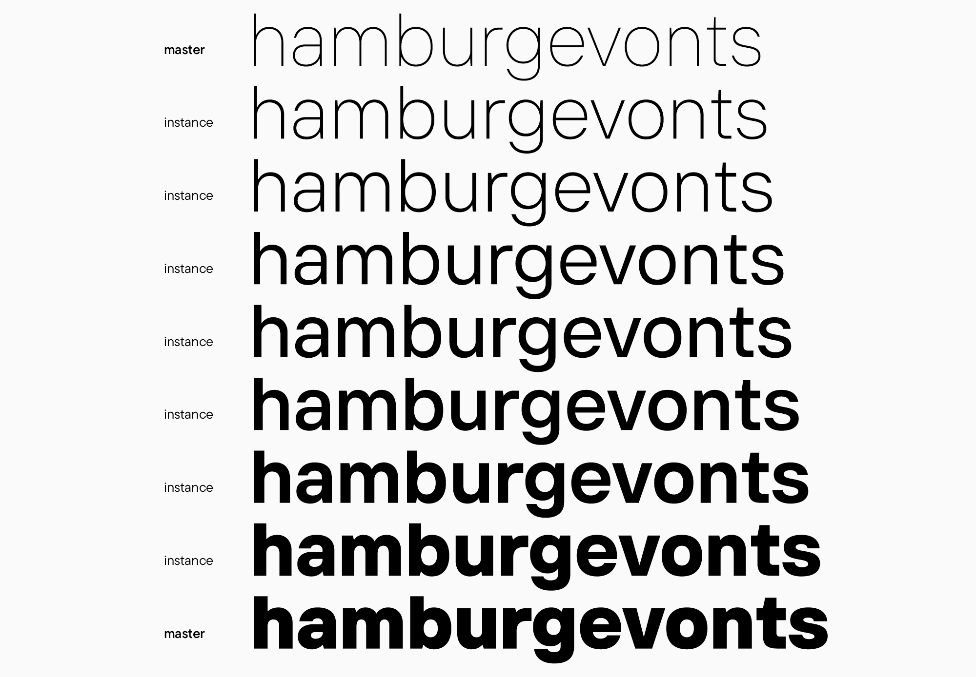
Given the noticeable difference between Thin and Black, some unwanted artifacts appear in the intermediate font styles, for example, a contrast that this font doesn’t need. It’s especially obvious in the letters “a” and “e.” In a case like this, we recommend adding one or more masters. Our sans serif has Regular and Bold font styles, and it improves the situation significantly.
This is a standard case. Typically, serifs need fewer masters than sans serifs, and it all boils down to the presence or absence of contrast.
However, you should be careful with adding more masters as they increase the amount of work you will have to do.
Ultimately, the initial font development stage sets the groundwork for all upcoming tasks: what to draw, how to do it, and in what quantity.
As a result of all these manipulations, you will have:
- a complete graphic concept of the font;
- an understanding of how this concept works in all the planned font styles;
- an idea of the font styles you will continue working with;
- a complete font family structure.
In terms of designing a font family, I only focused on working with weights as it’s the most popular typeface extension option. If you plan to draw additional widths, for instance, you will have to design them right away as well. When it comes to italics, we will discuss them in detail in the upcoming articles. I can say that working on them often becomes a separate stage.