Gehen Sie auf die Websites Ihrer drei Lieblingsmarken und versuchen Sie herauszufinden, welche Emotionen sie wecken. Ob Kleidung oder Schuhe, Autos oder Elektronik, Kosmetik oder Accessoires – jedes Unternehmen hat ein Geheimnis: Es möchte ein Teil Ihres Lebens werden.
Die Emotionen, die diese Dinge auslösen, der Lebensstil, mit dem sie assoziiert werden, sind ein wesentlicher Bestandteil der Markenbildung.
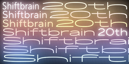
Wenn Sie die Website eines Unternehmens zum ersten Mal öffnen, kennen Sie dessen Geschichte, Produktqualität und Preise noch nicht. Sie sehen die Informationen, hatten aber noch keine Zeit, sie zu lesen. Dennoch sind bereits Assoziationen entstanden, und der Grund dafür ist die Schrift, die von der Marke verwendet wird.
Warum die Wahl der richtigen Schrift wichtig ist
Die Schrift ist die Stimme der Marke. Wie bei der Stimme vermitteln Worte Informationen, Emotionen werden aber erst durch die Genauigkeit und Intonation des Sprechers oder – im Falle der Schrift – durch das Schriftbild ausgelöst.
Menschen lernen, ihre Stimme professionell einzusetzen, um auf andere den richtigen Eindruck zu machen und deren Wahrnehmung des Gesagten zu beeinflussen, Marken nutzen dafür Schriften. Ob billig oder teuer, modern oder klassisch, umweltfreundlich oder technologisch – die Schrift vermittelt es.
Die Wahl der richtigen Schrift trägt dazu bei, ein interessiertes Publikum zu gewinnen, bevor es die Produkte des Unternehmens kennen lernt. Wenn Sie jedoch die falsche Schriftart wählen, können Sie widersprüchliche Emotionen hervorrufen, die nicht zu einer Bindung an die Marke führen.
Es ist, als ob eine Person versucht, selbstbewusst über sich oder ihre Leistungen zu sprechen, aber man fühlt sich verwirrt, als ob man getäuscht wird. Vielleicht verrät sie sich, wenn ihre Stimme zittert oder ihre Intonation unpassend ist.
Damit eine Schrift die gewünschten Assoziationen vermittelt und mit der Positionierung der Marke harmoniert, ist es wichtig, der Wahl der richtigen Schrift die nötige Aufmerksamkeit zu schenken.
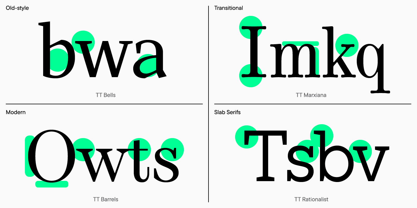
Die interessantesten Fakten über Serifenschriften
Die zeitgenössische Typografie bietet Designern eine große Auswahl an Schriften, die sich jedoch alle in einige grundlegende Kategorien einteilen lassen. Die beliebtesten sind Serifen– und Sans-Serif-Schriften – sie werden von den meisten modernen Marken verwendet, auch von den größten.
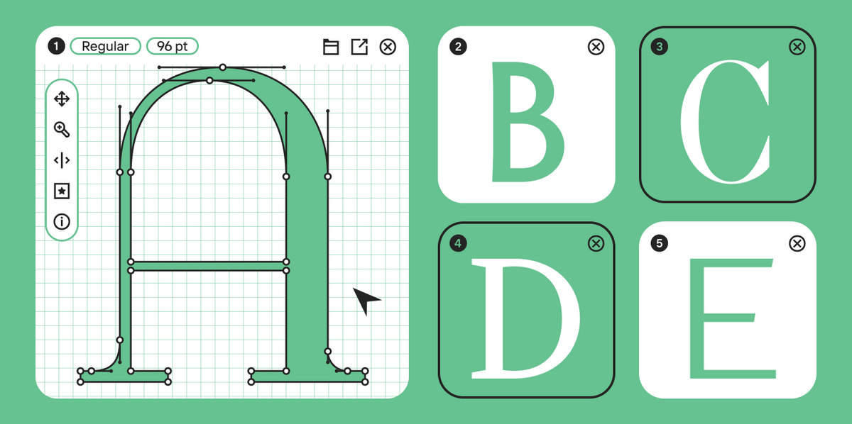
Es ist recht einfach, Serifenschriften zu erkennen – das sind Schriften, bei denen die Buchstaben Serifen haben.
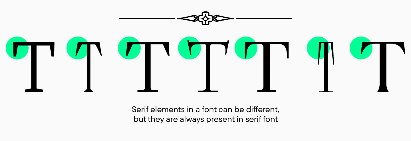
Serif ist eine große Kategorie von Schriften, die wiederum in Unterkategorien unterteilt ist. Grundsätzlich gibt es vier Arten von Serifenschriften: Old-Style, Transitional, New-Style und Slab Serifs. Sie unterscheiden sich durch die Form der Serifen, den Kontrast und die Neigung der Ovale.
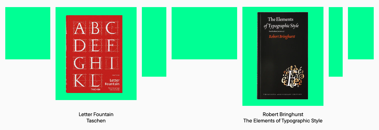
Mehr über Schriften erfahren Sie in Robert Bringhursts Elements of Typographic Style. Eine modernere und übersichtlichere Klassifizierung von Schriften finden Sie in Letter Fountain von Taschen.
Wann sollte man sich für eine Serifenschrift entscheiden?
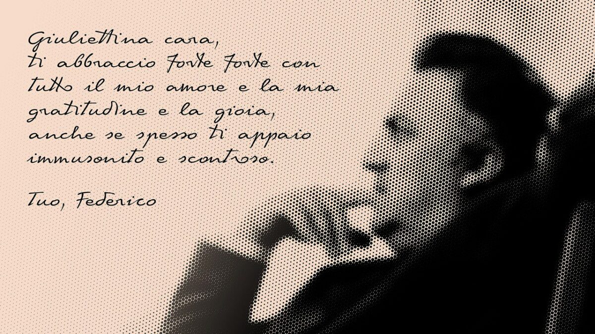
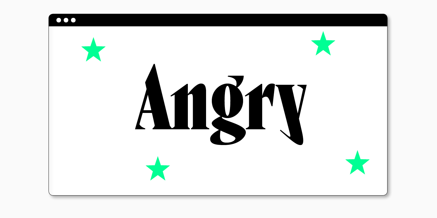
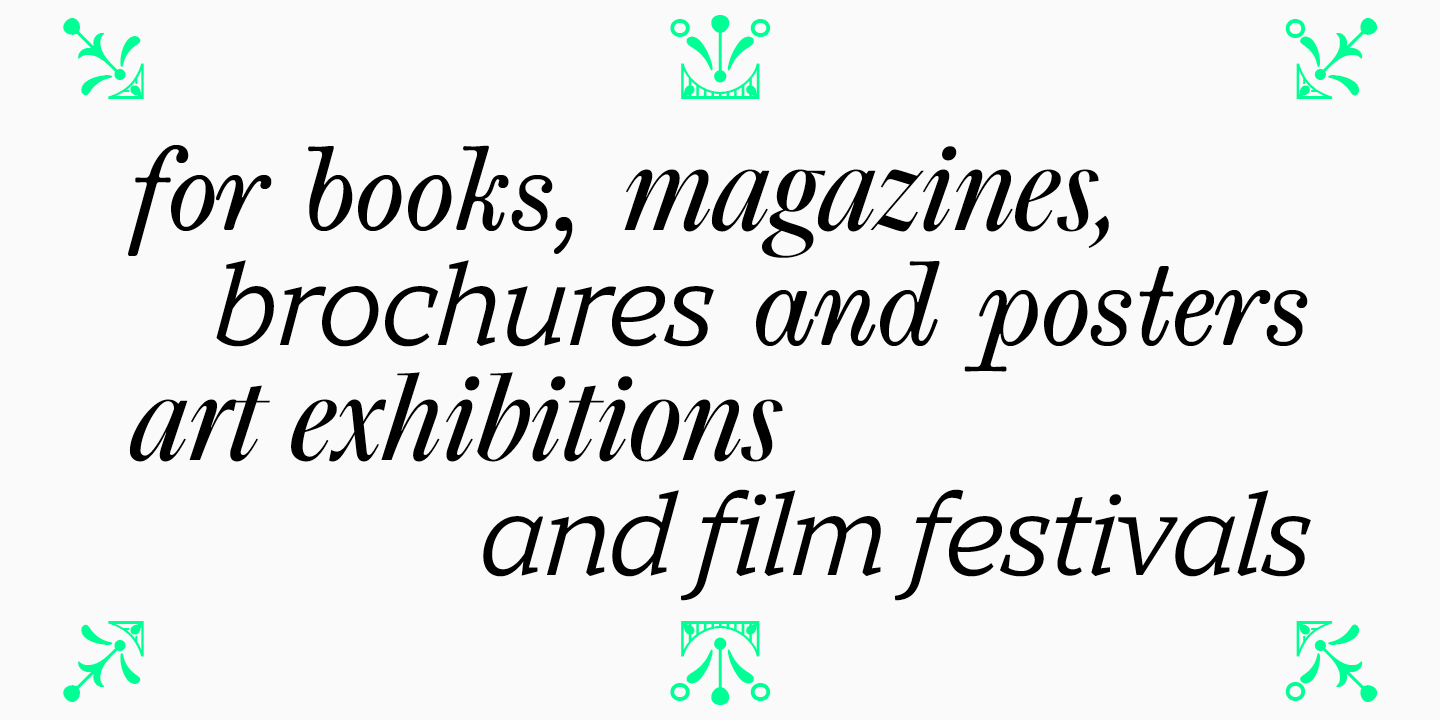
Mit Sicherheit kann man sagen, dass die Druckindustrie das größte Anwendungsgebiet für Serifenschriften ist. Die meisten Bücher und Zeitschriften, Broschüren und Plakate werden in Serifenschriften gesetzt. Serifenschriften ziehen die Blicke auf sich und können elegant und anmutig wirken, weshalb sie häufig von Künstlern, aber auch von Veranstaltern von Ausstellungen und Filmfestivals verwendet werden.
Serifenschriften können sehr vielseitig sein. Bei der Auswahl einer Serifenschrift sollte man jedoch sorgfältig analysieren, welche Emotionen die Schrift hervorruft.
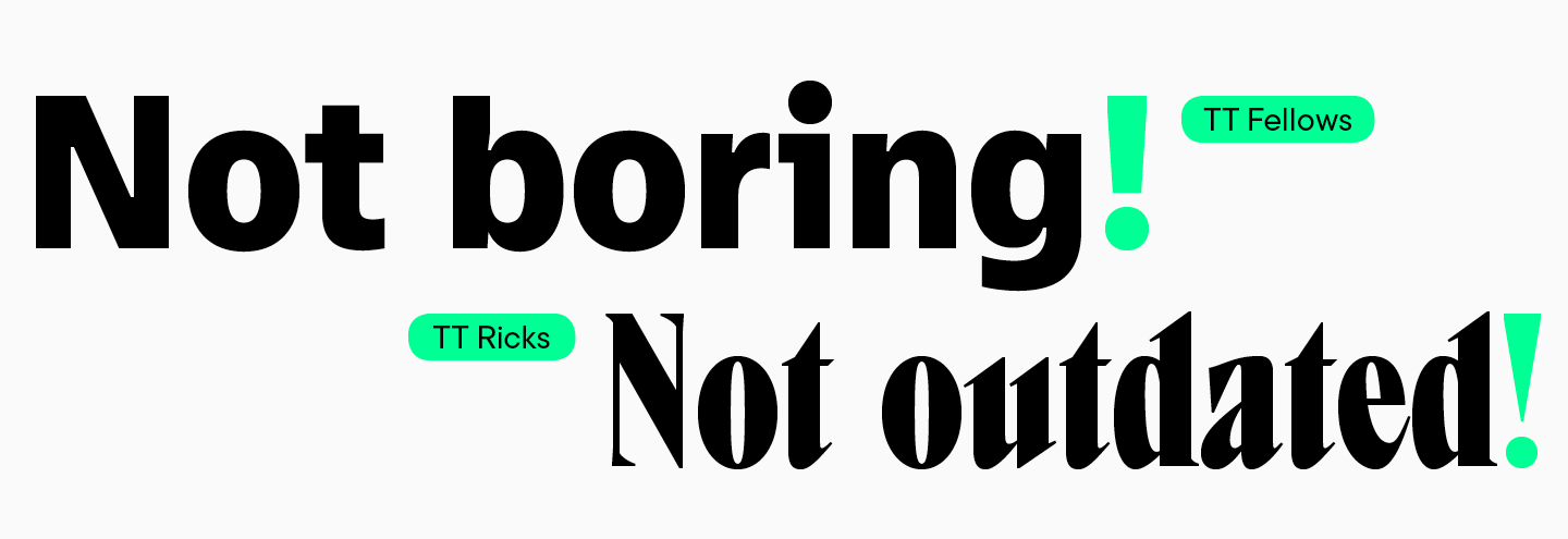
Es ist zu beachten, dass Serifenschriften oft als große Familien produziert werden, d.h. mehrere Stile und sogar Kategorien sind in einer Schrift enthalten. Meistens gibt es in einer Schrift eine Display-Serif mit einem expressiveren Charakter und eine Text-Serif mit neutraleren Eigenschaften.
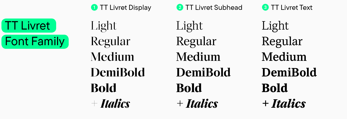
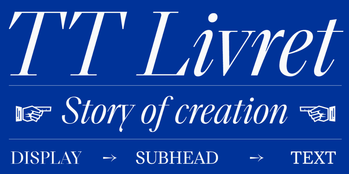
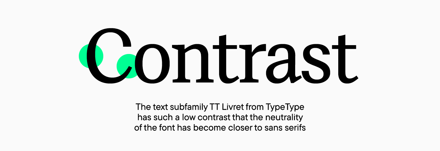
Eine Display-Serif eignet sich für Überschriften oder große Beschriftungen, da ihr Charakter besser lesbar ist und dekorative Elemente besser zur Geltung kommen. Eine Text-Serif wird zusammen mit einer Display-Serif verwendet, um große Textfelder zu setzen, da eine solche Schrift eine gute Lesbarkeit und einen neutraleren Charakter hat. Je nach Größe der Schrift kann es weitere Unterfamilien geben. Die TT Livret von TypeType hat beispielsweise drei Unterfamilien: Display, Text und Untertitel. Durch die Erweiterung der Unterfamilien ermöglichen die Studios die Verwendung einer Schrift für verschiedene Aufgaben.
Was eine Serifenschrift über eine Marke aussagen kann
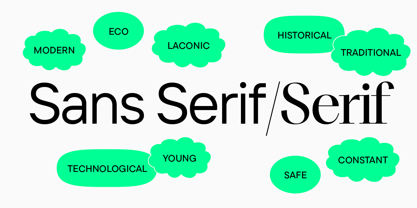
Serifenschriften werden häufiger von Marken gewählt, deren Grundsätze auf dem Respekt vor Tradition und Geschichte beruhen. Serifenschriften vermitteln eher den Eindruck einer klassischen und ruhigen Marke, können aber auch Status und Eleganz signalisieren.
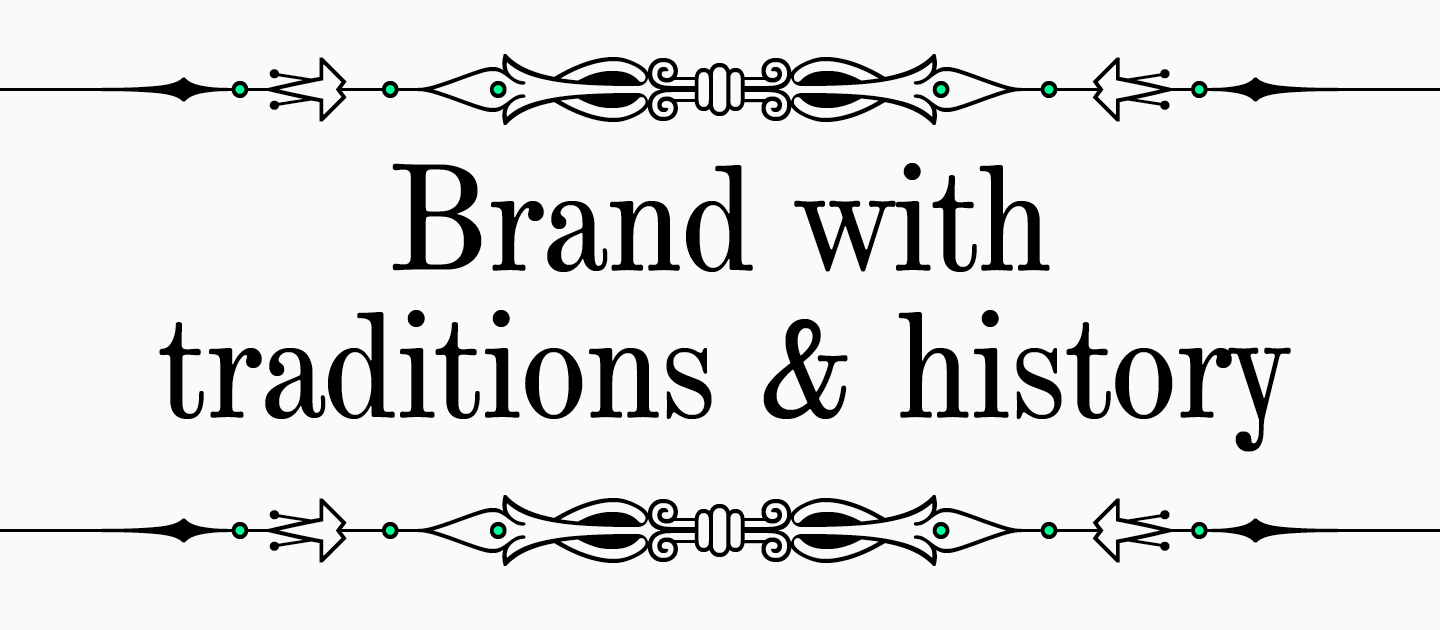
Traditionelle Medien, High-Fashion-Magazine und Luxusmarken verwenden häufig Serifenschriften. Sie sind ideal für Unternehmen, die stolz darauf sind, ihre Marke über Jahre hinweg zu pflegen und weiterzuentwickeln, die Qualität zu verbessern und gleichzeitig die Grundprinzipien beizubehalten. Serifen vermitteln ein Gefühl von Zuverlässigkeit und Sicherheit und können daher im Bankwesen oder im medizinischen Bereich eingesetzt werden.
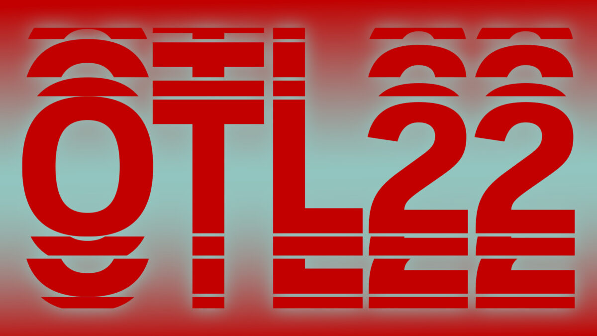
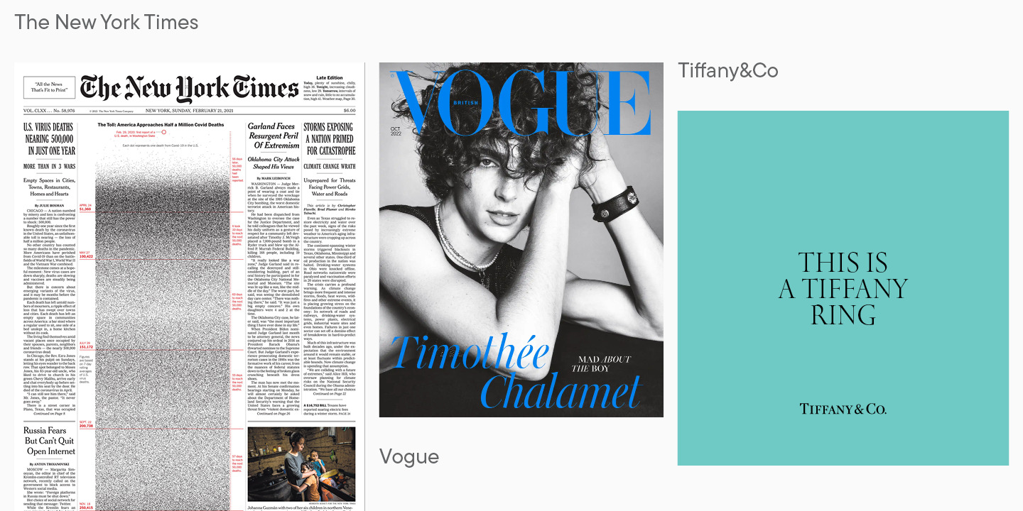
Beispiele für Serifenschriften
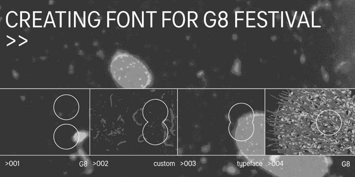
Um die mit Serifen verbundenen Assoziationen besser zu verstehen, werfen wir einen Blick auf bekannte Marken, die sich für Serifenschriften entschieden haben.
Das Wichtigste über serifenlose Schriften
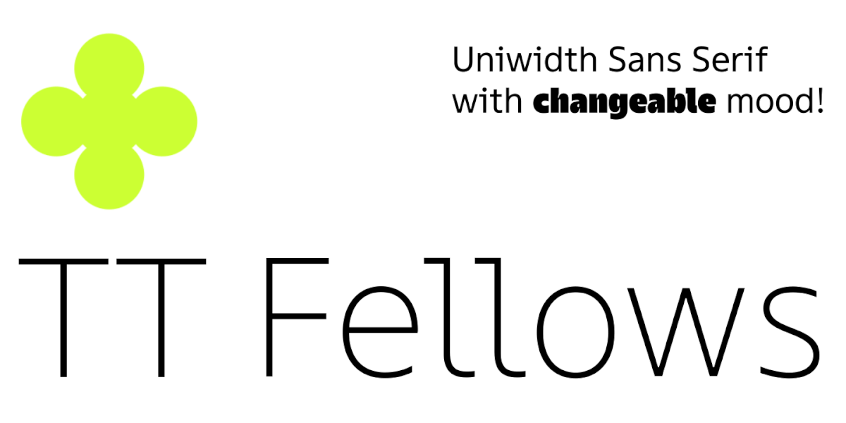
Serifenlose Schriften sind in vielerlei Hinsicht das genaue Gegenteil von Serifenschriften. Während eine Serifenschrift leicht an ihren Serifen zu erkennen ist, sind serifenlose Schriften leicht an ihrem Fehlen zu erkennen. Sie sind prägnante Schriften mit einem breiten Anwendungsspektrum. Sie können sicher sein, dass die meisten Websites, die Sie besuchen, serifenlose Schriften verwenden. Außerdem ersetzen globale Marken bei einem Rebranding ihre alten Schriften eher durch serifenlose Schriften.
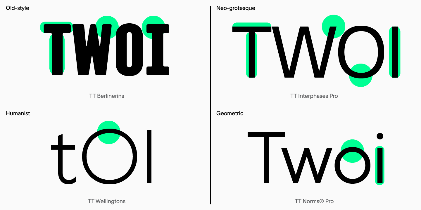
Serifenlose Schriften wirken einfach und aufgeräumt, weshalb sie in der Typografie als Universalschrift gelten. Wie bei den Serifenschriften gibt es auch bei den Groteskschriften Unterkategorien. Dazu gehören die Antiqua-, die Neogrotesk-, die Humanismus- und die Geometrischen Serifenlosen.
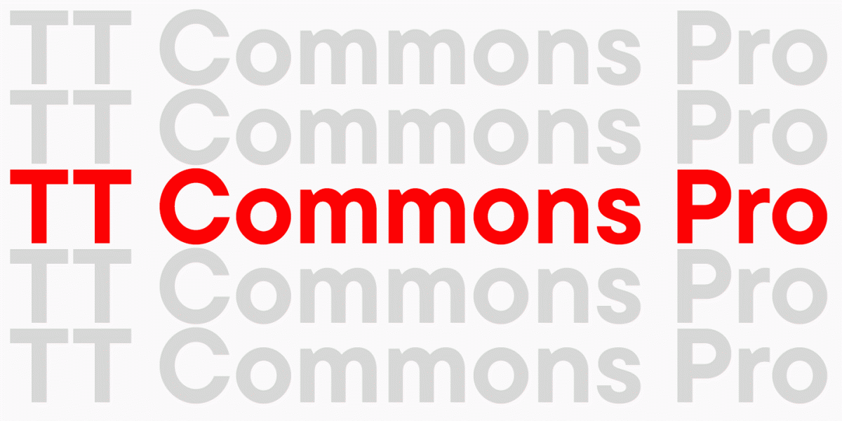
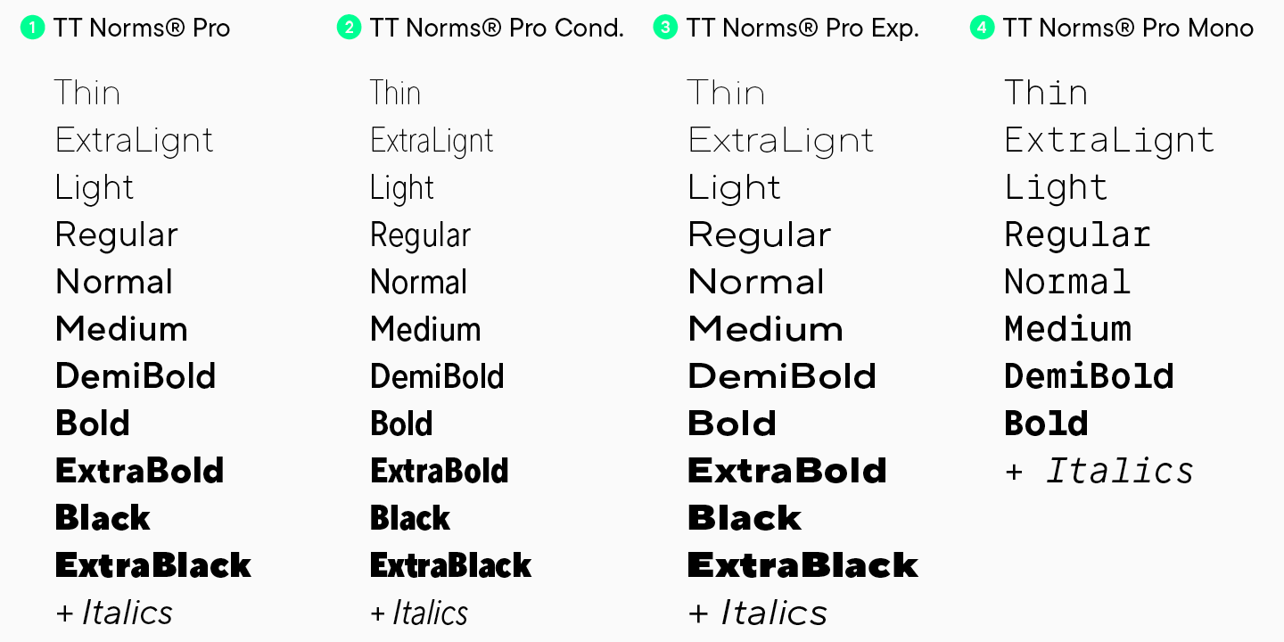
Wie Serifenschriften können auch Sans Serif-Schriften in großen Schriftfamilien produziert werden, die Anzeige- und Textschriften umfassen. Oft werden die Familien nach der Veröffentlichung der Schrift erweitert und um neue Unterfamilien ergänzt. TT Norms® und TT Commons™, zwei der meistverkauften Schriften von TypeType, wurden beispielsweise bereits mehrfach erweitert. Neben Text- und Display-Fonts wurden die Familien um Condensed- und Expanded-Versionen und sogar um Monospaced-Fonts erweitert.
Wann sollte man sich für eine serifenlose Schrift entscheiden?
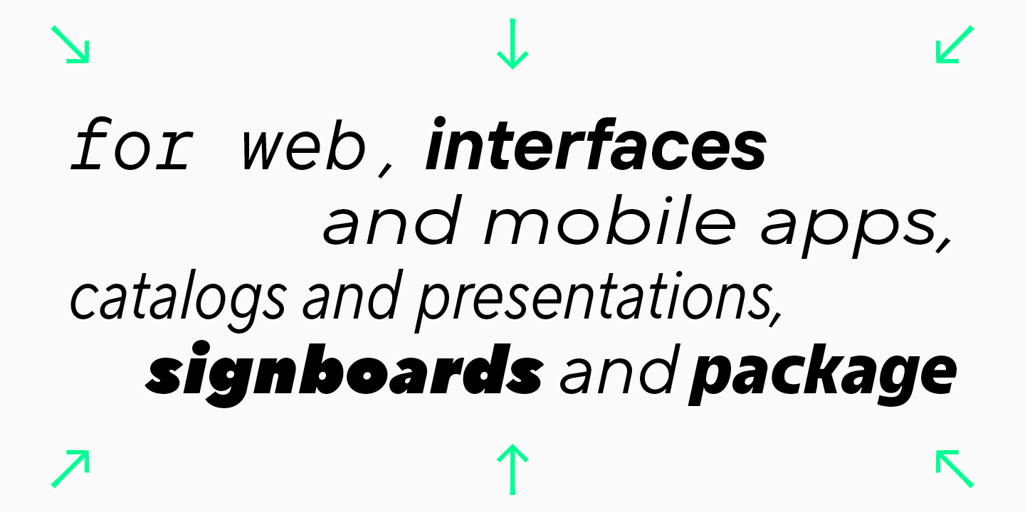
Serifenlose Schriften können aufgrund ihrer Neutralität und Prägnanz fast überall eingesetzt werden. Websites, elektronische Kataloge, Präsentationen und mobile Anwendungen werden häufig mit Sans Serif-Schriften gestaltet. Man findet sie auch auf Schildern von Geschäften und Restaurants, in Drucksachen und im Verpackungsdesign.
Natürlich sind serifenlose Schriften die Favoriten der meisten modernen Designer.
Was eine serifenlose Schrift über eine Marke aussagen kann
Modernität, Leichtigkeit, Trendbewusstsein und Offenheit für Neues – das ist es, was die meisten Menschen lesen, wenn sie eine serifenlose Schrift auf der Website ihrer Lieblingsmarke sehen.
Bei der Entwicklung serifenloser Schriften lehnen Schriftgestalter die Verwendung von Serifen ab, und Marken, die sich für serifenlose Schriften entscheiden, bauen zusätzliche Mauern in der Kommunikation mit ihrem Publikum ab. Marken, die sich für serifenlose Schriften entscheiden, wollen ihren Kunden näher sein und sich harmonisch in deren Leben integrieren.
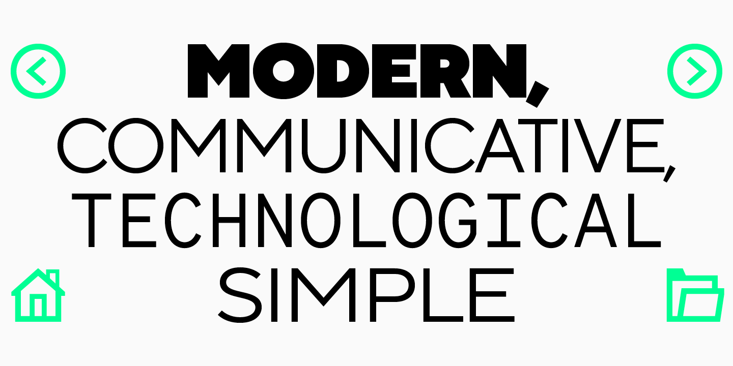
Technologischer Fortschritt und Experimentierfreude, die Ablehnung unnötiger Konventionen, die Freude am Augenblick – das sind die Botschaften, mit denen serifenlose Schriften auch zur Markenpositionierung beitragen.
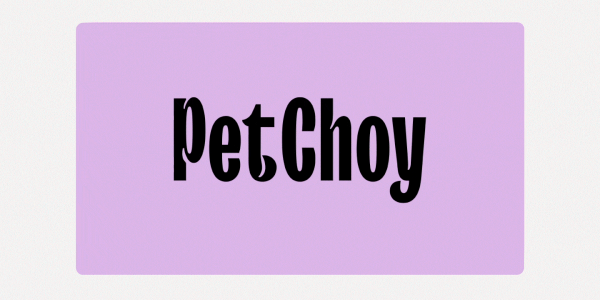
Serifenlose Design-Beispiele
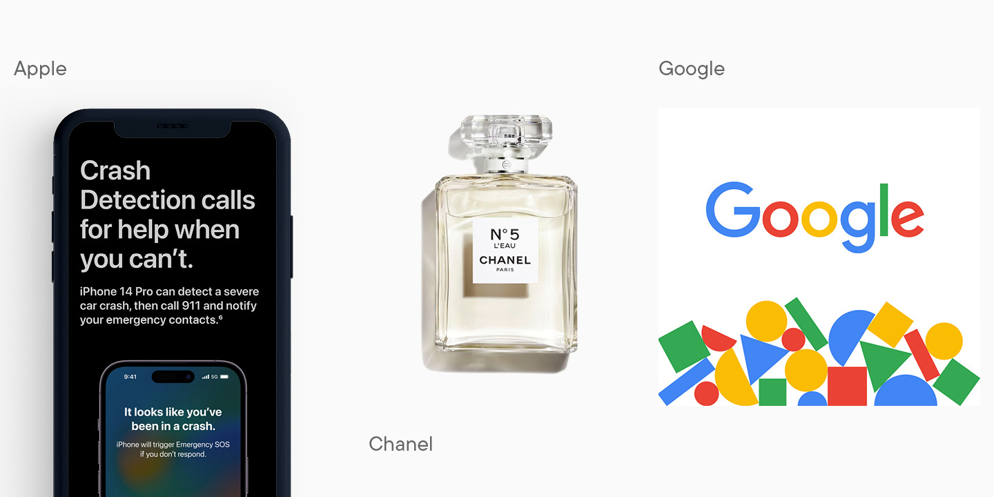
Lernen Sie serifenlose Schriften besser kennen, indem Sie einen Blick auf die Beispiele werfen, in denen serifenlose Schriften in zeitgenössischem Design verwendet werden.
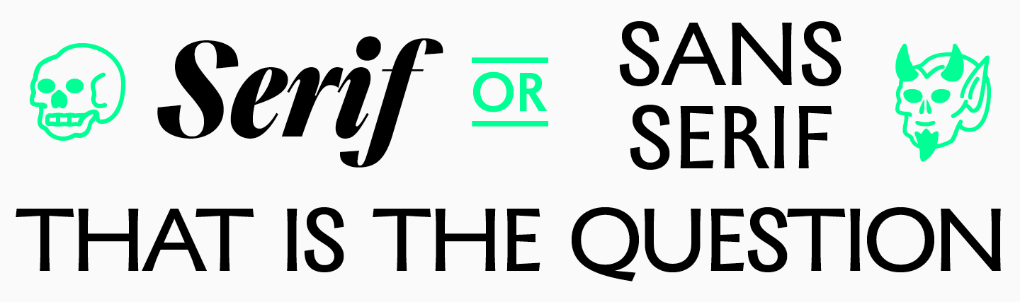
Die wichtigsten Unterschiede zwischen Serifen- und Sans Serif-Schriften
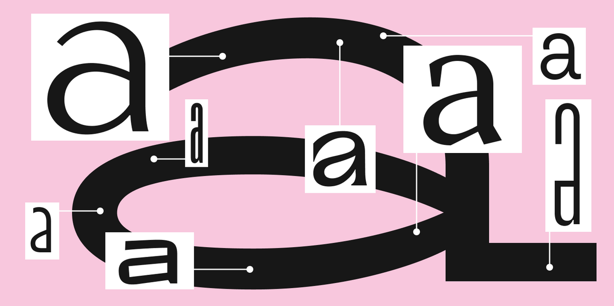
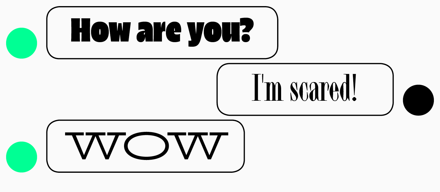
Der offensichtlichste Unterschied zwischen Serifen– und Sans Serif-Schriften sind die Serifen. Sie sind ein Muss für Serifenschriften und dürfen bei Groteskschriften nicht vorhanden sein. Aber dieser Unterschied allein reicht nicht aus, um zu verstehen, in welchem Bereich Sie nach einer Schrift für Ihr Projekt suchen sollten.
Die visuellen Unterschiede zwischen diesen Schriften lassen sich auch ohne den Fokus auf die Serifen erkennen. Serifenlose Schriften wirken prägnanter und klarer, auch durch den geringen Kontrast in der Schriftstärke. Bei Serifenschriften können sich die dünnsten von den dicksten Stellen stark unterscheiden, was besonders bei Display-Serifen auffällt.
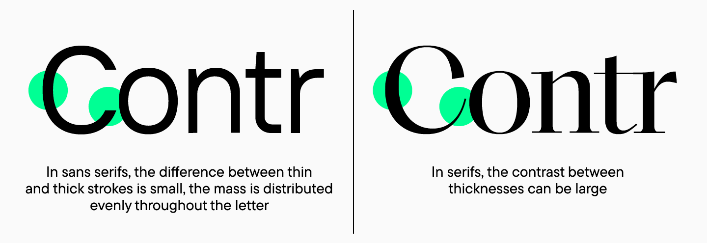
Auch der Kontrast zwischen Groß- und Kleinbuchstaben ist unterschiedlich. Bei serifenlosen Schriften ist er minimal, wodurch der gedruckte Text neutral wirkt, während der Kontrast bei Serifen sehr viel höher sein kann. Moderne Serifenschriften können jedoch auch kontrastarm sein.
Auch die Assoziationen, die Serifenschriften und serifenlose Schriften hervorrufen, sind unterschiedlich. Serifenschriften werden häufiger als klassisch, raffiniert oder streng beschrieben, während serifenlose Schriften als minimalistisch, einfach und ordentlich gelten.
Wie man eine Schrift auswählt
Um eine Schrift zu finden, die die Werte Ihrer Marke widerspiegelt, müssen Sie definieren, was Sie Ihrem Publikum vermitteln wollen. Angesichts der Vielfalt moderner Typografie kann die Auswahl überraschend sein. Immer mehr Schriftenstudios veröffentlichen neutrale Serifenschriften oder serifenlose Schriften mit ausgeprägtem Charakter.
Um eine bessere Vorstellung davon zu bekommen, welche Schrift für ein Projekt geeignet sein könnte, sollte man Beispiele anderer Unternehmen studieren und auf die Assoziationen achten, die eine Schrift weckt. Für moderne, junge Marken, die ökologische und technologische Aspekte betonen, könnte beispielsweise eine serifenlose Schrift mit ihren prägnanten Eigenschaften besser geeignet sein. Eine Serifenschrift passt zu Unternehmen, die ihre lange Geschichte und Tradition betonen oder ein Gefühl von Zuverlässigkeit und Stabilität vermitteln wollen.
Gleichzeitige Verwendung von Serifen- und Sans-Serif-Schriften
Manchmal haben Designer bei der Auswahl einer Schrift die Idee, mehrere Schriften gleichzeitig zu verwenden, von denen eine eine Serifenlose und eine andere Serifenschrift sein könnte. In der Praxis kommt diese Wahl nur selten vor, vor allem wenn die Schriften unterschiedliche Eigenschaften haben.
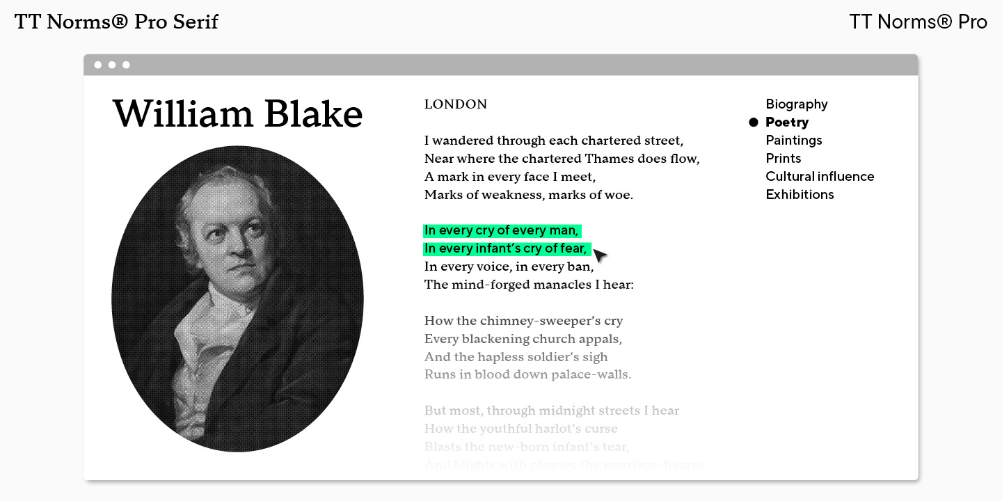
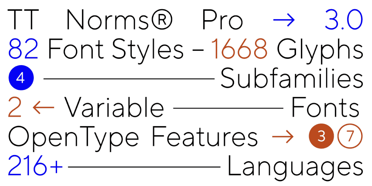
Am sichersten ist es, eine Serifenschrift und eine Serifenlose aus demselben Font zu verwenden, da diese Schriften als Schriftpaar erstellt werden. Im TypeType-Katalog können Sie zum Beispiel die TT Norms® Serif wählen, die als Teil der großen TT Norms®-Familie entwickelt wurde und eine geometrische Serife mit neutralem Charakter ist.
Stereotypen über Serifenschriften und serifenlose Schriften
„Eine serifenlose Schrift ist eine langweilige Schrift, die mit langweiligen Büroanwendungen in Verbindung gebracht wird, und eine Serifenschrift kann nicht modern sein und lässt die Marke alt aussehen“ – so lauten die Stereotypen, die auch heute noch vorherrschen.
Schriftdesigner arbeiten jedoch hart daran, mit diesen Mythen aufzuräumen, und bringen moderne, schöne Serifenschriften und elegante Serifenlose heraus, die sich flexibel gestalten lassen. Das Wichtigste ist, aus der Vielzahl der Schriften die eine zu finden, die perfekt zur Marke passt.
Die finale Auswahl
Die Typografie entwickelt sich ständig weiter und erfreut die Designer mit einer riesigen Anzahl von Schriften, die veröffentlicht werden. Manchmal ist es das Schwierigste, sich in dieser Fülle zurechtzufinden und die richtige Wahl zu treffen.
Wir hoffen, dass dieser Artikel zu einem Leitfaden wird, der die Suche nach einer Schrift übersichtlicher und spannender macht.
FAQ
Was ist der Hauptunterschied zwischen Serif- und Sans-Serif-Schriftarten?
Serif (Antiqua) bezieht sich auf Schriftarten mit kleinen dekorativen Strichen an den Enden der Buchstaben (Serifen). Sans Serif (Grotesk) bezieht sich auf Schriftarten ohne diese Striche; im Vergleich wirken sie oft knapper und neutraler.
Welche Schriftarten gelten als Serif und welche als Sans Serif?
Serifs sind Schriftarten mit «Füßen», die klassisch und traditionell wirken. Sans Serifs sind Schriftarten ohne diese Details, gekennzeichnet durch ein modernes und strenges Aussehen. Der Hauptvisuelle Unterschied ist das Vorhandensein oder Fehlen kleiner Striche an den Enden der Buchstaben.
Wann ist es besser, Serif-Schriftarten vs. Sans-Serif-Schriftarten zu verwenden?
Serifs werden oft für Druck verwendet: Bücher, Magazine, Poster; sie können elegant und auffällig sein. Sans Serifs funktionieren oft in der digitalen Umgebung – die meisten Websites verwenden sie.
Wie wirken sich Serif- und Sans-Serif-Schriftarten auf die Markenwahrnehmung aus?
Serifs werden meist als klassisch, traditionell, statusorientiert und elegant gelesen, manchmal vermitteln sie Zuverlässigkeit und Sicherheit. Sans Serifs werden öfter als minimalistisch, einfach und ordentlich wahrgenommen.
Können Serif- und Sans-Serif-Schriftarten zusammen in einem Design verwendet werden?
Ja, das kann man, aber es ist ein seltenes Szenario, das gut gelingt, besonders wenn die Schriftarten unterschiedliche Charaktere haben. Es ist sicherer, eine Serif und Sans Serif zu nehmen, die als Paar innerhalb einer Familie erstellt wurden, zum Beispiel TT Norms® Pro und TT Norms® Pro Serif.
Welche gängigen Missverständnisse gibt es über Serif- und Sans-Serif-Schriftarten?
Es gibt den Mythos, dass Sans Serif «langweilig und corporate» ist, während Serif «nicht modern sein kann» und eine Marke veraltet wirken lässt. Die Aufgabe des Designers ist es jedoch nicht, Etiketten zu glauben, sondern die Schriftart zu finden, die genau zur Marke passt.
Welche Schriftarten sind am leichtesten im Druck und auf dem Bildschirm zu lesen?
Am häufigsten werden Serifs im Druck verwendet (Bücher, Magazine), und Sans Serifs auf Bildschirmen (die meisten Websites). Aber die spezifische Schriftart entscheidet: Kontrast und die allgemeine „Neutralität“ des Textes sind wichtig.
Sind Serif-Schriftarten besser für formelle Dokumente?
Für offizielle Dokumente wirken Serif-Schriftarten (wie Times New Roman, Georgia) traditionell und akademisch, besonders im Druck. Moderne Standards erlauben jedoch zunehmend strenge Sans-Serifs (Arial, Calibri) für bessere Lesbarkeit in digitalen Formaten. Die Schlüsselregel ist, der etablierten Unternehmensvorlage oder dem Styleguide zu folgen.
Welche Beispiele für beliebte Serif- und Sans-Serif-Schriftarten gibt es?
Beliebte Schriftarten umfassen TypeType-Schriftfamilien: Serifs – TT Livret, TT Bells, TT Regins; Sans Serifs – TT Norms® Pro, TT Commons™ Pro, TT Turns. Als ordentliches Paar in einem Stil können Sie TT Norms® Pro und TT Norms® Pro Serif verwenden.
Wie wähle ich die richtige Schriftart für mein Projekt aus?
Berücksichtigen Sie zuerst, welche Werte und Assoziationen aus Ihrem Projekt gelesen werden sollen, und prüfen Sie Beispiele in ähnlichen Projekten. Wählen Sie dann zwischen einer knappen Sans-Serif und einer „historischen“ Serif basierend auf der erforderlichen Stimmung und Angemessenheit.