ttgertika
Type foundryBlogGrow and divide: Creating a font for the G8 festival

Grow and divide: Creating a font for the G8 festival

Grow and divide: Creating a font for the G8 festival

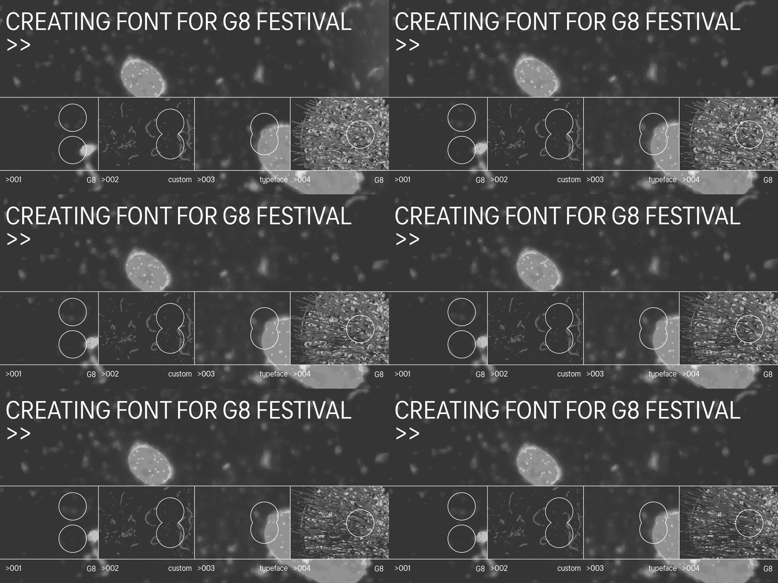
Creative industries Festival G8 has presented its 2022 visual identity. The associations that immediately come to mind are the unity of nature and people, cell division, and organics.

The «grow and divide» principle was guiding the creation of the corporate visual identity created by a large team. The font design studio TypeType is one of the participants in the creative process of making the font and logo.
Grow and divide: Creating a font for the G8 festival

The team was invited to participate in the project at the peak of creative activity. We were introduced to the visual identity concept, which TypeType had to sustain typographically in font development.

«Organics that visualize the dynamics of creative thought in the botanical world» is the main idea that was brought to life by the designer Denis Bashed and Easy Digital Agency.

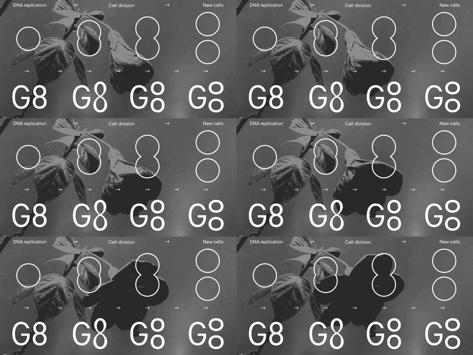
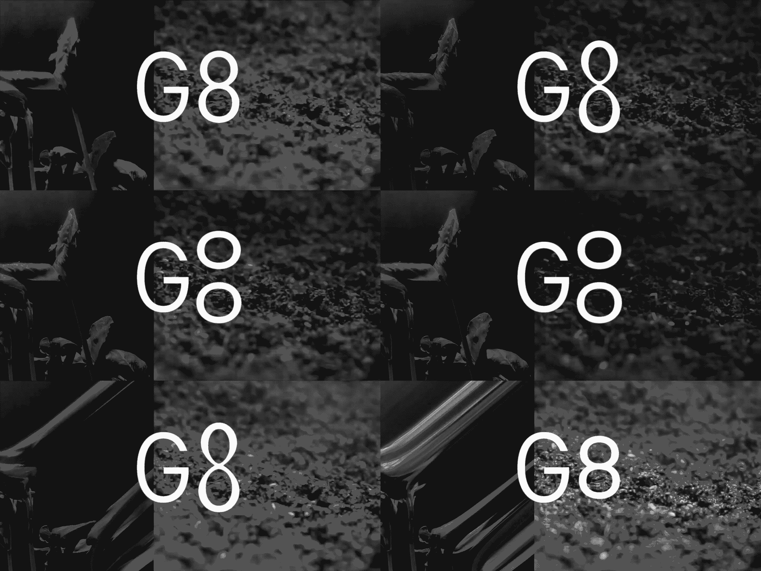
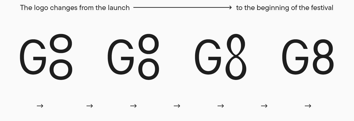
As noted by the organizers of G8, the «grow and divide» principle guiding the visual identics is also reflected in the new logo. It will change for the whole duration of the festival, growing, dividing, and becoming one whole entity again.
Grow and divide: Creating a font for the G8 festival

The team shared the idea to design all festival communications as experimental notes taken by scientists. We wanted to sustain this thought in typography. Selecting a font, we tried conveying an image of scientists describing the results of their experiments. We wanted to choose a font that would transmit the idea without attracting too much attention to itself. We were looking for a reasonably neutral font that would not be too ostentatious.

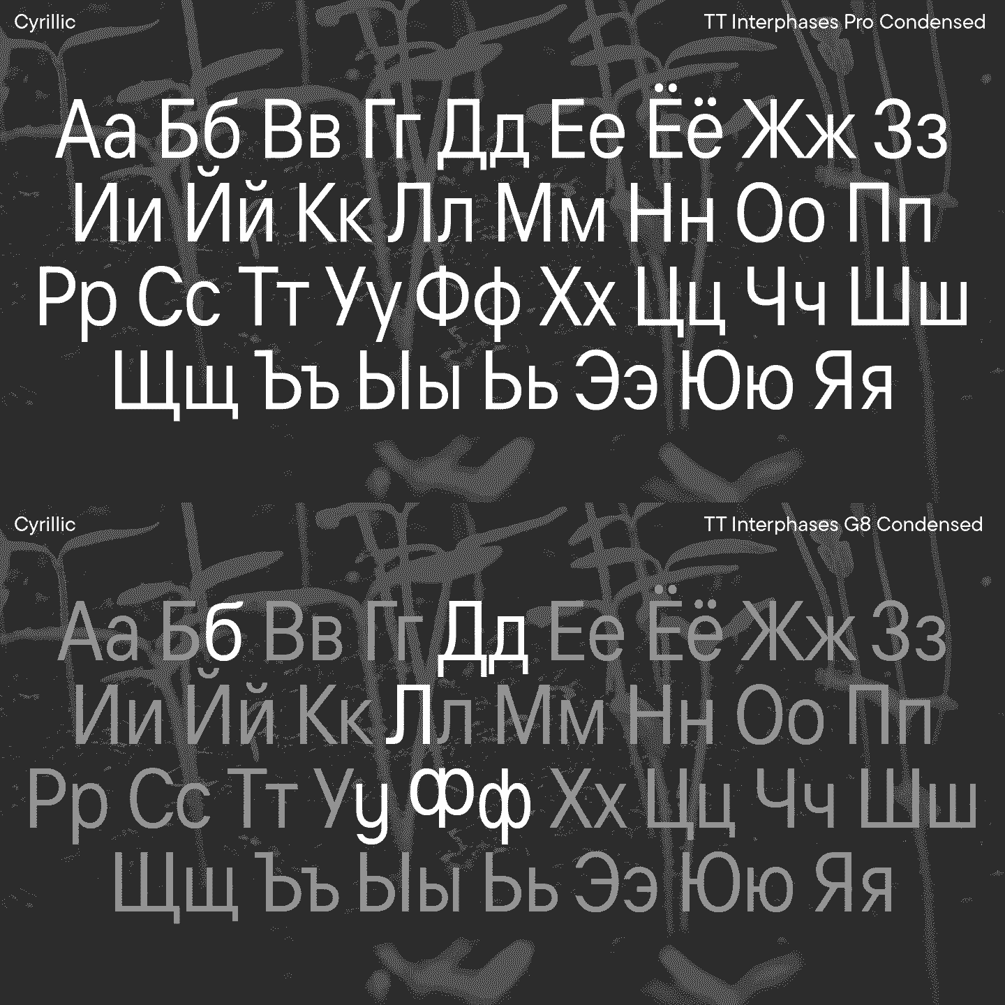
We were inspired by the fonts Cyrillized in the 80s and 90s with their «strange» Cyrillics that a modern onlooker is unfamiliar with. The studio’s TT Interphases was chosen as the basic font, and we selectively changed some of the glyphs so that the set would gain its slightly messy, quirky flair, bringing about the right associations.
Grow and divide: Creating a font for the G8 festival

We have to admit that among the options, there was a more radical version in which we changed some of the characters for «scientific» notations. But this idea seemed too straightforward, and we decided not to go there.

Grow and divide: Creating a font for the G8 festival

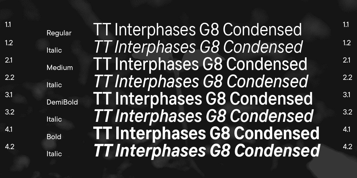
After internal iterations, we provided the festival team with 4 upright and 4 inclined faces with altered Cyrillic: Regular, Medium, DemiBold, Bold.
Grow and divide: Creating a font for the G8 festival

But before the work on the font began, the TypeType team was invited to participate in the creation of the festival’s logo. After discussing the concept, especially the «grow and divide» principle, we realized what we needed to do right away. The analogy between the number 8 and the dividing cells came almost immediately and we started to embody it. We decided to illustrate the process using a variable font, and that was how we found the right solution. You can see the result yourself.
Grow and divide: Creating a font for the G8 festival

Taking part in the G8 creative process was a great experience and thousands of participants and viewers can evaluate the results. We were happy to support the project on a not for profit basis.

Participants:

  • G8 festival organizer—Vitaly Bykov
  • Project art director—Denis Bashev
  • Head project designers—Easy Digital Agency
  • Corporate font and logo provider—TypeType

Latest publications

How to Choose the Best Infographic Fonts: Сomprehensive Guide

How to Choose the Best Infographic Fonts: Сomprehensive Guide

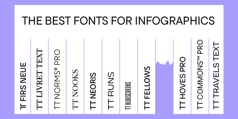
Infographics is a versatile and convenient tool that finds application everywhere: business, advertising, science, journalism, and more. This is a powerful way to communicate information in a simple, visual manner. Why is it so essential to choose the right font for your infographic, and how to do this? How do you pair fonts with each other? What fonts work best for marketplace infographics? Read on to find out!

See more
On Opposite Sides: Wide and Narrow Fonts

On Opposite Sides: Wide and Narrow Fonts

Wide and narrow fonts are among the newest trends in typography, graphic design, and web design. At first glance, some may seem odd and awkward, but when thoughtfully applied, they can infuse a project with freshness, boldness, relevance, and strength. What are narrow and wide fonts, what variations do they come in, and where are they used? Let’s explore this together in this article.

See more
How do you add a font to your computer? 

How do you add a font to your computer? 

How to install a new font on a PC? Users and designers face this question very often. Rest assured, there is nothing tricky in this process! This article provides a step-by-step guide to help you understand how to install downloaded fonts correctly on Windows and iOS-powered computers.

See more
Font Licensing: Complete Guide for Designers and Business Clients

Font Licensing: Complete Guide for Designers and Business Clients

In this article, you will find out what types of font licensing exist, how to choose a suitable font license and use it, how to verify and buy a commercial font license, and how to avoid unpleasant typeface licensing issues whether you are a designer or a client.

See more
Kerning, Tracking, Leading & Spacing in Typography: What’s the Difference?

Kerning, Tracking, Leading & Spacing in Typography: What’s the Difference?

Even seasoned designers sometimes mix up the concepts of kerning, tracking, spacing, and leading. Become a pro at distinguishing them! Learn the definitions of these concepts, explore their differences, and discover some helpful tips on how to use them while working on your fonts.

See more
Branching out: How Scandinavian Sans TT Firs Grew and Found Its Font Pair

Branching out: How Scandinavian Sans TT Firs Grew and Found Its Font Pair

In 2023, we breathed new life into the beloved Scandinavian sans serif TT Firs Neue by dramatically refining and renewing the typeface to comply with cutting-edge standards. Soon after, we introduced the text font pair for this typeface – an elegant TT Firs Text. This article is dedicated to how it all began, why we decided to update TT Firs Neue, what we added and modified, and how TT Firs Text was born.

See more
Top 10 Typography Trends of 2024

Top 10 Typography Trends of 2024

We live in a time when trends shift nearly every day, and typography design trends are no exception. We all encounter typography daily: on the web, in supermarkets, and on shop windows and signs. Outdated design, at the very least, induces boredom; at worst, it fosters distrust in the product or service. However, trendy design looks captivating and attractive.Experts and designers from the TypeType font studio are excited to share the key type trends of 2024 with you in this article. Stay trendy!

See more
15+ Best Magazine Fonts for Perfect Editorial Designs

15+ Best Magazine Fonts for Perfect Editorial Designs

Magazines are a perfect backdrop for typography to express all its dimensions. Fonts, in this case, not only communicate information but also directly influence the design. They deliver the magazine’s message, reflecting its values and ideas. In this article, we discuss how to choose the best magazine font and compile a list of 15 relevant options for editorial designs on various themes.

See more
UniversiTTy: Lesson 9. Uppercase Characters. Detailed Contour Refinement

UniversiTTy: Lesson 9. Uppercase Characters. Detailed Contour Refinement

Welcome to the ninth lesson of our «UniversiTTy»! In this series, we guide you through the process of font design step by step. The font is a cohesive visual system. This can be seen on all levels: global (font type, weight, proportions, contrast, general forms) and at lower scales that encompass all graphic choices in individual characters. Let’s find out together how visual details influence the overall perception of fonts.

See more

See more

Expansion of the TT Hoves Pro family

Expansion of the TT Hoves Pro family

TT Hoves is the youngest font in the collection of universal geometric sans serifs. It forms a functional trio with TT Norms® and TT Commons™, yet has its own recognizable character.
The TT Hoves font has managed to win the sympathy of designers from all over the world. The font family has been among the studio’s bestsellers since its release on marketplaces, and yet it’s time to update the typeface!

See more
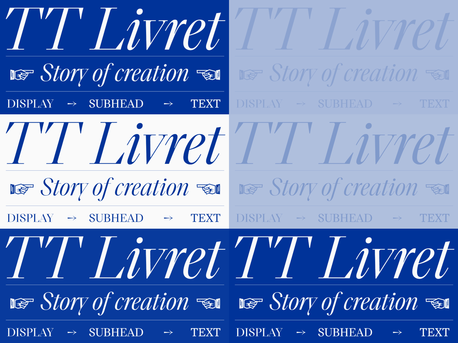
Creation of a modern serif TT Livret

Creation of a modern serif TT Livret

It sometimes happens that on paper, a new font seems to be a relatively simple and quick task, but as a result of the work, it turns into one of the largest projects of recent years. Today’s story is about just such a font.

See more
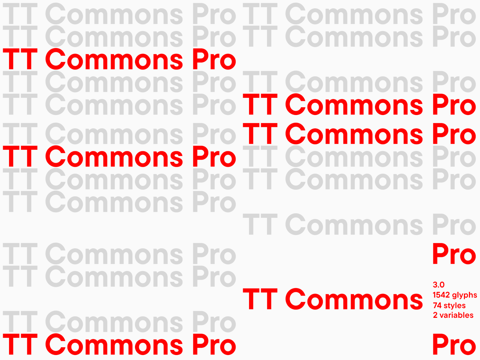
Creation of TT Commons™: From the foundry’s corporate typeface to a bestseller

Creation of TT Commons™: From the foundry’s corporate typeface to a bestseller

The TT Commons™ Pro font family needs no introduction as it has been TypeType’s best-seller for many years now. These are not just words — since 2018, the font family has been a bestseller for 93% of the time it has been on the sites.
TT Commons has a fascinating history, because it was created in 2016, and back then it was not supposed to be released as a commercial font at all.

See more
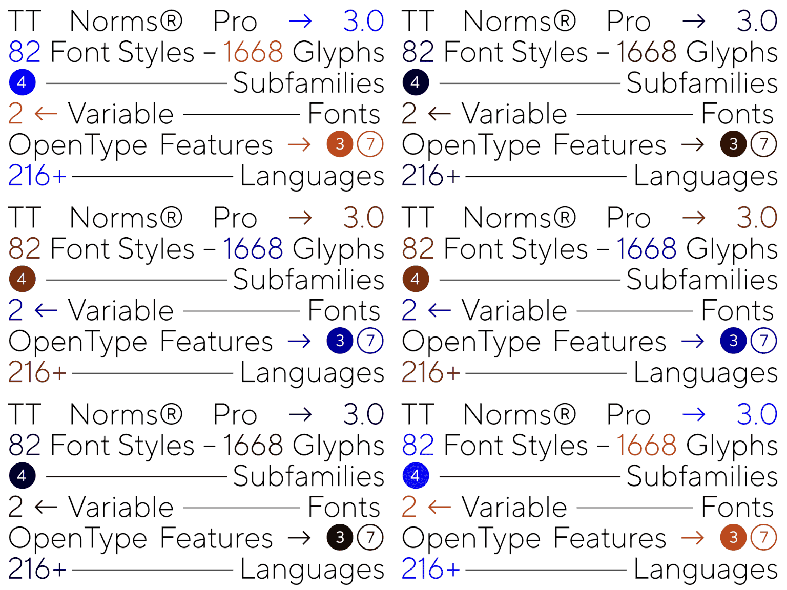
TT Norms® Pro: a 7-year history of the font family

TT Norms® Pro: a 7-year history of the font family

TT Norms® Pro is one of the most sought-after typefaces in the TypeType collection. More than three reissues in 7 years, first lines in MyFonts ratings, dozens of customizations and reviews.
It’s hard to put into words what a valuable experience this font has been for everyone at the foundry, but we will try to tell its full story, with all its dead ends and mistakes, with the first victories and a massive redrawing process.

See more
Change faces while maintaining the layout—revealing the secrets of creating the uniwidth font TT Fellows

Change faces while maintaining the layout—revealing the secrets of creating the uniwidth font TT Fellows

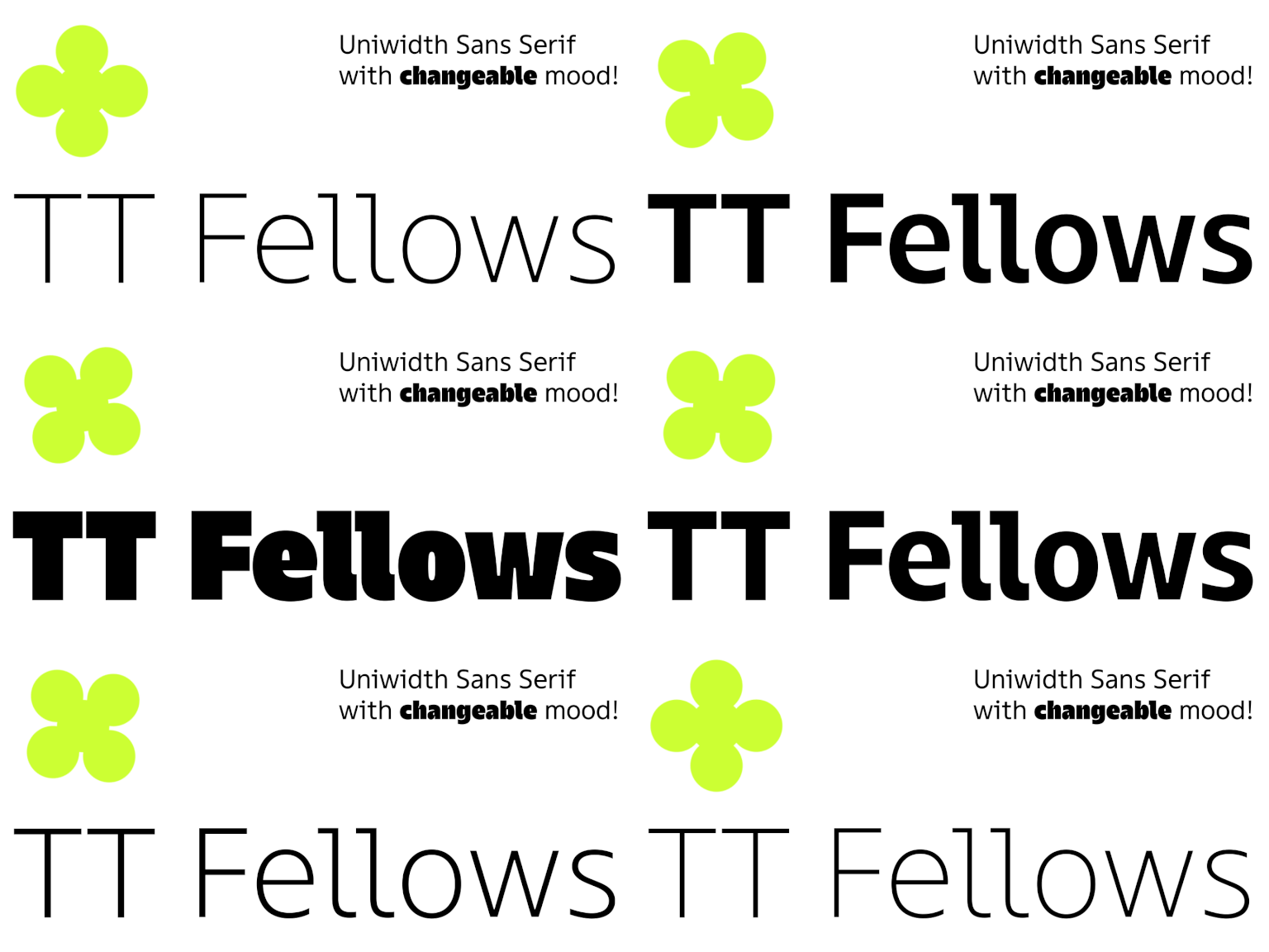
In January 2022, a new TypeType font TT Fellows was released on sales platforms. Almost immediately, it attracted the attention of designers from all over the world, which is not surprising, because this versatile, concise, and functional typeface is suitable for most modern projects.

See more
Felliniana: Font Mastering for the Venice Film Festival

Felliniana: Font Mastering for the Venice Film Festival

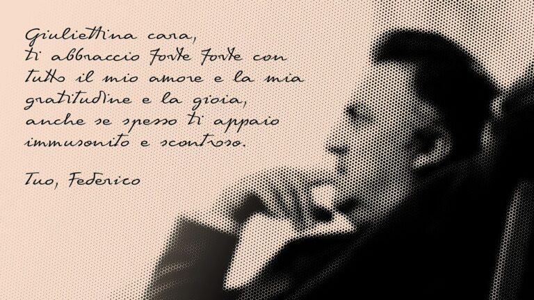
A font is a work of art. Many designers think so, but we will talk not about the industry as a whole but about a specific font which is of interest for art lovers. It has all that is necessary: a beautiful creation story, aesthetics, and line flow. The Italian font designer Antonio Pace created the font for the Capelli Identity Design studio, and TypeType transformed their creation into a functional work instrument.

See more
OT L22: Mastering a Font for the Legendary Typewriter’s 70th Anniversary

OT L22: Mastering a Font for the Legendary Typewriter’s 70th Anniversary

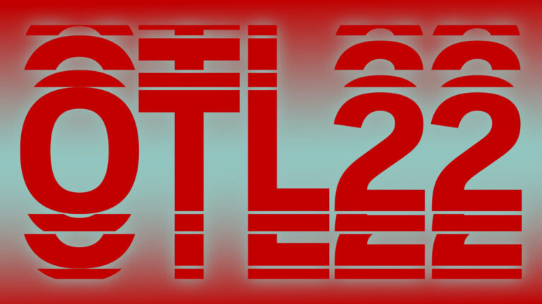
Technical work on a new typeface by third-party designers always arouses professional curiosity. Especially when it comes to working with fonts for brands with a world-famous history.
Olivetti is an Italian company whose name inspired admiration and respect in the 20th century, especially among journalists and writers.

See more
Creating a customized version of TT Trailers with pet-friendly diacritics

Creating a customized version of TT Trailers with pet-friendly diacritics

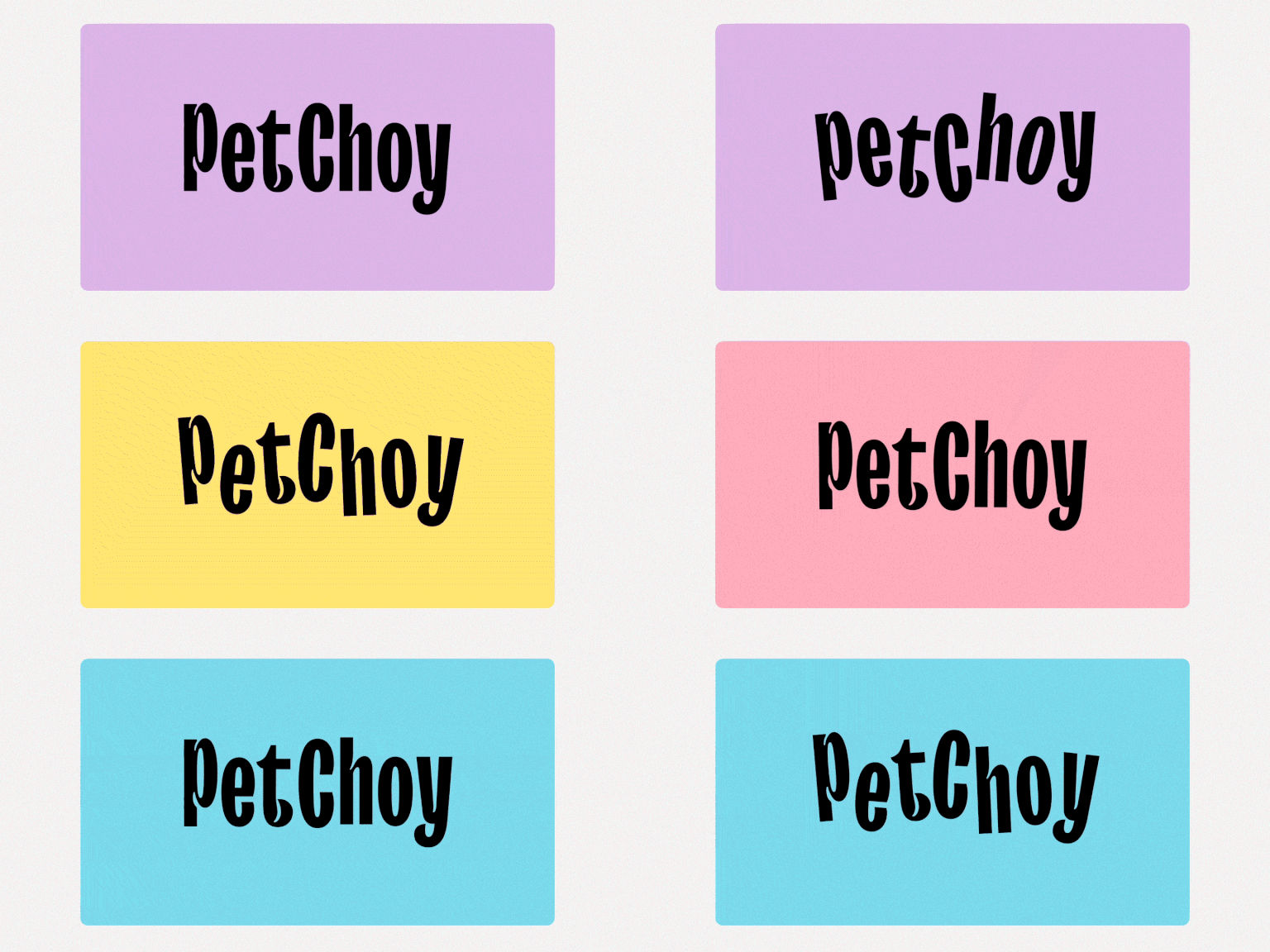
How often have you come across hidden kitties and puppies right in the letters? If never, do hurry to read this case.

See more
Customized version of TT Hoves for True Digital agency

Customized version of TT Hoves for True Digital agency

TypeType received a font customization request from True Digital Ltd, a marketing agency from Great Britain. The company emphasizes a sincere and involved approach to brand promotion. They wanted to underline their concept by adapting a font to their corporate style.

See more