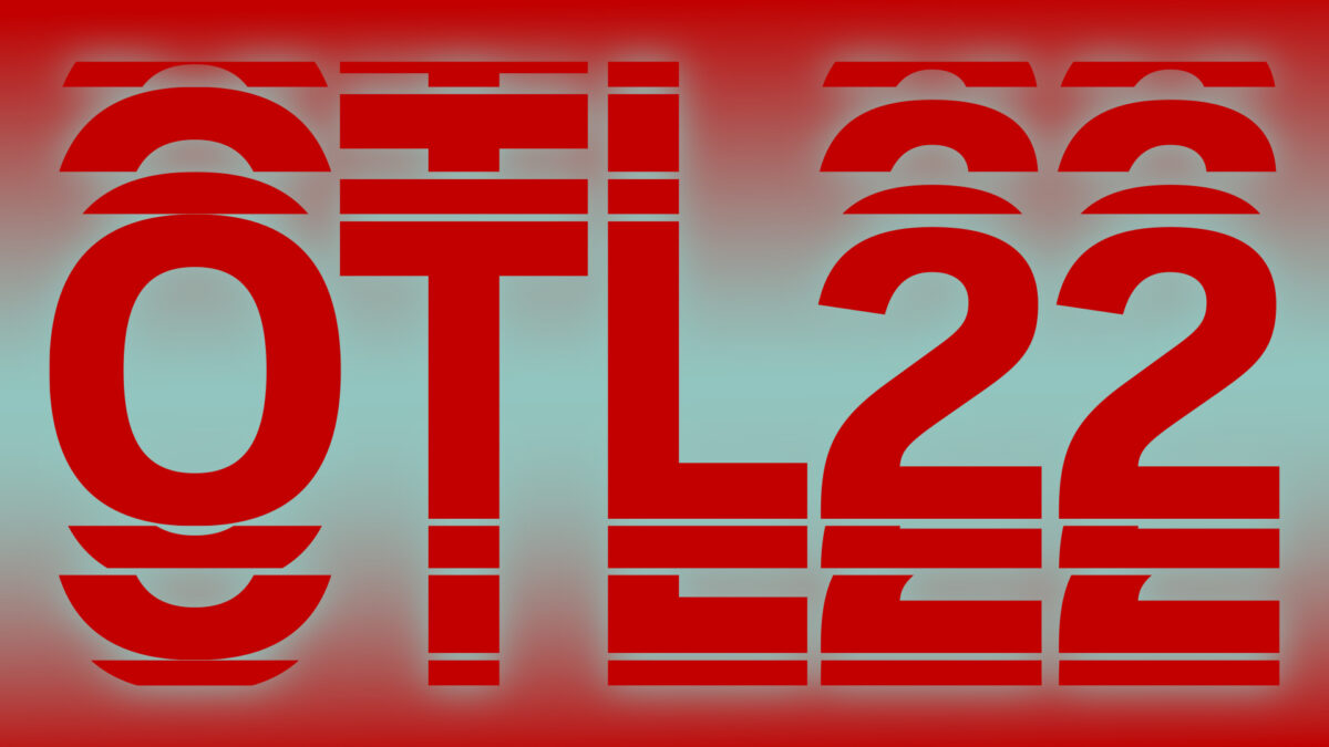
Das Festival der kreativen Industrien G8 hat seine visuelle Identität für das Jahr 2022 vorgestellt. Sofort kommen Assoziationen auf: sich teilende Zellen, organische Formen und die Einheit von Mensch und Natur.
Nach dem Prinzip „wachse und teile“ wurde der Markenstil entwickelt, an dem ein großes Team mitwirkte. Das Schriftgestaltungsstudio TypeType war einer der Akteure im kreativen Prozess der Entwicklung des Schriftsatzes und des Logos.
Das Team des Studios wurde mitten im kreativen Prozess in das Projekt eingebunden. Man stellte uns die Konzeption der Markenidentität vor, die das Studio TypeType typografisch unterstützen sollte, indem es einen Schriftsatz entwickelte.
„Organik, die die Dynamik kreativer Gedanken durch die Welt der Pflanzen visualisiert“ — so lässt sich die zentrale Idee formulieren, die von Easy Digital Agency und dem Designer Denis Bashev umgesetzt wurde.
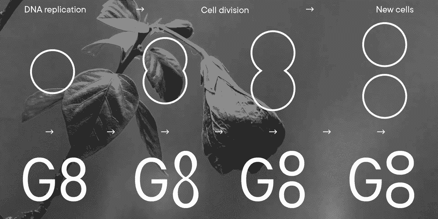
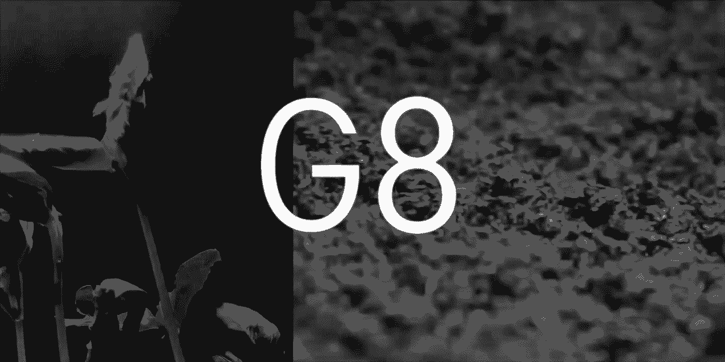
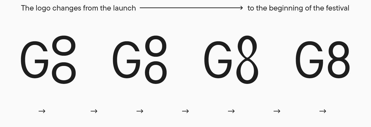
Wie die Organisatoren des G8-Festivals betonten, spiegelt das Prinzip „wachse und teile“, das in die visuelle Identität eingebracht wurde, auch im neuen Logo wider. Während des gesamten Festivals wird sich dieses Logo verändern: Es wird wachsen, sich teilen und wieder zu einem Ganzen verschmelzen.
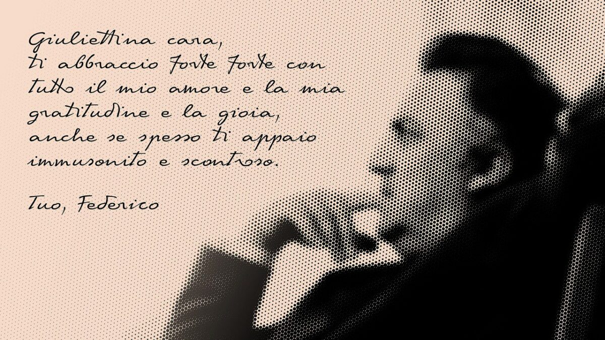
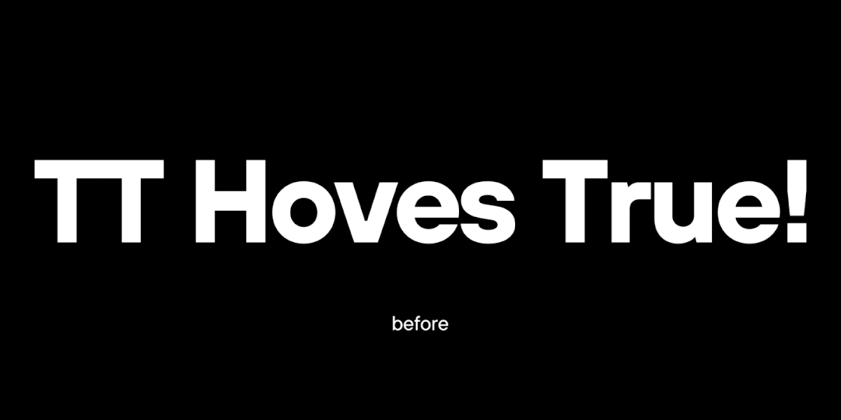
Das Team entwickelte die Idee, alle Kommunikationsmittel des Festivals im Stil von Notizen von Wissenschaftlern zu gestalten, die ein Experiment beobachten. Wir wollten diese Idee typografisch unterstützen. Bei der Auswahl des Schriftsatzes für das Projekt war es unser Ziel, das Bild von Wissenschaftlern widerzuspiegeln, die die Ergebnisse ihrer Experimente beschreiben. Wir suchten nach einem Schriftsatz, der die Idee unterstützt, ohne zu sehr die Aufmerksamkeit auf sich zu ziehen. Es sollte ein maßvoll neutraler, nicht zu auffälliger Schriftsatz sein.
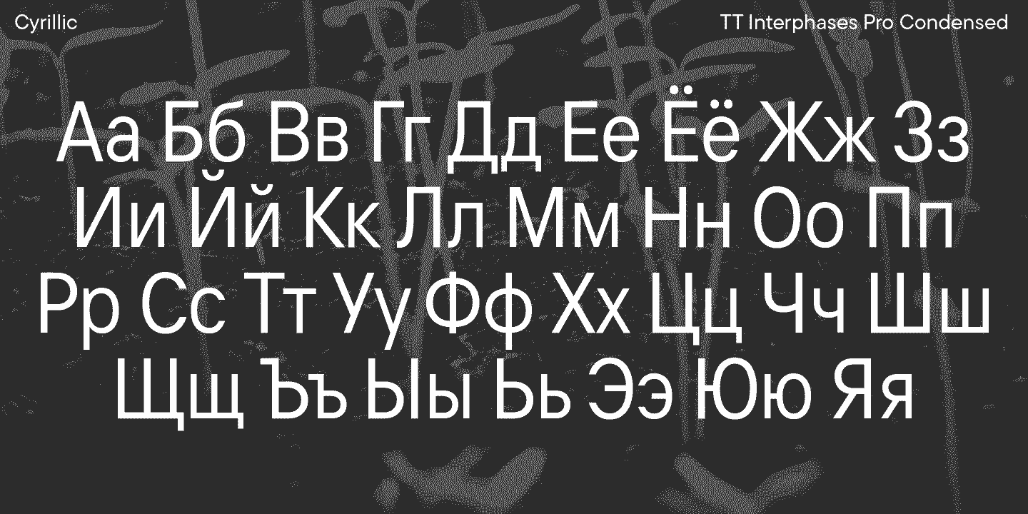
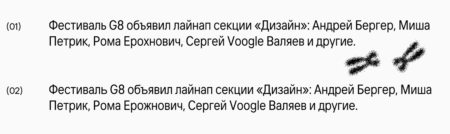
Inspiration fanden wir in den in den 80er- und 90er-Jahren kyrillisierten Schriften mit einer „seltsamen“, für heutige Betrachter ungewöhnlichen kyrillischen Schrift. Als Basis wählten wir den Schriftsatz TT Interphases des Studios, genauer gesagt die schmale Version, und veränderten gezielt einige Glyphen, um dem Schriftsatz einen leicht unordentlichen, skurrilen Charme mit den richtigen Assoziationen zu verleihen.
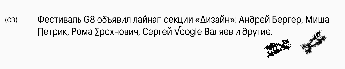
Es sei erwähnt, dass unter den Varianten auch eine radikalere Version existierte, bei der wir einige Zeichen des Schriftsatzes durch „wissenschaftliche“ Zeichen ersetzten. Diese Idee erschien uns jedoch zu direkt, weshalb wir sie verwarfen.
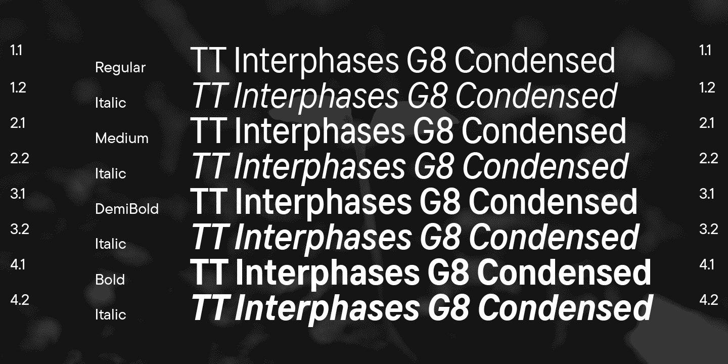
Nach internen Iterationen stellten wir dem Festivalteam vier aufrechte und vier kursive Schnitte mit veränderter kyrillischer Schrift zur Verfügung: Regular, Medium, DemiBold und Bold.
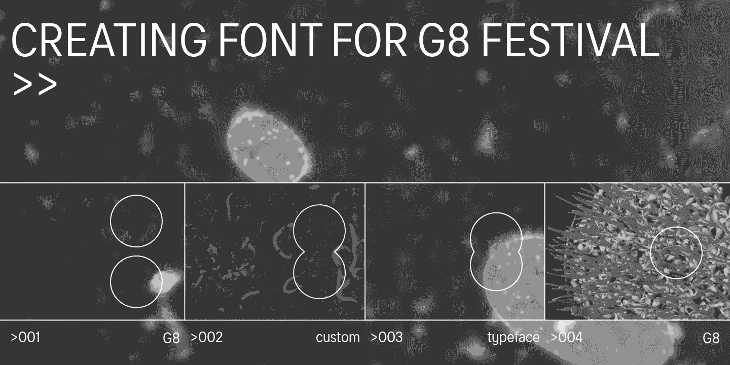
Bevor jedoch die Arbeit am Schriftsatz begann, wurde dem Team von TypeType angeboten, an der Entwicklung des Logos für das Festival mitzuwirken. Nach Diskussionen über das Konzept, insbesondere das Prinzip „wachse und teile“, war uns sofort klar, was zu tun war. Die Assoziation zwischen der Zahl 8 und sich teilenden Zellen kam fast augenblicklich, und wir begannen, diese umzusetzen. Wir entschieden uns, diesen Prozess durch einen variablen Schriftsatz darzustellen — so fanden wir die passende Lösung. Das Ergebnis können Sie selbst sehen.
Die Teilnahme am kreativen Prozess für das G8-Festival war eine großartige Erfahrung, deren Ergebnisse von Tausenden von Teilnehmern und Besuchern geschätzt werden können. Wir haben dieses Projekt mit Freude auf nicht-kommerzieller Basis unterstützt.
Beteiligte Personen:
- Organisator des G8-Festivals: Vitaliy Bykov
- Artdirektor des Projekts: Denis Bashev
- Hauptdesigner des Projekts: Easy Digital Agency
- Anbieter des Markenschriftsatzes und Logos: TypeType