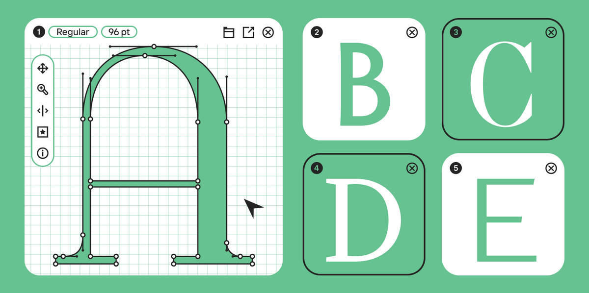
In fast jedem Musikstück, in dem Gesang die Hauptrolle spielt, gibt es mehr als eine Stimme. Manchmal merkt man es nicht sofort, aber die Momente, in denen man Gänsehaut bekommt, werden durch eine andere Stimme ergänzt – einen Ton tiefer oder höher, um den Effekt zu betonen und zu verstärken. Oft werden solche Fragmente von Backgroundsängern vorgetragen, damit der Unterschied durch die verschiedenen Töne beim Zuhörer noch emotionaler wirkt.
Man kann sich eine Schrift wie eine Stimme vorstellen, denn sie vermittelt dem Leser nicht nur Informationen, sondern ist auch eine Quelle von Emotionen. Wir haben bereits gesagt, dass die Stimme einer Marke ihre Schrift ist. Jetzt ist es an der Zeit, darüber zu sprechen, wie man die Hauptstimme einer Marke mit Hilfe von Schriftpaaren verstärken kann und welche intelligenten Möglichkeiten es gibt, die Kombination von Schriften zu steuern, um die gewünschte Wirkung auf den Leser zu erzielen.
Außerdem erfahren Sie am Beispiel der TT Norms® Pro Serif, wie Schriftpaare innerhalb einer Familie entstehen und wo sie am besten eingesetzt werden.
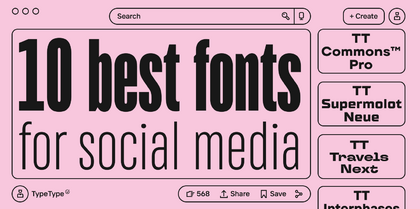
Was ist ein Schriftpaar?
Nicht alle Schriften machen in einem Projekt eine gute Figur. Designer wissen, dass es schwierig sein kann, überhaupt eine geeignete Schrift für ein Projekt auszuwählen, und noch schwieriger ist es, das perfekte Schriftpaar zu finden. Doch zunächst wollen wir herausfinden, was man im Allgemeinen unter einem Schriftpaar versteht.
Ein Schriftpaar ist eine Kombination von zwei Schriften in einem Projekt. Das Besondere daran ist, dass in einer solchen Kombination jede Schrift ihre eigene Aufgabe hat. In der Regel soll die eine Schrift die Aufmerksamkeit auf sich ziehen, die andere soll Informationen vermitteln und das Lesen des Textes nicht behindern. Überschriften und Hervorhebungen werden in der ersten Schrift gesetzt, der Haupttext in der zweiten.

Wichtig ist, dass die Chemie zwischen den beiden ausgewählten Schriften stimmt, sie müssen sich gut ergänzen. Sonst entsteht keine Magie, und der Leser erlebt nicht die Emotionen, die der Marke innewohnen.
Die Auswahl solcher Schriften ist ein kreativer Prozess. Es gibt kein Regelwerk, das genau festlegt, ob Schriften zusammenpassen oder nicht.
Wozu Schriftpaare gut sind
Natürlich kann man eine Schrift für eine Marke verwenden, ohne sich die Arbeit durch die Suche nach einem Schriftpaar zu erschweren. Das ist der einfachste und sicherste Weg für einen Designer.
Die Wahrheit ist, dass dies nicht immer der richtige Weg ist. Die menschliche Aufmerksamkeit funktioniert so, dass wir uns nur schwer über längere Zeit auf monotone Dinge konzentrieren können, wir brauchen Ankerpunkte. Beim Lesen sind solche Anker Textabschnitte, die sich optisch abheben.
Das Schriftpaar hilft, die Aufmerksamkeit des Lesers zu lenken. Eine größere Schriftgröße und eine ausdrucksstarke Schrift, die sich vom Fließtext unterscheidet, erleichtern das Lesen der Überschrift. Hervorhebungen im Fließtext werden durch Kursiv- oder Fettdruck erreicht.
Die Verwendung von zwei verschiedenen Schriften erleichtert dem Publikum die Orientierung und verstärkt die emotionale Botschaft der Marke.
Grundlagen der Schriftkombination
Es gibt Dutzende von Artikeln über Schriftkombinationen, aber keiner davon enthält klare Regeln für die Auswahl einer Schrift. Viele Komponenten sind für die Chemie zwischen Schriften verantwortlich, und nicht alle können in Form von Anweisungen formuliert werden.
Wir werden jedoch über die Erstellung eines Schriftpaares für die meistverkaufte TT Norms® Pro des Studios sprechen, um später Empfehlungen des Studios geben zu können. Diese werden in Zukunft bei der Auswahl einer harmonischen Schriftkombination helfen.
TT Norms® Pro Sans Serif und TT Norms® Pro Serif
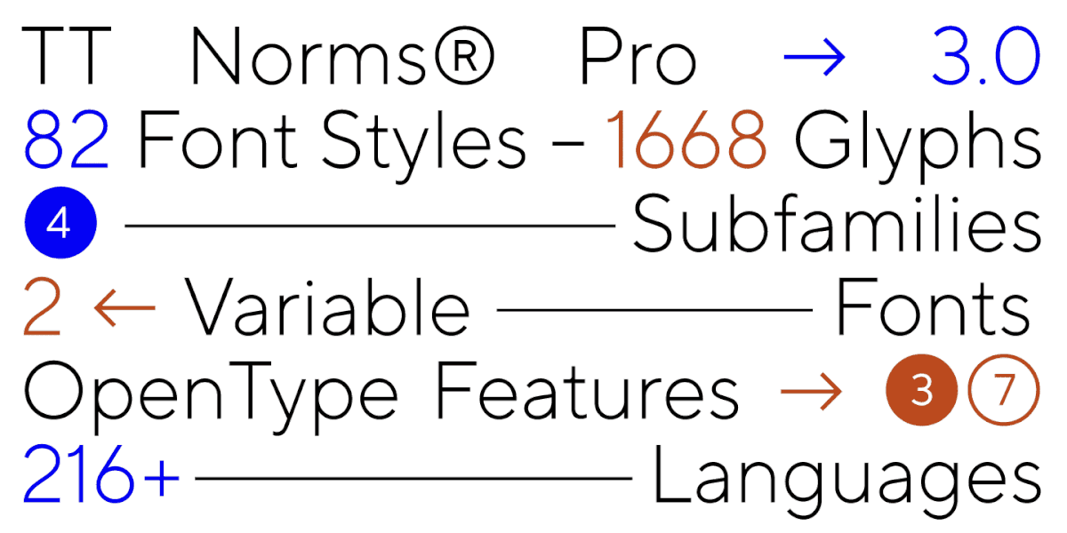
TT Norms® Pro ist die meistverkaufte Schrift vom Studio TypeType. Die Schrift ist zur Stimme von Marken wie Cartoon Network, Sartorius, Intercom, CSN und vielen anderen geworden.
Ihre Beliebtheit verdankt die TT Norms® Pro unter anderem der Tatsache, dass sie eine geometrische Serifenlose mit neutralem Charakter ist. Sie ist eine vielseitige, moderne und stilvolle Schrift, deren Charakter sich leicht an verschiedene Anwendungsbereiche anpassen lässt.
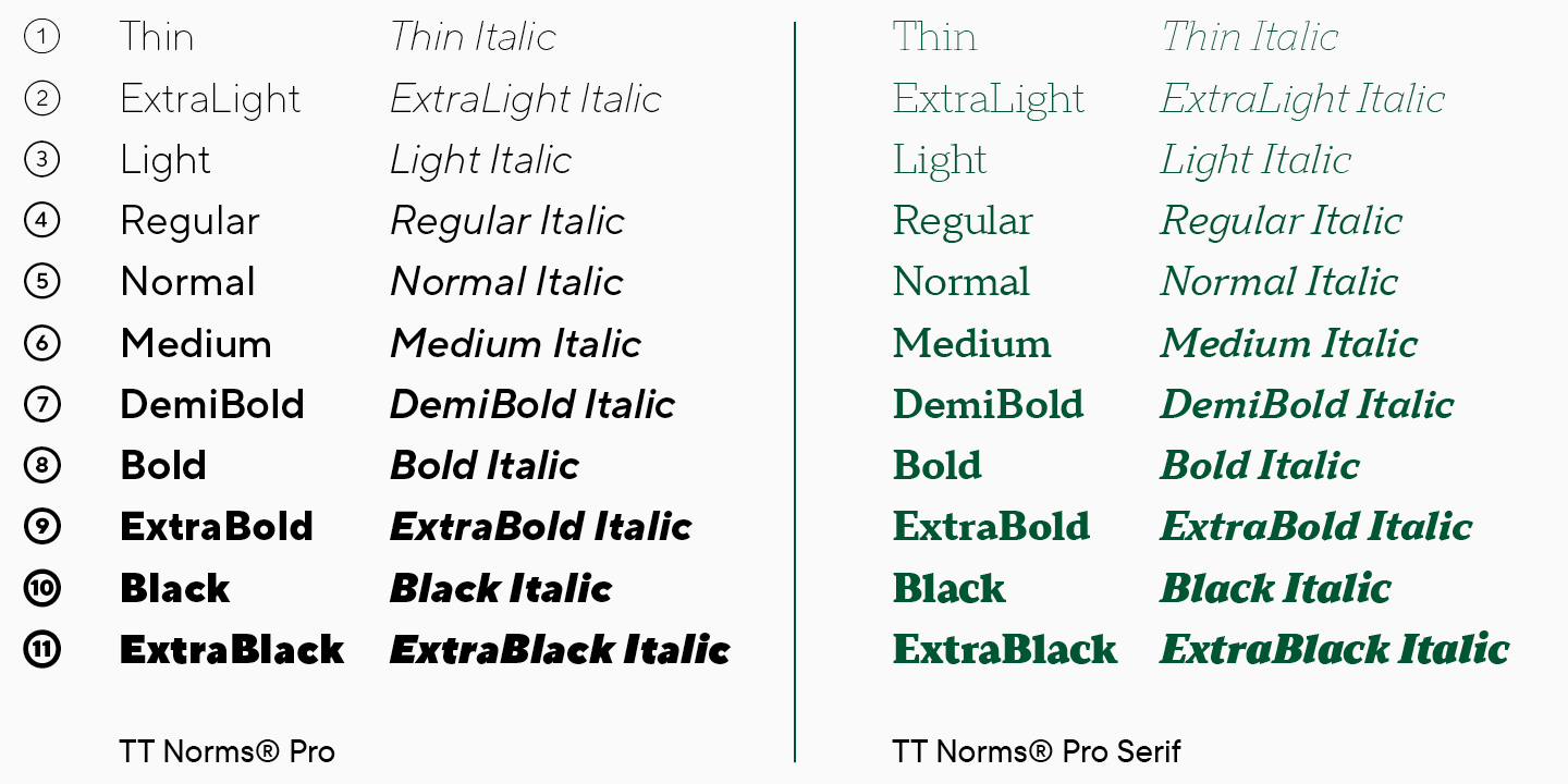
Die Schriftfamilie wurde mehrfach erweitert, unter anderem um eine Monospace-Version der TT Norms® Pro Mono, neue Schnitte und Sprachen. Aufgrund ihrer Vielseitigkeit fällt es nicht schwer, ein Schriftpaar für die TT Norms® Pro auszuwählen, aber TypeType entschied sich, das perfekte Paar zu entwickeln und eine Serifenschrift zu entwerfen, die die serifenlose Schrift harmonisch ergänzt.
Wir wollten nicht nur eine Ergänzung zur klassischen Version schaffen, sondern auch eine Textschrift, die Designer allein oder in Kombination mit anderen Schriften verwenden können.
Wir begannen mit einer Recherche, bei der wir große Schriftfamilien anderer Studios und Autoren untersuchten, in denen sowohl Serifen- als auch Sans-Serif-Schriften vorkommen. In der Testversion untersuchten wir, wie ähnlich die neue Serifenschrift der TT Norms® Pro sein sollte.
Die endgültige Version der TT Norms® Pro Serif ist ein Gleichgewicht zwischen der Ähnlichkeit der Zeichen und den visuellen Unterschieden in den Formen.
TT Norms® Pro ist eine serifenlose Schrift mit geringem Kontrast und mäßigem Charakter. Wie Sie wissen, sind Serifen und ein hoher Strichkontrast charakteristisch für Serifenschriften, aber die Veränderung dieser beiden Komponenten reicht nicht aus, um ein Schriftpaar zu bilden.
Damit die Schriften perfekt miteinander harmonieren und die Chemie zwischen ihnen stimmt, muss noch etwas hinzukommen, das die Serifen zu einer wirklich eigenständigen Schrift macht.
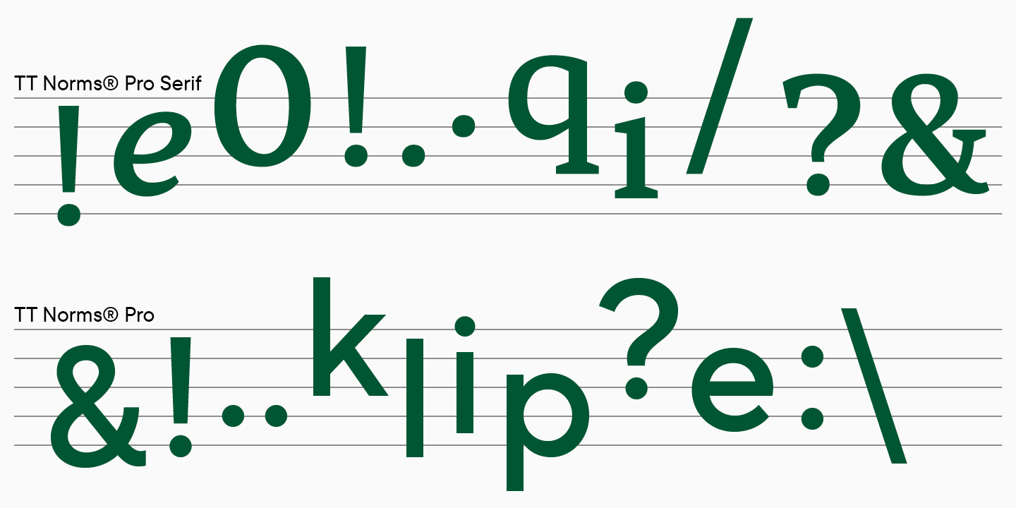
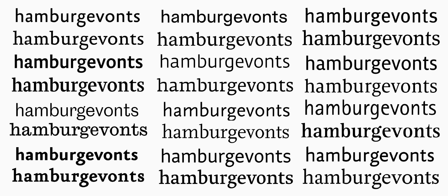
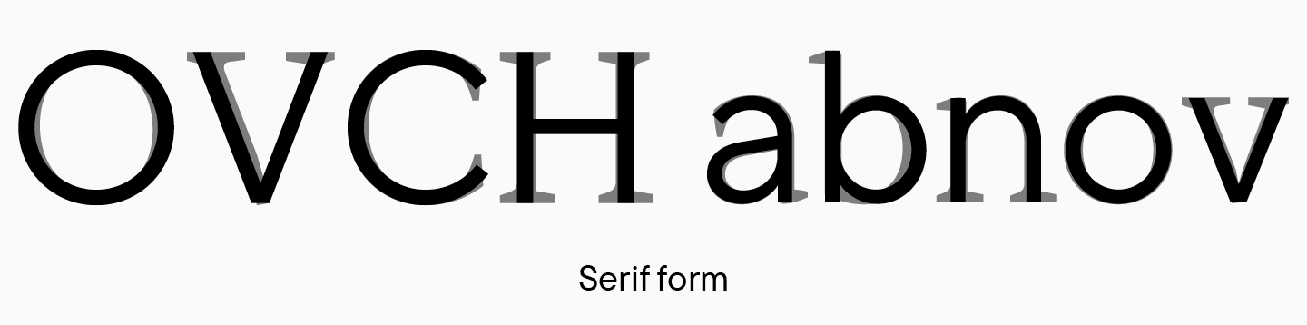
Die TT Norms® Pro Serif hat ihre eigenen, unverwechselbaren Merkmale.
- Sie ist härter geworden. Die Bogeneinläufe und die Form der Halbovale haben sich verändert.

- Die Kreise der Buchstaben sind rund geblieben, die Ovale sind dynamischer geworden. In der TT Norms® Pro ist das Oval vertikal symmetrisch, während in der TT Norms® Pro Serif eine Neigung in den runden Zeichen auftritt.

- Der Buchstabe g verändert seine Form und wird zweistufig, was für die meisten Serifenschriften typisch ist, bei Groteskschriften jedoch selten vorkommt.

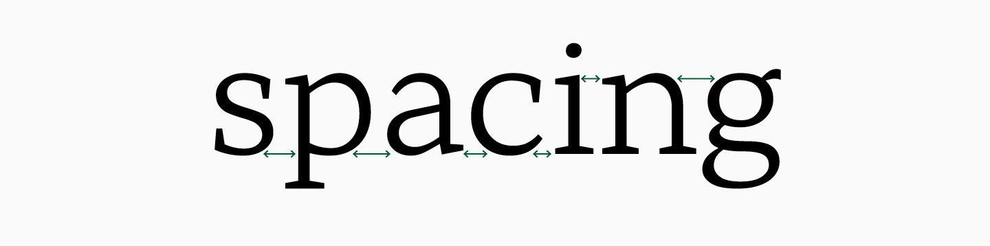
- Die Schrift ist durch die Serifen etwas breiter geworden, aber die Abstände wirken dichter, da die Serifen optisch mehr Weißraum einnehmen.
Trotz der Unterschiede sind sich die Zeichen der beiden Schriften in vielerlei Hinsicht ähnlich. Dies ist visuell wahrnehmbar und wird bei genauer Betrachtung der Strukturen deutlich.
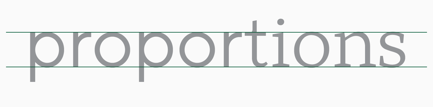
- Höhe und Proportionen der Zeichen sind gleichgeblieben. Dies erleichtert die gemeinsame Verwendung, da man die Schriften nebeneinandersetzen kann, sogar in derselben Zeile, ohne dass die visuelle Harmonie verloren geht.
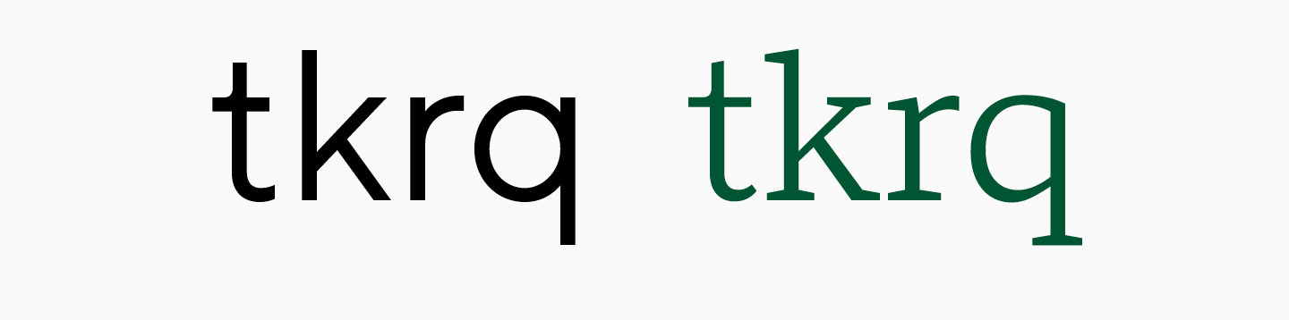
- Die gleiche Öffnung und der ähnliche Aufbau vieler Zeichen wie t, k, r, q tragen dazu bei, dass die Schriften harmonieren.
- Der Zeichensatz der beiden Schriften ist nahezu identisch, TT Norms® Pro Serif verfügt über erweiterte kyrillische und lateinische Zeichen, eine Vielzahl von Währungen und Satzzeichen.
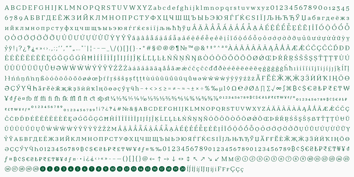
- Die neue Serifenschrift wurde mit vertrauten OpenType-Funktionen ausgestattet, um die Funktionalität der Schrift zu gewährleisten.
Designer, die mit der TT Norms® Pro vertraut sind, können problemlos mit der neuen serifenlosen Schrift arbeiten. Auch bei der Auswahl der Schriftschnitte gibt es keine Probleme, da die Namen der Serifenschrift mit denen der TT Norms® Pro-Schriften identisch sind. Trotz der unterschiedlichen Strichstärken wurden die serifenlosen Schriften so konzipiert, dass sie mit den TT Norms® Pro-Schriften kompatibel sind und die Designer die Schriften paarweise verwenden können.
Ein schönes Extra der TT Norms® Pro Serif ist die Kursiv-Version, die sich völlig von den schrägen Serifenlosen unterscheidet. Wir haben eine echte Kursivschrift geschaffen, bei der die Form der Buchstaben von Grund auf neugestaltet wurde. Dabei haben wir uns von den Formen der Serifenschriften inspirieren lassen, ohne uns zu sehr an den Serifenlosen zu orientieren.
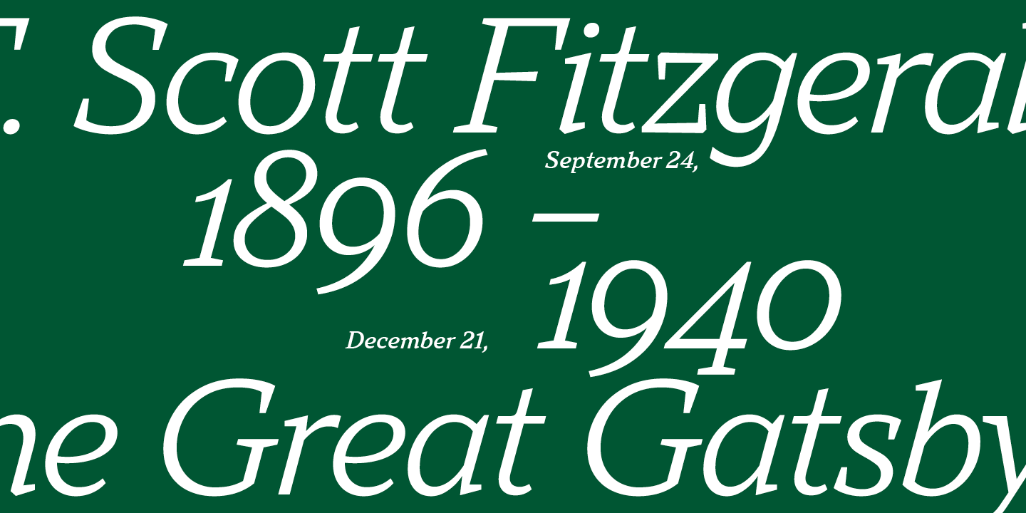
Die schrägen Flächen der TT Norms® Pro Serif sind ideal, um den in der TT Norms® Pro gesetzten Text zu betonen. Die Kursivschrift zieht die Aufmerksamkeit des Lesers auf sich und wirkt gleichzeitig harmonisch, da in ihren Formen der Charakter der ursprünglichen TT Norms® Pro noch erkennbar ist.
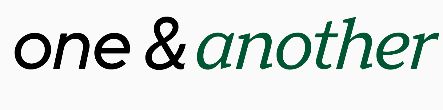
Das Schriftpaar TT Norms® Pro Sans Serif und TT Norms® Pro Serif Serif ist ein Duo, bei dem die eine Schrift die andere ergänzt. Während die moderne, universelle und neutrale Serifenlose vielen bekannt ist, muss man die konservativere und strengere Textserif erst noch kennen lernen. Wie genau Sie diese Schriften kombinieren, bleibt Ihnen überlassen.
Unsere Empfehlungen für die Kombination von Schriften
Die Kombination einer serifenlosen mit einer serifenbetonten Schrift ist eine häufige Variante eines Schriftpaares. Das hat seinen Grund, denn damit Schriften miteinander kombiniert werden können, müssen mehrere Kriterien erfüllt sein. Die Schriften müssen unterschiedlich sein, sie müssen etwas gemeinsam haben und sie müssen zusammen den gewünschten Eindruck auf den Betrachter machen. Letzteres ist ein wenig wie Magie, denn es muss eine Chemie zwischen den Schriften bestehen, die es ermöglicht, Emotionen hervorzurufen. Die ersten beiden Kriterien lassen sich jedoch erklären, und wir haben Empfehlungen zusammengestellt, die Ihnen bei der Auswahl eines Schriftpaares helfen sollen.
- Die Schriften müssen sich voneinander unterscheiden. Serifenlose Schriften und Schriften mit Serifen werden oft zusammen gesehen, da sie sich in erster Linie durch ihre Serifen und ihren Kontrast unterscheiden. Die Wahl einer beliebigen Serifenschrift und einer serifenlosen Schrift bedeutet jedoch nicht, dass man sich für ein Schriftpaar entschieden hat.
- Schriften müssen Schnittmengen haben. Sie können sich in der Gestaltung einzelner Zeichen ähneln, die gleichen Proportionen haben, aus der gleichen historischen Epoche stammen oder einen ähnlichen Charakter haben.

- Schriften sollen sich gut ergänzen. Dies ist ein schwieriges Kriterium, da man nur intuitiv beurteilen kann, wie attraktiv Schriften in Kombination sind. Es gibt jedoch eine Möglichkeit, die Kompatibilität zu überprüfen. Versuchen Sie, die Schrift aus der Distanz zu betrachten und sich ihren Charakter so vorzustellen, als würden Sie eine Person beschreiben. Stellen Sie sich folgende Fragen: Was trägt diese Person, wie alt ist sie, wie klingt ihre Stimme, welchen Kleidungsstil bevorzugt sie? Wenn Sie sich vorstellen, wie die Schrift aussieht, können Sie erraten, welches Zeichen daneben fehlt. Dies kann ein Zeichen sein, das das erste Zeichen ergänzt, indem es die fehlenden Merkmale aufweist.

Scheuen Sie sich nicht, verschiedene Schriftkombinationen auszuprobieren und vertrauen Sie Ihrer Intuition. Die visuelle Erfahrung, die Ihnen das Finden von Schriftpaaren erleichtert, kommt mit der praktischen Erfahrung.
Wo Schriftpaare eingesetzt werden
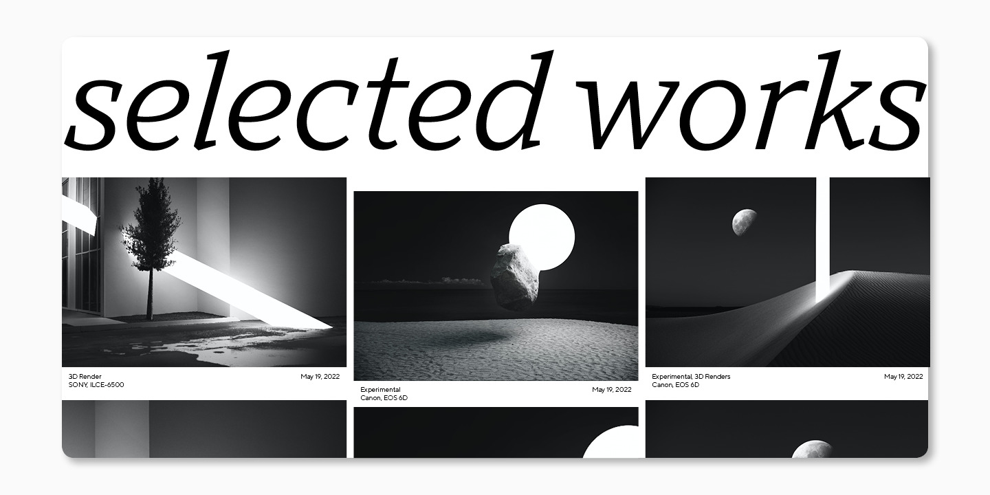
Schriftpaare begegnen uns jeden Tag, wenn wir durch die Stadt gehen oder im Internet surfen. Bei der Gestaltung von Plakaten und Postern zum Beispiel werden fast immer zwei Schriften verwendet – eine für eine auffällige Überschrift, die andere für Informationen über eine Veranstaltung oder ein Projekt.
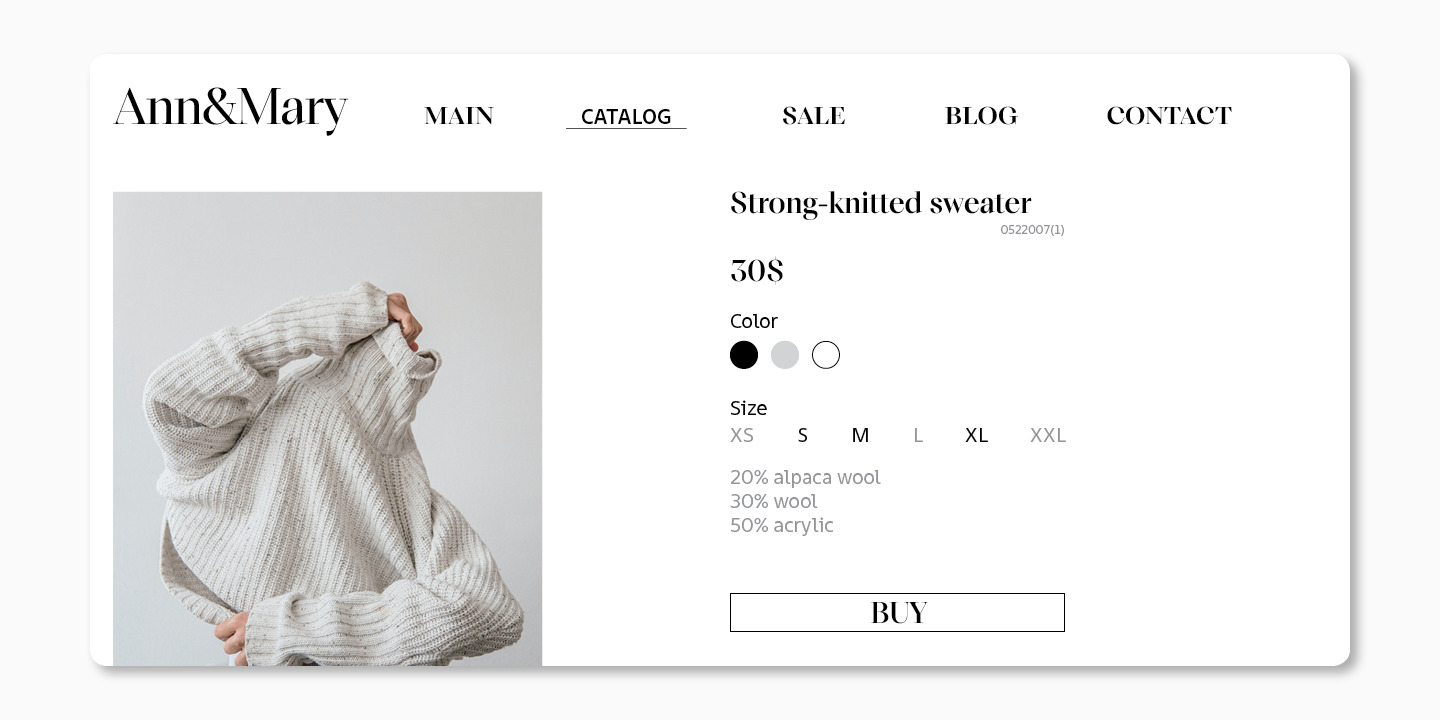
Überschriften auf Websites, in Büchern, Zeitschriften und Zeitungen werden oft in einer anderen Schrift gesetzt. Einige Marken verwenden eine zweite Schriftart für einen separaten Seitenblock, wenn sich dessen Inhalt grundlegend von den anderen unterscheidet. Diese Methode kann von Unternehmen verwendet werden, um den kommerziellen Block vom sozialen Block zu trennen oder um einen Blog mit langen Texten hervorzuheben.
Beispiele für Schriftpaare
Am Ende dieses Artikels stellen wir einige Beispiele für Schriftpaare vor, die sich in Projekten harmonisch ergänzen.
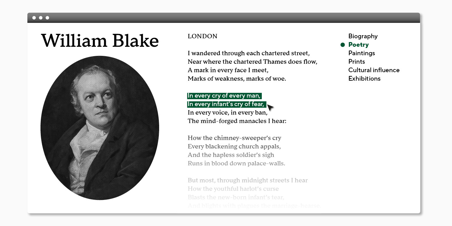
- Neutrale Serifenlose und konservative Textserifen. Schriften: TT Norms® Pro Serif und TT Norms® Pro.
Ein bereits bekanntes Paar, das sich perfekt für den Einsatz in Büchern oder für die Gestaltung von Websites eignet.
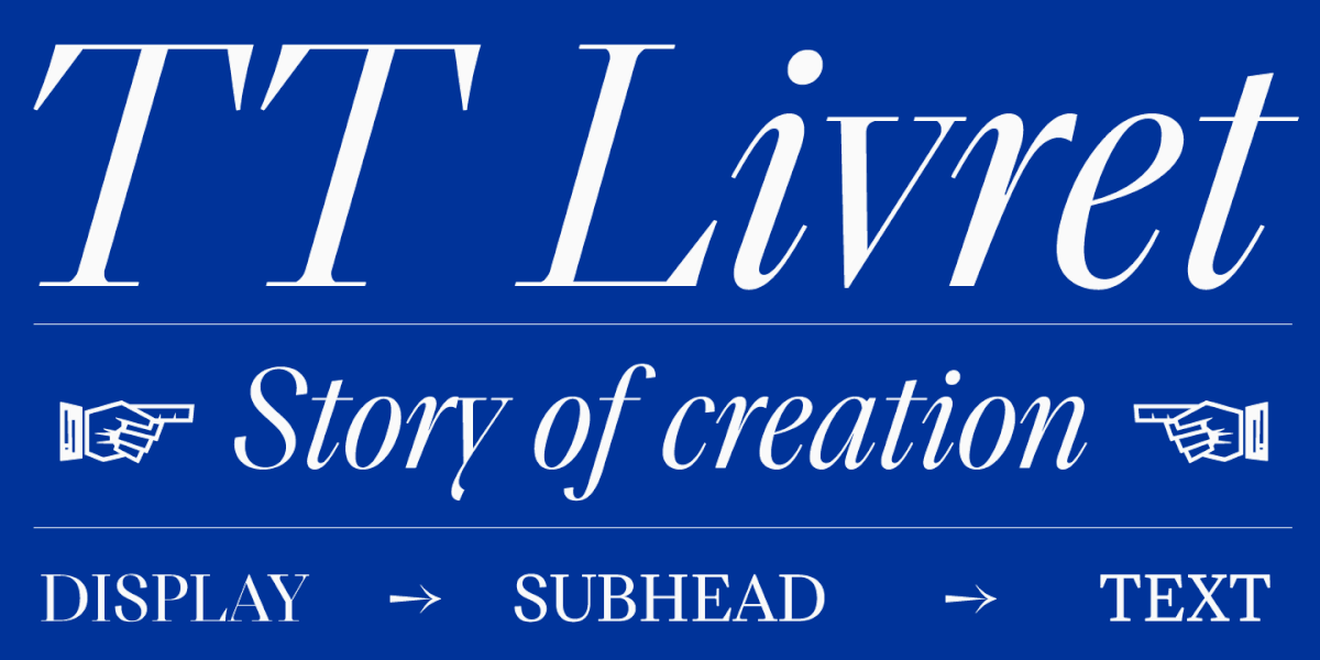
- Elegante Display-Serifen und humanistische Serifenlose. Schriften: TT Livret Display + TT Fellows.
Die elegante Serifenschrift lenkt die Aufmerksamkeit auf die Überschriften, während der Großteil des Textes in einer weichen, freundlichen Schrift gesetzt ist.
3. Displayschrift und Textserifen. Schriften: TT Ricordi Marmo + TT Livret Text.

Wenn Sie die Überschrift in einer ausdrucksstarken und einprägsamen Schrift setzen, wird sie nicht unbemerkt bleiben. Für eine Reihe von Texten ist es besser, eine Schrift zu wählen, die nicht vom Lesen ablenkt.
Fazit
Es ist keine leichte Aufgabe, zwei Schriften auszuwählen, die perfekt zueinander passen und dem Leser sowohl Emotionen als auch Informationen vermitteln. Durch die Verwendung von zwei Schriften hat der Designer jedoch mehr Möglichkeiten, die Werte der Marke zu vermitteln und gegebenenfalls Akzente zu setzen.
Kombinieren Sie verschiedene Schriften, genießen Sie den Prozess und wählen Sie die besten Paare aus.
FAQ
Was ist ein Schriftpaar und warum ist es im Design wichtig?
Ein Schriftpaar ist eine Kombination aus zwei Schriften, die in einem Projekt verwendet werden. Meist zieht eine Schrift in Überschriften oder Akzenten Aufmerksamkeit auf sich, während die andere Informationen im Fließtext klar vermittelt. Ein gut gewähltes Paar hilft, sowohl Bedeutung als auch Emotion zu kommunizieren.
Wie verbessern Schriftpaare Lesbarkeit und visuelle Hierarchie?
Schriftpaare lenken die Aufmerksamkeit der Lesenden, indem sie verschiedene Informationsebenen trennen. Eine expressivere oder größere Schrift kann Überschriften hervorheben, während eine ruhigere Textschrift komfortables Lesen im Fließtext unterstützt.
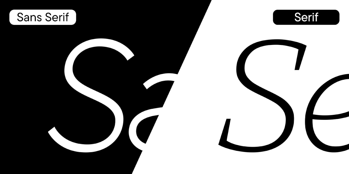
Warum ist die Kombination von Serif- und Sans-Serif-Schriften eine gängige Strategie?
Serif- und Sans-Serif-Schriften funktionieren oft gut zusammen, weil sie sichtbaren Kontrast schaffen und zugleich Balance ermöglichen. Eine Sans Serif kann Neutralität und Klarheit vermitteln, während eine Serifenschrift einen traditionelleren, editorialen oder expressiven Ton hinzufügt.
Was macht zwei Schriften kompatibel oder „gut kombinierbar“?
Kompatible Schriften haben meist sowohl Gemeinsamkeiten als auch Unterschiede. Sie sollten sich deutlich genug unterscheiden, um Kontrast zu erzeugen, aber genügend strukturelle oder stilistische Merkmale teilen, um im selben Layout harmonisch zu wirken.
Was bedeutet „Schriftpaar-Chemie“ in der Typografie?
„Schriftpaar-Chemie“ bedeutet, dass zwei Schriften sich visuell und emotional ergänzen. Fehlt diese Chemie, kann das Paar zufällig wirken, und das Design vermittelt die beabsichtigte Stimmung nicht klar.
Wie wurde TT Norms® Pro Serif als Paar zu TT Norms® Pro gestaltet?
TT Norms® Pro Serif wurde als Serif-Begleiterin zu TT Norms® Pro entwickelt. Sie bewahrt viele strukturelle Merkmale der ursprünglichen Sans Serif, etwa Proportionen und offene Formen, ergänzt sie aber um serifenspezifische Details, einen konservativeren Ton und echte Kursiven für Hervorhebungen.
Was sind die wichtigsten Unterschiede zwischen TT Norms® Pro und TT Norms® Pro Serif?
TT Norms® Pro ist eine moderne, neutrale geometrische Sans Serif, während TT Norms® Pro Serif eine strengere und konservativere Textserif ist. In der Serif-Version wurden die Formen härter, die Ovale dynamischer, das kleine „g“ zweistöckig, und der Satz wirkt durch die Serifen dichter.
Welche Gemeinsamkeiten helfen TT Norms® Pro und TT Norms® Pro Serif, zusammen zu funktionieren?
Die beiden Schriftfamilien teilen eine ähnliche Zeichenhöhe, Proportionen, offene Aperturen und Konstruktionsprinzipien in vielen Buchstaben. Auch ihr Zeichensatz und ihre OpenType-Funktionalität sind ähnlich, was ihre Kombination in einem Projekt erleichtert.
Wo können Schriftpaare verwendet werden: Branding, Websites, Editorial Design?
Schriftpaare können in Branding, Postern, Websites, Büchern, Magazinen, Zeitungen und einzelnen Content-Blöcken innerhalb eines Markensystems eingesetzt werden. Eine Schrift kann zum Beispiel für Überschriften und die andere für Veranstaltungsdetails, Longreads oder Fließtext verwendet werden.
Was sind die besten Praktiken für die Auswahl und Kombination von Schriftpaaren?
Die beste Praxis besteht darin, die Rolle jeder Schrift klar zu definieren: eine für Betonung und eine für Information. Ein gutes Paar sollte sowohl Emotion als auch Klarheit vermitteln, Akzente an den richtigen Stellen setzen und das Design für das Publikum leichter lesbar und verständlich machen.