Choosing the right font for an ebook might seem like a simple task at first glance, but it actually requires a careful approach and consideration of several nuances. After all, digital media differs significantly from print.
What exactly should you pay attention to? And how do you select the best font for reading ebooks? We’ll explain it all in this article!
Why Font Choice Matters for Ebook Reading
Selecting an appropriate font for an ebook directly impacts user experience. Here’s why:
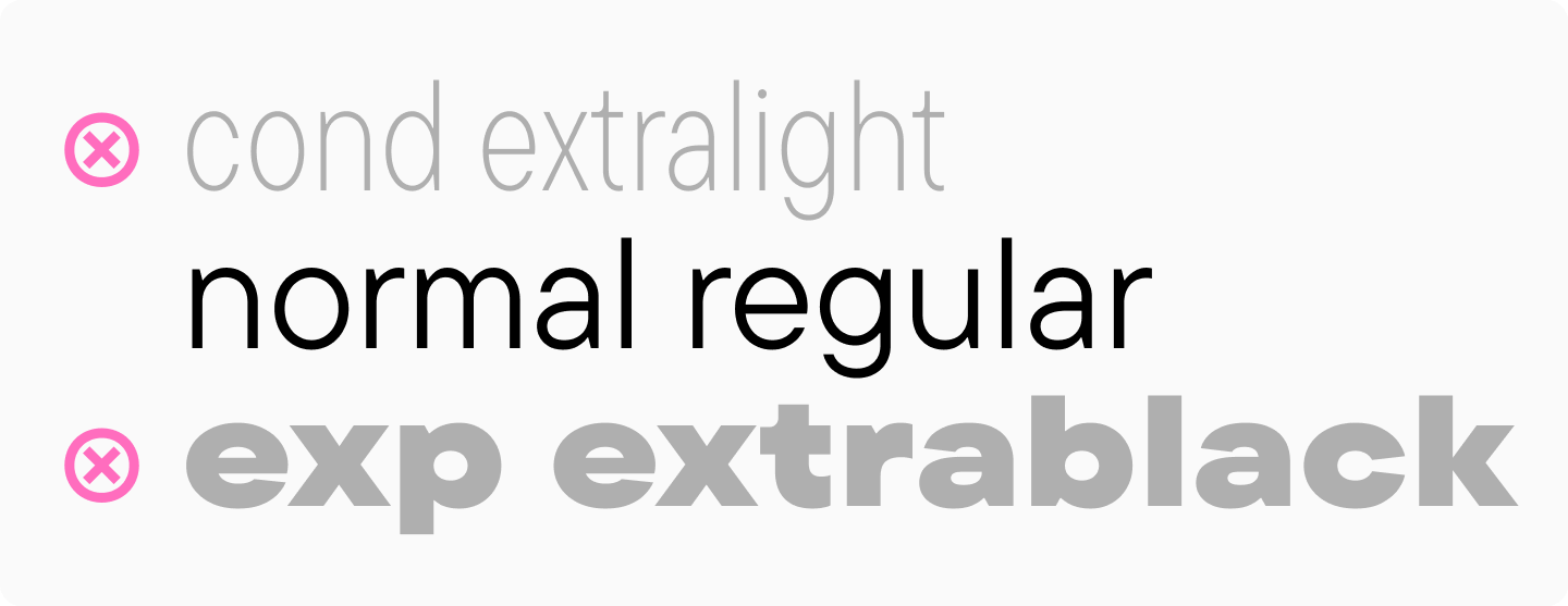
- The font determines how comfortable the book will be to read. Readability and legibility are what you should focus on first. The simplest fonts without unnecessary details are the most comfortable to read. An optimal line thickness means you should choose a Regular font style. The same applies to character width—fonts that are too wide or too narrow might look stylish in design and accent inscriptions but are inconvenient for reading. The best option is a font of medium width. Finally, the spacing between characters plays a crucial role—intervals should be neither too large nor too small. For more details on choosing the best font for reading, check out our previous article.
- A correctly chosen font helps retain the reader’s attention. It can influence how much time a person spends reading—whether it’s five minutes or an hour. Again, this depends on how comfortably the font reads (regardless of the book’s content).
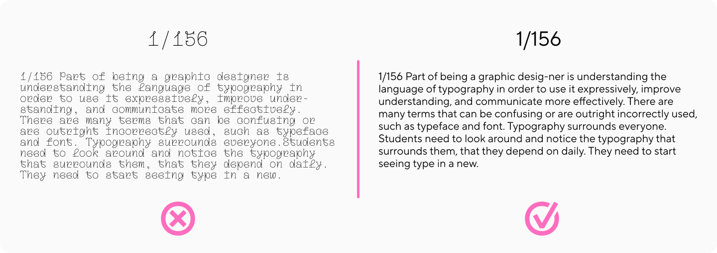
- A good font helps more effectively convey the message. If the reader gets distracted by individual characters or spends time deciphering the text, they might miss the essence of what’s written. Therefore, an ebook font should be neutral and legible.

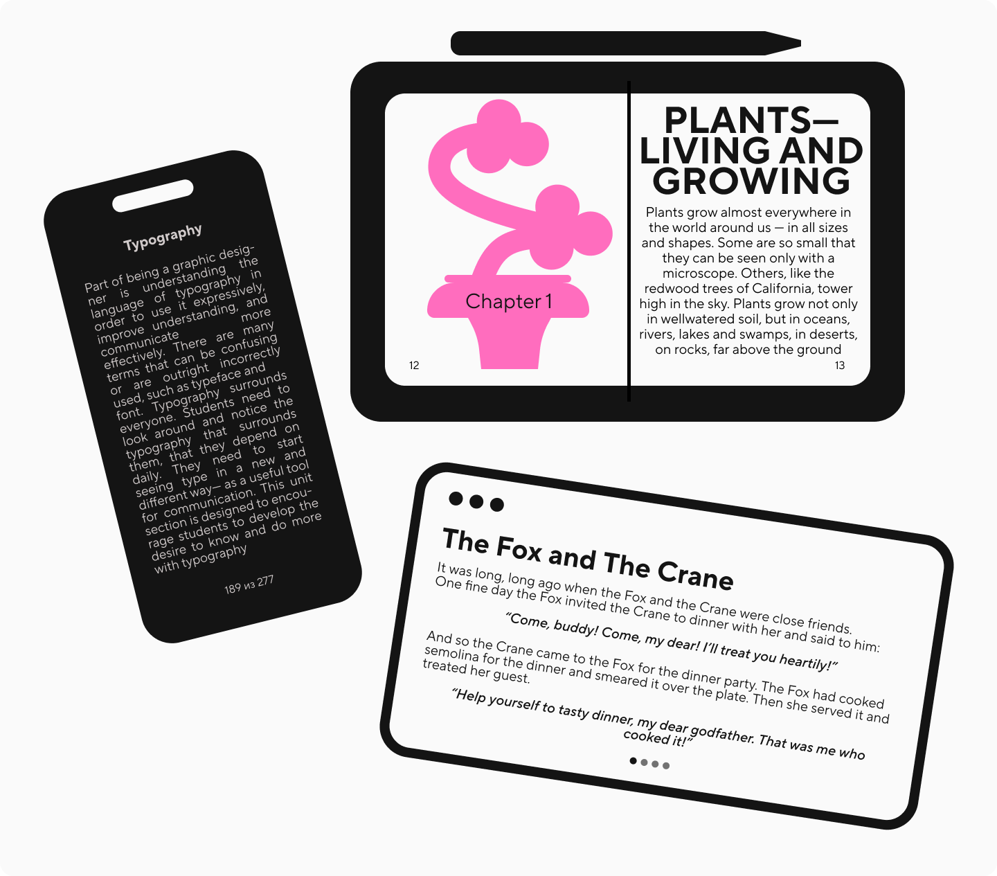
- A quality font will display correctly on any device, whether you’re reading a PDF ebook or using an e-reader app. Ensure the font is technologically advanced and scales well across different devices, maintaining clarity, legibility, and basic settings like leading and spacing when zooming in or out. Learn more about these details here.
About Choosing Ebook Font Size
Font size is also important, but unlike a printed book, users can change the scale on digital devices. As mentioned earlier, it’s crucial that the font is high-quality and displays correctly with such changes. However, you should still choose the default font size correctly. For the main text, the optimal size is 12 pt, and for headings—14—18 pt.

Best Fonts for Ebooks: Our Top Picks
Often in similar articles, you’ll encounter claims about which font types—serif or sans serif—are better for reading. Opinions vary: some believe typefaces with serifs help the eye «glide» along the line, while others prefer sans serif fonts due to their more neutral design. In reality, both font types can have excellent readability, and we’ve included them in our selection. You can choose sans serif fonts for more modern publications, while serif fonts will help create the feeling of a printed book.
Sans Serif Fonts
TT Interphases Pro

TT Interphases Pro is a functional and modern neo-grotesque created specifically for interface use. Text set in this font is very legible due to the height of lowercase characters, and its static proportions look uniform.
TT Norms® Pro

TT Norms® Pro is a neutral and highly adaptable geometric sans serif, one of the studio’s bestsellers. It’s a perfect «workhorse» that works excellently for electronic media. This font is impeccably readable even in small point sizes and creates an even set in large text volumes.
TT Hoves Pro

TT Hoves Pro is another studio’s bestseller, a Scandinavian sans serif with a neutral yet distinctive character. The glyph design features predominantly vertical and horizontal strokes, making the font appear clean and minimalist while ensuring comfortable reading and even text composition.
TT Firs Text + TT Firs Neue

TT Firs Text and TT Firs Neue form a font pair of two Scandinavian sans serifs. Both fonts are minimalist and highly readable. TT Firs Text is more neutral and perfect for body text, while TT Firs Neue shines in headings thanks to its expressive details. If you want to add a Nordic touch to your ebook and make its design more stylish, this is the perfect choice for you.
TT Travels Text + TT Travels Next

TT Travels Text and TT Travels Next make up another font pair of two stylish wide sans serifs. Here, TT Travels Text is suitable for body text, while TT Travels Next works best for covers and headings. These fonts have a bold, cutting-edge character—if your ebook needs a contemporary edge, don’t hesitate to use them!
TT Fellows

TT Fellows is a humanist sans serif with a mechanical touch. While appearing calm at first glance, this versatile font can adapt to different contexts. One of its key advantages is being uniwidth, which makes it perfect for ebooks—the layout stays consistent regardless of weight adjustments. Use the regular weight for body text and bold for headings.
TT Commons™ Pro

TT Commons™ Pro is a versatile geometric sans serif and one of TypeType’s most sought-after fonts. This font is suitable for any ebook format—it has all the necessary characteristics, including excellent readability and neutral design.
Serif Fonts
TT Livret

TT Livret is an elegant yet functional serif font that blends modern and classic qualities. It looks excellent in any publication, especially in fiction, history magazines, art publications, and similar works. The family includes three subfamilies—a calm text version, a more expressive display version, and a balanced Subhead version. They comprehensively address all text formatting needs.
TT Norms® Pro Serif

TT Norms® Pro Serif is a versatile serif font that strikes a perfect balance between elegance and functionality. If you’re looking to recreate that classic printed book feel in your ebook, this font is an excellent choice. Its standout feature is the inclusion of true italics—not just slanted versions of regular letters—which allow you to add emphasis without disrupting the reading flow.
TT Tricks

TT Tricks is a modern serif font that means business. Drawing inspiration from transitional serifs, it maintains a professional demeanor while staying contemporary and fresh. It’s remarkably adaptable—whether you’re publishing business content, academic works, or general literature, this font adjusts naturally to its context while maintaining its polished look.
Conclusion
As you can see, our collection offers readable and high-quality fonts with different moods and advantages. We hope our advice helps you find the perfect option for your electronic publication. We also recommend checking out our article on font selection for book design.


