Open 5 sites of any famous brands.
Let’s say the choice fell on Chanel, Toyota, Apple, Fender and Rolex. Do you know what they have in common?
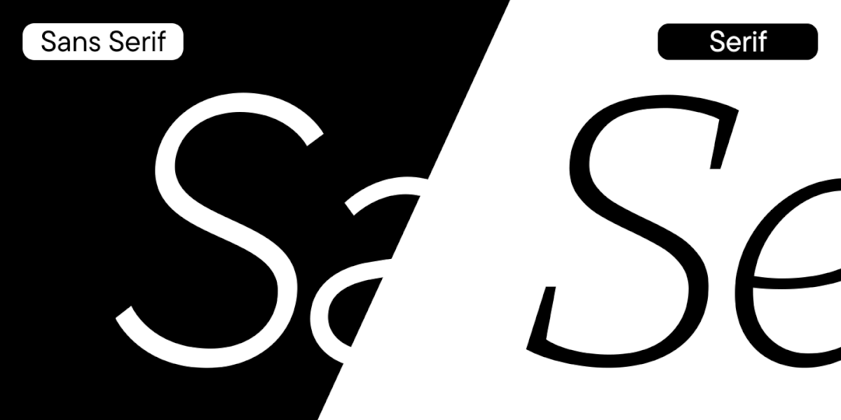
The corporate sans-serif font that meets you on the main page. Most modern brands choose sans serifs fonts as their corporate font.
Such fonts began to gain popularity almost a century ago, but still remain at their peak.
Let’s find out what is so attractive about these fonts and have a look at a selection of the best sans serifs from the TypeType collection.
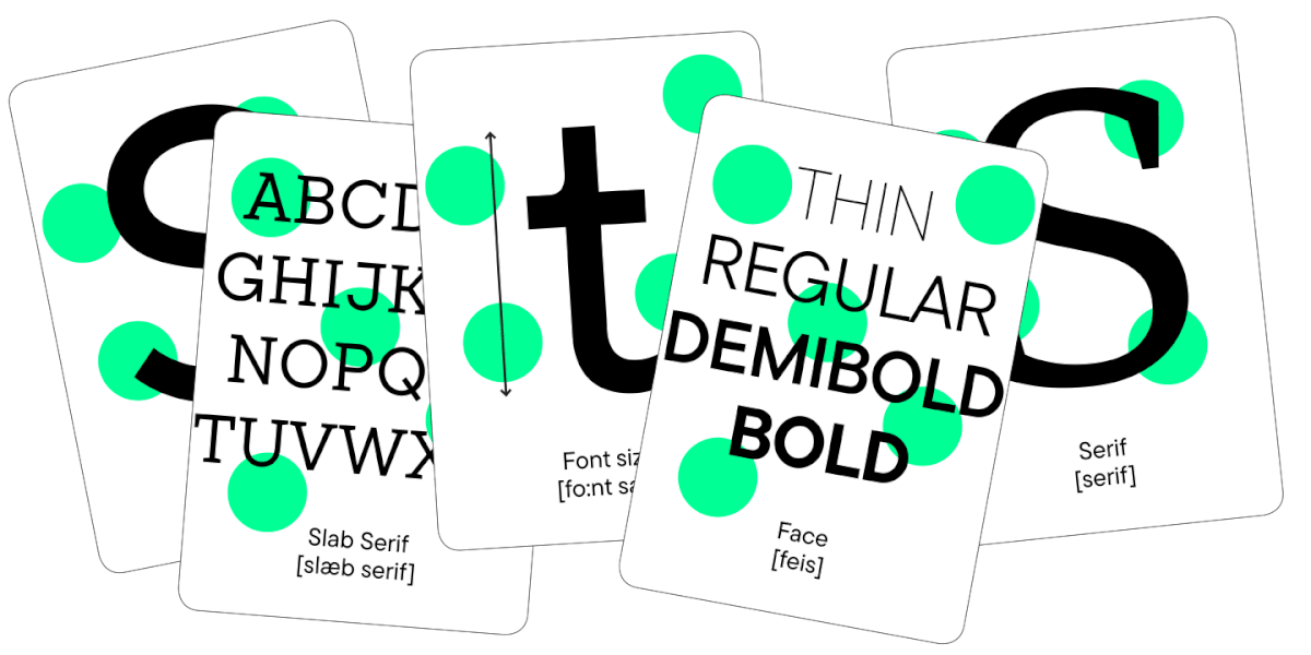
What kind of sans serif fonts there are
Many have already guessed that this article could be renamed «15 Best Grotesques». It’s a fact that most sans-serif fonts are grotesque.
Even if we talk only about grotesques, you can find a huge number of fonts that are different from each other.
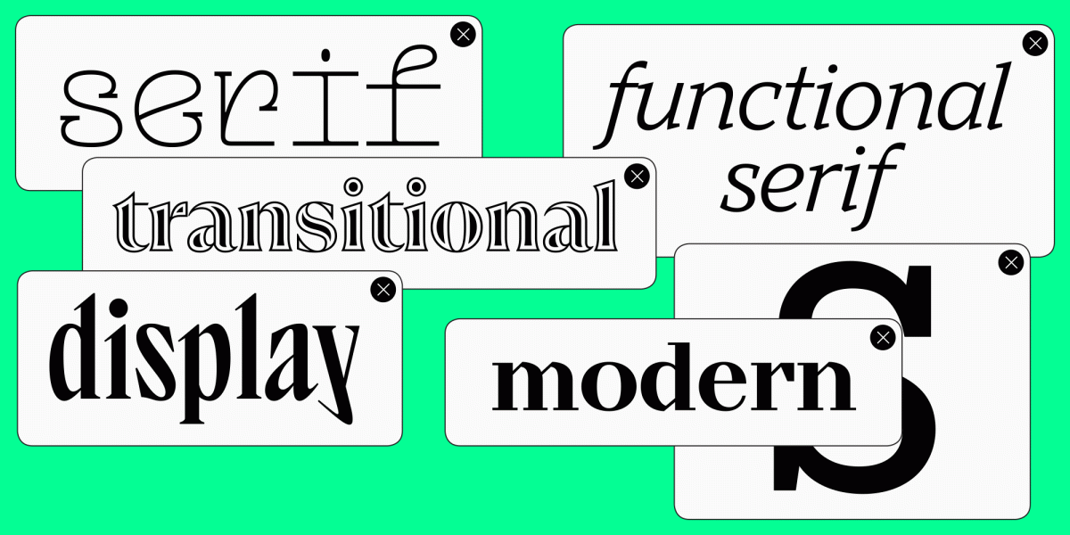
Grotesques can be divided by style, by area of application, by belonging to a historical era, and by other criteria. We will consider only the most common categories.
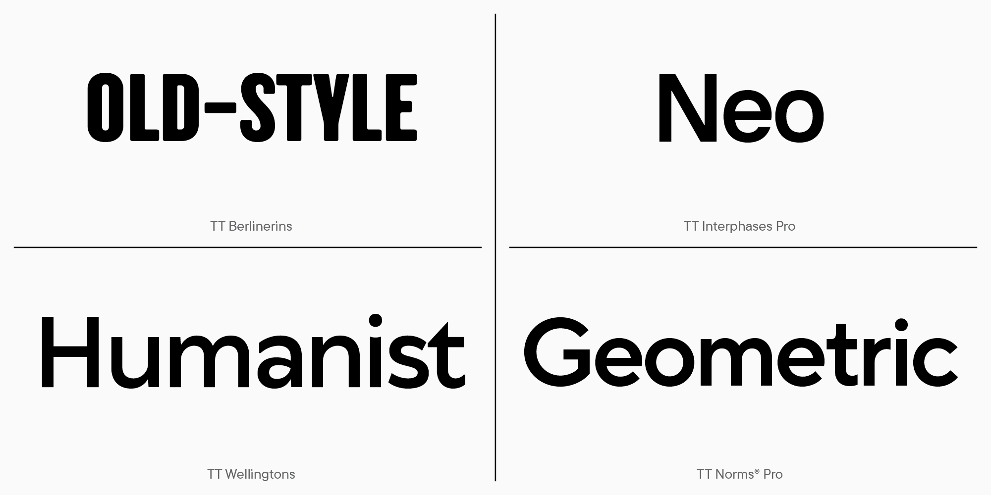
The most common classification of grotesques includes:
- old;
- new (neo-grotesque);
- humanist;
- geometrics.
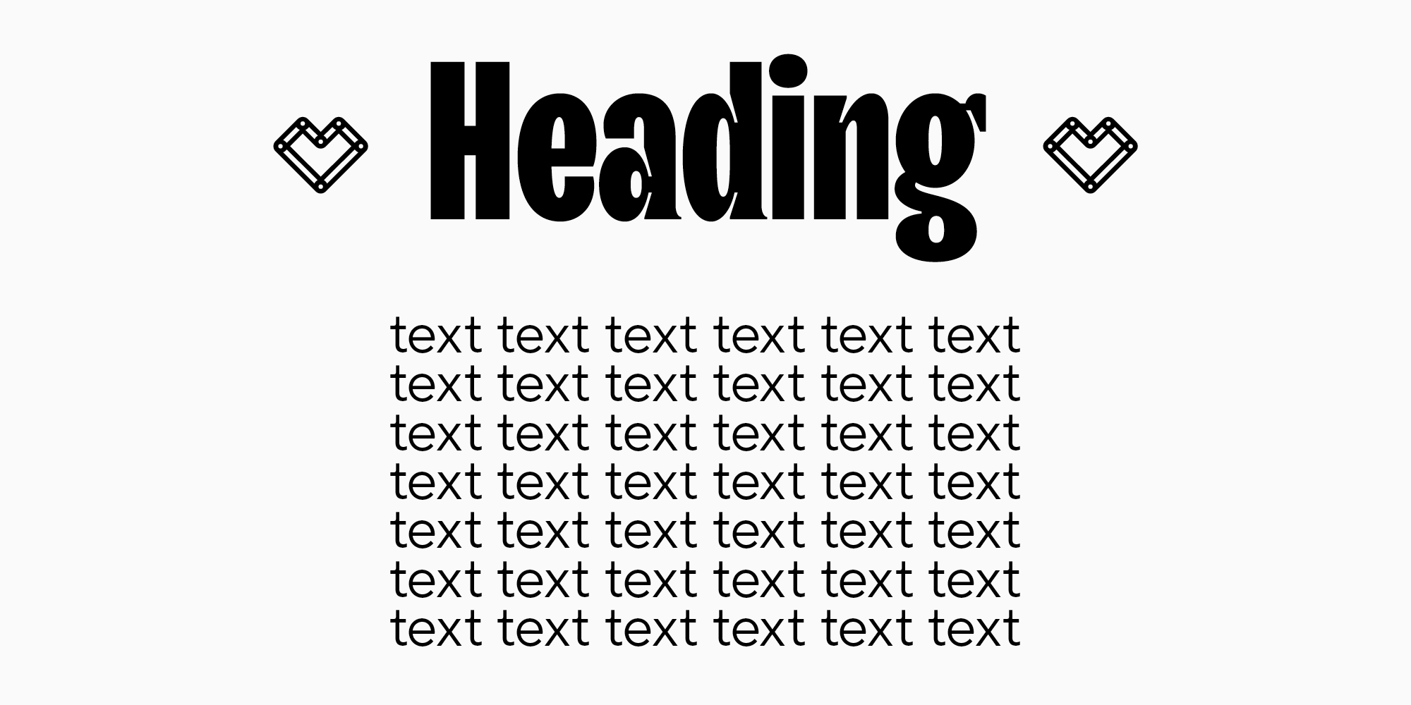
Based on scope, grotesques can be classified as follows:
- text;
- heading.
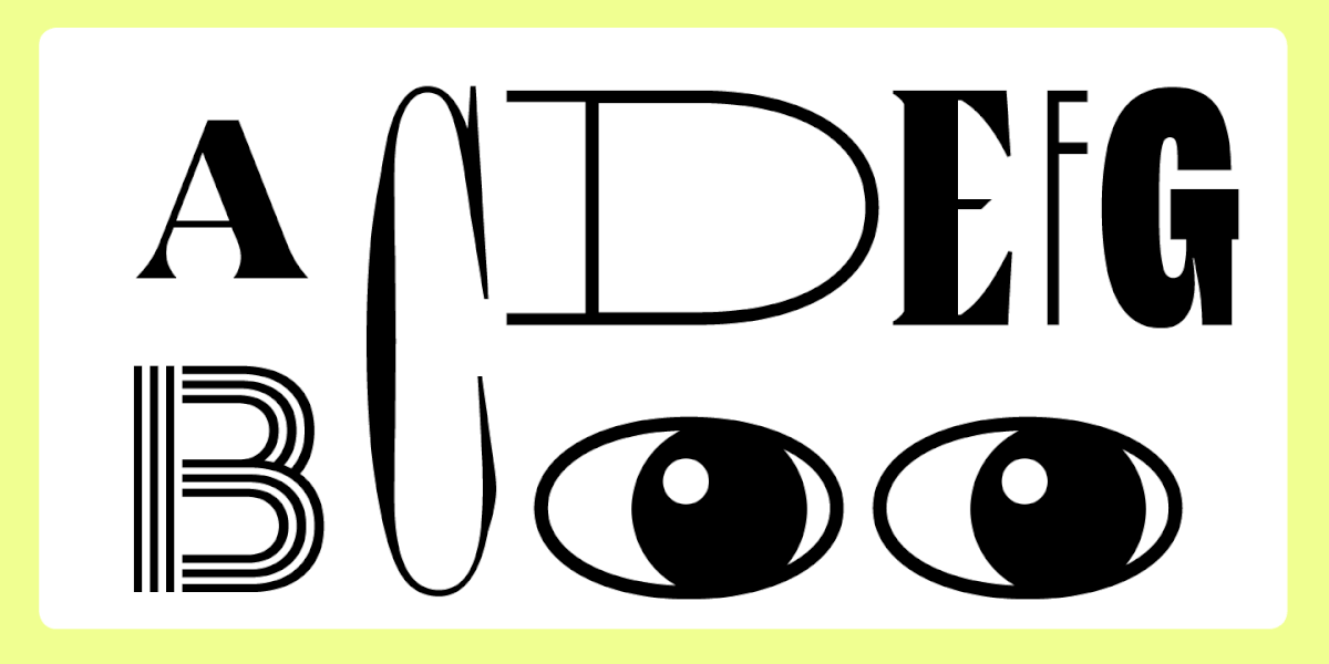
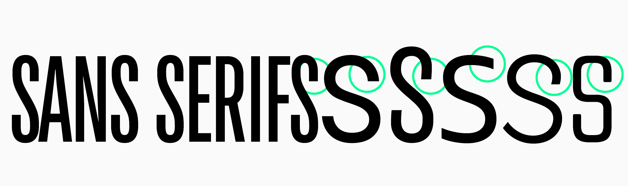
Among sans-serif fonts, there is only one antiqua — stressed sans, which is sometimes called contrasting sans serif.
Sans-serif fonts can be opposite in character and characteristics: classic neutral or decorative, rounded or narrowed. The selection includes different fonts so that you can choose the right one for different areas.

Where sans serif fonts are used
The scope of grotesques is limitless.
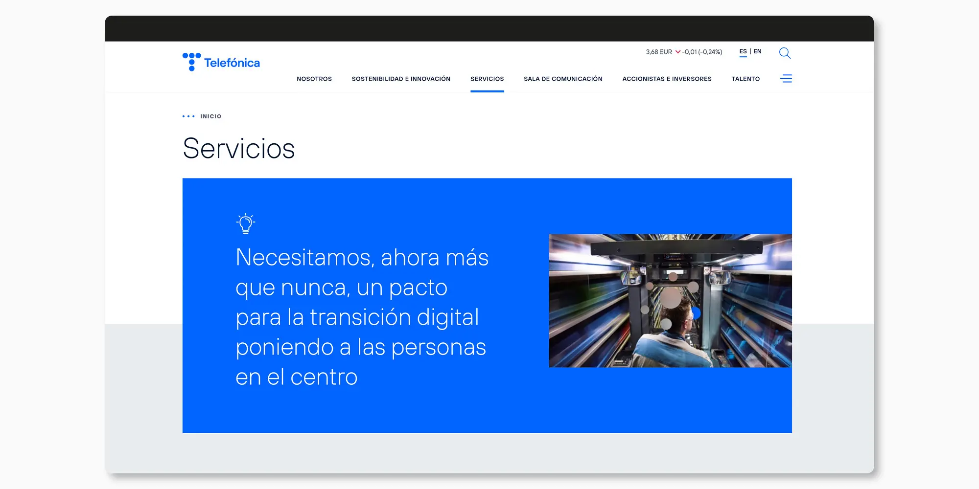
On the web, sans serif fonts are used on websites, in applications, and in corporate documents. Increasingly more often, grotesques are chosen for game interfaces, packaging and identity design. Sans serif fonts began to appear more often in the layout of books, catalogs and magazines.
15 best TypeType fonts
Universal sans serifs
This category of fonts is often referred to as «workhorses». A characteristic feature of such fonts is their concise nature, extensive character set and well-thought-out technical component. This is the font in the collection that looks attractive in almost any project.
As a rule, it is a geometric, humanist or new grotesque. You may come across the term «Swiss Style» used in reference to sans serif fonts. Most often, the criteria for «Swiss Style» include minimalistic design, good readability of typed text and versatility of use.
There are many «workhorses» in the TypeType collection, but the main trio is TT Commons™ Pro, TT Norms® Pro and TT Hoves Pro.
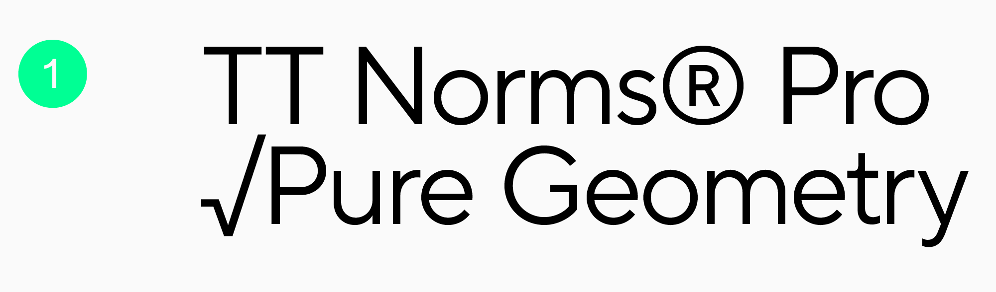
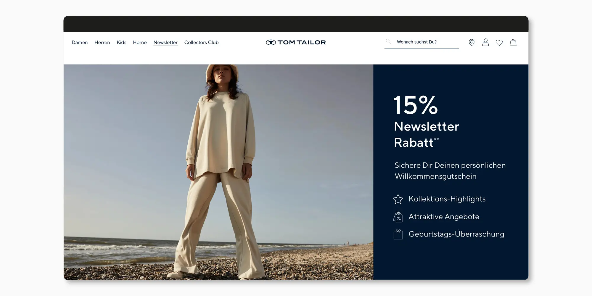
TT Norms® Pro is the studio’s #1 studio bestseller. It has been used in the design of more than 1000 famous world brands: Cartoon Network, Tom Tailor, CSN, and others.
The font supports over 275 languages, including Bulgarian, Greek, and Vietnamese.
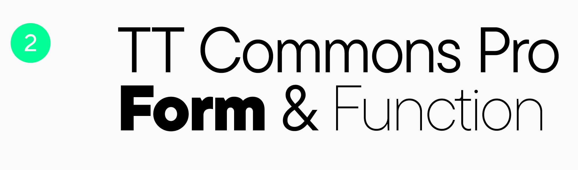
TT Commons™ Pro is another bestseller of the studio. It features Uniqlo, Commercetools, Typo and other global brands in its portfolio. Supports 275+ languages and has an extensive character set.

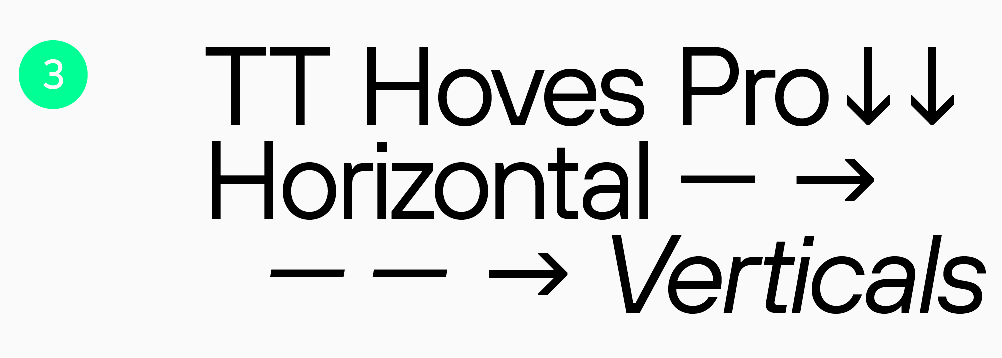
TT Hoves Pro is the third font included in the rating of the most popular universal sans serifs of the studio. Offers extensive support for European and Cyrillic languages, a large number of styles and an extended character set.
All universal fonts of the studio are regularly updated with new styles, OpenType features, and characters.
Display sans serifs
These are the sans serifs that are intended for headings and display inscriptions and have a more pronounced character than other groups of sans serif fonts. They are expressive, stylish and bright, therefore they are also used in packaging design, in the development of corporate identity, and for the design of signs and exhibitions.
The most popular display or decorative sans serifs are TT Rounds Neue, TT Travels Next, and TT Frantz.
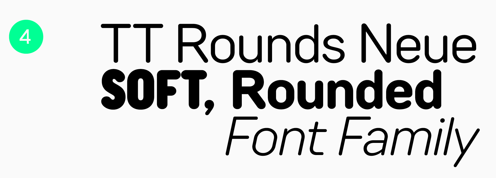
TT Rounds Neue is a rounded font with soft shapes and a friendly character. It is often chosen for eco-themed brands, children’s products and socially important projects.
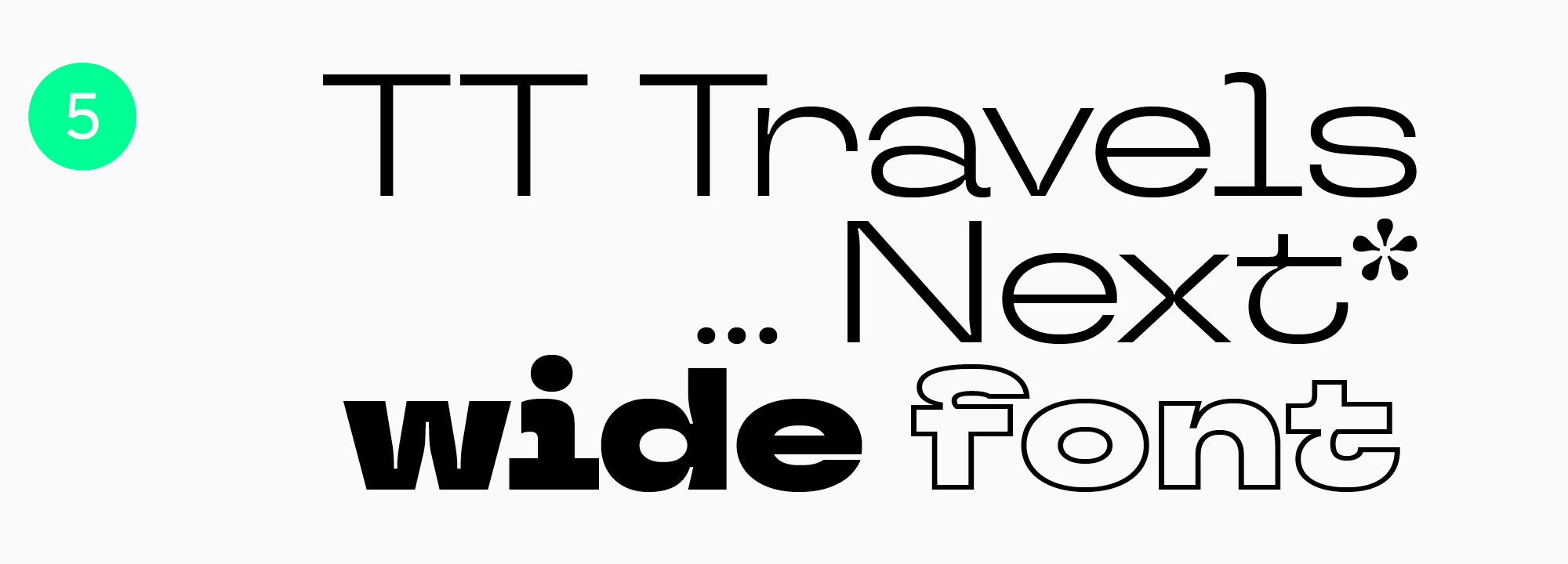
TT Travels Next is a stylish display sans serif with wide proportions for modern projects.
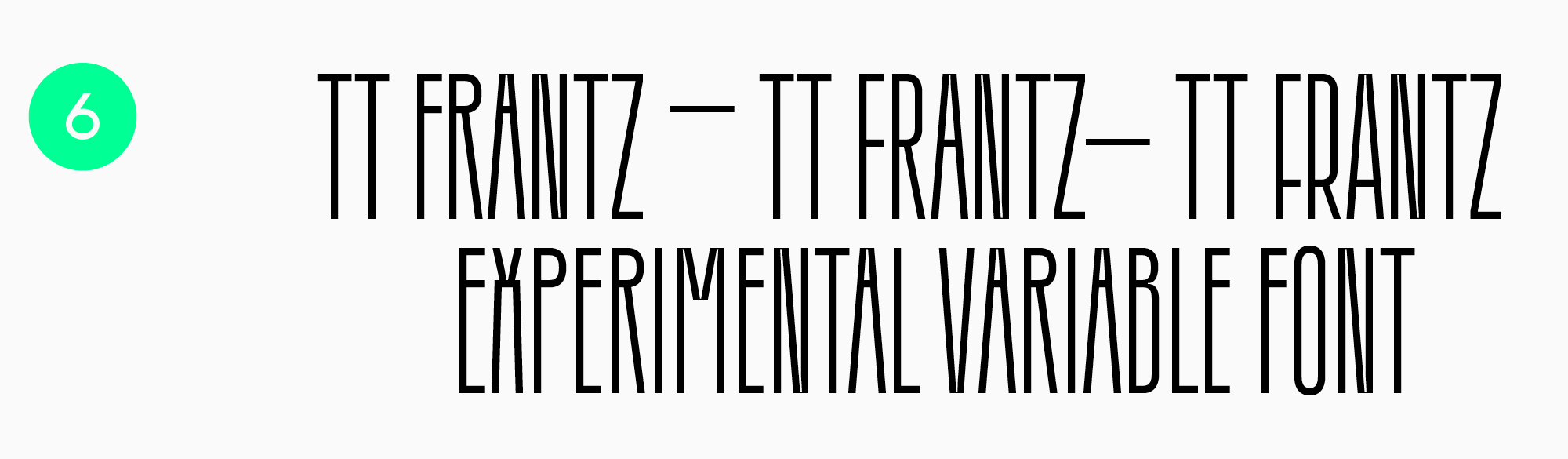
TT Frantz is an experimental variable sans serif. You can change the middle line of the font by raising or lowering it. In the set, it looks tight and aesthetically pleasing.
Humanist sans serifs
Humanist sans serifs are fonts without serifs that have contrast. They are most frequently multi-width fonts and may contain elements referencing calligraphy.
The collection of humanist grotesques by TypeType is represented by TT Fellows and TT Wellingtons.
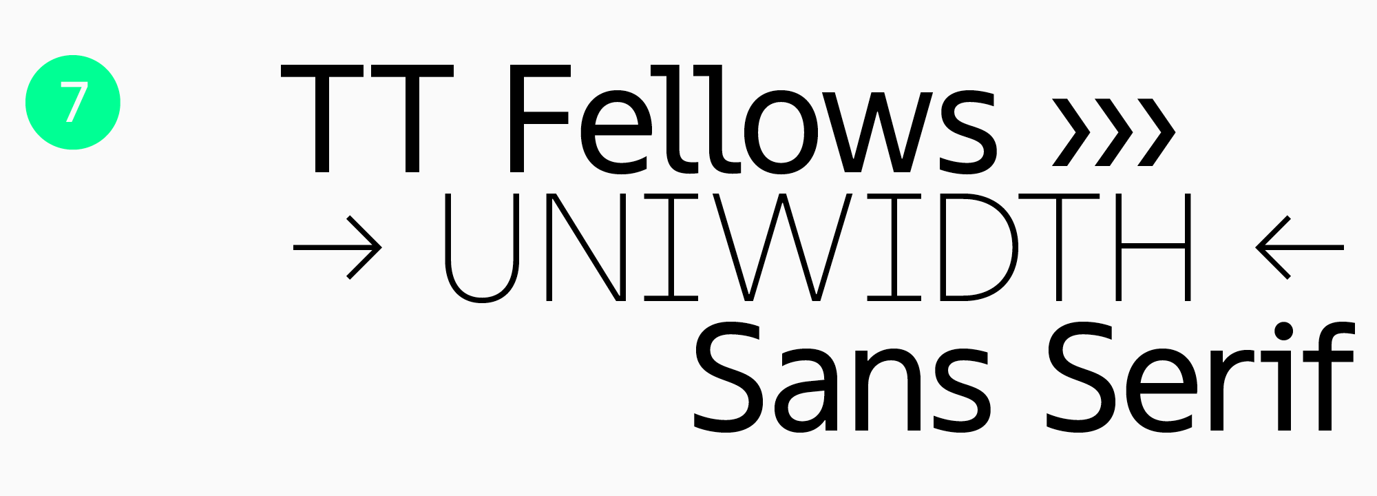
TT Fellows is the studio’s first uniwidth typeface, which became a bestseller right after its release. It can be categorized as a «workhorse» as well, as it is a truly versatile typeface. Uniwidth allows you to change styles directly in the layout, because the width of the characters does not change when increasing or decreasing the weight.
Geometric sans serifs
The shape of characters of such fonts is based on simple geometric shapes. This category of fonts is popular and often used by modern brands.
The TypeType collection has many geometric grotesques with different characters. This category includes the versatile TT Commons™ Pro, TT Norms® Pro and TT Hoves Pro. There are also TT Fors, TT Chocolates, TT Travels and TT Firs Neue fonts.
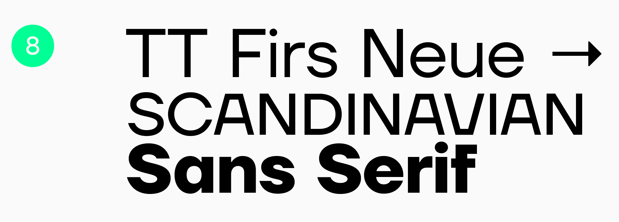
TT Firs Neue is a sans serif with a wide range of applications. The font has a recognizable character, so it is used for headings. It will look beautiful in text blocks set in large size.
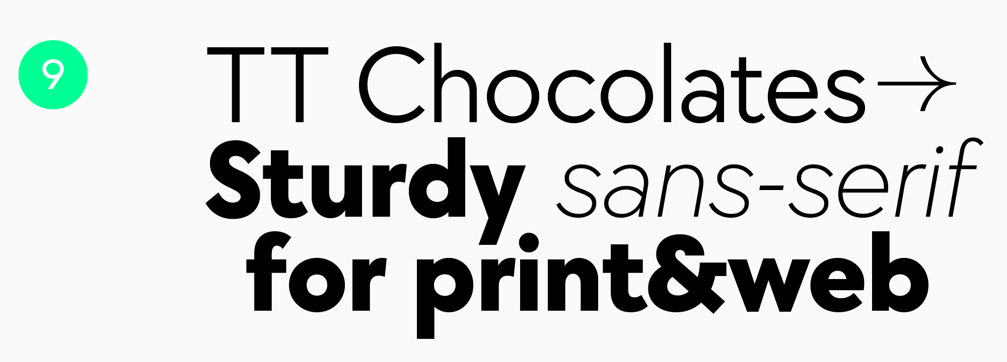
TT Chocolates is a favorite of many designers. It is a text font with a dense set and friendly character.
Neo-grotesques
This category of fonts is represented by sans serifs with a wide range of applications. As a rule, these are low-contrast fonts with concise forms.
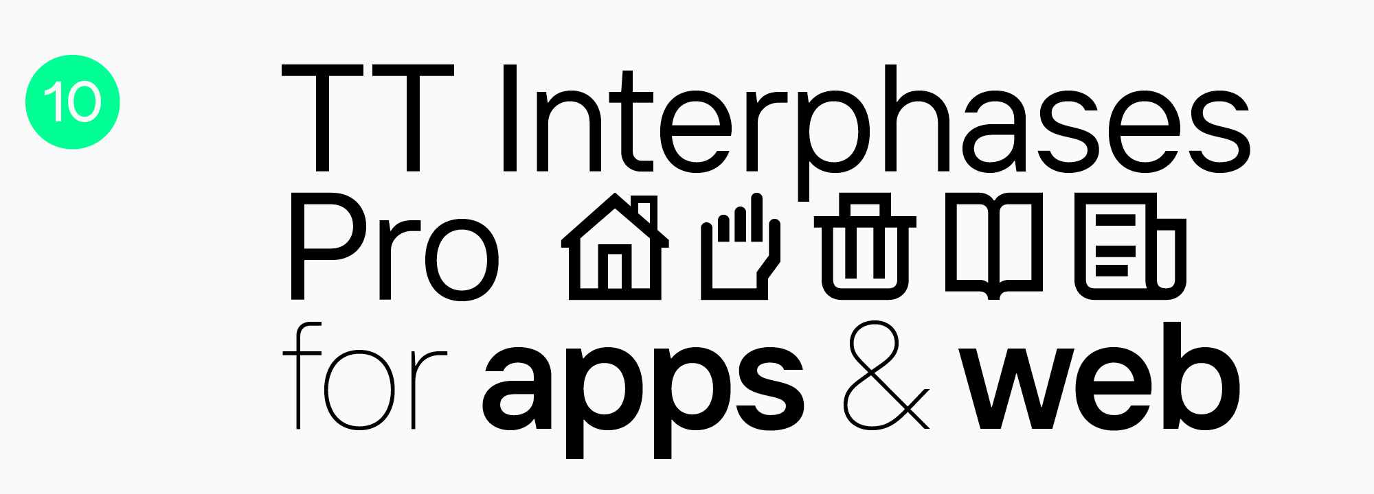
TT Interphases Pro is a neo-grotesque for use in interfaces. The text typed in this font remains readable and looks uniform even in a small size. It has a broad language and character set and is regularly updated.
Stressed serif
This is an antiqua without serifs. It is categorized as antiqua because of the high contrast inherent in typefaces of this category. Sometimes this font is called a contrasting sans serif.
We recommend the TT Ricordi Allegria and TT Knickerbockers stressed serifs.
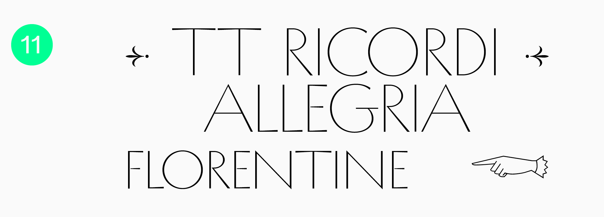
TT Ricordi Allegria is a sophisticated and beautiful typeface with variable width proportions.
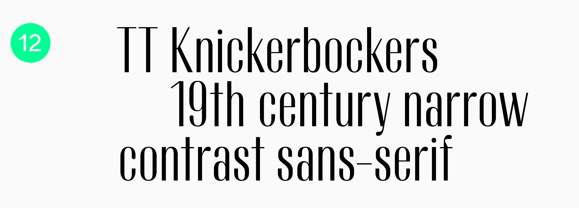
TT Knickerbockers is a contrast typeface that has hints of serifs. An original typeface that can be used to type headings or decorative inscriptions.
Bonus: Technological and monowidth fonts
There are sans-serif fonts that are difficult to categorize or that cover several types at once. As a bonus, we want to suggest 3 fonts that are not included in previous collections.
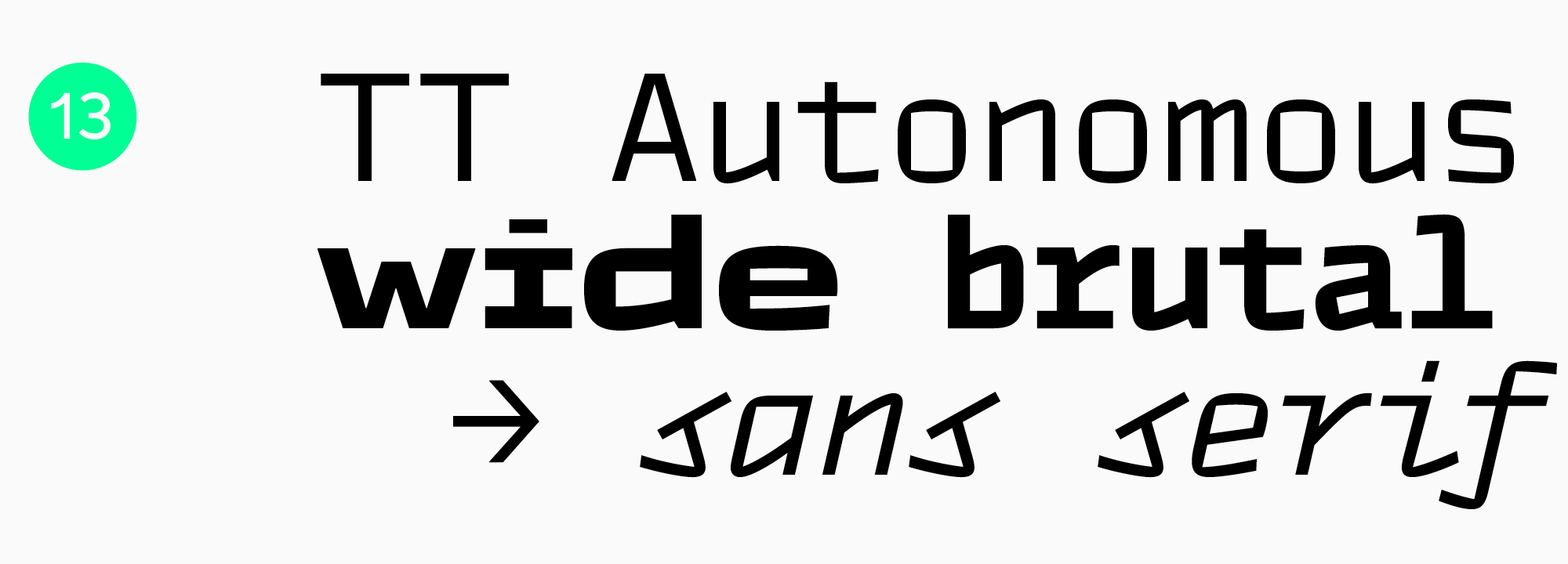
TT Autonomous is a technological grotesque. This is a brutal font whose proportions look monospaced. Ideal for projects related to mechanical engineering, technology or AI.
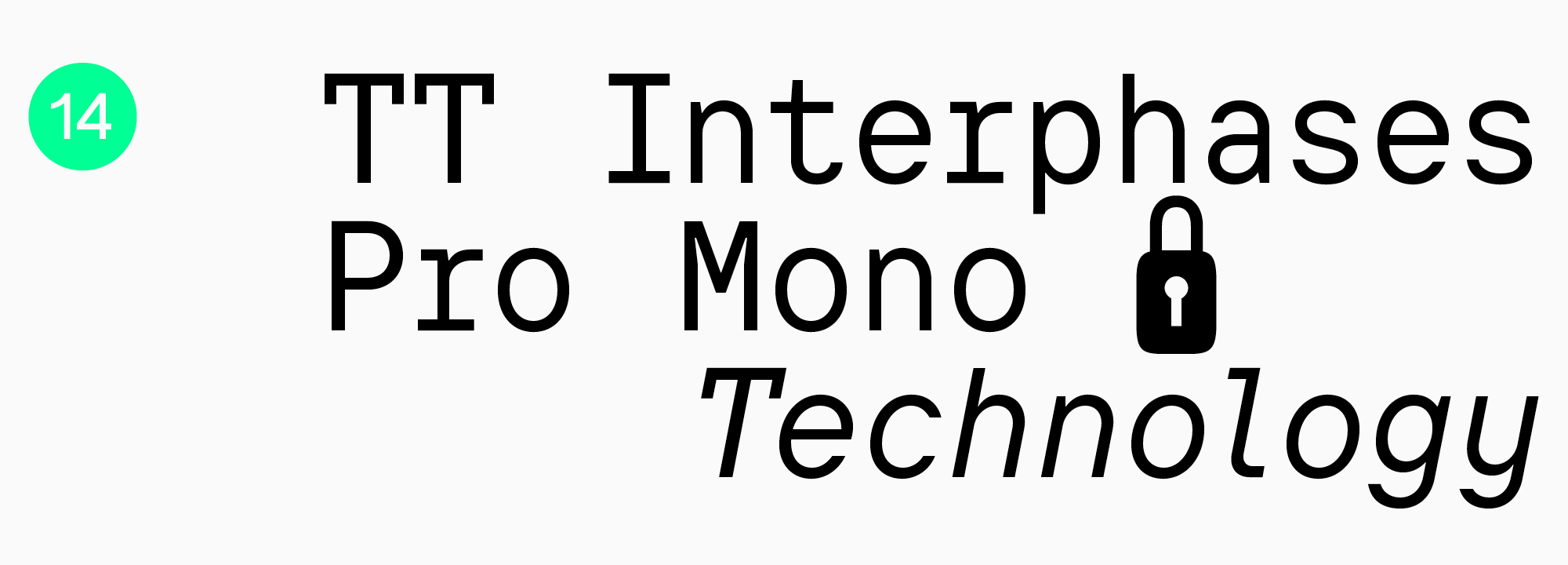
TT Interphases Pro Mono is a subfamily of the TT Interphases Pro font, rendered in monospace proportions. This is a stylish typeface that can be used not only in programming, but also in branding, packaging design and headlines.
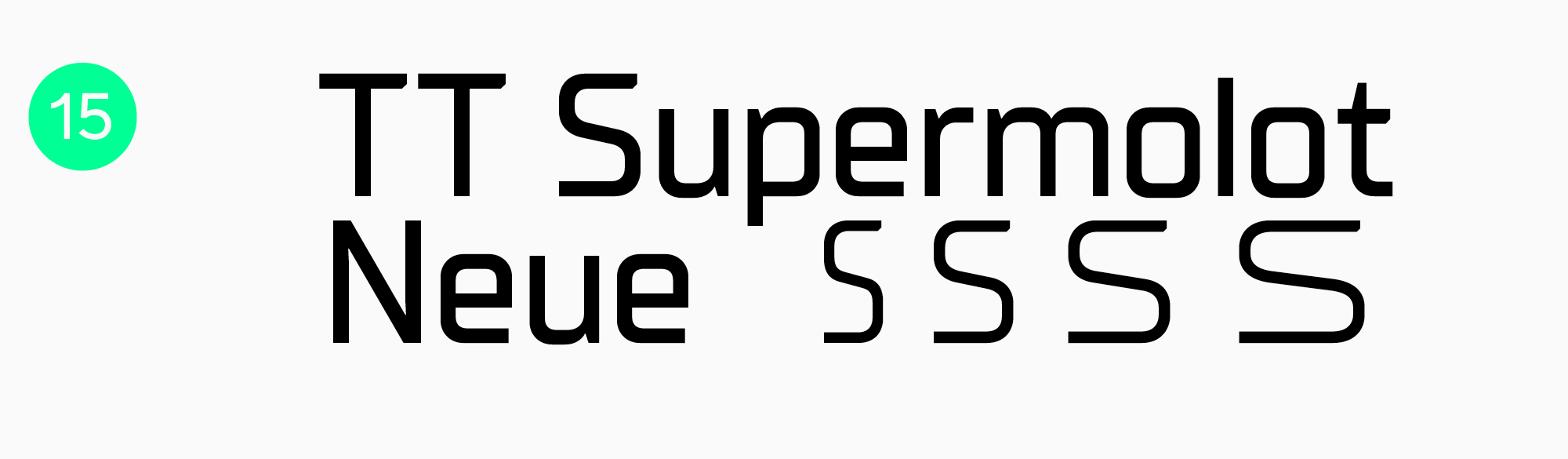
TT Supermolot Neue is another technological grotesque whose character you can control. The typeface includes a variety of styles that harmoniously match each other.
We’ve shown you 15 sans-serif fonts to add to your collection in 2026.
Share the list of your favorite grotesques on social networks and don’t forget to tag TypeType studio.
FAQ
What are the best sans serif Google Fonts to use in 2026?
In 2026, key trends will remain variable fonts for maximum flexibility and humanist sans serifs, which can be found in the Google Fonts or TypeType libraries.
Which sans serif fonts are ideal for resumes?
For resumes, it is logical to use «workhorses»: concise, with good readability and a strong technical base. Any universal font will work perfectly: TT Commons™ Pro, TT Norms® Pro, and TT Hoves Pro.
What are the best sans serif fonts for body text and long reading?
Universal sans serifs with a neutral character and good readability in running text are best suited for this.
Which sans serif fonts work best for logos and branding?
Many brands choose a universal and concise sans serif, for example, TT Norms® Pro. For more “distinctive” branding, display sans serifs are suitable: among the popular ones are TT Rounds Neue, TT Travels Next, and TT Frantz.
Are there free sans serif fonts suitable for professional projects?
Yes, there are. However, strictly check the license for commercial use. Free fonts often lack broad language support or proper technical adaptation. For professional projects, we recommend fonts from proven studios. TypeType typefaces offer trial downloads for testing.
What are the best bold sans serif fonts for emphasis and headings?
Display sans serifs are suitable for accents—they are designed for headers and large inscriptions and provide a brighter character. Popular display fonts include TT Rounds Neue, TT Travels Next, and TT Frantz.
Which modern sans serif fonts are popular among designers today?
Among universal modern sans serifs, TT Commons™ Pro, TT Norms® Pro, and TT Hoves Pro stand out. Among display (decorative) options—TT Rounds Neue, TT Travels Next, and TT Frantz.
What are the best sans serif fonts available in Canva and Adobe?
In Canva, popular and universal fonts are considered the best: Inter for modern design, Montserrat for headers, and Open Sans for text. In Adobe Fonts, professional classics are available: the benchmark Helvetica Now, geometric Futura PT, and universal Gotham.
Which sans serif fonts are optimal for websites, presentations, and posters?
Sans serifs are actively used in web (sites, apps) and corporate materials, and increasingly in identity and even game interfaces. For universal tasks, TT Norms® Pro, TT Commons™ Pro, and TT Hoves Pro are suitable.
What sans serif fonts work best in Microsoft Word and for print materials?
Universal and functional fonts with a strong technical base are perfect for corporate documents. Therefore, for Word documents and printing, it is logical to use the universal TT Norms® Pro, TT Commons™ Pro, or TT Hoves Pro.