The Challenge Windows 7 Fonts Fonts Solve
The first challenge is separating system maintenance from design selection. Restoring a missing Windows typeface is a different task from choosing additional typography for a brochure, identity, or presentation. This page addresses the latter: it presents TypeType families to consider when the choices already available do not express your project’s intended tone. Inclusion on this page does not establish compatibility with a particular operating system or application version. Before making a decision, identify your software requirements and check the relevant family information. For bundled-system questions or installation procedures, consult documentation specifically applicable to your Windows version.
What Makes Windows 7 Fonts Fonts Distinct
An operating-system label does not describe a shared visual style. Instead of expecting a particular shape or mood, assess each candidate on its own merits. Look at letter proportions, spacing, stroke contrast, and the relationship between uppercase and lowercase forms in specimens. Then check the family details for the characters and options your project requires. Names alone cannot establish appearance, language coverage, or technical behavior. Keep visual assessment separate from technical verification: an attractive specimen can help narrow your shortlist, but testing in the intended application is necessary to understand how a candidate behaves in your workflow.
Where Windows 7 Fonts Fonts Are Used
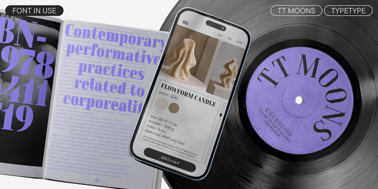
Brand identities, marketing materials, editorial layouts, and presentations offer useful contexts for evaluating this selection. These are possible project scenarios, not documented applications of the individual families. A small business might need consistent typography across stationery and sales sheets; a communications team might be comparing headline treatments for a campaign. In each case, the brief should determine the choice rather than the operating-system label. Prepare representative content with realistic headings, paragraphs, numerals, and punctuation. Assess it at the sizes and viewing conditions your audience will encounter, including printed proofs when relevant. If colleagues will edit the work, include their application versions in your checks. Review exported deliverables as well as editable documents so that substitutions or layout changes do not go unnoticed. Before commercial deployment, confirm that the selected license covers the intended use and how the work will be shared.
Explore TypeType's Windows 7 Fonts Collection
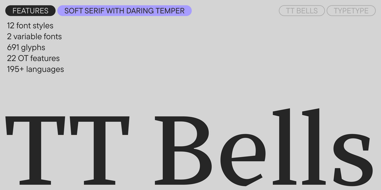
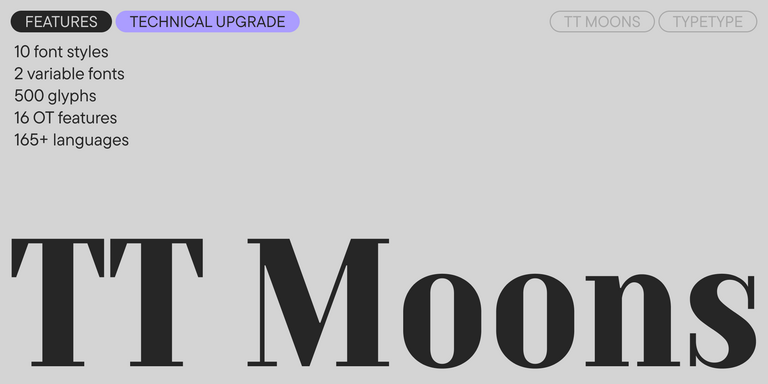
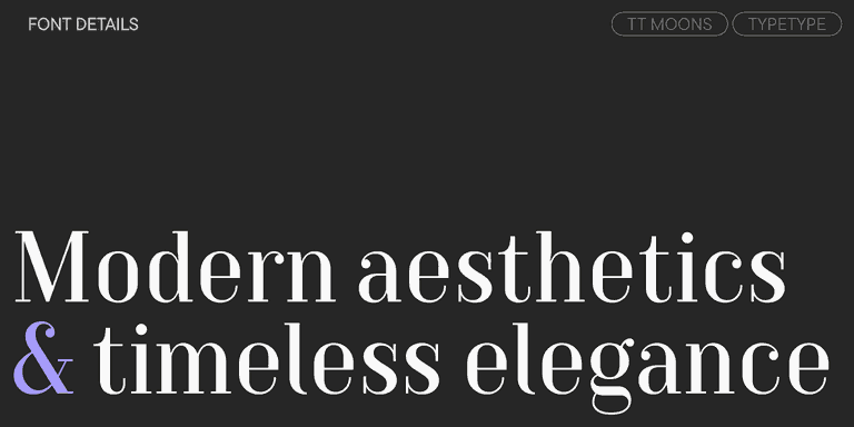
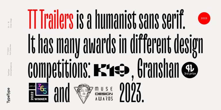
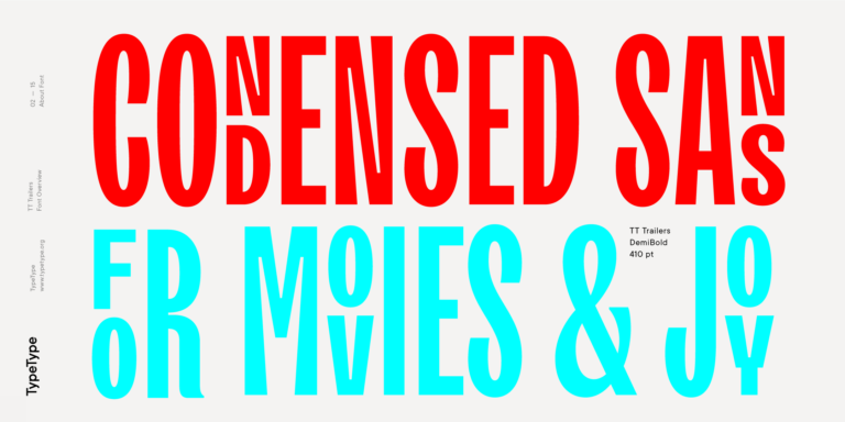
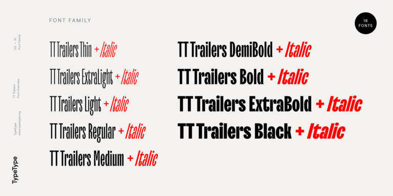
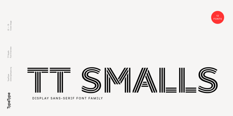
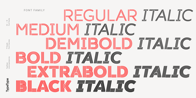
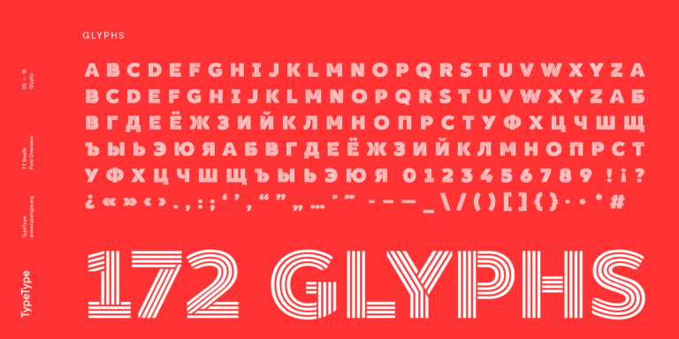
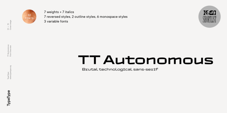
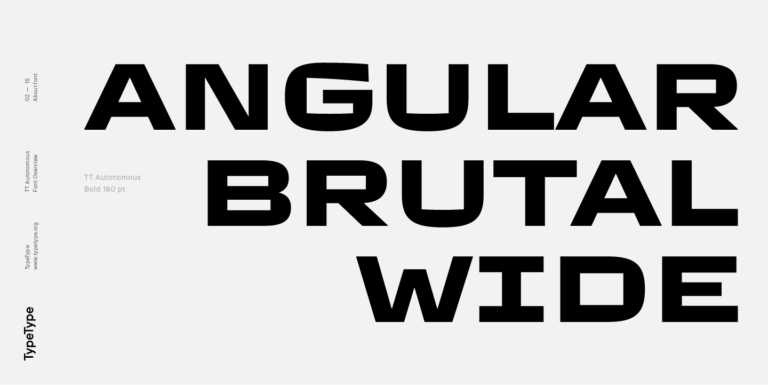
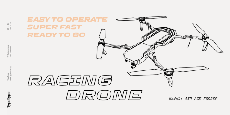
The families listed here are TT Bells, TT Moons, TT Trailers, TT Smalls, and TT Autonomous. Browse their individual pages to compare specimens and review the available family information before deciding which candidates deserve closer attention. Build a shortlist around your actual requirements: the content you need to set, the visual tone you want, and the applications involved. TypeType offers trial versions for this selection, allowing evaluation under the applicable trial terms. Keep a comparison sheet with the same sample text and layout for each candidate, noting questions that the product information does not resolve. For further guidance, contact TypeType’s design or client-care team through the website form. Include your operating system, application versions, intended deliverables, and any specific technical concerns. Ask about compatibility and suitable licensing before committing, rather than treating either trial access or inclusion on this page as approval for deployment.