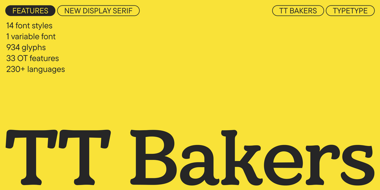
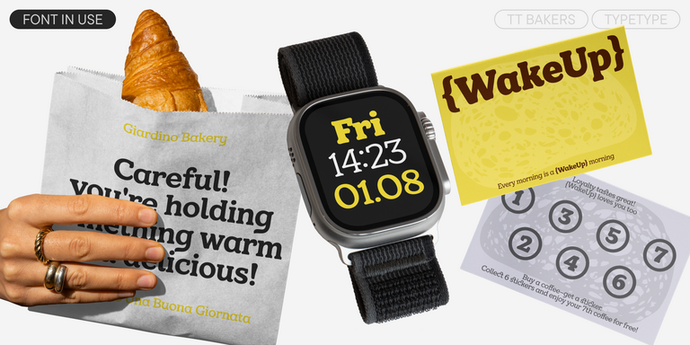
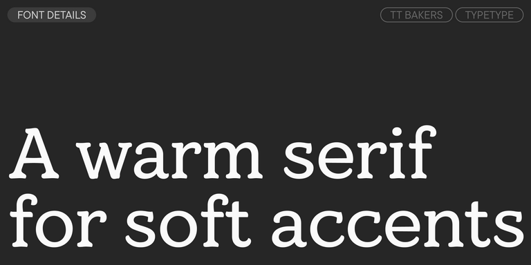
TT Bakers is a fluid serif with a gentle and lively character. This font is like freshly baked goods: it`s warm and soft, especially in its bolder weights.
4 Lines Fonts
Parallel strokes running side by side give lettering a layered, rhythmic look that reads as decorative rather than neutral. 4 Lines Fonts gather typefaces suited to that display mood: headlines, posters, packaging and titles where letterforms act as graphic elements. Here you can compare TypeType families carrying this tag, test them in trial versions and request a license that matches your project.
- All fonts 78
- Sans Serif 46
- Serif 21
- Slab Serif 6
- Display 44
- Script 9
- Variable 49
- Font sale 12
What Makes 4 Lines Fonts Distinct
Multi-line lettering is built from several parallel strokes instead of one solid stem. Depending on the design, the lines may appear as inline cuts, striped fills or separate contours that trace the shape of each letter. The result is a sense of motion and depth that a single-stroke face rarely delivers. In 4 Lines Fonts, the tag points to this decorative display character, although construction varies between families, so each typeface on the page deserves a closer look. Compared with conventional text faces, line-based letters carry more visual texture, which is why they work best as accents.
Where 4 Lines Fonts Are Used
Brands aimed at audiences who respond to nostalgia, energy or playfulness often turn to line-based lettering. Think of cafés and bakeries, music festivals, streetwear labels, toy makers and event organizers that want a headline to feel crafted or retro without looking dated. Designers apply 4 Lines Fonts to posters, packaging, signage, magazine covers and large titling, where the stripes have room to stay crisp. Long passages are a different matter: at small sizes the gaps between strokes close up and reading slows, so body copy is better served by a calmer companion face.
How to Choose 4 Lines Fonts for Your Project
Start with the smallest size at which the lettering will appear. A dense pattern of parallel strokes that looks striking on a billboard may turn grey on a phone screen or a product label, so test real layouts early. Next, judge stroke density and spacing: wider gaps between lines usually survive reduction better, while tight stripes suit very large formats. Mood matters as much as mechanics. Some line-based designs lean toward vintage signage, others feel geometric or playful, and the right choice depends on the tone your audience expects. Check whether the family offers supporting weights or a plainer companion for subheads and captions. Finally, plan a pairing with a neutral sans or serif for running text. TypeType provides trial versions of 4 Lines Fonts, so you can compare candidates in actual mockups before deciding which license to request.
Explore TypeType's 4 Lines Fonts Collection
This page brings together five TypeType families tagged 4 Lines: TT Bakers, TT Marxiana, TT Tsars, TT Hazelnuts and TT Corals. Each has its own personality, so the most reliable way to compare them is to type your own headline into the preview and look at the letters side by side. Browse the list with a specific brief in mind, such as a poster title, a package front or a logotype, and note how every family behaves at the size you need. Trial versions of all the tagged typefaces are available, which makes it possible to test them in layouts before committing. When a design fits, leave a request for the license type that suits your intended use. If you are unsure which option applies, the TypeType design and client care teams can advise, and the contact form on the website is the quickest way to reach them.
- The quick brown fox jumps over a lazy dog.
- Pack my box with five dozen liquor jugs.
- Sphinx of black quartz, judge my vow
- 0123456789 !?.,:;—–()[]{}<> “quotes” ‘apostrophe’ @#%&*_+=/\| № $ € £ ₽ +−×÷=≠≤≥ … % © ® ™
- Aa Bb Cc Dd Ee Ff Gg Hh Ii Jj Kk Ll Mm Nn Oo Pp Qq Rr Ss Tt Uu Vv Ww Xx Yy Zz
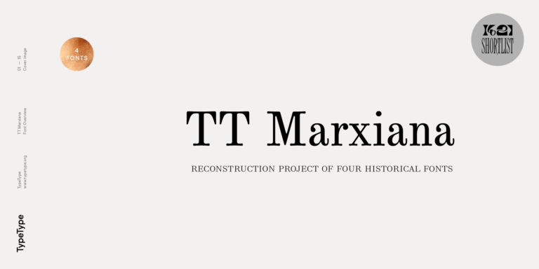
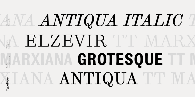
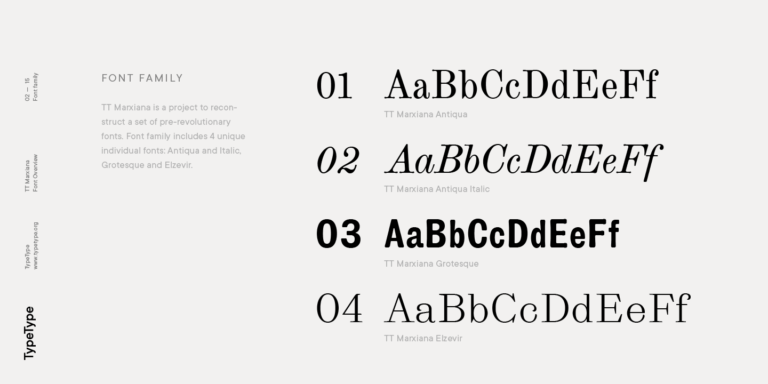
TT Marxiana Elzevir is a title or header font and is a compilation of monastic Elzevir that were actively used in the Niva magazine for all its prints.
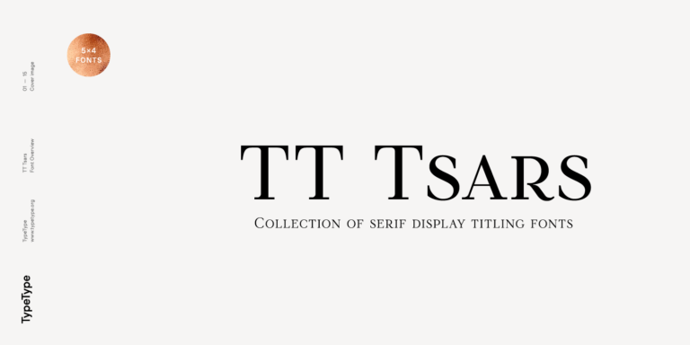
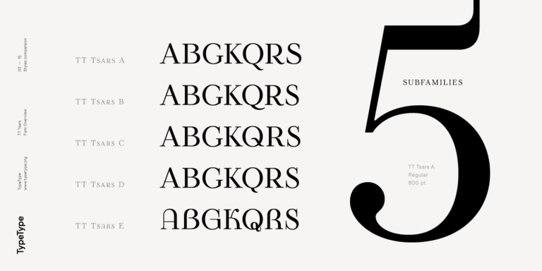
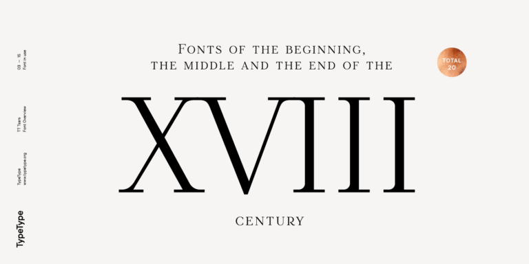
The TT Tsars font family is a collection of serif display fonts that are stylized to resemble the fonts of the beginning, the middle, and the end of the XVIII century.
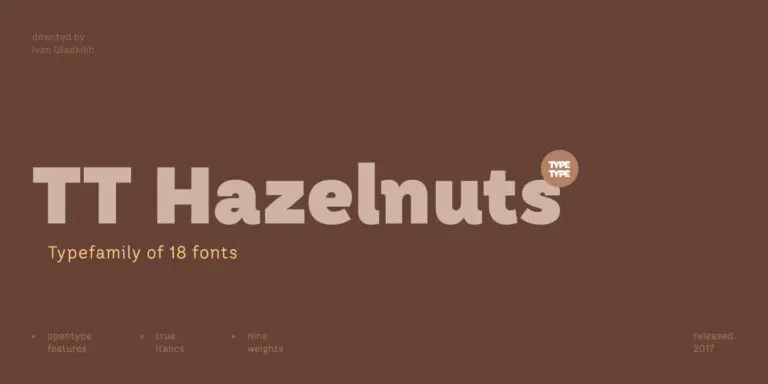
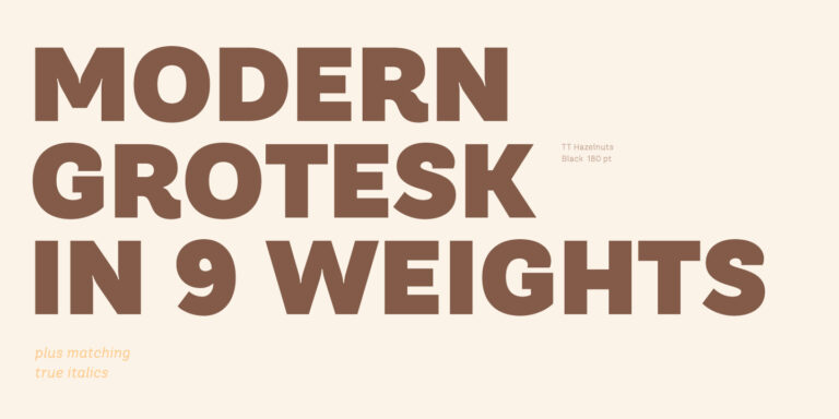
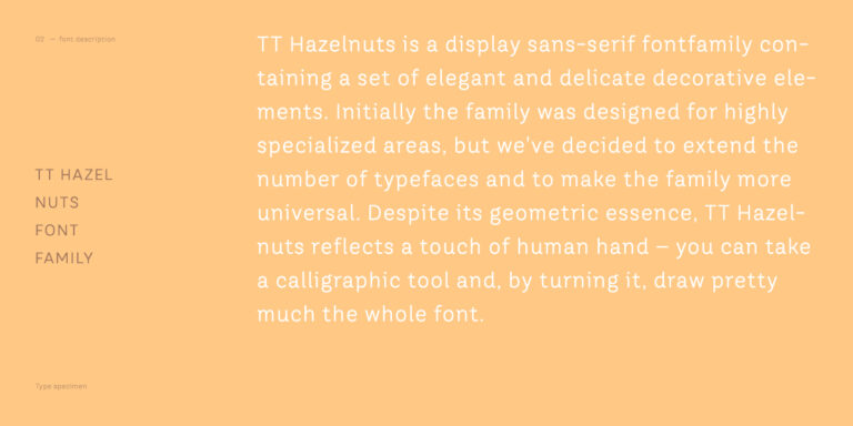
TT Hazelnuts is a display sans serif font family containing a set of elegant and delicate decorative elements.
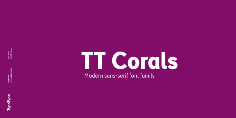
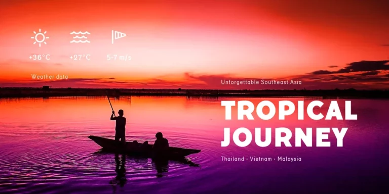
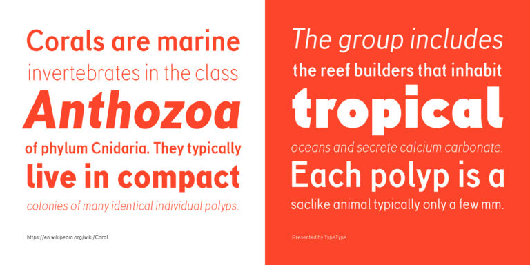
TT Corals is a modern humanistic sans serif which has many typical traits of the beginning of the 20th century. For an increased functionality of the font family, we`ve created 6 styles of various weights.
What Are 4 Lines Fonts?
They are display typefaces whose letters are drawn with several parallel strokes, inline cuts or striped fills instead of one solid stem. The effect is rhythmic and decorative, giving words texture and movement. Because every design treats the lines differently, compare families at the size you plan to use.
Which Industries Use 4 Lines Typefaces Most Often?
Line-based display lettering commonly appears in food and beverage packaging, entertainment and event promotion, retail, fashion, advertising and editorial covers. These fields value headlines that catch attention quickly and carry a retro or energetic tone. The approach is usually reserved for titles, logos and signage.
Can 4 Lines Typefaces Be Used for Branding?
Yes. Multi-line lettering can give a logotype or campaign headline a distinctive, retro or dynamic character that is easy to remember. Before committing, check how the mark reads at small sizes such as app icons or labels, and support it with a simpler text face for everyday communication.
What Should Be Considered When Pairing 4 Lines Typefaces?
Keep the decorative face for headings and let a calm, neutral sans or serif handle body copy. Contrast in texture keeps both voices clear. When testing 4 Lines Fonts next to a companion, compare x-heights, weight and spacing in real layouts, and avoid combining two expressive display designs.
Can You Download TypeType Fonts for Commercial Projects?
Trial versions of the tagged families can be downloaded from TypeType for testing in your layouts. For commercial use, leave a request for the license type that matches your project. If you need help choosing, the design and client care teams are available through the contact form on the website.