


TT Livret
Text Regular
32 font styles
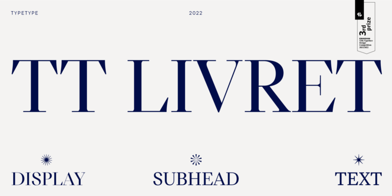
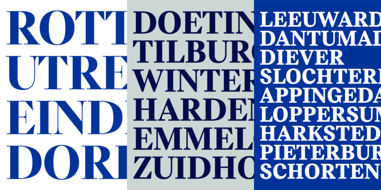
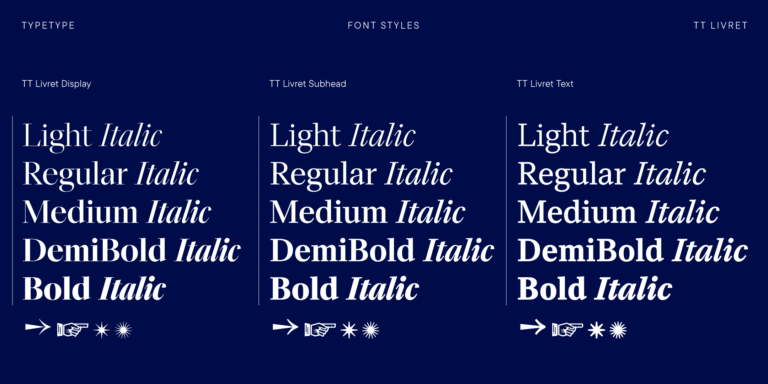
TT Livret is an elegant, modern and functional serif

The Arcadia Fonts selection brings together TypeType designs for exploring expressive serifs, editorial typography, and distinctive display lettering. Compare TT Livret, TT Bells, TT Ramillas, and other families with different proportions and details. Choose a direction for a book cover, packaging system, or brand identity, then consider how the lettering handles both prominent titles and supporting information.
Within Arcadia Fonts, several serif designs offer contrasting personalities. TT Bells combines curved forms with straight terminals and wedge serifs. TT Jenevers adds asymmetrical serifs and an irregular slant in its oval shapes. TT Ramillas uses pronounced stroke contrast and flared serifs, with Outline and Decor styles for more ornamental settings. Choose among these approaches by comparing how the letters work together, not just how striking one capital looks. Check the lowercase a and e, the leg of R, and recurring pairs in your project name. These details help establish whether the lettering feels measured, sharp, or expressive.
Use Arcadia Fonts to explore typography for art books, independent magazines, beauty packaging, and hospitality identities. Begin with the content: a photography monograph may need a restrained title beside a dominant image, while a small product carton needs clear separation between its name, variant, and practical details. For a restaurant identity, let the name carry more character and keep menu descriptions quieter. Avoid treating every surface as a headline. Plan the typographic roles across the whole project so a cover, label, business card, or booking page feels related without requiring identical scale, density, or decorative treatment.
Build a hierarchy with Arcadia Fonts by deciding which element should lead before introducing a second family. For a coordinated serif layout, consider TT Livret's Text and Display subfamilies: the former has open apertures and looser spacing, while the latter uses denser spacing and more closed forms. Alternatively, test an expressive serif headline with a restrained sans serif for navigation, captions, and longer descriptions. Compare lowercase height, line length, and the visual weight of both choices at their intended sizes. Keep italics for a defined purpose, such as emphasis or a secondary voice, instead of making every subheading decorative. Set a full paragraph with punctuation, numerals, and accented characters, then check whether the pairing remains balanced. On packaging, repeat that exercise at the smallest required size. Judge the result as a complete layout: a compatible pair should make the reading order clearer, not merely look attractive in isolation.
Review the collection to compare individual styles and complete families, then download a free trial for evaluation. TypeType permits trial use in test layouts and client mockups, but not commercial publication. Use this stage to check the character set, required language coverage, and OpenType features in your chosen applications. For print work, request a proof on the intended stock; for a website, review real text at narrow and wide screen sizes. Once the design is approved, select licensing for the actual deliverables rather than assuming one purchase covers every medium. TypeType distinguishes Desktop, Webfont, App, and other usage categories. Prepare a clear list of installations, websites, and embedded uses before ordering. Keep the licensed files, purchase records, and typographic specifications together so future revisions remain consistent. Where collaborators need access, confirm the appropriate arrangement with TypeType before distributing the files.
TT Livret is an elegant, modern and functional serif
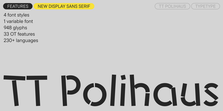
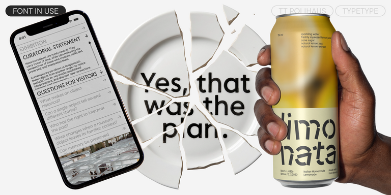
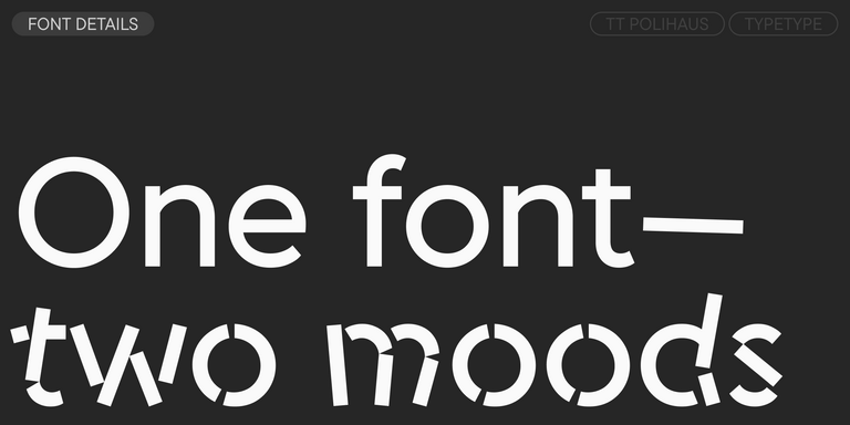
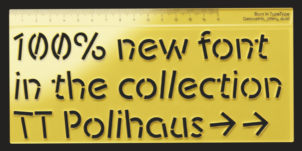
TT Polihaus is an experimental sans serif that, at first glance, looks ordinary, but then breaks apart, transforming into a stencil pattern.
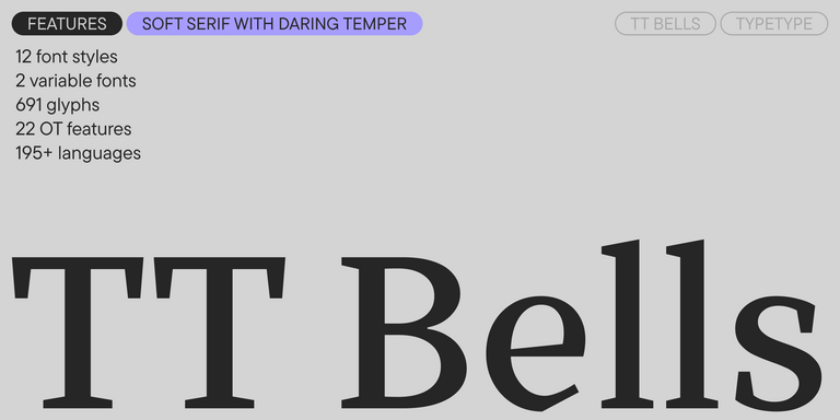

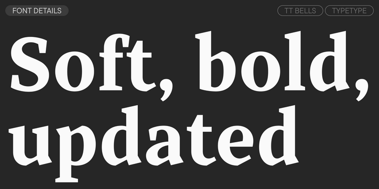
TT Bells combines the elegant softness of Antiqua with a complex and daring temper reflected in straight stroke terminals and arrowheaded serifs. The typeface is based on the broad nib, which creates these hallmark terminals and serifs.


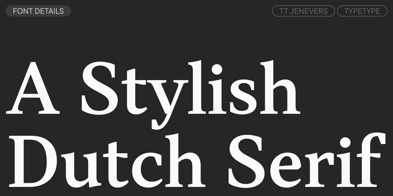
TT Jenevers is a modern serif with a Dutch flavor. The font family features the characteristic details peculiar to Dutch serifs—these are the asymmetrical shape of serifs and an irregular slant of ovals.


TT Regins is a Scottish modern serif. Striking contrast and sharp triangular serifs give this font a stern and commanding character, while refined forms, enlarged lowercase letters, and slightly condensed, static proportions add grace to its design.
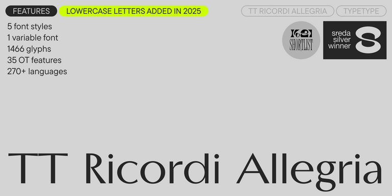
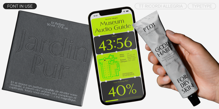
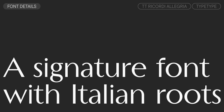
TT Ricordi Allegria is a sleek and intelligent contemporary Florentine grotesque.
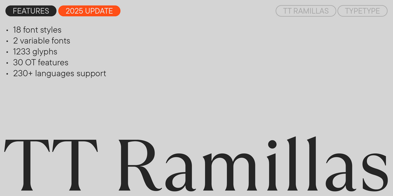
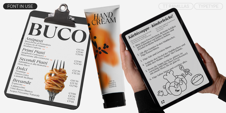
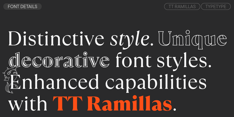
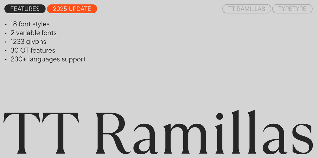
TT Ramillas is a contemporary serif with editorial versatility. It features decorative styles and ornamental initials with floral motifs.
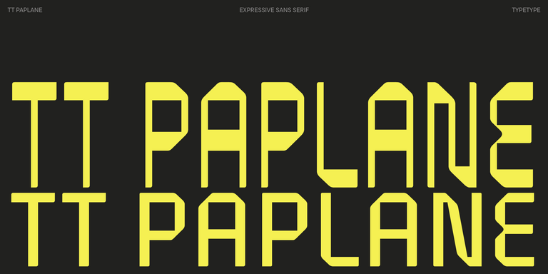
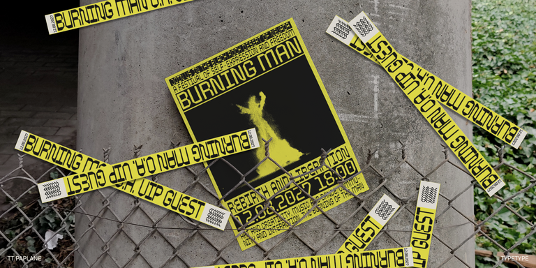
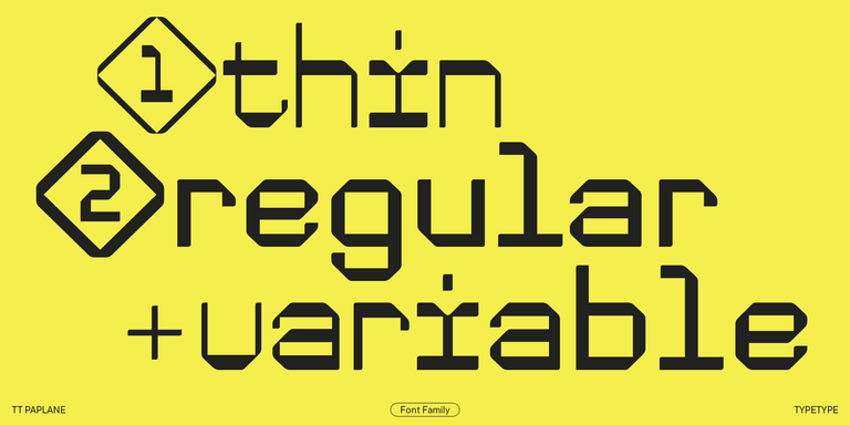
TT Paplane is a squared-looking display sans serif.
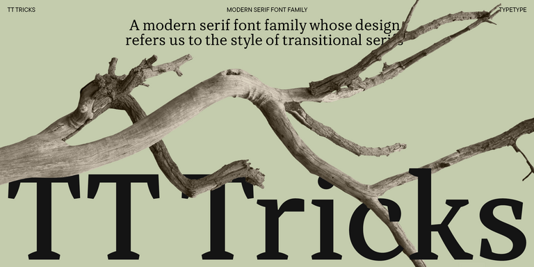
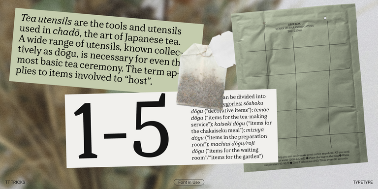
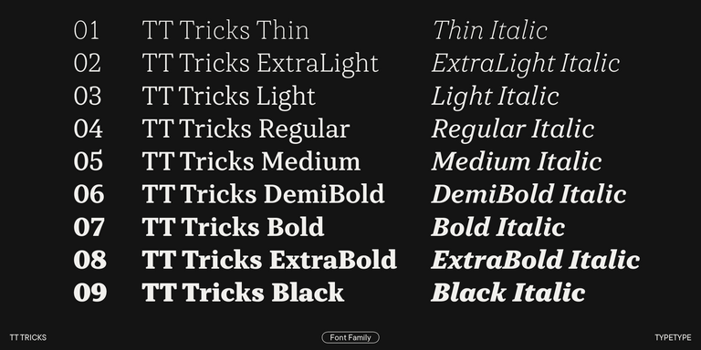
TT Tricks is a modern text serif with a design reflecting the style of Transitional serifs. This font has a calm, elegant, and moderately stern character.
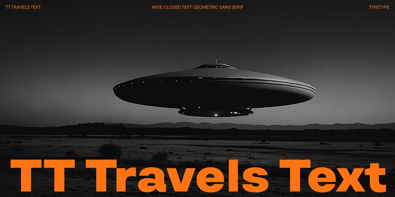
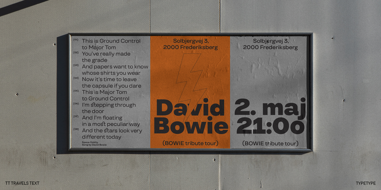
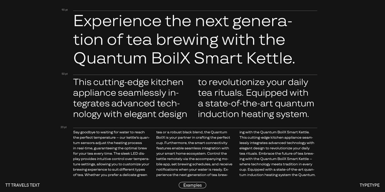
TT Travels Text is a geometric grotesque with wide proportions and specific shapes of circles and fillets, which includes two stylistic sets with completely different natures.
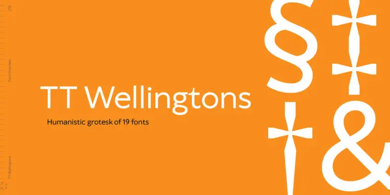
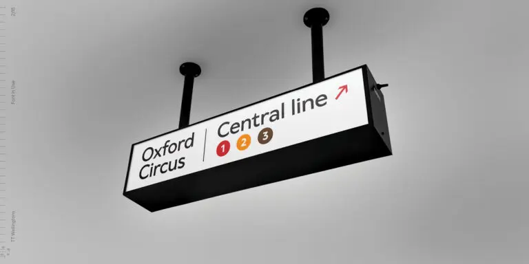
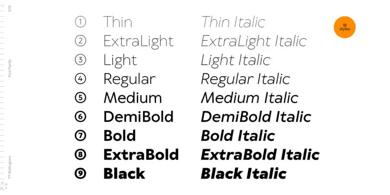
TT Wellingtons is an attempt to combine the style of English humanist sans serifs of the early 20th century with the requirements for modern geometric grotesques.
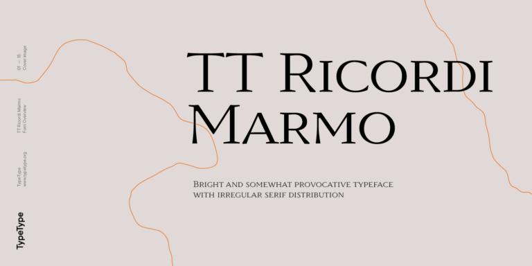
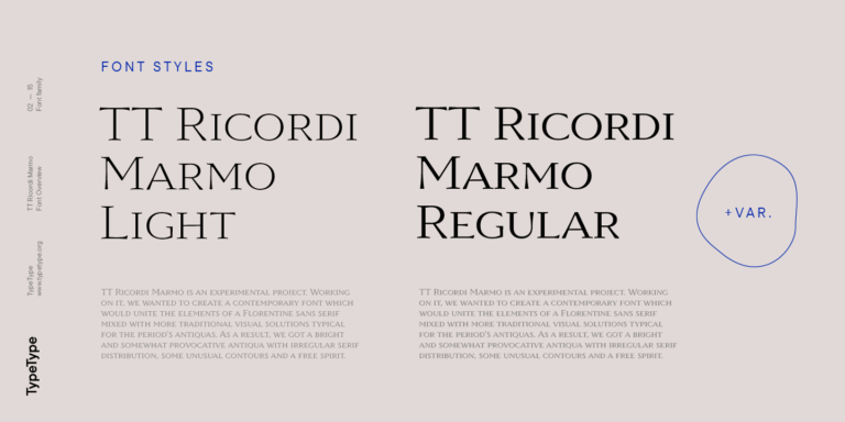
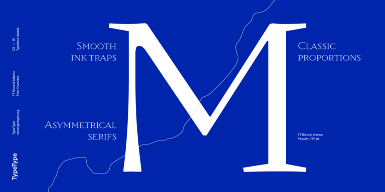
TT Ricordi Marmo is an original experimental project inspired by inscriptions at Basilica di Santa Croce in Florence.
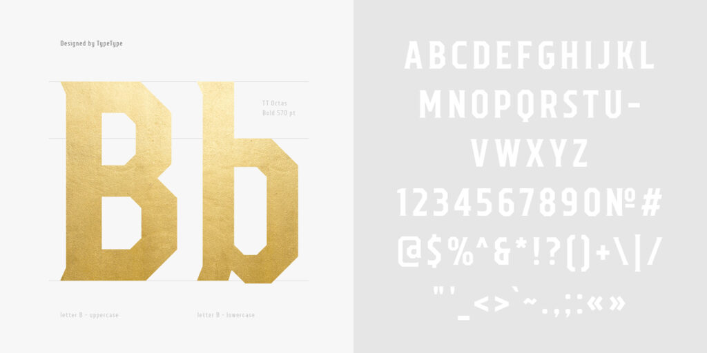




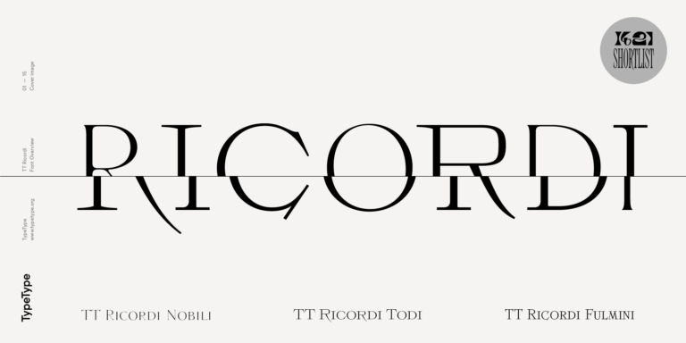
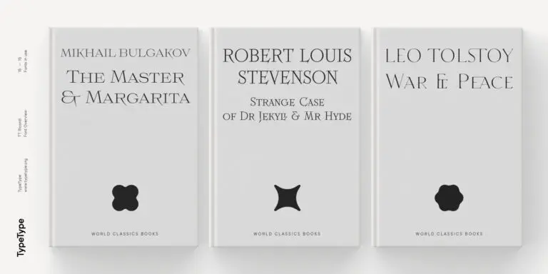
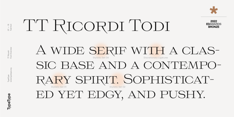
The TT Ricordi font family is a collection of three display heading serifs.
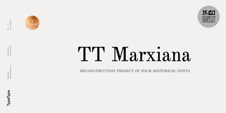
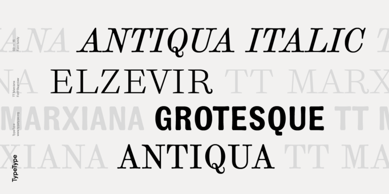
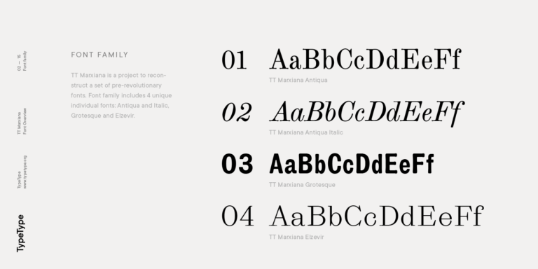
TT Marxiana Elzevir is a title or header font and is a compilation of monastic Elzevir that were actively used in the Niva magazine for all its prints.
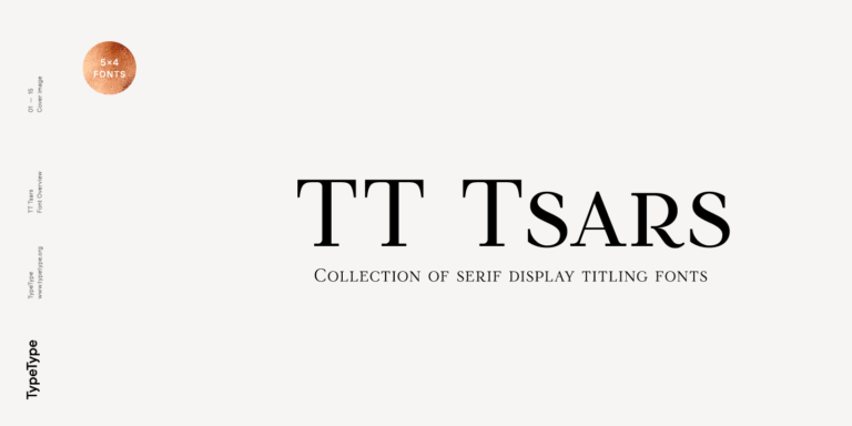
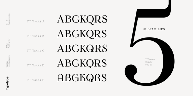
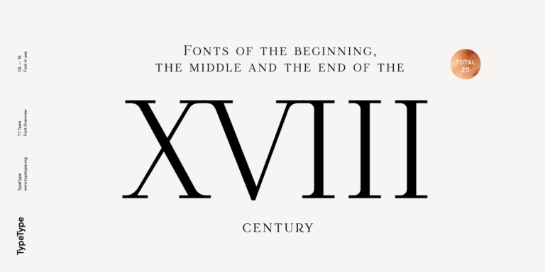
The TT Tsars font family is a collection of serif display fonts that are stylized to resemble the fonts of the beginning, the middle, and the end of the XVIII century.
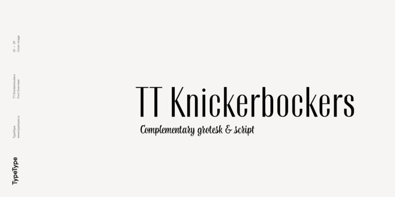
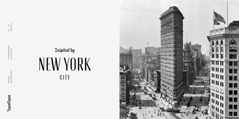
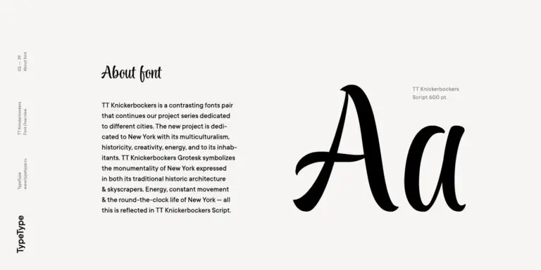
TT Knickerbockers Grotesk is a narrow contrast sans serif with characteristic elements sending us back to the 19th century in New York.
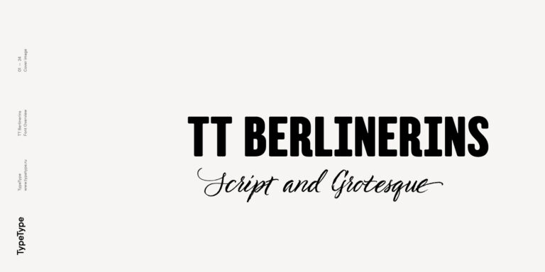
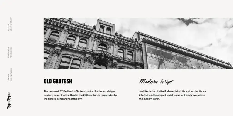
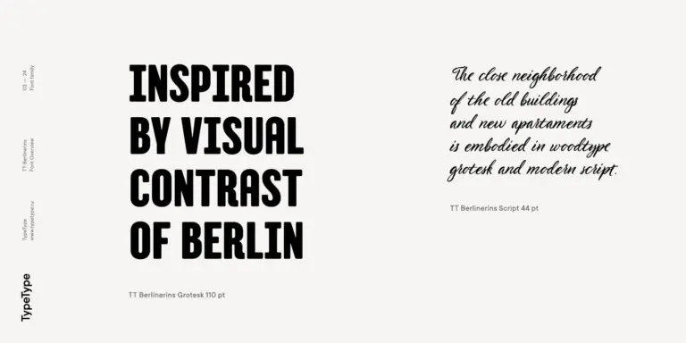
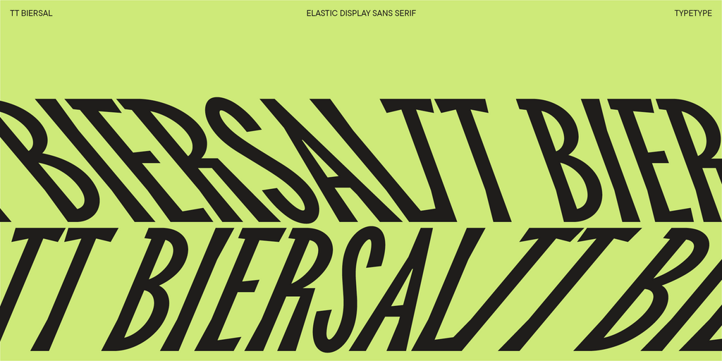
TT Berlinerins is a grotesque inspired by the wood-type poster types of the first third of the 20th century is responsible for the historic component of Berlin.
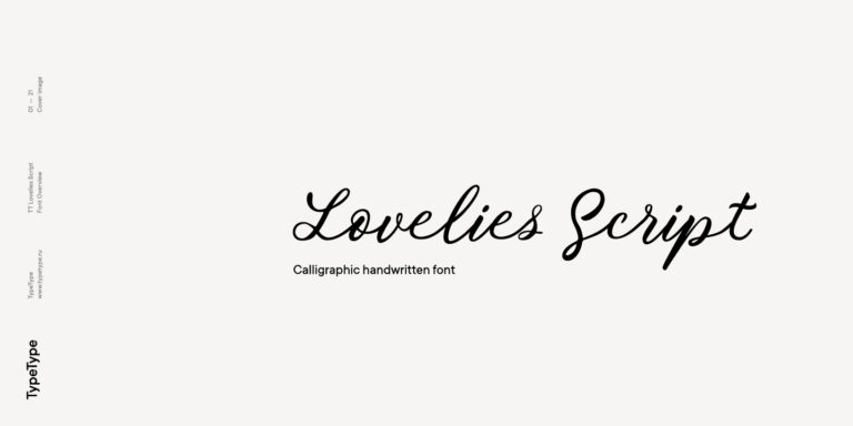
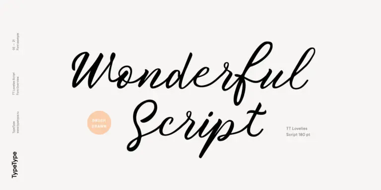
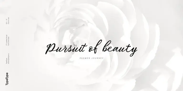
Without any false modesty, we can say that TT Lovelies Script is one of the most complicated projects we have ever carried out—there are 1115 glyphs, more than 2000 contextual alternates, 10000 kerned pairs, and a large number of OT features, including ligatures and Old Style numbers.
This page presents a TypeType selection rather than a single family named Arcadia. It brings together designs with different structures and intended roles. Choose by the individual family's specimen and your layout requirements, especially when working from a specific visual reference.
Consider the serif options for publishing, fashion, beauty, cultural organizations, and hospitality. Match the treatment to the task: expressive lettering for a cover or campaign title, quieter styles for descriptions and practical information. The appropriate choice depends on the brief, not the industry label.
Yes, with licensing that covers the intended applications. TypeType requires a Logo license for public logo use; a Desktop license alone does not cover that use. Develop the identity around your own name, audience, and materials rather than relying on decorative lettering alone.
Compare proportions, lowercase height, stroke contrast, and spacing before judging the combination. Give each face a clear function, such as titles or supporting copy. Start with two families at most, then test paragraphs and captions together before adding another style to the system.
Yes. Purchase individual styles or a complete family with the appropriate commercial license. Free trials are available for evaluating layouts before purchase, not for commercial publication. Check the planned media, required character coverage, and any embedding requirements before selecting the final files.