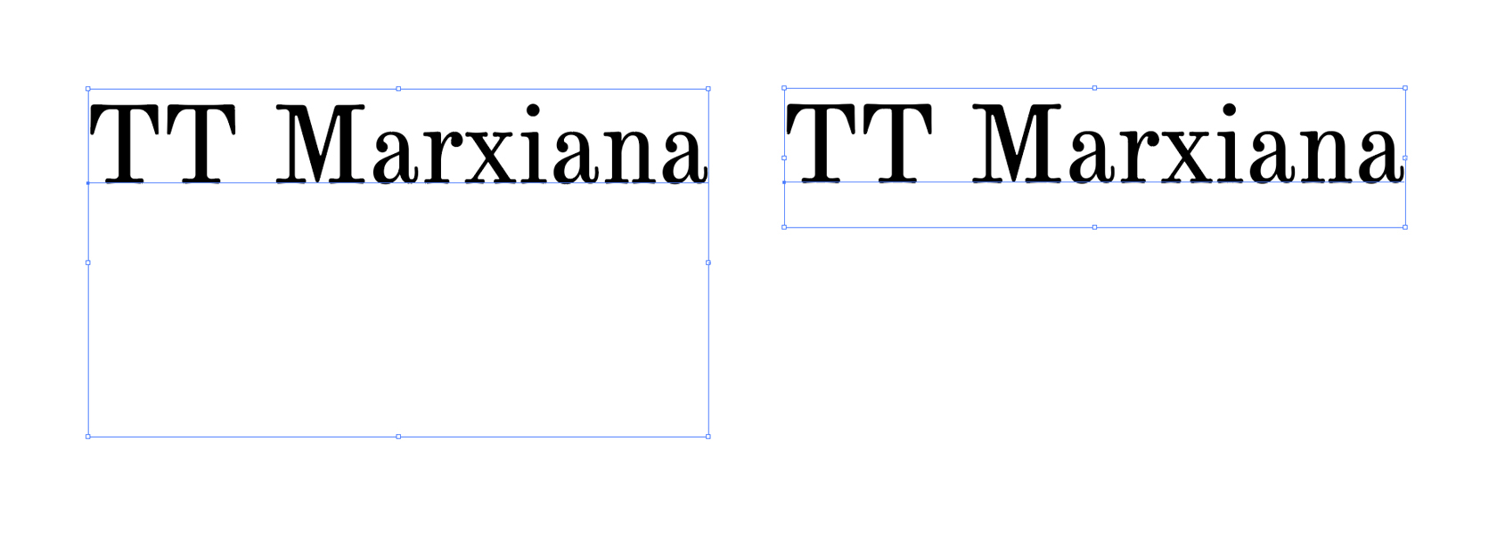
We are glad to present you the story of the TT Marxiana font family creation.
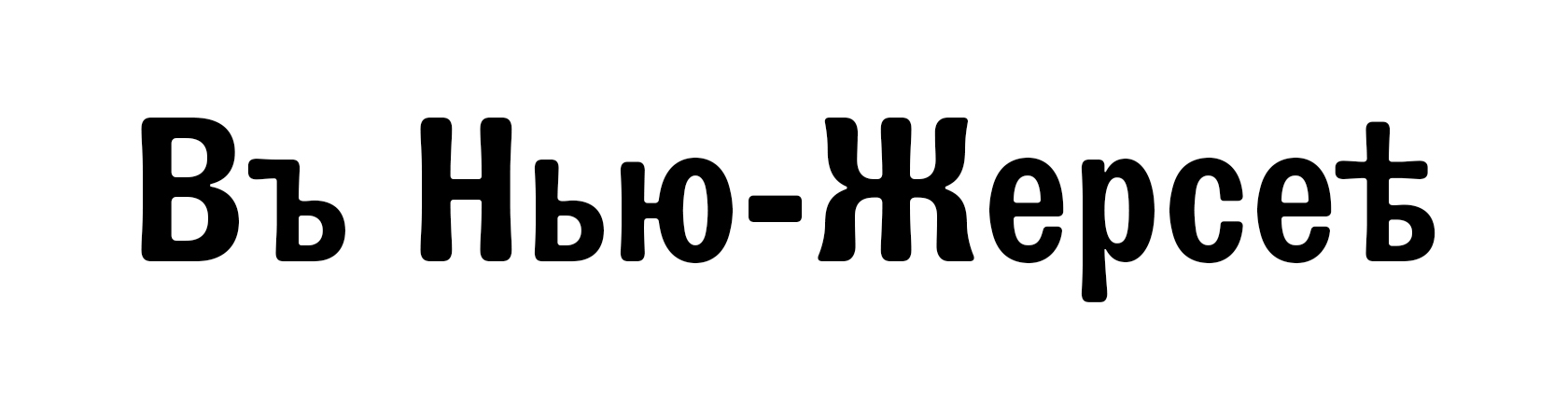
TT Marxiana is a pre-revolutionary font reconstruction project. These fonts were used in the layout of the “Niva” (nee-vah, “Cultivated field”) magazine published by the A. F. Marx publishing house in Saint Petersburg. In our project we decided to focus on a very specific set of fonts that were used in preparation and printing of the “Niva” magazine in 1887 — Antiqua, Antiqua Italic, Grotesque, and the Elzevir.
In the TT Marxiana project, we aimed to preserve the strict historic character of the font and to keep it as close as possible to the original. We wanted to avoid any ‘modernization’ of the fonts, except for, of course, kerning, OpenType features, and manual hinting. As a result, TT Marxiana is a fully functional set of different fonts that allows the designer to work with contemporary software and methodologies to create a magazine with a typical late-19th century design.
1. Inception of the project
In the summer of 2018, we started thinking about how it would be great to embark on a revival (or a reconstruction) project of several historic fonts that were in use a century or more ago. We thought this would be a nice contribution to the knowledge of the partially lost pre-revolutionary Russian culture and a great way to introduce contemporary designers to a truly historic font project.
At the time period we chose for our project, there existed several large and well-developed printing houses in Russia and the Cyrillic archetype has already acquired the form that we know today. In addition, despite the loss of the physical font sets, a lot of printed specimen dating back to that time have been preserved, which meant we could find the most interesting fonts there.
Searching for ideas, we explored the period from the end of the 19th century and the beginning of the 20th century, specifically focusing on Russian pre-revolutionary printing houses.

2. The library and sources
Initially, when planning our library trips, we thought we would only study the expensive gift book editions and look for the font gems in there. Indeed, there were a lot of interesting font specimens that we found in the electronic archives and libraries.
While searching, we realized that in the books printed at different print houses one could find the same fonts or their close variations.
During one of the library visits, we found a book edited by A. F. Marx publishing house, which became the starting point for our project. We found a set of fonts that were a great match to our idea in that three-volume edition.
Following this discovery, we had settled on creating a set of fonts that would not be discordant, but, on the contrary, would supplement each other in a united vision. With that, the fonts would have to be completely different in style and have their own peculiarities such as the stylistic features, character, historicity, emotionality, conveyed zeitgeist, etc.
3. Drawing the first 3 fonts, or the first version of the project
Initially, we only planned to work in a font editor, but as it was impossible to do the necessary work with raster references in it, we traced all the paper references in a graphic editor. This approach had later made our work more difficult because the Bézier curves in graphic editors do not allow for the same freedom of action and careful preservation of the character contours as specialized font editors do. However, that was enough for the first stage. These first digital sketches made us think both about the main font properties (proportions, contrast, serif shapes) and the general concept of the project.
4. Working on the variable font, or the dead-end
Once we had the first sketches, we had once again gone back to discussing the concept of our project. We pondered the character composition of the font family and the idea of the revival (reconstruction) itself. The whole idea of font revival can be interpreted differently: on the one hand, it means an exact match with the original; on the other hand, it also calls for an independent interpretation of the topic.
At that point, we did not quite have the idea of which direction we should choose. We could have created an independent font with its artistic and functional novelty based on the old references, as well as a completely reconstructed historic font without any excesses or our personal whims.
As a result, we chose the wrong way of artistic independence — we got carried away by trends and new software possibilities and decided to develop the project into an experimental variable font.
The idea was rather curious, and we had spent a lot of time finding the most organic transitions from one font to the other through variability. For a smoother flow, we corrected some serif shapes and other font details, which took us even further away from the source font.
Thus, we had a working prototype that looked strange and weird, and we realized the project could not go on in such a form. So, we had to either rethink the concept or to move away from the pre-revolutionary graphic references.
5. Abandoning the initial idea and looking for new concepts
A year after its inception, the project got a fresh start. We reviewed the concept and adopted the “Niva” magazine as a reference, which was a perfect source for us in terms of its historicity.
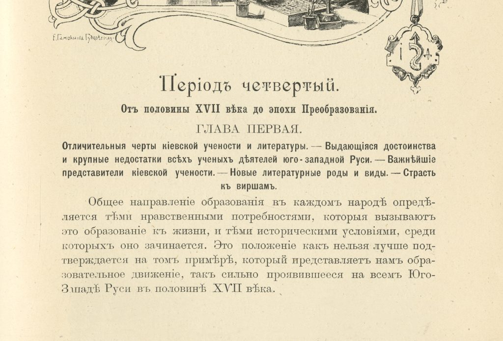
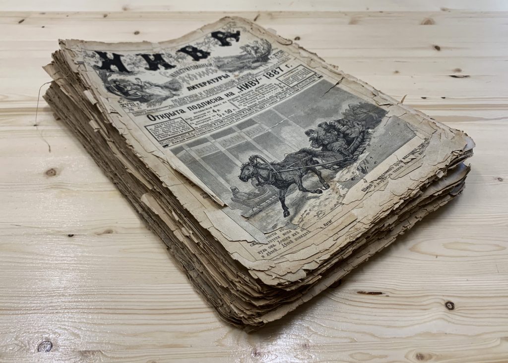
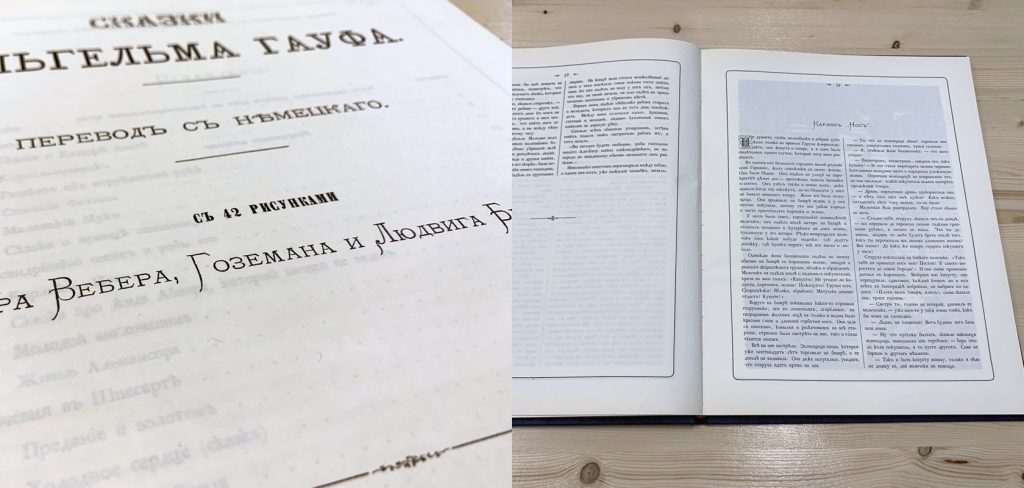
The “Niva” magazine was published weekly from the end of 1869 till September 1918 by the A. F. Marx publishing house in Saint Petersburg. Thanks to its being affordable and the publishing strategy of A. F. Marx, the magazine was very popular and reached the highest circulation numbers (up to 240 000 copies).
We were inspired by this story and we were also enticed by the idea to create fonts that would preserve the irregularities and roughness typical for the late-19th century printing in modern print. In addition, one of our colleagues had found a collection of “Niva’s” from 1887 at her country house storage — so we literally dug into the dust of ages!
The conclusions we came to after this reconceptualization were as follows: reconstructed fonts that are enriched with modern artistic elements are not rare, but the fonts that are fully identical to the historic ones are not as frequent. So, we altered our idea.
6. Working with paper references
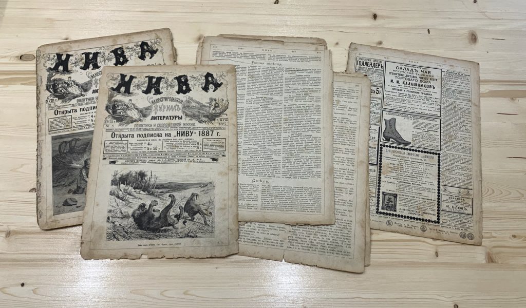
So, we had approximately fifty issues of the “Niva” magazine at our hands, and we had to figure out how to go on working with them. In general, each “Niva” issue can be divided into two parts: the content part (articles and fiction) and extras (quizzes and advertisement). The same was true for the layout: while the ad part was ripe with display fonts that each tried to be more visible and louder than its neighbor, the content part had a very conservative layout featuring two fully justified columns and centered headings.
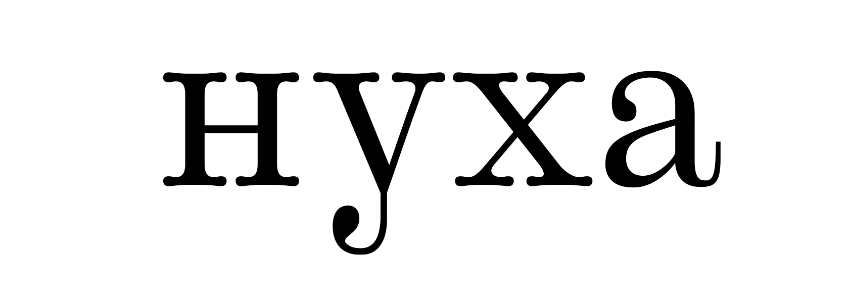
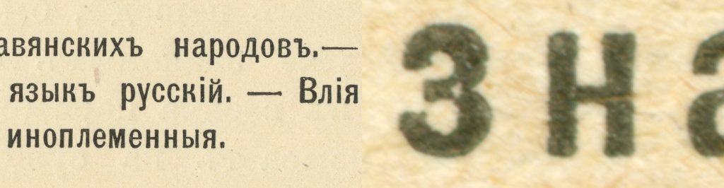
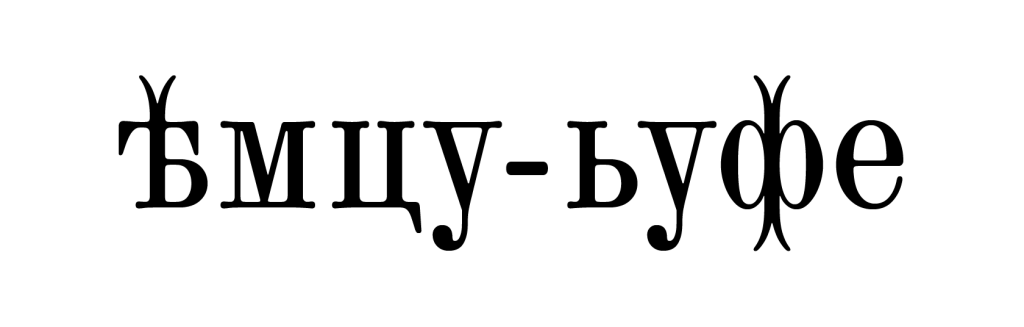
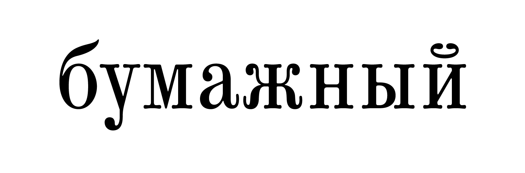
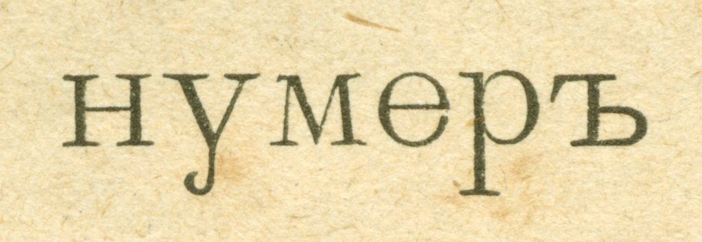
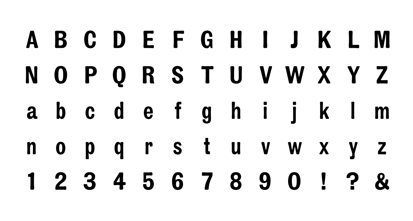
We focused on four main fonts: Antiqua, Antiqua Italic, Grotesque, and the Elzevir. The magazine’s Antiqua was a fairly narrow font with characteristic shapes of the б, л, д, and у characters. Almost all of the pages were formatted using the text Antiqua. The drawing of the Italic was very close to the Antiqua, and the magazine used it to highlight a specific portion of the text. The Grotesque was fairly bold and was mostly used by the magazine in sub-headings and illustration captions. The Elzevir was used in all headings.
The Antiqua was used in different point sizes in the magazine, but we chose to work with the smallest one (approximately 8 points) as we found its rhythm and drawing most fascinating. Accordingly, we looked for the references for most of the font character composition in the small size, and if some characters were only present in a bigger point size we tried to bring them closer to the smaller characters by working with the black and white balance.
We had gone through the “Niva” collection multiple times. We had to find as many characters, details, and artifacts as we could to include in our project.
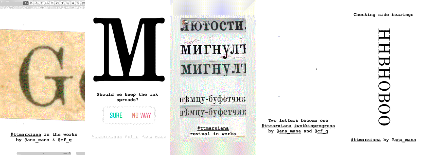
Studying the magazine, we encountered a number of characters in which the ink spread unevenly, which was one of the characteristic peculiarities of the period’s printing. Sometimes, when printed like that, some characters receive extra bridges while in others, some letter details disappear.
We decided to preserve this peculiarity and created a separate stylistic set with printing defects, thanks to which a contemporary designer can experience the problems his or her printing predecessor had.
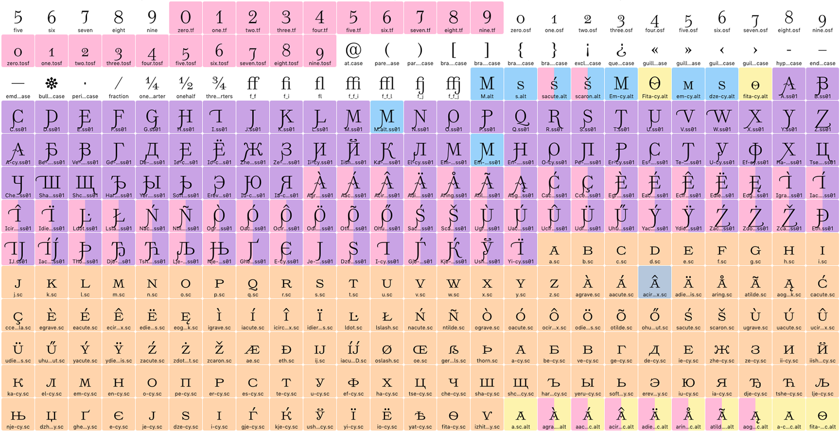
In addition to Cyrillic and Latin, the fonts were to include an extended character composition: a large set of punctuation marks, special characters, currency symbols, and so on.
It might seem strange, but it was entirely possible to gather basic Latin in a magazine published in Russian. First, we have to thank our Russian classic writers who would often use French phrases in their texts. Second, the “Niva” magazine often published scientific articles and many names and terms were typed in Latin, too.
However, despite the fact that we had studied all of “Niva”’s issues from almost fifty years of its existence, we could not find all the characters we needed. We then looked into the printing catalogs of the late 19th — early 20th century. This was a good idea and we could partially fill the gaps and find a basis for some of the decisions we had made.
The Elzevir was the most interesting font in terms of collecting the character composition. “Niva” only used it in headings, so we did not have a reference of the Latin Elzevir. To find suitable references, we searched almost two hundred books and catalogs and finally drew the Latin.
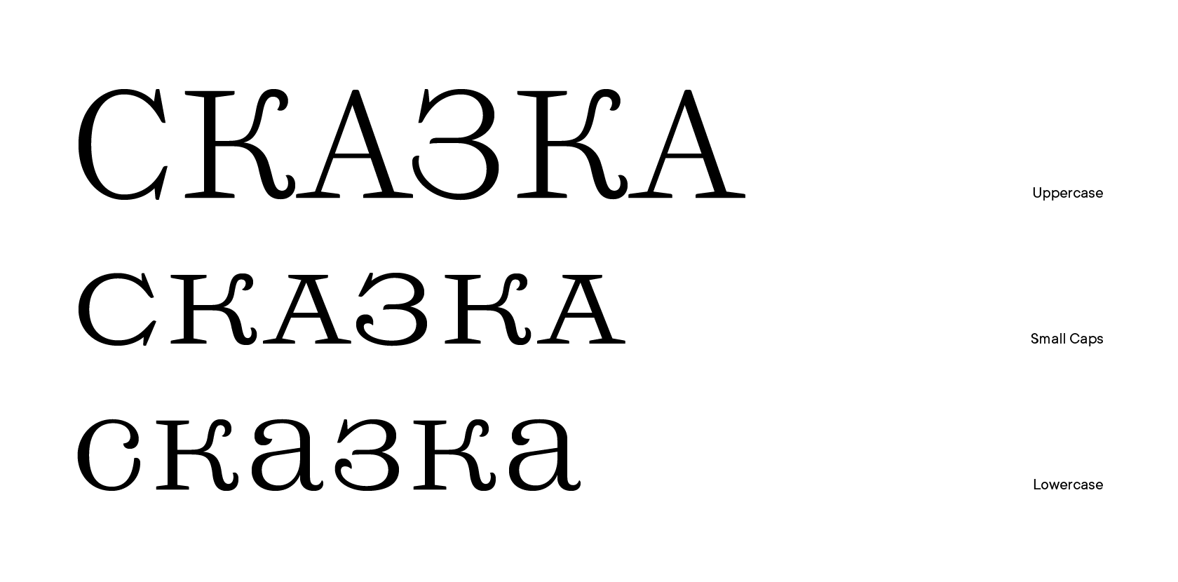
While searching, we also found that monastic fonts, similar to our Elzevir, existed featuring both lowercase letters and small capitals (in earlier versions). In addition, in the first ten years of “Niva”’s existence, its headings were set in small capitals Elzevir. So, we decided to bring all three-letter cases together and added small capitals as well.
What is more, we were once again very lucky: one of our colleagues found a reprint of Hauff’s Tales published by M.O. Wolff, which used Elzevir in headings — and did so in small capitals.
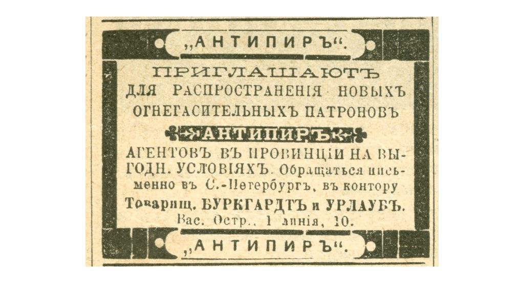
We would like to separately mention the ad pages of “Niva”. All these framed ads, each set in its own font, the illustrations of pre-revolutionary cameras and pill bottles, as well as other graphic elements, are mesmerizing and fully convey the spirit of that era.
So, we really wanted to add all these decorative elements into our font, but our common sense prevailed, and we decided that less is more and chose not to overcrowd this voluminous project. In the end, we decided to add arrow pointers, spacings, and frames that can be used as border patterns and corner stubs, as well as a special reverse set for the Grotesque.
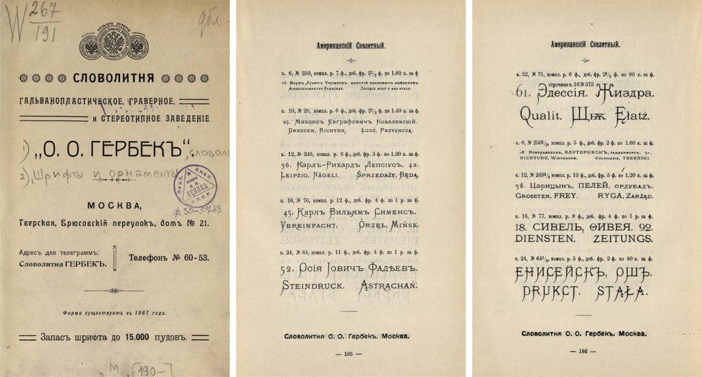
To make this set even more attractive, we had supplemented it with several decorative elements from the O.O. Herbeck’s Type Foundry catalog, in which the font and ornament collection matches those used by the A.F. Marx publishing house.
In parallel with defining the character composition, we started scanning the magazine pages. We tried doing it in the 2400–4800 dpi resolution and initially scanned the whole pages, but it turned out that it is extremely difficult to work with files of that size and it takes forever to scan a page. So, we started scanning single lines or even single words where we found the characters we needed. It took a lot of time to complete this work, but we were entirely satisfied with its results.
7. Drawing the Antiqua
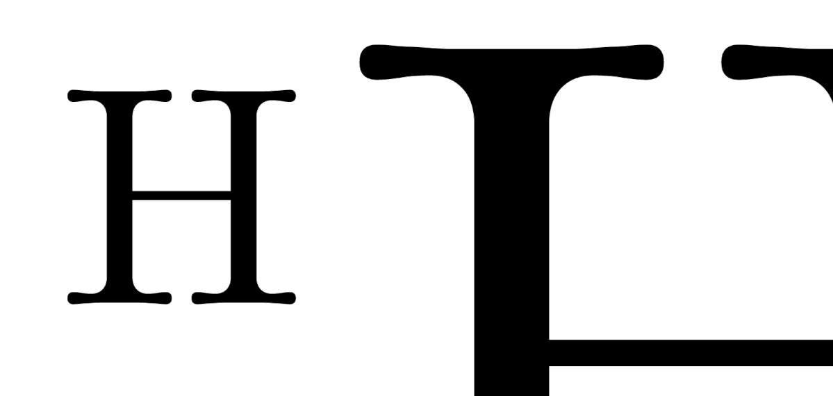
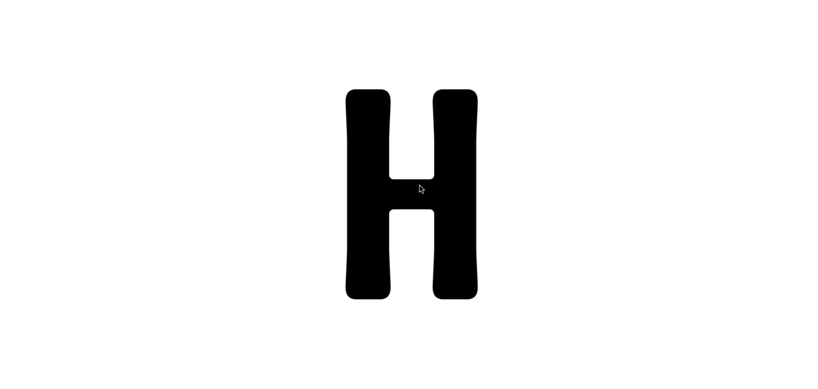
We started working with Antiqua by transferring the sketch contours from the graphic editor into the font editor. First, we picked the basic letter sizes — the stem width and the heights of lower- and uppercase letters — such that their digital contours matched the initial proportions from the “Niva” setting as close as possible. It is notable that these measurements — the x-height, the H-height, and the stem width — remained unchanged until the project completion, while the markings of ascenders and descenders were altered more than once.
This can be explained by the fact that the rhythm of the font and the general impression from its proportions are not difficult to grasp, while the kerns are often badly printed or the line deviates from the base makes, which makes it difficult to estimate their height.
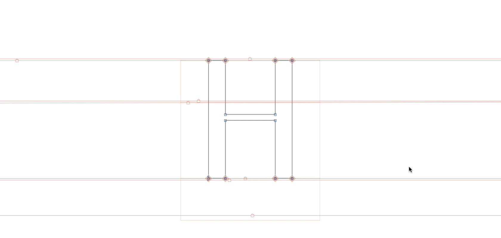
From day one it was clear to us that the serifs had to be created as corner components. This solution had spared us endless edits of the same repeated elements in the font. Basically, each serif in the font was created as a component, so when we would decide on changing the serif shape again, we did not have to edit every single glyph, but only the glyph with the corner component.
At first, it seemed to us that it would be enough to make the two corner components from the two basic and most frequent serifs, namely the large serif for the uppercase and the smaller serif for the lowercase. It turned out in practice that we could not do with just the two types of serifs, and so more serifs of different types and sizes were added to the font. In addition, we decided to create corner components for other characteristics and repetitive elements in the font, for instance, for the bracketings, of which there were plenty. And since we had to preserve the feel of the old-time printing with its typical dot gain, flooding, and deformation, we ended up with 20 different corner components in this font.
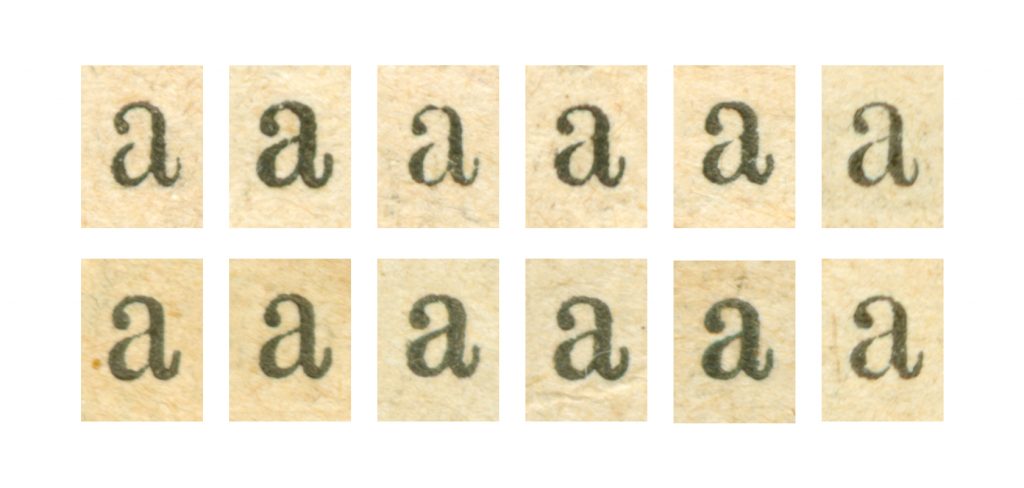
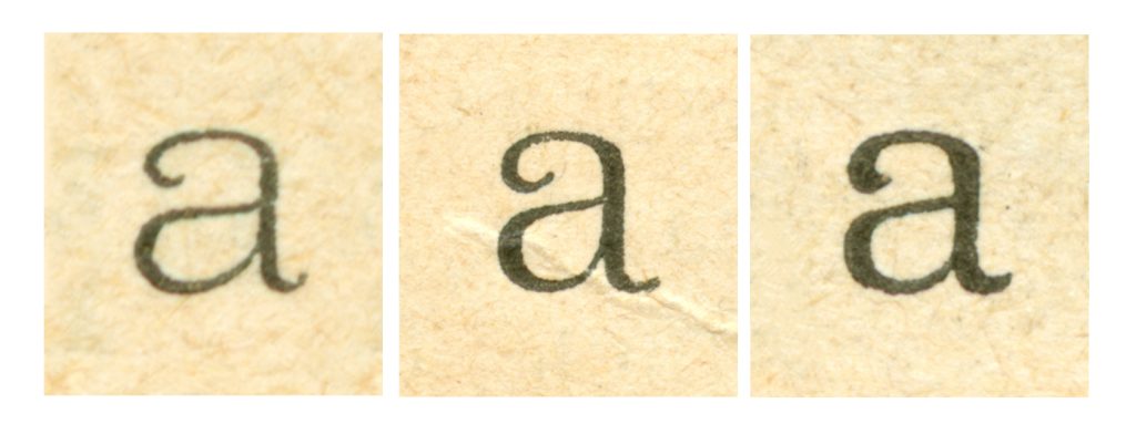
It turned out that drawing a font based on the scanned pages of a century-old magazine is a very difficult task. In fact, such a reconstruction is very much alike to archeological excavation or deciphering a complicated code — and all this effort is only necessary to understand which steps need to be taken for a font to become not just any Antiqua, but the very specific and precise Antiqua from the “Niva” magazine.
In addition, due to the printing peculiarities, the same characters in the old magazine setting looked completely different, which made the task even more complicated. In some places, there was not enough ink and the reference letter was not printed well and too thin. In some other instances, there was more ink than needed and the letter was flooded. So, it was an important task for us to preserve this touch of typographic print but at the same time to decipher the uniting logic and character of dot gains in order for the font to make an organic and unified, yet lively impression.
Some Latin characters were missing in the magazine, so in drawing them we referred to the font catalogs from the late 19th — early 20th century. We were primarily interested in Latin, as “Niva” did not have a lot of it. So, for example, the options for the germandbls were first drawn using a catalog reference, but in the process of consequent editing, it had become more characteristic for our font in its form.
However special this project might have been, we always kept going back to the process of font creation as we know it: namely, to thinking about the font as a system in which all characters live and interact according to certain laws and rules. When we had an issue with how to best set the contrast or what the overhangs should look like, we would make the decision based on our experience in the first place.
But even here surprises and discoveries were waiting for us. When we had finally made it to the contours and proportions we were satisfied with, we found that in the design of new characters there were discrepancies as compared to the original design. The alterations in these characters lead to other edits, and like that, the whole font was significantly edited once again.
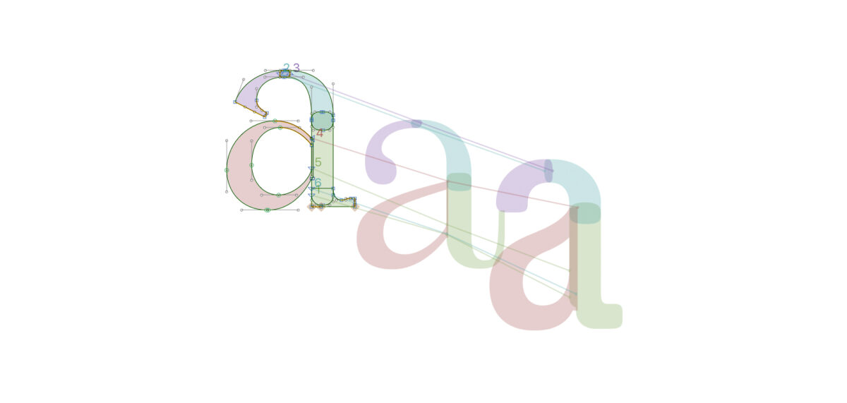
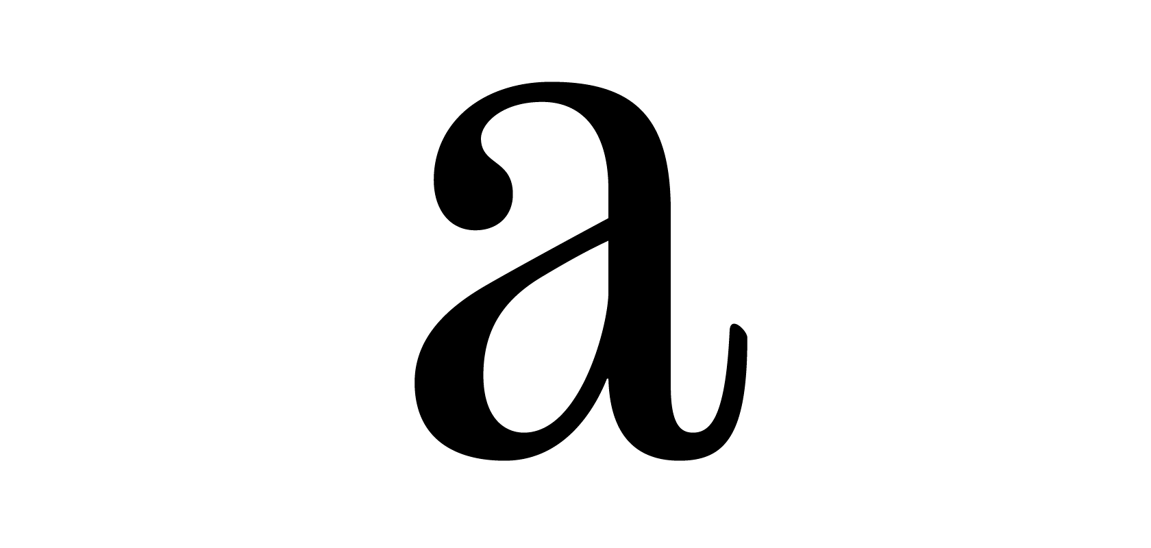
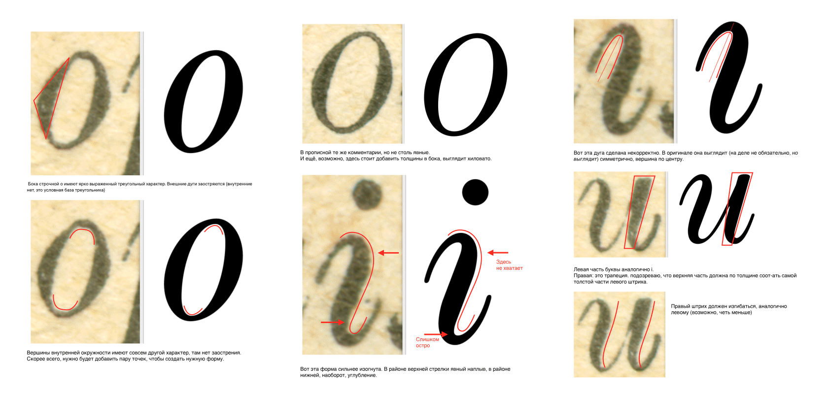
It was most difficult to work with round characters. We had corrected the width of horizontals in them multiple times, as well as the size of the overshoot and the width and the depth of joinings. It was impossible to choose one single measurement for the narrow elements and keep it constant. We had to constantly compensate the character widths in order for the setting to be homogenous first and for it to visually match the magazine font second.
We paid special attention to the bowls in the setting as we wanted to convey their original style as closely as possible. To do so, we closely monitored and corrected such difficult-to-grasp character parameters as squaredness, elongation, diamond-shapedness, and bowl plumpness.
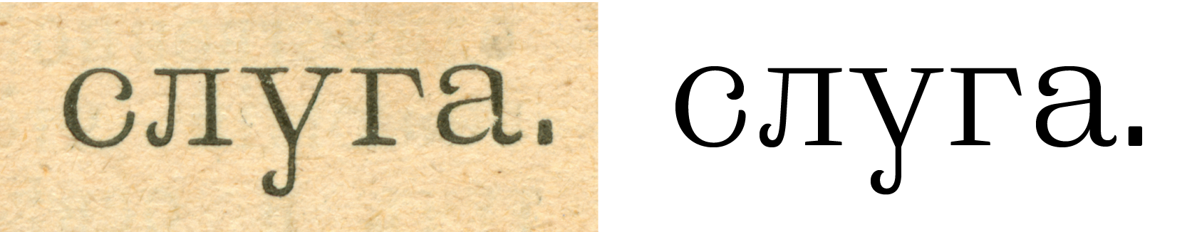
A lot of times, we had edited drops at the stroke ends because as opposed to serifs, the drops were not corner-components and were drawn for each character individually. If we look at the original setting, we can see that most of the characters’ drops are different. This is because these elements were most prone to the irregularities of the old-time typographic print. It was important for us to preserve the liveliness and the dynamics of the drops and, at the same time, to unify them and standardize their size for greater setting homogeneity.
Despite all the meticulous work, when we started testing the font in the setting and comparing it to the “Niva” reference pages, we were unpleasantly surprised. Yes, by all means, we did create a narrow text Antiqua from the end of the 19th century, but this was not “Niva” magazine font. We had to look at and analyze each character in the font to understand where this different look and feel of the font came from.
We increased the overhangs in the round characters, made them even pointier, went over drops once more, and changed the form of tails in а, к, and other letters. While they did look good on screen and in print, when compared to “Niva” the joints looked too dark and needed to be rethought and redrawn.
When we completed the work on the main contours, we decided to add an alternative set of letters to the font imitating printing defects.
Thanks to working on the Antiqua, we gained enormous experience and acquired skills that we were able to use later on in working on the other three fonts of the TT Marxiana font family.
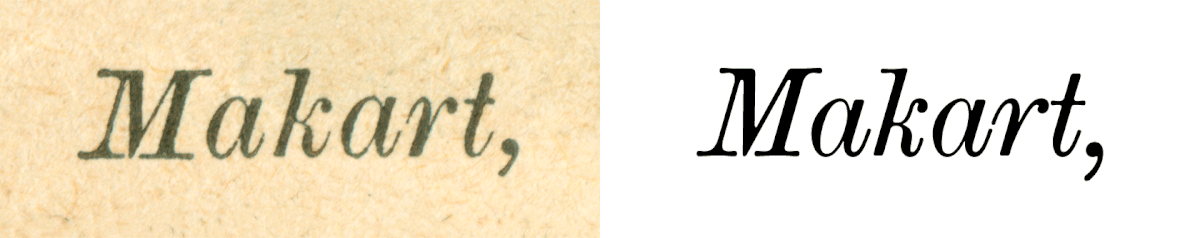
8. Drawing the Antiqua Italic
We invited our remote colleague to draw the Antiqua Italic. We gave him all the scans and the completed Antiqua as a reference for the basic measures.
The working process consisted of several steps: drawing the basic characters AOH, aoxiu, and their validation; drawing the HANDGLOVES and НОБЕЛЬФАЙК that we all know oh so well, and drawing the full character composition, several characters at a time. We ended up achieving the end result a bit later than we had initially planned.
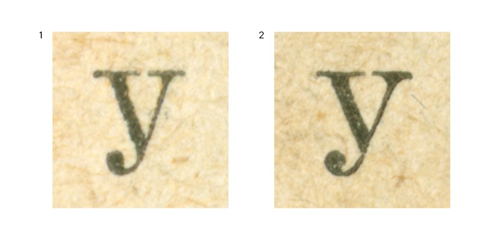
As we only found the lowercase Latin k used once in the magazine and it looked suspiciously similar to the Cyrillic к, we decided to add an alternative Latin k into the font, which would look more familiar to the contemporary user.
The alternative version of the Latin letter “k”
At the first stage of testing and comparing it to the “Niva” magazine setting, we continued editing the contours, printing them, and looking at the results. We would then edit, print, and look at them again, and this went on and on. Once we finished editing the contours, we corrected all the serifs and set the measurements. As a result, we are sure to say the Antiqua Italic looks good in the setting and is a great complement to the Antiqua.
9. Drawing the Grotesque
The main character composition of the Grotesque had already been drawn in the first iteration of the project using the graphic editor, and this process also had a lot of problems similar to those we have described in the Antiqua section above. It turned out that the “Niva” magazine used the same Grotesque, and we only had to finish and polish it.
If you look at the Grotesque in “Niva” in large body size, you may notice that the font was not intended for such pronounced roundness. Yet, in smaller body sizes the dot gain would take place and the characters became plumper. As we set out to preserve the printing defects from the beginning, we kept these details as they were.
The drawing of the Grotesque made us feel a little uneasy about its mobility as it was very different from modern sans-serifs everyone is accustomed to. Sometimes it seemed to us that we might want to tame it a bit, but when testing it in setting, we saw the Grotesque looked well and was very harmonious.
The last touch in working on the Grotesque was finishing the width of the uppercase characters as they looked bolder than the lowercase ones. We had to diminish this a bit, but we couldn’t remove it entirely because in the magazine reference the uppercase characters also looked a bit bolder.
This was yet another choice in favor of historicity that we made working on TT Marxiana. In all our projects, we strive for the perfect result — and here the perfect result was the imperfect historical look.
Differences in the thickness of uppercase and lowercase characters
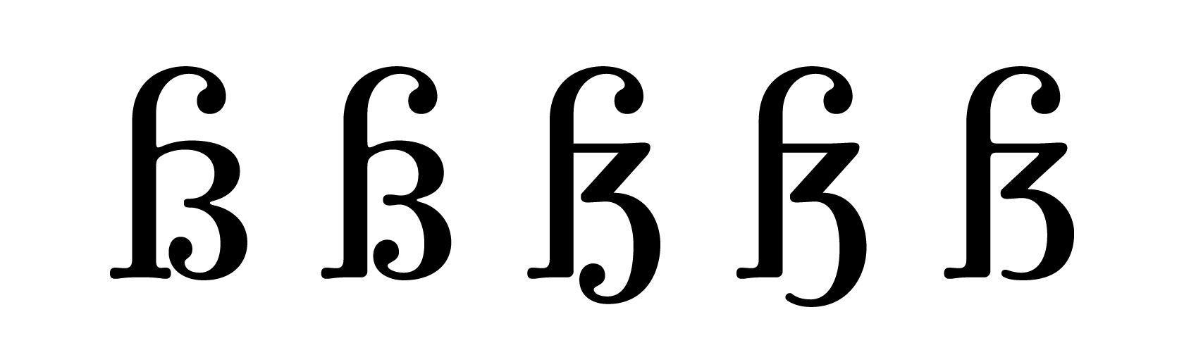
10. Drawing the Elzevir
The Elzevir was used in the magazine as a heading font in large body size, and so it differed from other fonts in the family with its more precise forms that were less affected by the printing deformation. The size of lower and uppercase characters in Elzevir is the same as in the Antiqua, but it is a lighter font and, unlike the Antiqua and the Grotesque, it has a lot of acute angles.
Same as when creating the Antiqua, we started working on the Elzevir by drawing the letters on the scanned magazine pages. We studied the character proportions and picked the stem widths, but again we were confronted with the controversial issue of serif shapes. In the reference scans the serifs were blurred, so they could be interpreted as rounded shapes as well as absolutely straight elements.
At the very first stages of working on the Elzevir, we created its serifs in a trapeze-like shape with acute, non-rounded angles. These serifs made the font look clean-cut, but we felt there was a mismatch with other letter elements, especially in the round characters, and a general misfit with the magazine references.
We decided to make the serifs narrower and add small roundings to them. They were also embedded in all stroke terminals and became the basic style element of the font.
Searching for the mass and shape of serifs in the Elzevir
While there are drops in the Antiqua’s letters a, c, f, r, and y, in the Elzevir these endings cannot be called drops. This is because unlike the drops, these elements have pointed endings — we called them saber-shaped drops. We devoted a lot of time to finding and sharpening the form of these elements: when drawing them, we had to find a balance between the sharpness of the form we created and maintaining the feel of typographic print in the original setting.
Although the Elzevir in “Niva” looked more clean-cut than other fonts, there were many of its forms present as well. For example, the drops in the characters would vary from very plump to almost ‘skeletal’.
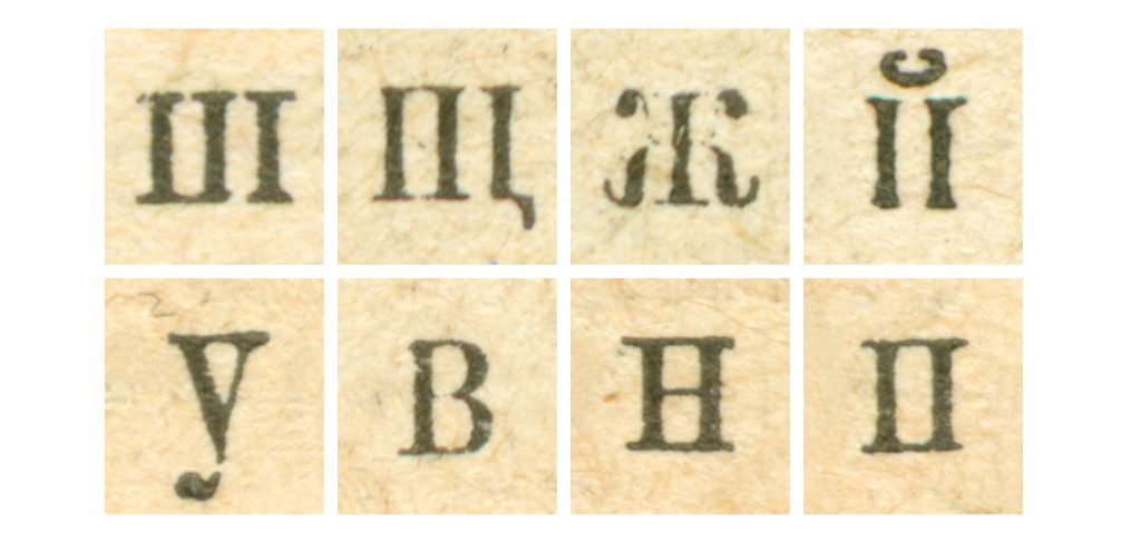
What is more, looking through the magazine you could find different shapes of the letters, for example, of the letter м. To preserve such artifacts, we created stylistic alternates. There were also swashes in the font that were placed all over without any apparent logic.
One of the curious features of our Elzevir is the swashes in uppercase characters. In addition, we also created alternative character forms for some letters. When this is turned on, in some characters the bar changes to an angle, like, for example, in the letters Аа.
Use of alternate letter “О” and small capitals in a heading
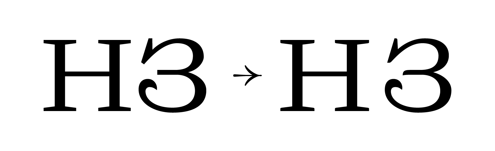
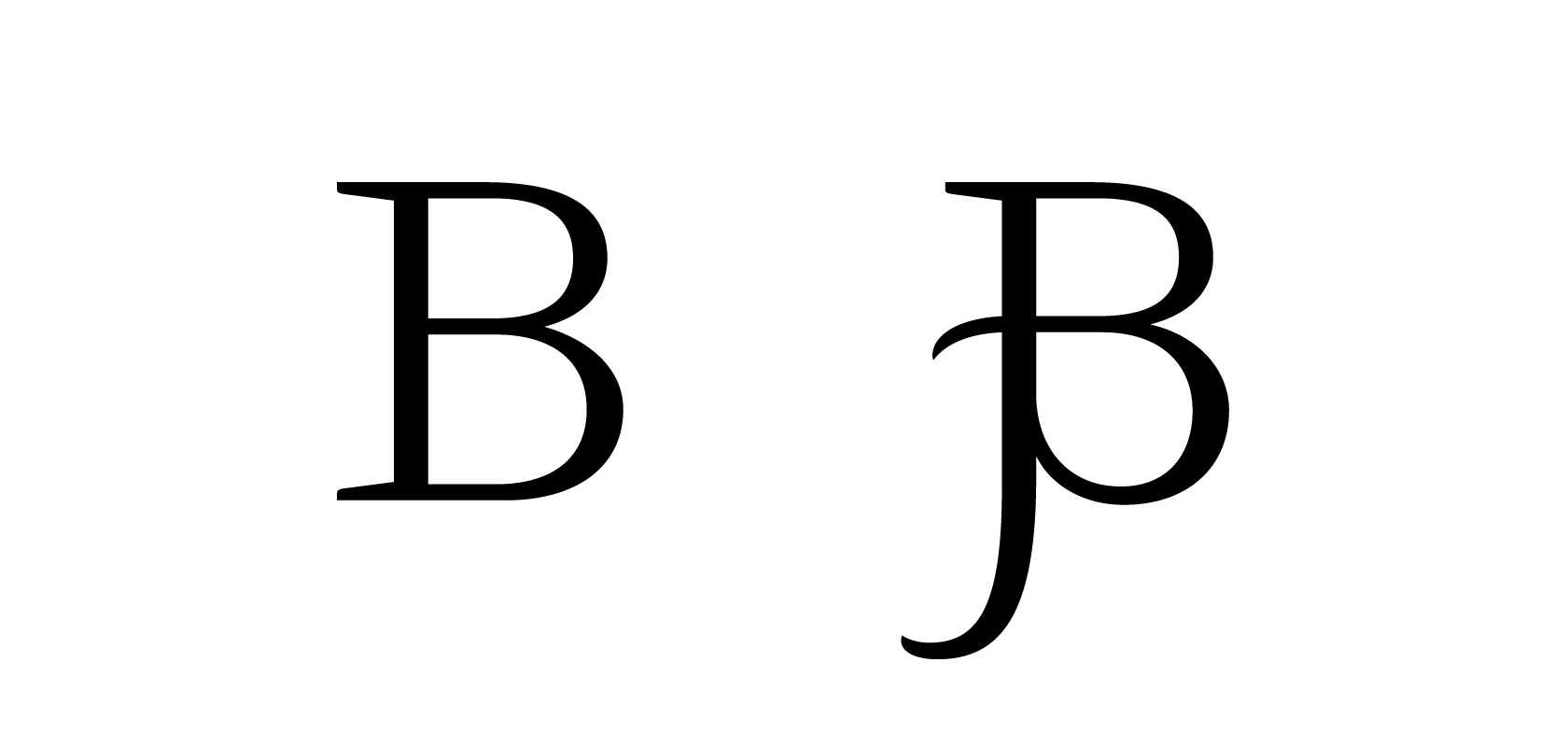
All Elzevir’s swashes can be divided into four groups: swashes for round characters ОСSUЭЗ; swashes that extend the stem in letters HEDFP and so on; swashes as an extension of diagonals in AVXM etc.; and swashes in RКЯ where the leg of the letter becomes the swash. In a number of cases, adding a swash led to changing the grapheme of the character, like, for example, this happened in the letter B.
The alternative set with swashes is needed for typing the first letters in words, exactly as this was done in the magazine.
An example of using alternative letters “M” and “s
As small capitals in Elzevir was only present in the early issues of the magazine, we had to go over all contours and proportions to correct them and make the font look unified and harmonious. While editing, we found that the weights of serifs in small capitals are smaller than in other cases and the width of characters does not match our established system.
We corrected all discrepancies or found alternative forms for them. In addition, there were other, more obvious discrepancies in the font. For example, in letters К and З in small capitals there were usual drops at the end of the strokes, while in the main character composition the drops had the peculiar saber-like form.
Upon visual inspection and minor edits on contours and metrics, the font gained its impressive look. That was when we solemnly completed the main part of work on contours in the project.
11. Kerning
To be honest, initially, we were thinking about not adding kerning into the TT Marxiana family fonts at all. This was because in the metallic fonts of the time there were limited possibilities for mandatory setting compensation. So, in the original printed copies, the text was sometimes either too dense or too disperse.
On the one hand, it was very tempting for us to replicate this effect in TT Marxiana. On the other hand, we also understood that given the modern quality criteria this would look like a text defect since even in old settings these gaps do not look very appealing.
We have been very serious about the project from the very beginning and treated it with great respect, so we tried working out a custom kerning methodology specifically designed for TT Marxiana.
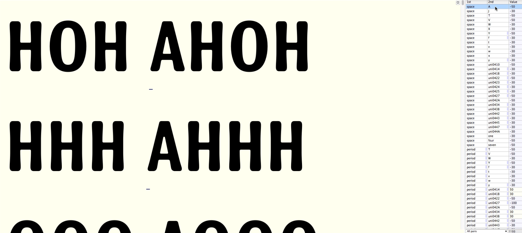
At first, we created the kerning classes. These are groups of characters in which the first character is set to be kerning-paired with other characters, and these other characters ‘inherit’ the kerning from the first character. Here’s a typical example of a kerning class: а’ à á â ã ä å ā ă ą. In such a class, kerning is done for the first Latin letter a, and the rest of the characters apply the same kerning.
Working on kerning, we created separate classes for the whole Cyrillic and Latin alphabets, including their diacritic characters. The most interesting classes were created for non-letter characters: for example, the _bottom class contains the period, comma, elision marks, and lower inverted-comma quotation marks. The _middle class contains the hyphen, em dash, long dash, and the _top class contains all the upper quotation marks. We had also created classes for Cyrillic angular quotation marks and brackets in the family’s fonts (all three types in one class).
After that, we moved on to the long period of manual kerning creation that required a lot of persistence. For the Latin uppercase set, we kerned the AA to ZZ pairs and the aa to zz pairs for the lowercase. For the Cyrillic alphabet, we kerned the set of АА to ЯЯ pairs, as well as the set of lowercase аа-яя pairs. We also created separate sets of kerning pairs for “uppercase + lowercase” pairs like those that might be seen in names or first words in a sentence. For Cyrillic, this was Аа-Яя, and the Latin alphabet had Aa-Zz. In the same way, kerning was done in Elzevir for small capitals. Furthermore, we also set up the kerning for figures — in each font, we did it for all 00 to 99 pairs.
To top off, we were only missing the combinations of special characters and text characters. So, all classes of special characters were kerned together with the rest: X, X., -X, X-, ‘X, X’, (X, X), «X, X» (substitute X here with every upper- and lowercase Latin, every upper- and lowercase Cyrillic, every Latin small capital, every Cyrillic small capital, and all figures, including old-style figures).
All in all, there were 1000+ kerning pairs in the Grotesque and 1300+ kerning pairs in the Antiqua.
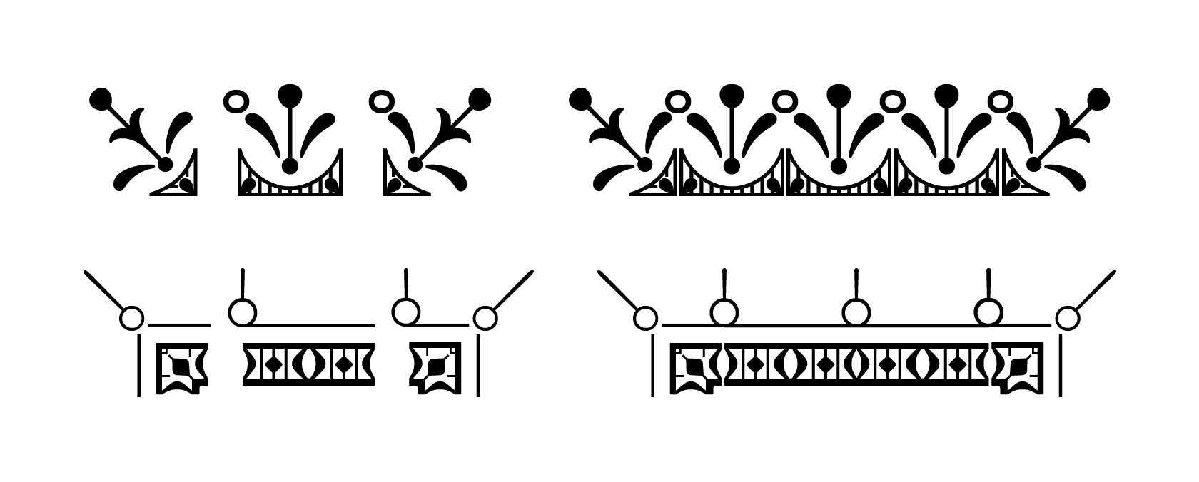
12. Decorative font elements
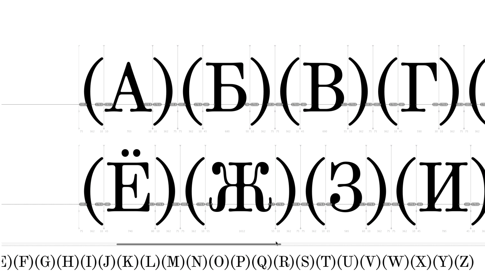
To begin, we sorted and logically grouped the decorative elements (border corner stubs) for the reverse Grotesque. They were now placed in the font character map as follows: upper-left, upper-right, lower-left, and lower-right element of the four-part inscription frame. These border corner stubs are used when the reversed type is set in two lines. In such a case the user has to manually regulate line and letter spacing for the text array to look unified.
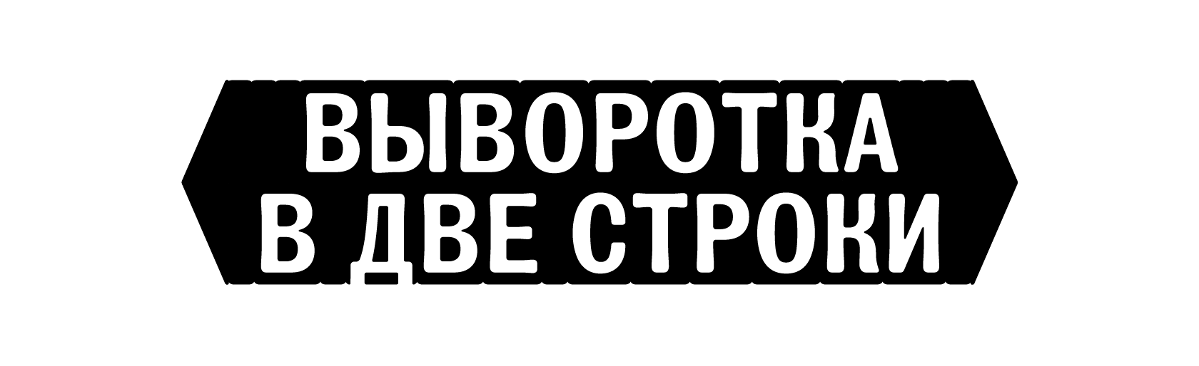
For the single-line reversed type we grouped the left and right border corner studs as a pair.
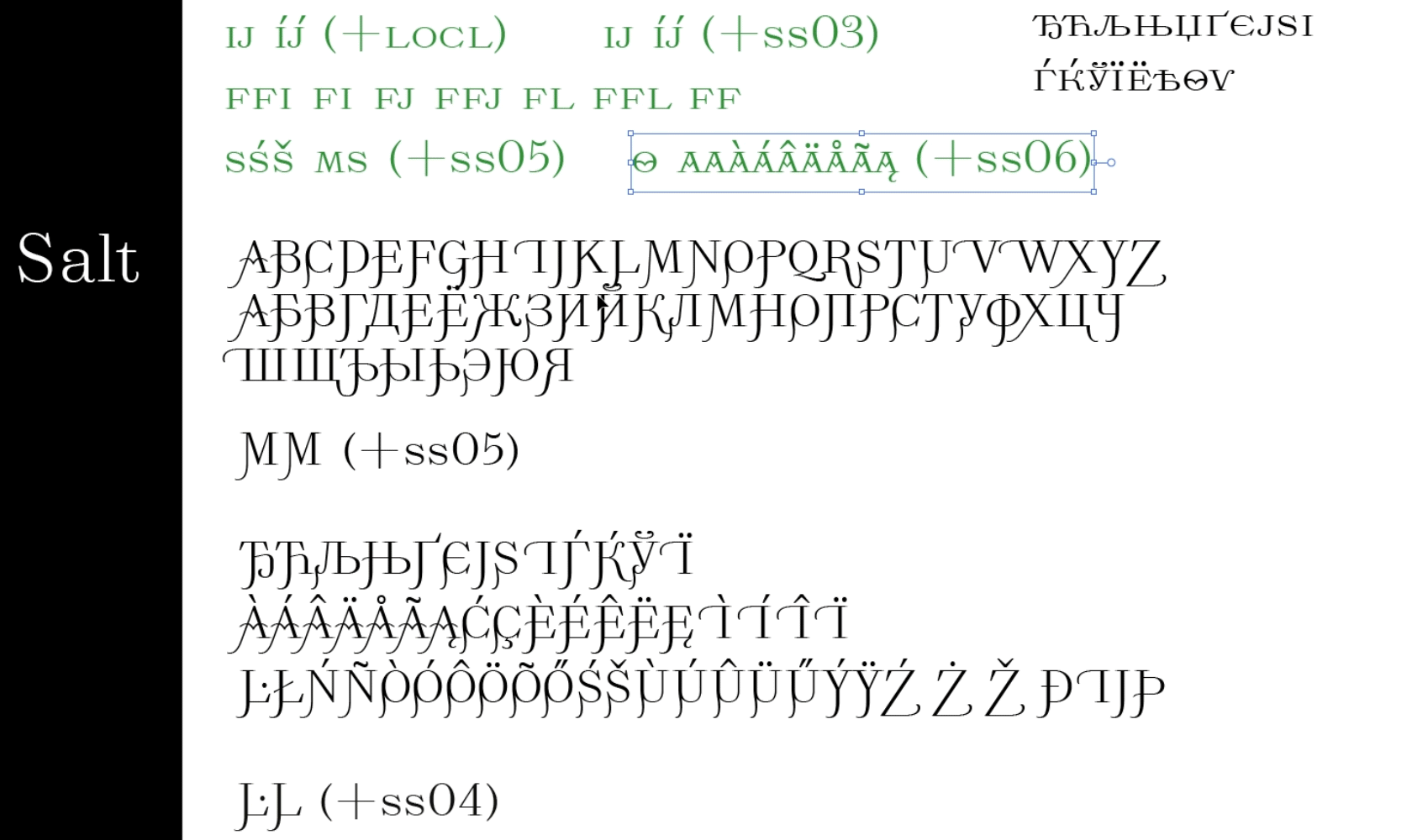
OpenType features in our fonts follow a certain standard, and they are included in all TT Marxiana fonts. These features are CASE, ORDN, FRAC, SUPS, SINF, NUMR, DNOM, TNUM, ONUM, SALT, SS01-SS05, LOCL, LIGA, CALT. The SALT and SS01 OpenType features are duplicates: when using SALT (or SS01) in the Grotesque, the standard text, regardless of its case, is changed to the reversed, which only has uppercase characters. In the Antiqua, these two features turn on the alternative characters with dot gain imitation.
We had also sorted the Antiqua’s decorative elements to make the search for the needed frame elements more convenient. Also, to enable setting the upper part of the frame alone using only the ‘Text’ instrument, we added right frame corners for cases where this element mirrors the left corner.
Variety of frames in the Antiqua
When testing the frames in graphic editors, we found two frame types with corner elements that were not fully symmetrical. We solved this problem by adding the missing details.
While testing the fonts, we had encountered a lot of interesting issues. For instance, in the web, the non-breaking space is often used instead of the usual space, so we had to take this into account in coding the feature. We made it so that in the reversed type, it would be possible to type several consecutive spaces and they would all be converted into the single required solid black.
We had also encountered the problem of exporting the font in the .otf format with the Remove Overlap turned on. As we found out, there was a decorative element that was about ten thousand units wide, but the script is only capable of processing 8191 units. So, we had to exclude this glyph applying a custom parameter.
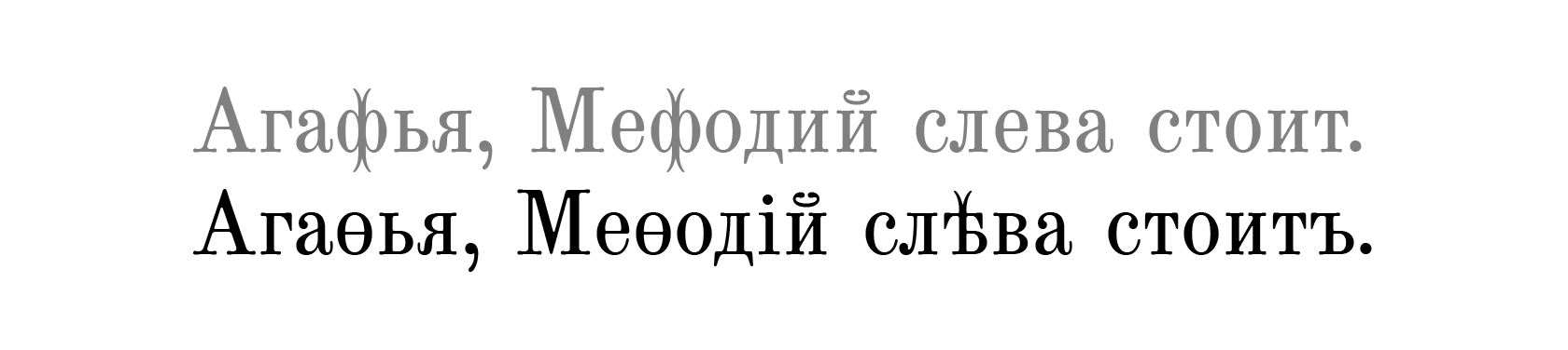
13. Pre-revolutionary spelling
The most unusual OpenType feature that the TT Marxiana font family has is the conversion of the modern spelling to the pre-1917 norm. This function is rather experimental and decorative as it is impossible to include all the words where substitution takes place in the font without impairment to its size and development time.
This feature has many contextual alternatives, but since we had already used the CALT feature, we decided to include this code into the SS02 stylistic set.
To learn the rules for pre-revolutionary spelling, we used several sources, such as an article by the edutainment portal arzamas.academy Какъ писать въ старой орѳографіи? and a Wikipedia entry. To test some of the words, we referred to the slavenica.com page.
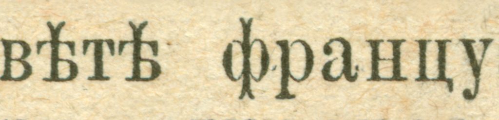
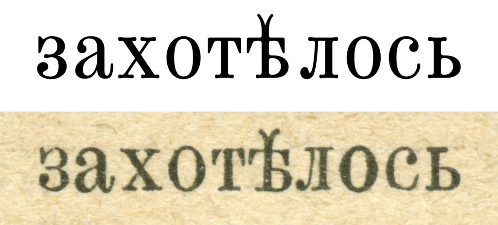
First, we outlined the alternatives for the exceptions: ‘ф’ to ‘ѳ’ (fita); ‘и’before a vowel to ‘i’ (decimal i); various substitutions of ‘е’ to ‘ѣ’ (yat). As the exceptions with ‘ѵ’ (izhitsa) are very rate, we did not take those into account.
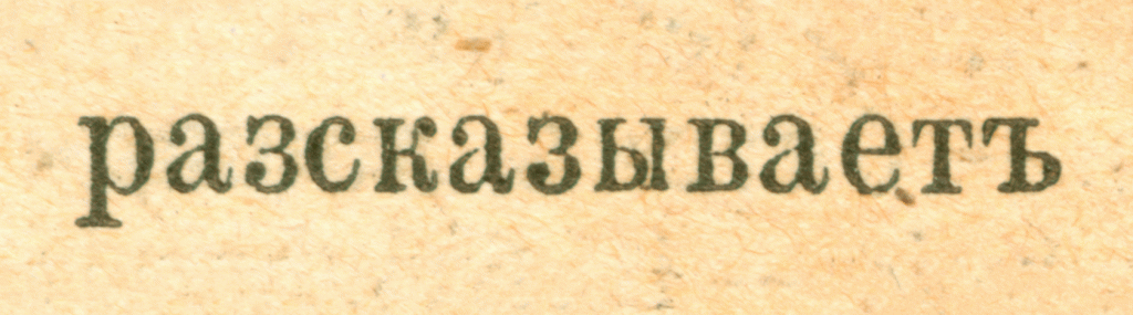
Then we added substitutions in prefixes ‘рас- (ras-)’, ‘ис- (is-)’, ‘вос- (vos-)’, ‘бес- (bes-)’, ‘черес- (cheres-)’, which in the pre-reform version were spelled with a -з- (z). To substitute ‘е’ with the ‘ѣ’ (yat), we found all the exception words in the poems published in the arzamas.academy article defined their grammatical roots and considered possible letter variations that follow the root in different tenses and grammatical cases. We had also considered the letter case of a given word.
In addition, we also coded the frequent adverbs, pronouns, and prepositions that have ‘ѣ’ (yat), the ‘-ейш- (-yeish-)’ suffix (signifies superlative in adjectives and participles), as well as the endings ‘-еть (-yet’)’ and ‘-еться (-yetsya)’. In the words ending with ‘-него (-nego)’ and ‘-ого (-ogo)’, we specified the ‘-няго (-nyago)’ and ‘-аго (ago)’ substitutions. We had to sacrifice some of the rules for endings and suffixes and did not include them so as to not specify an endless number of exceptions — after all, our task was to create a font and not a machine translation system.
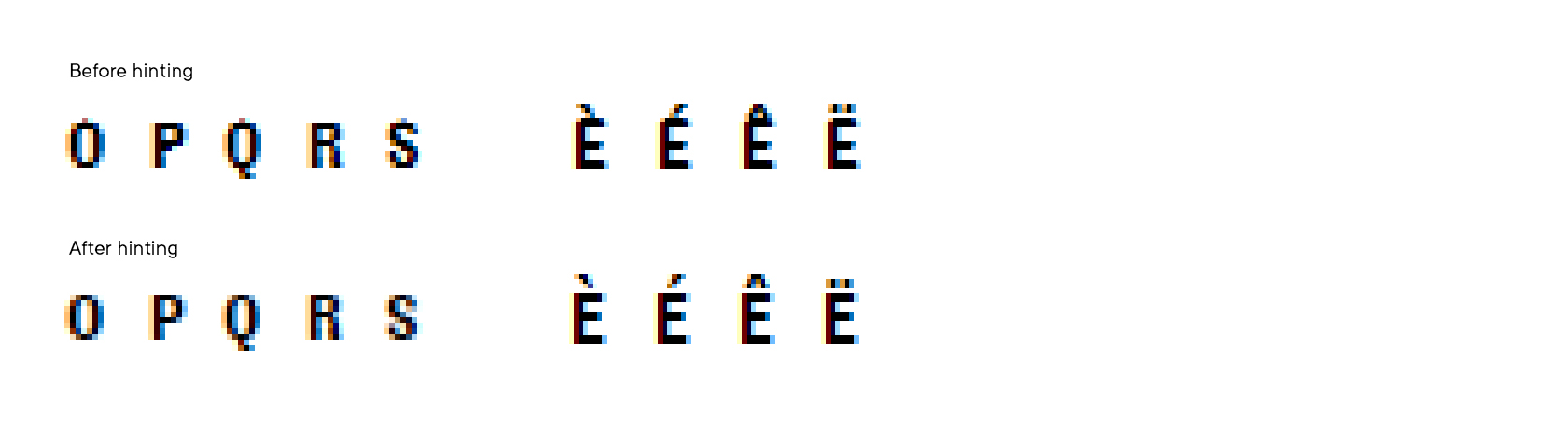
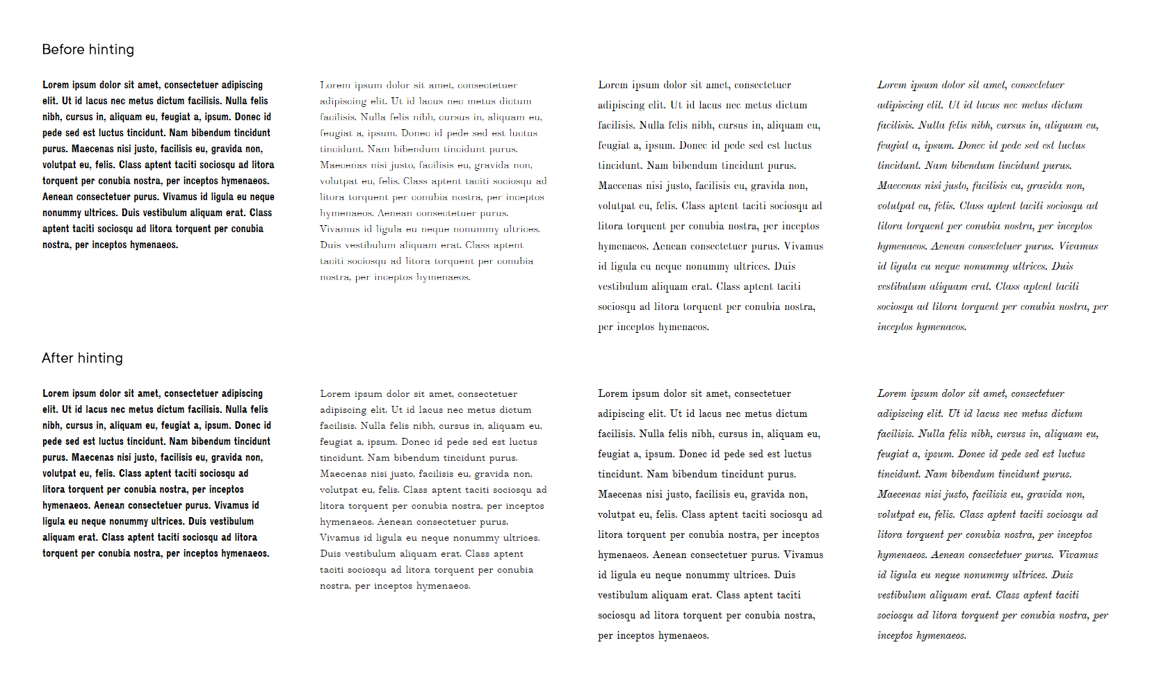
14. Hinting
As in all our other contemporary fonts, we tried to hint TT Marxiana to the highest quality.
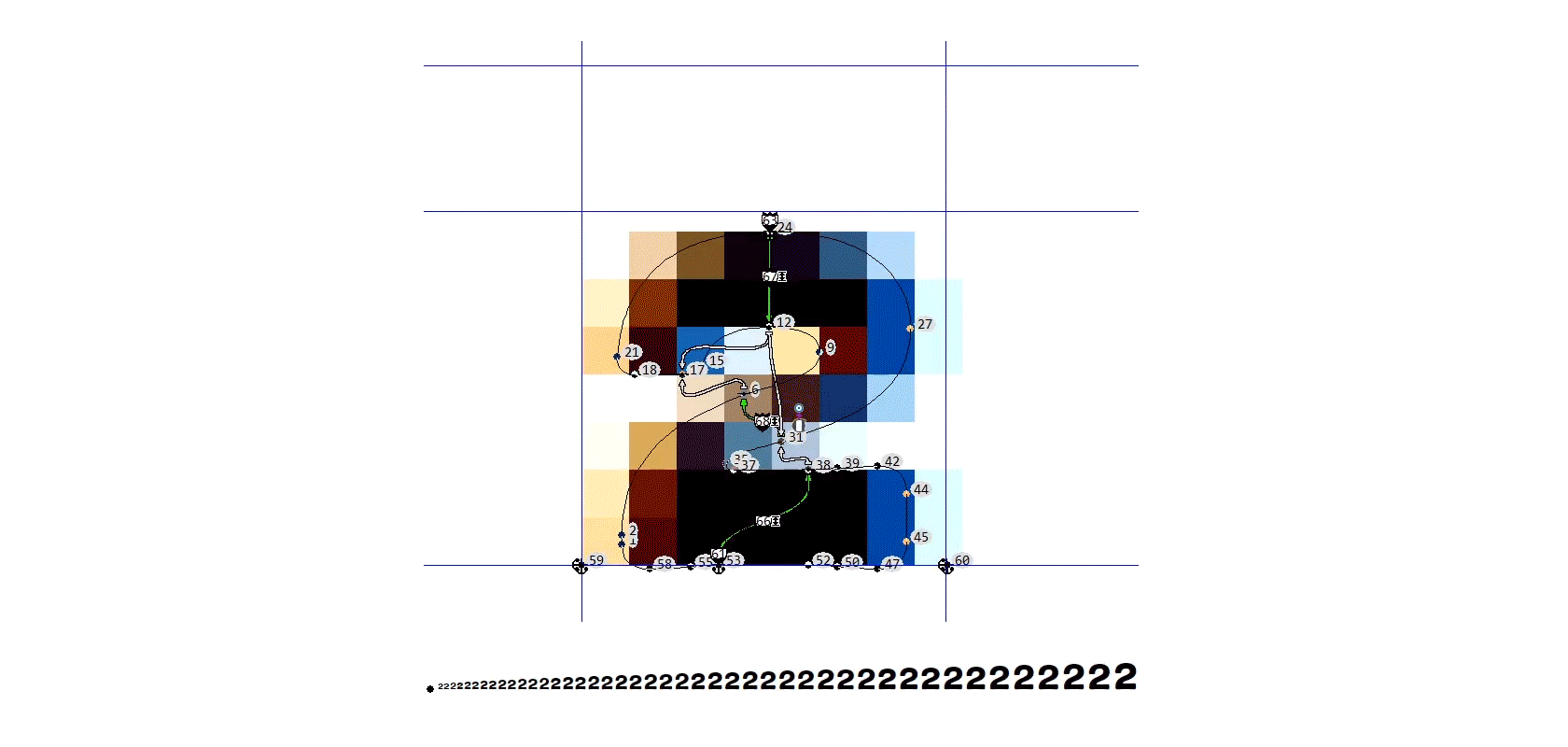
As the Grotesque was the first in line for hinting, we will also show the examples from there. First, we reinstated the internal white space of the characters.
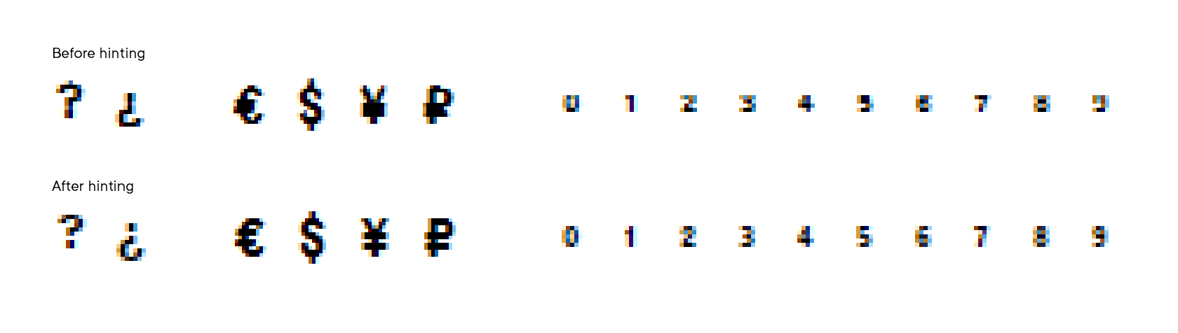
Then, we restored some of the contours.
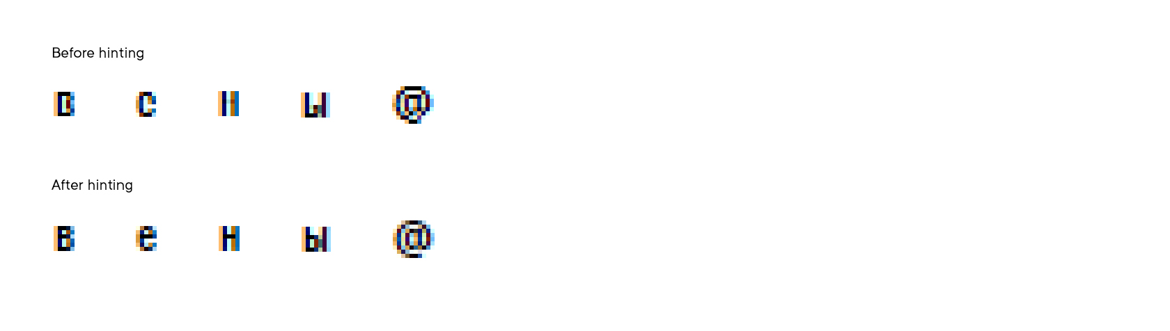
We synchronized the stem width across the stems in the same glyph as well as across all glyphs.
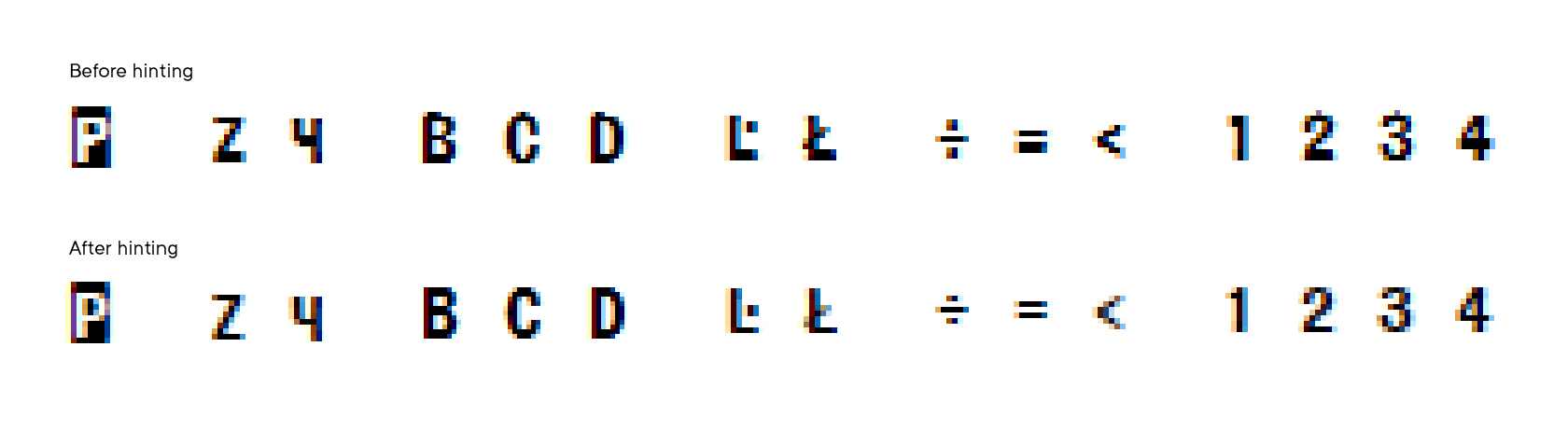
Furthermore, we eliminated outliers and restored character heights, and of course, we had also corrected the diacritic overlays.
15. Typeface testing
All TT Marxiana testing can be divided into several stages:
• editing glyph composition when coding and testing OpenType features
• testing the OpenType features in different software
• checking hinting in different sizes
• making small changes in Font Info
• editing and addition of kerning pairs
• editing the pre-revolutionary orthography feature by adding auxiliary ligatures and rewriting the feature code.
When testing, we added the largest number of new glyphs into the Elzevir. These were, for instance, tabular figures, alternative “s”s with a diacritic, all diacritic glyphs for the SS01 stylistic set that has swashes, and the “A”s in small capitals. To make it more convenient, all-new characters are marked in pink and are entered into the feature code.
We mostly tested the OpenType features in graphic editors. To do so, for each font from the TT Marxiana family we created a template demonstrating all possible combinations of activated features.
One of the musts when testing is hinting check. In addition to our own hinting testing instruments, we also used the site serpentype.ru. In the hinting tab, we added all Unicode glyphs for each available size from 48 to 12 pixels. Next, we carefully looked at each character to see if there were any shortcomings, and if we found some, we sent these to our programmer to correct the hinting. After that, we looked at the corrected characters again and also checked the characters turned on with features.
At the same time, we tasked all our colleagues with testing the font. As a result, we found some more shortcomings that were also then eliminated.
For example, in the Antiqua and the Antiqua Italic, the pointer size and the Bounding Box were disproportionately bigger than the main glyphs because of very tall decorative elements. To solve this problem, we had to delete vertical parts of the decorative frame corners.
We also checked and edited the kerning groups and added several new kerning pairs.
The last thing to do was to partially change the functioning principle for the pre-revolutionary spelling in the SS02 stylistic set. Initially, we coded the “one to many” substitution in the feature to add the hard sign to the words ending with a consonant. However, this substitution did not work “out of the box” in Adobe programs. To activate it, the user would have to go to settings, tick a mark, then in the “Paragraph” panel they would have to change the linker type — and only then the feature would work correctly.
We wanted to make our users’ life easier and added auxiliary ligatures of several types into each font of the family. These ligature types were “Uppercase consonant + Uppercase hard sign”, “Uppercase consonant + Lowercase hard sign”, “Lowercase consonant + Lowercase hard sign”, and the Elzevir also had the “Uppercase consonant + Small capitals hard sign”. All in all, we added about 298 auxiliary ligatures into our four fonts.
We have also significantly edited to code of the feature, and now instead of the “one to many” it uses the “one to one” substitutions, thanks to which the feature works the same across all software without any additional steps necessary.
16. Project outcomes
The TT Marxiana project was started in the summer of 2018 and from its very beginning, it was different from the traditional TypeType projects as we wanted to preserve the historical identity of the font. As we have never reconstructed a font from historic paper references before and with such attention to detail, it took us two years to complete the project.
Working on it, we have learned a lot and even revised some of the working processes in our studio. We hope you have enjoyed reading this font creation story.
We will be glad to know your opinions, answer your questions, or receive suggestions on what should be the topic of our new article.

TT Marxiana Team
A team of seven people worked on the creation of the TT Marxiana font family, which included font designers, font engineers, and managers. The full list of project participants:
Ivan Gladkikh — technical director
Yulia Gonina — project manager
Marina Khodak — art director, lead type designer
Anna Tikhonova — lead type designer
Nadyr Ralhimov — type designer
Victor Rubenko — technical engineer, programmer, hinting specialist and just a villain
Yuri Nakonechny — technical engineer, debug tester
TT Marxiana useful links
PDF specimen | Graphic presentation | Try&Buy TT Marxiana
Contact
If you have any questions, just write to us at marketing@typetype.org and we will be happy to answer them.