TrueType format history
The personal computer industry was going through a period of rapid development in the second half of 1980s, and it was necessary to have a specific font format for these computers. By then, Adobe already had one called PostScript Type 1. The standard was implemented in the company’s graphic software and thus spread quickly.
Apple and Microsoft were the TrueType format visionaries. The development pursued economic advantages: huge royalties were due for the use of PostScript fonts.Thus, TrueType was the response of the two giants to the de-facto Adobe’s PostScript Type 1 monopoly. The idea was that TrueType fonts would become the base for a common standard and would be easily scaled and used on PCs. Apple began the development and was later joined by Microsoft who started to actively promote the standard. Apple implemented the format support in May 1991 (OS System 7.0), while Microsoft adopted system fonts for PC almost a year later, in April 1992 (OS Windows 3.1).
Apple released its variant (TrueType GX) earlier, which could have caused Microsoft, whose format was still in development, some problems related to licensing. Thus, Microsoft’s product got the name TrueType Open.
The TrueType Open release was timed to the Windows 95 release. The main update there was Antialiasing – on-screen anti-aliasing (i.e., smoothing of lines) in grayscale.
In 1996, Microsoft and Adobe, previously competitors, released together a joint open font format – OpenType supporting TrueType and PostScript contour, Unicode, and typographic functions (small capitals, ligatures, etc.).
Thus, the family of modern fonts got its name reflecting the whole history of their creation, OpenType:
• TrueType (.ttf) – OpenType fonts with TrueType contours
• OpenType (.otf) – OpenType fonts with PostScript contours
Thanks to TrueType’s initially broad functionality, variable fonts based on it appeared in 2016.
Right from the start, the TrueType format had gotten a bad reputation: the reason for this was a large number of low-quality fonts appearing due to TrueType being an open format, unlike PostScript Type 1. Consequently, TrueType fonts had not spread widely at the beginning, and PostScript Type 1 format fonts had become popular with the broad audience. After a while, TrueType format found its niche: large companies used it when they needed to develop important system fonts or create custom fonts.
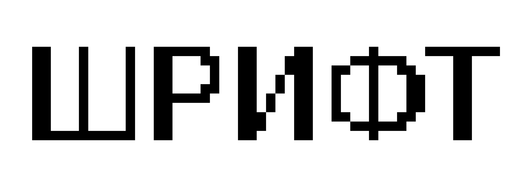
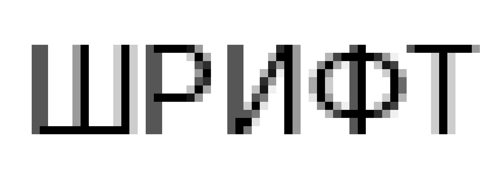
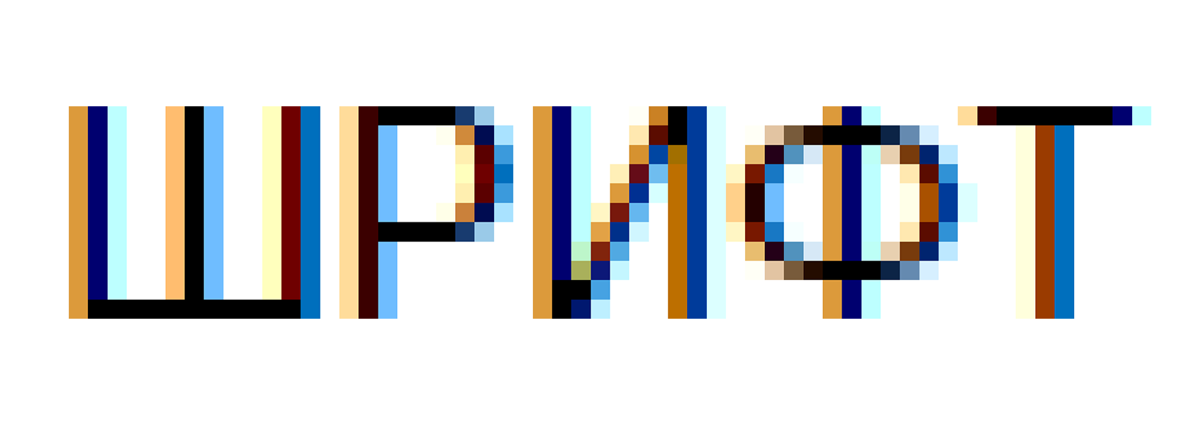
The TrueType technology appeared in the beginning of 90s when extremely low DPI monitors were used. This technology was the easiest black and white graphics. The fonts displayed on screen only had single color representation with no midtone gradation (BI-level Rendering). With advances in hardware and software, PC graphics became more sophisticated, and so Grayscale Rendering appeared. Over time, LCD displays appeared and software developers implemented the features of LCD displays in which each pixel is composed of three colors. This was named SubPixel Rendering and it is the basis for Microsoft’s ClearType and DirectWrite rasterizers.
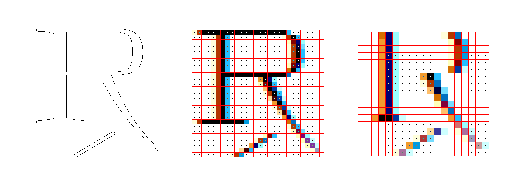
DirectWrite rendering
Both TrueType and OpenType formats contain Bézier curve contoured glyphs, but hinting approaches are radically different in each.
Put briefly, in PostScript fonts, specific elements (horizontal and vertical stems, serifs etc.) are defined in each glyph and then specifically prescribed or calculated parameters, such as thickness, width, and height, are applied. Following this algorithm, hinting is very fast but there are very few opportunities to manually influence the final contour because the rasterizer “decides” on its own how and which of these hints will be used to display the font.
In TrueType fonts, a different approach is used. Instead of delegating the work to the rasterizer, the font contains specific dot-at-a-time instructions which should either be executed in their entirety or not carried out at all.
The high precision and quality of TrueType fonts display is possible due to the great complexity in development. The curves of TrueType contours are very difficult for a designer to edit, since such fonts have a great number of dots because of the use of quadratic Bézier curves. Hinting is also a complicated complex process that only high-level professional font designers can master. With that, OpenType (PostScript) font contours are easy to edit, contain cubic curves, and hinting is simplified and almost automated. On-screen font display quality is much worse but is unified for all fonts.
In 1999, Apple integrated its own Quartz 2D screen rasterizer into its operating system. It unifies the display of both TrueType and OpenType fonts from all developers on all Apple computer screens ignoring TrueType hinting. Thus, TrueType format is relevant for Windows and Linux devices.

What TrueType hinting is and why it is needed
In digital typography, each symbol is defined by a set of contours, which usually consist of Bézier curve splines. When a symbol is rendered on a pixel grid, the contours are scaled to the necessary size and then the pixels inside the contour are filled with black. This algorithm works great at high DPIs. However, when DPI is below 150, rendering is problematic.
TrueType hinting (or instructing) means hints that are embedded into the font file with help of special software. One could say that these are limitations imposed onto font characters during scaling that best reflect the shapes programmed by the designer initially in any body size, on any device, resolution, and software. Hinting improves the look and readability of the text in low screen resolution and small font size.
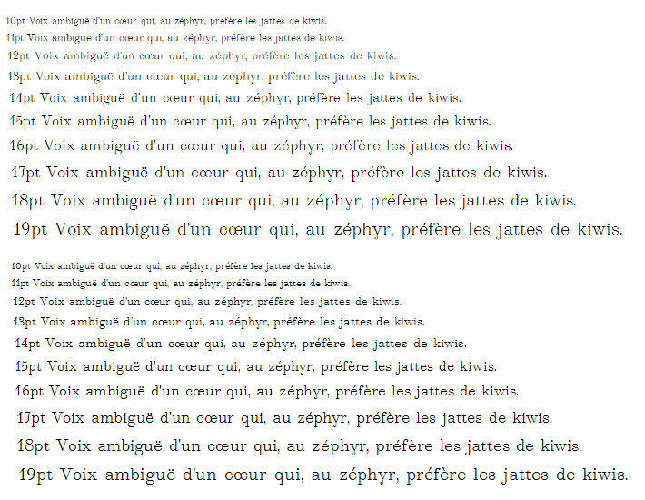
TrueType hinting can be manual and automatic. For light and medium weight fonts with simple shapes, such as Thin, ExtraLight, Light, Regular, Medium, automatic hinting is sufficient in most cases. For heavier weights – from DemiBold to Black and more complex font forms (for example, fonts with serifs or display fonts) – some problems may arise. Manual TrueType hinting is done either in a graphic editor or in specialized software. Manual font hinting is a true art on the one hand and a craft on the other. A hinting specialist marks up the completed font file manually, character after character, and then tests it in different body sizes. Often hinting allows for maintaining the characteristic font design up to 14 px size and readability up to 9 px size.
Four key tasks that hinting solves
1. Maintaining contrast – hinting allows to bring back into the font the contrast envisioned by the designer.
2. Readability increase – in small text sizes, hinting is responsible for character readability.
3. Creates spacing – hinting does not let letters to merge and controls the letter spacing as it was envisioned by the author.
4. Maintains a plain text line – hinting makes the letters in all text sizes stay within the line and not to jump out of it.
Real-life practical applications
By the beginning of 2021, 40% of PC users have two main screen resolutions – 1920×1080 and 1368×768. A monitor with a 1920×1080 resolution and a 22 inch diagonal will only have approximately 100 DPI. Taking 300 DPI as a printing ideal, this is three times less than is necessary for flawless font display.
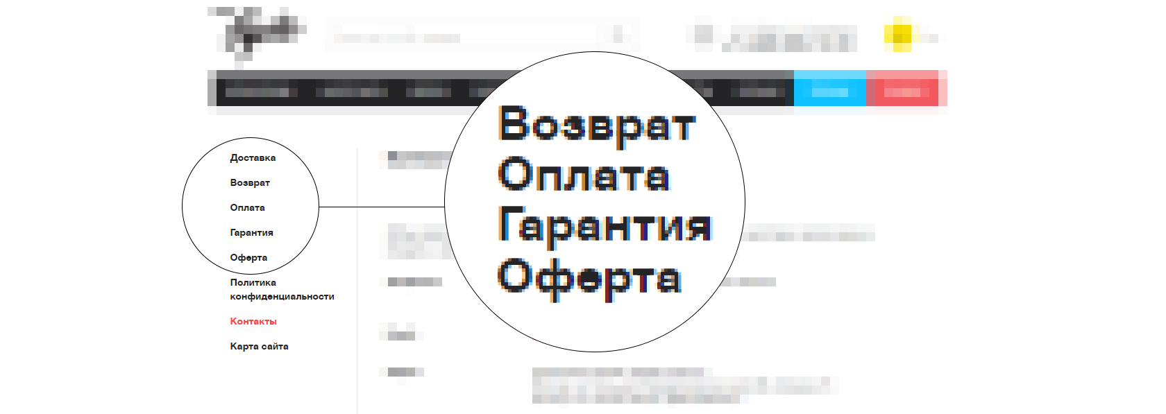
Even so, many font foundries invest very little time into hinting: they either refer to OpenType fonts with simple PostScript hining without even having TTF fonts, or use automatic hinting instruments. As a result, users of different sites and services, including small and large corporate ones with millions of views, see distorted font designs.
In addition, large international companies and corporations may have outdated or industrial equipment with low DPI resolutions, so font display issues are still relevant to them. Specialized application areas, such as banking (ATMs), navigation equipment, game and applications development, television broadcasts requiring careful attention to font display, are also concerned.
Hinting at TypeType
In early 90s, hinting was a technologically complicated process as instructions in TrueType were low-level assembler commands:

Software that supports high level visual commands and converts them to native code is used for hinting today. The following software need to be mentioned:
• ttfautohint – automatic hinting with optional parameters based on Free Type render
• Fontlab/Glyphs – font editors with hinting possibilities
• Microsoft Visual TrueType – standalone hinting application
With that, unlike in PostScript, font decompilation in order to edit TrueType hinting is impossible as each application carries out its own commands. One has to go to the source or start from scratch.
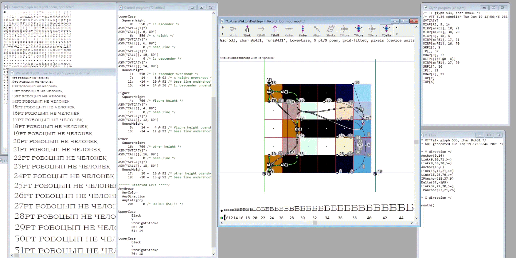
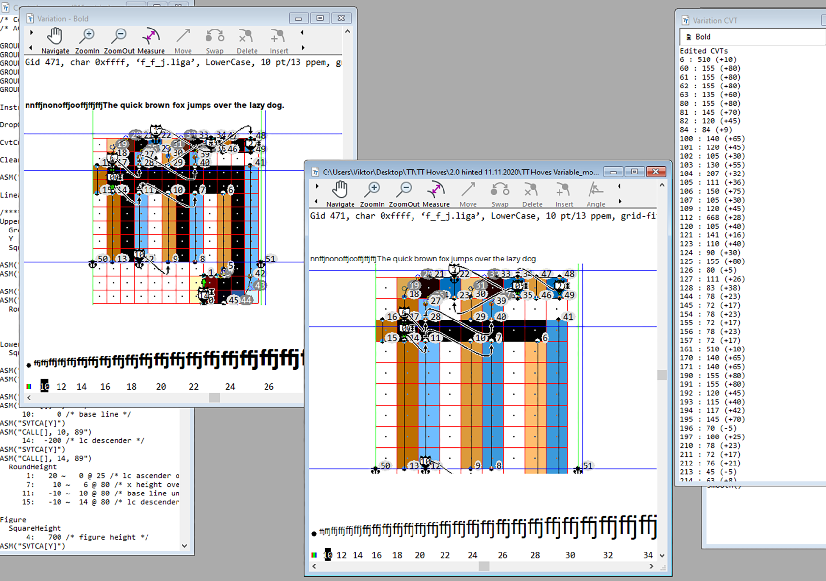
We carry out TrueType hinting both for individual static faces and for variable fonts and use Visual TrueType and several proprietary technical subprograms to optimize hinting work.
An interesting fact:
VTT’s history goes back to the creation of TrueType format. One of its authors and the creator of the TrueType instruction language is Sampo Kaasila, who also created a for-profit hinting application Typeman for Macintosh. After a while, the Typeman license was acquired by Microsoft and VTT, which currently only runs on Windows, was developed based on it. Although VTT was originally free in the beginning of 2000s, to work with it you had to fill out a license agreement and fax it to Microsoft to obtain access to a forum and download the application there.
Why VTT? In our opinion, this is the most complex editor allowing all possible alterations to the font image. Another advantage is that VTT is developed by Microsoft, which guarantees that the image in the preview in the editor and the final render are identical. There’s also customer support: you can email the developers and get a link to an unbugged build in a few days. A disadvantage is that the code is proprietary, so we had to write additional Python scripts to enable needed functionalities. Here are some examples:
• Correct positioning of diacritics over and under characters.
• Constrained alignment of components to the pixel grid.
• Correct character automatic grouping.
• Inter-font hinting transfer.
• Stem correction in thin faces.
A typical font hinting process:
1. Height dots are marked up such that the character is consistent in relation to other characters and sticks to the defined text line without exceeding it (that is, for example, such that a capital character is as tall as other capital characters and lowercase characters are as tall as other lowercase characters).
2. The width of all horizontal sets is fixed such that they are identical to other analogous sets in the font.
3. Similarly, the width of all vertical sets is fixed.
4. Other unconcerned dots are automatically smoothed relative to the ones that were subject to a command.
Font hinting process:
1. First we run an autohinter, whose task is to smoothen the glyphs and identify the spots where manual editing will be needed. This saves up significant amounts of time.
2. Before manual hinting, we apply an array of our scripts to the font. This helps identify problematic spots and spares us extra work again.
3. Manual work: we check control values of the font (heights and widths) and add edits to instructions created by autohinting.
4. Testing and corrections.
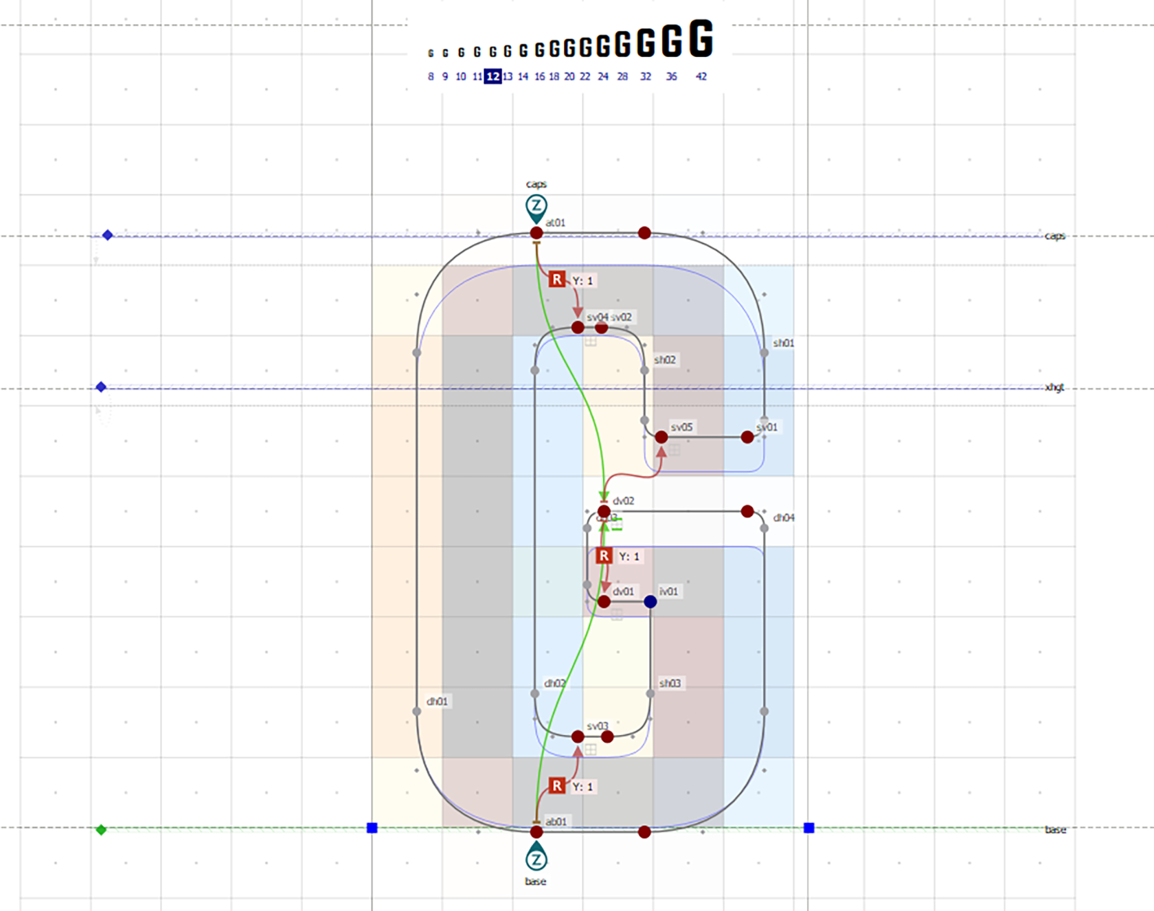
Variable font hinting is a more complicated process as some of the functional items, like deltas, are missing, while we still want to hint the font as well as we would a static one. This process is very similar to hinting a single font but with a single difference: in the variable fonts, there are several so called master fonts, in between which variability takes place. But hinting lets us hint only the basic anchor face. So, other masters receive hinting instructions from the main face and the hinting testing/debugging process becomes more complicated.
Hinting is subject to a number of peculiarities depending on the operating system or the browser in which the font is displayed. We constantly update our scripts/programs which enhance and optimize our hinting. For our clients, we work on detailed hinting whenever requested such that the fonts are displayed as precisely as possible. In addition, we also do font auditing and suggest appropriate recommendations.
In place of a conclusion
It might seem that hinting is a complicated and effort-consuming process. But that’s not quite the case. We were able to significantly optimize hinting of both separate faces as well as of large families. We transposed hinting (instructing) from different font weights as well as between upright and inclined font versions, and learned how to hint variable fonts.
We created our own instruments (scripts) and methodologies which optimize the font hinting process. Together, these have made hinting affordable. And, as our experience shows that without high-quality hinting a font misses out on many use opportunities, we hint all fonts we currently release.
We also help other font foundries with hinting. TypeType team is open to communication with colleagues.