ttnormspro
Type foundryBlogTT Ricordi creation story

TT Ricordi creation story

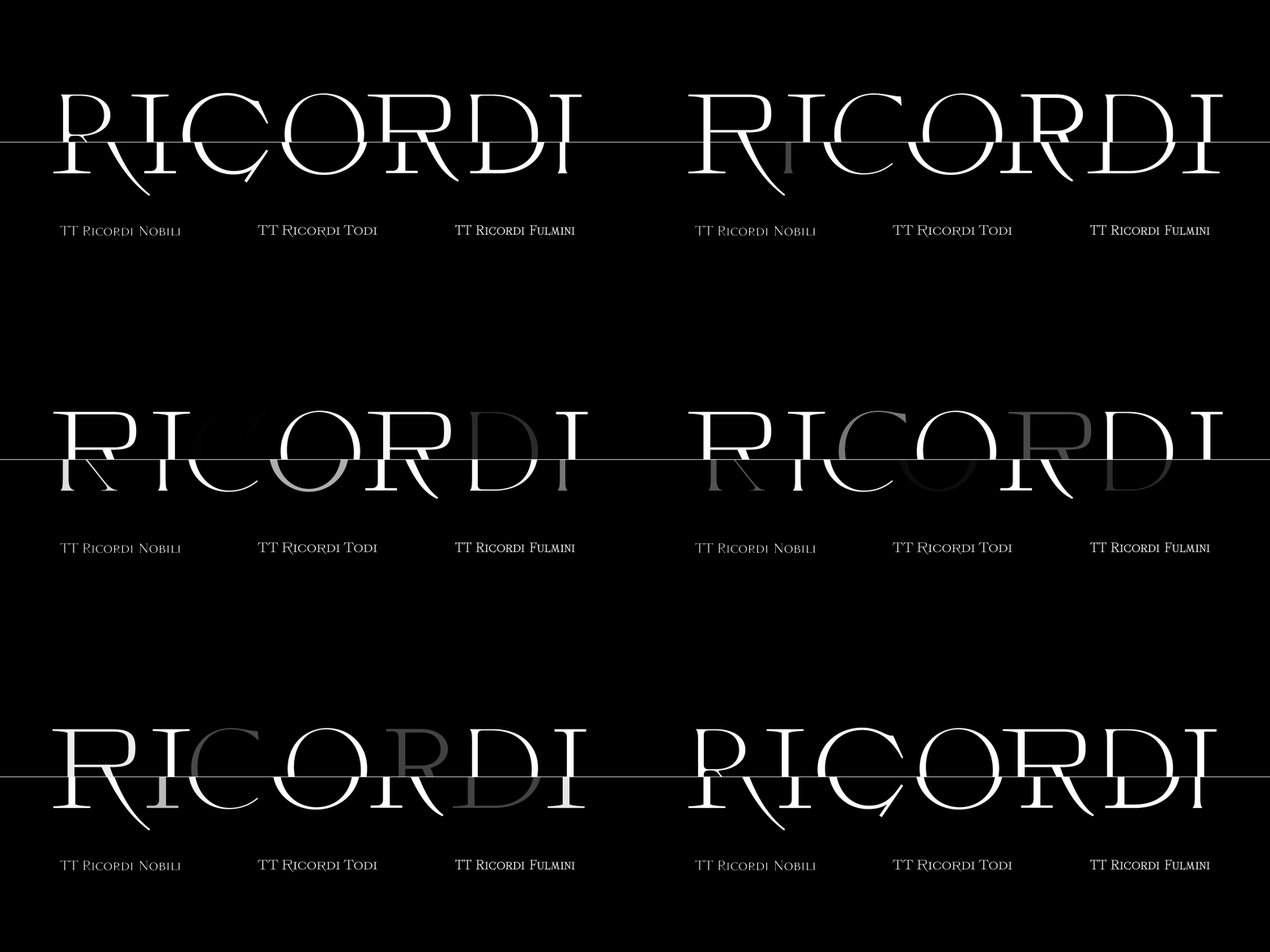
The TT Ricordi font family is a collection of three display heading antiquas designed to significantly diversify the traditional font palette. With that, all three fonts are close in thickness and similar in their character compositions and are featured in the uppercase set and the small capitals set, which replaces lowercase characters. The fonts have broad support of Latin languages and support basic Cyrillic.
TT Ricordi creation story
Ricordi font family

How the idea came about

Each font from the TT Ricordi family was drawn by a separate designer and has its own story.


TT Ricordi Todi


Historical sources are a great starting point for working on a font. Despite the fact that the forms are already defined by the original, the project can still go in completely different directions. You can make a font that will carefully preserve all its historical artifacts, or you can transform the original into something ultra-modern.

During all my trips to Italy, I have accumulated quite a few photographs of historical inscriptions, and every time I revise them, I feel the urge to make something of them. When we decided to use them in our work, we were not yet sure how much demand there would be for this concept.

After thinking about how and where such fonts could be used, we came to the conclusion that they should be conceptual and display rather than functional. Therefore, it would be much more interesting to work on several different concepts than to develop one and work towards increasing the size of the font family. And if we are talking about several different concepts, it was logical to give them to different designers. Thus, we could work on them in parallel, discuss each other’s projects together, share experiences, borrow developments, but all the same, the character of the fonts turned out to be completely different.”

Yulia Gonina, Art director

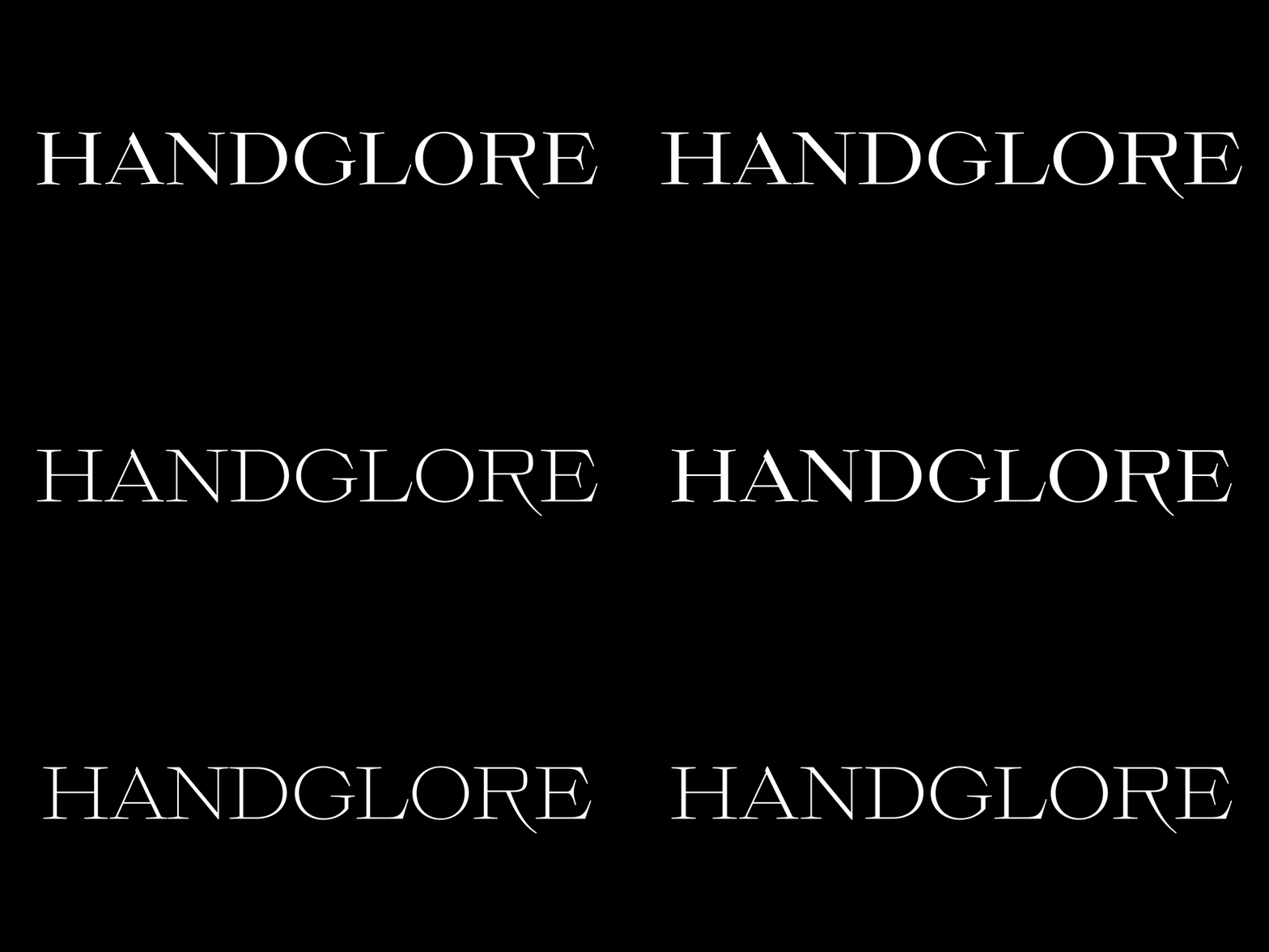
TT Ricordi Todi is a wide antiqua with a classic base and a contemporary nature. The font turned out to be refined yet sharp, and in places even pushy and aggressive. The font was drawn by Yulia, and the project was based on plaques with engraved street names from the small Italian town of Todi. The main challenge was to decipher the characteristic features of the signs and emphasize them in a modern way. In addition, it was necessary to draw a Cyrillic alphabet that would not be inferior to the Latin alphabet in its expressiveness.
TT Ricordi creation story
Evolution Ricordi Todi

The TT Ricordi Todi font has fairly wide character proportions, and there is practically no contrast in them. The main feature of the font is the combination of smooth round shapes with deliberately squared shapes. In addition, the font is characterized by crisp and sharp character details, exaggerated ascenders and descenders, and muted contrast. Among the interesting font peculiarities, you can choose between the characteristic long descenders and ascenders and their more tempered versions, you can find a stylistic set with triangular full stops, alternative versions of the EF characters and two letter F shapes, round and squared.


TT Ricordi Nobili 


My work on TT Ricordi was of course different from my usual work on our fonts, such as TT Norms® Pro 3.0. For me, this project was primarily about creativity, expressiveness of forms and display fonts. Here I was given maximum freedom in finding shapes, which was a great pleasure, but also a great challenge.”

Anna Tikhonova, Type designer
TT Ricordi creation story
Evolution Ricordi Nobili

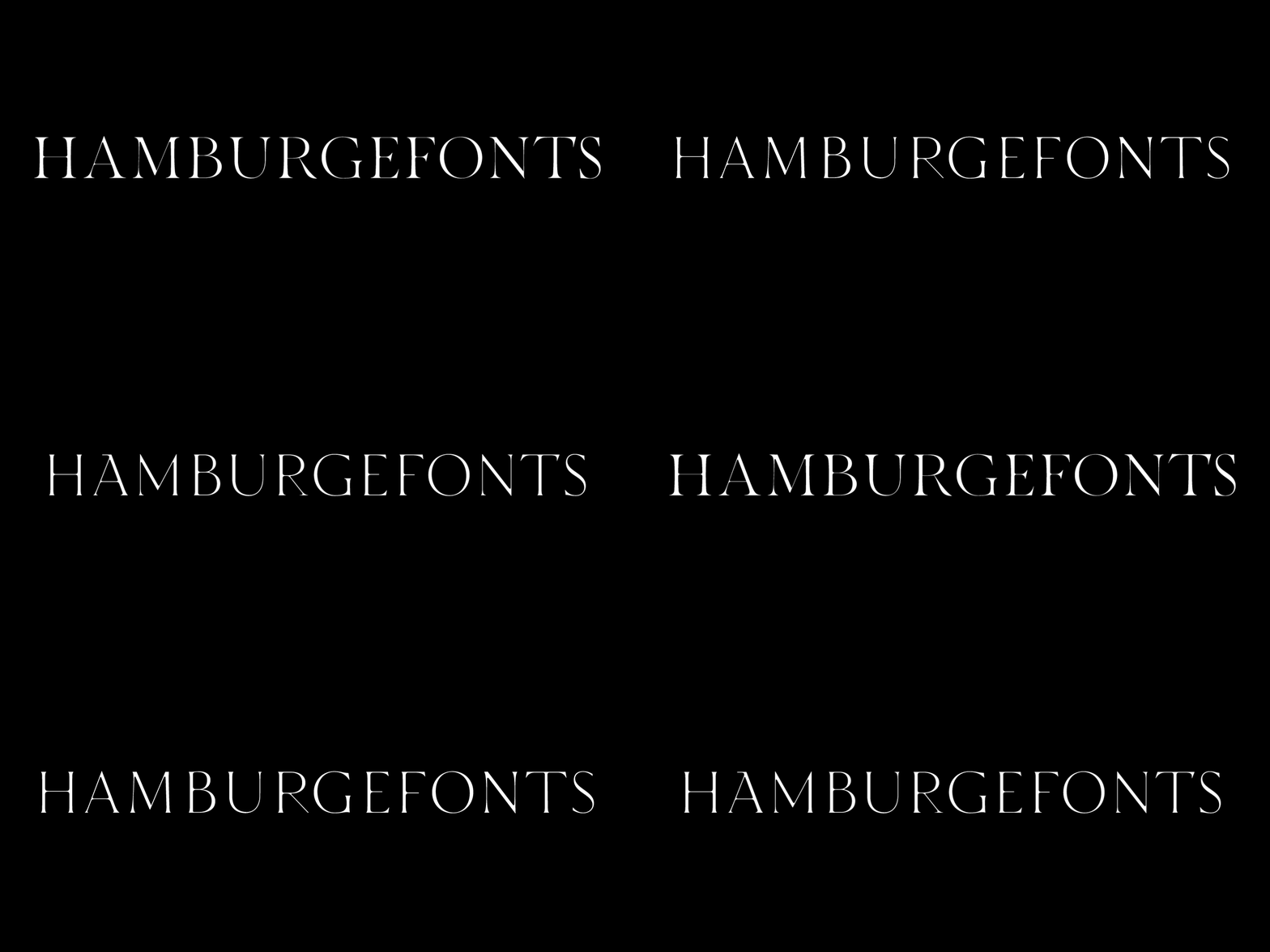
TT Ricordi Nobili is a display antiqua with a rich Roman ancestry and contemporary world views. It stands out from the crowd with its subtlety and elegance.

The font was drawn by Anya and was inspired by an inscription carved into the stone floor of a cathedral in Florence. Because people walked over the inscription, some of the letters got thinner and worn out over time. It is this feeling of disappearing or flickering elements that we wanted to capture and implement in the project.

The TT Ricordi Nobili font has a high contrast, even though the font itself is quite thin. The serifs in the font are not massive at all, but at the same time they are display serifs. There is a certain tension in the font, and the viewer perceives this tension. We can say that behind the external classic facade lies a rather modern plot. The font has a large set of discrete ligatures which allow to create interesting combinations and expand the capabilities of the font.

TT Ricordi Fulmini

“For me, the project was unusual already at the stage of technical specification. We had a limited amount of time for sketches, drawing and testing. It was very invigorating and did not allow one to fall into contemplation. The most difficult thing for me was to get away from the old style and give the font a modern feel. To do this, we had to abandon the fullness of the reference and make the font thinner and sharper.”
Marina Khodak, Senior type designer
TT Ricordi creation story
Evolution Ricordi Fulmini

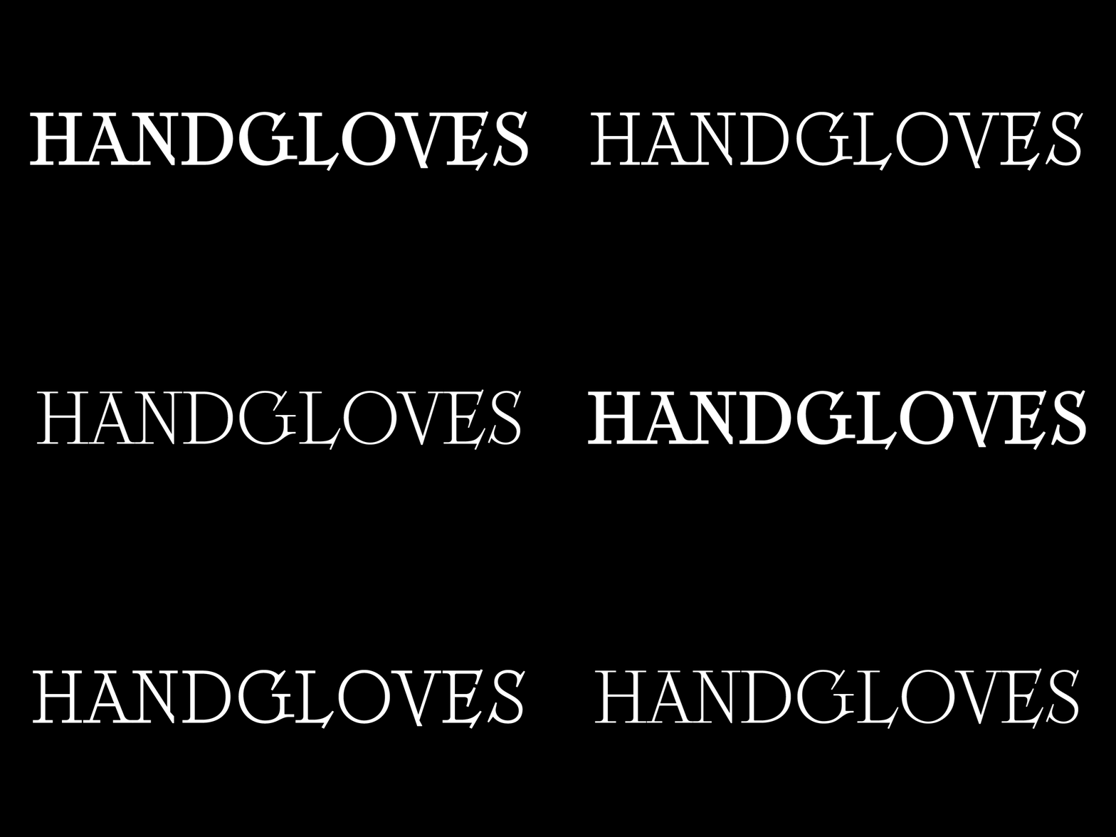
TT Ricordi Fulmini is a fashionable contemporary antiqua firmly holding on to its historic roots. The font turned out to be like a thistle flower: bright and catchy, but still subtle and delicate. TT Ricordi Fulmini was drawn by Marina, and the initial inspiration for the project was the inscription on the altar from the National Gallery of Umbria in Perugia. As the font was pulled into “contemporaneity”,  it was completely transformed and revealed its new side.

The main catchy detail in the TT Ricordi Fulmini font is the aggressive and rather sharp diagonal serifs. In addition, in the process of working on the font, several graphic solutions emerged, for example, the mono-serifs and the very calligraphic connections of diagonal strokes with their historic spirit. We wanted to keep them, and thus 4 thematic visual sets appeared in the font, thanks to which we can greatly change the perception of the font. In addition, the font has a set of interesting discrete ligatures.

Latest publications

How to Choose the Best Infographic Fonts: Сomprehensive Guide

How to Choose the Best Infographic Fonts: Сomprehensive Guide

Infographics is a versatile and convenient tool that finds application everywhere: business, advertising, science, journalism, and more. This is a powerful way to communicate information in a simple, visual manner. Why is it so essential to choose the right font for your infographic, and how to do this? How do you pair fonts with each other? What fonts work best for marketplace infographics? Read on to find out!

See more
On Opposite Sides: Wide and Narrow Fonts

On Opposite Sides: Wide and Narrow Fonts

Wide and narrow fonts are among the newest trends in typography, graphic design, and web design. At first glance, some may seem odd and awkward, but when thoughtfully applied, they can infuse a project with freshness, boldness, relevance, and strength. What are narrow and wide fonts, what variations do they come in, and where are they used? Let’s explore this together in this article.

See more
How do you add a font to your computer? 

How do you add a font to your computer? 

How to install a new font on a PC? Users and designers face this question very often. Rest assured, there is nothing tricky in this process! This article provides a step-by-step guide to help you understand how to install downloaded fonts correctly on Windows and iOS-powered computers.

See more
Font Licensing: Complete Guide for Designers and Business Clients

Font Licensing: Complete Guide for Designers and Business Clients

In this article, you will find out what types of font licensing exist, how to choose a suitable font license and use it, how to verify and buy a commercial font license, and how to avoid unpleasant typeface licensing issues whether you are a designer or a client.

See more
Kerning, Tracking, Leading & Spacing in Typography: What’s the Difference?

Kerning, Tracking, Leading & Spacing in Typography: What’s the Difference?

Even seasoned designers sometimes mix up the concepts of kerning, tracking, spacing, and leading. Become a pro at distinguishing them! Learn the definitions of these concepts, explore their differences, and discover some helpful tips on how to use them while working on your fonts.

See more
Branching out: How Scandinavian Sans TT Firs Grew and Found Its Font Pair

Branching out: How Scandinavian Sans TT Firs Grew and Found Its Font Pair

In 2023, we breathed new life into the beloved Scandinavian sans serif TT Firs Neue by dramatically refining and renewing the typeface to comply with cutting-edge standards. Soon after, we introduced the text font pair for this typeface – an elegant TT Firs Text. This article is dedicated to how it all began, why we decided to update TT Firs Neue, what we added and modified, and how TT Firs Text was born.

See more
Top 10 Typography Trends of 2024

Top 10 Typography Trends of 2024

We live in a time when trends shift nearly every day, and typography design trends are no exception. We all encounter typography daily: on the web, in supermarkets, and on shop windows and signs. Outdated design, at the very least, induces boredom; at worst, it fosters distrust in the product or service. However, trendy design looks captivating and attractive.Experts and designers from the TypeType font studio are excited to share the key type trends of 2024 with you in this article. Stay trendy!

See more
15+ Best Magazine Fonts for Perfect Editorial Designs

15+ Best Magazine Fonts for Perfect Editorial Designs

Magazines are a perfect backdrop for typography to express all its dimensions. Fonts, in this case, not only communicate information but also directly influence the design. They deliver the magazine’s message, reflecting its values and ideas. In this article, we discuss how to choose the best magazine font and compile a list of 15 relevant options for editorial designs on various themes.

See more
UniversiTTy: Lesson 9. Uppercase Characters. Detailed Contour Refinement

UniversiTTy: Lesson 9. Uppercase Characters. Detailed Contour Refinement

Welcome to the ninth lesson of our «UniversiTTy»! In this series, we guide you through the process of font design step by step. The font is a cohesive visual system. This can be seen on all levels: global (font type, weight, proportions, contrast, general forms) and at lower scales that encompass all graphic choices in individual characters. Let’s find out together how visual details influence the overall perception of fonts.

See more

See more

TT Autonomous creation story

TT Autonomous creation story

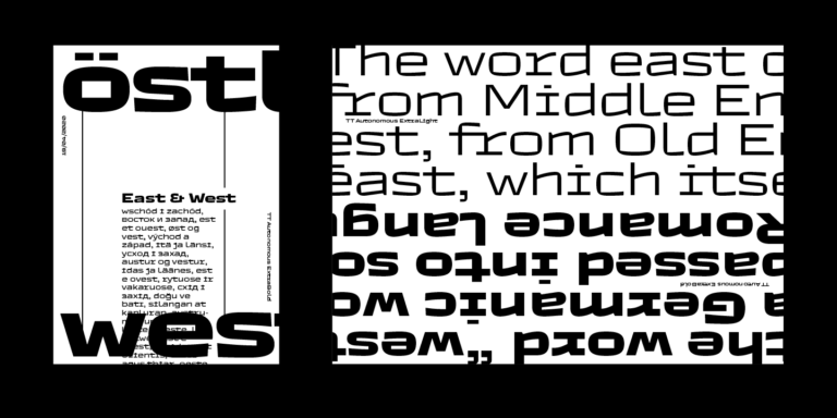
Today we want to share with you the short story of the TT Autonomous font creation. We’ll tell you what inspired the designers and what types of fonts are included in the family.

See more
Changing glyph sizes in TT Commons™ Classic

Changing glyph sizes in TT Commons™ Classic

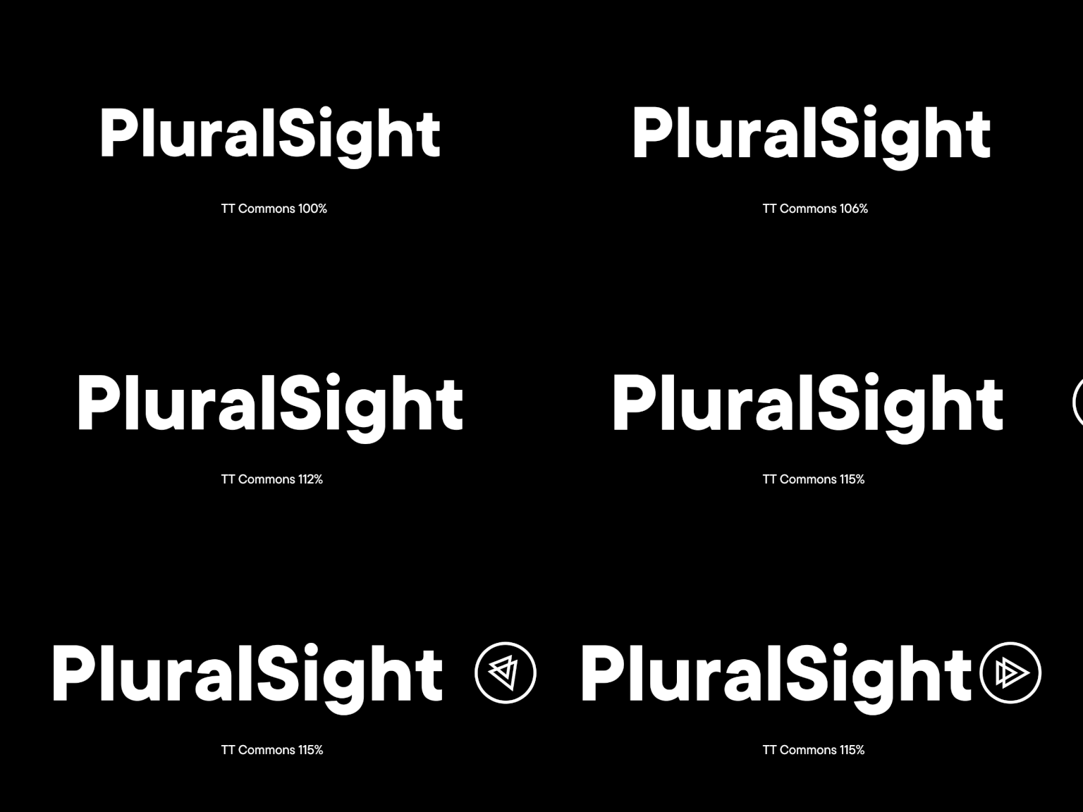
PluralSight has asked TypeType for trial versions of the TT Commons™ Classic and TT Interphases fonts to choose a suitable one. They were attracted by TT Commons™ Classic, but the non-standard size of glyphs made the font unsuitable for several directions.

See more
Font hinting: From first developments to use in practice

Font hinting: From first developments to use in practice

In this article, we will tell you the history of font hinting development. We will share our own experience of working with fonts and explain what tasks hinting solves.

See more
Turning off ligatures in TT Norms® Pro

Turning off ligatures in TT Norms® Pro

The German marketing analytics platform Adjust has addressed TypeType with a request to customize the TT Norms® Pro font. Adjust provides services for company development all around the world.

See more
Creation of TT Marxiana

Creation of TT Marxiana

TT Marxiana is a pre-revolutionary font reconstruction project. These fonts were used in the layout of the “Niva” (nee-vah, “Cultivated field”) magazine published by the A. F. Marx publishing house in Saint Petersburg. In our project we decided to focus on a very specific set of fonts that were used in preparation and printing of the “Niva” magazine in 1887 — Antiqua, Antiqua Italic, Grotesque, and the Elzevir.

See more
Creation of TT Interphases

Creation of TT Interphases

We decided to try to tell you about the creation of a complex font family TT Interphases at independent font foundry. We hope you enjoy our story and discover something interesting and new.

See more