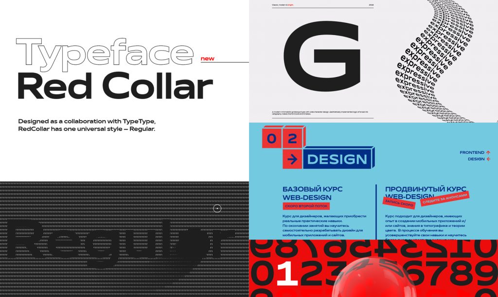
Corporate font for the Red Collar digital agency
Red Collar is a digital agency active on the international level, a laureate of multiple web-design awards.
Red Collar write the following about themselves: “World’s best agency according to the CSS design award in international web design and development. We create impressive digital items that help touch not only people’s minds, but their hearts, too”.
From the moment of its founding, the agency has impressively developed, changed over time, and perfected its approach to the business and the client message. So, the corporate style and the font they had had at the moment were no more an adequate representation of their values.
The spirit that the client wanted to see in the font would be supposed to reflect the agency’s self-positioning: “It’s technological, but affordable; it is brave, bold, but fully responsible for the result”.
The basic principles that the agency’s employees adhere to were to be reflected in the font:
1. Discreet expressiveness
2. Simplicity, plasticity, comprehensibility
3. Moderately unique
The font had to have a certain feel to it: it should feel special but comprehensible.
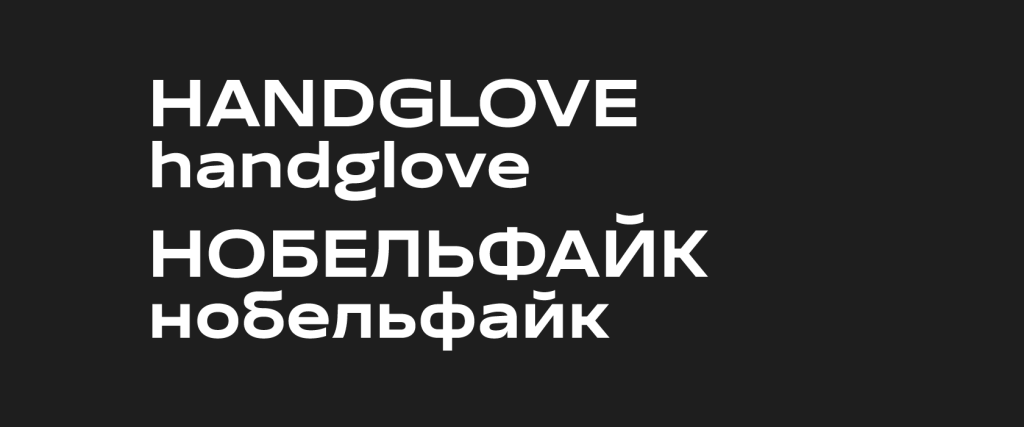
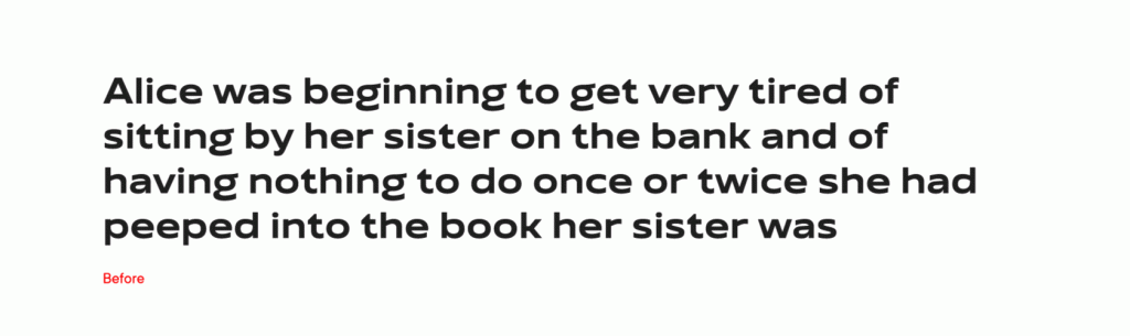
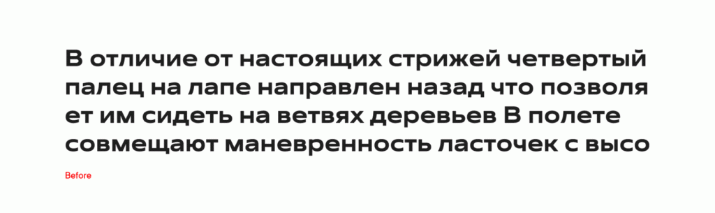
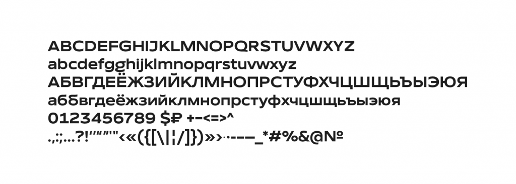
The client planned to use it as a display font mostly in large body size. The face was required to have one standard character composition that would include English and Russian languages, figures, main punctuation characters and symbols.
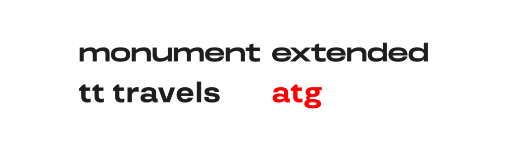
Red Collar chose the TT Travels font as a primary reference: they liked its specific details, for instance, the inflow of the semi-bowl in “a” into the stem, the inflow in the letter “t”. The Monument Extended by Pangram Pangram foundry was also a reference because of its bold wide proportions and dynamic characters. Thus, these two fonts were a starting point for us.
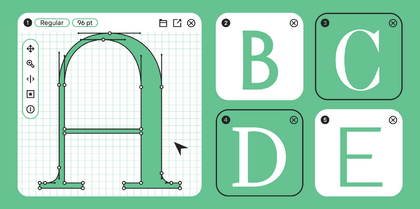
First, we decided to create several sketches as this request opened up a space for creative exploration. To look at the different ways to interpret this task, we engaged two designers in the creative process, and each created three sketches. The results were very different – one of the triads turned out more stern and was based on the “discreet expressiveness” motto, while the other has been much closer to display fonts.
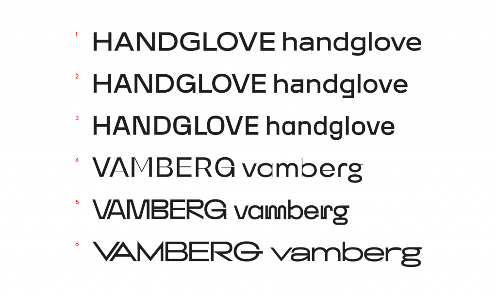
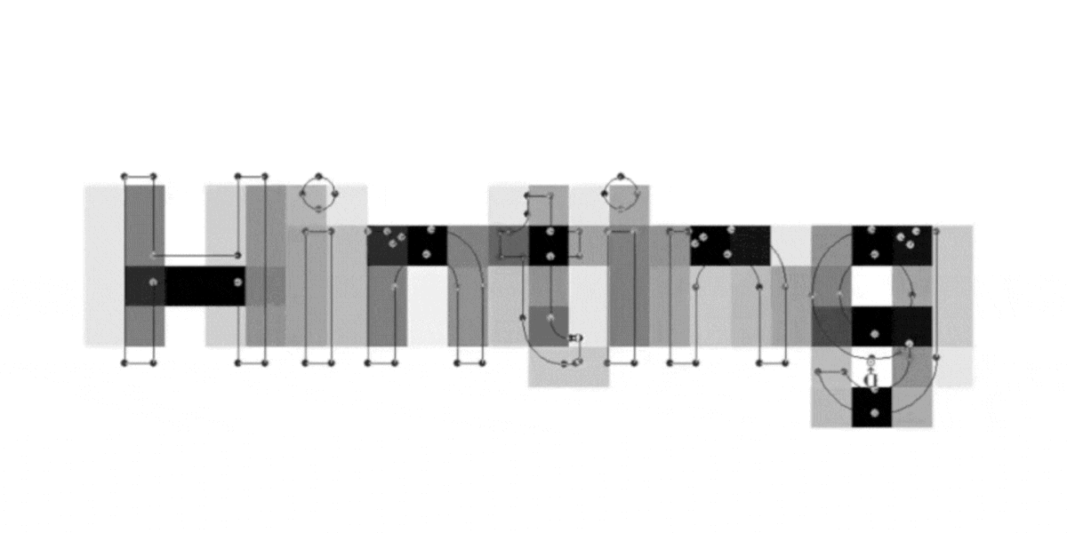
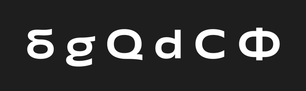
The client ended up liking the first version, and we continued working with it. In the process, the shapes of the characters had undergone many changes and the sketch has almost completely changed. We had worked with the plasticity of the font, adjusted the saturation and added several prominent character constructions: we are referring here to g, б, л, й. The had to add a unique touch to the font without making it too much of a display one.
When the sketch was approved, we started working with it extending the font character composition. In the meantime, we were solving problems that arose in the new characters due to the graphics peculiarities.
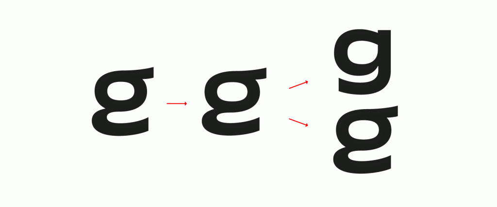
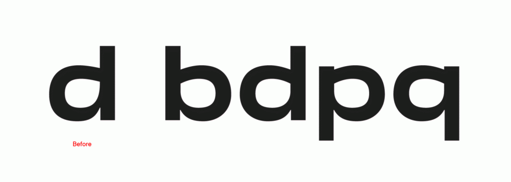
As a result, many characters had been altered more than once. The unusual forms of g and б were transferred to stylistic sets, and we had to redraw Л. In addition, we were looking for the right semi-bowl forms in d, p, b, and q for quite a while.
The initial version of the full font character composition has come a long way and undergone significant changes, becoming more harmonious and readable.
The font turned out to be modern, bold and dynamic, just like the agency itself. When all the graphics were ready, our technical team has started working on setting up the in-depth font parameters, its general checkup and kerning.
At the moment, Red Collar uses the font in communications and their webpages. For example, they have created a separate web-site with the presentation of the font font.redcollar.co, which has been featured as the Site of the Day at www.awwwards.com.

All in all, the project has taken us 11 months to complete. In this time, we created 9 sketches and 3 versions of the complete font. The font has a total of 199 characters and there were 6 people involved in the project.
* the article features the images from font.redcollar.co and school.redcollar.ru.