top_banner_ttsupermolotneue0326
Type foundry Blog Turning off ligatures in TT Norms® Pro

Turning off ligatures in TT Norms® Pro

Turning off ligatures in TT Norms® Pro

The German marketing analytics platform Adjust has addressed TypeType with a request to customize the TT Norms® Pro font. Adjust provides services for company development all around the world.

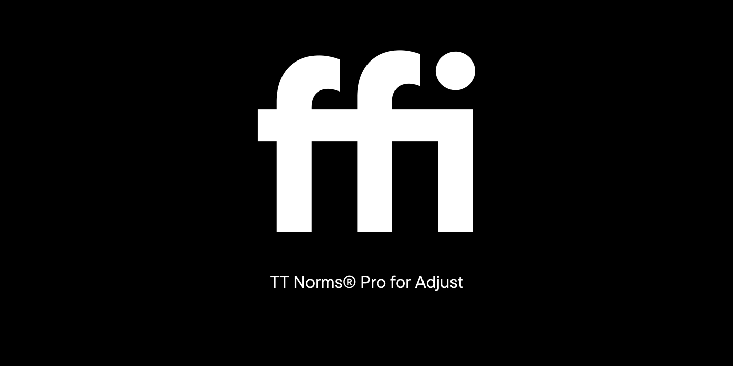
They were completely satisfied with the license for TT Norms® Pro they purchased, but one inconvenience resurged in the testing process: standard ligatures of the font were turned on by default, which turned out to be inconvenient for Adjust while using the basic version of the font.

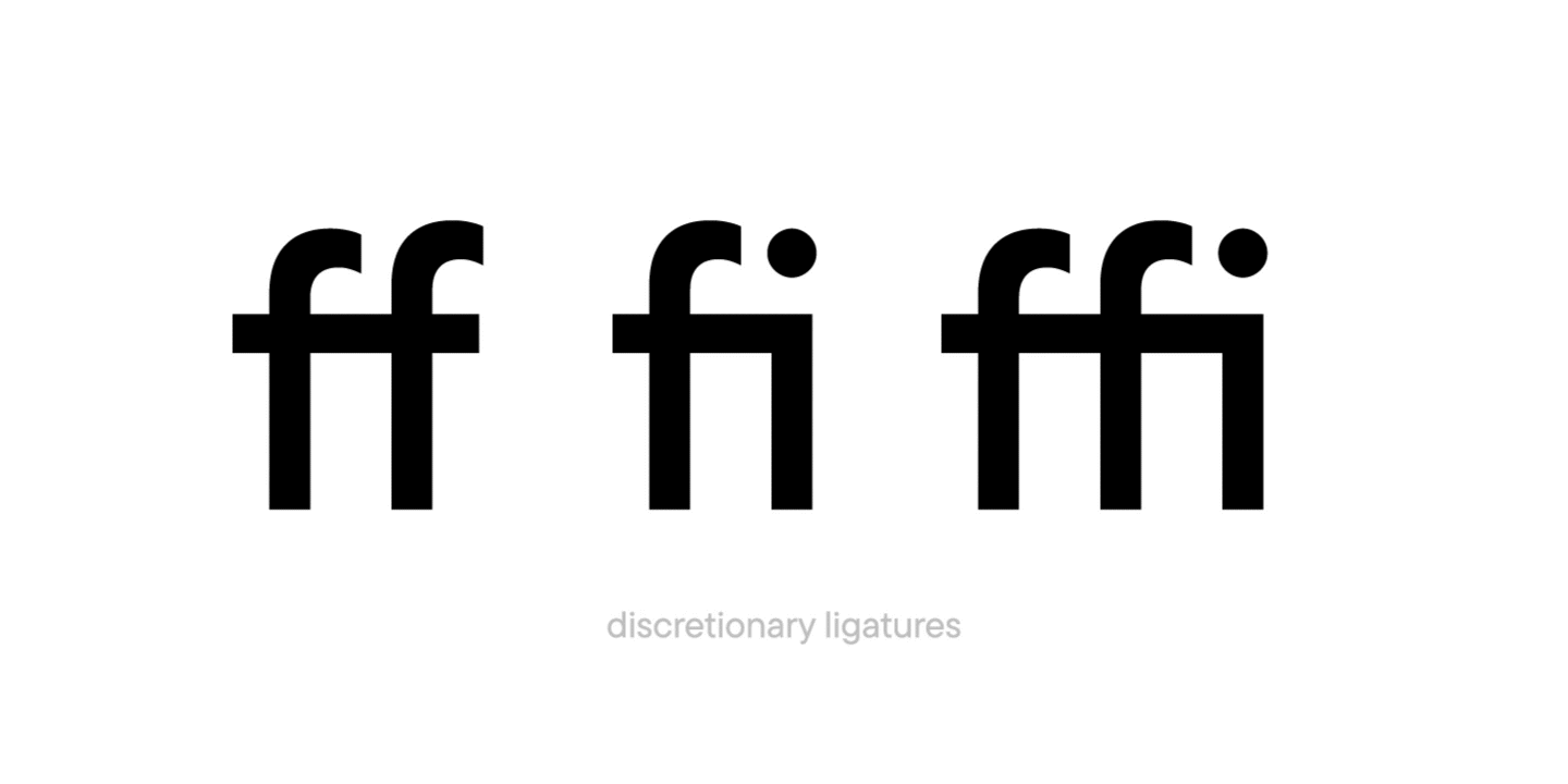
The company wanted the text set in TT Norms® Pro to look crisp without turning the ligatures on.

Such a task is no problem for TypeType because a client’s comfort while using our fonts should be at the maximum. TypeType’s technical specialists moved TT Norms® Pro ligatures from the standard ligatures feature into the discretionary ligatures one. Our team made the ligatures unavailable by default in all font faces, but if necessary they could still be turned on.

The customized version of TT Norms® Pro with the changed order of ligature display was then sent off to Adjust. The font has become more convenient for the company with the alternative display of glyphs on the screen and they could now use TT Norms® Pro to the fullest.

Below you can see what the changes to the font looked like:

Turning off ligatures in TT Norms® Pro

Adjust purchased an unlimited license for TT Norms® Pro, so this customization was complimentary for them.

Latest publications

IP Protection as an Art: TypeType’s Flexible Licensing Control Strategy

Drawing on their own experience, the specialists at TypeType explain how type foundries and designers can stop unlicensed use of their products and get additional revenue while avoiding reputational risk. In TypeType’s professional experience the popularity of a typeface is linked to the fact that it will be more likely used without an appropriate license—despite the fact that developing a single family can take years of meticulous work. We covered how font licensing works in detail here.

See more
Font Research: An Expert Approach to Brand Typography

Among TypeType Studio’s services, we offer typeface system research. Why do brands need such research, and how does it help them develop? How is it conducted? What does the research include, and how are the results interpreted? We answer these questions and show how it works in practice using the financial segment as an example.

See more
TypeType’s Year in Review: Looking Back at 2025

2025 was an incredibly productive year for TypeType: we released 7 new fonts, updated 14 typefaces, and added Arabic language support to two of our bestsellers. In addition, we won awards in type design competitions, explored new platforms, improved our website, wrote about type design in our blog, gave lectures, met with you at webinars, and created joint projects with friends and partners.

See more
Typography in the Museum: How We Developed the Corporate Typeface for the Hermitage

The TypeType team, with the support of the Mantera Group, has created a new font family for the State Hermitage Museum—the Hermitage Type Family. The typeface will be used across all of the Hermitage’s digital content; you can already see it on the website and the updated launch page of the mobile version. And this is just the beginning of a major overhaul of the museum’s digital identity, in which the new font will play a pivotal role.

See more
Proxima Nova Font: Alternatives, Pairings, and the Secrets of Its Popularity

Proxima Nova is one of the most recognizable sans-serif fonts in modern design. In this article, we’ll explore the history of the Proxima Nova font family, its graphic characteristics and composition, figure out what fonts go with Proxima Nova, what its best alternatives are, and what license you need to use it.

See more
The Perfect Moment Is Now: Launching Our Creative Lab, TT Labs

We spent a lot of time thinking about how to find a place for creative freedom within this system, how to set aside time for small passion projects, how to step outside our usual boundaries, and how to give spontaneity a chance. And we realized that the perfect moment will never come unless you take the first step. So we took it—and that’s how the TT Labs creative laboratory was born. Here’s the story from the beginning!

See more
What is Typography in Graphic Design: Key Concepts, Principles, and Examples

Discover what typography is, why it’s important in design, and how to apply its main principles, styles, and rules to create visually strong text.

See more
A Font with a Wide Reach: A Special Project for SHIFTBRAIN’s 20th Anniversary

In 2023, the Japanese marketing agency SHIFTBRAIN launched an interactive website dedicated to the company’s 20th anniversary. For this project, the TypeType team developed a unique variable font capable of stretching to extreme horizontal widths. As a foundation, we used the bestseller TT Norms® Pro, which was already the company’s corporate typeface—you can see it on the main SHIFTBRAIN website.

See more
Pangrams Explained: Meaning, Types, Usage and Complete List of Examples

If you’re interested in design, you’ve almost certainly come across the famous sentence about the quick brown fox and the lazy dog. Or perhaps one about a jived fox nymph and a quick waltz. These are pangrams—sentences that contain all the letters of the alphabet. In this article, we’ll provide a more detailed pangram definition, explain why these phrases are so important, and provide a list of the most popular pangrams in English.

See more

See more

Creation of TT Marxiana

TT Marxiana is a pre-revolutionary font reconstruction project. These fonts were used in the layout of the “Niva” (nee-vah, “Cultivated field”) magazine published by the A. F. Marx publishing house in Saint Petersburg. In our project we decided to focus on a very specific set of fonts that were used in preparation and printing of the “Niva” magazine in 1887 — Antiqua, Antiqua Italic, Grotesque, and the Elzevir.

See more
Creation of TT Interphases

We decided to try to tell you about the creation of a complex font family TT Interphases at independent font foundry. We hope you enjoy our story and discover something interesting and new.

See more