

Today we want to share with you the short story of the TT Autonomous font creation. We’ll tell you what inspired the designers and what types of fonts are included in the family.
How the idea came about
The idea was born in Amsterdam when one of our colleagues took the official electric taxi at the Schiphol airport. At the moment we were thinking about creating a new wide sans-serif, and an interesting question emerged during the trip: what font would be associated with autonomous electric transport. Then we thought it would also be nice to expand this theme visually.
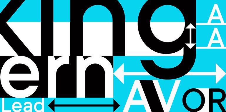
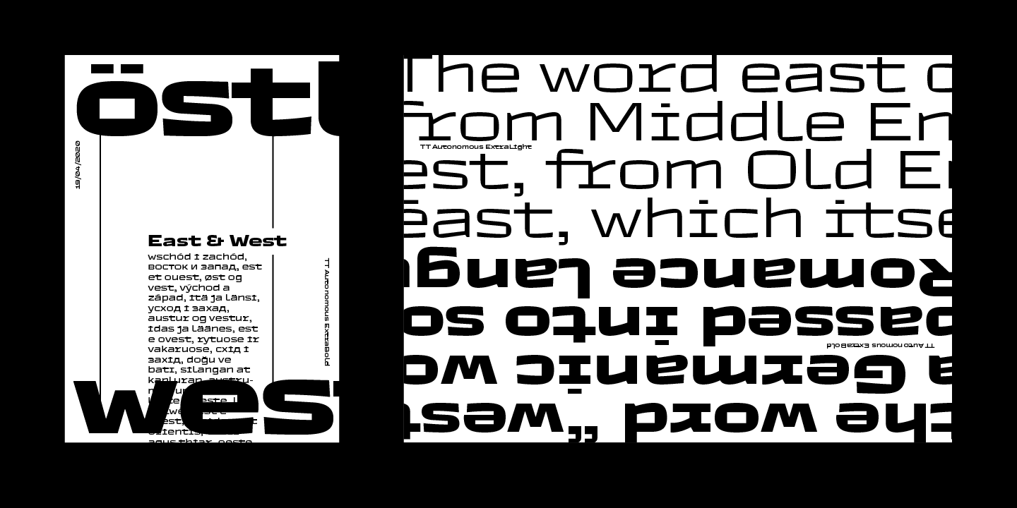
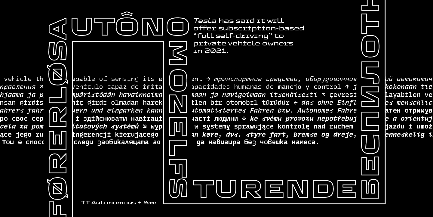
This is how the font family TT Autonomous came about. It is a modern brutal technological sans-serif. The basic visual characteristic of the typeface is the noticeable squareness of the characters and angular internal space. In addition, the typeface proportions tend to appear monospaced, but they are not really monospaced. The width of the characters is inspired by automobile logotype proportions, which are mostly rather wide.
Monospaced fonts
When we were planning the project and just starting to work on it, we didn’t think about a monospaced subfamily at all. The idea to create a separate monospaced subfamily appeared already in the process of working on the first sketches of the font, and later while working on the first vector characters.
During one of our regular team meetings, one of our colleagues noticed that the shape of some characters in the main font had clear references to monospaced fonts. It seemed quite logical to us to develop this idea fully and create a separate monospaced subfamily.
Due to the fusion of unusual visual solutions inherited from the main family, and the characteristics typical for monospaced fonts, the monospaced subfamily turned out to be non-traditional and original.
And therefore, starting to create their oblique versions, we immediately decided not to stop there and tried to combine them with something completely opposite in style — and that’s how the characteristic monospaced true italic was born.
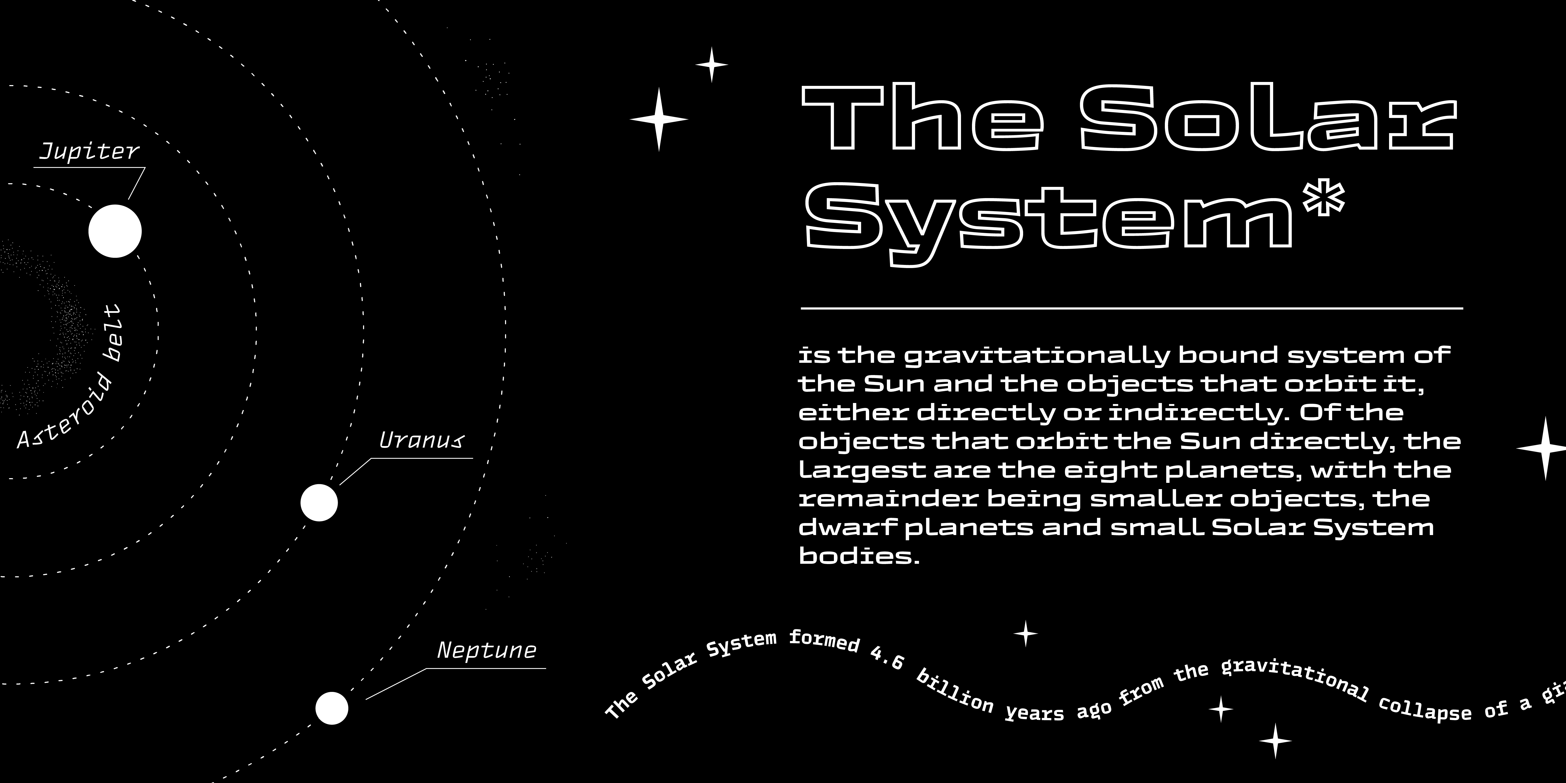
Outlined fonts
In addition, we created a couple of outline styles which are great for use in titles and large inscriptions and perfectly match the basic family and the monospaced family. As opposed to outlines that can be created in graphic editors, in TT Autonomous Outline we worked through the narrow and questionable spots, thanks to which the font looks professionally complete and harmonious.
Variable fonts
As from the very beginning, the font was developed with tomorrow’s technologies in mind, we could not miss addressing variability and creating a variable font. TT Autonomous has variable versions for both the basic and the monospaced subfamilies.
TT Autonomous in numbers
TT Autonomous is a complex font family that consists of 25 fonts intended to solve a broad range of design tasks. Overall, the font family features 14 regular styles, 6 monospaced styles, 2 outline styles and 3 variable fonts. The number of glyphs varies from 630+ in the monospaced font to 790+ in the basic styles. The basic subfamily has alternates, ligatures, old-style figures, slashed zeroes, and many other useful features. The font is available in over 180 languages.
If you want to try TT Autonomous in your projects, we will gladly send you a trial version. Just fill out the request form.