We accept card payments online! For any questions regarding checkout, please send us an email to commercial@typetype.org

Use font subscription! The full font library of 75+ fonts will always be at hand. See more

Introducing the TT Firs Text! Offering a 60% discount on our new Scandinavian sans serif. View typeface

Type foundryBlogChanging glyph sizes in TT Commons™ Classic

Changing glyph sizes in TT Commons™ Classic

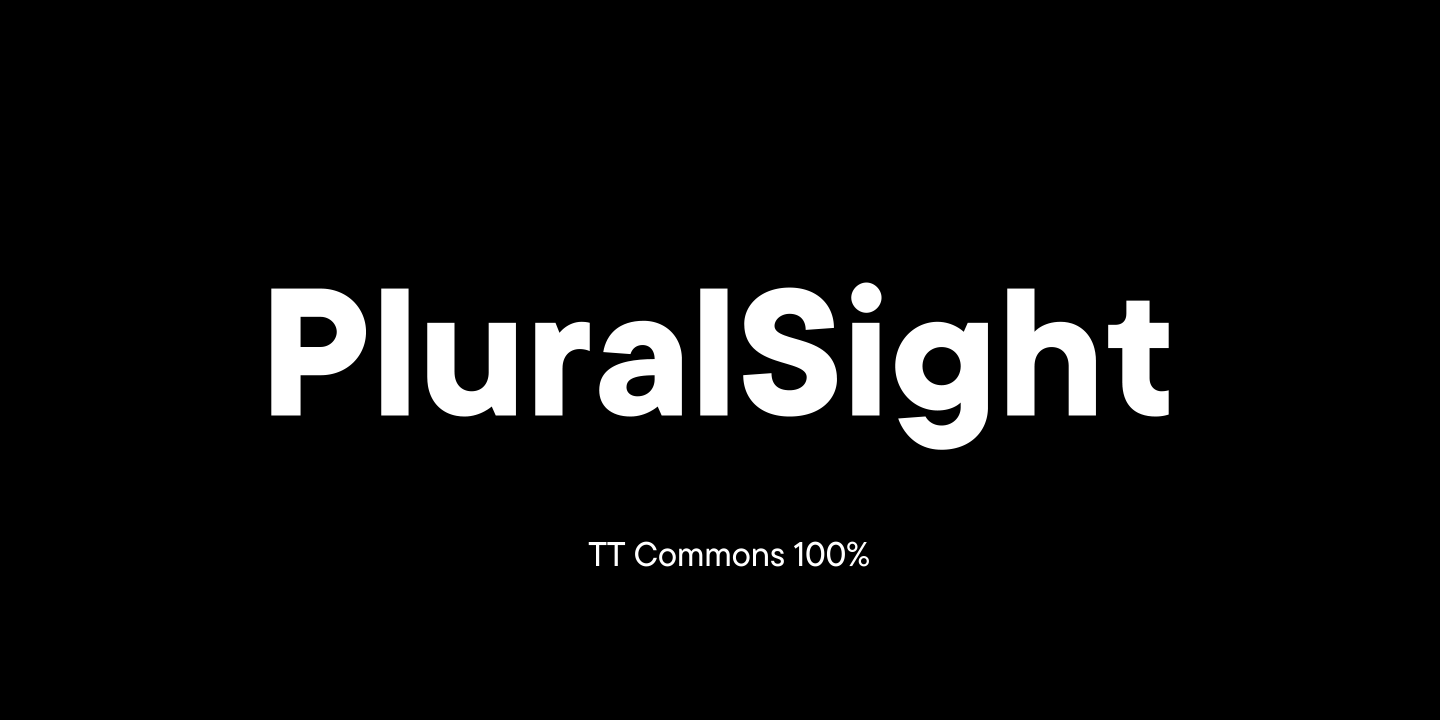
The educational project PluralSight from the USA is created to develop technical skills and make them accessible, understandable and democratic.

PluralSight has asked TypeType for trial versions of the TT Commons™ Classic and TT Interphases fonts to choose a suitable one. They were attracted by TT Commons™ Classic, but the non-standard size of glyphs made the font unsuitable for several directions.

The TypeType team suggested customizing the font so that the company could use an ideal version of TT Commons™ Classic in their projects.

In the discussion, a number of tasks to solve were defined:

  • scaling TT Commons™ Classic up to 115%, that is, to increase the size of glyphs;
  • changing the Line Height parameter for correct display of enlarged glyphs;
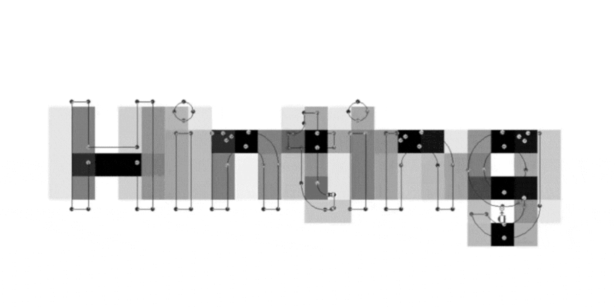
  • carrying out manual hinting so that the ways to use TT Commons™ Classic for PluralSight become almost unlimited;
  • adding the project logos to the TT Commons™ Classic font files;
  • changing the original name of the font to PS TT Commons™ Classic.

Upon approval, TypeType’s designers and technical specialists set off to work.

As a result, we changed the font size parameters and the line height to those that met PluralSight’s demands. Next we carried out manual hinting of the font so that the characters are impeccably displayed in all areas of use.

Changes of the font size parameters and the line height
Drawing and adding company logos to the font

As a result, we got an updated version of the font called PS TT Commons™ Classic, suitable for use in all PluralSight communications. Regardless of the altered glyph size, the font maintained its neutrality, simplicity and ease of use in different forms.

See more

UniversiTTy: Lesson 2. How Not to Get Lost When Working on a Font. The Art of Task Outlining

UniversiTTy: Lesson 2. How Not to Get Lost When Working on a Font. The Art of Task Outlining

Before you begin designing letters and forming the font, it is essential to carry out initial preparation to get a clear idea about the project’s outcome. In this article, we will focus on the essence of this preliminary stage and the importance of this work, describing and analyzing the process of task outlining.

See more07 September, 2023
4 Quick Ways to Identify Fonts Used on Websites

4 Quick Ways to Identify Fonts Used on Websites

Enthusiastic designers are constantly on the lookout for new fonts. Not only while they are working. You can notice new fonts to add to your collection while scrolling social media, browsing brands’ websites, and even playing your favorite video games. All that is left is a technical aspect: to identify a font family used in the project and purchase a license for it. There are many ways of identifying fonts. In this article, we will cover the easiest ones.

See more16 August, 2023
Best Fonts for Books: How to Choose

Best Fonts for Books: How to Choose

Web and printing in typography are two different worlds. At least, they are often presented this way. In reality, many typefaces can be used in both domains. To understand what typeface to choose, it is important to know the differences between book fonts and web fonts. This article covers the topic of fonts for books and how to choose the best typeface for book design, magazines, or any other printed material.

See more09 August, 2023