Es ist Zeit, unsere faszinierende Reise in das vielschichtige Thema des Schriftdesigns fortzusetzen! In der UniversiTTy-Serie behandeln wir die wesentlichen Schritte des Schriftenentwicklungsprozesses, daher empfehlen wir, die vorherigen Artikel der Serie zu lesen, bevor Sie in diesen eintauchen.
Dieser Artikel widmet sich der ersten Phase der Gestaltung grundlegender lateinischer Zeichen: der Glyphenkonstruktion sowie der Festlegung von grafischen Merkmalen, Proportionen und Konsistenz. Antonina Zhulkova, Design Lead bei TypeType, wird Ihnen alles über diese Prozesse erzählen. Antonina arbeitet seit über fünf Jahren im Schriftdesign. Sie ist die Konzeptautorin und leitende Designerin von Projekten wie TT Neoris, TT Ricordi Allegria, TT Globs und Ivi Sans Display. Außerdem war sie an der Entwicklung von TT Fellows, TT Fors, TT Interphases Pro, TT Commons, Red Collar und vielen anderen Schriftarten beteiligt.
Wo beginnt man mit der Gestaltung grundlegender lateinischer Zeichen?
Nachdem Sie alle Vorbereitungen abgeschlossen, die Aufgabe und die Schlüsselsmerkmale der Schrift definiert und Skizzen erstellt haben, ist es Zeit, mit dem Erstellen von Glyphen in einem Schrifteditor fortzufahren.
Die Hauptidee dieses Abschnitts ist, dass eine Schrift ein einheitliches, komplexes System ist, keine einzelnen Buchstaben. Daher sollte jede grafische Entscheidung alle Zeichen im Set beeinflussen. Einerseits mag dieses Konzept einschränkend und uninteressant erscheinen. Andererseits unterstützt die Konsistenz der Schrift aus grafischer Sicht, indem sie Glyphen miteinander verbindet und vereint. Das Verständnis der grundlegenden Prinzipien der Schriftkonstruktion erleichtert den gesamten Designprozess. Es lohnt sich zu wiederholen, dass eine klare und kohärente Konstruktionslogik die treibende Kraft hinter dem Glyphen-Design und der Entscheidungsfindung ist.
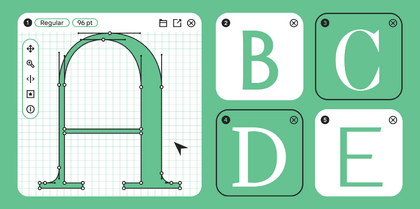
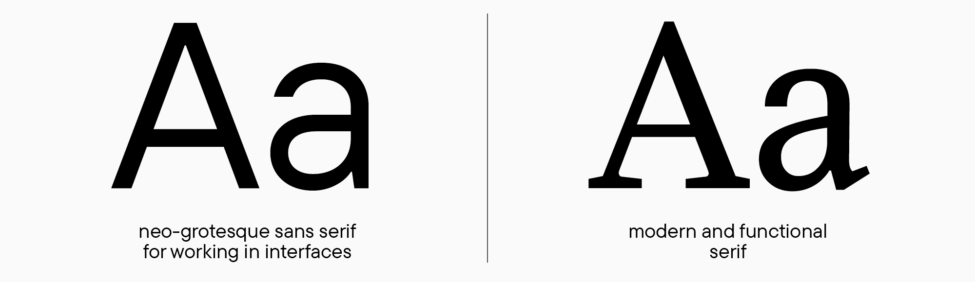
Der erste Schritt beim Entwerfen einer Schrift in einem Editor ist die Erstellung grundlegender lateinischer Klein- und Großbuchstaben. Diese helfen, die Gewichte und Proportionen festzulegen, die als Grundlage für die Gestaltung der restlichen Zeichen dienen. Diese Buchstabenformen sollten auf der Grundlage der fertigen Skizzen entworfen werden. Um die Schrift zu veranschaulichen, biete ich zwei Beispiele an, eine Serif- und eine Sans-Serif-Schrift, damit Sie zwei grundlegende Stile vergleichen und Gemeinsamkeiten sowie Unterschiede in den Entwicklungsprozessen solcher Schriftarten erkennen können.
Wir werden eine Schrift basierend auf unseren bekannten Aufgaben aus früheren „Lektionen“ entwerfen: eine moderne, funktionale Serif und eine Neo-Grotesque für Benutzeroberflächen. In einigen Fällen werden Beispiele aus anderen Schriften eingefügt, damit Sie die beschriebenen Prozesse in ihrer Gesamtheit nachvollziehen können. Ich möchte erwähnen, dass wir in diesem Artikel nur römische Schriftstile behandeln. Ein Abenteuer in der Welt der Kursiven erwartet Sie in einem der folgenden Kapitel.
Der Beginn der Arbeit: Erste Glyphen
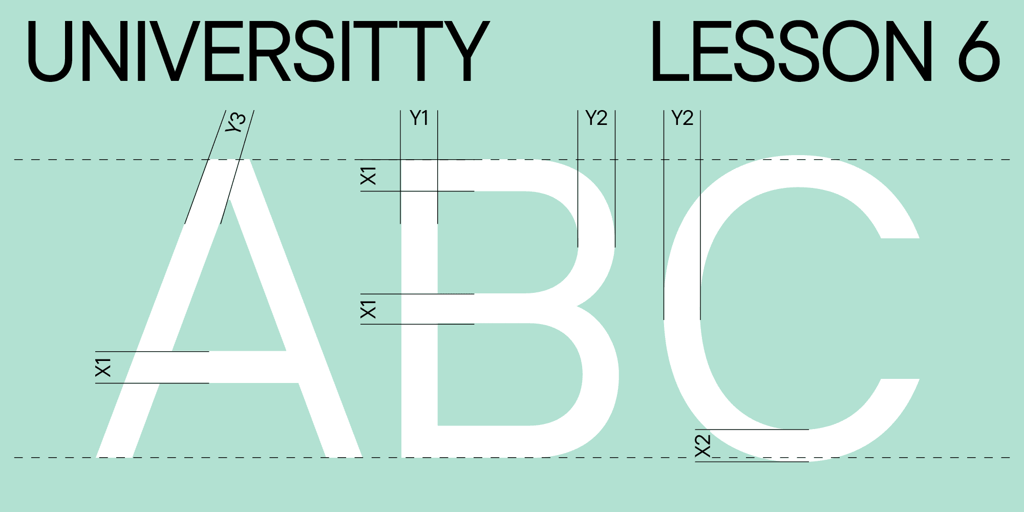
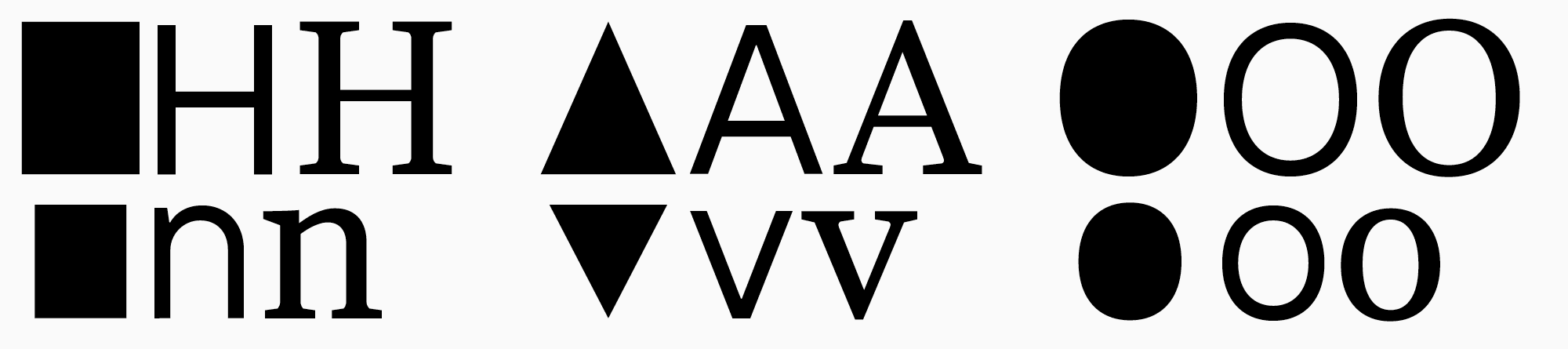
Zeichen des grundlegenden lateinischen Alphabets können in drei Gruppen unterteilt werden: gerade oder rechteckig (z. B. H oder n), rund (O, o) und dreieckig (A oder v). Diese Zeichen markieren den Beginn unserer Arbeit und legen die Grundlage für die restlichen Glyphen.
Meine Erzählung über das Glyphen-Design beginnt mit den Großbuchstaben. Dafür gibt es zwei Gründe. Erstens erschienen Großbuchstaben historisch früher als Kleinbuchstaben. Zweitens ist die Konstruktionslogik dieser Glyphen etwas einfacher zu verstehen. Falls Sie in dieser Phase nur Kleinbuchstaben skizziert haben, können Sie zu den Zeichnungen zurückkehren und die Buchstaben Н, О und А hinzufügen, um Proportionen und Gewichte zu bestimmen und zu analysieren, wie die Kleinbuchstabenformen Ihrer Schrift mit den Großbuchstaben korrespondieren. Sie können mit dem Zeichnen von Glyphen in beliebiger Schreibweise beginnen, um an Ihrem grafischen Konzept zu arbeiten. Meiner Meinung nach ist es jedoch methodisch besser, die Erklärungen mit den Großbuchstaben zu beginnen.
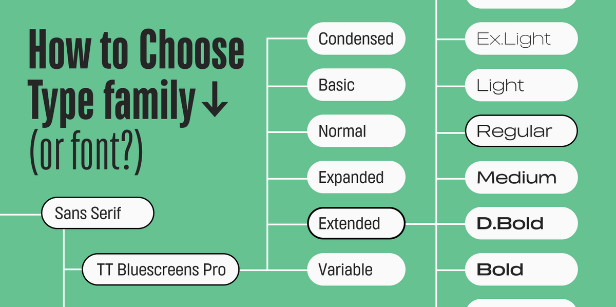
Schriftstil und Gewichte
Wenn Sie planen, eine gesamte Schriftfamilie mit mehreren Gewichten zu entwerfen, sollte der erste entworfene Schriftstil der reguläre Stil sein, den Sie in der Skizzenphase als „Master“ festgelegt haben. Diese Regel gilt für relativ neutrale Schriften, bei denen Lesbarkeit und logische Glyphenkonstruktion entscheidend sind. Außerdem sind verschiedene grafische Merkmale in einem regulären Schriftstil leichter zu verstehen. Im Gegensatz dazu ist das Entwerfen von Display-Schriften nur durch Ihre Vorstellungskraft begrenzt; die Wahl des „Masters“ beeinflusst den Prozess nicht wesentlich. Erfahren Sie mehr über die Planung Ihrer Schriftfamilie in unserem Artikel „UniversiTTy: Lektion 4“.

Beispiele für Glyphen-Gewichte und optische Kompensationen
Bevor wir mit dem Zeichnen beginnen, müssen wir die Theorie der variierenden Zeichen-Gewichte in Schriften besprechen. Numerische Parameter der Gewichte spielen eine wesentliche Rolle im Schriftdesign. Erstens dienen sie als Grundlage für die Konstruktion der restlichen Zeichen in der Schriftfamilie. Zweitens helfen sie, eine Schrift zu identifizieren, ihre stilistische Klassifikation zu bestimmen und festzustellen, ob sie der Aufgabe entspricht.
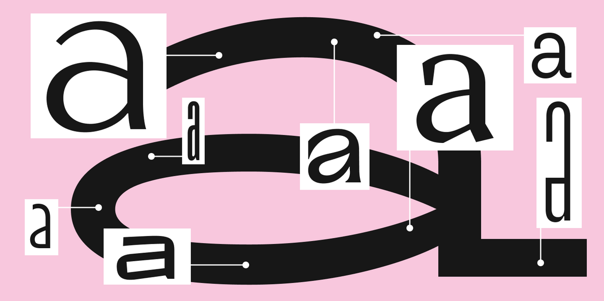
Aufgrund der Nuancen unserer Wahrnehmung erscheinen geometrisch präzise Formen gleicher Größe nicht identisch, wenn sie nebeneinander platziert werden. Dieses Wissen ist für einen Schriftdesigner entscheidend. Beim Zeichnen von Buchstaben muss dieser Aspekt der Wahrnehmung berücksichtigt werden, um den Schriftsatz gleichmäßig und stabil auf der Linie wirken zu lassen. Am besten sieht man dies am Beispiel geometrischer Formen.
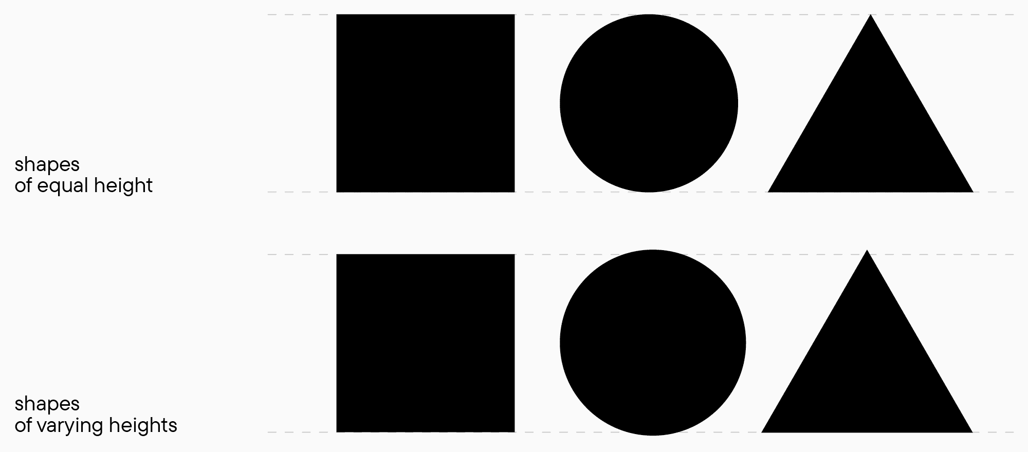
In der oberen Abbildung wirkt ein Kreis kleiner als ein Rechteck, und ein Dreieck erscheint sogar kleiner als der Kreis. Tatsächlich haben alle Formen die gleiche Höhe. In der zweiten Abbildung sind die Formen unter Berücksichtigung der visuellen Wahrnehmung ausgeglichen, sodass sie gleich hoch erscheinen. Der Kreis und der Scheitelpunkt des Dreiecks ragen jedoch tatsächlich über die Grundlinien hinaus. Sie können dasselbe Experiment (in einem Schrifteditor oder auf Papier) mit verschiedenen Formen und Eigenschaften durchführen, um den Kontrast in der Wahrnehmung besser zu erkennen.

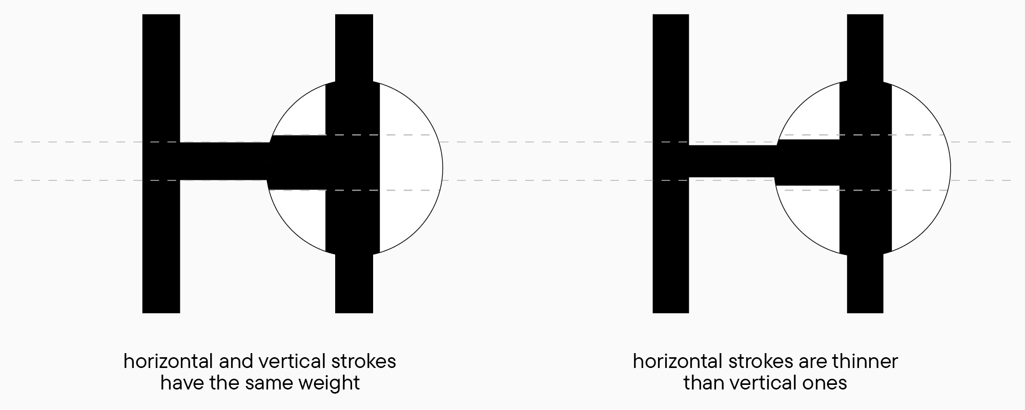
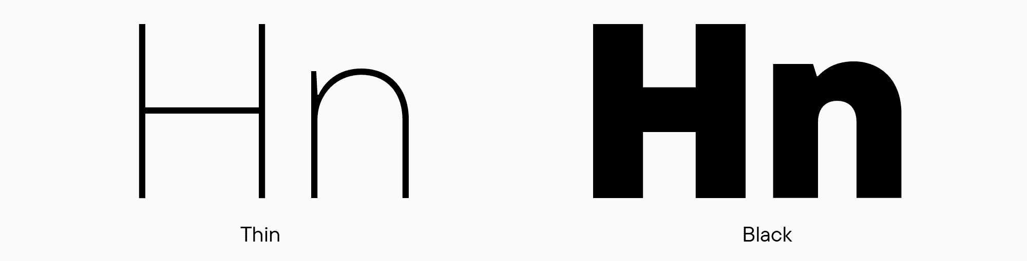
Das Beispiel mit Formen ist oft schwer mit „echten“ Designs zu verbinden, aber solche abstrakten Vergleiche sind essenziell, um die Grundlagen zu verstehen. Unsere visuelle Wahrnehmung beeinflusst auch die Gewichtsschätzung: Horizontale Striche erscheinen uns immer dicker als vertikale, selbst wenn beide gleiche Gewichte haben. Ebenso wirkt ein aufrechter Strich dicker als derselbe Strich, wenn er gekrümmt ist, wie beim Buchstaben O. Wenn Sie also eine Schrift ohne sichtbaren Kontrast entwerfen, z. B. eine neutrale Sans-Serif, bei der alle Striche visuell gleich sein müssen, sollten Sie horizontale Striche dünner als vertikale gestalten.
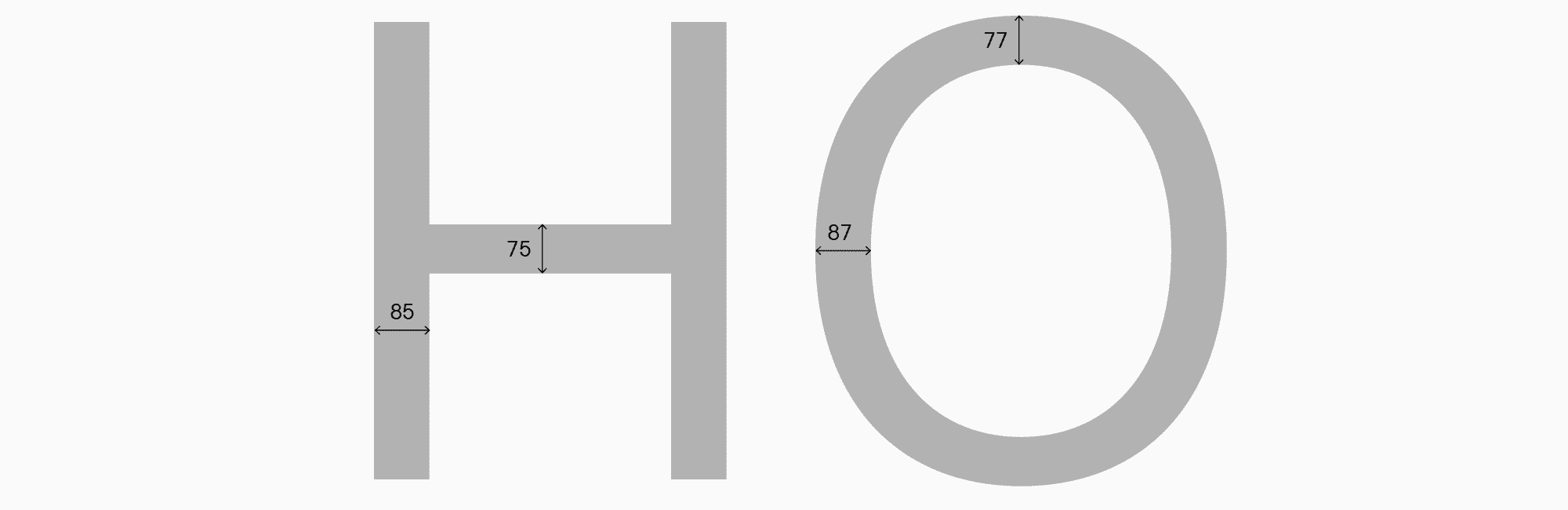
Um die Zeichen Ihrer Schrift zu konstruieren, müssen Sie vier Kernparameter für jede Schreibweise festlegen: Stammgewichte (für gerade und runde Zeichen) und Gewichte horizontaler Striche (ebenfalls für beide Arten von Glyphen). Diagonale Glyphen-Gewichte stehen separat, aber dazu kommen wir gleich. Wichtig ist, dass je größer das Gewicht des Schriftstils ist, desto ausgeprägter der Unterschied zwischen horizontalen und vertikalen Strichen wird. Ein weiterer Aspekt ist, dass die Wahrnehmung von Gewichten von der Größe des gesamten Buchstabens abhängt: Je größer die Glyphe und je mehr „Luft“ sie hat, desto leichter erscheint sie unserem Auge. Daher sollten die Parameter der Kleinbuchstaben mit denen der Großbuchstaben verglichen und durch Tests korrigiert werden.
Der Prozess der Gewichtswahl für Serifen– und Sans-Serif-Schriften ist im Wesentlichen derselbe. Der einzige Unterschied liegt in der Menge des Kontrasts zwischen vertikalen und horizontalen Strichen sowie einer sichtbareren Gewichtsunterscheidung zwischen geraden und runden Zeichen. Der Ansatz ist jedoch für beide Schriftstile gleich, und alle zusätzlichen grafischen Elemente (Querbalken in doppeltstöckigen Zeichen, Serifen usw.) folgen diesen Prinzipien der Gewichtsverteilung.
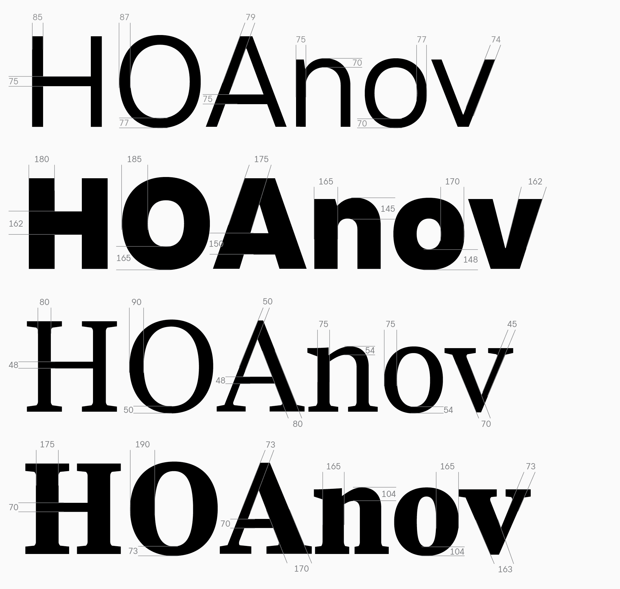
Anhand einer neutralen Sans-Serif für Schnittstellen und einer Text-Serif als Beispiel können wir sehen, welche Werte verwendet werden können.
Lassen Sie mich einen kurzen Kommentar zum Bogengewicht im Buchstaben n hinzufügen. Das Gewicht dieses Elements stimmt oft nicht mit den Gewichten horizontaler Striche in Kleinbuchstaben überein, und der Zweck dieses Elements unterscheidet sich von dem des Querbalkens im Buchstaben H. Daher muss es oft visuell ausgeglichen werden, um das Gleichgewicht des Schwarzen im Zeichen zu wahren. Beim Entwerfen kyrillischer Zeichen empfehle ich, den Buchstaben н zu verwenden, um die Kerngewichte horizontaler Striche oder Querbalken in Buchstaben wie a, e, z oder t zu bestimmen.
Nun beschreibe ich kurz ein paar weitere Optionen, denen Sie bei der Festlegung der Zeichen-Gewichte begegnen können. Zuerst eine Sans-Serif, da sie tendenziell keinen sichtbaren Kontrast aufweist. Selbst innerhalb derselben Schriftfamilie wird der Kontrast zwischen den Gewichten variieren: Je dünner der Stil, desto geringer kann der Kontrast zwischen Strichen sein. Zum Beispiel können im Thin-Schriftstil vertikale und horizontale Striche gleiche Gewichte haben, aber je mehr Schwarz hinzukommt, desto größer wird dieser Unterschied im Gegensatz dazu.
Gewichte in Sans-Serifs können auch je nach Stil variieren. In humanistischen Sans-Serifs ist der Unterschied zwischen den Gewichten meist ausgeprägter, während er in geometrischen Sans-Serifs nahezu unsichtbar wird. Gleichzeitig unterscheiden sich die vertikalen Strichwerte für runde Zeichen nur geringfügig oder gar nicht. In dieser Hinsicht sind Serifen vielseitiger und anspruchsvoller bezüglich der Gewichtsparameter, da sie den Stil der Schrift und die Formen der Glyphen beeinflussen. Um Ihr System des Glyphen-Designs zu etablieren, müssen Sie entscheiden, ob Sie eine kontrastreiche Serif, eine eher altmodische oder eine Serif mit umgekehrtem Kontrast erstellen. Das Thema Kontrast bei Serifen werde ich später noch behandeln.
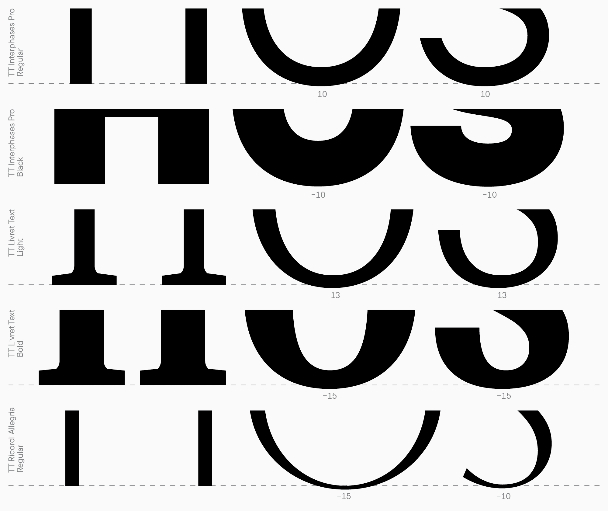
Konzentrieren wir uns nun auf runde und dreieckige Zeichen. Runde Glyphen erfordern sogenannte Überhänge, um die Buchstaben visuell in der Höhe übereinstimmen zu lassen. Das Ausmaß des Überhangs, also die Höhe runder Zeichen, ist die Höhe des Buchstabens H + ein bestimmter Wert von oben und unten (dies betrifft runde Elemente auf beiden Seiten). Es gibt keine festgelegten Regeln, um diesen Wert zu berechnen — alles hängt von der spezifischen Schrift und ihrem Verwendungszweck ab. Üblicherweise gilt die folgende Formel: Je größer die Menge an Schwarz in den Zeichen und je größer die Punktgröße, desto höher muss dieser Wert sein. In den meisten Fällen liegt die Größe zwischen 10 und 15 Punkten. Auch das Ausmaß des Überhangs ist nicht immer gleich: In manchen Fällen, wenn eine Schrift breite, runde Zeichen aufweist, wirken schmale Glyphen mit Überhängen, wie S, übermäßig aus der Linie herausragend, sodass die Überhänge reduziert werden müssen. Diese Details sind nach dem Drucken besser sichtbar, daher denken Sie daran, Ihre Schrift auf vielfältige Weise zu testen.
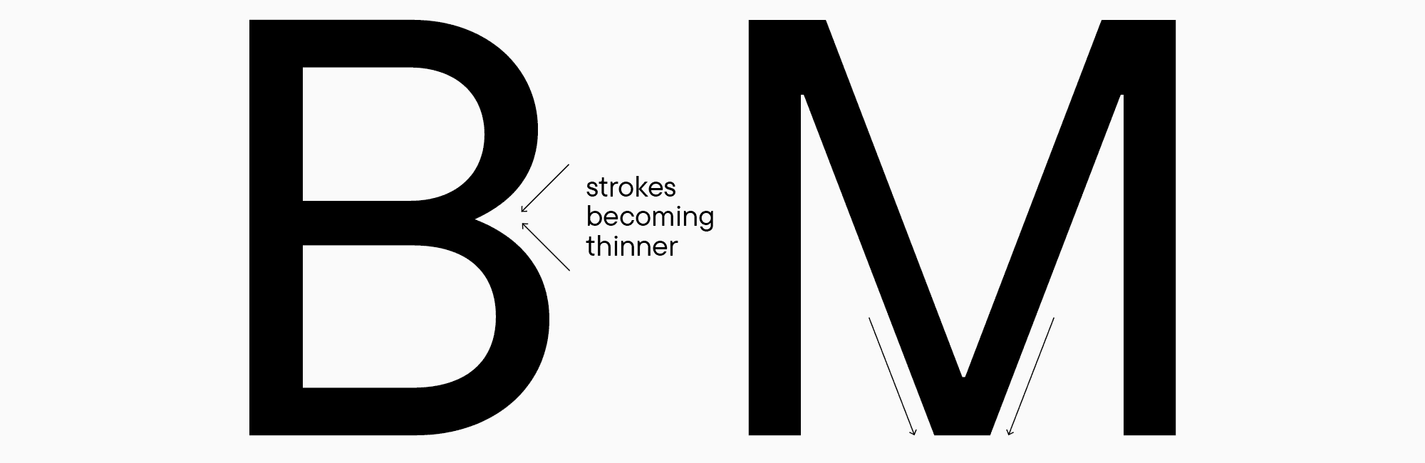
Beim Entwerfen dreieckiger Glyphen sind die geeigneten Gewichtsparameter oft unklar, da dreieckige Zeichen dazu neigen, deutlich dunkler oder heller als andere Formen auszusehen. Basierend auf meiner Erfahrung kann ich empfehlen, diagonale Striche etwas dünner als die Hauptstammgröße des Buchstabens H zu gestalten und jeden Buchstaben zwischen den anderen zu testen. Ein entscheidender Faktor beim Zeichnen horizontaler Striche ist, dass fast alle dreieckigen Zeichen mit solchen Strichen Punkte haben, an denen diagonale Striche sich schneiden, und diese Punkte wirken immer dicker (dies betrifft auch die Buchstaben B, M, N, R usw.). Daher müssen sie durch Reduzierung des Gewichts der sich schneidenden Striche ausgeglichen werden.
Im kommenden Artikel werden wir weiter über optische Kompensationen sprechen, herausfinden, wie man die Höhen von Groß- und Kleinbuchstaben bestimmt, und mehr über die Essenz des Kontrasts lernen.