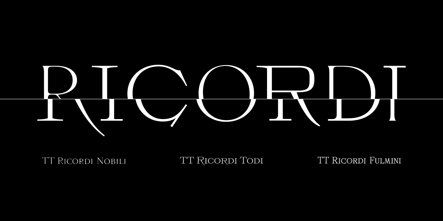
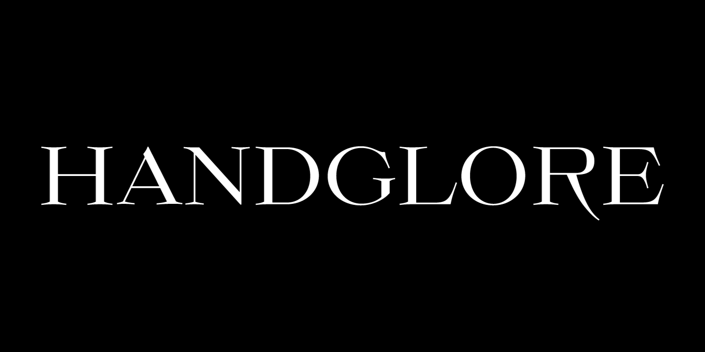
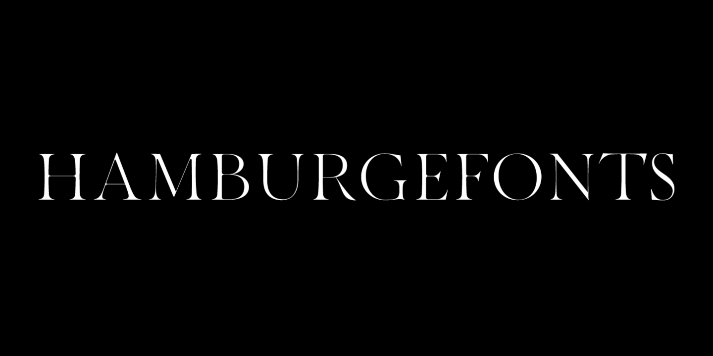
Die Schriftfamilie TT Ricordi ist eine Sammlung von drei Antiquaschriften, die das traditionelle Schriftangebot erheblich erweitern. Alle drei Schriften zeichnen sich durch eine geringe Strichstärke und einen ähnlichen Zeichenaufbau aus und sind in Großbuchstaben und Kapitälchen unterteilt, die die Kleinbuchstaben ersetzen. Die Schriften bieten eine breite Unterstützung der lateinischen Sprachen und unterstützen das kyrillische Alphabet.
Wie die Idee entstand
Jede Schrift der TT Ricordi-Familie wurde von einem anderen Designer entworfen und hat ihre eigene Geschichte.
TT Ricordi Todi
„Historische Quellen sind ein guter Ausgangspunkt für die Arbeit an einer Schrift. Obwohl die Formen bereits durch das Original definiert sind, kann das Projekt in ganz andere Richtungen gehen. Man kann eine Schrift entwerfen, die alle historischen Artefakte sorgfältig bewahrt, oder man kann das Original in etwas Ultramodernes verwandeln.
Auf meinen vielen Reisen nach Italien habe ich eine ganze Reihe von Fotos historischer Inschriften gesammelt, und jedes Mal, wenn ich sie mir anschaue, verspüre ich den Drang, etwas daraus zu machen. Als wir beschlossen, sie in unserer Arbeit zu verwenden, wussten wir noch nicht, wie groß die Nachfrage nach diesem Konzept sein würde.
Nachdem wir uns überlegt hatten, wie und wo solche Schriften eingesetzt werden könnten, kamen wir zu dem Schluss, dass sie eher konzeptioneller und gestalterischer als funktionaler Natur sein sollten. Es wäre also viel interessanter, an mehreren verschiedenen Konzepten zu arbeiten, als nur eines zu entwickeln und die Schriftfamilie zu erweitern. Und wenn es sich um mehrere verschiedene Konzepte handelte, war es logisch, sie verschiedenen Designern anzuvertrauen. So konnten wir parallel an ihnen arbeiten, die Entwürfe der anderen diskutieren, Erfahrungen austauschen, uns Entwicklungen ausleihen, und trotzdem wurde der Charakter der Schriften völlig unterschiedlich.“
Yulia Gonina, künstlerische Leiterin
TT Ricordi Todi ist eine breite Antiqua mit klassischer Basis und modernem Charakter. Die Schrift ist raffiniert und doch scharf, an manchen Stellen sogar aufdringlich und aggressiv. Die Schrift wurde von Yulia gezeichnet und basiert auf Schildern mit eingravierten Straßennamen aus der kleinen italienischen Stadt Todi. Die größte Herausforderung bestand darin, die charakteristischen Merkmale der Schilder zu entschlüsseln und sie auf moderne Weise hervorzuheben. Darüber hinaus galt es, eine kyrillische Schrift zu entwerfen, die in ihrer Ausdruckskraft der lateinischen nicht nachsteht.
Die Schrift TT Ricordi Todi hat relativ breite Zeichenproportionen, die praktisch keinen Kontrast aufweisen. Das Hauptmerkmal der Schrift ist die Kombination von glatten, runden und bewusst eckigen Formen. Darüber hinaus zeichnet sich die Schrift durch klare und scharfe Zeichendetails, übertriebene Ober- und Unterlängen und gedämpfte Kontraste aus. Zu den interessanten Merkmalen der Schrift gehören die charakteristischen langen Ober- und Unterlängen und ihre gemäßigteren Versionen, ein stilistisches Set aus dreieckigen Punkten, alternative Versionen der EF-Zeichen und zwei wählbare Formen des Buchstabens F: rund und eckig.
TT Ricordi Nobili
„Meine Arbeit an der TT Ricordi unterschied sich natürlich von meiner üblichen Arbeit an unseren Schriften wie der TT Norms® Pro 3.0. Für mich ging es bei diesem Projekt in erster Linie um Kreativität, um die Ausdruckskraft der Formen und um Display-Fonts. Hier hatte ich die größtmögliche Freiheit bei der Formgestaltung, was eine große Freude, aber auch eine große Herausforderung war.“
Anna Tikhonova, Schriftdesignerin
Die TT Ricordi Nobili ist eine Display-Antiqua, die ein reiches römisches Erbe mit einer modernen Weltanschauung verbindet. Sie zeichnet sich durch ihre Subtilität und Eleganz aus.
Die Schrift wurde von Anya entworfen und von einer Inschrift inspiriert, die in den Steinboden einer Kathedrale in Florenz eingemeißelt war. Da die Menschen über die Inschrift liefen, wurden einige der Buchstaben mit der Zeit dünner und abgenutzt. Dieses Gefühl des Verschwindens und des Verblassens wollten wir einfangen und in das Projekt einfließen lassen.
Die Schrift TT Ricordi Nobili ist sehr kontrastreich, obwohl sie sehr dünn ist. Die Serifen in der Schrift sind nicht massiv, aber gleichzeitig sind es Display-Serifen. Die Schrift hat eine gewisse Spannung, und der Betrachter nimmt diese Spannung wahr. Man kann sagen, dass sich hinter der äußeren klassischen Fassade eine ziemlich moderne Geschichte verbirgt. Die Schrift verfügt über eine große Anzahl diskreter Ligaturen, die interessante Kombinationen ermöglichen und die Möglichkeiten der Schrift erweitern.
TT Ricordi Fulmini
„Für mich war das Projekt schon in der Phase der technischen Spezifikation ungewöhnlich. Wir hatten nur wenig Zeit für Skizzen, Zeichnungen und Tests. Das war sehr stimulierend und ließ keine Zeit für Kontemplation. Am schwierigsten war es für mich, vom alten Stil wegzukommen und der Schrift einen modernen Charakter zu geben. Dazu mussten wir die Fülle der Referenzen aufgeben und die Schrift schlanker und schärfer machen.“
Marina Khodak, leitende Schriftdesignerin

Die TT Ricordi Fulmini ist eine moderne, zeitgemäße Antiqua, die ihren historischen Wurzeln treu bleibt. Die Schrift ist wie eine Distelblume: leuchtend und einprägsam, aber dennoch subtil und zart. Die TT Ricordi Fulmini wurde von Marina entworfen, die sich ursprünglich von der Inschrift auf dem Altar der Nationalgalerie Umbriens in Perugia inspirieren ließ. Als die Schrift in die „Zeitgenossenschaft“ gezogen wurde, verwandelte sie sich vollständig und zeigte ihre neue Seite.
Das auffälligste Detail der TT Ricordi Fulmini sind die aggressiven und ziemlich scharfen diagonalen Serifen. Während der Arbeit an der Schrift entstanden auch einige grafische Lösungen, wie die Monoserifen und die sehr kalligrafischen Verbindungen der diagonalen Striche mit ihrem historischen Geist. Diese wollten wir beibehalten, und so entstanden 4 thematische visuelle Sets in der Schrift, mit denen wir die Wahrnehmung der Schrift stark verändern können. Darüber hinaus verfügt die Schrift über eine Reihe interessanter, diskreter Ligaturen.