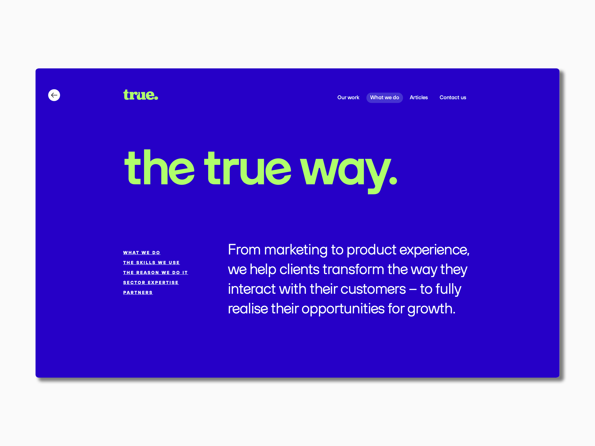
True Digital Ltd, eine Marketing-Agentur in Großbritannien, beauftragte TypeType mit der Anpassung von Schriften. Das Unternehmen legt großen Wert auf eine aufrichtige und engagierte Markenführung. Sie wollten ihr Konzept durch eine Schrift unterstreichen, die zu ihrem Unternehmensstil passt.
Die TT Hoves diente als Basisschrift.
Es gab mehrere wichtige Aufgaben:
– Änderung des Stils des Buchstabens e, so dass er leicht nach links geneigt ist.
– Ersetzen der quadratischen Punkte in den Zeichen und Buchstaben „! ? . ,; : … – j i “ durch runde Punkte.
– Die einteilige Form des Buchstabens wurde zur Standardform und die zweiteilige Form wurde in ein Stilset verschoben.
Als Ergebnis erhielt die angepasste Schrift einen neuen Namen – TT Hoves True. Die angepasste Version spiegelt die Werte der Marke True Digital Ltd. wider: modern und lebendig, aber nicht überwältigend.
Schritt für Schritt nahmen die Designer und technischen Spezialisten von TypeType die folgenden Änderungen vor:
– Neuer Look des Buchstabens e. Im neuen Stil wirkt der Buchstabe verspielt, sticht aber nicht aus der Gesamtkomposition heraus. Es wurde der ideale Neigungswinkel gewählt und das angepasste e in 20 TT Hoves-Stilen umgesetzt: 10 aufrecht und 10 kursiv.
Das neue Erscheinungsbild des Buchstabens e
– Die eckigen Punkte in den Buchstaben und Symbolen wurden durch runde Punkte ersetzt. Die Ernsthaftigkeit der Wahrnehmung wurde aufgelockert und die Symbole in der neuen Schrift sind dialogfreundlicher.

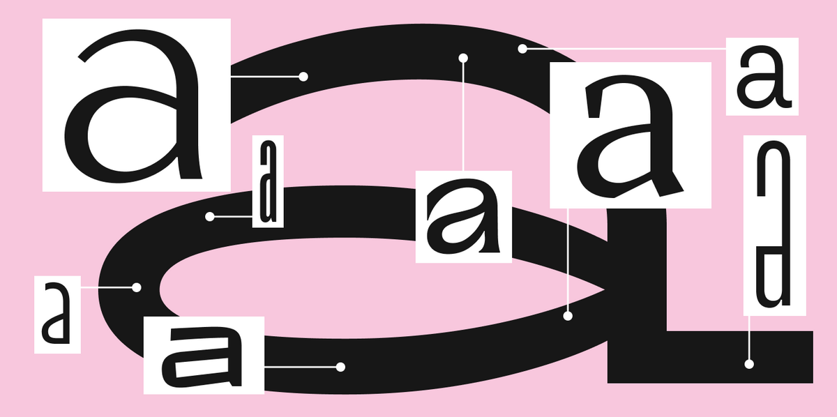
– Der Buchstabe a ergänzt die Vorliebe der neuen Schrift für Minimalismus. Die zweiteilige Form wurde durch eine einteilige ersetzt. Der Buchstabe a passt nun perfekt zu den anderen runden Buchstaben.
Die einteilige Form des Buchstabens a wurde Teil des Hauptsatzes, und die zweiteilige Form wurde in einen neuen Schriftsatz aufgenommen.

– In der letzten Phase wurden neue Andeutungen für die angepassten Zeichen hinzugefügt und der Name der angepassten Schrift in TT Hoves True geändert.
Das Ergebnis ist eine leichter lesbare Schrift, die mit ihren fließenden Formen und dem charmanten e perfekt zum Konzept der Agentur passt.