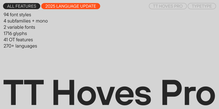
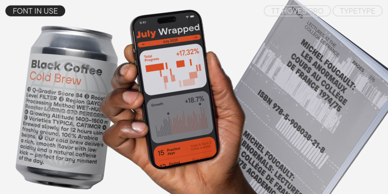
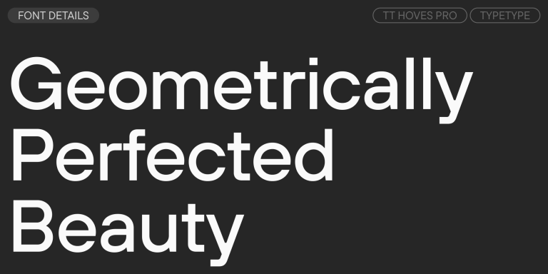
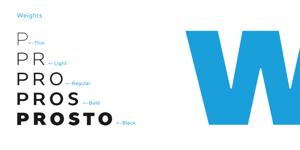
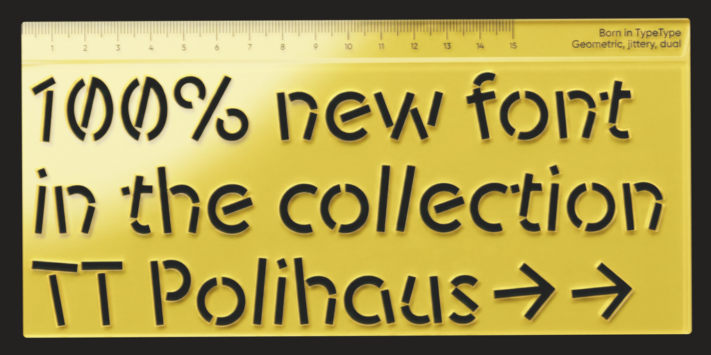
TT Hoves Pro is a versatile sans-serif with a recognizable geometry
Drunk Fonts
Give a poster, label, or event identity an offbeat typographic voice. Our Drunk Fonts selection includes handwritten, experimental, and more restrained TypeType designs to compare. Start with the mood of your headline, whether loose and spontaneous or deliberately unconventional, then choose supporting typography that keeps the rest of the message clear. The category brings together different approaches, not one uniform effect.
- All fonts 78
- Sans Serif 47
- Serif 21
- Slab Serif 6
- Display 44
- Script 9
- Variable 49
- Font sale 12
Drunk Fonts for Irregular, Expressive Lettering
For a deliberately unsteady look, focus on the letterforms rather than the category name. Approach Drunk Fonts through the effect your brief requires: uneven strokes, unexpected proportions, or a loose handwritten rhythm. Not every family listed here is distorted; the selection also includes quieter designs such as TT Hoves Pro and TT Livret. These can provide structure around a more expressive title. Keep the distinction between texture and shape in view. Worn edges suggest a physical drawing tool, while unusual proportions change the silhouette of a word. Decide which quality should carry the character of the design.
Marker Texture or Soft, Experimental Shapes?
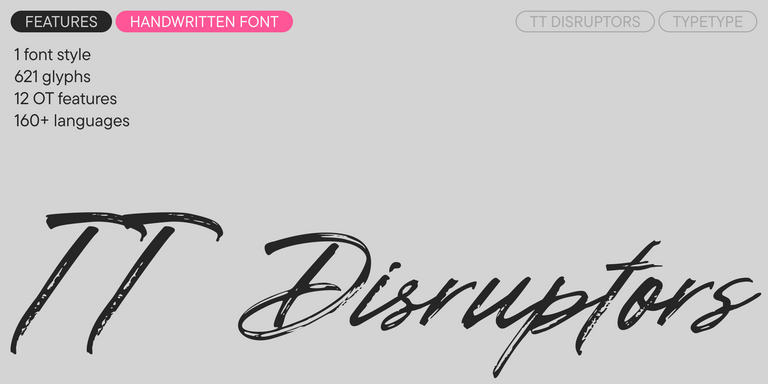
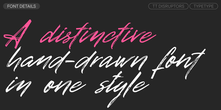
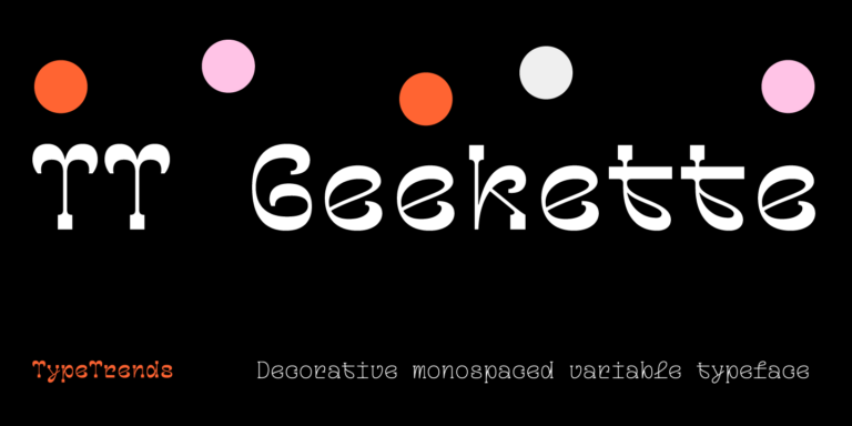
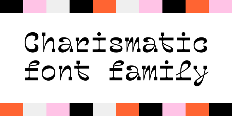
Two expressive directions within Drunk Fonts are TT Disruptors and TT Geekette. TT Disruptors has a marker-drawn construction, worn edges, and elongated ascenders and descenders. Consider it for a handwritten headline with visible texture. TT Geekette takes a different approach: its soft, monospaced shapes move from low contrast to pronounced reverse contrast through its variable design. Compare Bones and Muscles to see how differently the same word can feel. Choose between the immediacy of a marker stroke and a more constructed, unusual silhouette. Let the lettering establish the tone before adding illustration, borders, or other decorative elements.
Using Drunk Fonts in Posters, Packaging, and Brand Layouts
Give the expressive lettering a defined role. Use Drunk Fonts for the event name, product title, or short campaign message, then separate practical information from that display treatment. On a gig poster, keep the date, venue, and booking details easy to find. On packaging, give ingredients and product variants their own clear hierarchy. For a specific pairing, try TT Geekette Muscles above TT Interphases Pro Regular, a combination featured by TypeType. Compare their apparent size and visual weight rather than assigning identical point sizes. With TT Disruptors, enable contextual alternates and standard ligatures to use its designed letter combinations. Avoid adding arbitrary rotation to every character when the original forms already provide movement. Keep enough space around long ascending and descending strokes, and review a reduced version of the composition. The headline should retain its identity without forcing readers to decipher essential details.
Drunk Fonts: Browse the Collection and Choose Your License
Browse the collection by family, then open individual pages for specimens, character coverage, and available styles. Download TypeType’s free trials to develop layouts and present concepts to clients. Evaluation files are not intended for finished personal or commercial work. Build a proof with the actual headline and supporting copy, including punctuation, numerals, and any accented characters your project needs. Once the direction is approved, select licenses for the planned applications. Desktop coverage includes printed materials and merchandise; live website text requires the relevant Webfont license. Public logo use is covered by a separate Logo license. For a campaign extending into paid advertising, applications, or video, review those uses individually rather than assuming the initial purchase covers them. Record the selected styles and license holder in the project handover, and confirm who needs access to the installed files before distributing working documents.
- The quick brown fox jumps over a lazy dog.
- Pack my box with five dozen liquor jugs.
- Sphinx of black quartz, judge my vow
- 0123456789 !?.,:;—–()[]{}<> “quotes” ‘apostrophe’ @#%&*_+=/\| № $ € £ ₽ +−×÷=≠≤≥ … % © ® ™
- Aa Bb Cc Dd Ee Ff Gg Hh Ii Jj Kk Ll Mm Nn Oo Pp Qq Rr Ss Tt Uu Vv Ww Xx Yy Zz
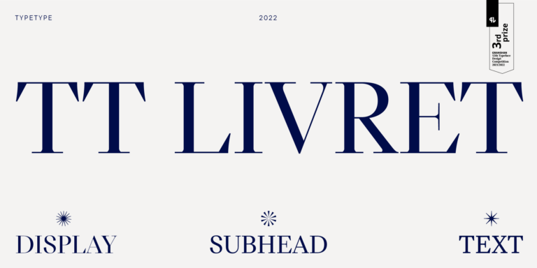
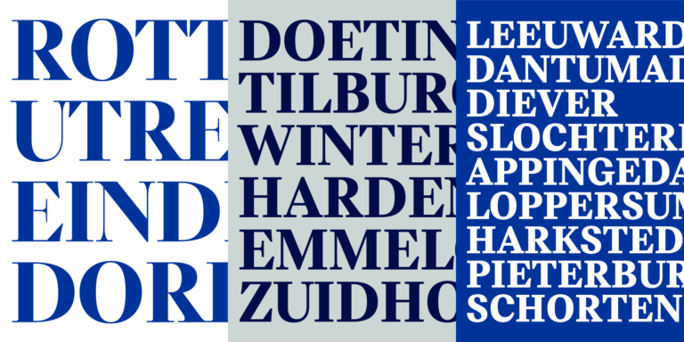
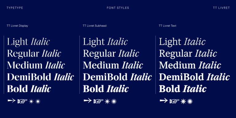
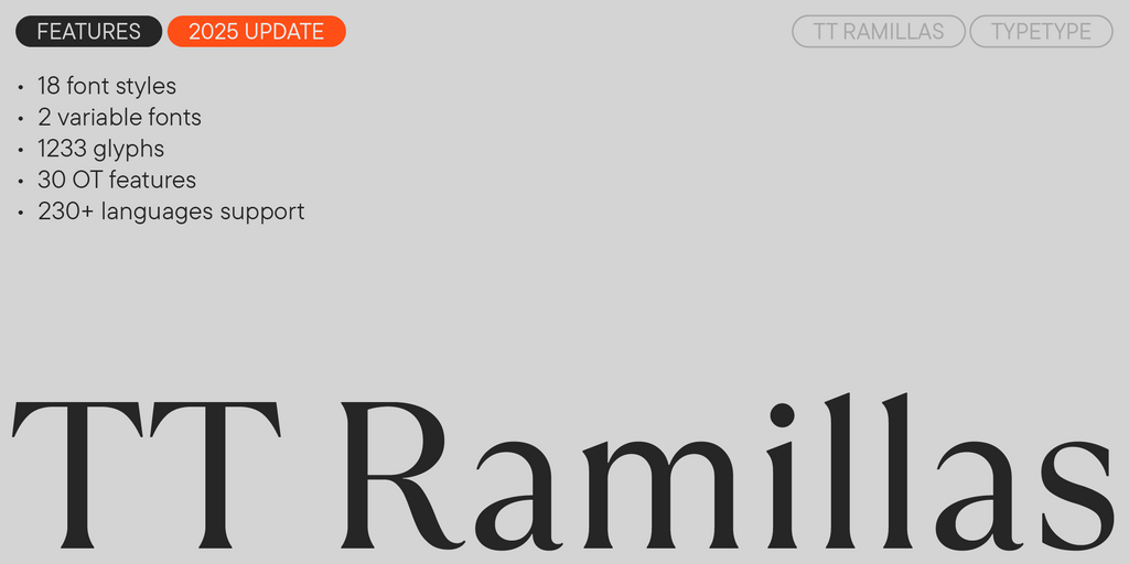
TT Livret is an elegant, modern and functional serif
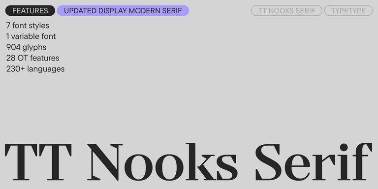
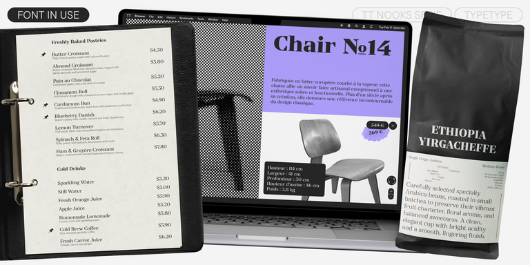
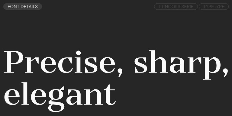
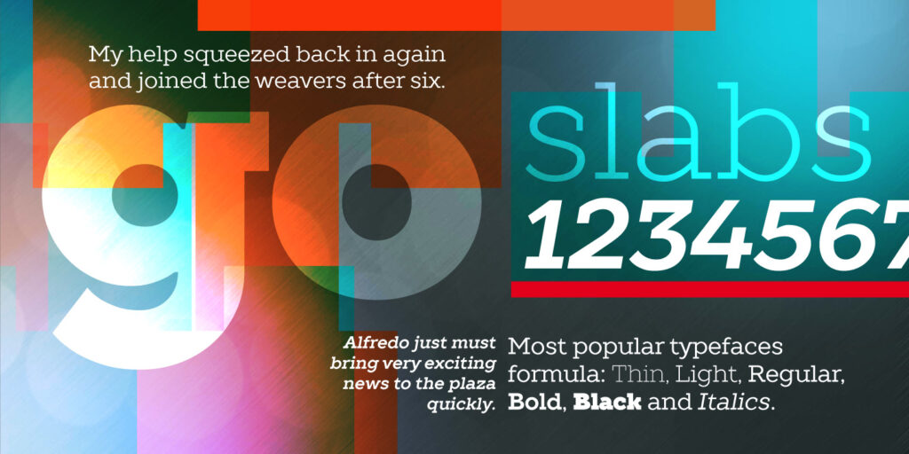
TT Nooks Serif is a display modern serif with a slight touch of egocentricity. It has a sharp and firm, yet elegant and stately character.
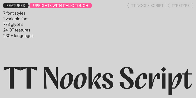
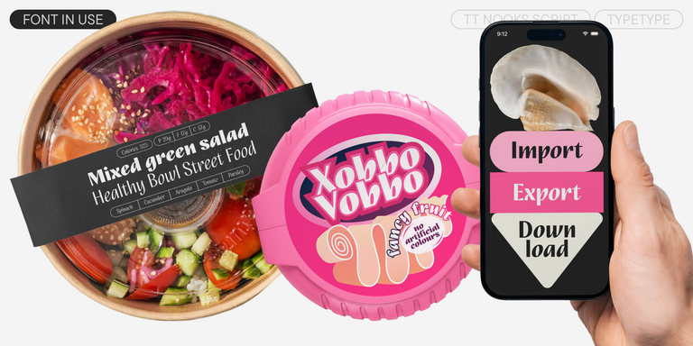
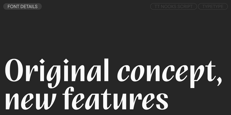
TT Nooks Script features a unique design that has no direct analogs.
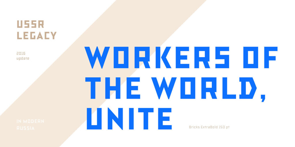
TT Rationalist is functional and neutral slab serif typeface.
TT Bluescreens is a upgraded geometric sans serif with narrow proportions
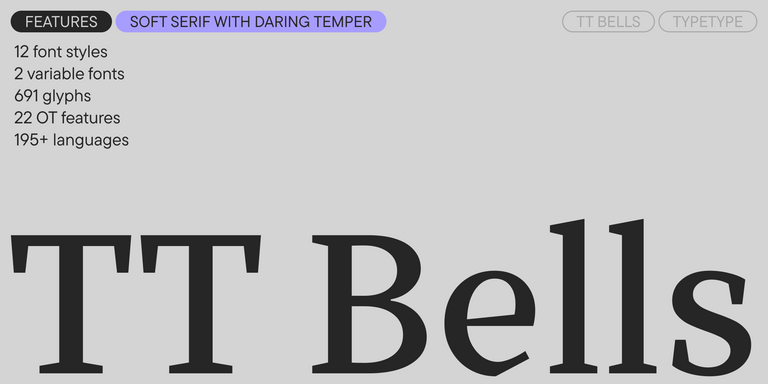
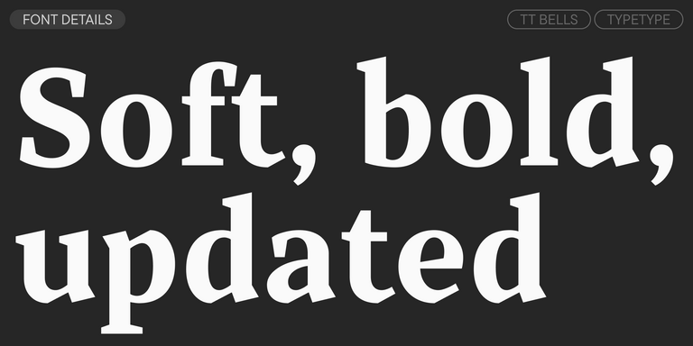
TT Bells combines the elegant softness of Antiqua with a complex and daring temper reflected in straight stroke terminals and arrowheaded serifs. The typeface is based on the broad nib, which creates these hallmark terminals and serifs.
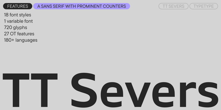
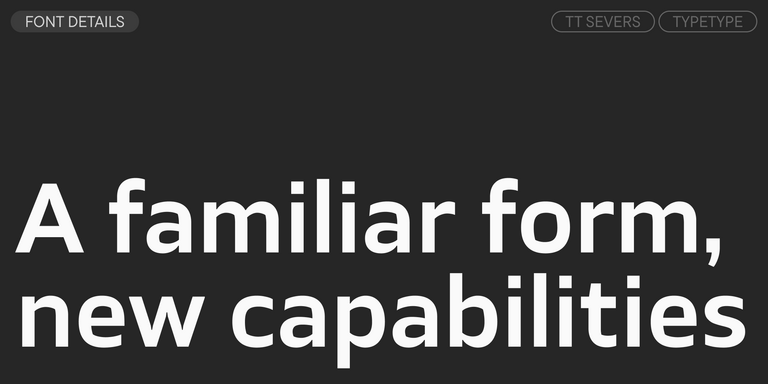
TT Severs is a geometric sans serif with emphasized elements of internal brackets. The main visual feature of TT Severs is the unusual form of internal ovals.
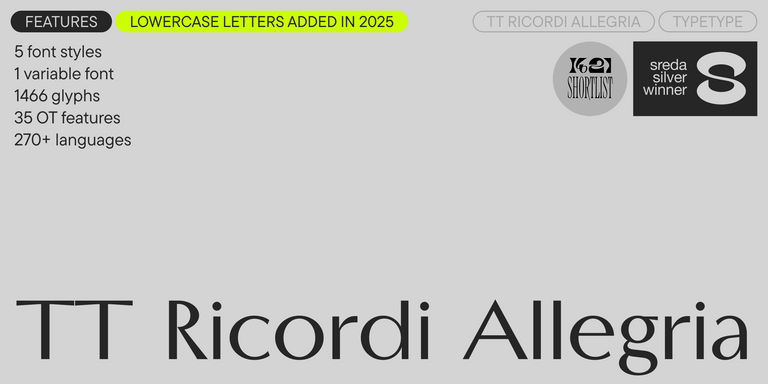
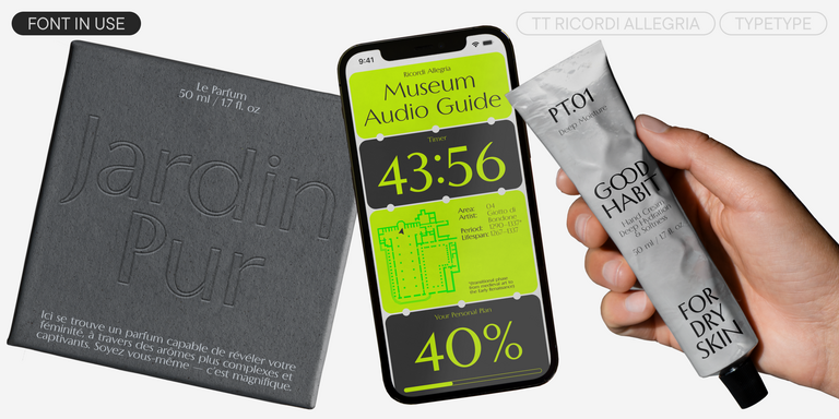
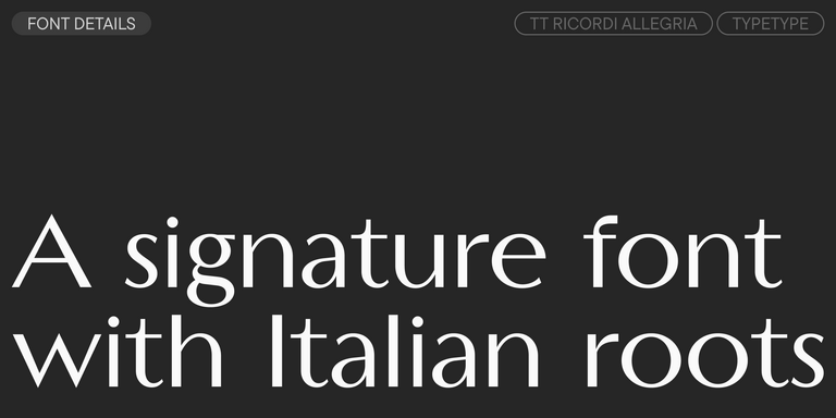
TT Ricordi Allegria is a sleek and intelligent contemporary Florentine grotesque.
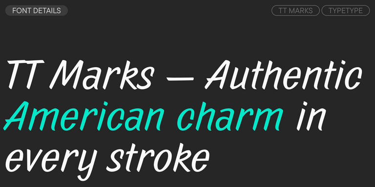
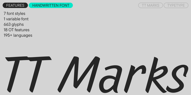
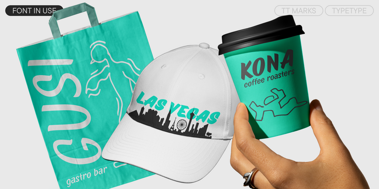
TT Marks delivers a script with dynamic rhythm, heartfelt character, and nostalgic appeal inspired by the classic art of American sign painting. This craft, where skilled artists hand-painted storefront signage with brushes and careful technique, is experiencing a well-deserved renaissance in today`s design world.
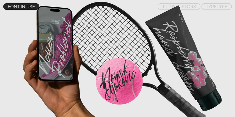
TT Disruptors is a ductile marker-drawn handwritten typeface. Its design is one-of-a-kind: worn edges, varying stroke thickness, and elongated ascenders and descenders give it a lively, dynamic texture and handcrafted feel. The personality of this font is spirited and emotional, yet warm and soulful.
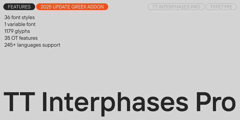
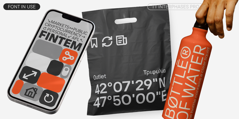
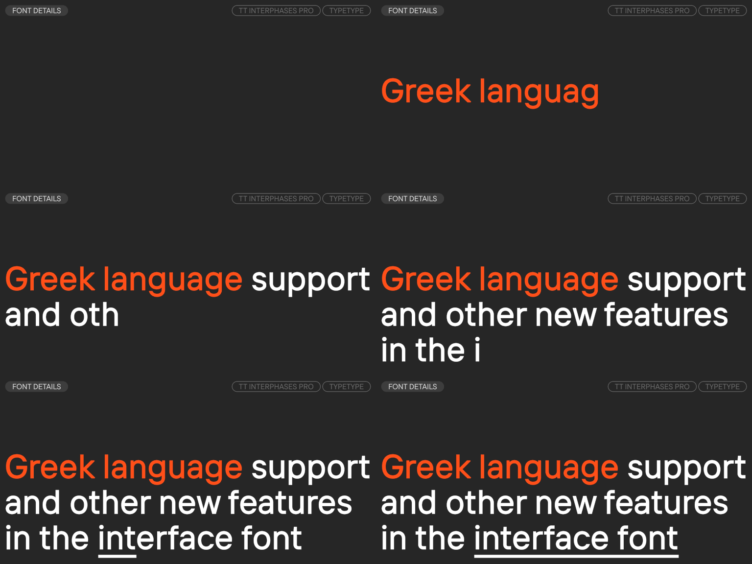
TT Interphases Pro is a neo-grotesque sans serif with equal-width proportions
- from Original price was: $43.99.$30.79Current price is: $30.79.
- 30% off Special offer is valid until 30 Oct, 2026
- from Original price was: $43.99.$30.79Current price is: $30.79.
- 30% off Special offer is valid until 13 Nov, 2026
- from Original price was: $43.99.$30.79Current price is: $30.79.
- 30% off Special offer is valid until 20 Nov, 2026
- from Original price was: $47.99.$33.59Current price is: $33.59.
- 30% off Special offer is valid until 20 Nov, 2026
- from Original price was: $43.99.$30.79Current price is: $30.79.
- 30% off Special offer is valid until 27 Nov, 2026
- from Original price was: $43.99.$30.79Current price is: $30.79.
- 30% off Special offer is valid until 4 Dec, 2026
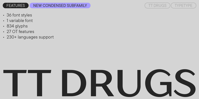
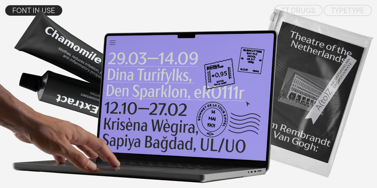
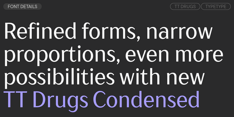
TT Drugs is a typeface that doesn`t feature serifs but stands out for its high contrast.
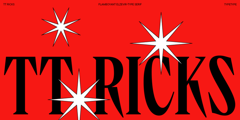
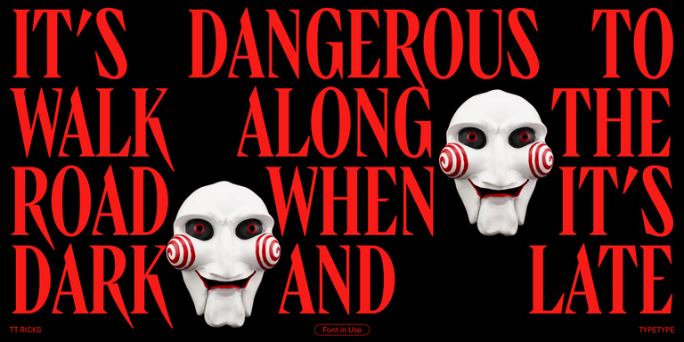
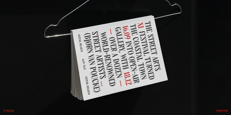
TT Ricks is a flamboyant elzevir-type serif, for which the words “cute” or “calm” are not a fitting definition.
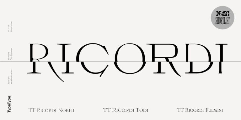
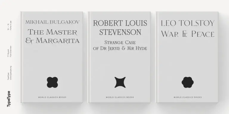
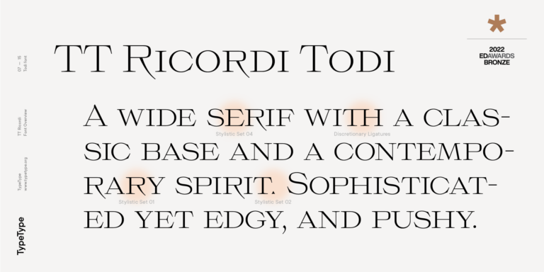
The TT Ricordi font family is a collection of three display heading serifs.
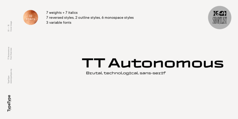
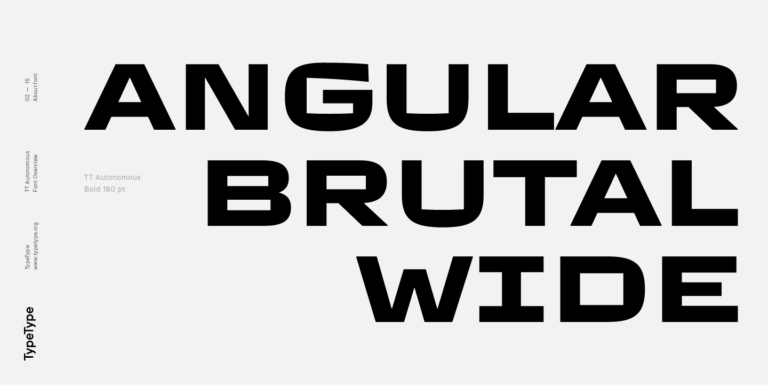
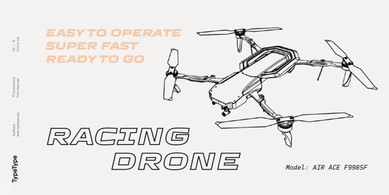
TT Autonomous is a modern techno sans serif with wide angular proportions.
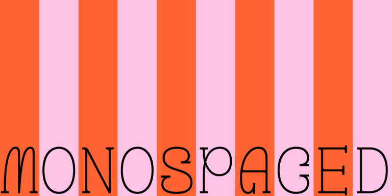
TT Geekette is an experimental variable serif with friendly and flexible character of shapes.
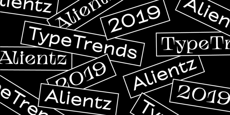
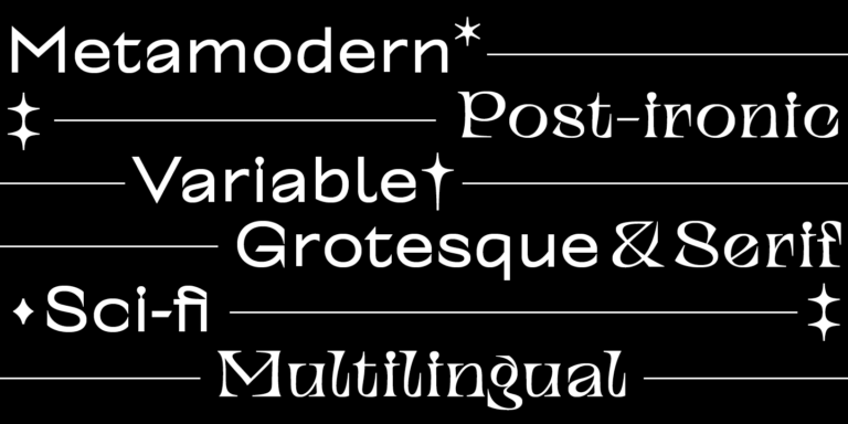
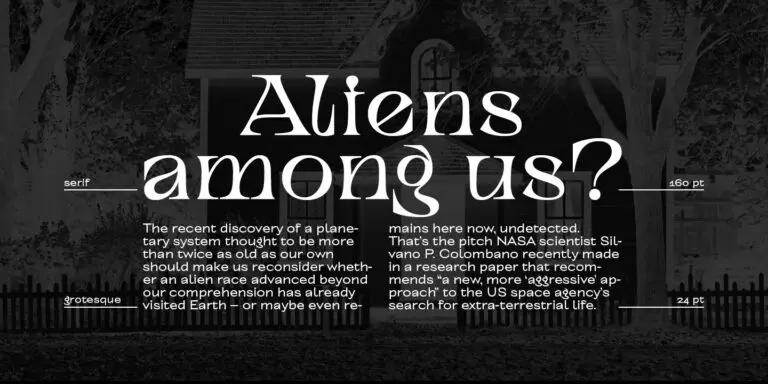
TT Alientz is a variable typeface that allows the user to make a visual journey from an extraterrestrial grotesque to a very prickly display serif.
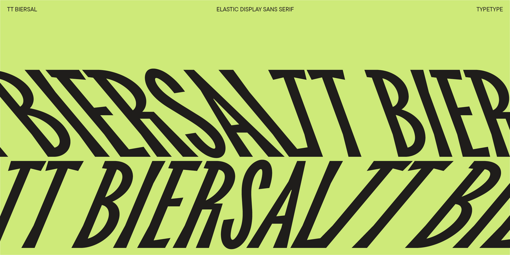
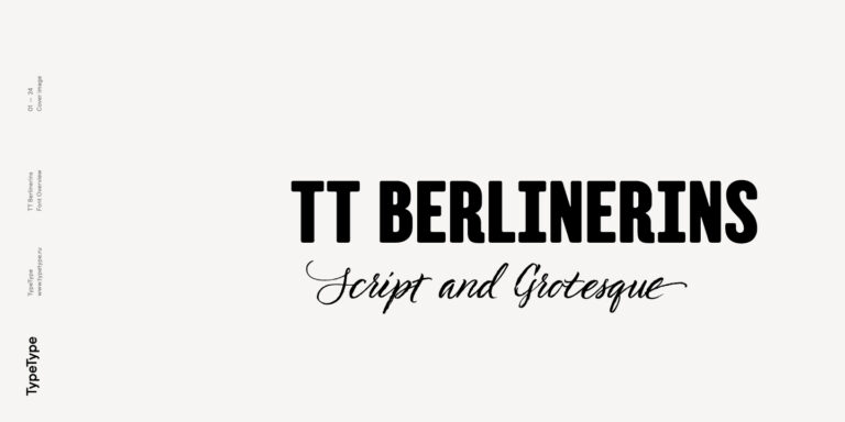
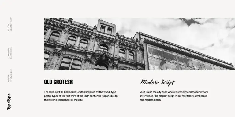
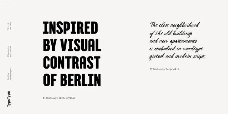
TT Berlinerins is a grotesque inspired by the wood-type poster types of the first third of the 20th century is responsible for the historic component of Berlin.
What Are Drunk Fonts?
Here, the term labels a TypeType selection, not one uniform design. It includes expressive display options alongside more restrained families. VSV Belgium also distributes a separate release under the same name; that is not the product offered on this page.
Which Industries Use These Typefaces Most Often?
Consider them for music promotion, hospitality, independent retail, and food packaging when the brief calls for informal or unconventional lettering. A suitable application might be an event headline, a café sign, or a product name. Base the choice on the message rather than an assumed industry style.
Can Drunk Fonts Be Used for Branding?
Yes. Use a distinctive style for the brand name or campaign headlines, with a quieter companion for recurring information. Establish consistent spacing and size relationships across applications. For a wordmark that will appear publicly, select TypeType’s Logo license before releasing the identity.
What Should Be Considered When Pairing These Fonts?
Look for a clear difference in role without creating competing focal points. Compare lowercase height, stroke density, and the space inside letters. Reserve the more expressive option for emphasis, and judge the combination in a complete composition rather than as two isolated words.
Can You Buy or Download TypeType Fonts for Commercial Projects?
Yes. Free trial downloads let you evaluate a design before purchase, while released work requires the appropriate commercial license. Choose the necessary styles, identify every intended medium, and review the relevant usage conditions. Do not pass evaluation files to clients as production assets.