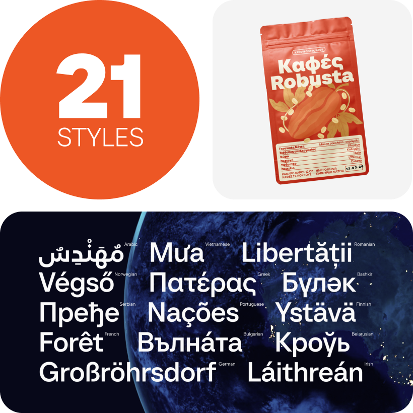
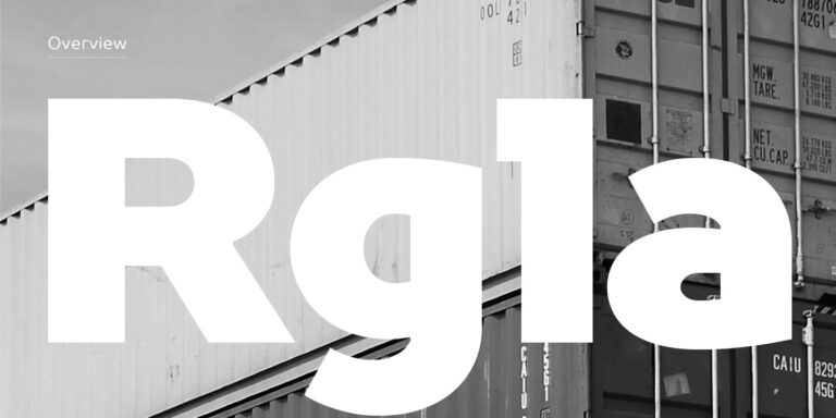
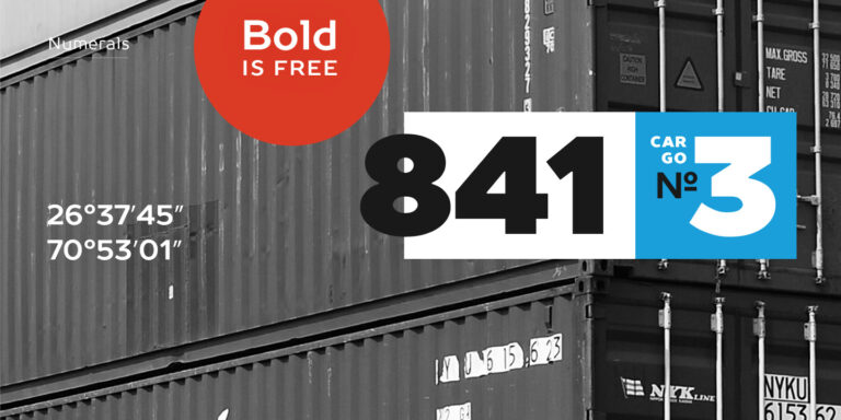
The bestseller TT Norms® Pro—a geometric sans serif, trouble-free workhorse
Under Armour Fonts
Use the Under Armour Fonts selection to compare TypeType alternatives for athletic branding, sportswear graphics, and training campaigns. Start with the character of your own project: angular and technical, broad and assertive, or restrained and functional. Explore the candidates below to find a direction for team names, product lettering, and campaign headlines without simply reproducing a familiar wordmark.
- All fonts 78
- Sans Serif 46
- Serif 21
- Slab Serif 6
- Display 44
- Script 9
- Variable 49
- Font sale 12
Under Armour Fonts: Athletic and Technical Alternatives
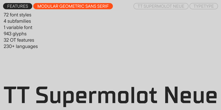
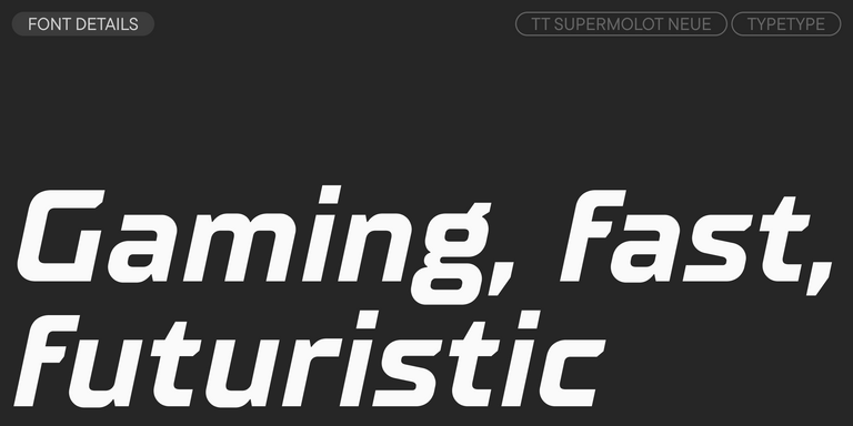
The Under Armour Fonts selection includes several distinct directions. TT Supermolot Neue combines squared forms and cut corners, with widths ranging from compressed to expanded. Its modular construction makes it worth considering for a technical brief. TT Runs was developed for sports projects and uses wide proportions with unconventional contrast; its variable style offers weight and slant adjustments. TT Norms® Pro provides a more neutral geometric alternative for a restrained identity or supporting text. These approaches offer different starting points: engineered, expressive, and understated. Choose the character that fits your project rather than treating the selection as interchangeable logo substitutes.
Choose Letterforms for the Message, Not Just the Weight
A heavy weight is only one way to suggest athletic strength. When comparing Under Armour Fonts, look at width, corner treatment, spacing, and the shape of the numerals. A broad setting may suit a short product name; longer team names need a different fit. Study the joins in A, M, and R, alongside the counters in B, D, and 8. Keep those internal spaces clear at the intended size. Compare upright and slanted styles using the same line of text, and prefer a designed narrow cut over horizontal compression when space is limited.
Applying Under Armour Fonts Across a Sports Identity
An identity built with Under Armour Fonts should work beyond the main headline. For a running club, plan separate roles for the club name, event dates, race numbers, and route information. For an activewear label, balance expressive campaign lettering with quieter product details, sizing, and care information. Reserve the strongest display styles for short phrases; use a supporting face for longer passages rather than forcing one treatment across every surface. Carry a consistent hierarchy from garment graphics to packaging and the mobile storefront. Establish rules for capitalization, alignment, and emphasis so new materials remain recognizably related. A useful presentation includes a shirt graphic, a product label, a social announcement, and a narrow screen layout. View these together: the identity should remain coherent even when photography, background color, and available space change. Let the typography organize information as well as communicate the brand's character.
Test and License Your Under Armour Fonts Selection
Browse the collection with a realistic sample: your brand name, a long product title, a price, and a short paragraph. Review the selected family's character set and available styles. Check every language your project needs, including accented capitals and currency symbols. Download a free trial to assess layouts before purchasing; trial files are for evaluation, not commercial publication. Before approving physical applications, ask your production partner for a sample at the intended size, particularly for embroidery, woven labels, or small packaging text. For production, match licensing to the actual use. Printed materials, a public logo, live website text, and app embedding are separate scenarios in TypeType's licensing system. Confirm who will install the files and whether a client or contractor needs access. Keep a record of the selected styles and permitted uses alongside the final artwork, so future updates can follow the same specification.
- The quick brown fox jumps over a lazy dog.
- Pack my box with five dozen liquor jugs.
- Sphinx of black quartz, judge my vow
- 0123456789 !?.,:;—–()[]{}<> “quotes” ‘apostrophe’ @#%&*_+=/\| № $ € £ ₽ +−×÷=≠≤≥ … % © ® ™
- Aa Bb Cc Dd Ee Ff Gg Hh Ii Jj Kk Ll Mm Nn Oo Pp Qq Rr Ss Tt Uu Vv Ww Xx Yy Zz
TT Supermolot Neue is a redesigned, extended, and greatly enhanced reincarnation of the popular font family
TT Rationalist is functional and neutral slab serif typeface.
TT Runs is a very stylish and charismatic display sans serif with irregular proportions of some characters.
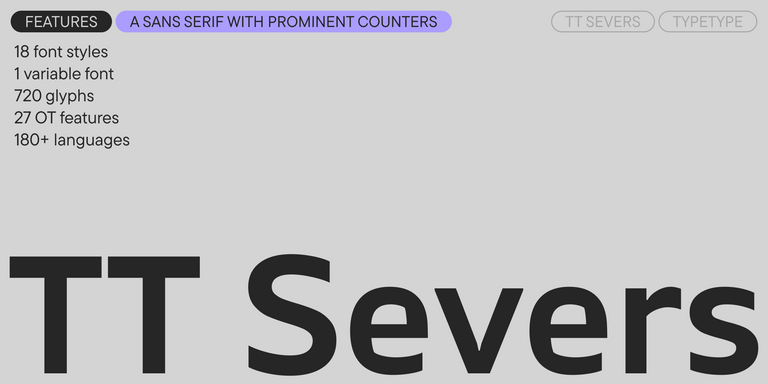
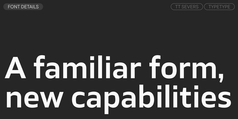
TT Severs is a geometric sans serif with emphasized elements of internal brackets. The main visual feature of TT Severs is the unusual form of internal ovals.
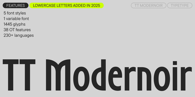
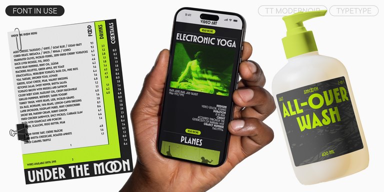
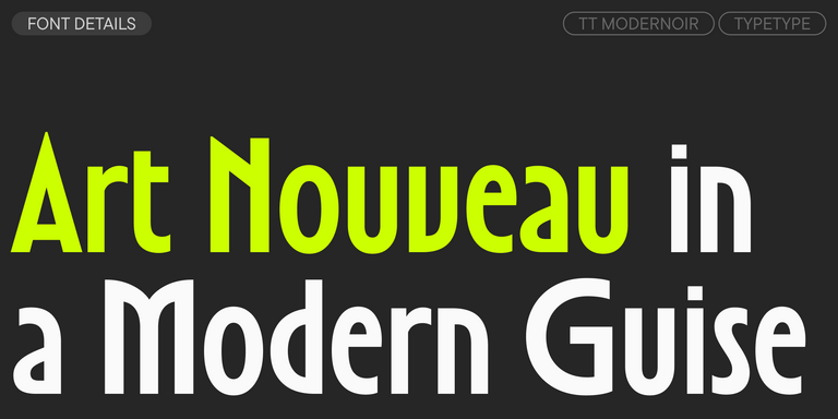
TT Modernoir is a display sans serif with dynamic proportions. Fluid lines and delicate Art Nouveau forms in this typeface blend seamlessly with the rhythmic flow and improvisational freedom of jazz.
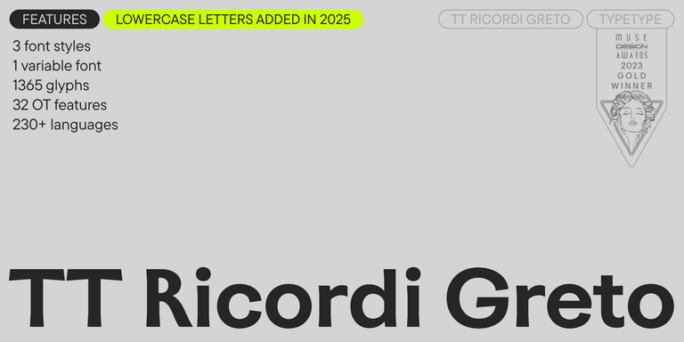
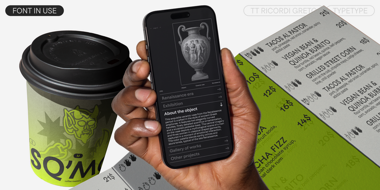
TT Ricordi Greto is an experimental project, inspired by a floor plaque dating from 1423 found in the Basilica di Santa Croce, Florence.
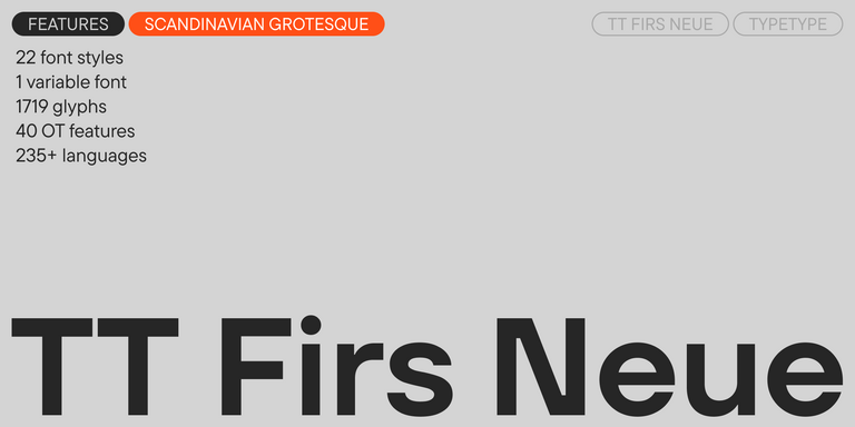
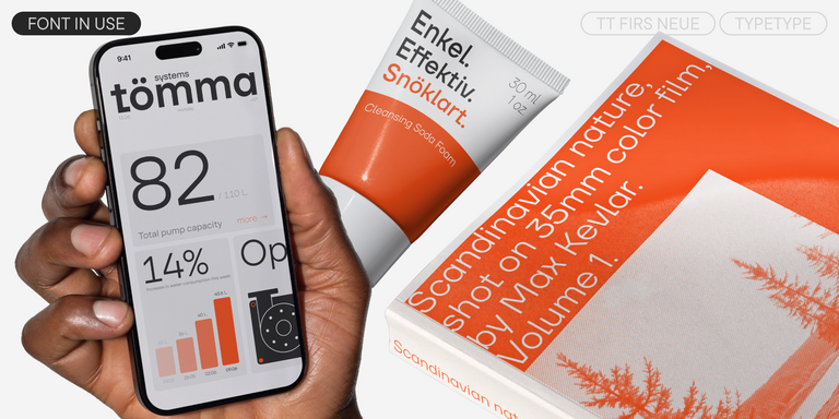
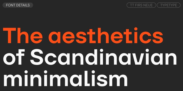
TT Firs Neue is a contemporary reincarnation of the good old TT Firs sans serif.
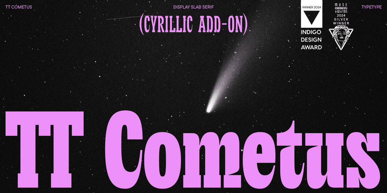
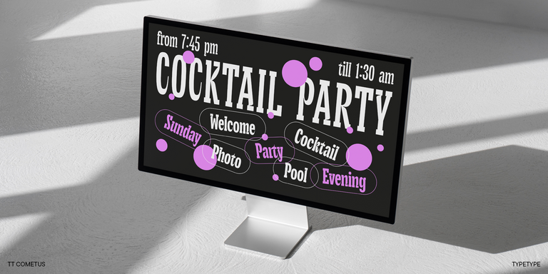
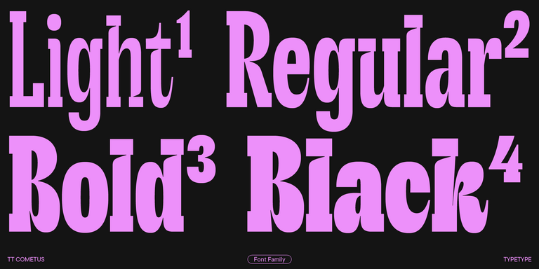
TT Cometus is an expressive typeface that captivates from the first time.
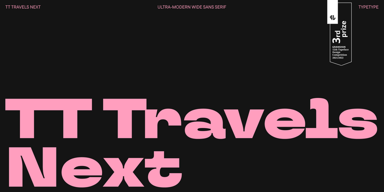
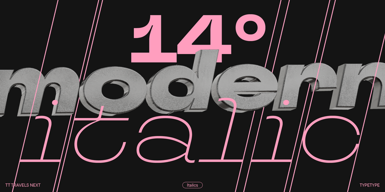
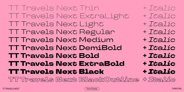
TT Travels Next is a very trendy and modern wide display sans serif for use in different sets, be they print or web.
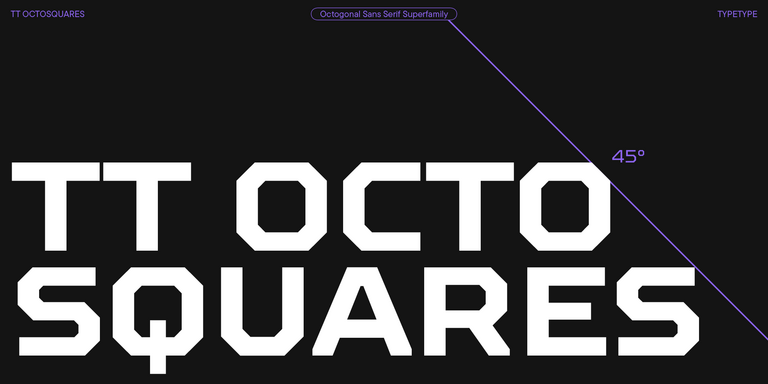
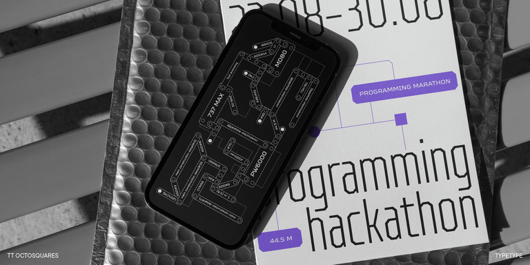
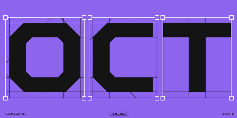
TT Octosquares is a fresh, revised, expanded, and significantly improved version of our first commercial font TT Squares & its narrow version.
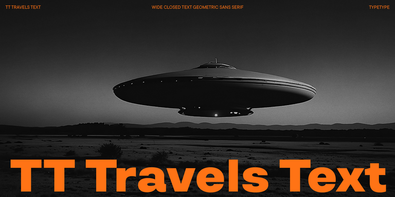
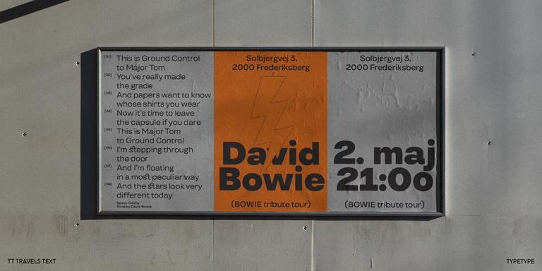
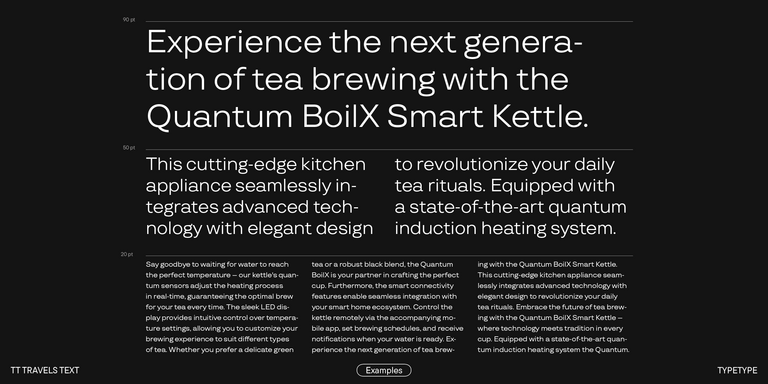
TT Travels Text is a geometric grotesque with wide proportions and specific shapes of circles and fillets, which includes two stylistic sets with completely different natures.
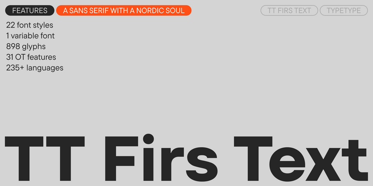
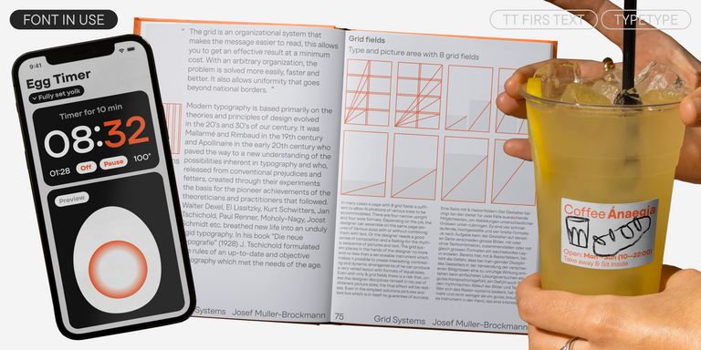
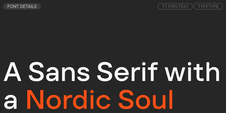
We have released a brand-new font. Meet TT Firs Text—a geometric sans serif with a Nordic character!
A technological font family for game design
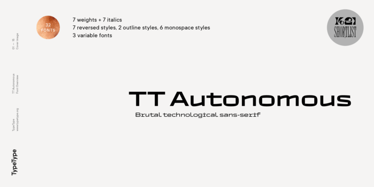
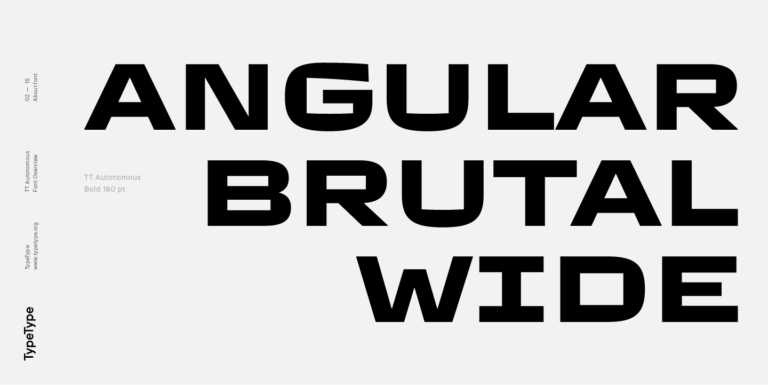
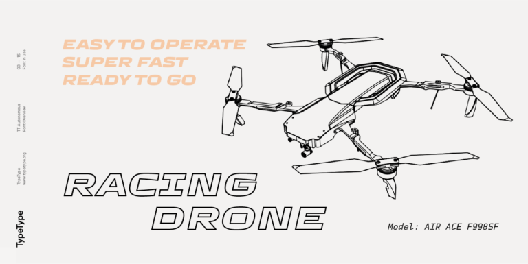
TT Autonomous is a modern techno sans serif with wide angular proportions.
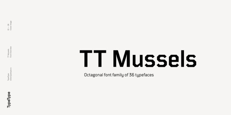
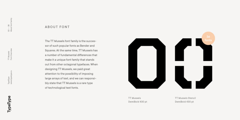
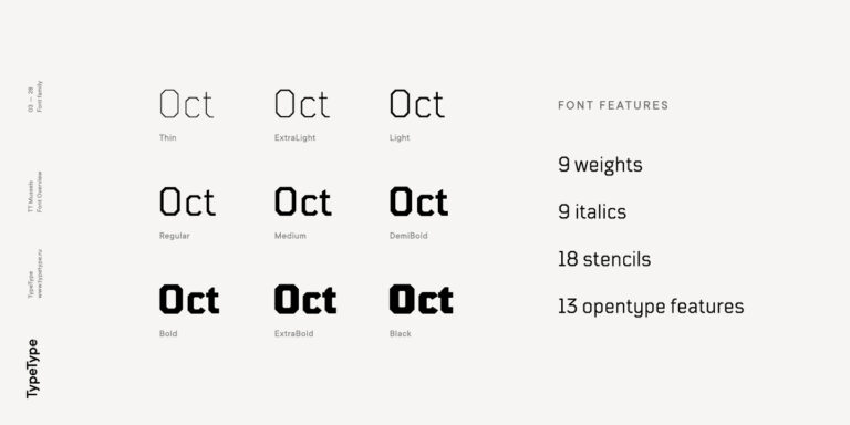
When designing TT Mussels, we paid great attention to the possibility of imposing large arrays of text, and we can state that TT Mussels is a rare type of technological text fonts.
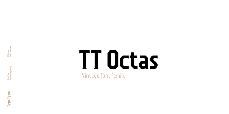
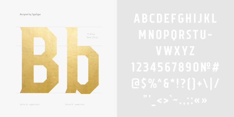
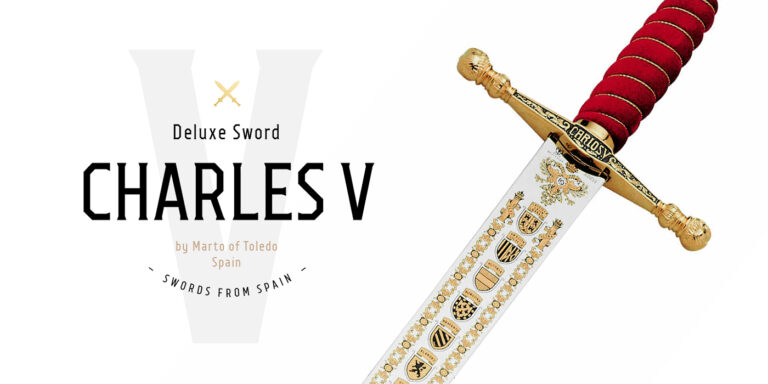
TT Octas is a narrowly proportioned font family built upon the principle of octagonal forms: all circles in this typeface are actually octagons. Thanks to small serifs, TT Octas has a vintage character to it.
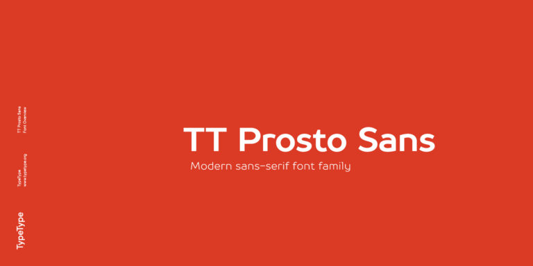
TT Prosto Sans is a font family for any tasks. You can use this font almost everywhere.
What Are Under Armour Fonts?
Here, the name identifies a TypeType selection for designers exploring an athletic or technical look. It does not describe a single typeface or establish which lettering the sportswear company uses. For an authorized brand project, request official assets directly from Under Armour.
Which Industries Use Athletic Typefaces Most Often?
Sportswear, fitness, team merchandising, and sporting events are natural applications. Consider this direction for training equipment, outdoor products, or automotive graphics as well. Choose according to the message: a race announcement and a wellness membership page may call for very different degrees of visual intensity.
Can Under Armour Fonts Be Used for Branding?
Yes, the TypeType alternatives can be licensed for an independent brand identity. For a logo used publicly, TypeType requires a Logo license rather than a Desktop license alone. Develop your own lettering arrangement and visual system instead of reproducing another company's identity.
What Should Be Considered When Pairing Athletic Typefaces?
Assign a clear role to each choice. Pair an expressive headline with restrained supporting text, then compare apparent size, stroke weight, and spacing in the same layout. Test real paragraphs and captions; two attractive specimens do not automatically create a readable hierarchy.
Can You Buy or Download TypeType Fonts for Commercial Projects?
Yes. Choose individual styles or a complete family, then purchase the license that covers your intended applications. Free trials let you evaluate designs before committing, but do not permit commercial use. Review the relevant terms before publishing, embedding, or sharing the files.