top_banner_ttnormspro0426
TT Dott
2 de estilo
Fundición tipográficaFuentesSans SerifTT Dott

TT Dott

TT Dott — es una grotesca pixelada experimental en la que el píxel se basa en un círculo. Es una fuente plástica y poco común, de carácter decorativo, que evoca asociaciones tanto con el bordado como con las fiestas techno.

Válido hasta el 19/06/2026

Por un estilo: desde  El precio original era: $43.99.El precio actual es: $30.79.
Familia de fuentes completa: desde  El precio original era: $79.El precio actual es: $55.30. 2 de estilo

Compra de fuente

Escoge las fuentes y las licencias Después pulsa el botón "Añadir al carrito"

¿Tienes duda sobre una fuente o licencia?

Escoge las fuentes

Promoción: descuento de 30% válido hasta el 19/06/2026

Pack de promoción:
por estilos $27.65
desde  $55.30
2 de estilo
desde  $55.30
desde  $30.79
desde  $30.79

¿Tienes duda sobre una fuente o licencia?

Elige licencia de fuente

Antes de elegir una licencia, debes seleccionar un paquete o estilo de fuente

Selecciona las licencias que necesitas

A solicitud
A solicitud
A solicitud
A solicitud
A solicitud
A solicitud
A solicitud
A solicitud
A solicitud
A solicitud
No hay elementos seleccionados
Total
$0

Muestras

TT Dott
Tamaño
Features
Habilitar todo

TT Dott — An experimental laboratory display font

Pares ideales para TT Dott

What is a font pair, and what does it serve for?

A font pair is a combination of two fonts within one text block. Most often, one of the fonts in a pair is a more expressive headline font, and the other one serves to communicate information. Such fonts complement each other and help designers solve various tasks, like highlighting key elements, adding emotional expressiveness to the project, or separating semantic blocks.

How to choose fonts for a project: Several general recommendations

To begin with, establish the project's tone. Choose the fonts that stylistically match the main idea. After that, you need to determine the functions of each font in the project and their hierarchy: which font will complement the design and which one will serve to attract attention as the main element. You need to assess the difference between the fonts and decide what kind of information each of them should convey. First, we recommend choosing the base font you will use most, and then you can find a suitable pair for it.

Core principles of font pairing and recommendations from designers

The main rule you should follow when matching two fonts is that both similarities and differences must be visible between them. You can highlight the coherence of fonts by the following characteristics: contrast, proportions, width, openness of characters, individual letter shapes, and overall tone. Feel free to experiment with different combinations. We also recommend analyzing the projects you like: this way, you can enhance your visual skills, elevate your knowledge base, and gain confidence in dealing with typography.

Descripción

Sobre el tipo de fuentes tipográficas TT Dott
120+ Soporte de idiomas

Presentamos la nueva TT Dott — ¡una fuente inusual que redefine la estética pixel!

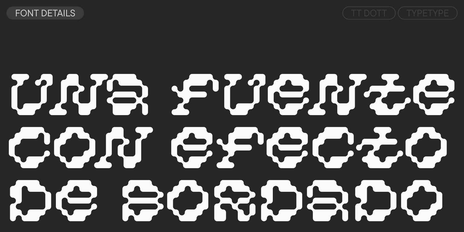
TT Dott es una grotesca pixel de exhibición. Es un proyecto experimental creado dentro de nuestro Creative Lab. La idea fue utilizar un círculo en lugar de un cuadrado como base del píxel y experimentar con las formas de los caracteres. Queríamos alejarnos de la asociación habitual con una fuente pixel, estática y mecanicista, y crear algo completamente distinto: fluido, vivo y rítmico. Por ello, hicimos que algunos glifos estuvieran inclinados y otros rectos, añadiendo dinamismo y una sensación de aleatoriedad a la fuente.

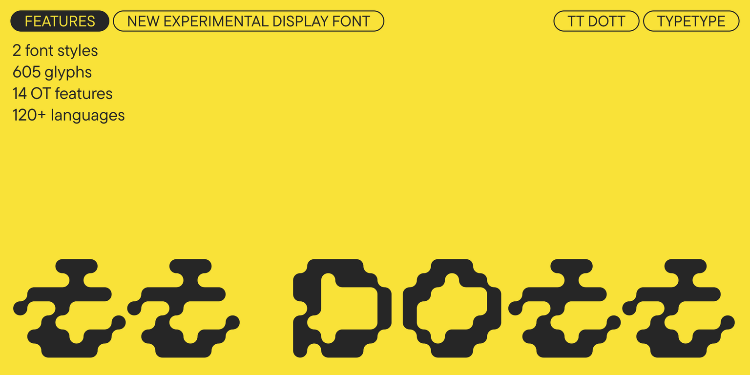
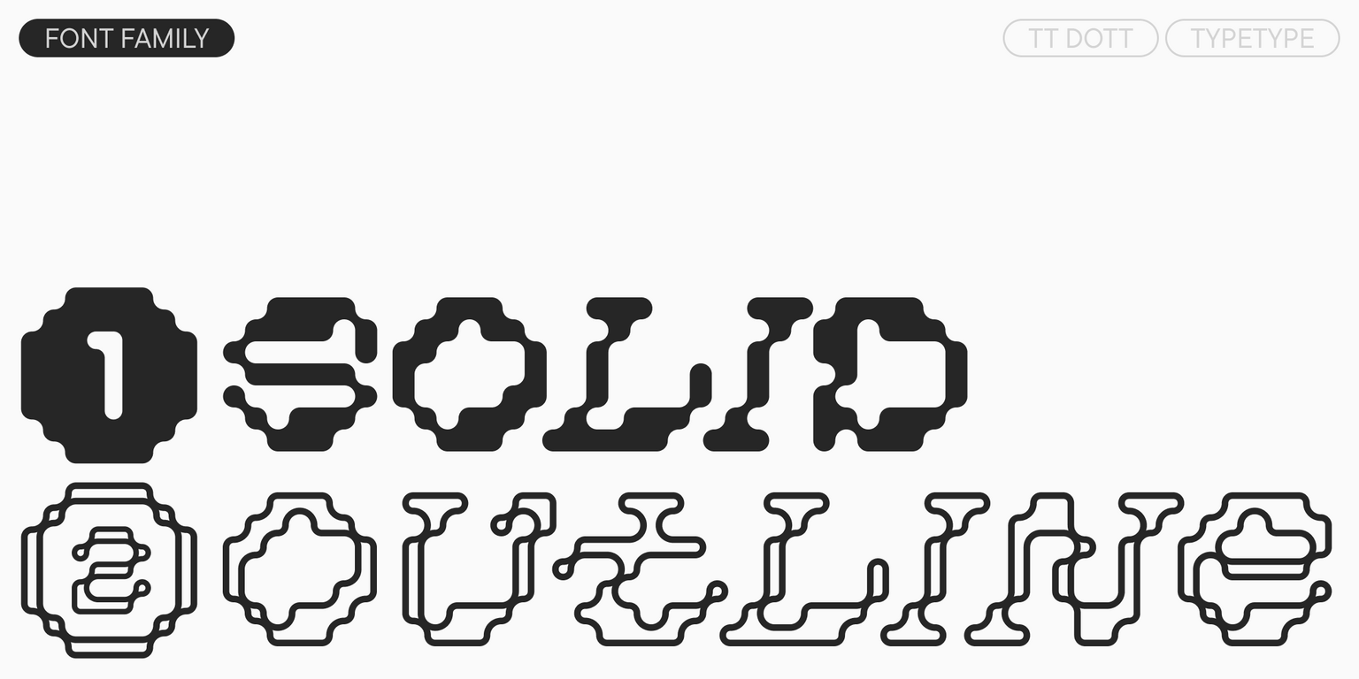
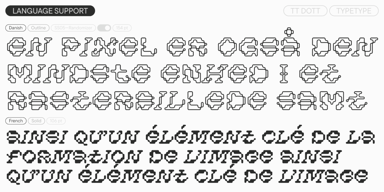
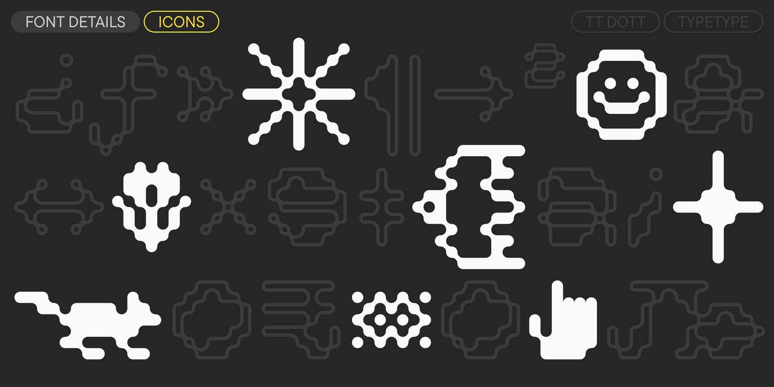
TT Dott resultó fluida y cálida, evocando al mismo tiempo asociaciones con el bordado, el tejido y las fiestas techno. La fuente incluye dos estilos: Solid y Outline, que funcionan perfectamente por separado y pueden complementarse de forma armoniosa. También presenta dos conjuntos estilísticos: el principal, con inclinaciones en ciertos caracteres que le aportan dinamismo y personalidad, y uno Static, más calmado, con caracteres rectos. Un amplio conjunto de iconos temáticos amplía aún más las posibilidades de diseño.

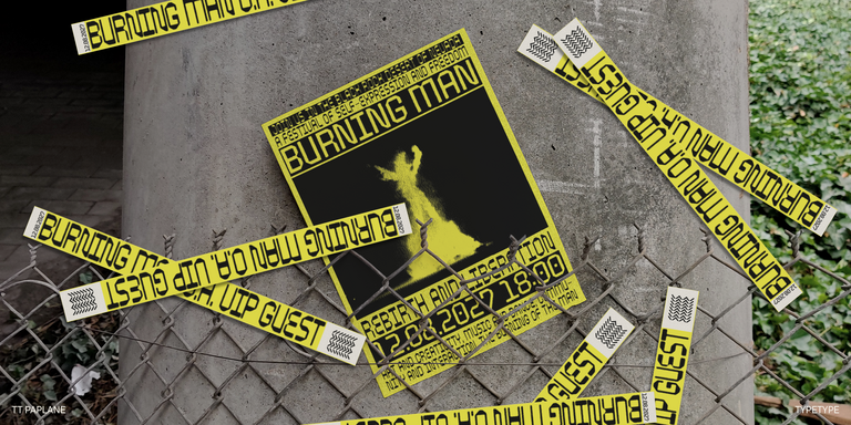
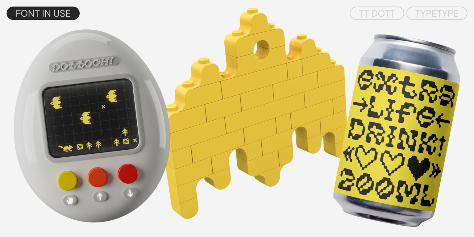
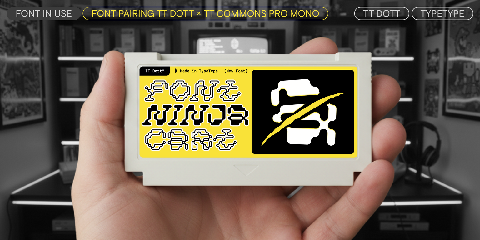
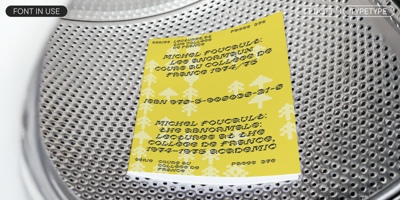
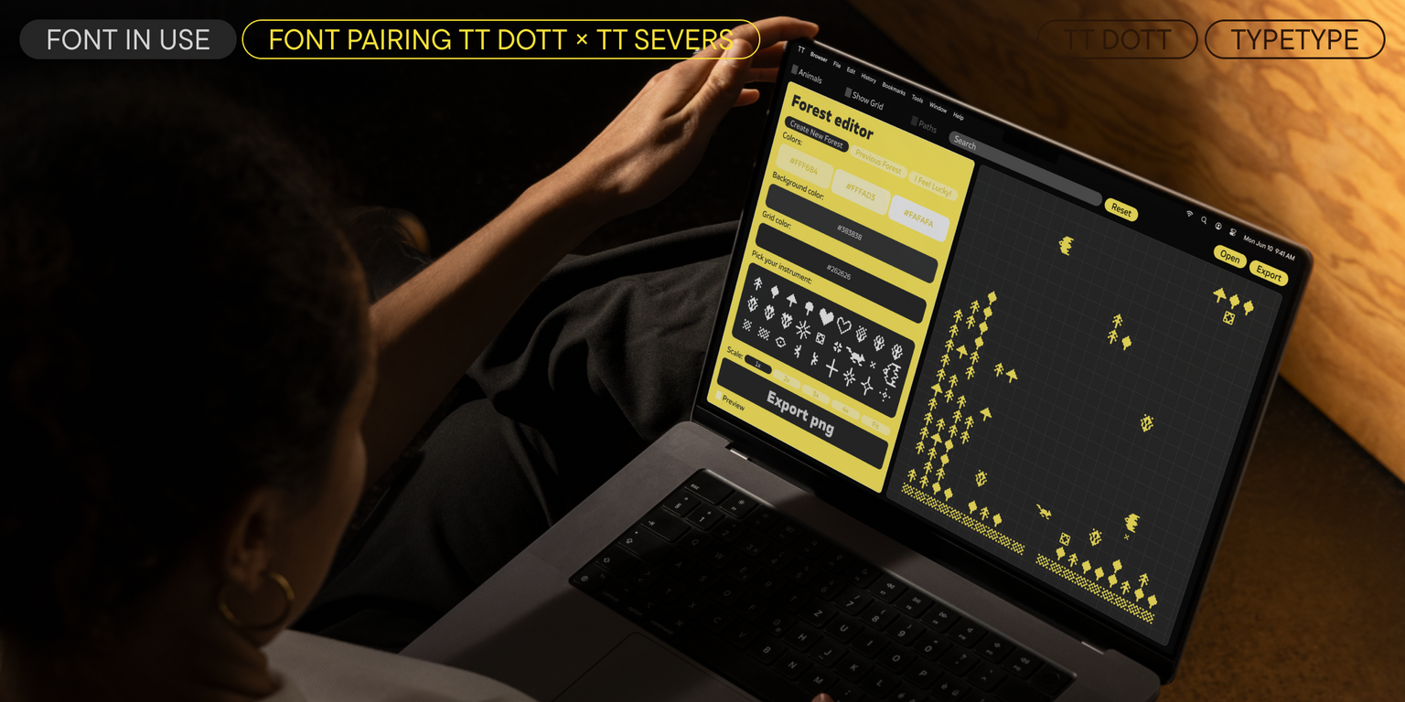
TT Dott es una fuente para acentos que funciona mejor en tamaños grandes. Es adecuada para el diseño de exposiciones y festivales, branding y diseño de packaging. Con su ayuda, puedes aportar viveza y originalidad a un proyecto y, en algunos casos, encajará de forma armoniosa en una temática étnica.

TT Dott incluye:

  • 2 estilos de fuente: Solid y Outline
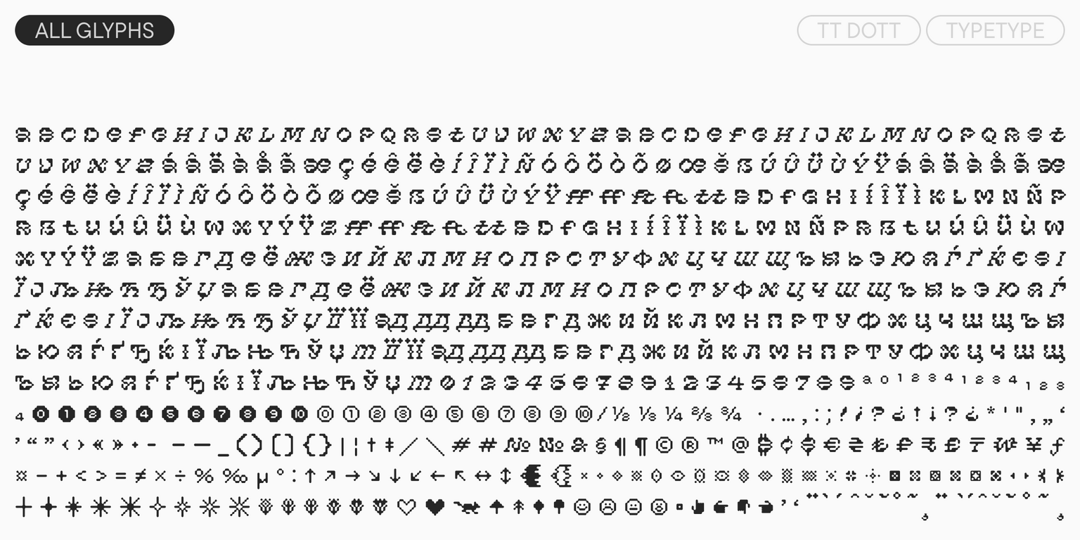
  • 605 glifos por estilo
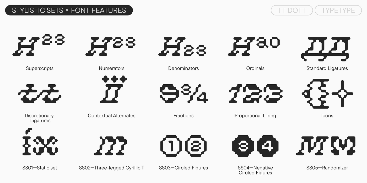
  • 14 características OpenType
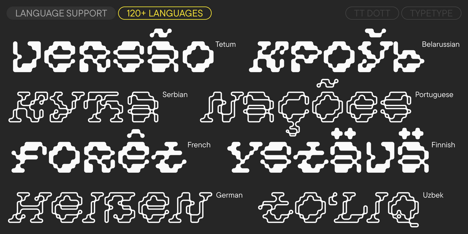
  • Soporte para más de 120 idiomas

Fecha de lanzamiento

5 mayo 2026

Extra

Specimen

Descargar specimen de fuente (pdf)

Versiones personalizadas

¿Buscas una versión personalizada de esta fuente?

Caracteres

Latín básico Cirílico básico Extended Latin Fractions Proportional Lining Figures and Currencies Other Figures Punctuation and Symbols Math Symbols Arrows Icons
A B C D E F G H I J K L M N O P Q R S T U V W X Y Z a b c d e f g h i j k l m n o p q r s t u v w x y z
А Б В Г Д Е Ё Ж З И Й К Л М Н О П Р С Т У Ф Х Ц Ч Ш Щ Ъ Ы Ь Э Ю Я Ѓ Ґ Ќ Є Ї Љ Њ Ћ Ђ Ў Џ а б в г д е ё ж з и й к л м н о п р с т у ф х ц ч ш щ ъ ы ь э ю я ѓ ґ ќ є ї љ њ ћ ђ ў џ
Á Â Ä À Å Ã Æ Ç É Ê Ë È Í Î Ï Ì Ñ Ó Ô Ö Ò Õ Ø Œ Š Ú Û Ü Ù Ý Ÿ
½ ¼
0 1 2 3 4 5 6 7 8 9 ¢ $ £ ¥ ƒ ¤
¹ ² ³
! ¡ ? ¿ « » . , : ; "' | ¦ - _ / ( ) [ ] { } · * # § © ® @ & ° ^
+ < > = × ÷ % ª º
🟆

Funciones de tipo abierto

ss01 | Static seta, y

FF FT G

FF FT G

ss02 | Three-legged Cyrillic T

Т

Т

ss03 | Circled Figures

1 2 3

1 2 3

ss04 | Negative Circled Figures

1 2 3

1 2 3

liga | Standard Ligatures

ff

ff

dlig | Discretionary Ligatures

ft tt

ft tt

Mostrar todo

Fuentes parecidas

3 de estilo
3 de estilo
4 de estilo
Comprar fuente