TT Livret
Text Regular
32 font styles
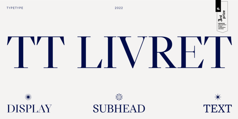
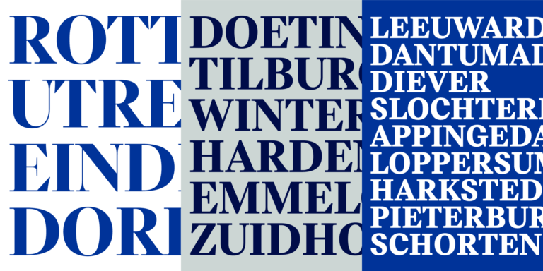
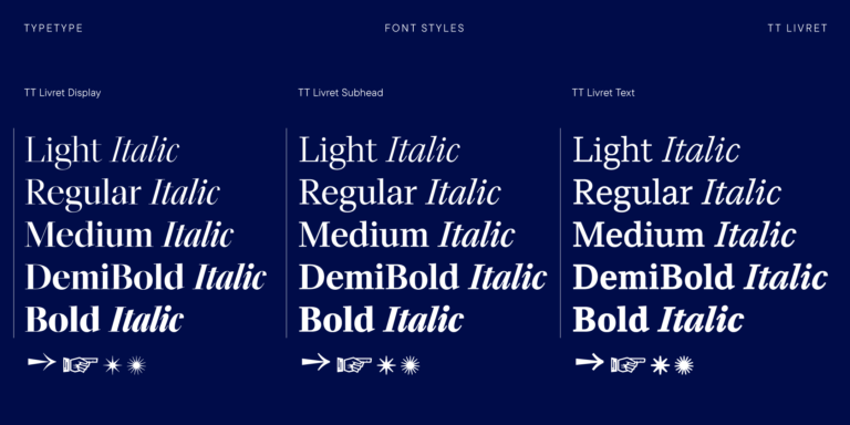
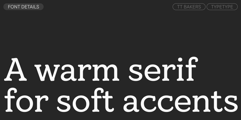
TT Livret is an elegant, modern and functional serif

If you’re searching for the Lana Del Rey Fonts to complement your design, TypeType studio is the one to provide a wide range of typefaces suitable for commercial purposes. The specific styles and the complete font families can be found on our page online: you may choose from a variety of well-made and technically verified fonts, use them for free, and leave a request to buy a suitable license type. TypeType gives an opportunity to download the trial versions of all Lana Del Rey Fonts for you to use in your projects, as well as to get advice from design or client care teams. Feel free to contact us by our form on the website.
TT Livret is an elegant, modern and functional serif
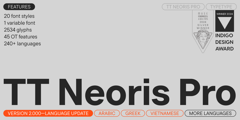
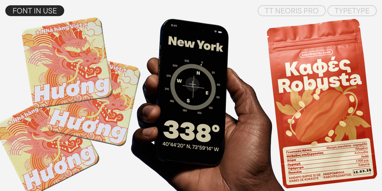
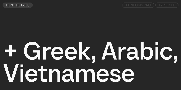
TT Neoris is an elegant Neo-Grotesque with unlimited potential and a font that encompasses all modern requirements and user desires.


TT Bluescreens is a upgraded geometric sans serif with narrow proportions


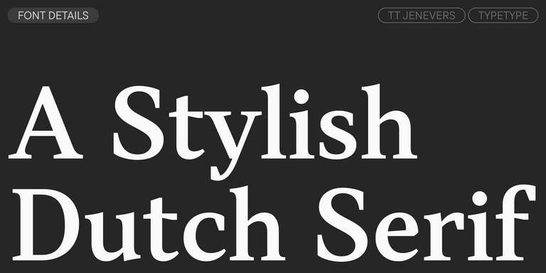
TT Jenevers is a modern serif with a Dutch flavor. The font family features the characteristic details peculiar to Dutch serifs—these are the asymmetrical shape of serifs and an irregular slant of ovals.
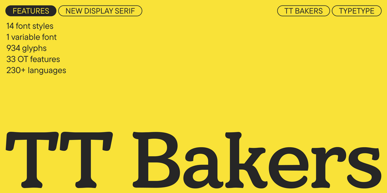
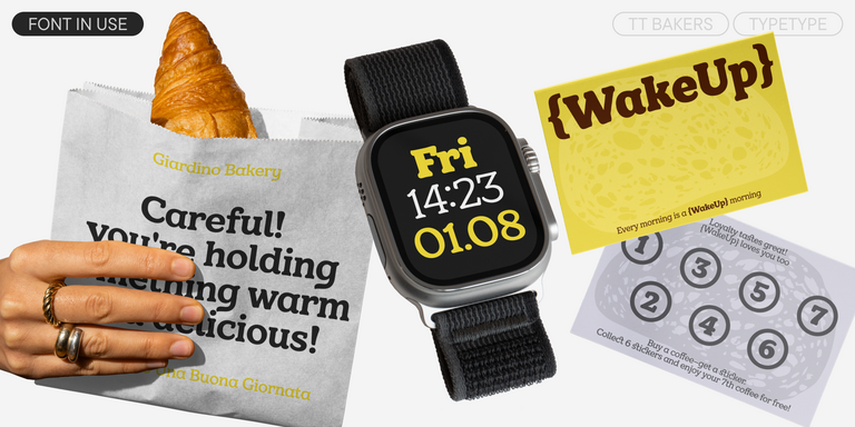
TT Bakers is a fluid serif with a gentle and lively character. This font is like freshly baked goods: it`s warm and soft, especially in its bolder weights.
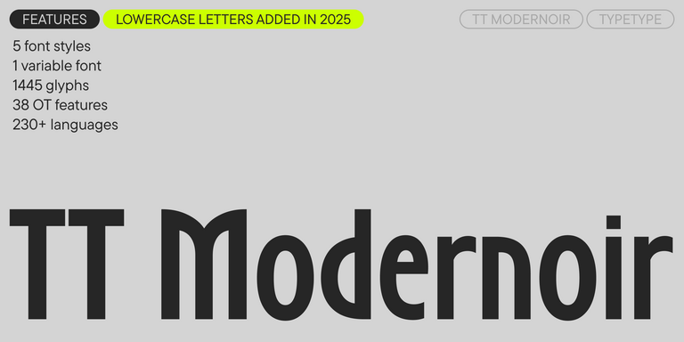
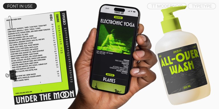
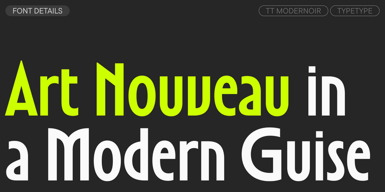
TT Modernoir is a display sans serif with dynamic proportions. Fluid lines and delicate Art Nouveau forms in this typeface blend seamlessly with the rhythmic flow and improvisational freedom of jazz.
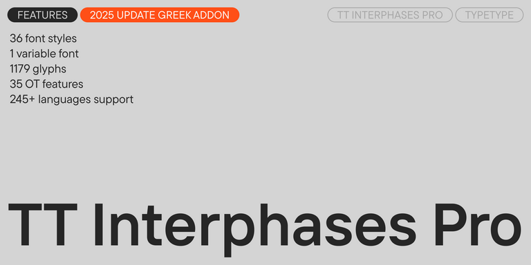
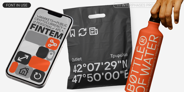
TT Interphases Pro is a neo-grotesque sans serif with equal-width proportions
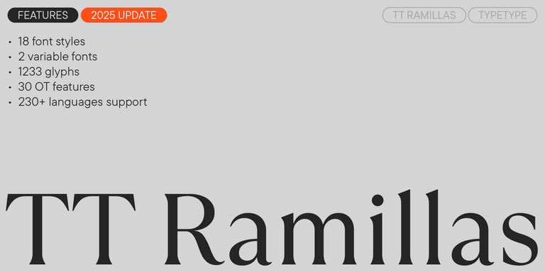
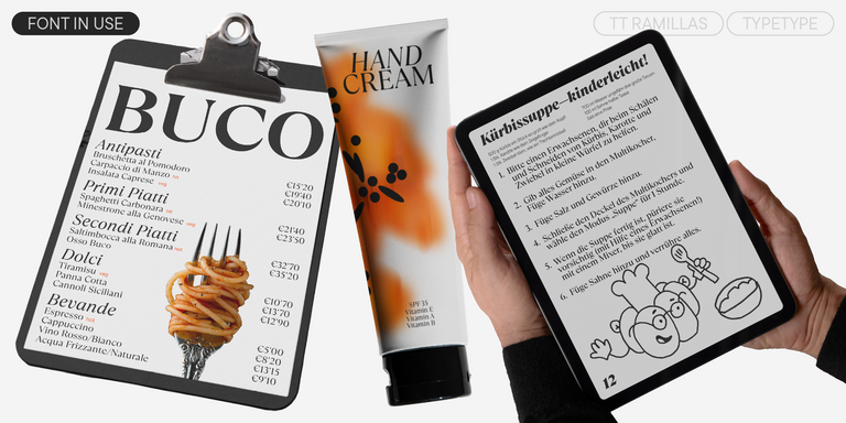
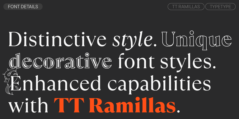
TT Ramillas is a contemporary serif with editorial versatility. It features decorative styles and ornamental initials with floral motifs.

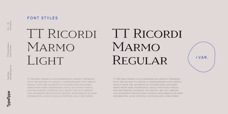
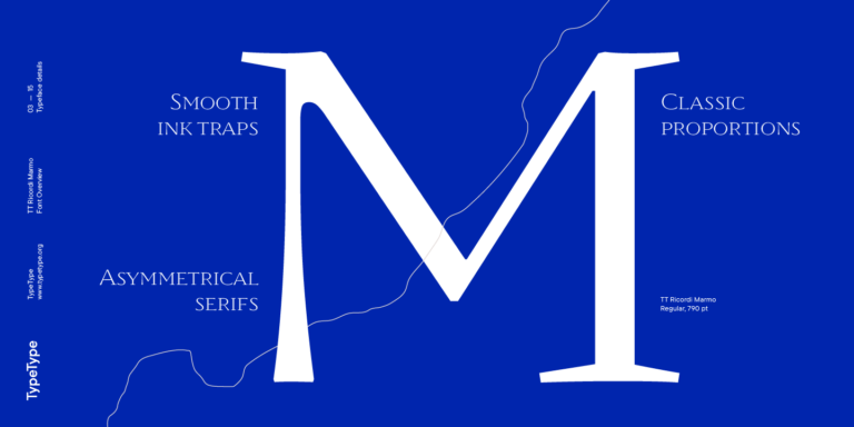
TT Ricordi Marmo is an original experimental project inspired by inscriptions at Basilica di Santa Croce in Florence.
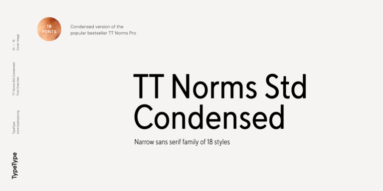
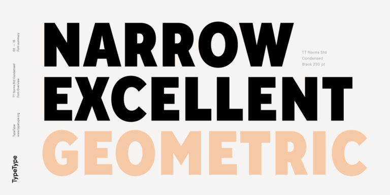
TT Norms Condensed continues to develop the ideas of neutrality and versatility stemming from our bestselling TT Norms.

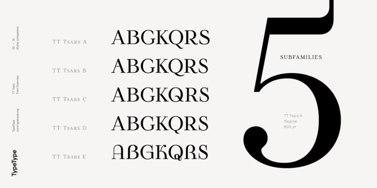
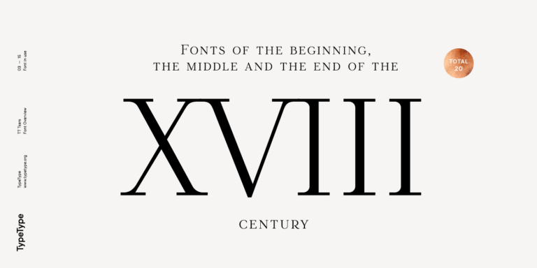
The TT Tsars font family is a collection of serif display fonts that are stylized to resemble the fonts of the beginning, the middle, and the end of the XVIII century.
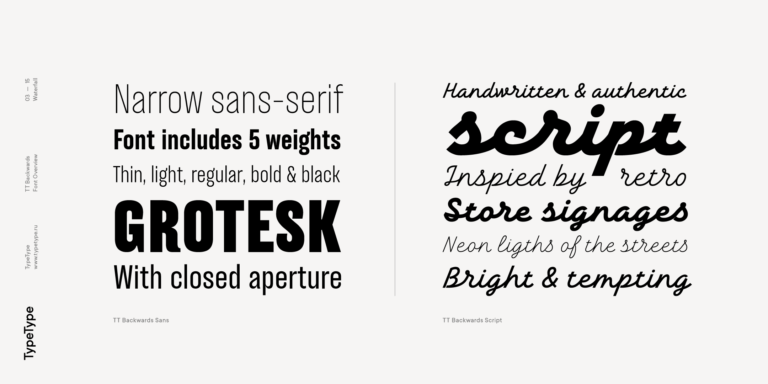
TT Backwards Sans is a narrow grotesque, which takes us back to the book design of late 70s and early 80s with its ductile characters.

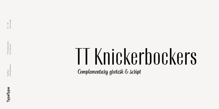
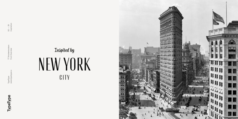
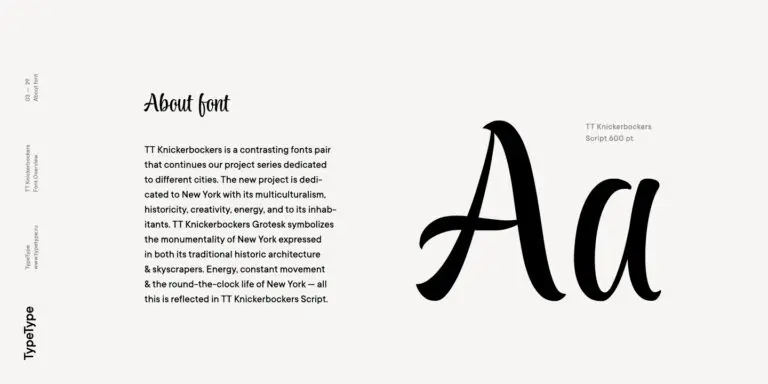
TT Knickerbockers Grotesk is a narrow contrast sans serif with characteristic elements sending us back to the 19th century in New York.
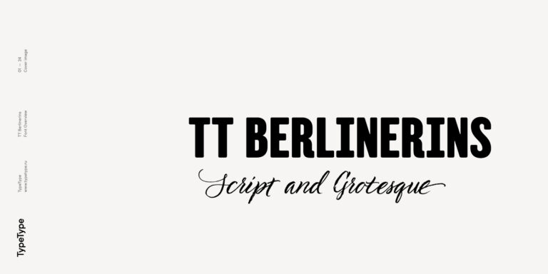
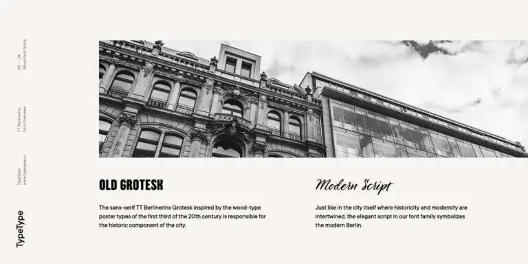
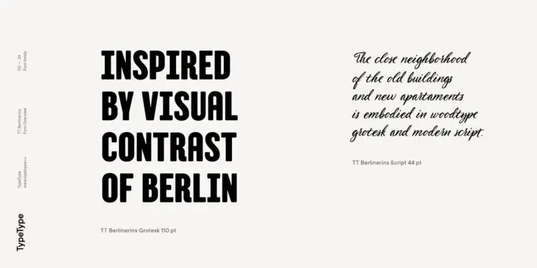
TT Berlinerins is a grotesque inspired by the wood-type poster types of the first third of the 20th century is responsible for the historic component of Berlin.

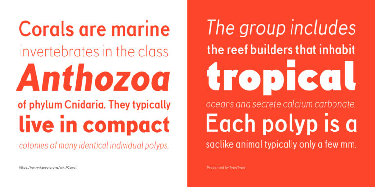
TT Corals is a modern humanistic sans serif which has many typical traits of the beginning of the 20th century. For an increased functionality of the font family, we`ve created 6 styles of various weights.
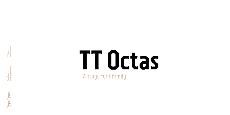
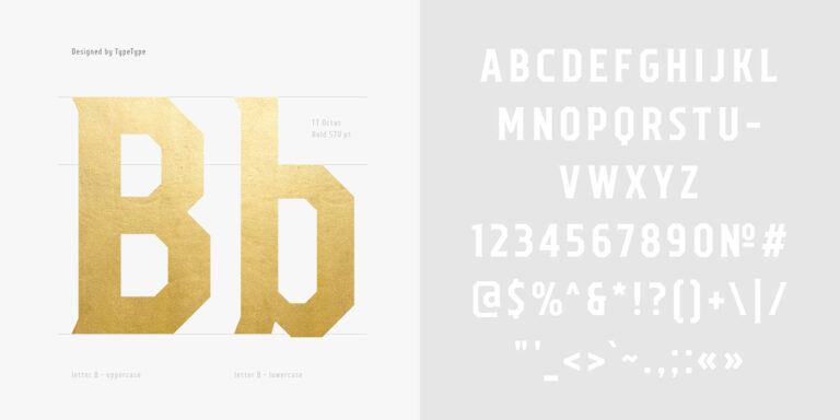
TT Octas is a narrowly proportioned font family built upon the principle of octagonal forms: all circles in this typeface are actually octagons. Thanks to small serifs, TT Octas has a vintage character to it.
MUSE Design Awards, part of the prestigious International Awards Associate (IAA) program, honors groundbreaking design excellence worldwide—spanning architectural marvels, transformative interiors, cutting-edge digital experiences, and pioneering industrial solutions.

Indigo Design Award is a globally recognized award dedicated to groundbreaking digital design. Spotlighting excellence in UX/UI, mobile apps, web interfaces, and digital solutions, it provides award-winners validation from top-tier experts while setting new benchmarks for emerging designers.