TT Livret
Text Regular
32 de estilo
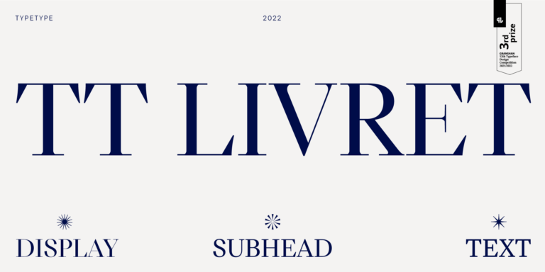
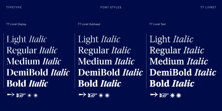
TT Livret es una serif elegante, moderna y funcional.

Si estás buscando Fuentes de Lana Del Rey para complementar tu diseño, TypeType Studio es el indicado para ofrecerte una amplia variedad de fuentes adecuadas para fines comerciales. Los estilos específicos y las familias tipográficas completas están disponibles en nuestra página web: puedes elegir entre una selección de fuentes bien diseñadas y verificadas técnicamente, usarlas de forma gratuita y dejar una solicitud para adquirir el tipo de licencia adecuado. TypeType te da la oportunidad de descargar versiones de prueba de todos los Fuentes de Lana Del Rey para utilizarlos en tus proyectos, así como de recibir asesoramiento de nuestros equipos de diseño o atención al cliente. No dudes en contactarnos a través del formulario en nuestro sitio web.
TT Livret es una serif elegante, moderna y funcional.
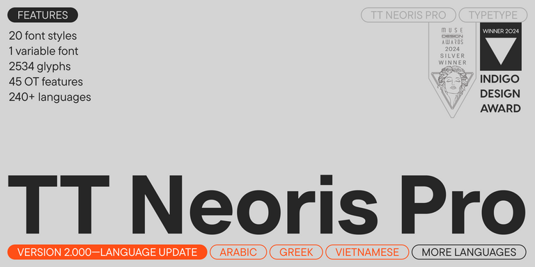
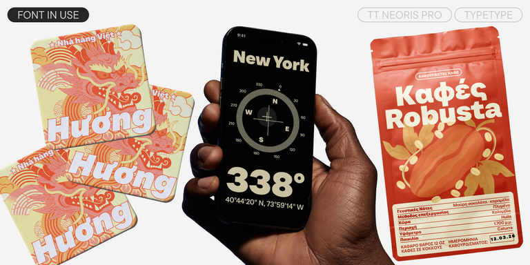
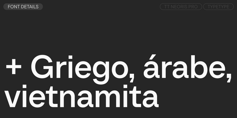
TT Neoris es una elegante neo-grotesca con potencial ilimitado, una tipografía que reúne todos los requisitos modernos y los deseos de los usuarios.
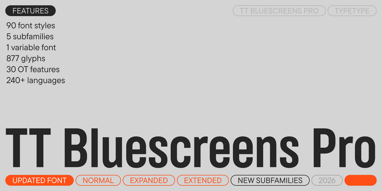

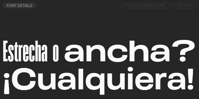
TT Bluescreens es una sans serif geométrica mejorada con proporciones estrechas.
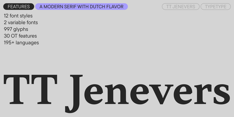
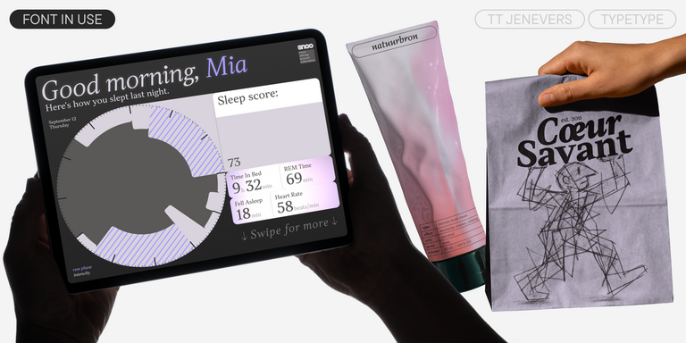
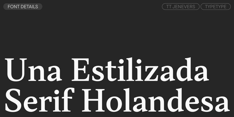
TT Jenevers es una serif moderna con carácter neerlandés. La familia tipográfica presenta detalles característicos de las serifas holandesas, como las serifas asimétricas y la inclinación irregular de los óvalos.
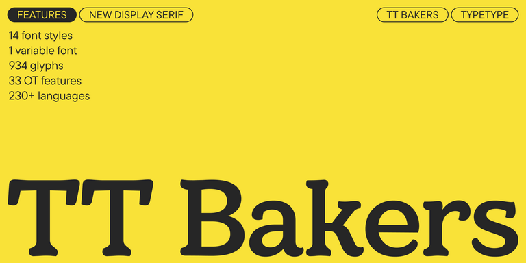
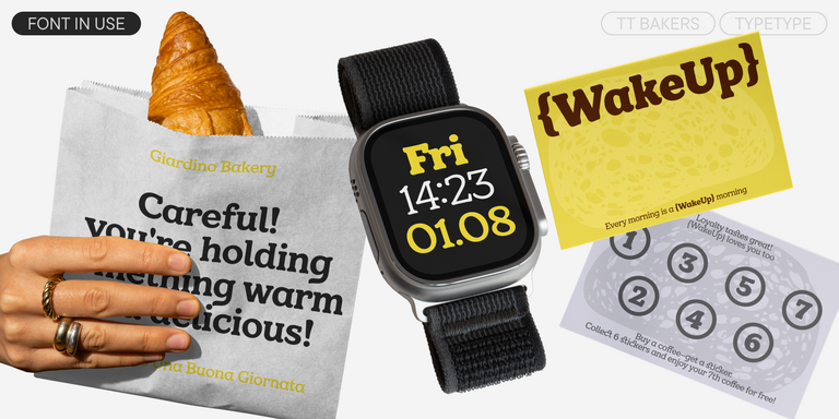
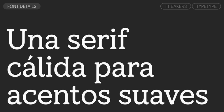
TT Bakers es una serif fluida con un carácter suave y vivaz. Esta tipografía recuerda a la repostería recién horneada: cálida y blanda, especialmente en sus pesos más gruesos.
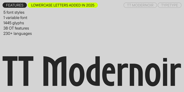
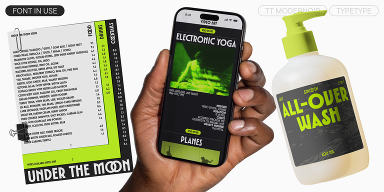
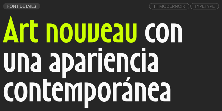
TT Modernoir es una display sans serif con proporciones dinámicas. Las líneas fluidas y las delicadas formas Art Nouveau se combinan perfectamente con el flujo rítmico y la libertad improvisadora del jazz.
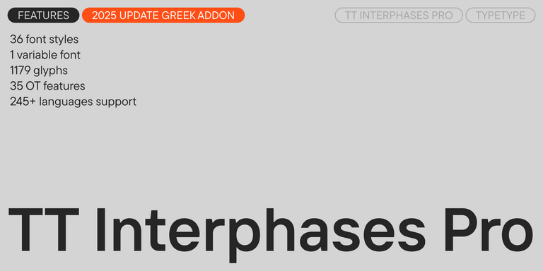
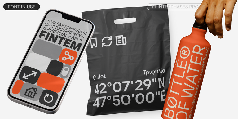
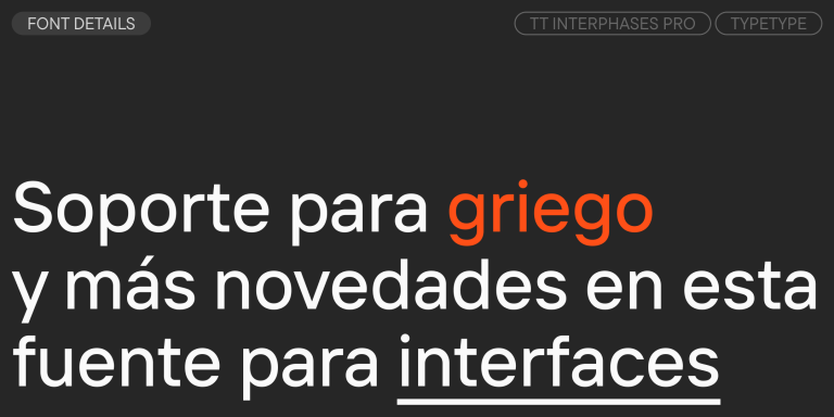
TT Interphases Pro es una sans serif neogrotesca con proporciones de ancho uniforme.
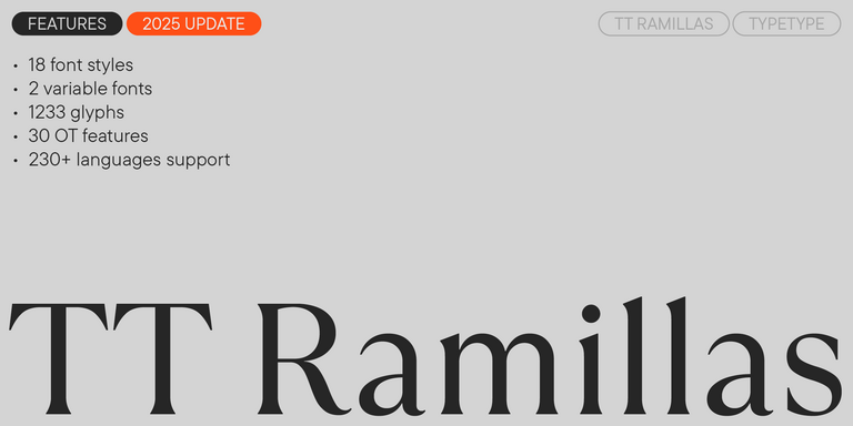
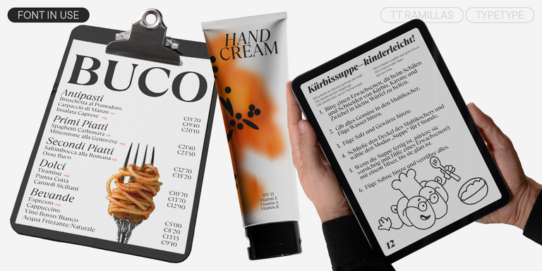
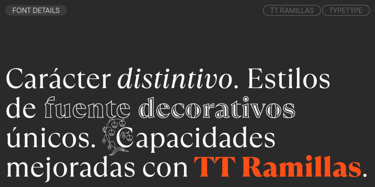
TT Ramillas es una serif contemporánea con gran versatilidad editorial. Incluye estilos decorativos e iniciales ornamentales con motivos florales.

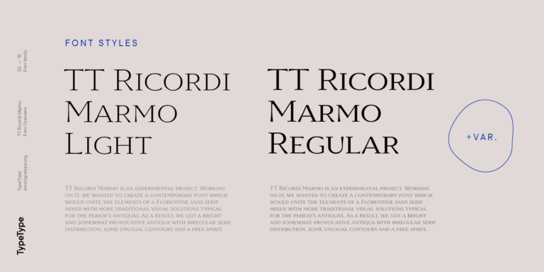
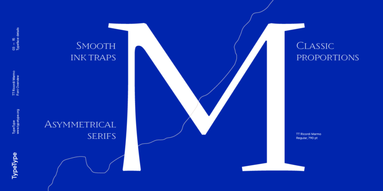
TT Ricordi Marmo es un proyecto experimental original inspirado en las inscripciones de la Basílica de Santa Croce en Florencia.
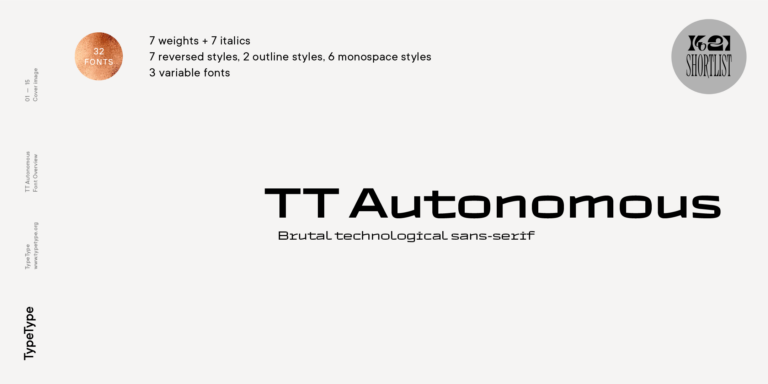
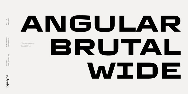
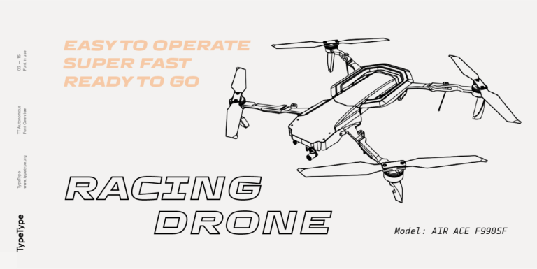
TT Autonomous es una moderna sans serif techno con amplias proporciones angulares.
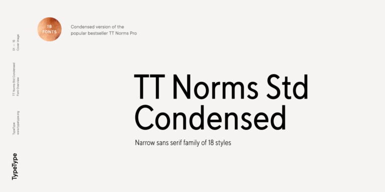
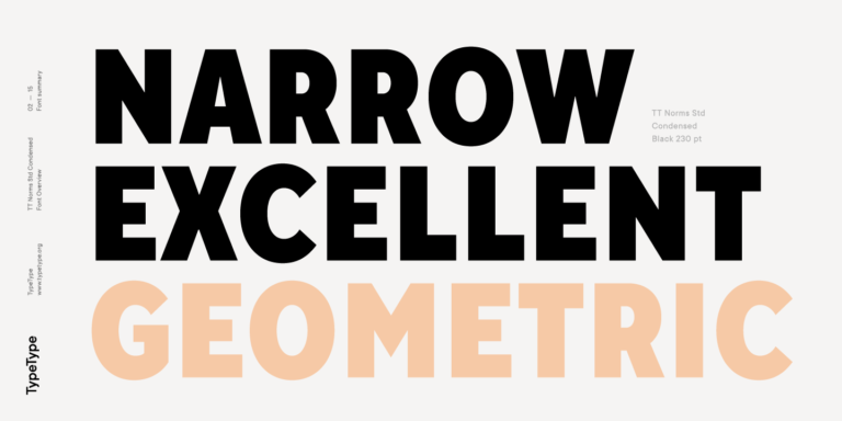
TT Norms Condensed continúa desarrollando las ideas de neutralidad y versatilidad que nacen de nuestra exitosa TT Norms.

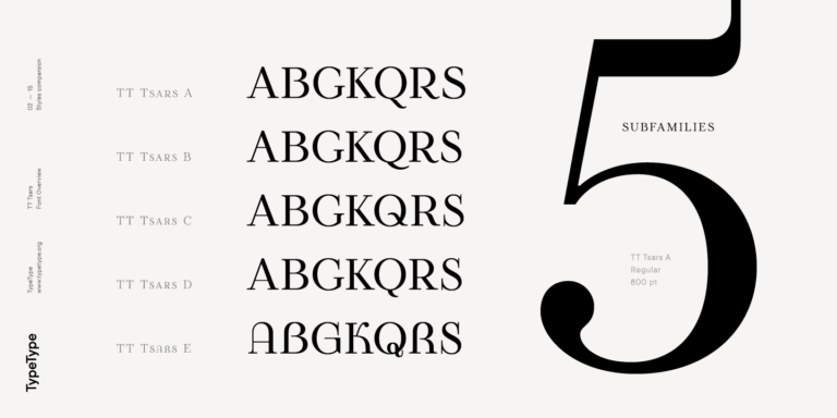
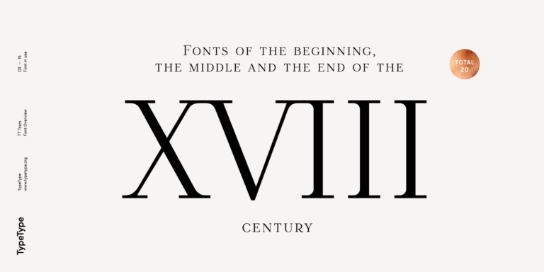
La familia tipográfica TT Tsars es una colección de fuentes serif display estilizadas para evocar las tipografías de principios, mediados y finales del siglo XVIII.
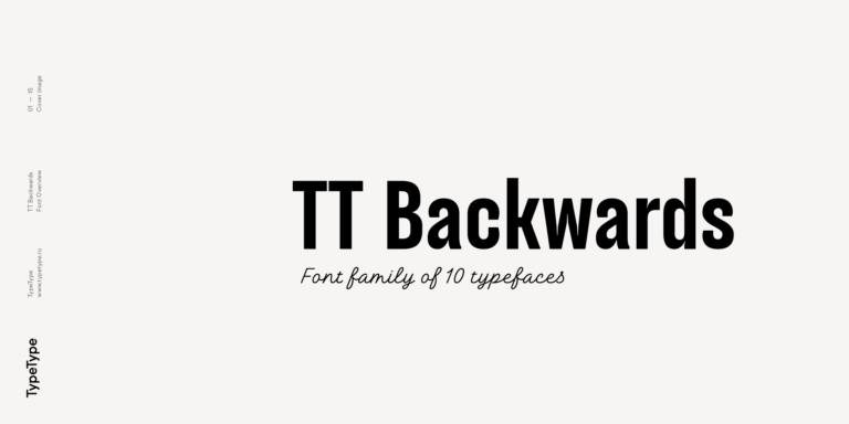
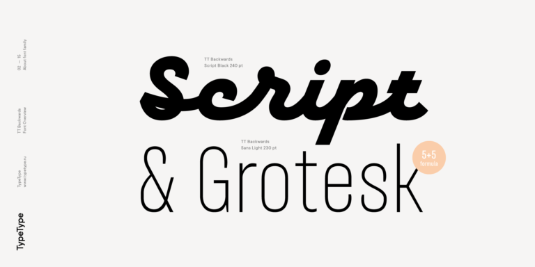
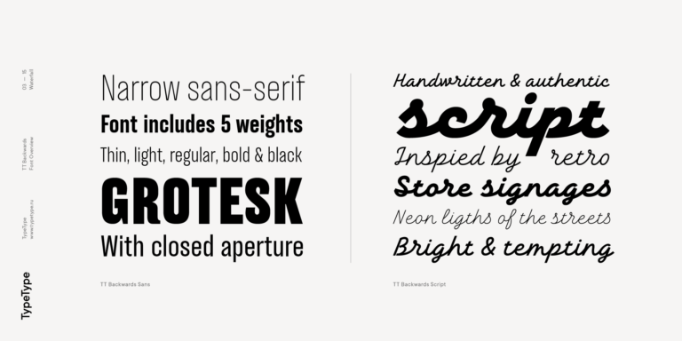
TT Backwards Sans es una grotesca estrecha cuyos caracteres flexibles nos devuelven al diseño editorial de finales de los años 70 y principios de los 80.
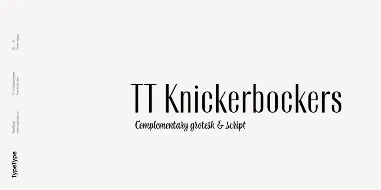
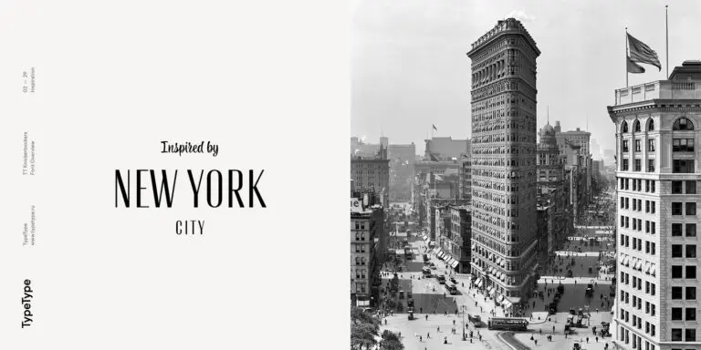
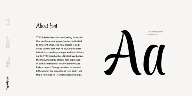
TT Knickerbockers Grotesk es una sans serif estrecha y contrastada con elementos característicos que nos transportan al Nueva York del siglo XIX.
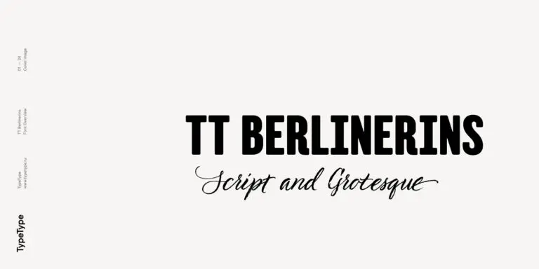
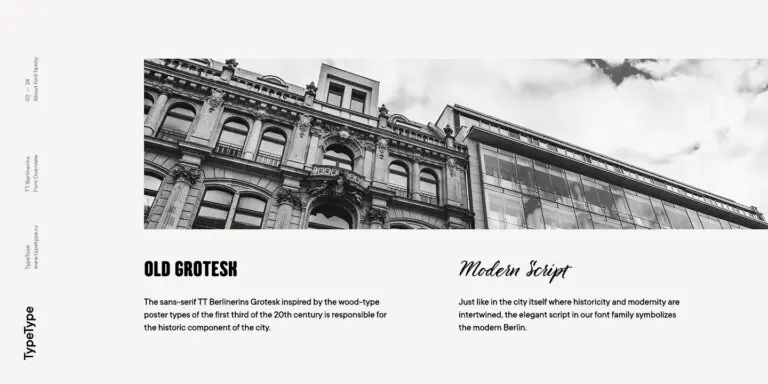
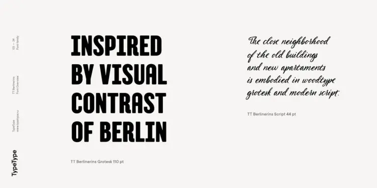
TT Berlinerins es una grotesca inspirada en los tipos de madera utilizados en carteles durante el primer tercio del siglo XX y representa el componente histórico de Berlín.

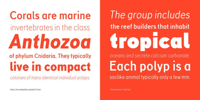
TT Corals es una moderna sans serif humanista con numerosos rasgos característicos de principios del siglo XX. Para ampliar la funcionalidad de la familia tipográfica, hemos creado 6 estilos con diferentes grosores.
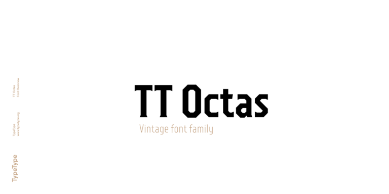
TT Octas es una familia tipográfica de proporciones estrechas construida a partir del principio de las formas octogonales: todos los círculos de esta tipografía son en realidad octágonos. Gracias a sus pequeñas serifas, TT Octas posee un marcado carácter vintage.
MUSE Design Awards, parte del prestigioso programa International Awards Associate (IAA), premia la excelencia en diseño a nivel mundial—desde maravillas arquitectónicas y espacios interiores transformadores hasta experiencias digitales innovadoras y soluciones industriales pioneras.
Indigo Design Award es un galardón de reconocimiento internacional dedicado al diseño digital innovador. Centrado en la excelencia en UX/UI, aplicaciones móviles, interfaces web y soluciones digitales, ofrece a los ganadores validación por parte de expertos de alto nivel y establece nuevos estándares para diseñadores emergentes.