top_banner_ttnormspro0426
Type foundryFonts & StylesPickle

Pickle Fonts

TypeType’s Pickle Fonts selection brings together five families, from restrained text faces to decorative display lettering. These designs offer different starting points for packaging, publications, and brand identities rather than a single shared style. Compare everyday versatility with more distinctive lettering, and narrow the selection around the tone, text length, and reading conditions of the finished piece.

Tags: Pickle

Pickle Fonts for Text and Everyday Design

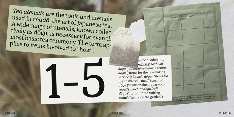
For projects that need a consistent typographic foundation, start with two contrasting options in Pickle Fonts. TT Commons™ Pro is a geometric sans serif with neutral base styles and a broad range of widths, making it a candidate for product information, navigation, and supporting copy. TT Tricks offers a serif alternative: relatively low stroke contrast, substantial serifs, narrow proportions, and slightly squared curves give it a more formal character. Its design is suited to running text. Compare these approaches when deciding whether a publication, website, or identity needs geometric simplicity or a stronger connection to traditional editorial typography.

Distinctive Lettering for Titles and Packaging

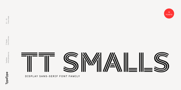
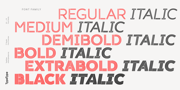
The display side of Pickle Fonts offers three different kinds of expression. TT Frantz brings narrow proportions and Art Deco references, with a variable midline that changes the internal balance of letters without altering their widths. TT Moons uses narrow, high-contrast serif forms and works best at medium or large sizes. TT Smalls takes a graphic approach through uppercase inline lettering; the number of internal strokes changes with the weight. Consider Frantz for a stylized product name, Moons for an editorial title, and Smalls for a decorative headline where the lettering can become part of the composition.

Choosing and Pairing Pickle Fonts

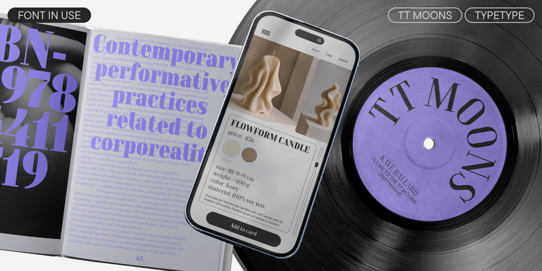
Choose Pickle Fonts around the relationship between display text and practical information. For a cosmetics package, try TT Frantz on the product name with TT Commons™ Pro handling instructions. For a magazine opener, compare a TT Moons title with TT Tricks in the article. Treat these as layouts to test, not automatic matches. Establish a clear difference in size and weight before adding another family. Include complete sentences, numerals, punctuation, and the longest names your project must accommodate. Review a printed proof for labels and a narrow viewport for digital work. Look closely at fine strokes, spacing, and the shapes left inside letters; attractive details should not make the message harder to read. Check the actual character set for every required language. Finally, compare the proposed combination with a layout using just one family, so additional contrast earns its place rather than merely adding complexity.

Preview and License Pickle Fonts

Turn this collection into a working shortlist by opening the individual family pages and reviewing the available styles. Use a free trial to evaluate layouts and present mockups to a client; trial access does not cover finished commercial use. Before purchase, separate the deliverables by how the lettering will be used. TypeType offers distinct Desktop, Logo, Webfont, and App licenses, alongside options for other applications. Printed artwork, a publicly used wordmark, and live website text therefore require separate consideration. Check the relevant terms rather than assuming one license covers the entire project. Establish who will install the files and whether the client needs their own access for future updates. Keep the selected styles, permitted uses, and purchase records with the design specification. Resolve licensing before production, when the final formats and responsibilities are clear, rather than after the artwork has been distributed.

  • The quick brown fox jumps over a lazy dog.
  • Pack my box with five dozen liquor jugs.
  • Sphinx of black quartz, judge my vow
  • 0123456789 !?.,:;—–()[]{}<> “quotes” ‘apostrophe’ @#%&*_+=/\| № $ € £ ₽ +−×÷=≠≤≥ … % © ® ™
  • Aa Bb Cc Dd Ee Ff Gg Hh Ii Jj Kk Ll Mm Nn Oo Pp Qq Rr Ss Tt Uu Vv Ww Xx Yy Zz
Leading
1.1
Tracking
0px
Bestseller
104 font styles

TT Commons™ Pro is a completely redesigned version of the well-established classic font family TT Commons.

TT Frantz Variable
4 font styles

TT FRANTZ IS AN EXPERIMENTAL VARIABLE FONT, DISTINGUISHED BY ITS SLIMNESS AND LIGHTNESS. THE VARIATION IN THE FONT AFFECTS THE CHANGE IN THE HEIGHT OF THE MEAN LINE—BY MOVING THE AXIS ADJUSTMENT SLIDER YOU CAN EASILY RAISE OR LOWER THE MEAN LINE OF THE FONT.

TT Moons Regular
12 font styles

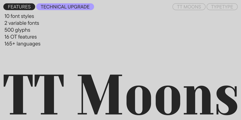
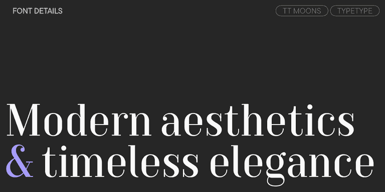
TT Moons is a slim and contrast serif. This font family works especially smart in classic design themes. TT Moons is a typeface of the glyptal modern typeface.

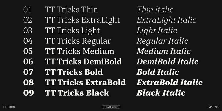
TT Tricks Regular
20 font styles

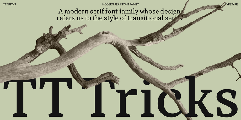
TT Tricks is a modern text serif with a design reflecting the style of Transitional serifs. This font has a calm, elegant, and moderately stern character.

TT Smalls Regular
12 font styles

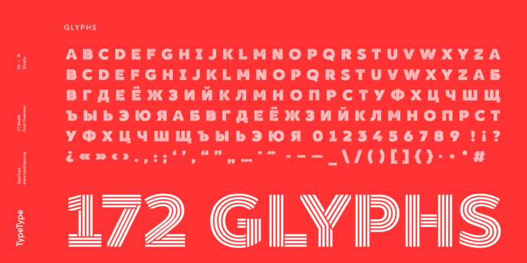
TT Smalls is now a decorative font that makes it easy to attract attention.

What Are Pickle Fonts?

Here, the name identifies a catalog selection containing TT Commons™ Pro, TT Frantz, TT Moons, TT Tricks, and TT Smalls. These are independent families, not styles within one typeface. Their construction ranges from practical text designs to expressive lettering intended for display.

Which Industries Use These Typefaces Most Often?

Suitable applications include publishing, fashion, cosmetics, cultural events, and retail. TT Frantz is a candidate for perfume packaging or exhibition posters, while TT Tricks suits projects with substantial reading. Choose according to the content and audience rather than expecting every design to serve the same sector.

Can Pickle Fonts Be Used for Branding?

Yes, with the appropriate commercial license. Build the identity around the actual company name, product range, and supporting messages. Decide which styles remain constant and where expressive lettering is allowed, then assess the system across packaging, presentations, signage, and small digital placements.

What Should Be Considered When Pairing These Fonts?

Give each design a distinct purpose and compare apparent size, stroke weight, and spacing. Avoid making two decorative voices compete in the same hierarchy. Start with one expressive headline and quieter supporting copy, then check whether the relationship remains clear across different content lengths.

Can You Buy or Download TypeType Fonts for Commercial Projects?

Yes. Free trial downloads are available for evaluation, while finished commercial work requires the relevant paid permissions. Select the styles you need and a license covering their intended use. Review the terms for installation and embedding before publishing or handing over editable files.

Contact us!