TT Livret
Text Regular
32 أنماط خط
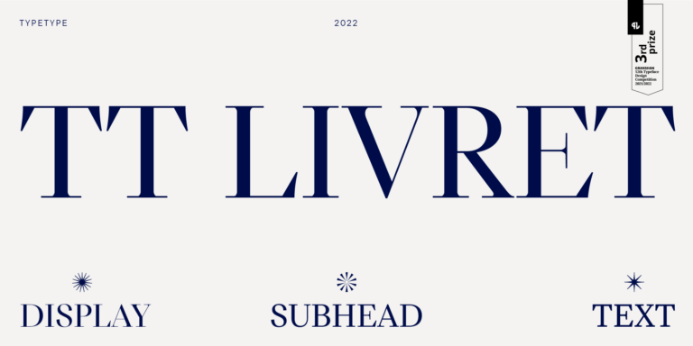
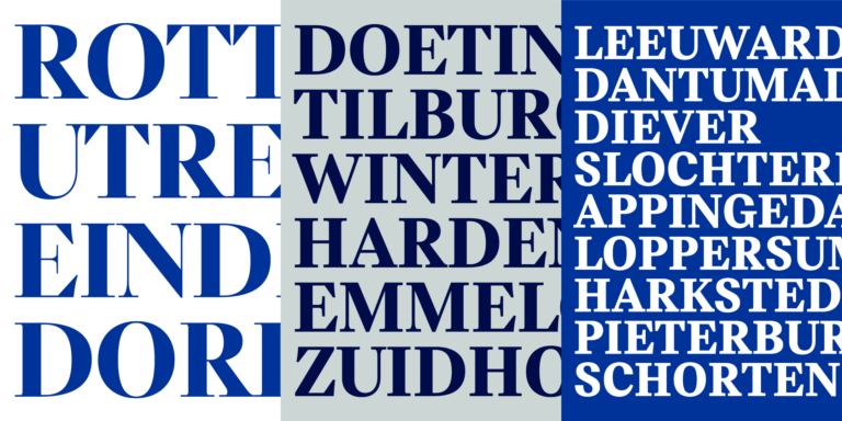
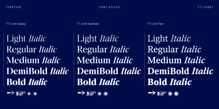
TT Livret is an elegant, modern and functional serif

إذا كنت تبحث عن خطوط لانا ديل ري لتكمل تصميمك، فإن استوديو TypeType هو المكان المثالي الذي يوفر مجموعة واسعة من الخطوط المناسبة للأغراض التجارية. يمكنك العثور على أنماط محددة وعائلات خطوط كاملة على صفحتنا عبر الإنترنت: اختر من بين مجموعة متنوعة من الخطوط المصممة باحتراف والمُختبرة تقنيًا، استخدمها مجانًا، أو قدّم طلبًا لشراء الترخيص المناسب.
يوفر TypeType فرصة تحميل الإصدارات التجريبية لجميع خطوط لانا ديل ري لاستخدامها في مشاريعك، بالإضافة إلى إمكانية الحصول على استشارة من فرق التصميم أو دعم العملاء. لا تتردد في الاتصال بنا عبر نموذج التواصل على موقعنا.
TT Livret is an elegant, modern and functional serif
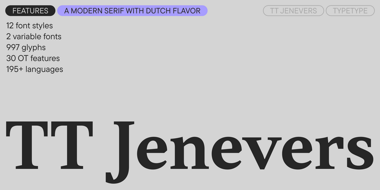
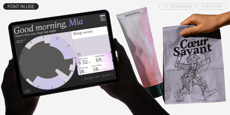
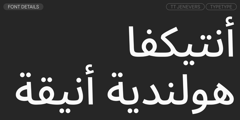
TT Jenevers is a modern serif with a Dutch flavor. The font family features the characteristic details peculiar to Dutch serifs—these are the asymmetrical shape of serifs and an irregular slant of ovals.
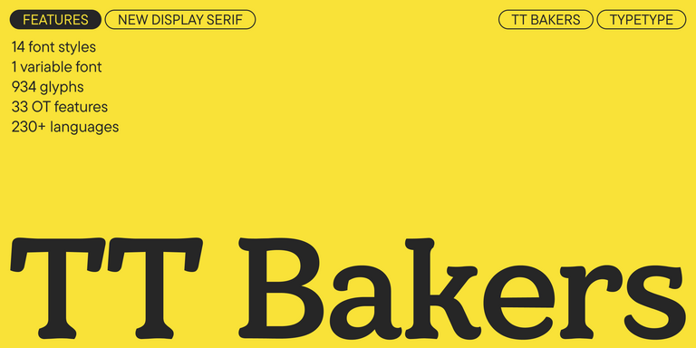
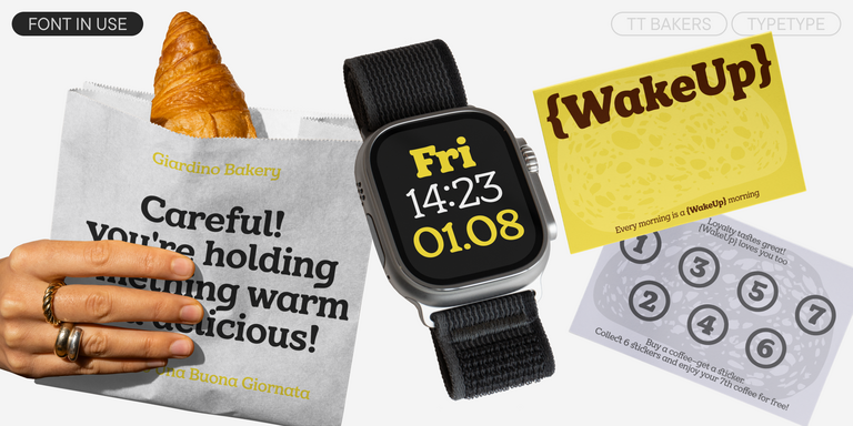

TT Bakers is a fluid serif with a gentle and lively character. This font is like freshly baked goods: it’s warm and soft, especially in its bolder weights.
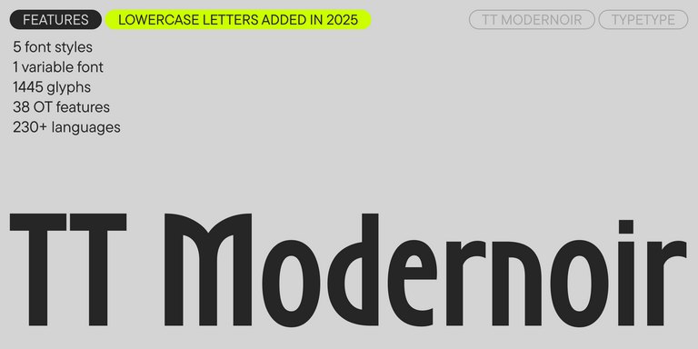
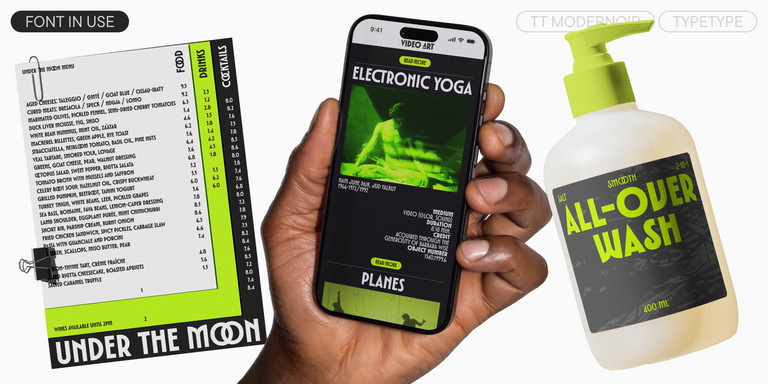
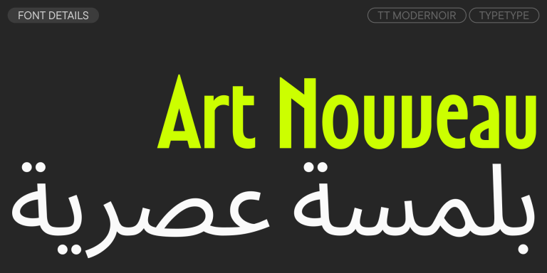
TT Modernoir is a display sans serif with dynamic proportions. Fluid lines and delicate Art Nouveau forms in this typeface blend seamlessly with the rhythmic flow and improvisational freedom of jazz.
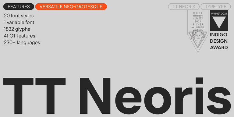
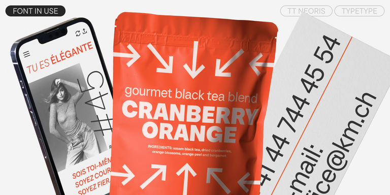
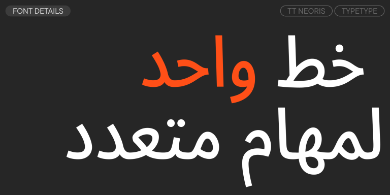
TT Neoris is an elegant Neo-Grotesque with unlimited potential and a font that encompasses all modern requirements and user desires.
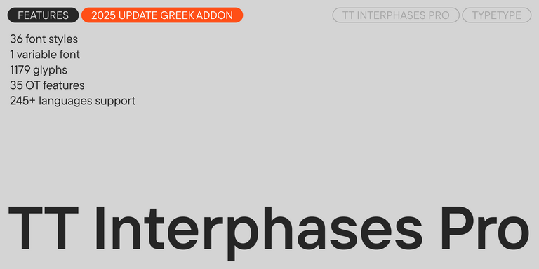
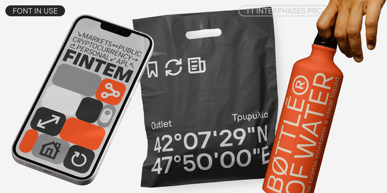
TT Interphases Pro is a neo-grotesque sans serif with equal-width proportions
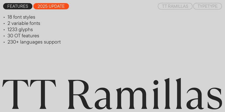
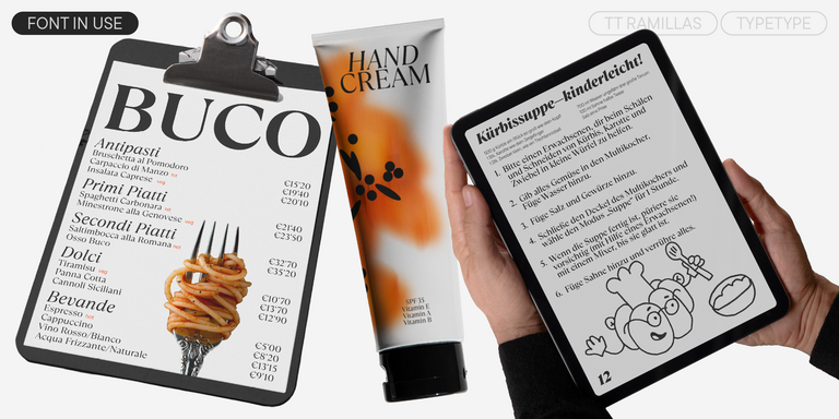
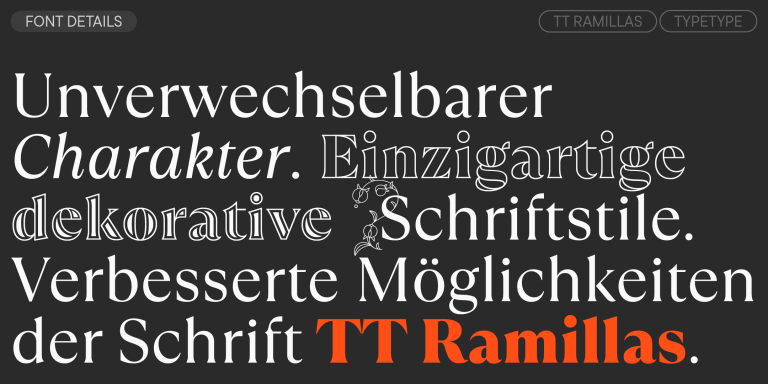
TT Ramillas is a fully reconsidered high contrast transitional serif, which is perfectly adapted to modern realities and requirements.
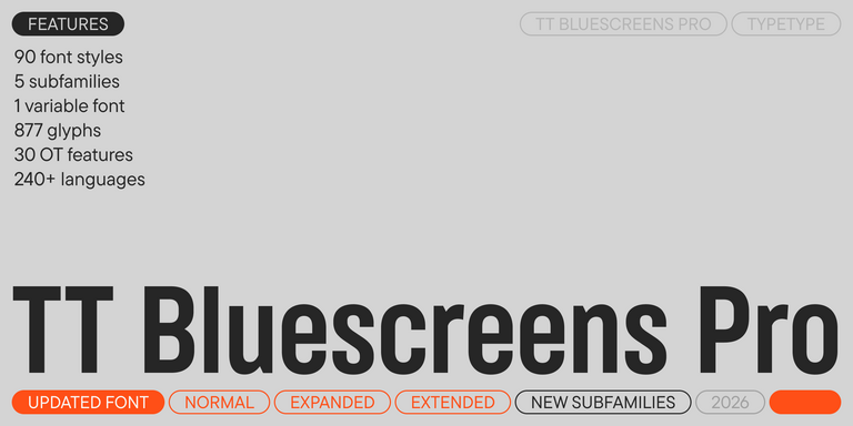
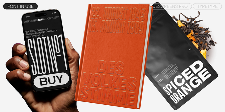

TT Bluescreens is a upgraded geometric sans serif with narrow proportions

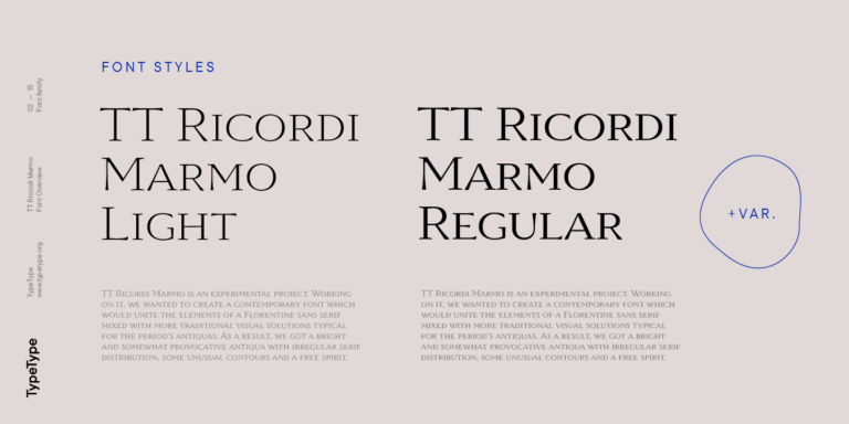
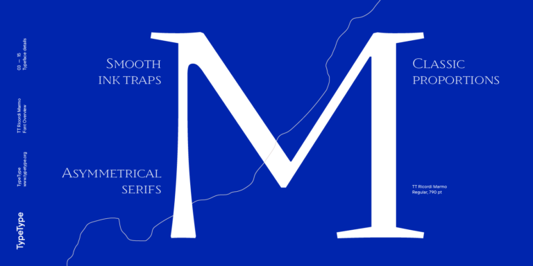
TT Ricordi Marmo is an original experimental project inspired by inscriptions at Basilica di Santa Croce in Florence.
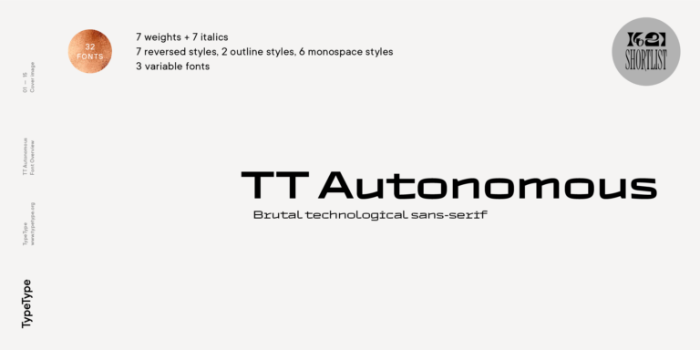
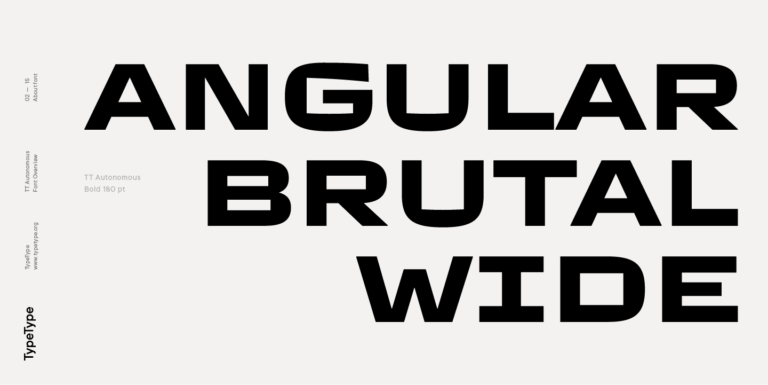
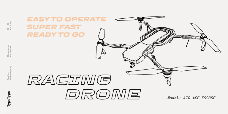
TT Autonomous is a modern techno sans serif with wide angular proportions.
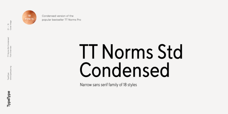
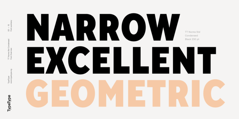
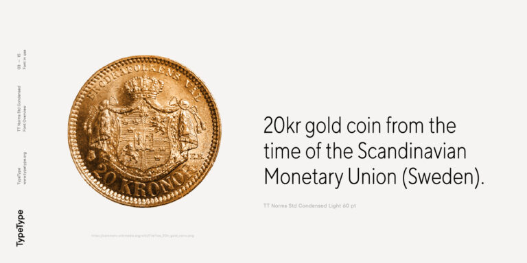
TT Norms Condensed continues to develop the ideas of neutrality and versatility stemming from our bestselling TT Norms.

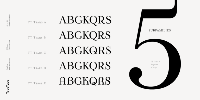
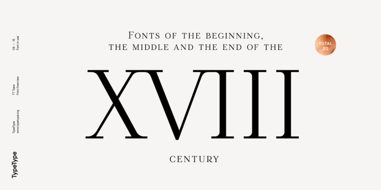
The TT Tsars font family is a collection of serif display fonts that are stylized to resemble the fonts of the beginning, the middle, and the end of the XVIII century.

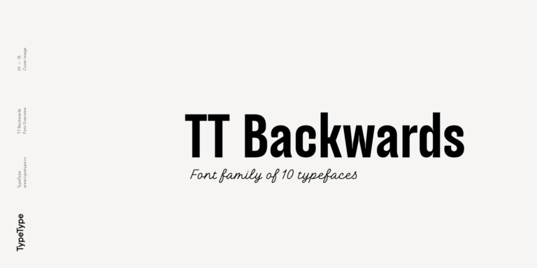
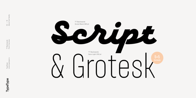
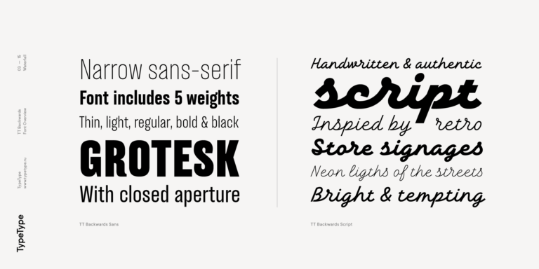
TT Backwards Sans is a narrow grotesque, which takes us back to the book design of late 70s and early 80s with its ductile characters.
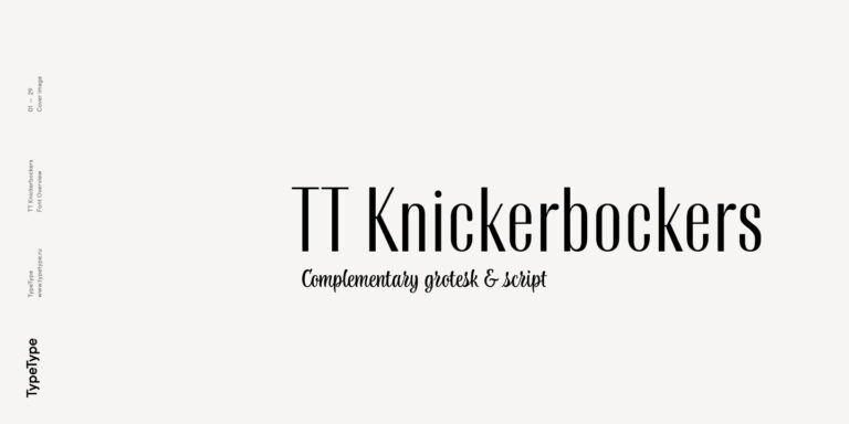
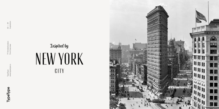
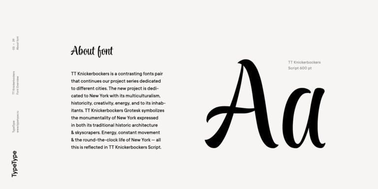
TT Knickerbockers Grotesk is a narrow contrast sans serif with characteristic elements sending us back to the 19th century in New York.
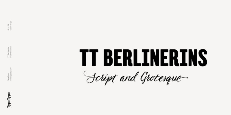
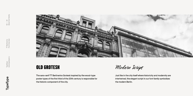
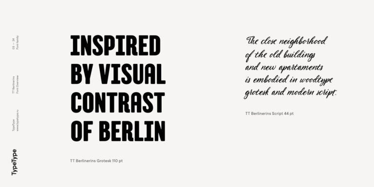
TT Berlinerins is a grotesque inspired by the wood-type poster types of the first third of the 20th century is responsible for the historic component of Berlin.

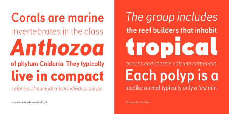
TT Corals is a modern humanistic sans serif which has many typical traits of the beginning of the 20th century. For an increased functionality of the font family, we’ve created 6 styles of various weights.
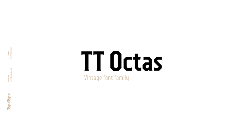
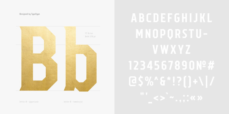
TT Octas is a narrowly proportioned font family built upon the principle of octagonal forms: all circles in this typeface are actually octagons. Thanks to small serifs, TT Octas has a vintage character to it.