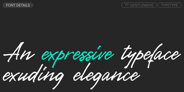
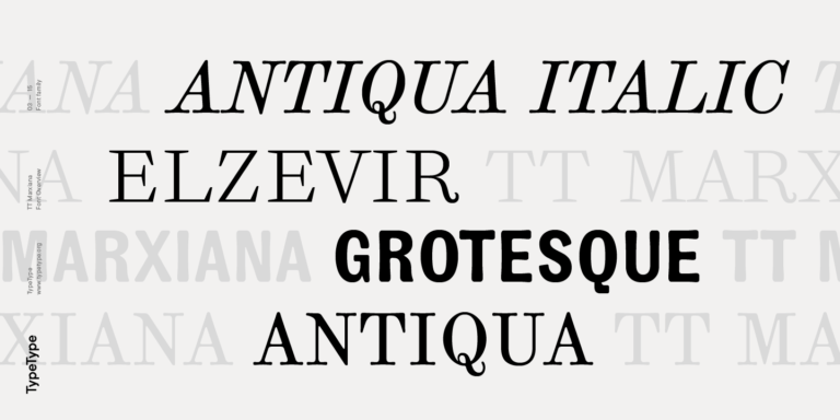
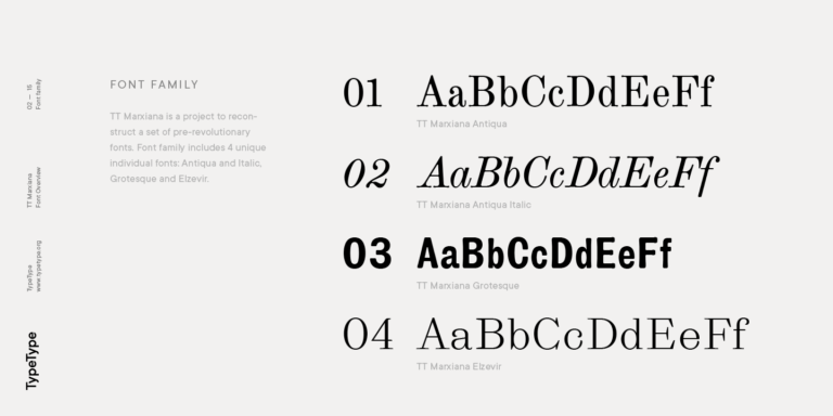
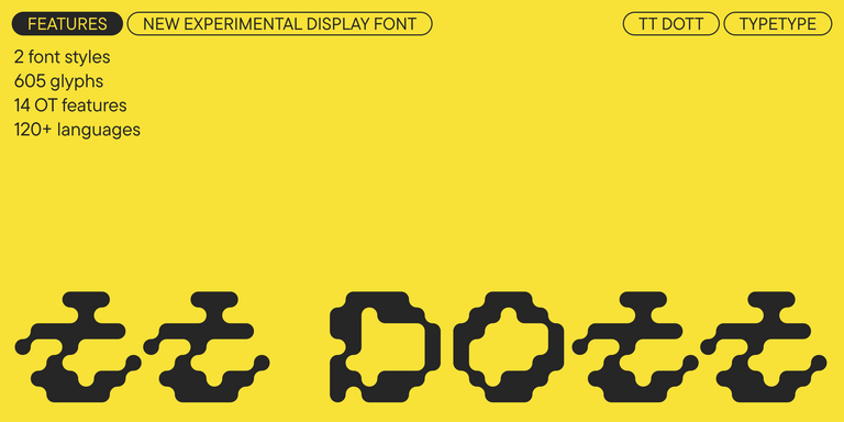
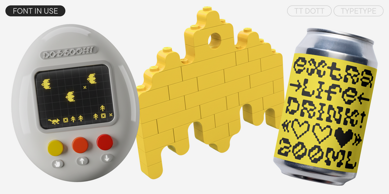
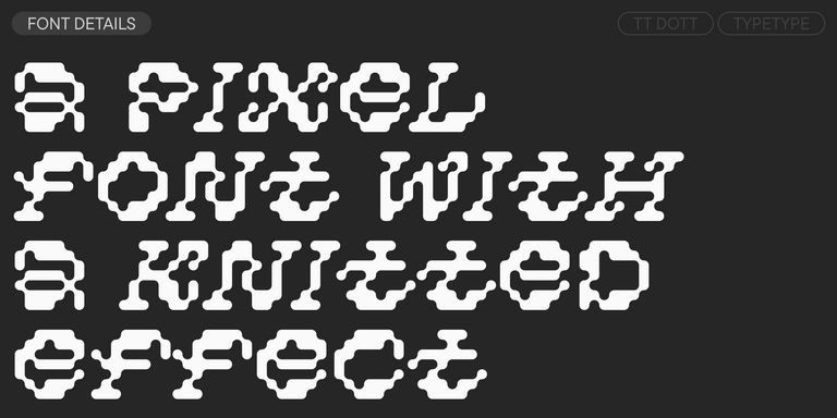
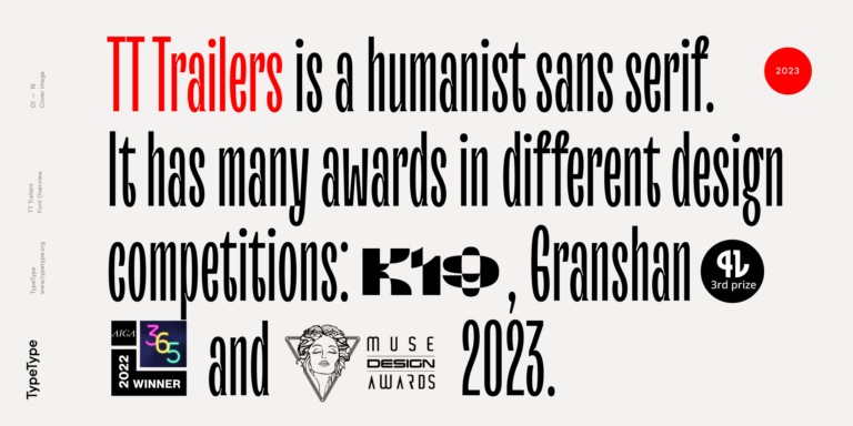
TT Dott is an experimental pixel grotesque where a circle is used as the base for the pixel. It is a fluid and unusual display font, evoking associations with embroidery and techno parties all at once.
Kaiju Fonts
- All fonts 74
- Sans Serif 48
- Serif 27
- Slab Serif 6
- Display 40
- Script 10
- Variable 46
- Font sale 12
If you’re searching for the Kaiju Fonts to complement your design, TypeType studio is the one to provide a wide range of typefaces suitable for commercial purposes. The specific styles and the complete font families can be found on our page online: you may choose from a variety of well-made and technically verified fonts, use them for free, and leave a request to buy a suitable license type. TypeType gives an opportunity to download the trial versions of all Kaiju Fonts for you to use in your projects, as well as to get advice from design or client care teams. Feel free to contact us by our form on the website.
- The quick brown fox jumps over a lazy dog.
- Pack my box with five dozen liquor jugs.
- Sphinx of black quartz, judge my vow
- 0123456789 !?.,:;—–()[]{}<> “quotes” ‘apostrophe’ @#%&*_+=/\| № $ € £ ₽ +−×÷=≠≤≥ … % © ® ™
- Aa Bb Cc Dd Ee Ff Gg Hh Ii Jj Kk Ll Mm Nn Oo Pp Qq Rr Ss Tt Uu Vv Ww Xx Yy Zz
TT Turns is a striking geometric sans serif with expressive elements. This versatile font works exceptionally well for running text, while at large point sizes, it takes on a distinct display character.
TT FRANTZ IS AN EXPERIMENTAL VARIABLE FONT, DISTINGUISHED BY ITS SLIMNESS AND LIGHTNESS. THE VARIATION IN THE FONT AFFECTS THE CHANGE IN THE HEIGHT OF THE MEAN LINE—BY MOVING THE AXIS ADJUSTMENT SLIDER YOU CAN EASILY RAISE OR LOWER THE MEAN LINE OF THE FONT.
TT Modernoir is a display sans serif with dynamic proportions. Fluid lines and delicate Art Nouveau forms in this typeface blend seamlessly with the rhythmic flow and improvisational freedom of jazz.
TT Marks delivers a script with dynamic rhythm, heartfelt character, and nostalgic appeal inspired by the classic art of American sign painting. This craft, where skilled artists hand-painted storefront signage with brushes and careful technique, is experiencing a well-deserved renaissance in today`s design world.
TT Gentlemens is a dynamic handwritten typeface that combines the seriousness and precision in writing with elegance and sophistication. It has the character and style of a true gentleman: restrained and always appropriate, yet confident and striking.
TT Ramillas is a contemporary serif with editorial versatility. It features decorative styles and ornamental initials with floral motifs.
TT Gertika is a geometric sans serif with a dynamic character and a dancing rhythm. This font`s idea originates from the lettering featured on an American poster from the late 1930s.
TT Biersal is a display sans serif with a free-spirited, playful, and adventurous nature. The concept of this font was sparked by a German poster from the early 1930s.
TT Paplane is a squared-looking display sans serif.
TT Travels Next is a very trendy and modern wide display sans serif for use in different sets, be they print or web.
TT Travels Text is a geometric grotesque with wide proportions and specific shapes of circles and fillets, which includes two stylistic sets with completely different natures.
TT Ricks is a flamboyant elzevir-type serif, for which the words “cute” or “calm” are not a fitting definition.
TT Carvist—peculiar, playful, and courageous—this font does an excellent job of grabbing attention!
The starting point of the TT Trailers project was the idea to develop a new generation of narrow typefaces for use in movie credits and posters.
TT Marxiana Elzevir is a title or header font and is a compilation of monastic Elzevir that were actively used in the Niva magazine for all its prints.
TT Geekette is an experimental variable serif with friendly and flexible character of shapes.
TT Alientz is a variable typeface that allows the user to make a visual journey from an extraterrestrial grotesque to a very prickly display serif.
TT Backwards Sans is a narrow grotesque, which takes us back to the book design of late 70s and early 80s with its ductile characters.
TT Berlinerins is a grotesque inspired by the wood-type poster types of the first third of the 20th century is responsible for the historic component of Berlin.
Without any false modesty, we can say that TT Lovelies Script is one of the most complicated projects we have ever carried out—there are 1115 glyphs, more than 2000 contextual alternates, 10000 kerned pairs, and a large number of OT features, including ligatures and Old Style numbers.
TT Slabs. Slab serif, also called «square serif». They originate shortly after the Industrial Revolution (1850), when the advertising industry began to grow.
